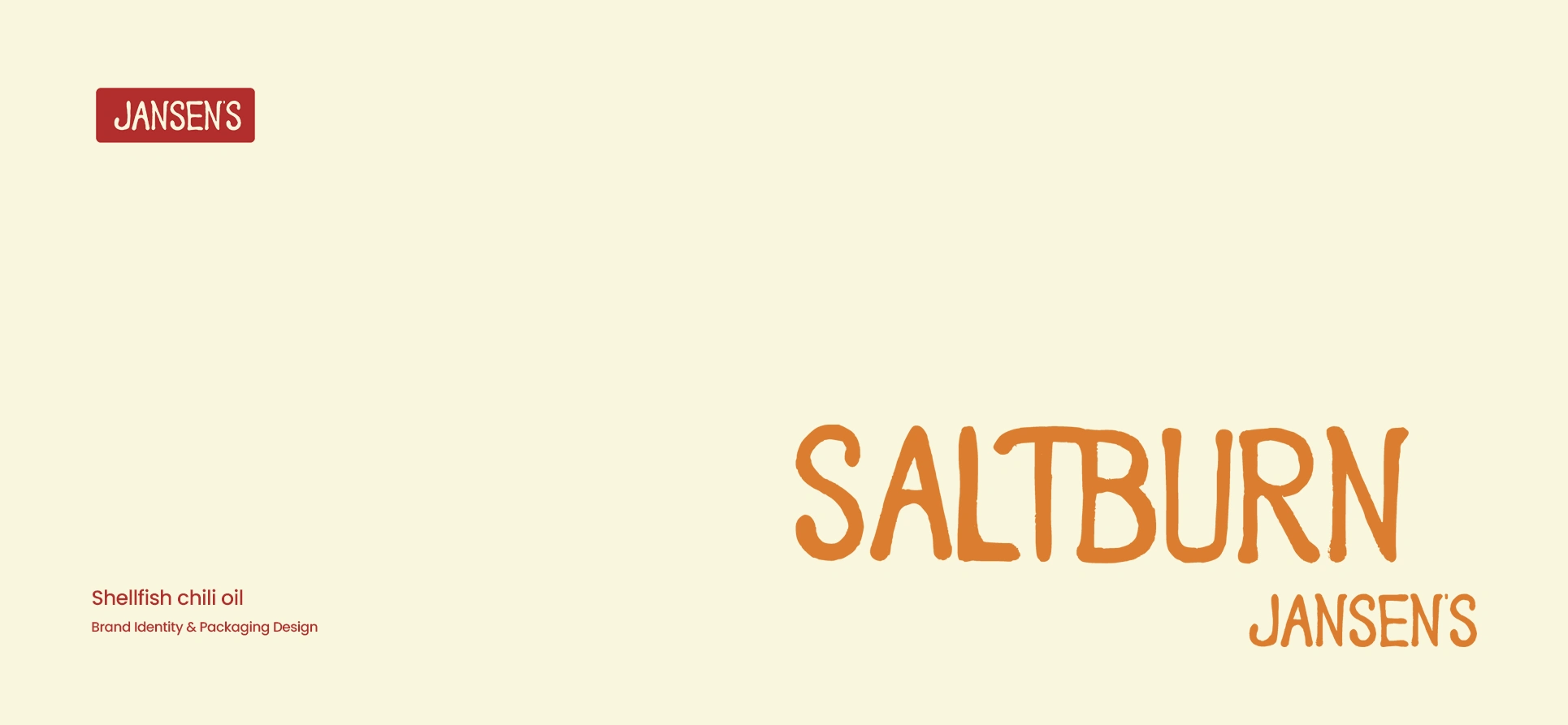
Shellfish chili oil Brand Identity & Packaging Design
Jasmijn Budding
SALTBURN JANSEN'S
Designed in just one week, this self-initiated project explores a complete brand identity system, from logo and custom typefaces to illustration, packaging and campaign assets.The concept centers around Salt Burn Jansen’s, a shellfish chili oil brand built around the character of Jansen: a chef dreaming of opening his own restaurant. That story became the foundation for the entire brand system.
Deliverables: Logo variations & brand assets, two custom hand-drawn typefaces, custom illustration, color palette, label design, three advertising posters, packaging design, animations & mockups.
Self-initiated project | Studio Cloudfairy
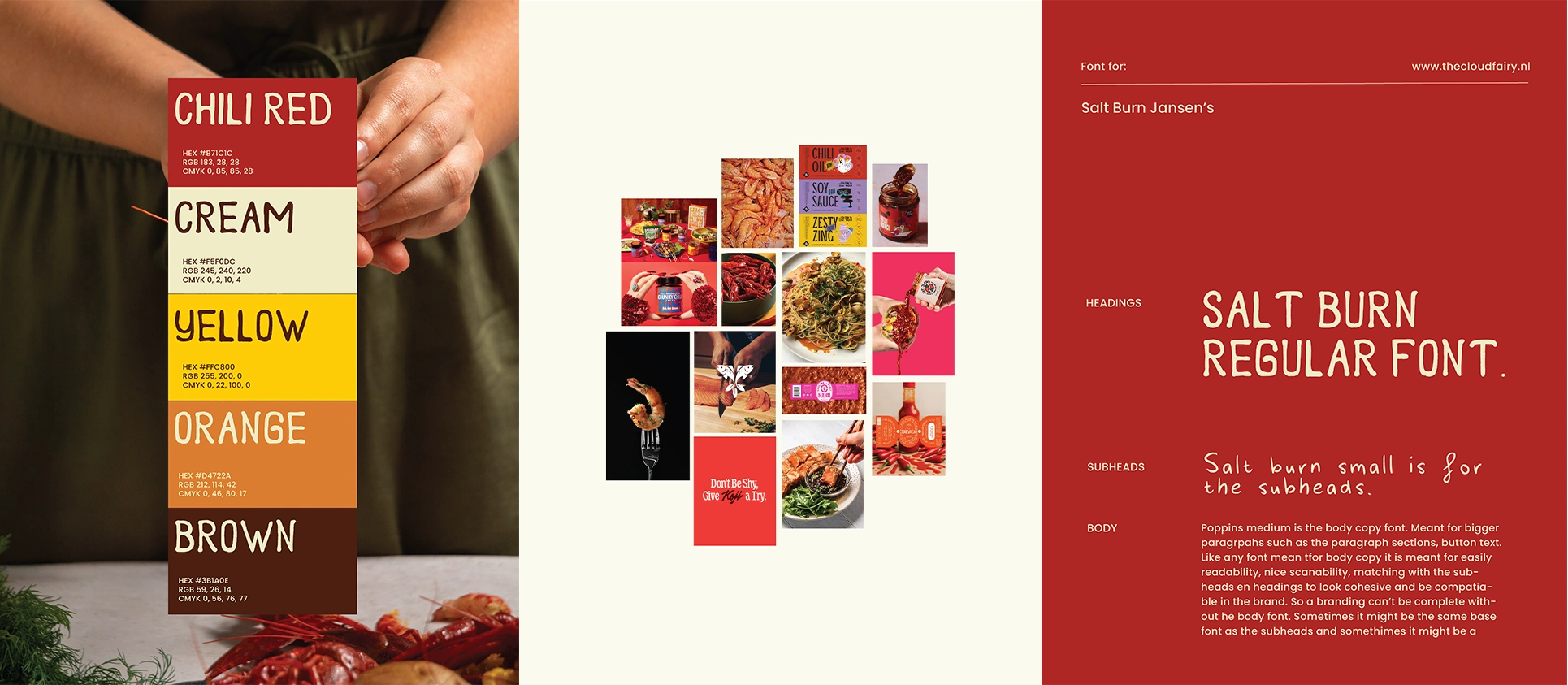
Direction & Moodboard
Two days spent visiting supermarkets, photographing products and observing who actually buys them. A strong brand direction comes from observation, not just from Pinterest.
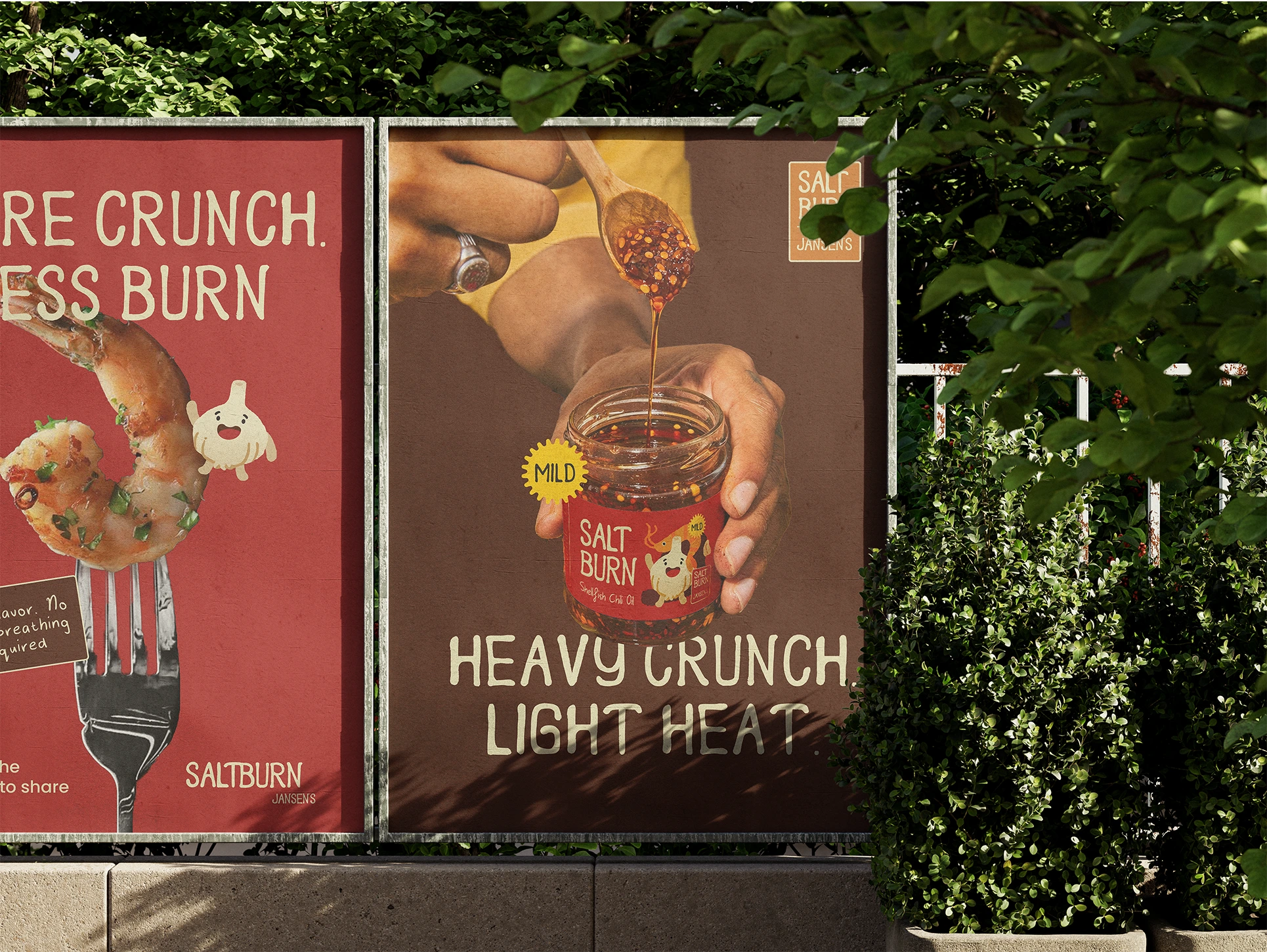
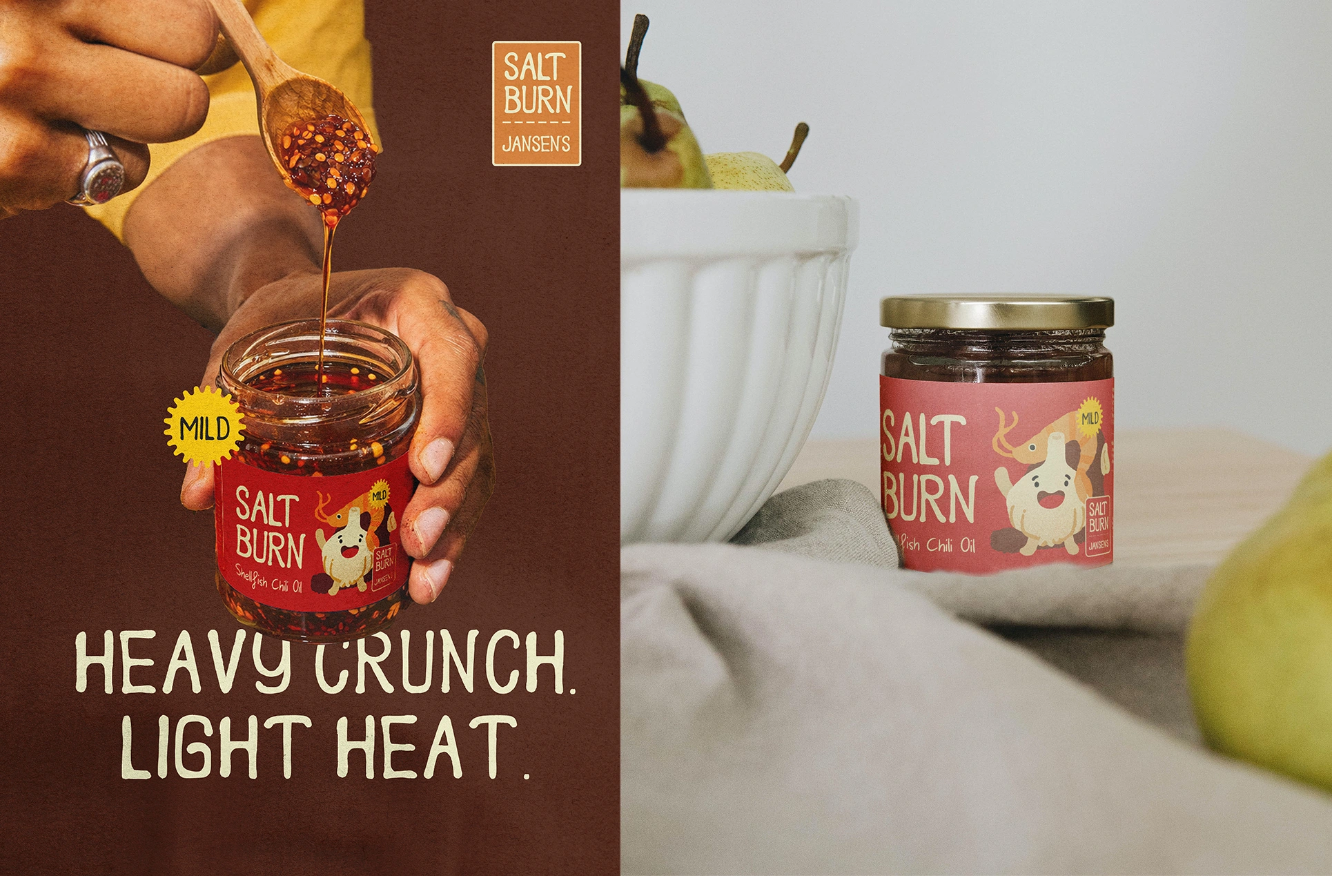
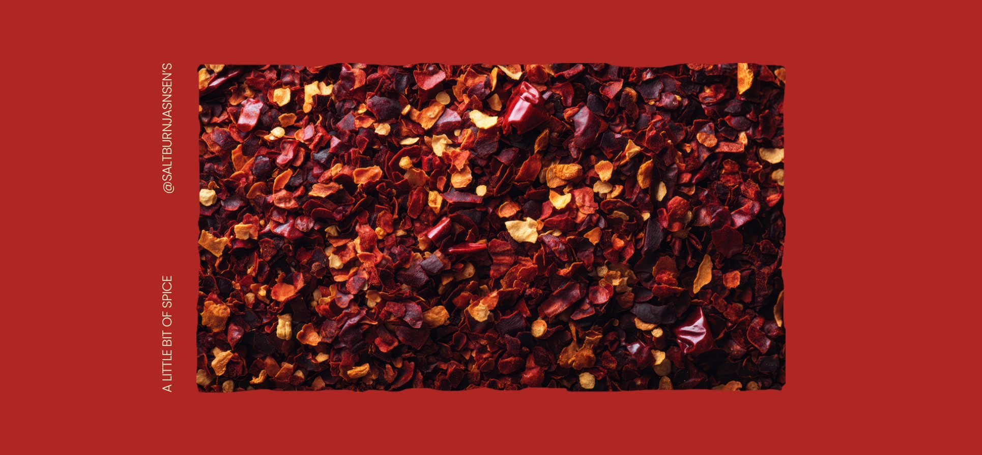
The result: warmth, playful illustration and handwritten typography. Deep chili red, antique cream, walnut brown and a yellow that jumps straight off the shelf. The atmosphere of your favorite street food stall, but translated into a premium brand.
The Brand System
Typography
Both typefaces were fully hand-drawn on paper, scanned and digitized. The first builds on my own handwriting, refined until it could carry a brand. The second is a display typeface with more character, a bit chaotic. Exactly Salt Burn.
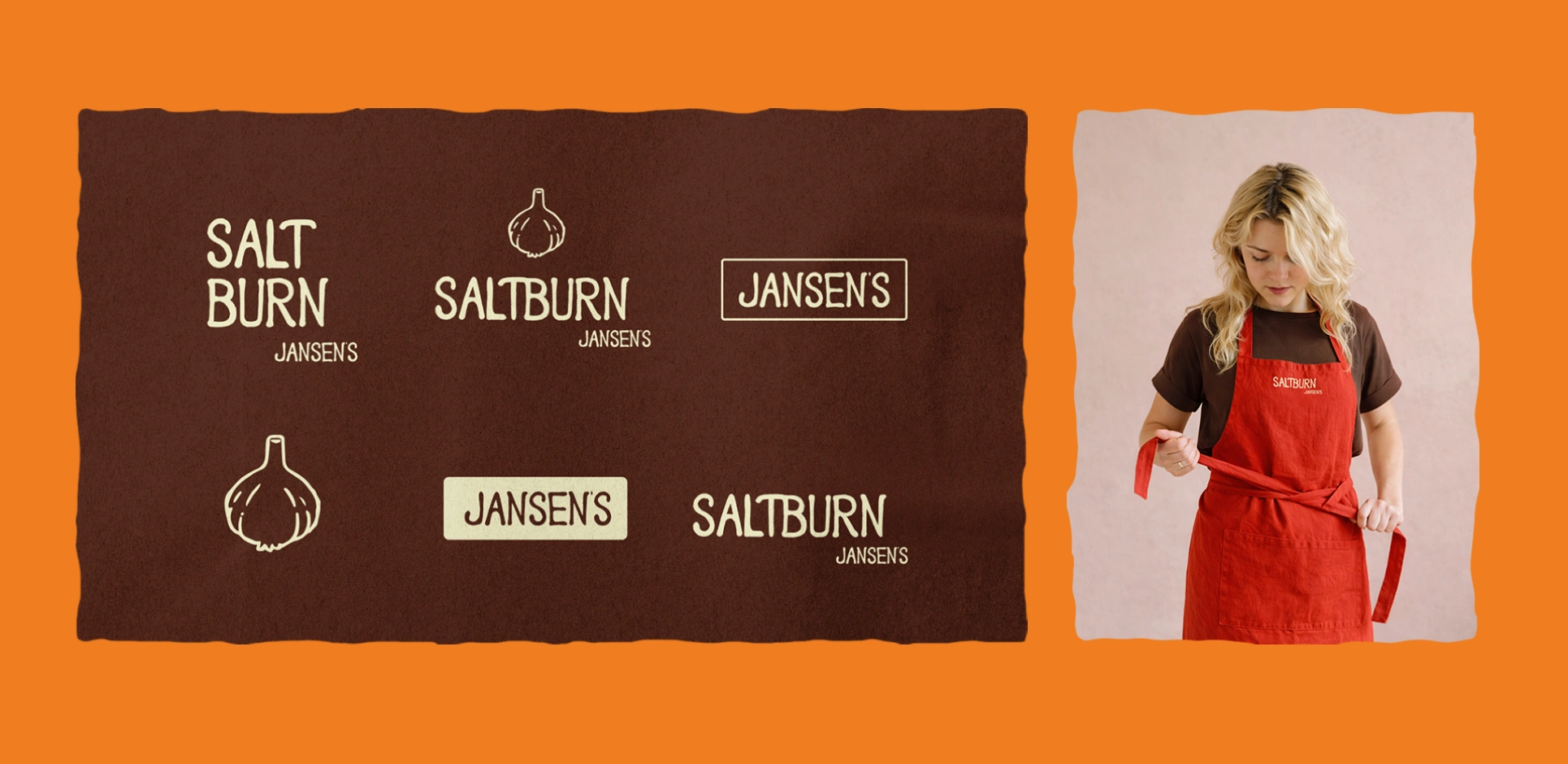
Illustration
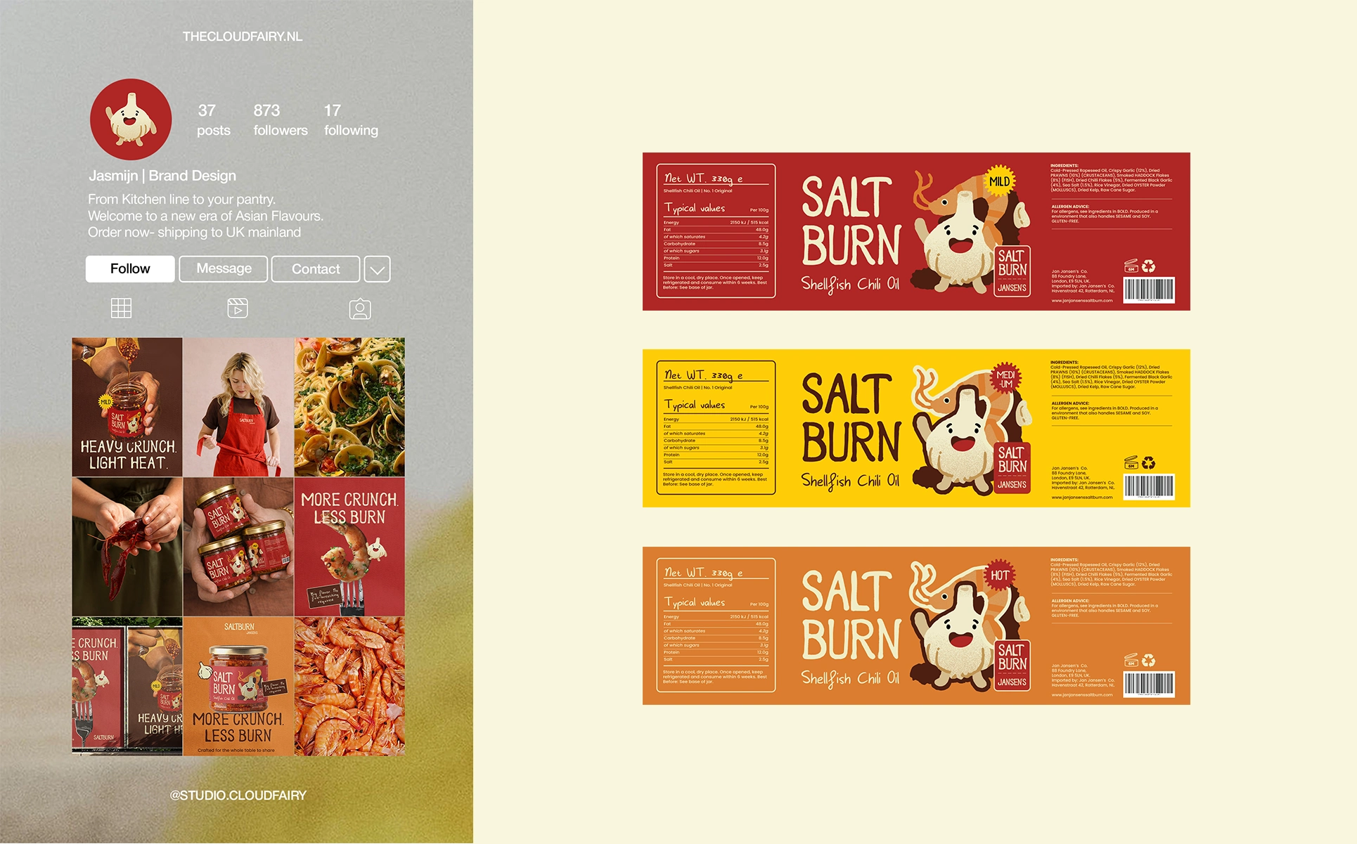
The garlic character with the shrimp emerged after several directions that didn’t work. Designed to function both together and independently. The garlic shape also became the favicon: one element that works at every scale.
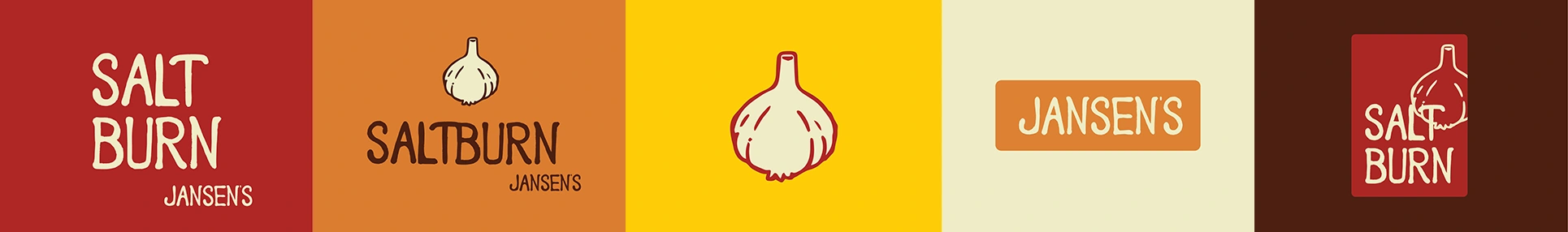
The full logo system
Primary mark, variations, badges and favicon, were all tested across all color combinations. Not everything worked: yellow as a badge color felt too much like a car plate. Aside from that- everything suddenly belonged to the same world.
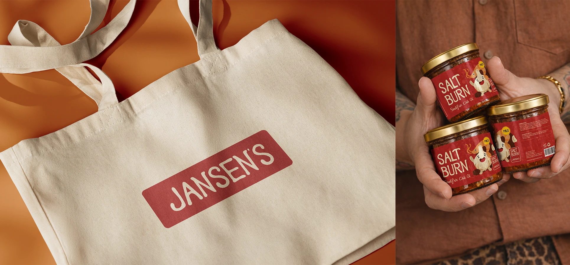
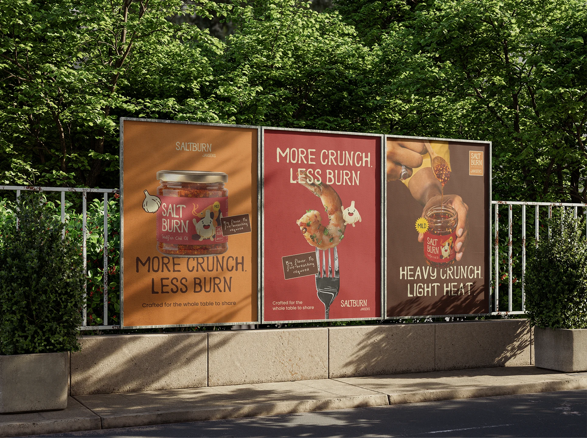
Packaging & Campaign
Label design is where brand identity meets reality, dealing with regulations, barcode placement and print margins. Digitally everything looks good quickly, but the real question is whether it works on the actual product.
Three advertising posters complete the campaign. Without product photography, using self-made mockups, masking and isolated ingredients instead. All brand identity elements return here: the custom typefaces, badges, colors and paper textures.
THE RESULTS
Salt Burn isn’t a real product. But if it ever becomes one, the brand is ready.
In one week a complete brand identity system emerged, from concept to packaging design, from hand-drawn type to animation. Consistent, flexible and with enough personality to survive on a supermarket shelf.
Curious to see the full process? YouTube video coming soon
Like this project
Posted Apr 6, 2026
A complete brand identity created in one week for Salt Burn, a shellfish chili oil concept built around Jansen, a chef dreaming of opening his own restaurant.
Likes
1
Views
3
Timeline
Mar 23, 2026 - Mar 30, 2026