Contemporary Brand Identity for De Lage Landen
Jasmijn Budding
A Contemporary Brand Identity for Publishing House De Lage Landen
I designed a complete visual identity for Uitgeverij De Lage Landen, a Dutch publishing house rooted in heritage, and historical stories. The goal was to build a brand world that felt both classic and contemporary, a system that could hold the weight of history while presenting new voices.
To get there, I developed a restrained typographic voice, a timeless logo suite, and a series of editorial layouts that set the tone for the publisher’s imagined catalogue. The intention was to let atmosphere lead: warm paper textures, archival nuances, and a visual calm that reflects the literary character of the imprint.
The result is a cohesive identity that captures the spirit of De Lage Landen:
stories that stay.
Timeline: April 2025
Scope of Work:
• Brand identity direction
• Logo suite & typographic system
• Editorial book design (two concepts)
• Brand visuals & promotional compositions
• Mockup art direction
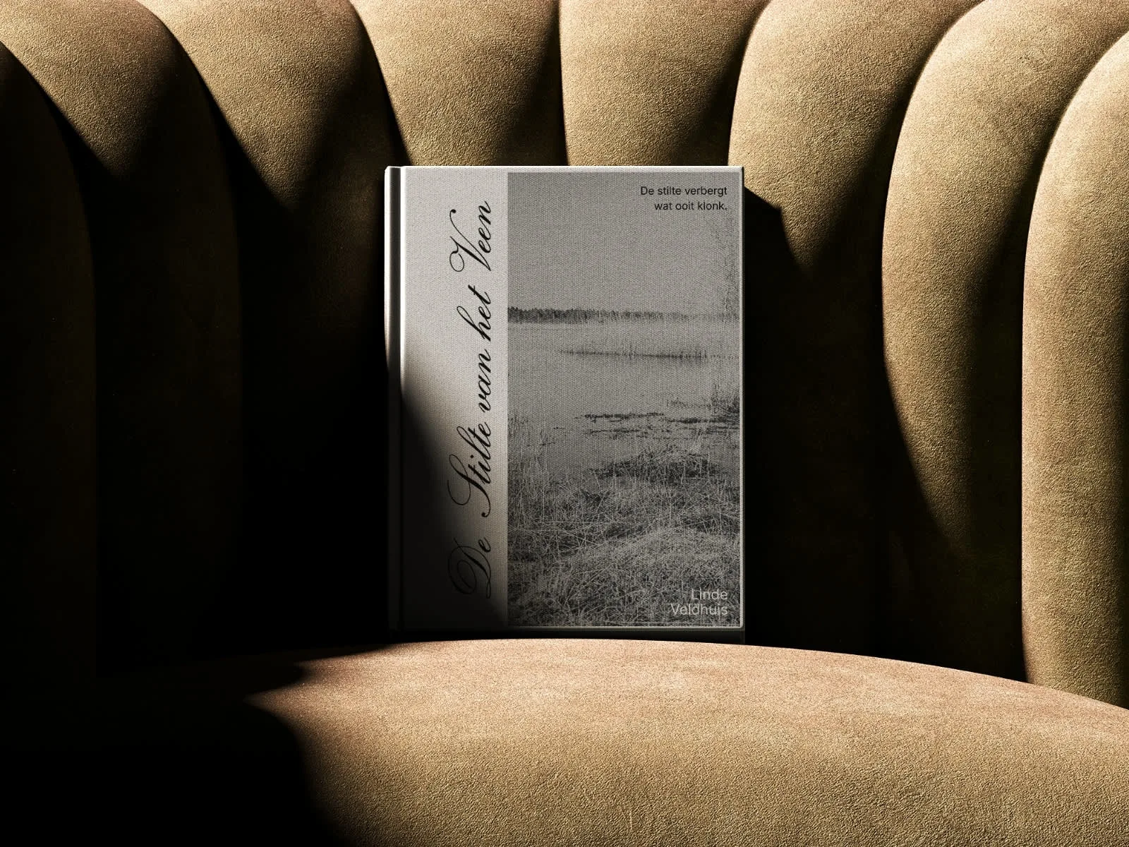
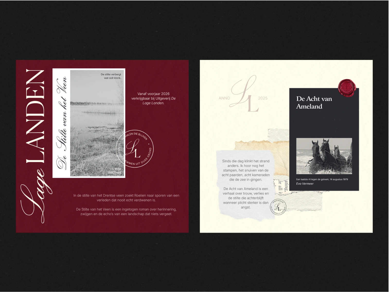
A minimal, atmospheric cover capturing the quiet landscape of the Dutch veen and the memory-driven narrative behind the story.
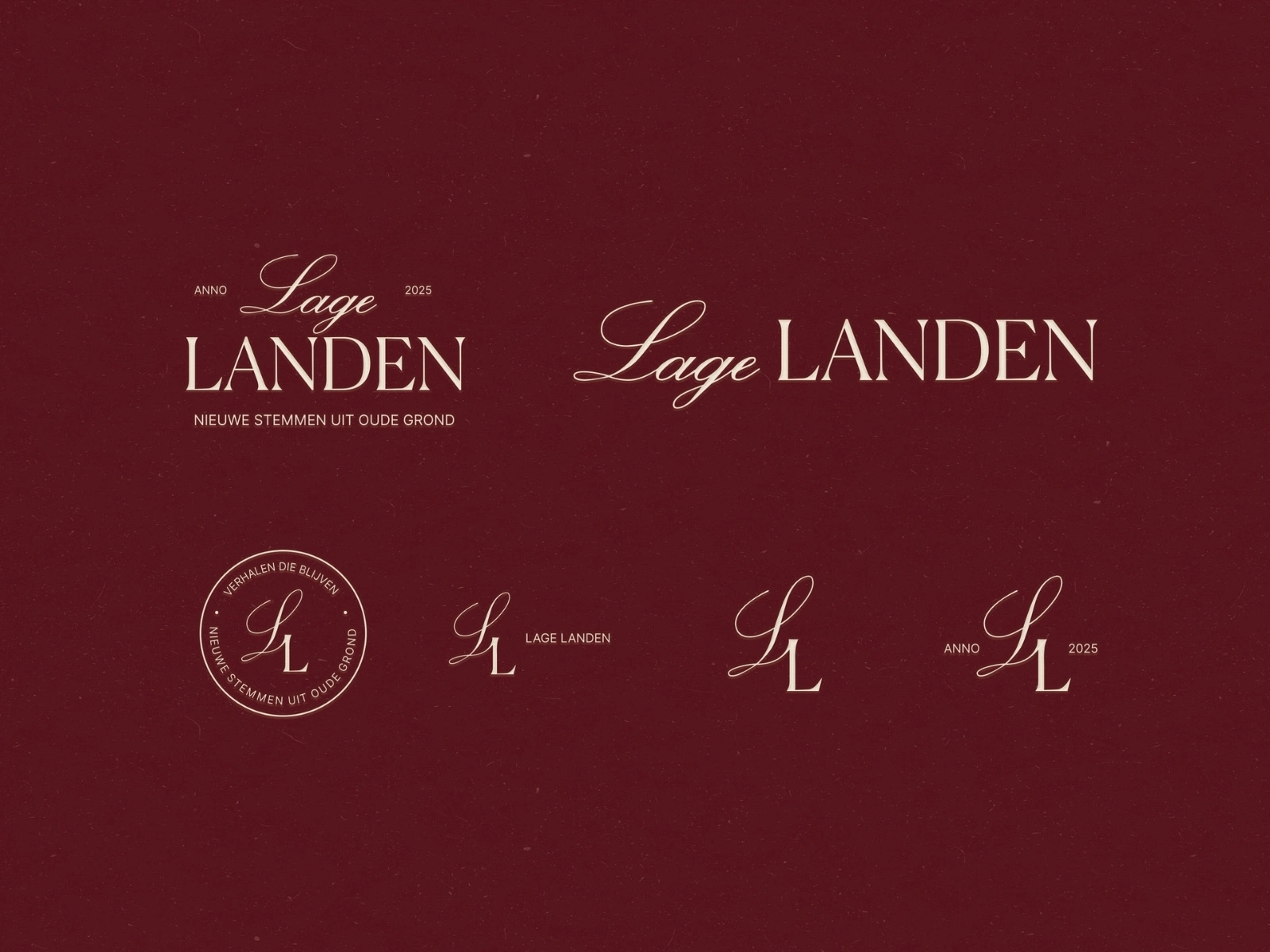
Logo suite, typographic palette, and brand elements created to define the contemporary–classic visual language of the publishing house.
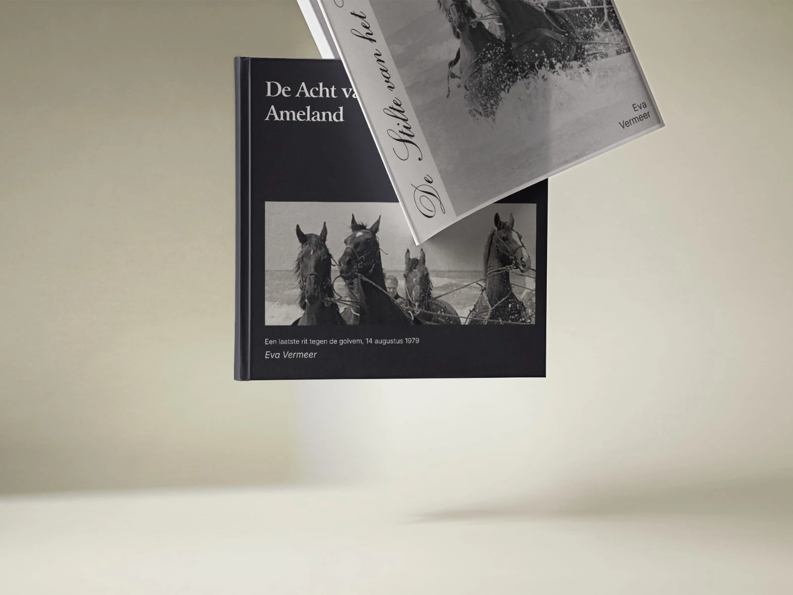
A dark, archival-inspired cover exploring the 1979 Ameland horses rescue, designed in the literary tone of De Lage Landen.
Like this project
Posted Nov 15, 2025
A contemporary brand identity and pair of book designs for Uitgeverij De Lage Landen, blending modern clarity with Dutch literary heritage.
Likes
4
Views
22
Timeline
Apr 7, 2025 - Apr 11, 2025