Brand & Web Designer

Building brands people feel something for
Creative Director/Creative All-Rounder
Holistic Designer: Templates, Copy & Strategy Expert
Holistic Designer: Templates, Copy & Strategy Expert

View more →
Designing brands that stand out!⚡️❤️🔥
Designing brands that stand out!⚡️❤️🔥

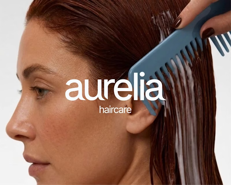
Building brands with soul✨
Building brands with soul✨

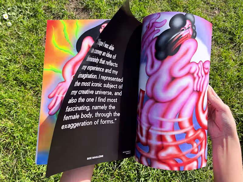
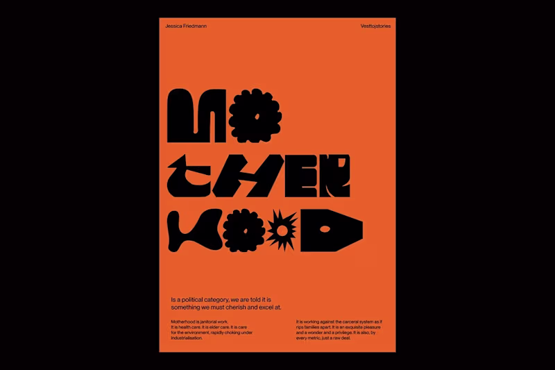
Innovative Graphic, Brand & Editorial Design Aficionado
Innovative Graphic, Brand & Editorial Design Aficionado