Conscious Kids
Rebecca Hayter
The Logo
A fresh and modernised logo design was needed! One of my favourite things to do is a logo design. It's a lot of pressure as it sets the tone for the rest of the branding but it almost feels like a fun puzzle coming together. For this logo, I played with typography to speak to the concept of the product. This is the idea of moulding conscious-driven children. The brand aimed to create awareness around eco-conscious topics in South Africa through sustainable and plant-based treats.
The first word of the logo "conscious" uses a font that exudes spaciousness and a sense of calm. These are the types of adjectives that coincide with being conscious - having a clear state of mind to be able to be aware. The first word juxtaposes, but not harshly, with the second word "kids". This word remains playful with letters slightly rotated in different directions, with lively lines that curve and stretch. The font feels childish, but in a good way. The two words together create a sense of balance in imperfection.
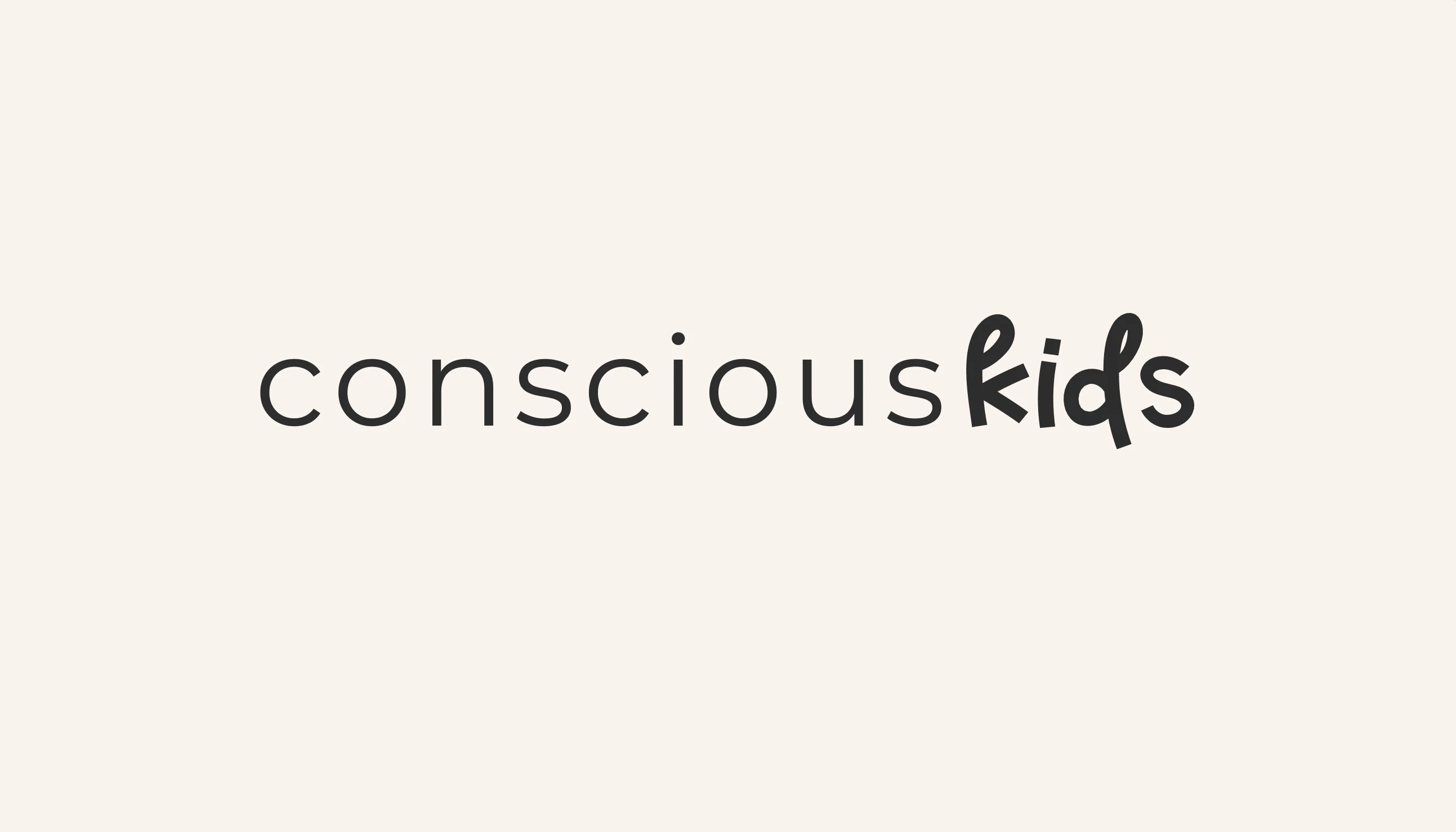
The chosen logo.
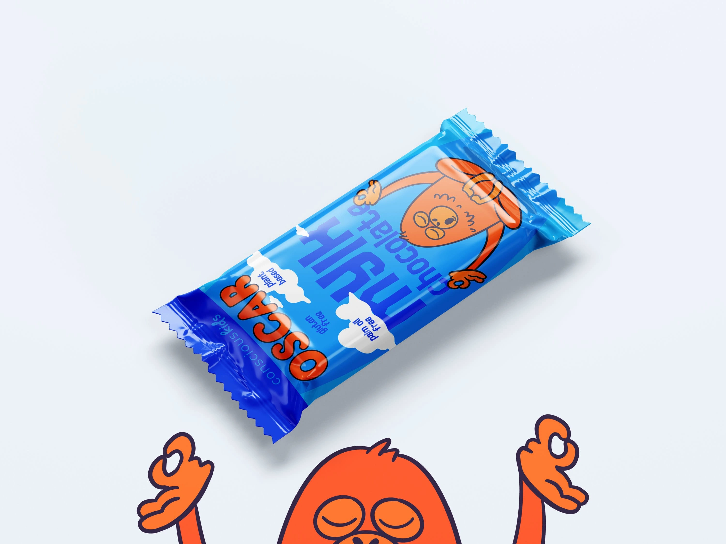
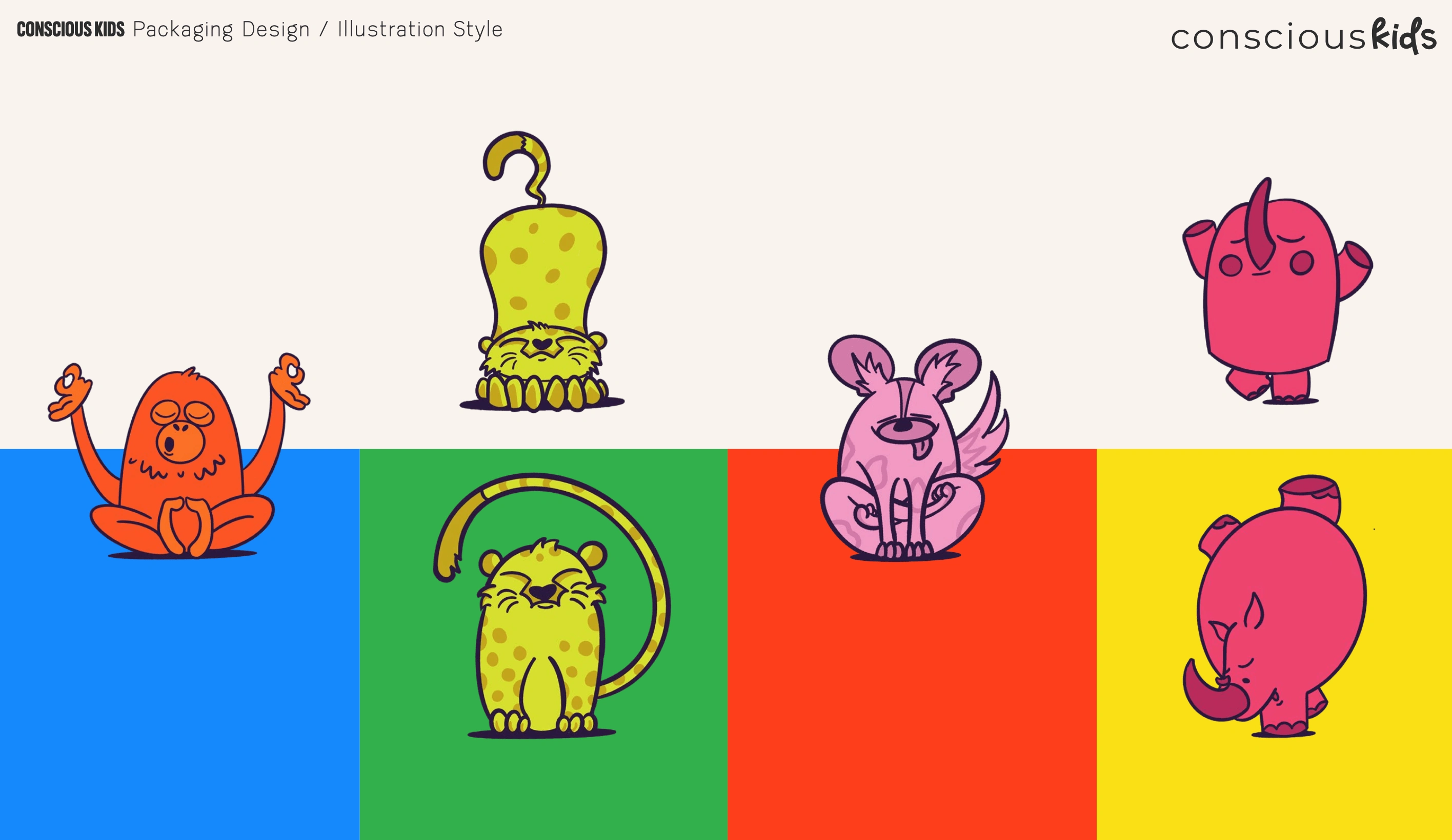
I’m always so grateful to find jobs that allow me to create with a purpose. That’s the dream right? An Ikigai dream. The client asked me to redesign some outdated packaging for vegan chocolate treats that supports the fair cacao trade but also lacks in palm oil. The request was for a new logo, character design of Oscar the orangutan and friends, and a redesign of the actual chocolate packaging. I thoroughly enjoyed the task and please let me know if you’ve seen or spotted Oscar on the shelves in South Africa! 🦧

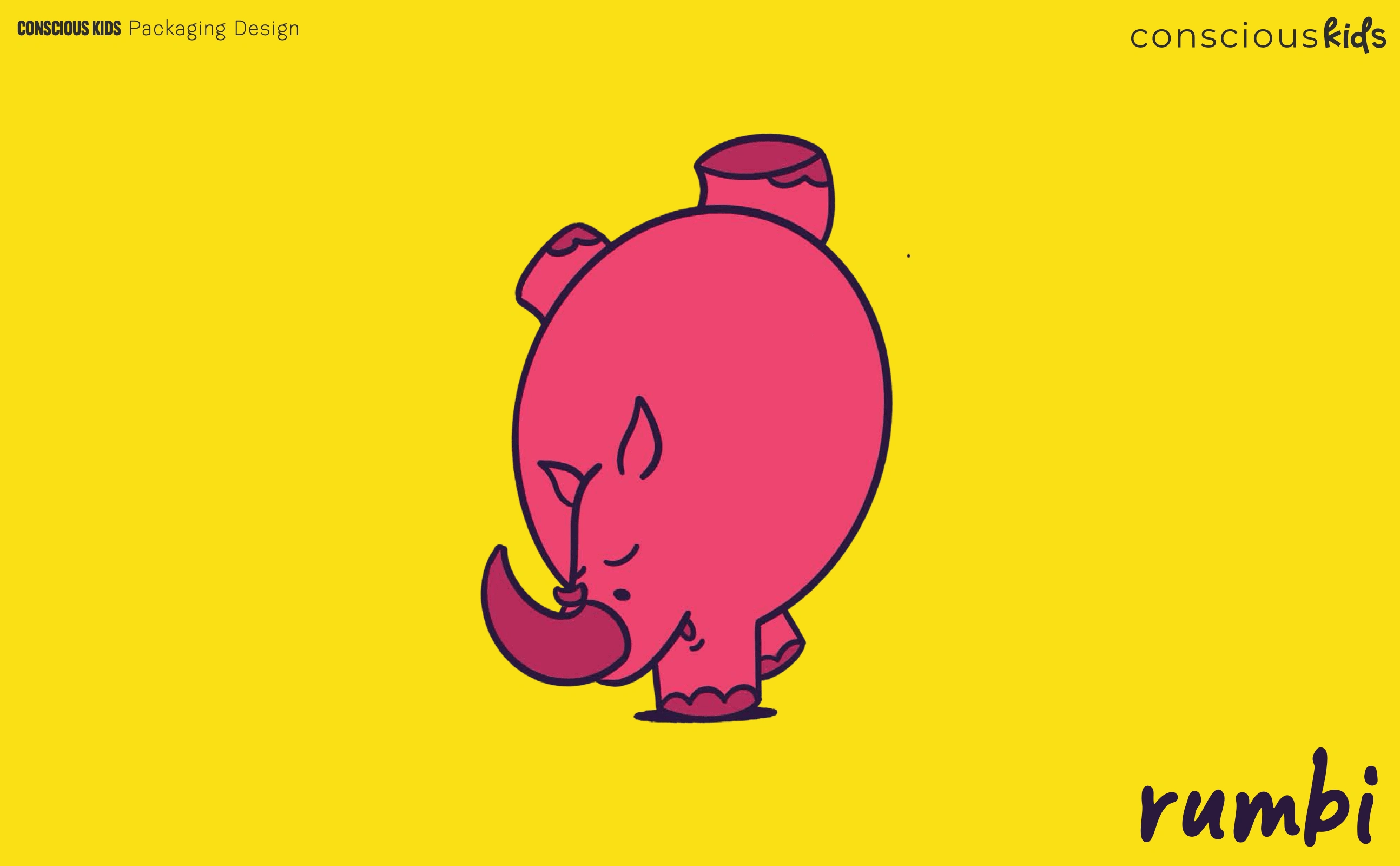
Let's not leave out the other characters like Rumbi the Rhino whos aim was to create awareness around the conservation of Rhinoceroses.
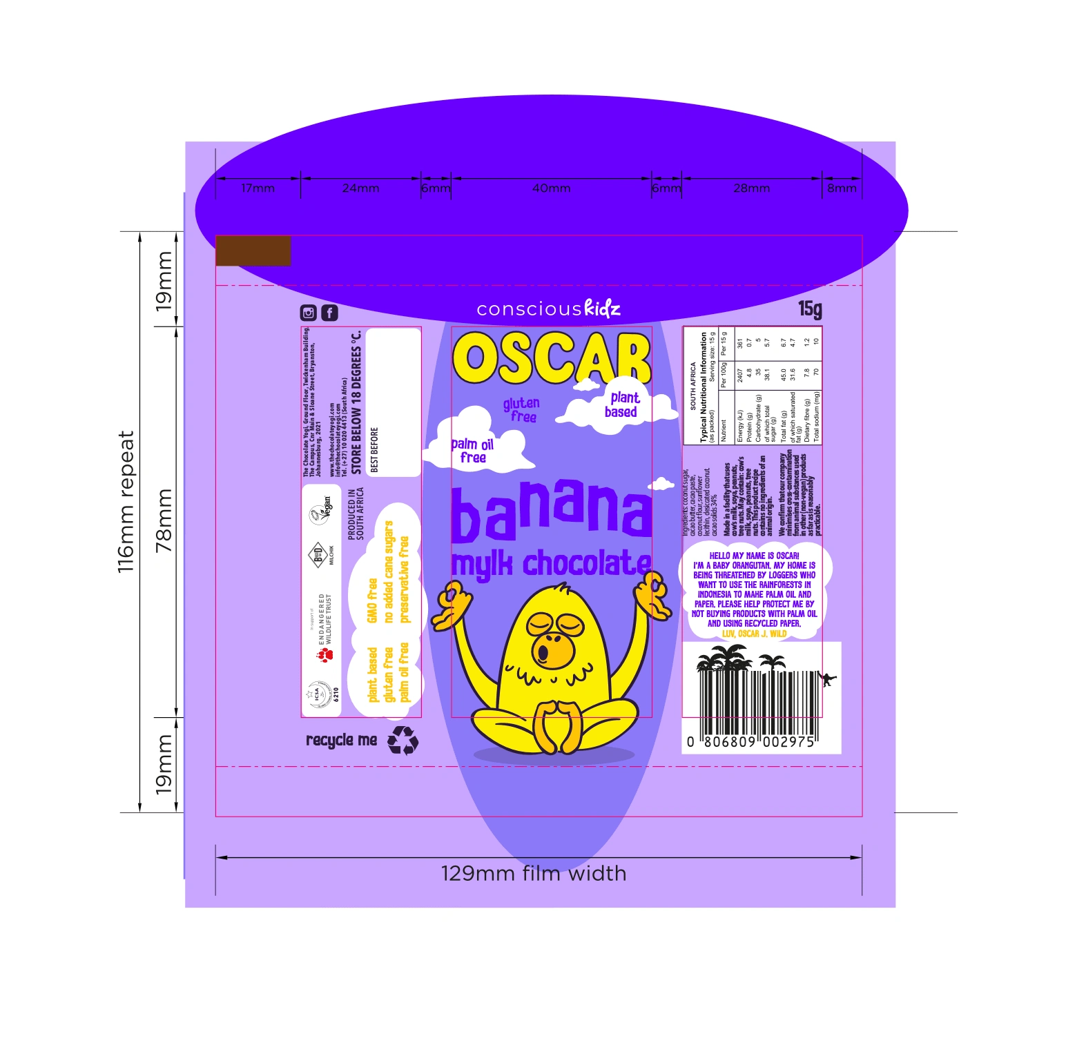
One of the trickiest but most rewarding stage of packaging design is the template flatlay. Precision and a checklist of notes need to be attended to but the test print is always an absolute reward.
Like this project
Posted Jan 20, 2025
A dream project of mine rooted in sustainability and cruelty-free education, smoothly mixed with chocolate! I got to rebrand these tasty little kids chocolates
Likes
0
Views
9
Clients
NEO Trading