A'ma - Brand Identity + Social Posts for an African Restaurant
ABOUT THE BRAND
Embark on a culinary journey with A'ma, an African restaurant that transcends borders to celebrate the rich tapestry of flavors from across the continent. A'ma, derived from "mother," pays homage to the heart of every home—the nurturing spirit of mothers who weave love into every dish. The brand envisions a space where diverse African cuisines harmonize, inviting patrons to rediscover the essence of home through a symphony of cultural delights.
BRAND VALUES
Culture: At A'ma, culture is more than a flavor; it's an experience. From the vibrant colors of the dishes to the diverse culinary traditions honored, they weave the threads of Africa's rich culture into every element, creating a tapestry of authenticity and celebration.
Comfort: Just like a warm embrace from a mother, A'ma seeks to provide comfort through familiar tastes and cozy ambiance. The dishes, inspired by home-cooked meals, evoke the comfort of shared family moments, creating a haven where patrons can relax and savor the essence of Africa.
Community: A'ma believes in the power of shared meals to build bridges and foster a sense of belonging. Rooted in the communal spirit of African dining, the brand values the creation of a vibrant and welcoming community where diverse individuals come together to celebrate the universal joy of good food and shared experiences.
MOOD BOARD
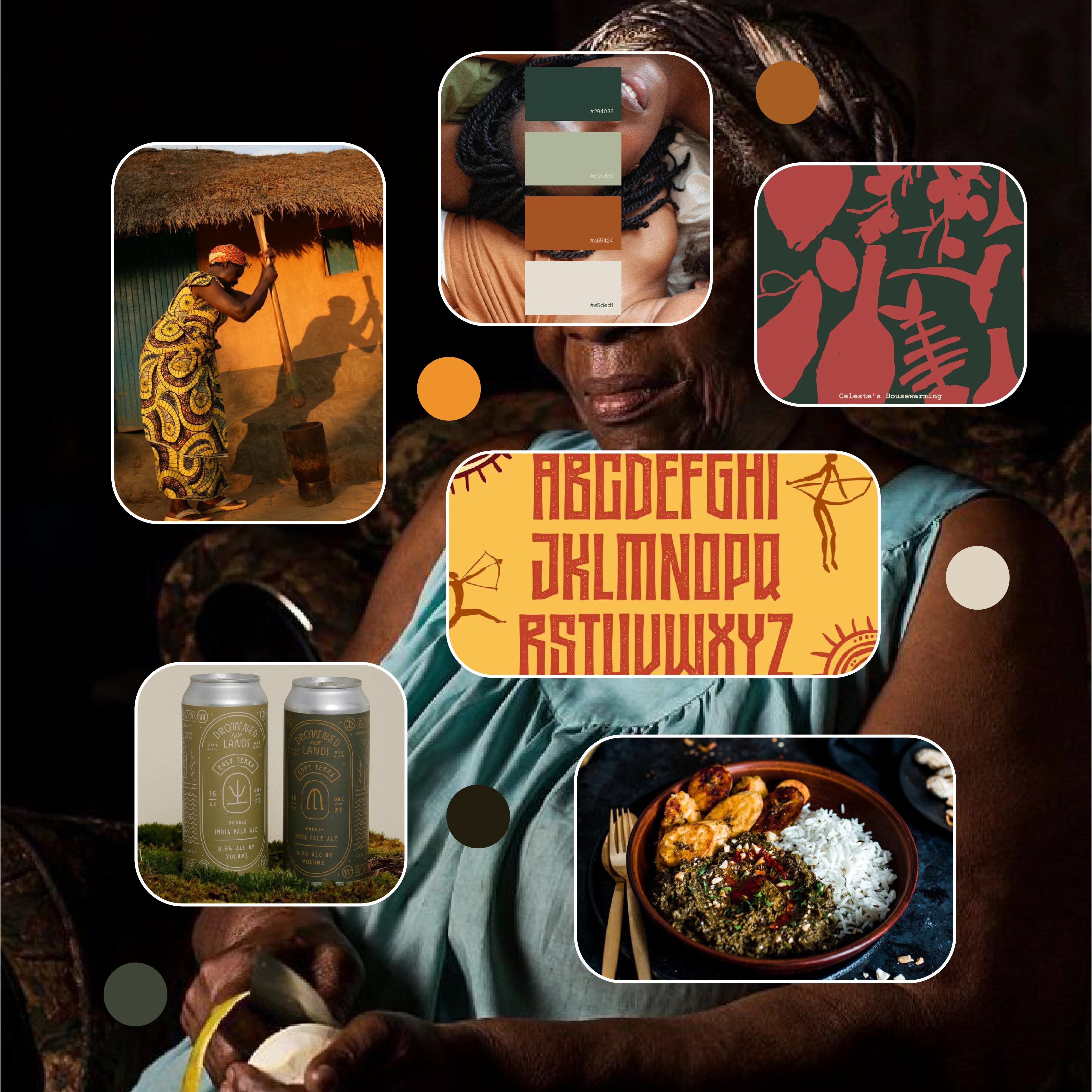
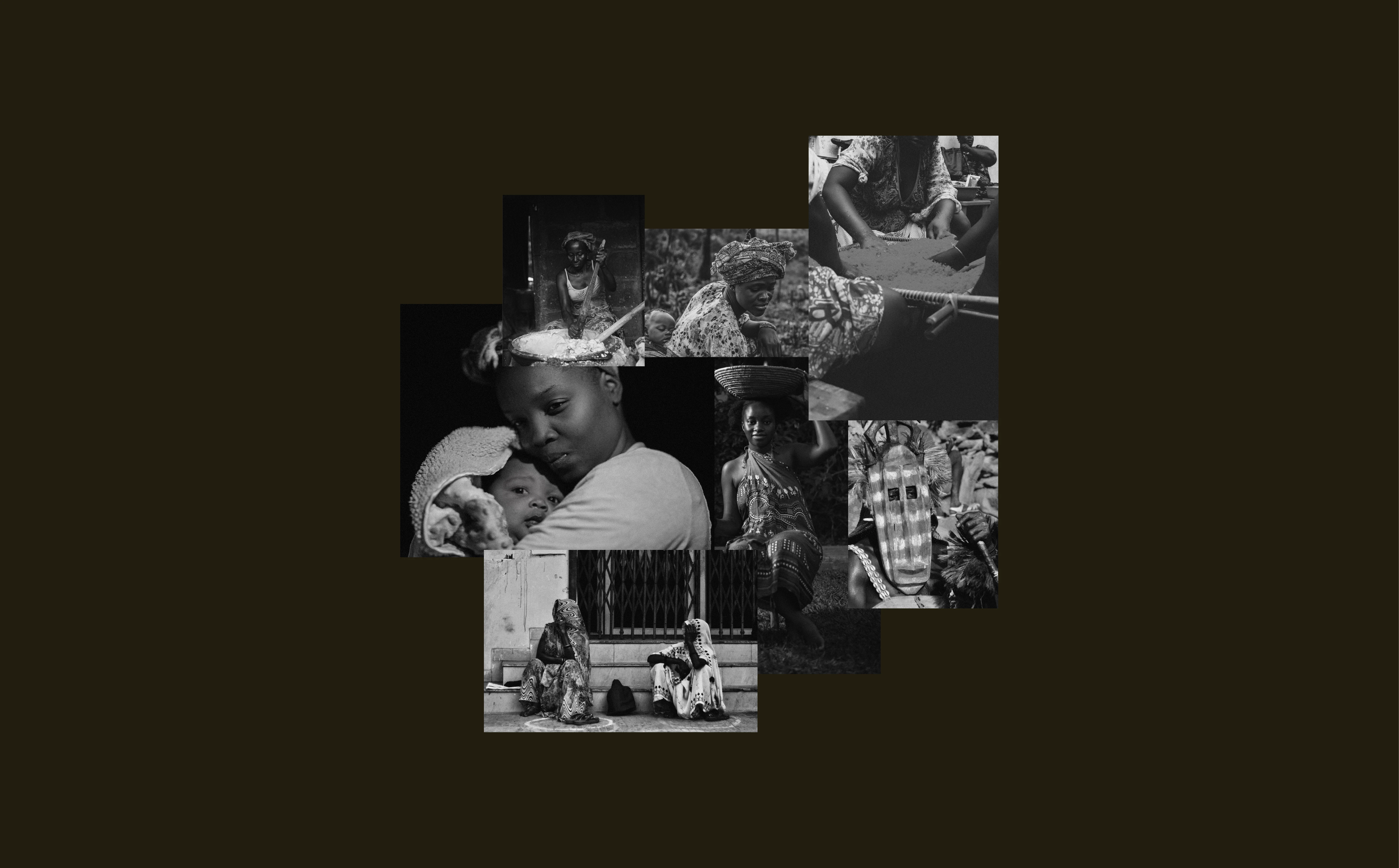
A'ma Mood Board & Creative Direction
BRAND CONCEPT
For the branding concept of A’ma, I wanted to create an atmosphere that warmly embraces African hospitality and culinary tradition. To achieve this, I chose a logotype font modeled after historical runes, which I felt mirrored Afrocentric symbols and shapes. To add a distinctive African touch, I replaced the original bar across the "A" with an illustration of an African mortar, symbolizing the central role of food and family in African culture. I also roughened the edges of the font to enhance its authentic and rustic look. For the heading font, I opted for a serif font, and for the body font, a sans serif font, to convey a blend of tradition and modernity. The color palette, consisting of warm earthy tones, was inspired by the African landscape, aiming to evoke a sense of warmth and familiarity. The imagery features women of African descent cooking in both traditional and contemporary settings, African landscapes, and women being motherly towards their children, all captured in warm tones and hues. Together, these elements create a brand identity that not only looks visually appealing but also reflects the rich cultural heritage of Africa.
Services
Brand identity
Typography and color palette
Hand drawn illustrations
Menu design
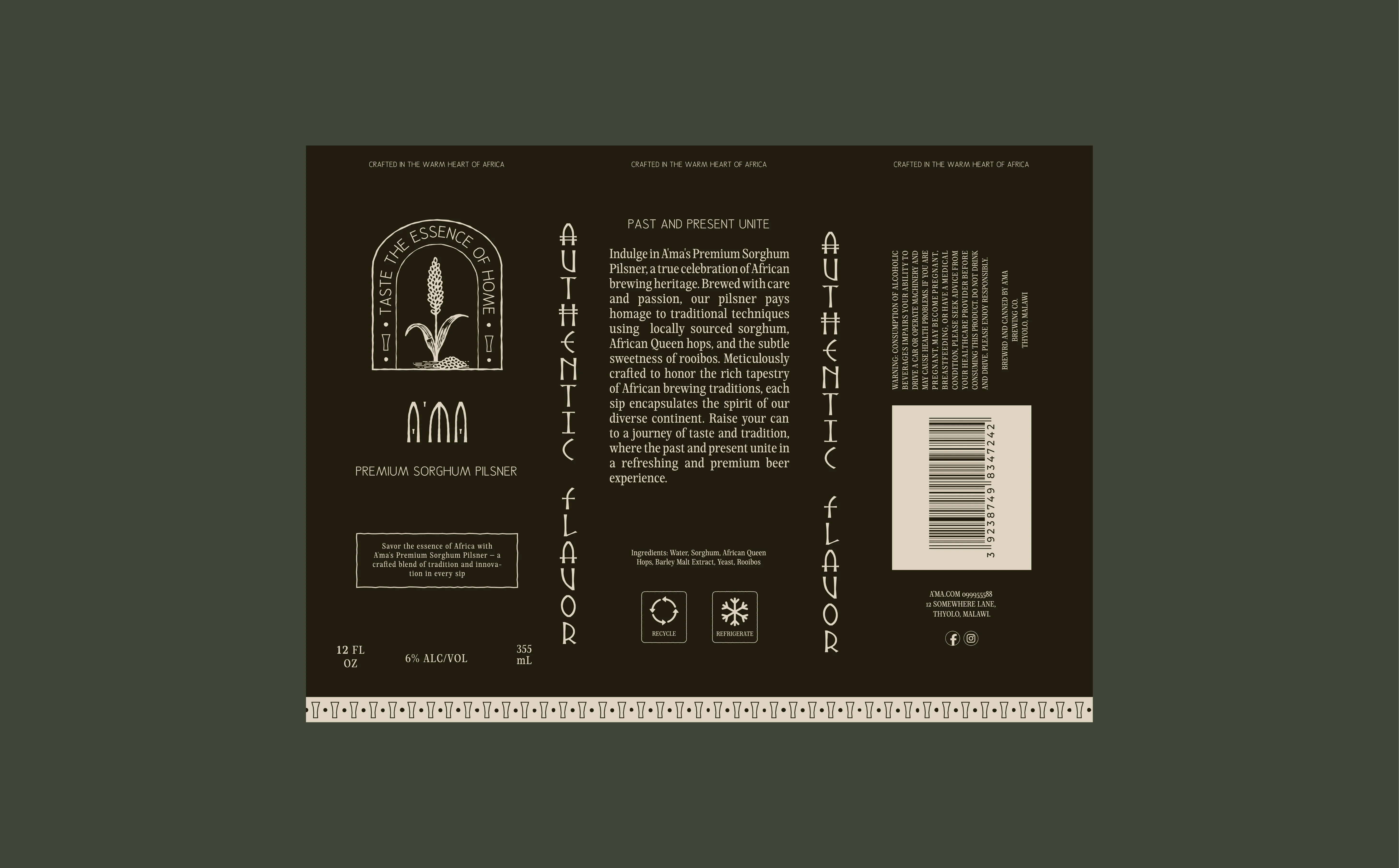
Packaging design
Instagram styling
LOGO SUITE
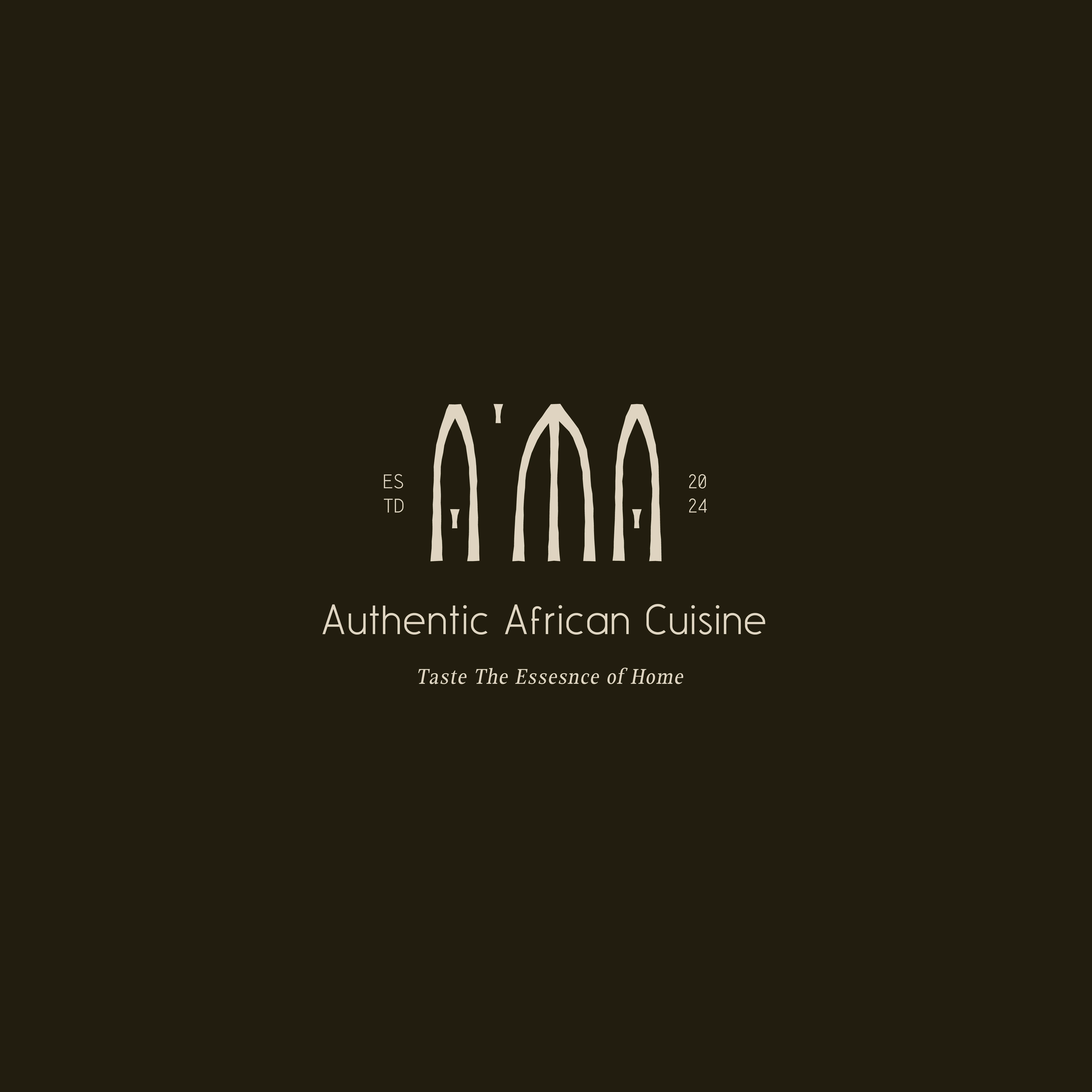
Master Logo
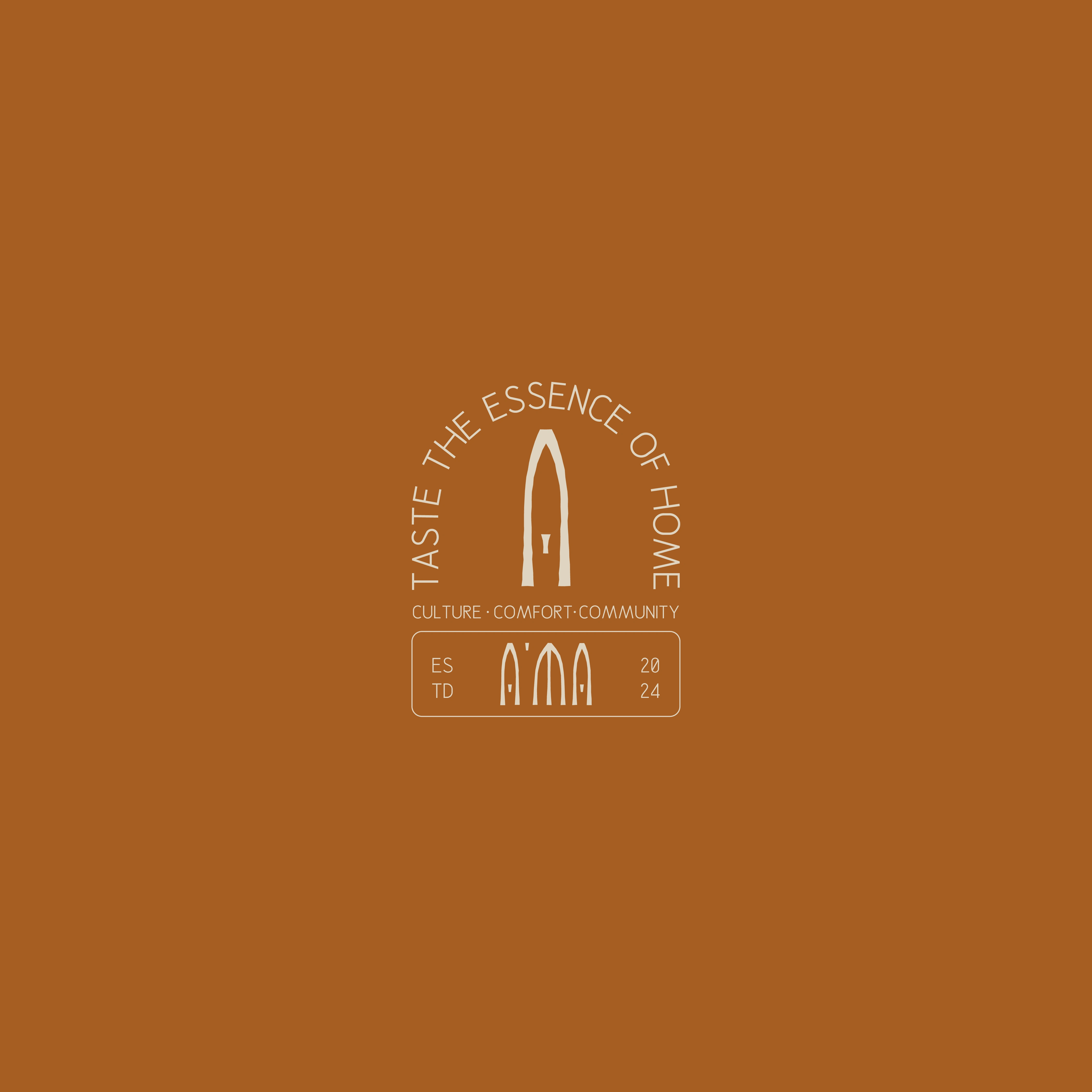
Alternative Logo

Primary Logo

Brand Mark
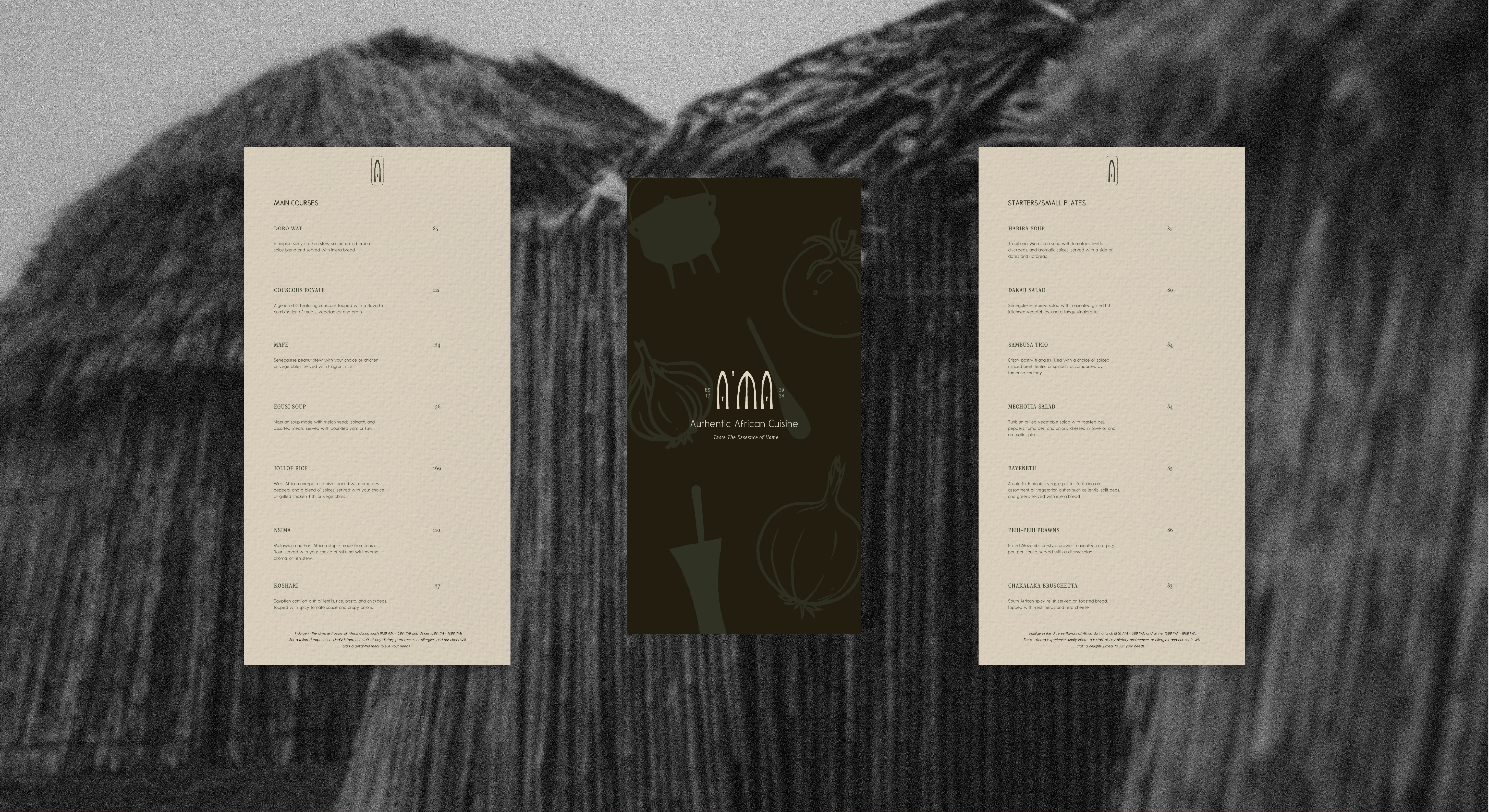
MENU
PACKAGING
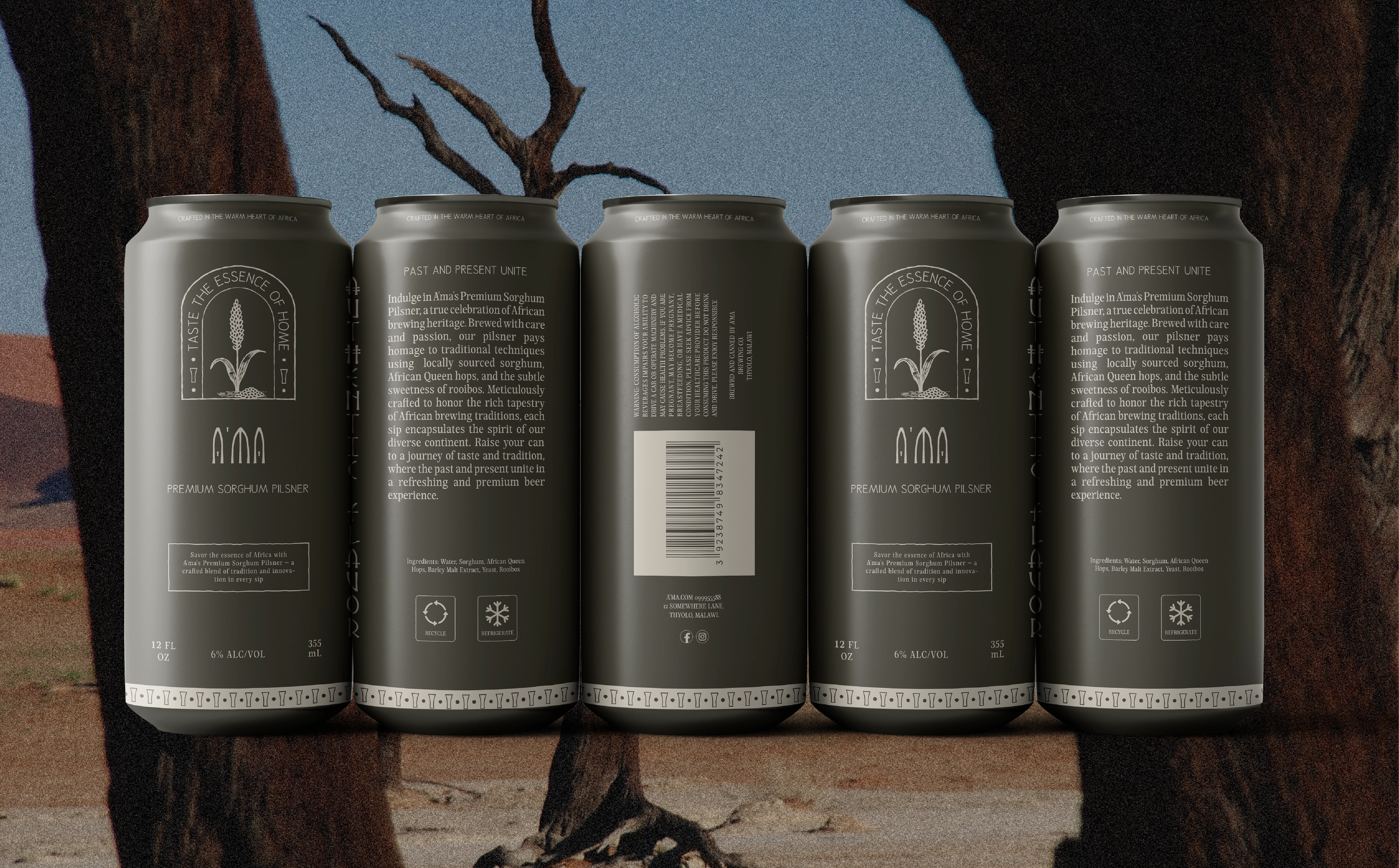
Beer Can Packaging
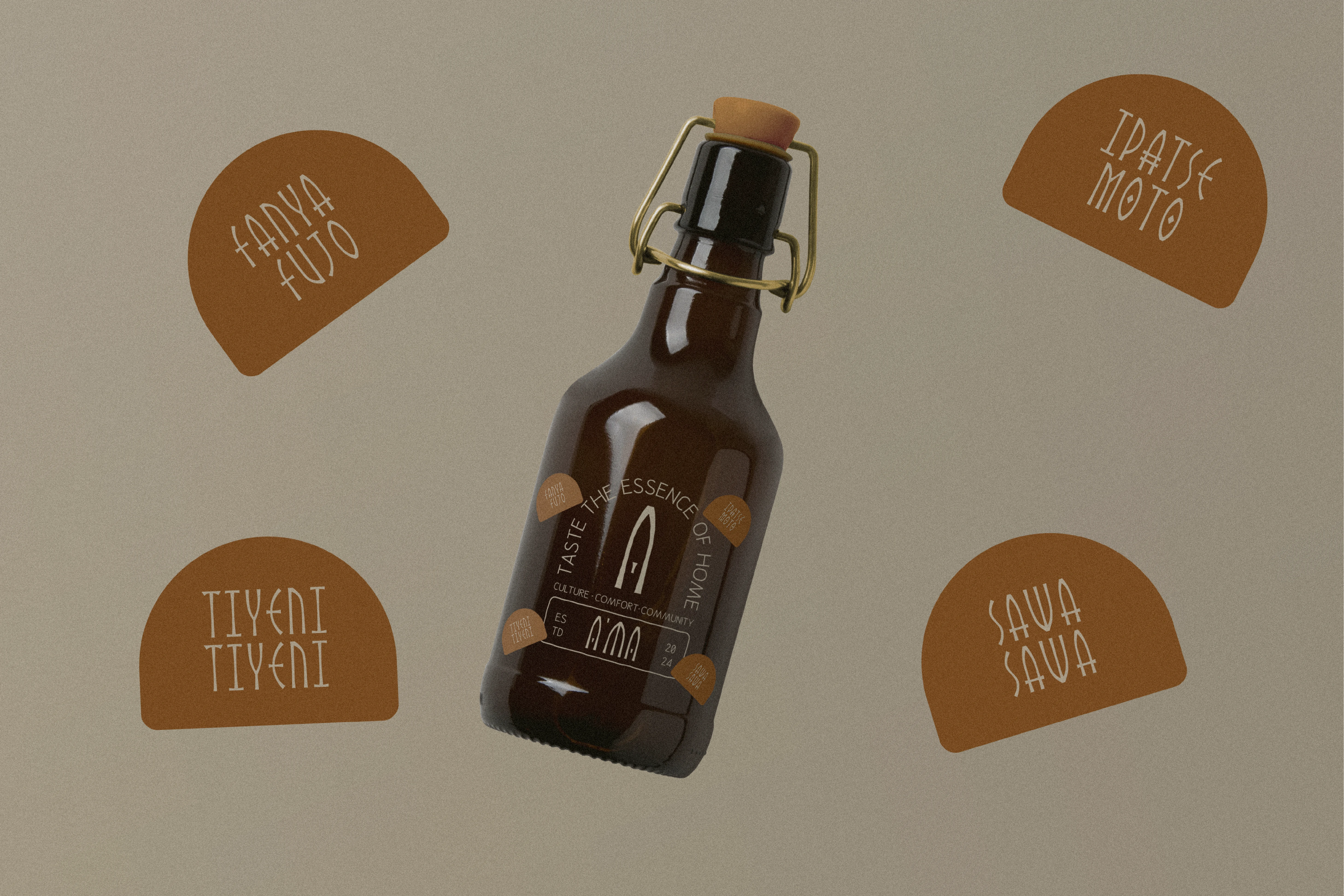
Beer Bottle Packaging
SOCIAL MEDIA/BRAND IMAGERY
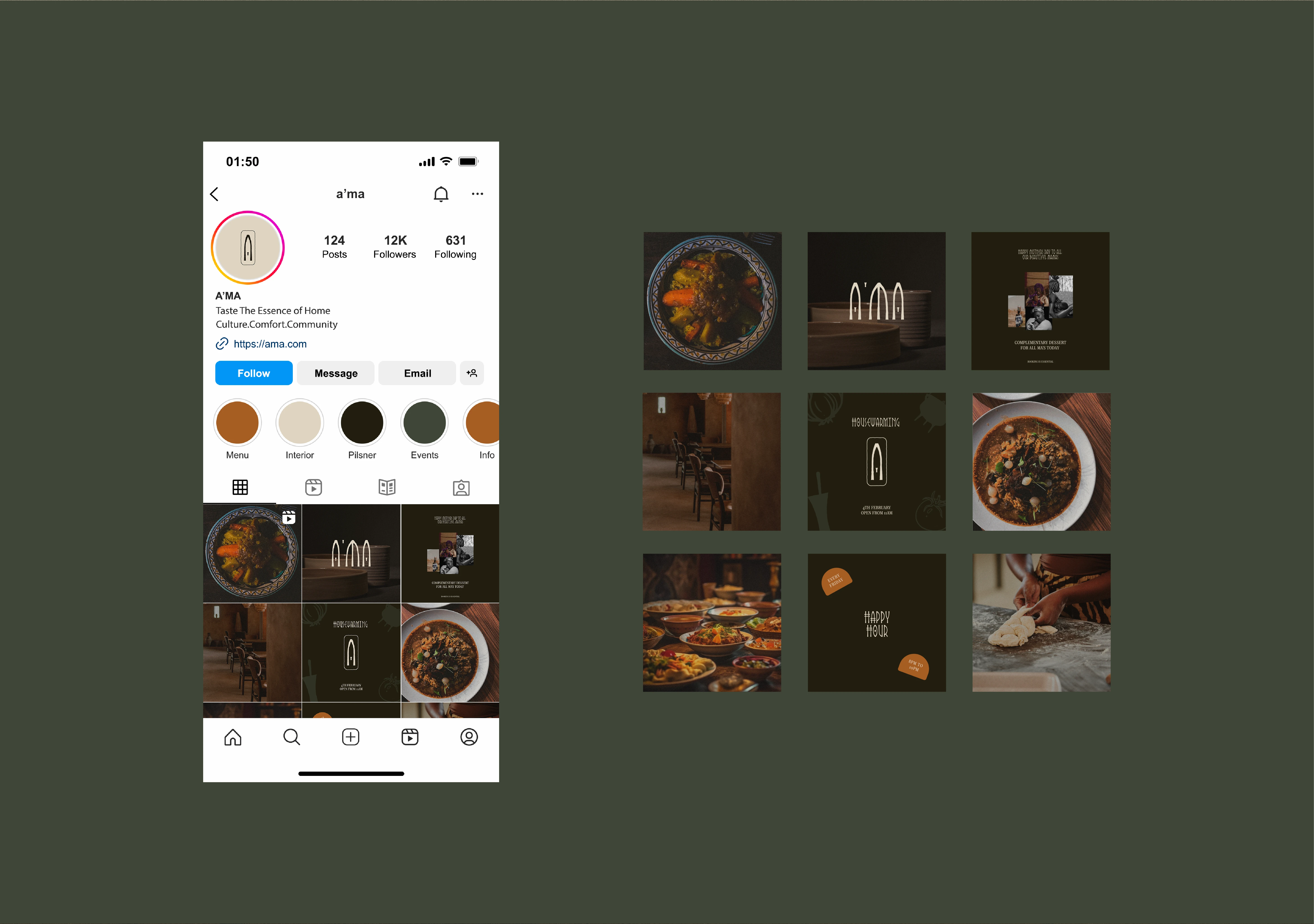
Instagram Styling

Like this project
Posted Mar 5, 2024
Delve into an African culinary experience. The brand identity for A'ma takes you on a journey of African culture, comfort, and community .

