Nimi Pretorius - Brand Strategist | ContraWork by Nimi Pretorius
Nimi Pretorius
pro

Nimi Pretorius

Building brands people feel something for

New to Contra

Nimi is ready for their next project!

Cover image for SOUTH AFRICAN AIRWAYS
A catalyst for
SOUTH AFRICAN AIRWAYS A catalyst for African growth: the SAA corporate identity guide Strategic planning, creative direction and copywriting for the corporate identity guide of a national airline and a national symbol. THE STORY There are brands that carry weight in the literal sense. And then there are brands that carry weight in every other sense. South African Airways is both. As the national carrier of South Africa and one of the continent's longest-running airlines, SAA represents something beyond its routes and its fleet. It represents a country, a continent, an idea of what Africa is becoming and what it deserves to be. When I took this brief I understood that the stakes were not just creative. They were cultural. The CI guide I developed for SAA had to hold all of that without buckling under it. It needed to give every person who touched the brand, from cabin crew to marketing managers to external agencies across the world, a clear and inspiring sense of what SAA stood for and how that should show up in everything they did. The platform we built was "A Catalyst for African Growth." Vibrant, cosmopolitan, contemporary. A carrier that didn't just fly people to destinations but believed in the destinations themselves. The guide covered brand assets, tone of voice, photographic style, colour, typography and the full brand narrative. Every word was written to inspire as much as to instruct. The simplest line in the whole document took the longest to write. It always does. WHAT IT TAUGHT ME That the most important reader of a brand guide is not the designer. It's the person who has never thought about brand before and needs to understand, in plain and beautiful language, why any of this matters at all.
0
69
Cover image for CALIBRE LIFE SCIENCE
Creating immunity for
CALIBRE LIFE SCIENCE Creating immunity for Africa, from Africa: brand strategy, creative direction and copywriting for a life science engineering firm Brand strategy, manifesto, creative direction, content strategy and ongoing copywriting for a pharmaceutical and biotech facility engineering company. THE STORY There are industries where the stakes are abstract. And then there are industries where the stakes are people's lives. Calibre Life Science designs, builds and validates the facilities where medicine is made. Sterile pharmaceutical environments, biosafety laboratories, large-scale production facilities across the continent. The work is technical, precise, and unforgiving in ways most people never see. The challenge wasn't understanding what they did. It was finding language that could carry the weight of it without collapsing under the gravity. The platform I built centres on a single idea: the line. Every facility begins with a line of intention. A line that has to hold through design, through build, through validation, all the way to the moment production comes online and the system either proves itself or it doesn't. Design. Build. Validate. Not three separate phases. One continuous commitment. The manifesto came first and set the temperature for everything that followed. The content strategy extended the voice across thirteen LinkedIn posts in the first calendar, each anchored to a pillar and written to sound like people who knew exactly what they were doing and felt no need to shout about it. Precise. Direct. Quietly certain. Writing for this industry taught me something I didn't expect. The engineers building these facilities will never meet the patients whose medicine is made inside them. But they think about them anyway. That's what the writing had to hold. WHAT IT TAUGHT ME That gravity is a gift. When the work genuinely matters, you don't have to manufacture meaning. You just have to get out of the way and let it speak.
0
88
Cover image for AMBER ROSE NOBLE
A name worth
AMBER ROSE NOBLE A name worth remembering: naming and creative direction for a feminist graphic novelist Naming and creative direction for the personal brand of a graphic novelist and feminist voice. THE STORY A writer's name is their first piece of writing. It sets a tone before a single word of the work has been read. When this graphic novelist came to me, she needed something that could carry the weight of her voice and the breadth of her work. Something that felt like a person and a position at the same time. Amber Rose Noble. The name arrived with its own quiet authority. Warm but grounded. Feminine without being soft. The kind of name that looks right on a book cover and sounds right when someone says it out loud for the first time. The creative direction followed from the name's personality. A diamond mark in blush and red, sitting at the intersection of femininity and precision. Typography that is elegant without being delicate. A colour palette that feels intimate and bold in equal measure. The identity needed to work across everything from a notebook to a silk scarf, and it does, because it was built around a single clear idea of who this person is and what she stands for. When your work is about giving women a voice, your brand needs to have one too. WHAT IT TAUGHT ME That naming a person is different from naming a product. A product can be anything you decide it is. A person already knows who they are. Your job is just to help them say it.
0
94
Cover image for When less is the whole
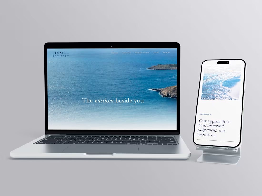
When less is the whole point: brand development for Sigma Advisory Brand direction, visual identity and creative positioning for a private wealth advisory firm. THE STORY Financial advisory is a category where everyone says the same things. Trust. Expertise. Partnership. The words have been borrowed so many times they've stopped meaning anything. Sigma Advisory is a firm that helps growth-minded businesses replace operational chaos with clear systems and capable leadership. The work is serious and the clients are serious. What they needed wasn't a louder way to say the usual things. They needed a brand that could hold the same quiet authority they hold in a room. Deep navy. Clean serif. A horizontal rule that separates the name into two parts without breaking it. Nothing decorative. Nothing that reaches. The identity doesn't announce itself. It assumes its own credibility, which is exactly how the firm operates. The voice followed the same logic. Clarity as confidence, not performance. WHAT IT TAUGHT ME Restraint is a decision that has to be made repeatedly. Every element you leave out is a choice. The discipline is in knowing what the brand can carry without being said.
0
80
Cover image for THE ONLY OIL

The only one
THE ONLY OIL The only one you need: brand creation, packaging design and copywriting for a luxury South African skincare oil Brand creation, product naming, creative direction, packaging design and copywriting across a range of organic handcrafted facial oils. THE STORY Luxury skincare is one of the most crowded shelves in the world. Every brand promises transformation. Every brand reaches for the same words. Pure. Radiant. Restore. After a while it all blurs into the same thing. The Only was built to cut through that quietly. A South African skincare brand rooted in organic, handcrafted facial oils made from rare local ingredients. Clinically tested. Carefully formulated. The kind of product that doesn't need to shout because it already knows what it can do. I created the brand from scratch, starting with the name. The Only. Two words that don't hedge, don't qualify, don't ask permission. Everything else followed from that conviction. The product names, Age-Less, Rooted, Ultimate, Calm, Nourish, Soothe, Revitalise, each share a feeling rather than a feature. The kind of names that make sense the moment you read them and stay with you. The visual identity is deep matte black and gold. Minimal by design, because the product deserved space to breathe. The copy took the same approach: warm and purposeful, never overwrought. Skincare writing has a habit of tipping into the breathless. This couldn't afford to. When the ingredients are this good and the formulation is this considered, the writing just needs to show up with the same integrity and get out of the way. WHAT IT TAUGHT ME That restraint is its own kind of confidence. The Only doesn't try to convince anyone. It simply presents itself and trusts that the right person will understand immediately. Learning to write like that, to say less and mean more, is a practice that never really ends.
0
71
Cover image for A world of herbs and
A world of herbs and spices: packaging design, naming and copywriting for a travel-inspired spice brand Brand creation, product naming, copywriting and creative direction across a range of internationally inspired spice blends. THE STORY Some of the best ideas start with a feeling rather than a brief. Three friends had spent years travelling together, eating their way through markets and street corners and other people's kitchens. They wanted to bring something back. Not souvenirs. The real thing. The flavours that made them stop mid-bite and ask what on earth was in this. Taste Adventures was built around that feeling. A spice brand organised not by ingredient but by journey. My job was to create the whole world: the name, the products, the visual language, the words on every surface. The product names came first, because everything else had to follow from them. Mississippi Magic. Pride of India. Mama Africa. Each one needed to evoke a place without reducing it, to feel like a destination rather than a description. Get those wrong and the whole range falls flat. The design gave each SKU its own cultural visual language: Mardi Gras tilework, Indian mandala patterning, West African textile motifs. Distinct enough to stand alone. Connected enough to belong to the same story. The hot air balloon in the brand mark tied it all together quietly, a symbol of curiosity and movement that didn't need to shout. The copy on each pack had one job: make someone feel something before they even open it. Like they're already halfway there. WHAT IT TAUGHT ME That a range is only as strong as its internal logic. The moment one product feels like it slipped in from somewhere else, the whole idea loses its nerve. Here, consistency wasn't a creative constraint. It was the whole point.
0
68
Cover image for Rich, robust and guilt-free: packaging
Rich, robust and guilt-free: packaging design and copywriting for a South African artisinal coffee brand Brand creation, creative direction, packaging design and copywriting for a Nespresso-compatible ecopod coffee brand. THE STORY There are coffee brands that compete on convenience. There are coffee brands that compete on credentials. Vumba was built to do both, without apology. The name comes from the early morning mist that settles over the Bvumba Mountains. That specific quality of stillness. The moment before the day begins. It's a perfect name for a coffee brand, and it arrived with its own mood already intact. A South African-born artisinal coffee brand, hand-roasted in Kommetjie, Cape Town, and delivered in fully compostable ecopods compatible with Nespresso machines. The brief was to create something that felt premium without feeling cold. Dark and rich without feeling heavy. Proudly local without feeling small. The visual identity followed from the name: deep black, warm gold, bold geometry drawing from African pattern tradition. The kind of packaging that earns its place on a kitchen counter and doesn't apologise for being there. The copy across the pack had to work on multiple registers at once. The front needed to communicate quality and confidence in a single glance. The back needed warmth and personality, including a mascot moment for the ecopod itself that explained composability in a way that felt charming rather than preachy. Getting a brand to be both serious and playful on the same piece of cardboard is harder than it sounds. Vumba is the kind of brand that reminds you why origin matters. Not as a marketing claim. As something you can actually taste. WHAT IT TAUGHT ME That the best brand names don't describe the product. They evoke a feeling that the product then has to live up to. Vumba set a high bar. That was the whole point.
0
72
Cover image for Proudly African, naturally caffeine-free: packaging
Proudly African, naturally caffeine-free: packaging design and copywriting for an organic South African tea brand Creative direction, packaging design and copywriting across a range of rooibos ecopod teas. THE STORY Rooibos is one of those things South Africans grow up taking for granted. It's just there, in the cupboard, at the end of a long day. The rest of the world is still discovering it. Mutea was made for that moment of discovery. An organic South African tea brand bringing rooibos to a broader market in a format that felt as considered as the product itself: plant-based ecopods, compostable, clean. No compromise on what goes in or what gets left behind. My job was to build the world around it. The visual language draws from African textile and craft traditions, bold colour blocking, geometric pattern, warmth you can feel before you've even read a word. Each SKU has its own colour and personality. Rooibos and Chai. Rooibos and Vanilla. Rooibos and Honeybush. But together they feel like they've always belonged on the same shelf. The copy took its cues from the design: direct, warm, quietly confident. A voice that knows what it is and doesn't feel the need to convince anyone too hard. Because when the product is this good, and this honest, the writing just needs to get out of the way and let it breathe. WHAT IT TAUGHT ME That the best packaging feels inevitable. Like there was never any other way it could have looked. Getting there takes longer than people think. But when it lands, you just know.
0
76
Cover image for CREATIVE DIRECTION & BRAND STORYTELLING

A
CREATIVE DIRECTION & BRAND STORYTELLING A selection of brand films, visual storytelling projects, and campaign work developed through my creative studio, The Nimble, where I lead strategy, narrative development, creative direction, scripting, and production oversight across a range of clients and industries. My role typically spans concept development, narrative strategy, scripting, creative direction, client leadership, and guiding multidisciplinary creative teams from idea through to final delivery.
1
162
Cover image for NETFLIX
Writing for Netflix: on what
NETFLIX Writing for Netflix: on what happens when advertising discipline meets global storytelling One liner Scriptwriting and creative collaboration with a global creative team for a Netflix production. THE STORY Some projects you can't say much about. This is one of them. What I can tell you is that I was invited to collaborate with Netflix's global creative team on a scriptwriting project, working alongside writers and producers from across the world. It was one of those experiences that quietly shifts something in the way you think. About pace. About precision. About the specific weight of a word in a script versus a word in an ad. About what it means to write for an audience of millions who have chosen, in a world of infinite distraction, to give you their full attention. I brought to that room everything I had learned from 20 years of writing for brands: clarity of intent, economy of language, and an instinct for the emotional truth inside a brief. The discipline of advertising, where every word costs money and every second counts, turns out to be surprisingly good training for everything else. I took home something I hadn't expected: a renewed belief in simplicity. That the hardest thing in any medium is to say exactly what you mean and nothing more. And that when you get it right it feels not like an achievement but like an inevitability. Which is of course exactly how the best work always feels. WHAT IT TAUGHT ME That good writing is good writing, whatever the medium. And that the perspective you bring to a room matters as much as the skill you bring to the page.
0
146
Cover image for JOY FROM AFRICA TO THE
JOY FROM AFRICA TO THE WORLD Writing a campaign that made Christmas feel like it actually belonged to Africa Creative direction, manifesto, storytelling playbook, social, print, outdoor, film and UX copy for the V&A Waterfront's flagship festive campaign. THE STORY Joy from Africa to the World was already a beautiful idea when it came to me. My job was to build the world around it and make sure nothing got lost between the concept and the page. At its heart was something genuinely radical: the belief that Africa doesn't need to borrow Christmas from anywhere else. That there is a way to celebrate this season that is rooted in craft, in community, in the particular magic that happens when African creativity is given room to breathe and be seen and celebrated on its own terms. Not as an exotic variation on someone else's tradition. As something original and alive and worth giving to the world. My role was to take that idea and give it language. I developed the full storytelling playbook that guided everyone working on the campaign, from illustrators to social media managers to event producers, giving them a shared creative language and a clear sense of what the campaign was really saying beneath the visuals. I wrote the manifesto "Between the Mountain and the Sea," a piece of prose that tried to capture Cape Town's soul at its most open and celebratory. I wrote across print, outdoor, social, digital and film, and developed the UX copy for the art installation wayfinding experience that brought visitors into the story physically, not just visually. What made it work was not any single piece of writing. It was the coherence. Every word, in every place, coming from the same warm and generous place. Getting there meant murdering a great deal I was personally attached to. It always does. WHAT IT TAUGHT ME That the best thing a writer can do with someone else's great idea is get out of the way of it, and quietly make sure it sounds as good as it looks.
0
147
Cover image for HOLLARD INSURANCE
The Book of Brand
HOLLARD INSURANCE The Book of Brand Bravery: rewriting what an insurance brand sounds like CI guide concept, creative direction, and copywriting for one of South Africa's most distinctive and fearless financial services brands. THE STORY Insurance brands are not, historically, known for their bravery. They tend to sound cautious, careful, slightly nervous about saying anything too interesting in case someone holds them to it. Which makes a kind of sense. Except that Hollard, one of South Africa's largest and most innovative insurance groups, had always been different, and they knew it. They just needed someone to help them say so out loud. The brief was to create a CI guide. What I made instead was a book. I called it The Book of Brand Bravery, and from the opening line, it made clear that this was not going to be another corporate identity document that lived in a shared drive and was never opened again. The guide defined Hollard's personality as lionhearted, challenging, and inventive. Warm without being soft. Bold without being arrogant. Genuinely funny in places where most financial brands would never dare to go. Every section was written to be read, not just referenced. Because a brand guide only works if people actually want to open it. I murdered a lot of darlings getting this one right. Every line that was slightly too clever, slightly too safe, slightly too much like something another brand might say got cut. What was left was something that only Hollard could have said. That's always the goal. WHAT IT TAUGHT ME That the most powerful thing you can do for a brand is give the people inside it something to believe in. The CI guide is where that belief either lives or dies.
0
149
Cover image for V&A WATERFRONT
Giving an icon its
V&A WATERFRONT Giving an icon its voice: the V&A Waterfront rebrand Full rebrand including brand platform, CI guide, manifesto, campaigns, digital, UX, outdoor and editorial for one of Africa's most visited destinations. The work I'm proudest of in 20 years. THE STORY The V&A Waterfront is Cape Town's iconic harbour precinct. A working harbour, a world-class art museum, a celebrated food market, luxury hotels, and one of the most visited destinations on the African continent, all occupying the same few remarkable hectares on the edge of the Atlantic Ocean, with Table Mountain watching over everything. It's a place with extraordinary energy. But a great location and a great brand are two very different things. The Waterfront needed to find its voice. Something that went beyond tourism brochure warmth or retail centre cheerfulness. Something rooted in Cape Town, in Africa, in the genuine complexity of a neighbourhood that contains multitudes. A place that holds the city's history and its future at the same time, and needed language that could hold both too. That became my job. Over several years of ongoing creative partnership, I led the concept, creative direction and copywriting across the entire rebrand and everything that grew from it. I developed the brand platform "African Alchemy," wrote the foundation CI guide "The Book of Brand Magic," concepted and wrote multiple campaigns across every channel, directed the tone of voice across every sub-brand within the precinct, and wrote everything from manifesto copy to UX microcopy to outdoor headlines to video scripts. I also rebranded two sub-destinations within the precinct: the Watershed, a design hub celebrating African makers and craftspeople, where I wrote "Meet Cape Town's Design Story," and Solve, an innovation hub focused on sustainable futures, where I developed the brand, the manifesto and the full website. Each needed to feel like itself while still belonging to the larger world of the Waterfront. Getting that balance right is harder than it sounds. The hardest part was also the most important: making everything feel like it came from the same place. Same warmth. Same curiosity. Same pride in this particular city at this particular moment in its history. This is the work I'm most proud of. Not because of the scale, though the scale was significant. Because it asked me to find the soul of a place and put it into words. And I think we got it right. WHAT IT TAUGHT ME That the best brand writing doesn't describe a place or a product. It describes a feeling that was already there, waiting for someone to finally name it.
0
131