

UI/UX Designer | Framer Developer
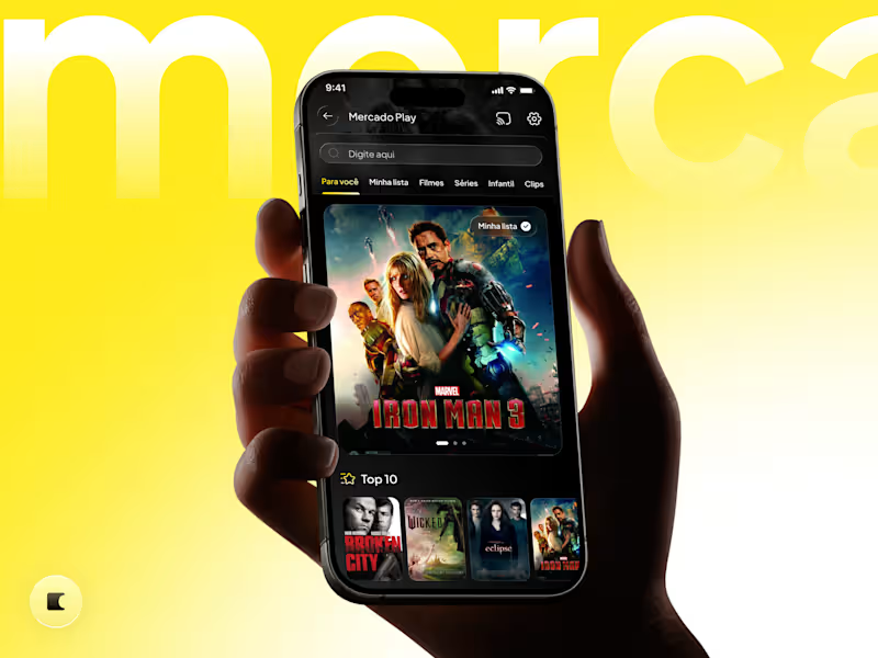
Mercado Play, reimagined in dark mode. 🎬🌙
This concept started with a feature I missed in the app: a dark theme built around the streaming experience.
I chose darker surfaces to give movie artwork more presence, reduce visual distractions, and create a more cinematic atmosphere. The signature yellow remains an accent, highlighting key actions and keeping the brand recognizable.
Beyond the palette, I refined components with a purpose:
✦ Larger featured artwork for stronger visual impact.
✦ Clearer navigation and selected states to guide browsing.
✦ Watchlist filters and visible playback progress to support returning viewers.
✦ A prominent “Watch for free” button to communicate the offer immediately.
The goal: make the experience feel more polished and immersive, strengthening its perceived value while keeping the content at the center.
An independent redesign concept exploring visual direction and interaction ideas.
Would you use Mercado Play in dark mode? 👇
2
2
137


Design that breaks brands out of the cocoon.
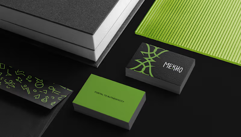
Language can be a portal, where each word opens a passage to new worlds. Yet in the language school market, many brands still communicate in similar ways.
With MEKHO, the goal was to move away from traditional academic imagery without losing credibility or structure. The challenge was to translate depth and authenticity into a consistent visual system for digital environments.
The logotype features angular strokes to convey precision. The symbol combines stylized bat wings, representing guidance, with a form that suggests a coded sign, reinforcing language as a system to be deciphered. The palette builds authority through dark tones, while green acts as a calculated contrast, signaling sophistication and direction.
The result is an identity that positions MEKHO as an immersive brand focused on real communication.
5
10
141

Alquimia do Sabor is a vegan confectionery brand that transforms plant-based ingredients into sensory experiences filled with care, consciousness, and meaning. More than sweets, the brand creates everyday potions, creations that awaken memory, affection, and presence.
2
132

This is the essence of the brand: a hybrid space that connects literature and botany as two forms of care. Here, books are not merely objects, they are seeds of possible worlds. And flowers are not just ornaments, they are gestures of affection, small breaths that soften the day.
2
27
259

NÓRIA is an artisanal fashion studio that brings together gesture, technique, and silence. Each piece emerges as a study of form: soft curves, natural textures, and a drape that follows the body’s own flow. The process is slow and intentional — stitching that respects time, fabric, and touch.
The visual identity begins with the central symbol: four continuous loops inspired by the running stitch. It represents the movement of the thread, the repetition of the gesture, and the delicate precision of patternmaking. The neutral, mineral palette reflects the studio’s aesthetic: calm, tactile, organic. Fine, gentle typefaces support the brand’s editorial character. Graphic elements derived from the loop create visual rhythm, as if the motion of sewing extended across the entire system.
2
18
233

Designer and Webflow & Framer expert
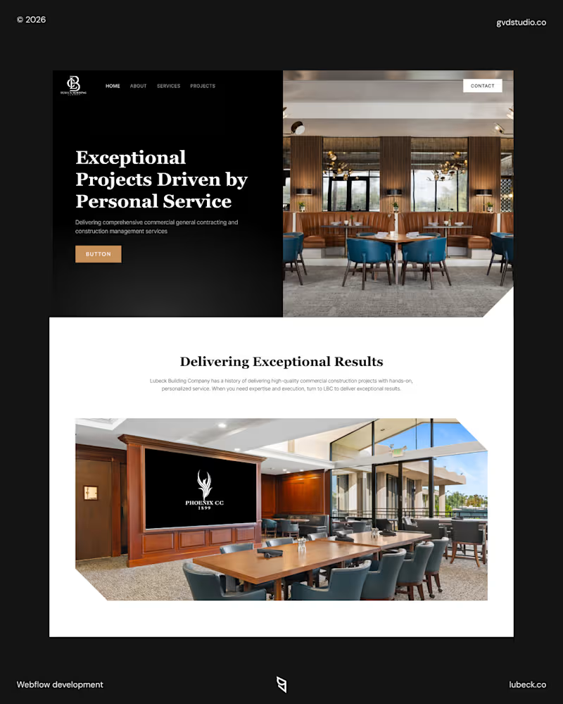
Webflow build for Lubeck, a commercial construction firm in Phoenix, AZ. Clean layout, strong project photography and a straightforward path from services to contact.
Available for agency partnerships and white-label Webflow projects.
1
151

They came back for a second project, that's the only review that matters.
Premium wasn't enough for ListLift. The full Webflow redesign leans on image-led layouts and B2B clarity to make the brand feel as high-end as its offer.
→ https://listlift.com/
2
4
173


Art director and graphic designer. +10y XP.
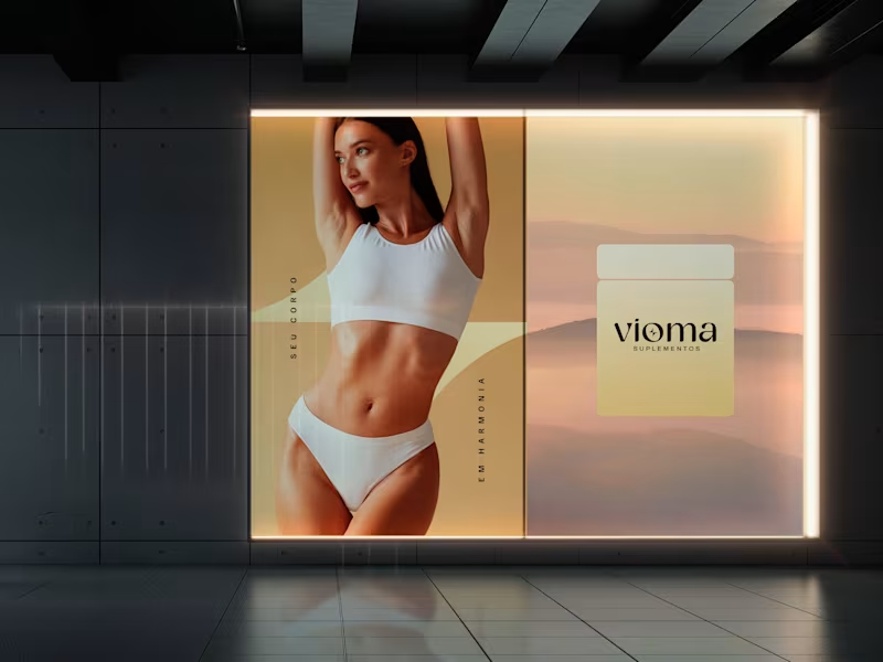
Vioma is a supplement brand built around the idea that wellness should feel as refined as it is effective.
I developed the complete brand identity, creating a visual system that moves away from the conventional fitness aesthetic in favor of a clean, premium, and lifestyle-driven approach. From the logo and packaging to social media and brand applications, every element was designed to communicate balance, vitality, and modern wellbeing.
Scope: Brand Identity · Art Direction · Packaging Design · Visual System · Social Media · Brand Applications
2
181
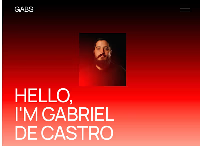
I’m currently rebuilding my portfolio, step by step. It’s been both interesting and challenging to curate and develop case studies from over 11 years of work.
I’d love to hear your thoughts so far
https://www.gabrieldecastro.work/
1
142

Submission for #levelupwithbubble
App Name: STUDYO
Category: Education & Learning
Live Link: https://gabrielcastrodias.bubbleapps.io/version-test
The STUDYO prototype starts with a simple idea:
what if learning worked more like thinking?
Instead of linear formats, STUDYO organizes knowledge through connections. From a single topic, AI generates a structured mind map, revealing key concepts and their relationships.
Each node opens layered content — from summaries to deeper explanations, supported by images, videos, and curated references.
STUDYO also introduces a collaborative layer.
Existing maps can be reused, expanded, and reorganized, allowing knowledge to grow over time through contributions.
Flexibility is central.
Users can reshape structures, move ideas, and define their own way of learning.
1
8
535
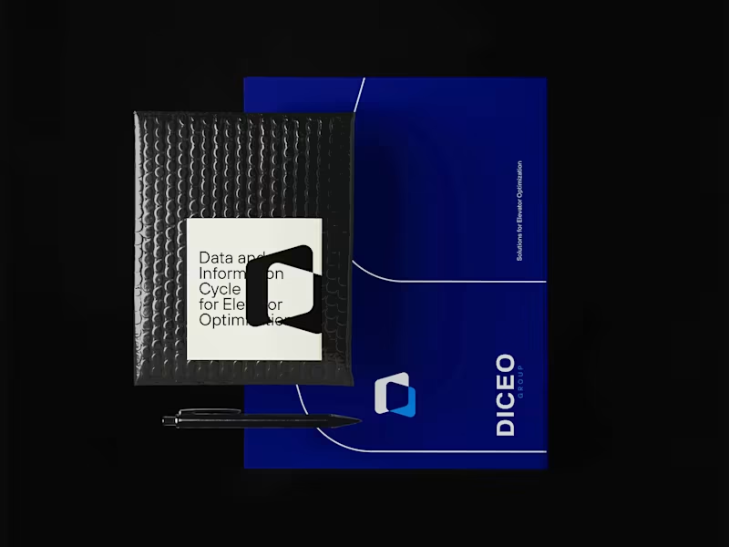
I developed the branding for DICEO — a German company built around the concept of transforming data into meaningful, actionable information.
DICEO stands for Data and Information Cycle for Elevator Optimization, and the entire brand was designed to reflect this core idea: collecting, organizing, and cross-referencing data from elevators to generate smarter, more efficient solutions.
The visual identity is rooted in this logic. The logo is constructed from two integrated data blocks, creating an intersection that forms the letter “D” — a direct representation of data connection and information flow. This geometric approach reinforces the idea of structure, precision, and intelligence behind the system.
1
169

Product Design: Fast, Strategic, Business Aligned
Product Design: Fast, Strategic, Business Aligned


View more →


Building AI Agents & SaaS with Next.js

Official Website: TENET AI (High-Conversion Landing Page)
The public-facing portal and onboarding flow for the TENET AI ecosystem.
Built with Replit:
Rapid Prototyping: Used Replit's instant preview environment to iterate on the UI/UX design in real-time without local server setup.
Frontend Performance: Optimized assets and code splitting directly within the Replit editor to ensure high Lighthouse scores.
Zero-Config Dev: Leveraged Replit's pre-configured templates to jumpstart the development of the responsive layout.
Stack: HTML5, Tailwind CSS, JavaScript (Developed in Replit).
0
200

SaaS Platform: TENET AI (Built on Replit)
A multi-tenant AI agent platform developed entirely within the Replit ecosystem.
Replit-First Workflow:
Cloud IDE: Used Replit as the exclusive environment to build complex Python/FastAPI microservices without local setup.
AI Assisted: Leveraged Replit Ghostwriter to accelerate boilerplate generation for the multi-agent orchestration logic.
Debugging: Utilized the Replit Shell for real-time testing of WhatsApp API webhooks before pushing to production.
Stack: Python, FastAPI, PostgreSQL. (Production deployed via Railway, Development via Replit).
0
175

PagueFlow: Personal Finance PWA (Built with Replit AI)
A full-stack financial management application featuring expense tracking, dashboards, and authentication.
Replit Development Workflow:
AI-Driven Development: Heavily utilized Replit Ghostwriter to generate logic for the dashboard calculations and UI components (visible in Git history as "Assistant checkpoints").
Version Control: Managed the entire Git workflow directly via the Replit Git pane to track features and rollbacks.
Integrations: Configured the connection with Supabase (Auth & Database) directly within the Replit environment variables and shell.
Stack: TypeScript, Tailwind CSS, Supabase (Developed entirely in Replit).
1
170

LeadInsights: Data Mining Tool (Developed in Replit)
A Python-based lead qualification tool. The entire development lifecycle, from initial scripting to final debugging, was executed within the Replit cloud IDE.
Replit Development Workflow:
Zero-Setup Environment: Leveraged Replit's pre-configured Python environment to immediately start coding complex data processing scripts using pandas and BeautifulSoup without local dependency hell.
Interactive Debugging: Utilized the Replit Shell heavily to run ad-hoc data scraping tests and inspect data frames in real-time before integrating them into the main application logic.
Package Management: Managed Python dependencies directly through the Replit console, ensuring a reproducible development environment.
Stack: Python, Pandas, Web Scraping Libraries (Developed directly in Replit).
1
199

Video Editor


Global Web Designer & Developer | 700+ Projects
Global Web Designer & Developer | 700+ Projects


View more →