Freelancers using Adobe InDesign in RawalpindiFreelancers using Adobe InDesign in Rawalpindi
Editorial & Print Designer | InDesign | Catalogs, Magazines
7
Followers
Editorial & Print Designer | InDesign | Catalogs, Magazines
Senior UI/UX & Brand Designer | Motion Graphics | Packaging
New to Contra
Senior UI/UX & Brand Designer | Motion Graphics | Packaging

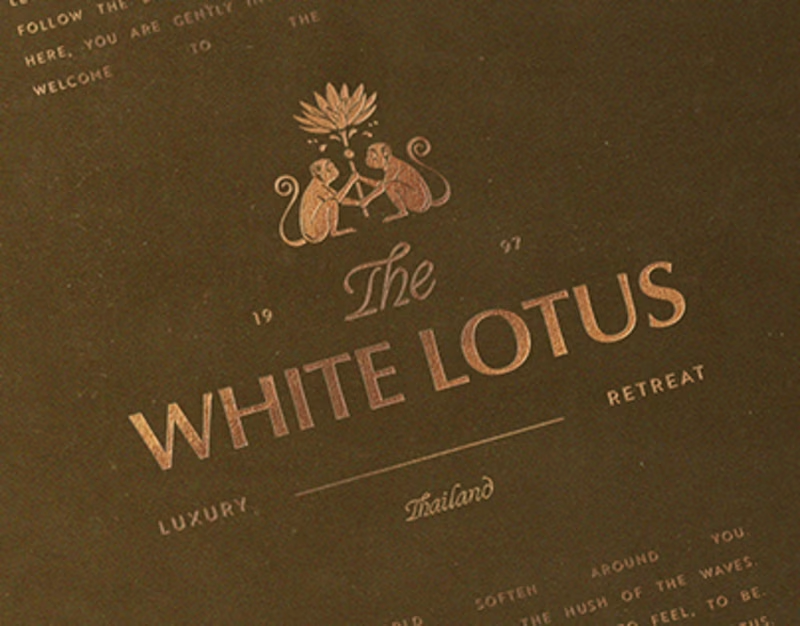
Cover image for Luxury Logo Design & Brand
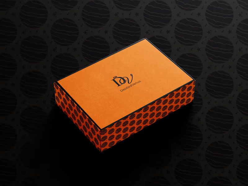
Luxury Logo Design & Brand Identity Collection I designed a collection of premium luxury logos and brand identity concepts for high-end businesses seeking a distinctive and memorable visual presence. The objective was to create timeless logo systems that communicate elegance, trust, exclusivity, and professionalism while building strong brand recognition across digital and print platforms. Each logo was developed through a strategic design process that combines meaningful symbolism, refined typography, balanced proportions, and sophisticated color palettes. Inspired by luxury fashion, hospitality, lifestyle, and corporate brands, every identity was crafted to reflect the unique personality of the business while ensuring versatility, scalability, and long-term brand value. The branding concepts are designed to perform seamlessly across websites, social media, packaging, stationery, signage, business cards, and premium marketing materials. Every logo maintains clarity and consistency in both digital and print applications, creating a cohesive visual identity that strengthens customer trust and enhances brand positioning. This project showcases my expertise in luxury logo design, brand identity design, visual identity systems, typography, minimalist branding, and strategic logo development that helps businesses establish a premium and recognizable market presence. Key Highlights • Luxury logo design with timeless and memorable concepts • Premium brand identity systems for modern businesses • Minimalist and sophisticated logo development • Strategic logo concepts with meaningful symbolism • Luxury typography and balanced visual composition • Scalable vector artwork for print and digital use • Professional color palettes and brand consistency • Logo applications for packaging, websites, social media, and stationery • High-end branding for fashion, hospitality, lifestyle, and corporate businesses • Print-ready and developer-friendly logo assets • Complete visual identity designed for long-term brand growth • Adobe Creative Suite workflow with precision vector design
0
70
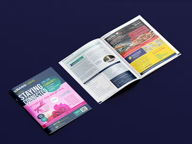
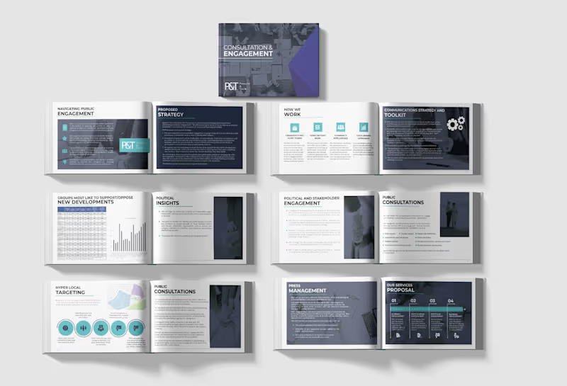
Cover image for Editorial Design, Corporate Brochure &
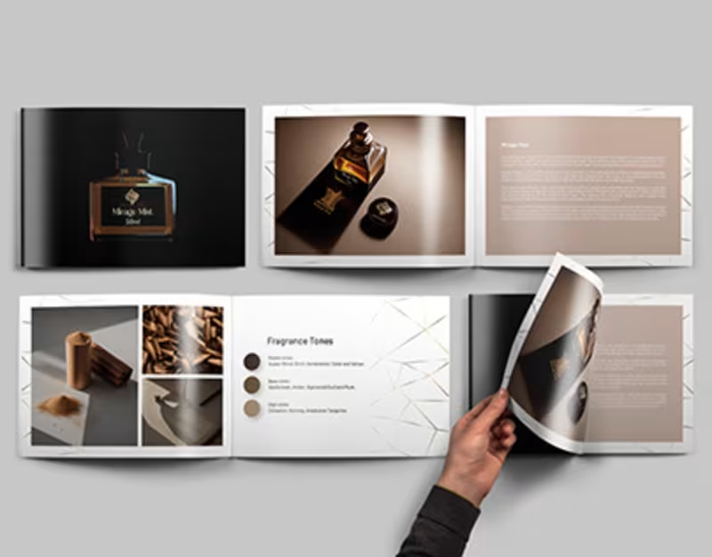
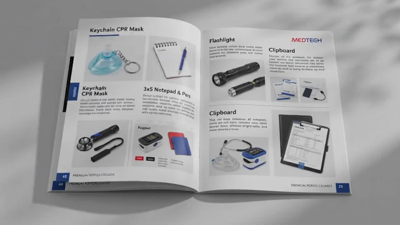
Editorial Design, Corporate Brochure & Print Publication I designed a collection of premium editorial layouts and corporate marketing publications that transform complex information into visually engaging, professionally structured print experiences. The objective was to create modern, brand-focused publications that communicate key messages with clarity while strengthening visual identity across every page. Each publication was carefully crafted using editorial grid systems, refined typography, balanced white space, and strategic visual hierarchy to improve readability and elevate the overall user experience. From corporate brochures and company profiles to product catalogs, annual reports, and marketing booklets, every layout was designed to present content in a clean, compelling, and memorable way. The project combines creative storytelling with functional design, ensuring every publication reflects the client's brand while maintaining consistency across print and digital formats. Every page was optimized for professional printing, making the designs production-ready while delivering a premium look and feel. This project demonstrates my expertise in editorial design, brochure design, publication design, corporate branding, print design, layout design, typography, and creating high-impact marketing collateral that helps businesses communicate effectively and build stronger brand recognition. Key Highlights • Premium editorial and publication design • Corporate brochure and company profile design • Annual reports, product catalogs, and marketing booklets • Professional editorial layouts with structured grid systems • Modern typography and clear visual hierarchy • Print-ready artwork with production specifications • Brand-consistent layouts across multi-page publications • Creative storytelling through editorial design • High-end marketing collateral for businesses • Adobe Creative Suite workflow with scalable design systems • Clean, modern layouts optimized for readability • Premium presentation materials that strengthen brand identity
0
78
Cover image for Luxury Aesthetic Clinic Branding &
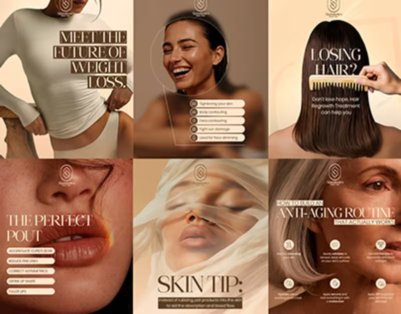
Luxury Aesthetic Clinic Branding & Digital Experience I developed a complete brand identity and digital experience for a premium aesthetic clinic, combining luxury branding, modern UI/UX design, and strategic marketing visuals to create a sophisticated and trustworthy brand presence. The objective was to design a seamless customer experience that reflects professionalism, enhances credibility, and attracts clients seeking high-end skincare and cosmetic treatments. The project includes a responsive website, social media campaign, visual identity, and large-format advertising designed with a refined aesthetic that emphasizes beauty, confidence, and wellness. Soft neutral tones, elegant typography, premium imagery, and carefully balanced layouts work together to create a timeless brand experience while maintaining clarity, accessibility, and user engagement across every touchpoint. Every design element was crafted to strengthen the clinic's visual identity, improve the customer journey, and communicate premium services through consistent branding. From the website interface and treatment pages to promotional content and outdoor advertising, the entire system delivers a cohesive experience that supports brand recognition and business growth. This project demonstrates my expertise in healthcare branding, beauty website design, UI/UX design, responsive web design, social media design, advertising design, visual identity systems, and creating conversion-focused digital experiences that combine aesthetics with functionality. Key Highlights • Luxury aesthetic clinic branding and visual identity • Premium UI/UX design for a beauty and skincare website • Responsive desktop, tablet, and mobile website layouts • High-converting landing page and treatment experience • Social media campaign design for beauty and wellness marketing • Elegant typography and premium visual hierarchy • Consistent brand identity across digital and print media • Billboard and outdoor advertising design • High-fidelity interface designed in Figma • Developer-ready design system and reusable UI components • Modern, conversion-focused user experience • Professional marketing assets for brand growth
0
79
Vigorous & Vivid designs that resonate!

Graphic Design |Android Developer | Brand & UI/UX Specialist
6
Followers
Graphic Design |Android Developer | Brand & UI/UX Specialist
Web Developer | UI/UX| 3D Product Animation |

8
Followers
Web Developer | UI/UX| 3D Product Animation |
Cover image for 📐 BRAND STRATEGY — CASE
📐 BRAND STRATEGY — CASE STUDY ⚙️ Koia Objects: Making the Photography Match the Positioning Goal: Closing the gap between what Koia Objects makes and how it is seen — using photography as the proving ground for the brand's design logic. 📸✨ 1. 🎯 The Brief Koia Objects is a Swedish stainless steel tableware and serving brand, two years in, with a design sensibility that sits deliberately between two traditions: 🏛️ Bauhaus Rationalism (Mies van der Rohe): Form follows function & industrial precision. 🌿 Nordic Warmth (Alvar Aalto): Human-centric design that keeps precision warm rather than cold. 💰 The Positioning: Accessible Premium — not luxury, not budget, but a fair price for genuine material quality and craftsmanship. ⚡ The Challenge: This positioning has to be felt, not stated. It must be built into every decision the brand makes, starting with how the product is photographed. 2. 🔍 The Diagnosis Most young premium tableware brands drift into one of two failure modes: 🚫 The Catalog Trap (Current State): Flat white backgrounds, even front-on lighting, centered objects. It looks like a cheap e-commerce listing and flattens the way light moves across brushed steel. 🚫 The Overcorrection (To Avoid): Dark moody backdrops, heavy gold rim-lighting, and fake luxury marble. It looks like an imitation of luxury watch ads and ignores both Bauhaus and Nordic roots. 💡 The Fix: Build a third direction grounded in Koia’s true design lineage rather than borrowed conventions. 3. ⚖️ The Design Logic Translating "Bauhaus Rationalism + Nordic Warmth" into 5 concrete photographic principles: 🏷️ Principle🖼️, What It Means in a Photograph🛠️ Function, Visible Show the object doing its job (pouring, serving, being held). Function is the whole premise.✨ Material Honesty Real ,directional light on real steel. Let reflections show weight and precision without over-retouching.🪵 Restraint in Styling Few, purposeful props (raw wood, linen, stone). Nothing on set unless it earns its place.☀️ Warm Directional Light .Soft daylight or a single warm key light instead of flat, cold studio flashes.🏡 Grounded Negative Space, Generous breathing room on a real surface (table, hand, counter) — never a void. 4. 🎬 The Direction, Made Concrete 📋 Shot List 🖼️ Hero Shot: The object alone on a real surface (oiled wood, honed stone) with soft single-direction daylight. 💧 In-Use Shot: The object mid-function (pouring water, serving food, lifted by a hand). 🔍 Material Macro: A tight crop on an edge, weld line, or brushed surface to prove craftsmanship. 🍽️ Grounded Flat Lay: The product with 2–3 purposeful props (linen, raw ceramic, cut citrus) and generous breathing room. 5. 🔄 Before / After — Case Study 🏺 Object: Stainless Steel Serving Pitcher ❌ BEFORE (Catalog Default): Shot dead-on against a white seamless background with flat lighting. The steel looks flat, generic, and cheap. ✅ AFTER (Koia Direction): Shot at a slight angle on an oiled walnut counter, lit by soft side daylight. Highlights catch the spout, shadows add depth, and water is captured mid-pour into a glass. 🌟 Why It Works: Highlights prove the metalwork quality, the pour proves function, and the warm wood adds Nordic cozy vibes without clutter! 6. 📈 Why This Matters Commercially 🏷️ Shifts Value Perception: Replaces price comparison with craftsmanship appreciation ("This is clearly better made"). 📦 Scalable Framework: The 5 principles extend directly to packaging, website UI, and social content as the brand scales. Prepared as an example project — Koia Objects Brand Strategy Engagement. 🚀
1
99
Cover image for I designed a 25-page NGO
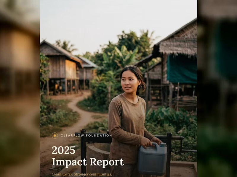
I designed a 25-page NGO Annual Impact Report for a non-profit called Clear Flow Foundation, and then created a short video reel to showcase the document's design, layout, statistics, and photography in an engaging, animated format. STEY BY STEP 😊😍 1. Cover Page (1 Page) Visual Style: Full-bleed, high-impact photo showing a community member carrying clean water in a rural village setting. Soft overlay for high-contrast typography. Header / Logo: ClearFlow Foundation logo placed subtly at the top center/left. Title: 2025 Impact Report Subtitle: Clean water. Stronger communities. 2. Inside Cover / Brand Pattern (1 Page) Visual Style: Elegant, custom line-art vector pattern representing water ripples, topographic lines, or fluid movement. Content: Minimalist brand motif that serves as a visual palette cleanser before diving into the report content. 3. Table of Contents (1 Page) Visual Style: Clean, grid-aligned typography with generous whitespace. Content Breakdown: 01 — Executive Summary & Leadership Letter 02 — Who We Are & Mission Overview 03 — Our Impact (2025 Key Statistics) 04 — Program 1: Sustainable Water Infrastructure 05 — Program 2: Community Health & Training 06 — Community Voices & Field Stories 07 — Financial Transparency & Performance 08 — Acknowledgments & Strategic Goals 4. Letter from Director/CEO (1–2 Pages) Headline: "Behind each statistic is a family no longer walking three hours for water." Content Focus: Opening: Acknowledging milestones achieved in 2025 across 38 villages. Core Message: Emphasizing that long-term sustainability and local empowerment—rather than quick fixes—are the foundation of ClearFlow's work. Sign-off: Warm closing remarks from Sophak Chan (Executive Director). Sidebar / Image: Professional portrait of the director alongside a highlighted quote pull-out. 5. Who We Are / Mission Overview (2 Pages) Headline: Our Mission Core Narrative: > "ClearFlow Foundation exists to ensure every community has reliable access to clean, safe water—and the knowledge to maintain it long after we’ve gone." Founding Context: Established in 2014, working alongside rural communities across Southeast Asia to combine infrastructure with local education. Key Metric Highlights: 11 yrs operating in Southeast Asian communities. 3 provinces with active programs. 6. Section Divider — Our Impact (1 Page) Visual Style: Full-page photographic cover showing clean water flowing from a newly installed filtration system, layered with section header styling. Text: SECTION 03 — Our Impact 7. Impact Overview + Key Stats Spread (2 Pages) Headline: 2025 At a Glance Key Performance Indicators (KPI Grid): 12,400 — People gained access to clean water. 45 — New water points constructed. 38 — Villages reached across two provinces. 96 — Community health workers trained. Sub-Section — Built to Last: 89% of water points fully operational after 5 years. 6,200 hours of hygiene education delivered. 0.4 km average distance to water (down from 3.2 km). 31% reduction in reported waterborne illnesses. 8. Program 1 Deep Dive: Water Infrastructure (2–3 Pages) Headline: Where the Wells Went: Sustainable Engineering Process Explanation: How sites are selected using a structured process evaluating distance, population density, and local readiness. Program Metrics: 14 villages received their first-ever water point. 6 existing wells rehabilitated and upgraded. 3.5 mo average time from survey to completion. 100% of sites selected with community sign-off. Testimonial Callout: "The pump is close enough now that my son fills a bucket before school and still makes it on time." — Village Parent, Kampong Thom Province. 9. Program 2 Deep Dive: Community Training (2–3 Pages) Headline: Training That Stays Local Core Focus: Building local autonomy by training residents directly in maintenance and sanitation management. Program Metrics: 62% of trained health workers are women. 4 training modules per certification cycle. 18 ongoing peer-education groups active. 2 wks average certification training length. Quotes & Data: Quote from a female community health worker on earning trust within her local village. 10. Community Story / Photo Spread (2 Pages) Visual Style: A 2-page full-bleed photograph capturing children playing near a village green or field after receiving clean water access. Minimal Overlay: A single narrative caption focusing on human impact rather than numbers. 11. Section Divider — Our Numbers (1 Page) Visual Style: Serene landscape photo of rice fields and stilt houses at dawn with bold overlay text. Text: SECTION 07 — Our Numbers 12. Financial Overview (2–3 Pages) Headline: 2025 Financial Summary Expense Allocation (Donut Chart/Breakdown): 72% — Program delivery (wells, filtration, training) 14% — Community education & staffing 8% — Administration 6% — Fundraising & operations Financial Totals: $482,000 Total Revenue $398,500 Total Program Expenses $83,500 Surplus reinvested into 2026 expansion 1,240 Individual and organizational donors in 2025 13. Donor & Partner Acknowledgments (1–2 Pages) Headline: With Gratitude to Our Partners Layout: Multi-column list categorizing individual donors, corporate sponsors, and institutional partners who made the year's work possible. 14. Looking Ahead / Future Goals (1–2 Pages) Headline: Our Goals for 2026 Strategic Roadmap: Expand into 20 new villages across two additional provinces. Launch a women-led maintenance technician training track. Reach 90% five-year operational sustainability across all water points. Publish our first fully independent impact audit. 15. Closing Photo Spread (1–2 Pages) Visual Style: Sunset photograph of a local resident looking across a peaceful landscape. Text: "Thank you for making clean water possible." 16. Back Cover / Contact Info (1 Page) Visual Style: Clean layout with subtle branding elements. Content: Contact email & website address. Social media handles. Designer sign-off block / Case study attribution. If you would like to read the complete document, check out the link below: https://drive.google.com/file/d/11wYbQoVzxaZNiWcNnYFLDqCluTZ-mTAI/view?usp=sharing Like this kind of work? Feel free to reach out—let's create something tailored for your business!
0
122
Cover image for 🖤 Velaro — Technical Architecture
🔗
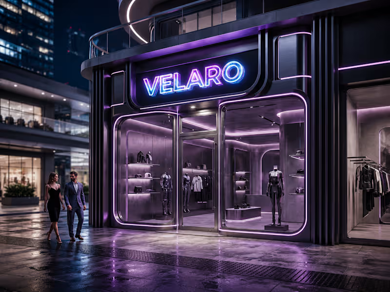
🖤 Velaro — Technical Architecture 🔗 Live Website https://saif-velaro-clothing-brand.netlify.app 📌 Overview Velaro is a single-page application (SPA) for a fashion/clothing brand, built with React + TypeScript, bundled by Vite, and styled with Tailwind CSS. The entire UI renders on one HTML page and updates dynamically as the user scrolls, searches, or interacts with the cart — no full page reloads. The architecture follows a standard modern frontend pattern: a single entry point boots the app, a root App component composes independent section components, and a global context manages shared state (the shopping cart) across all of them. ⚙️ Build & Tooling Layer These files configure how the project compiles, lints, and runs — they aren't part of the visible website, but control everything behind it. vite.config.ts — Configures Vite, the build tool/dev server. Defines how .tsx/.ts files are compiled, how the dev server runs (npm run dev), and how the production bundle is generated (npm run build). tsconfig.json — Root TypeScript config — points to the two more specific configs below via project references. tsconfig.app (http://tsconfig.app).json — TypeScript rules specifically for the application code in src/ (JSX handling, module resolution, strictness, the @/ path alias). tsconfig.node.json — TypeScript rules for Node-context files (like vite.config.ts itself), since those run outside the browser. tailwind.config.js — Configures Tailwind CSS — defines the design system (colors, spacing, fonts) and which files Tailwind scans to generate only the CSS classes actually used. postcss.config.js — Configures PostCSS, the tool that processes Tailwind's output and applies vendor prefixing/optimization during build. eslint.config.js — Defines linting rules — catches code-quality issues, unused variables, and React/TypeScript best-practice violations during development. package.json — Lists all dependencies (React, Vite, Tailwind, etc.) and defines the npm scripts (dev, build, preview). package-lock.json — Locks exact dependency versions so the build is reproducible across machines. .gitignore — Tells Git which files/folders to exclude from version control (e.g. node_modules, dist). index.html — The single real HTML file. Contains a root <div> that React mounts into — everything else is injected by JavaScript. dist/ — Auto-generated production build output (plain HTML/CSS/JS) created by npm run build. This is the folder actually deployed to Netlify. node_modules/ — Auto-generated folder holding all installed dependencies (created by npm install, never edited manually). 🚪 Application Entry & Root src/main.tsx — The true entry point of the app. Imports React, imports App.tsx, and mounts it into the <div> inside index.html. This is the first application code that runs. src/App.tsx — The root component. Doesn't contain page content itself — instead it imports and arranges every section component (Navbar, Hero, About, etc.) in order, and wraps everything in the CartProvider so cart state is available app-wide. src/index.css — Global stylesheet — imports Tailwind's base/utility layers, applied once at the root so every component can use Tailwind classes. src/vite-env.d.ts — TypeScript type declarations for Vite-specific features (like importing images/CSS as modules) — lets TypeScript understand syntax that isn't standard JavaScript. 🛒 State Management src/cart.tsx — Implements the CartProvider, a React Context that holds global cart state (items, quantities, totals) and exposes functions to add/remove items. Any component wrapped inside it (via App.tsx) can read or update the cart without prop-drilling. src/data.ts — Static data module — likely product listings, collection info, or other content consumed by components like FeaturedCollection and Showcase, kept separate from UI logic. 🧱 Component Layer (src/components/) Each file is a self-contained, single-responsibility UI section. App.tsx stacks them vertically to form the full page. Navbar.tsx — Persistent top navigation — branding, menu links, and likely triggers for search/cart. Hero.tsx — The primary landing banner — headline, tagline, and call-to-action (e.g. "Shop Collection"). HeroCanvas.tsx — A visual/animated layer paired with Hero.tsx — likely a canvas-based or decorative background effect behind the hero text. FeaturedCollection.tsx — Renders a curated set of products, pulling structured data from data.ts. About.tsx — Brand-story section — static content describing the label's identity. Lookbook.tsx — A style/editorial gallery — visually presents outfits or campaign imagery. Showcase.tsx — An additional highlight section, likely for a specific collection, drop, or promotional content. Testimonials.tsx — Displays customer reviews/social proof. Newsletter.tsx — Email capture form/section for marketing signups. SearchOverlay.tsx — A modal/overlay component for in-site product search, toggled from the Navbar. CartDrawer.tsx — A slide-out panel UI that reads from the CartProvider (cart.tsx) to display current cart items and totals. Footer.tsx — Bottom-of-page section — links, contact details, social icons. 🔄 How It All Connects (Data Flow) The browser loads index.html, which pulls in the compiled JS bundle. main.tsx runs first and mounts App.tsx into the page. App.tsx wraps all sections in CartProvider, so cart state is shared without passing props down manually through every component. Each section component renders independently — some are purely static/presentational (About, Footer), while others are interactive and tied into shared state (CartDrawer, SearchOverlay). Tailwind classes used throughout every component are compiled once into index.css based on what's scanned via tailwind.config.js. On npm run build, Vite compiles and bundles all of this into optimized static files inside dist/ — which is what gets deployed to Netlify and served to visitors. 🧠 Why This Structure Works Separation of concerns — each component owns one visual section; layout composition happens only in App.tsx. Centralized state — cart logic lives in one file (cart.tsx) instead of being duplicated across components. Data/UI separation — data.ts keeps content separate from rendering logic, making it easy to update products without touching component code. Type safety — TypeScript configs enforce consistent typing across the whole src/ folder, catching errors before runtime. Optimized output — the dev-only tooling (Vite, Tailwind, ESLint, TS configs) never ships to production; only the final compiled dist/ bundle is deployed.
0
55
Brand Design | Graphic Design | Packaging Design

Graphic Designer | E-Book Formatting | Annual Report Design