
VANTOR Automotive — Luxury Investor Pitch Deck
Project Overview
A premium investor presentation concept developed for a high-performance supercar brand. The objective was to combine luxury automotive aesthetics with clear business storytelling, creating a sophisticated, boardroom-ready presentation.
Design Approach
Developed six distinct slide concepts featuring cinematic automotive photography, bold typography, refined charcoal tones, and restrained racing-red accents. Each slide uses a unique composition, balancing narrative content with custom infographics, market insights, and financial data visualizations.
Design Outcome
A cohesive, visually engaging presentation concept that communicates brand positioning, competitive advantages, business strategy, and growth potential while maintaining a consistent premium identity.
Deliverables: 6-slide presentation concept | 16:9 widescreen | Investor pitch design
0
21
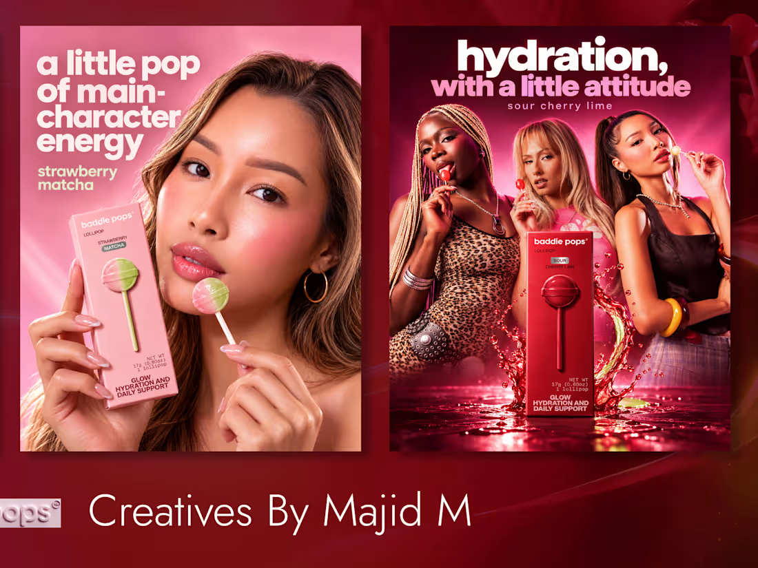
Baddie Pops | Instagram Carousel Campaign Concept
This concept carousel introduces Baddie Pops’ three flavors—Strawberry Matcha, Peaches & Cream, and Sour Cherry Lime—through a connected visual story. Each panel gives a flavor its own mood while keeping the product and people at the center.
A continuous background, cinematic lighting, and restrained bold typography link the three slides into one campaign. The layout is designed to feel dynamic and minimal, with each panel working on its own while guiding viewers through the lineup.
0
100
IEACF Educational Foundation
Project Type: Real Client Work | Magazine Design
IEACF Educational Foundation needed a professional magazine to present its scholarship initiatives, community impact, organizational stories, and educational content in a credible and engaging editorial format. The challenge was balancing substantial written content with photography while keeping each spread readable and visually engaging.
I created a structured editorial system with strong typographic hierarchy, multi-column grids, generous white space, and large photography. The final magazine provides IEACF with a polished publication that communicates its mission and impact while maintaining consistency across content-heavy spreads.
I’d love to hear your thoughts on this magazine design. What works well for you, and what would you improve in the layout, typography, or overall visual direction?
0
106
Event Document Design | Ambrosia Garden Party
Client: The Ambrosia Garden Party
Project Type: Real Client Work | Professional Document Design
The Ambrosia Garden Party needed a professionally designed event document that could present key event information in a polished, visually engaging, and easy-to-follow format. The goal was to capture the upscale garden-party atmosphere while keeping the content structured and practical.
I created a refined editorial layout using strong event imagery, clear typography, consistent branding, and balanced information hierarchy. The final document provides a cohesive presentation suitable for event communication, partners, sponsors, stakeholders, and digital distribution.
2
1
191