IEACF Educational Foundation Project Type: Real

Majid M


IEACF Educational Foundation
Project Type: Real Client Work | Magazine Design
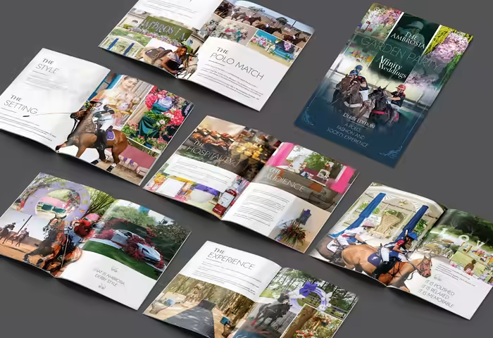
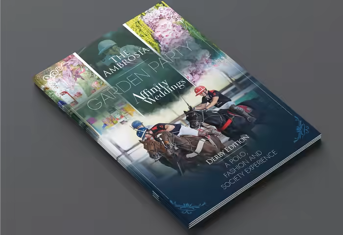
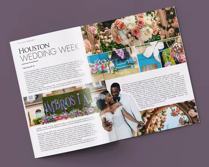
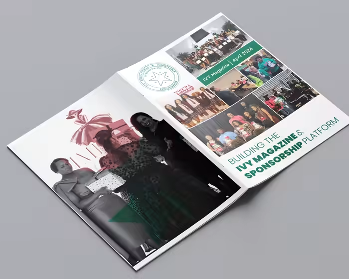
IEACF Educational Foundation needed a professional magazine to present its scholarship initiatives, community impact, organizational stories, and educational content in a credible and engaging editorial format. The challenge was balancing substantial written content with photography while keeping each spread readable and visually engaging.
I created a structured editorial system with strong typographic hierarchy, multi-column grids, generous white space, and large photography. The final magazine provides IEACF with a polished publication that communicates its mission and impact while maintaining consistency across content-heavy spreads.
I’d love to hear your thoughts on this magazine design. What works well for you, and what would you improve in the layout, typography, or overall visual direction?
Like this project
Posted Sep 25, 2026
IEACF Educational Foundation Project Type: Real Client Work | Magazine Design IEACF Educational Foundation needed a professional magazine to present its scho...