SOLAIX, Renewable Energy Branding & Logo Design

Ashar Qasmani


Project overview
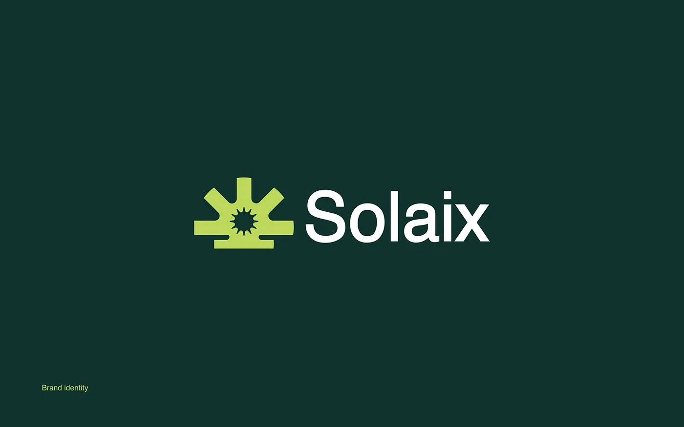
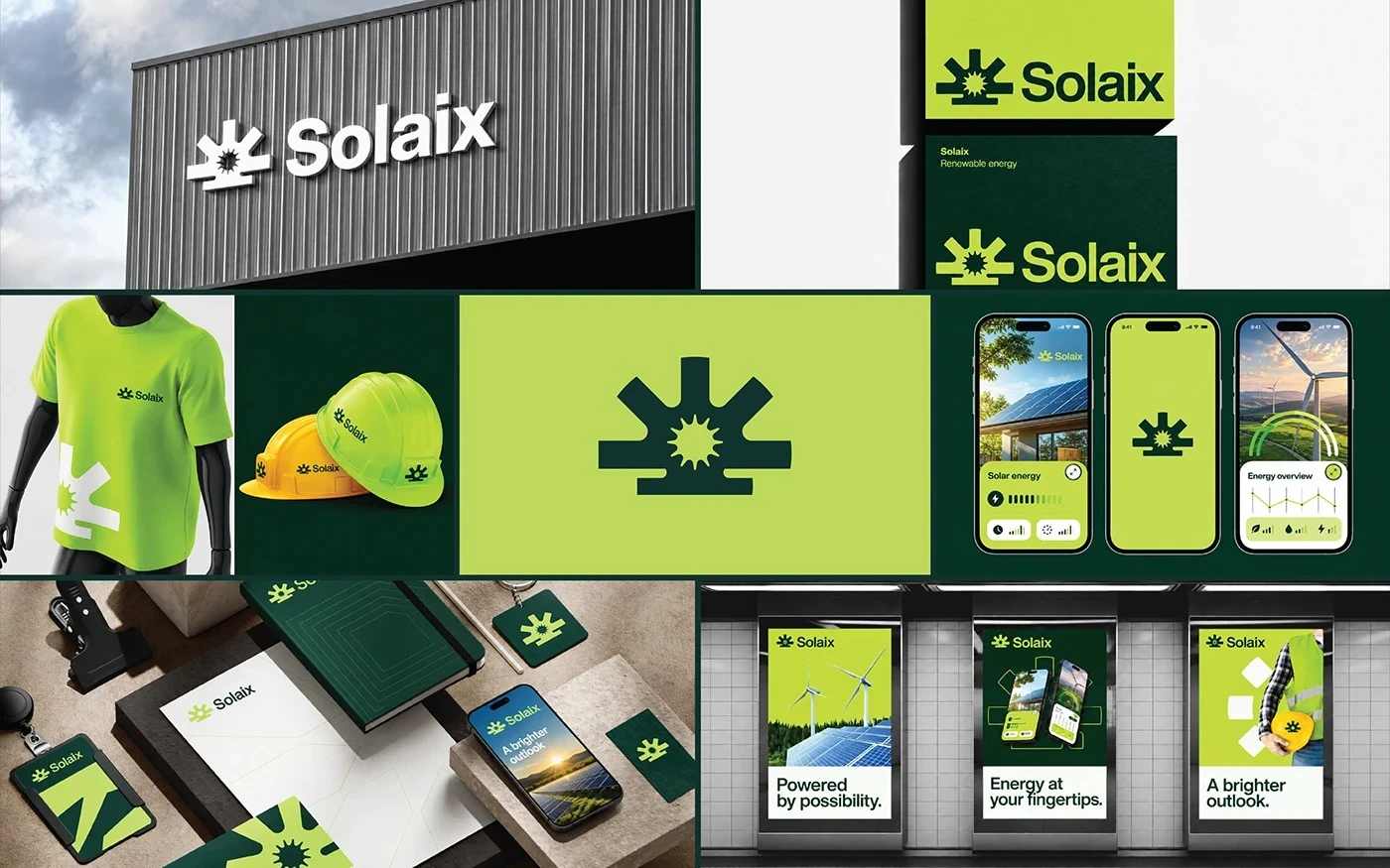
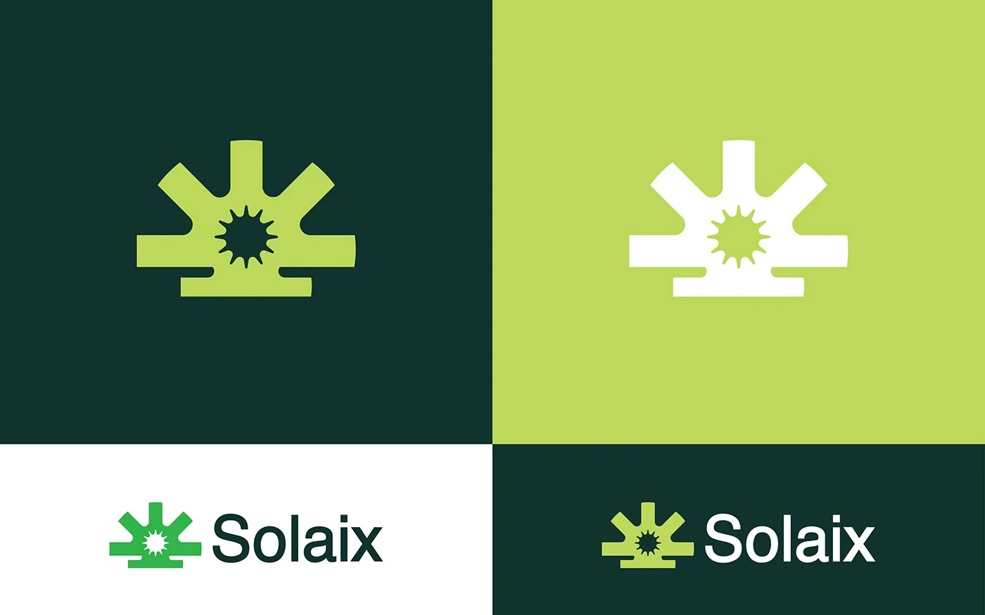
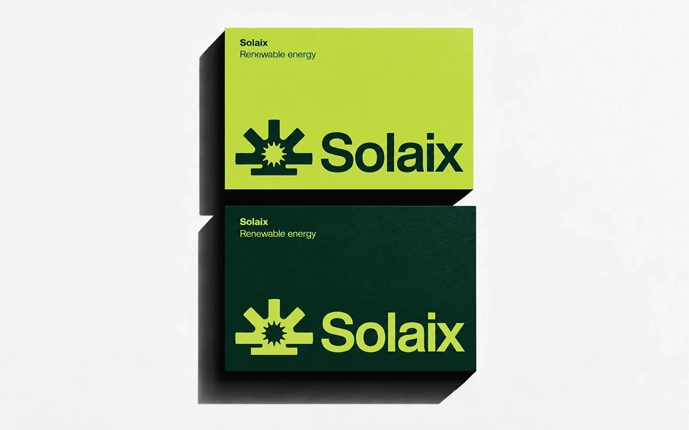
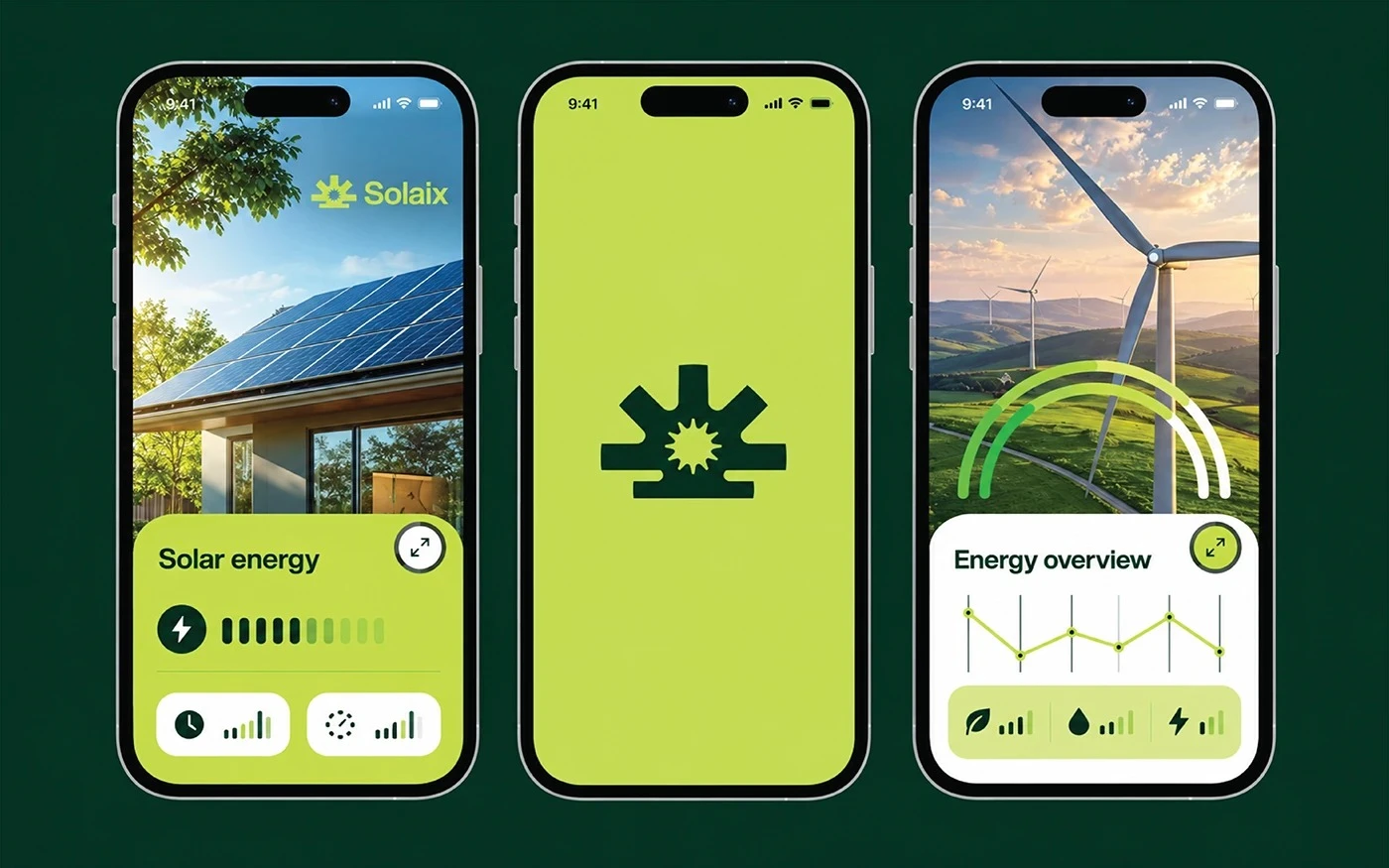
Renewable energy brand identity and logo design for Solaix, a client, built around a geometric sun symbol, a green and lime palette, and bold typography. The identity carries through app UI, signage, and guidelines, so the brand reads as bright, modern, and confident at every touchpoint.
The challenge
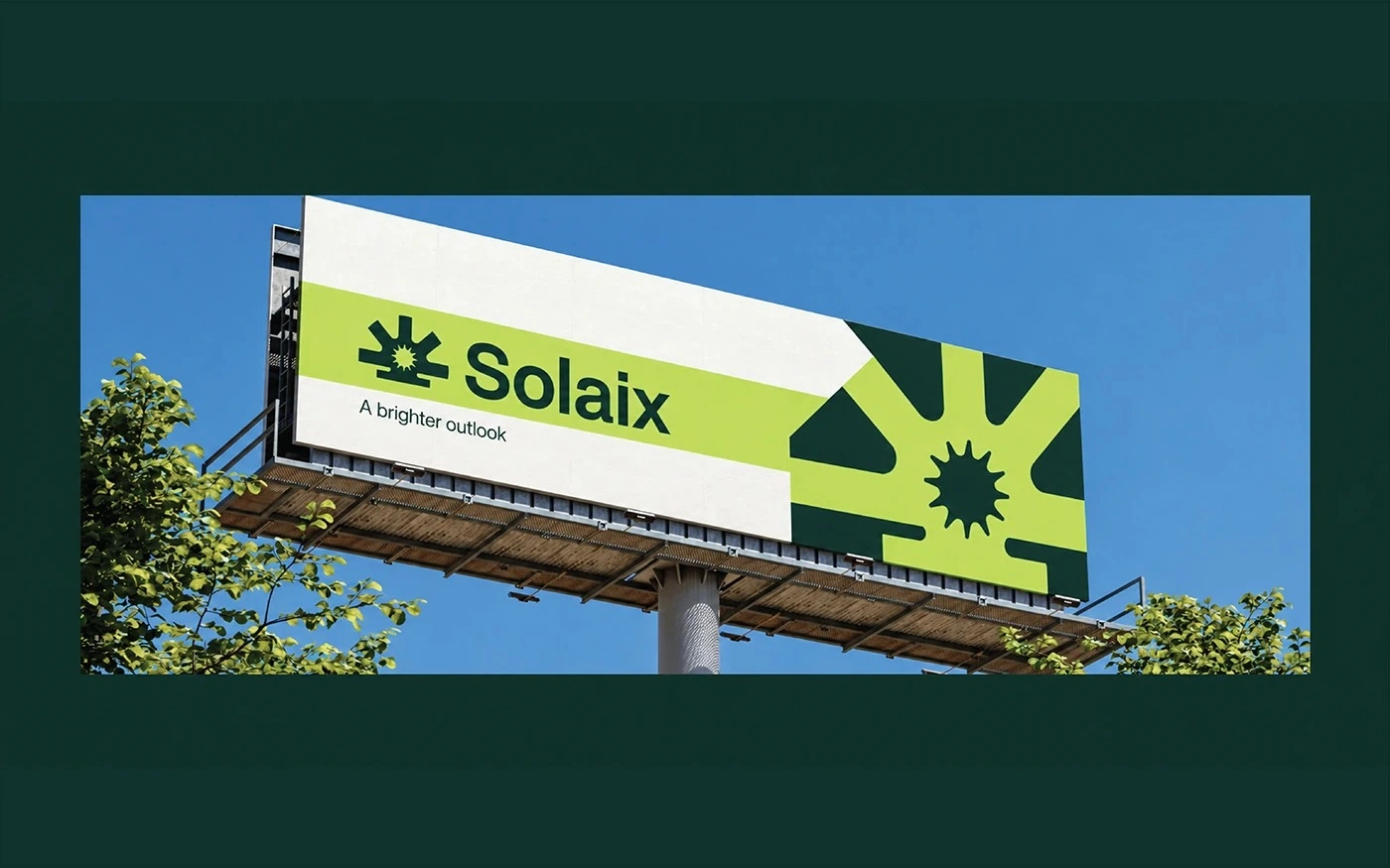
Renewable energy brands all reach for the same visual language: suns, leaves, and green. Solaix needed an identity that still reads as clean energy at a glance, but stays distinctive enough to own, and flexible enough to work on a hard hat, a phone screen, and a billboard without losing its shape.
Design approach and key decisions
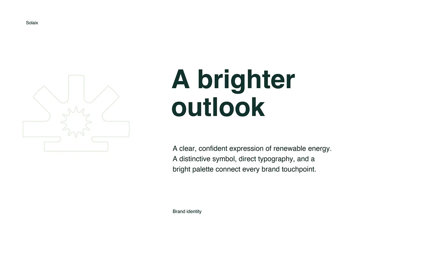
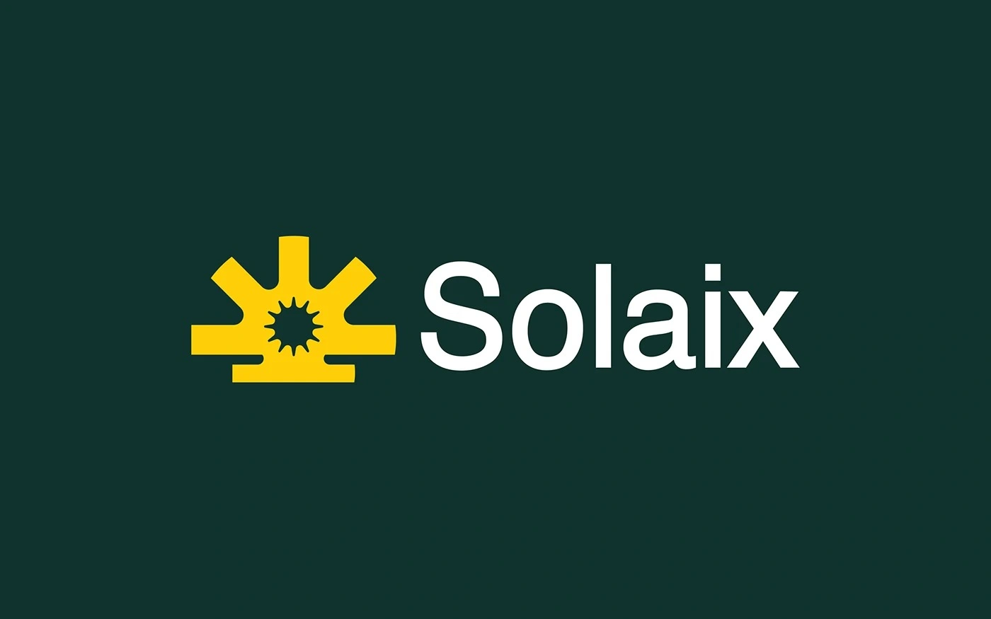
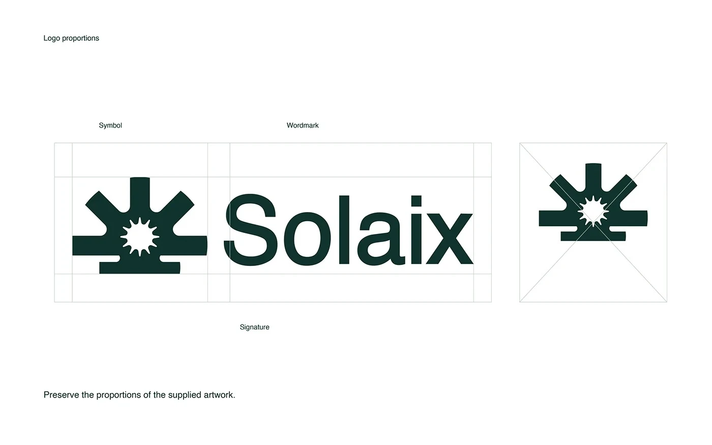
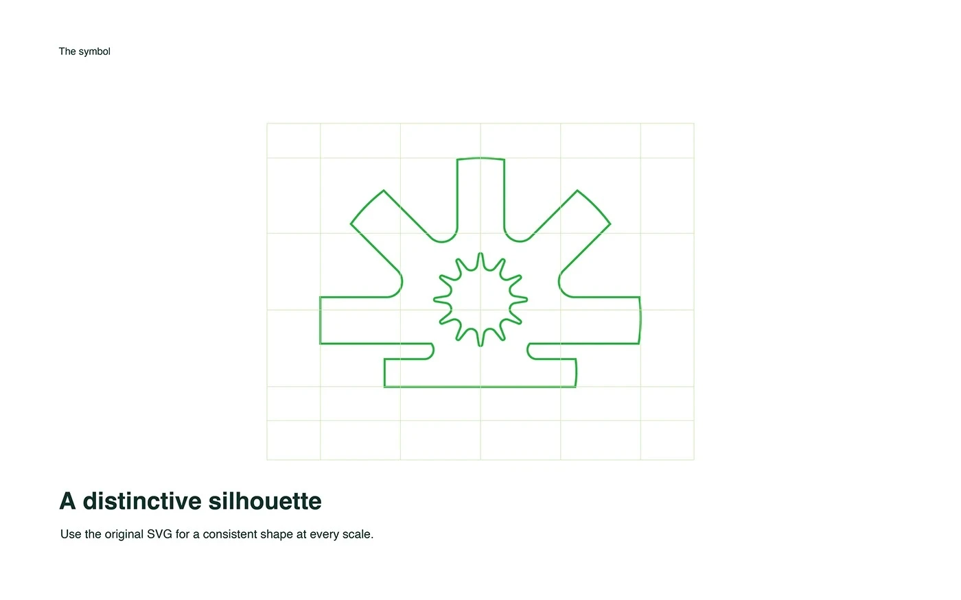
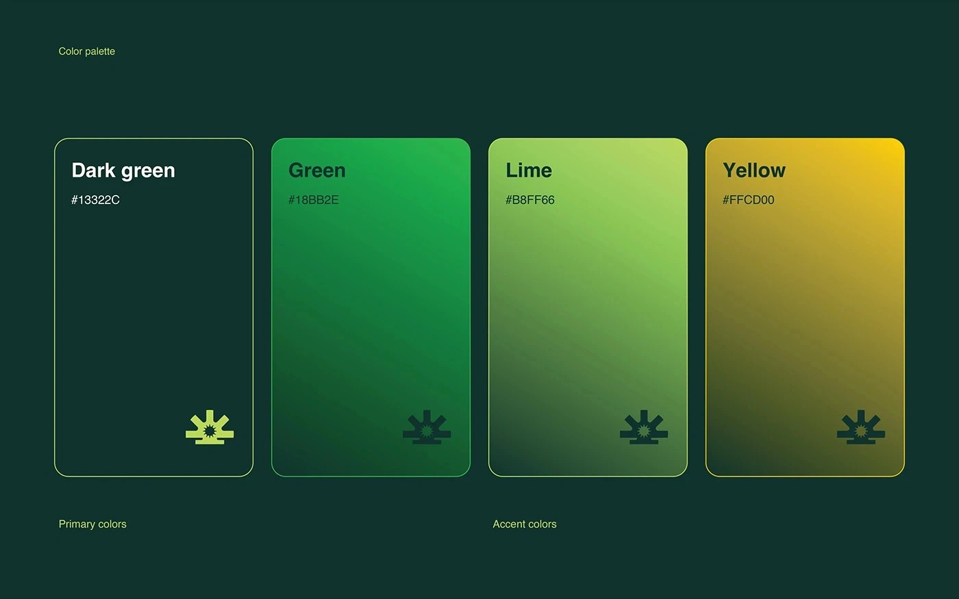
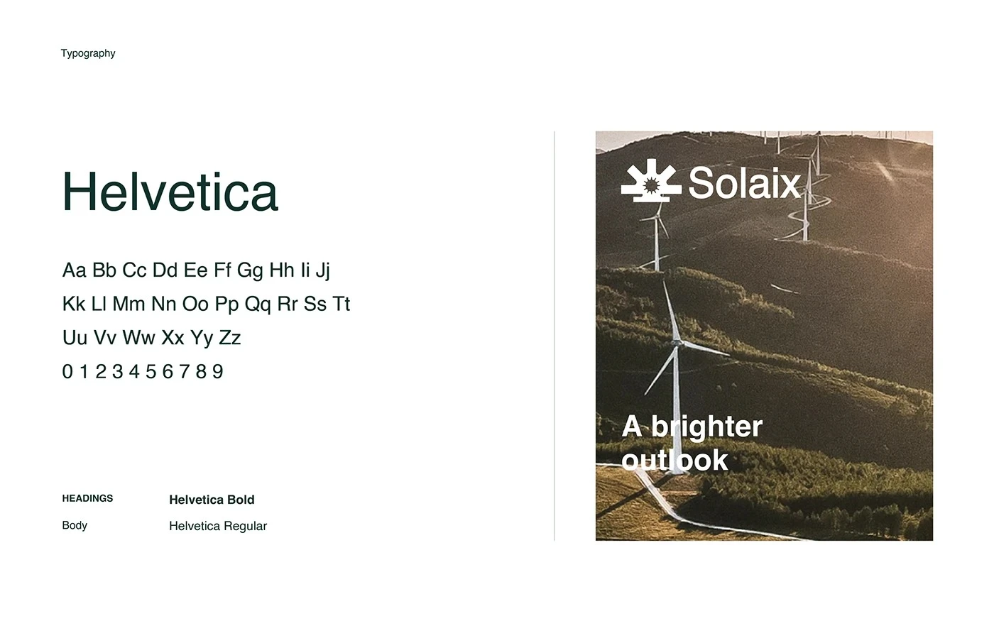
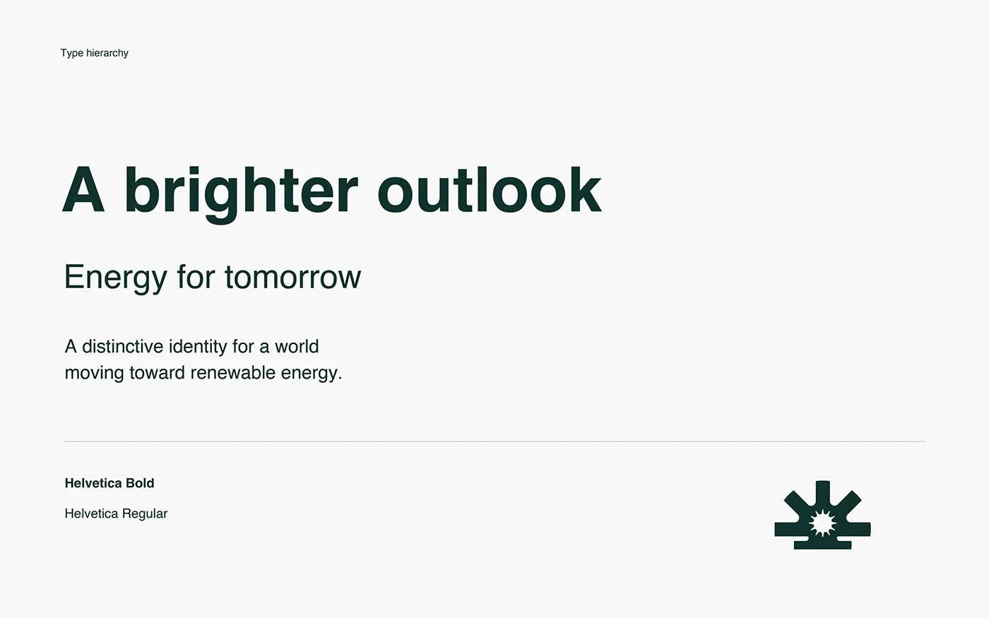
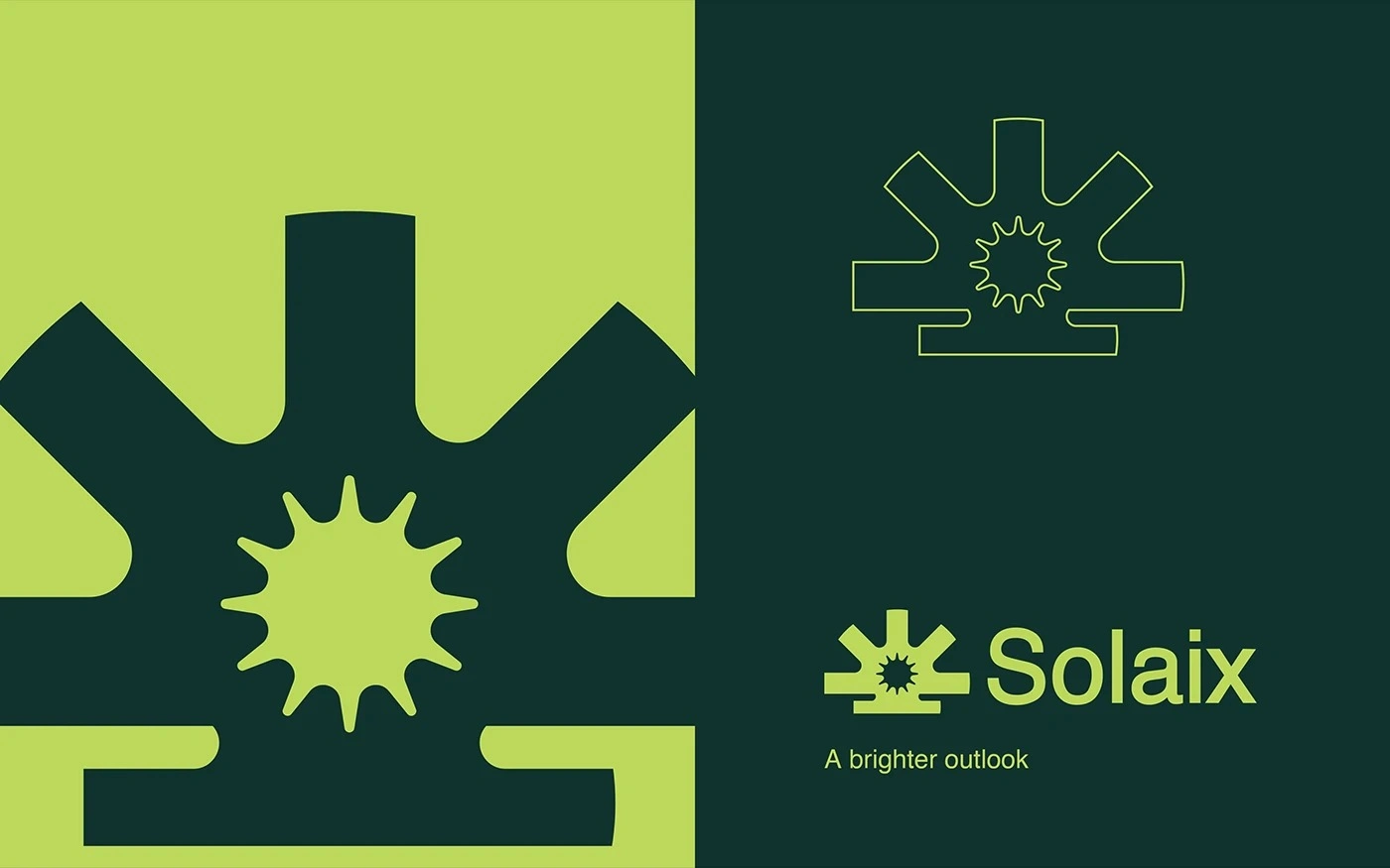
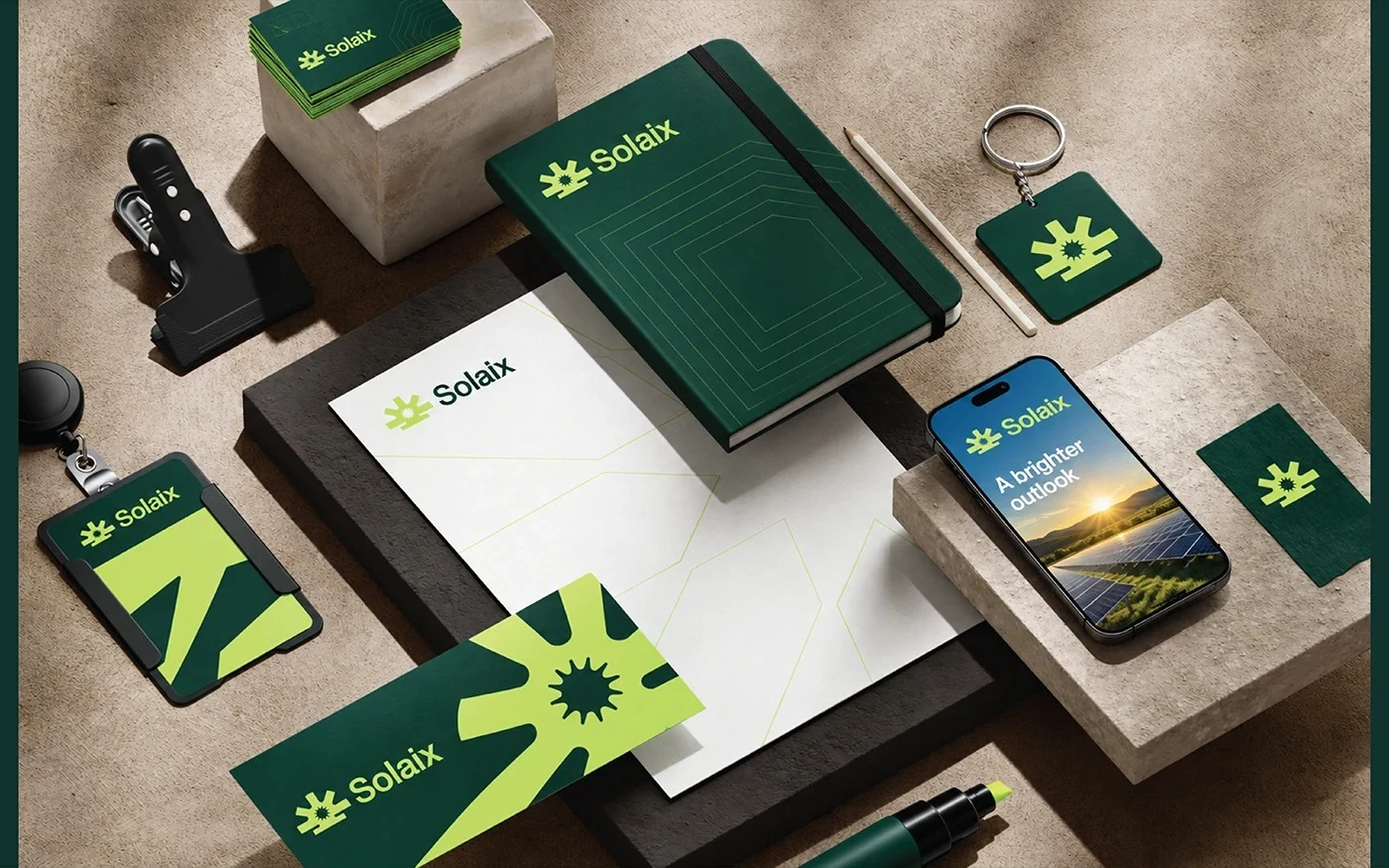
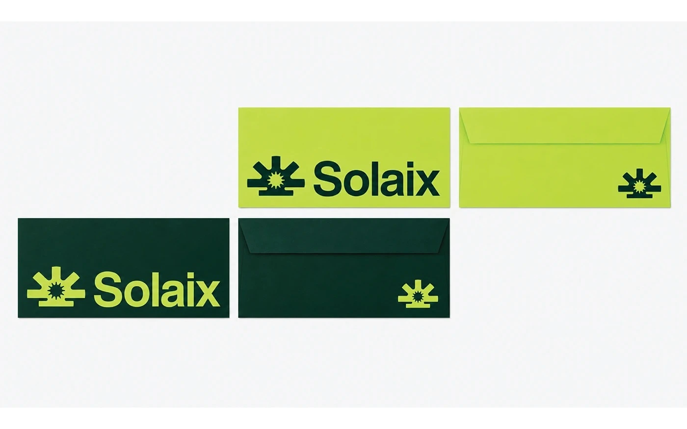
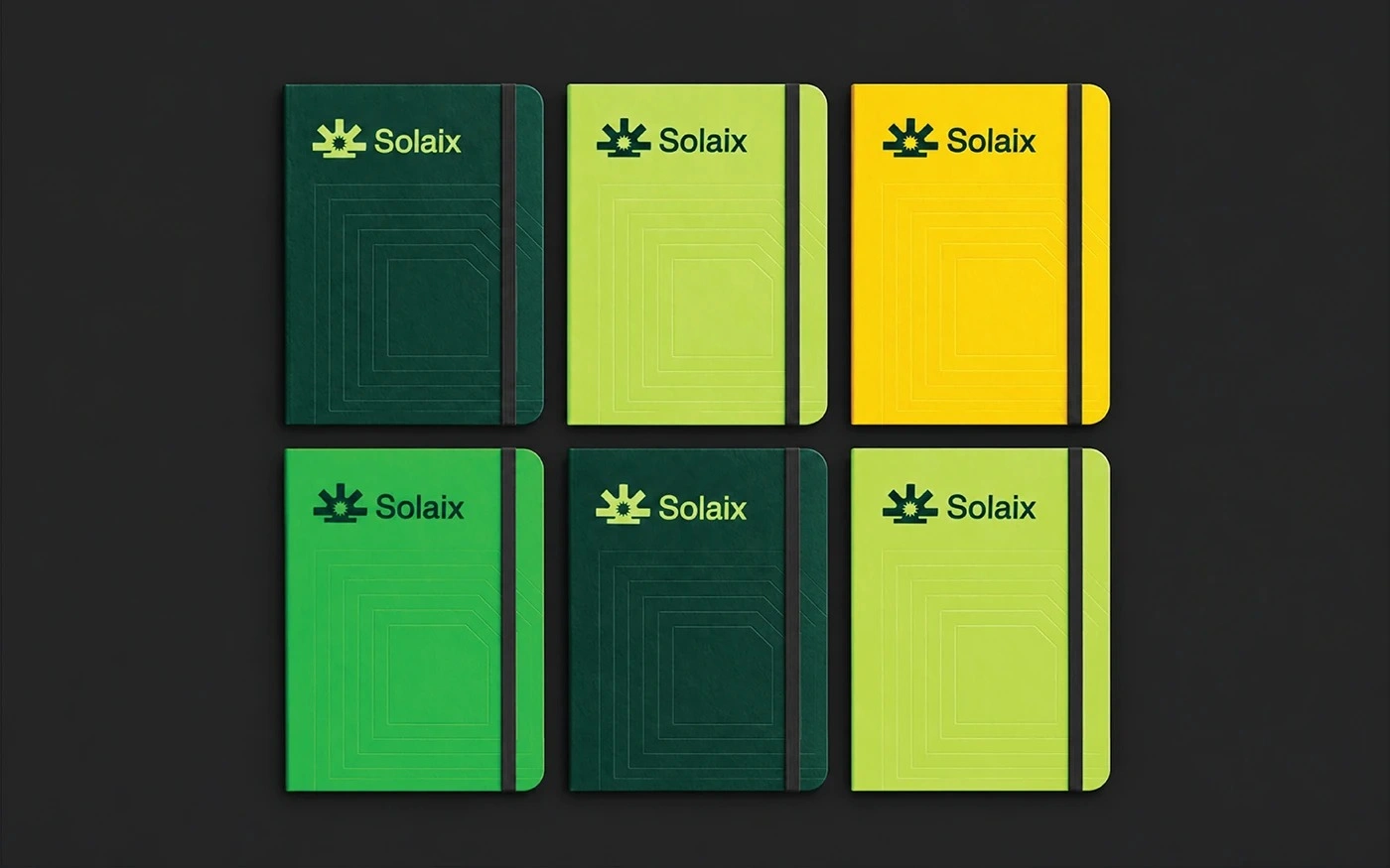
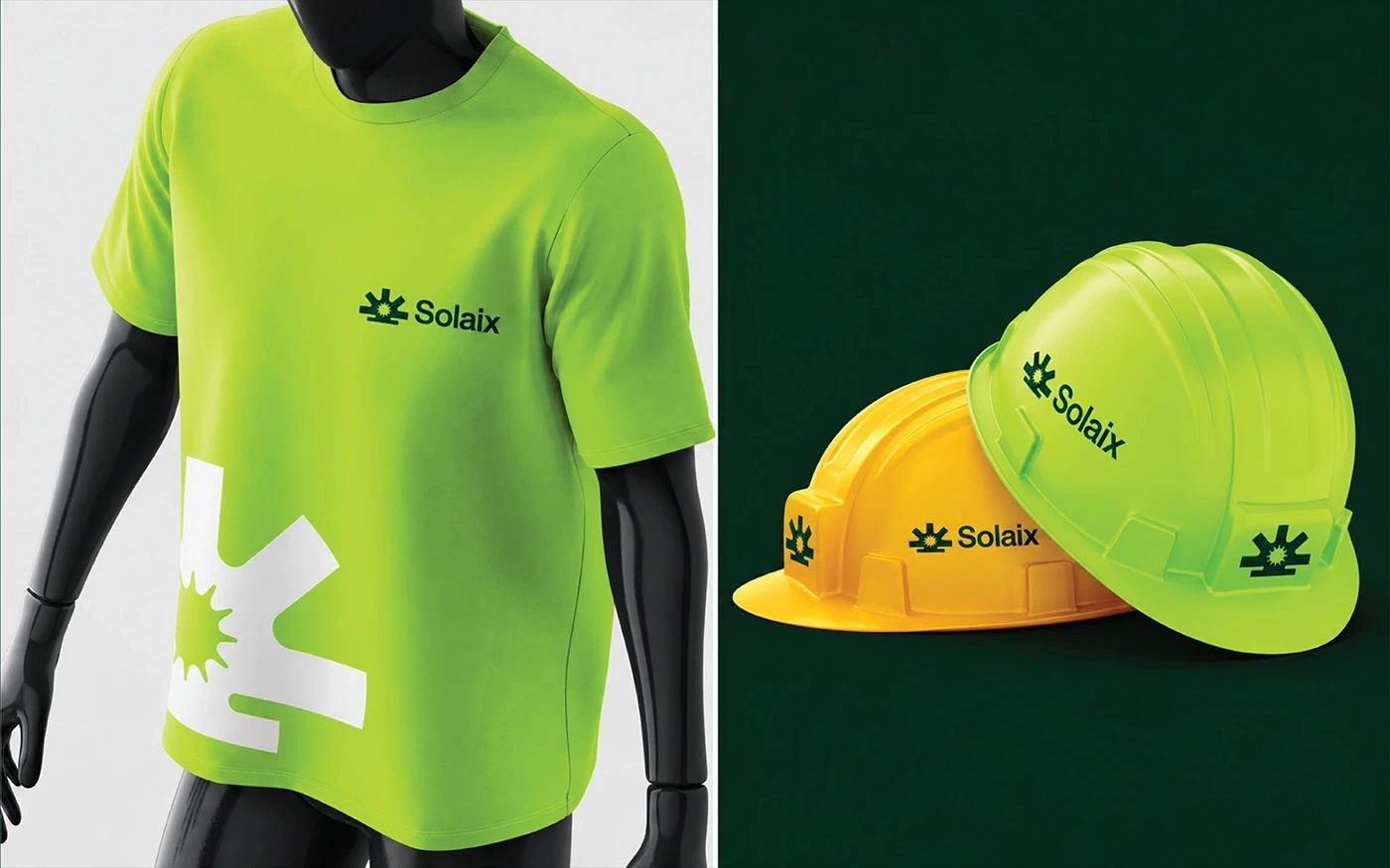
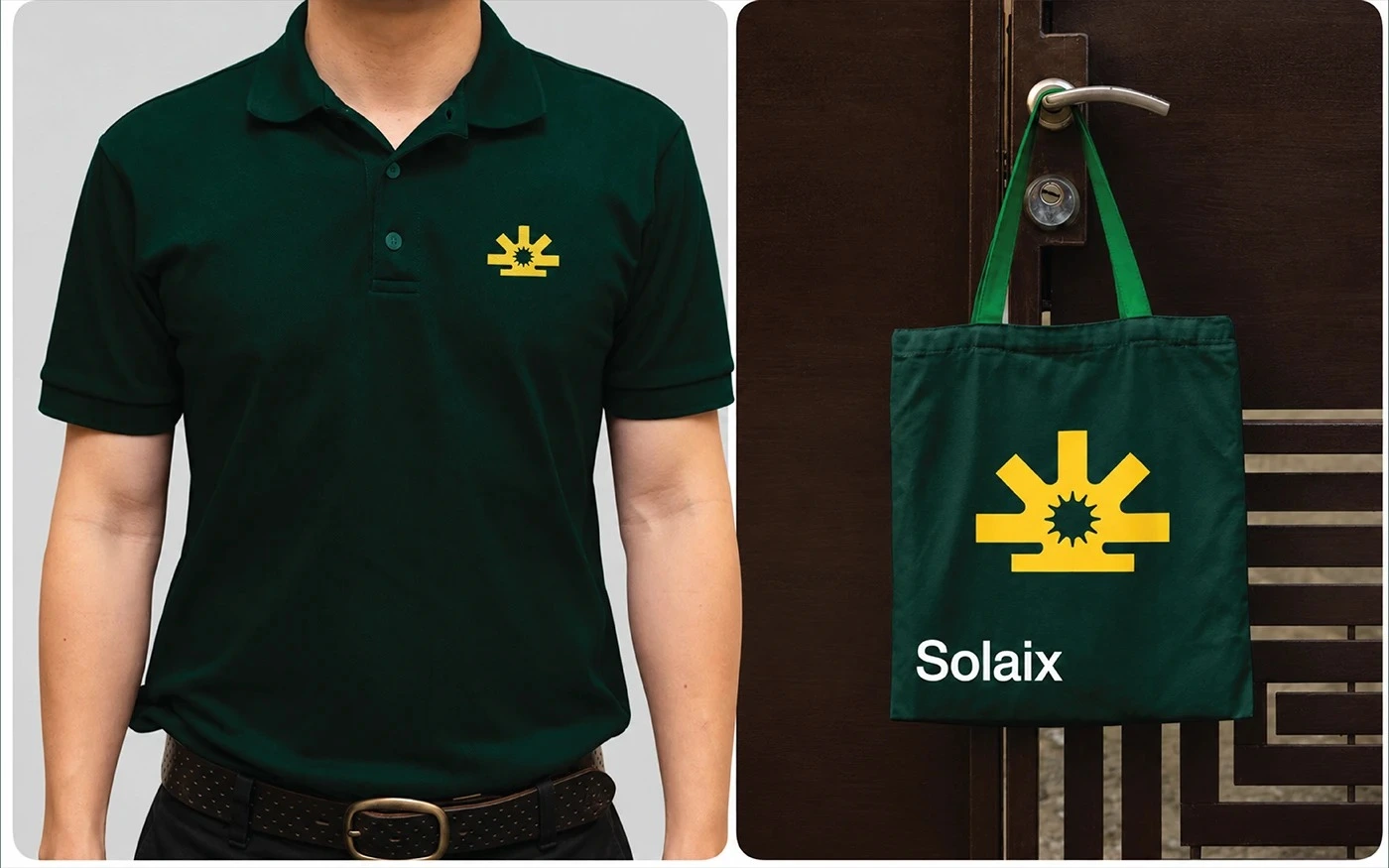
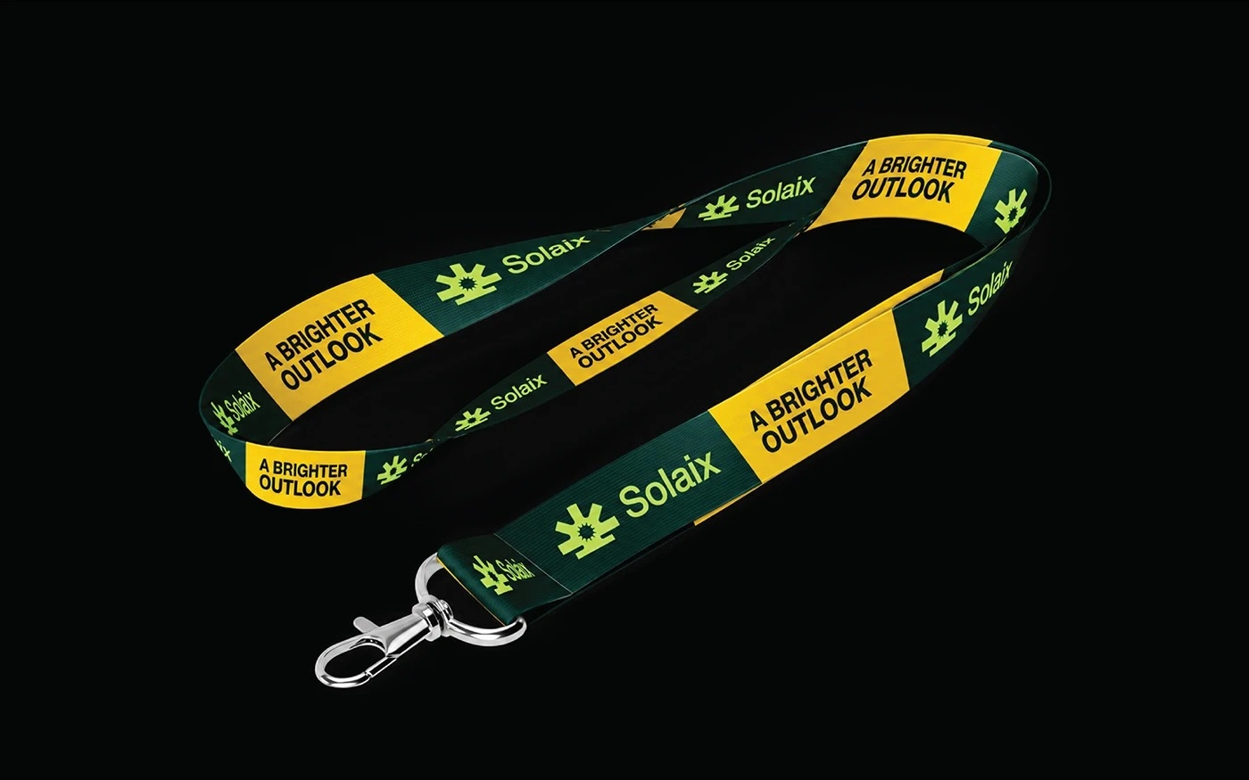
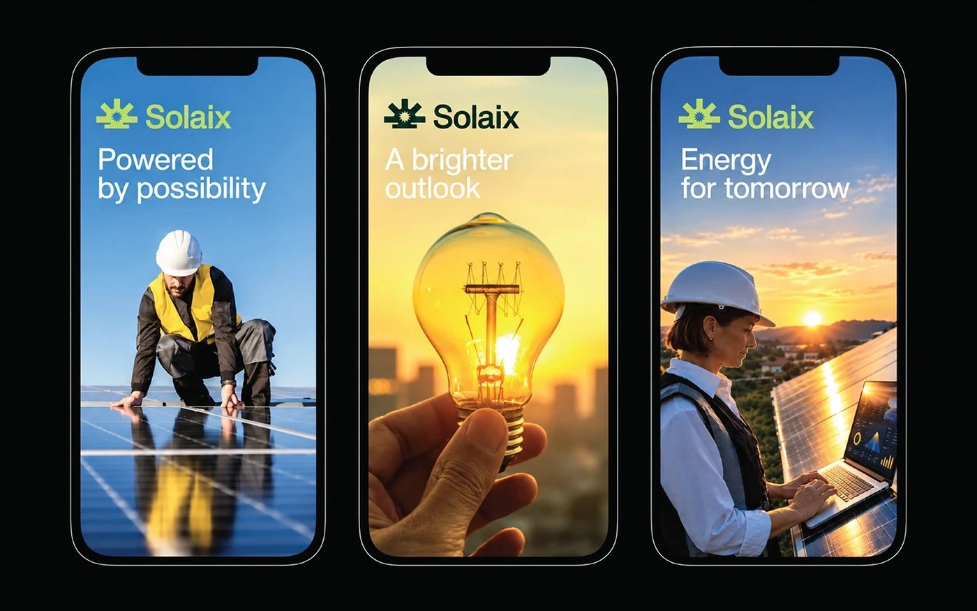
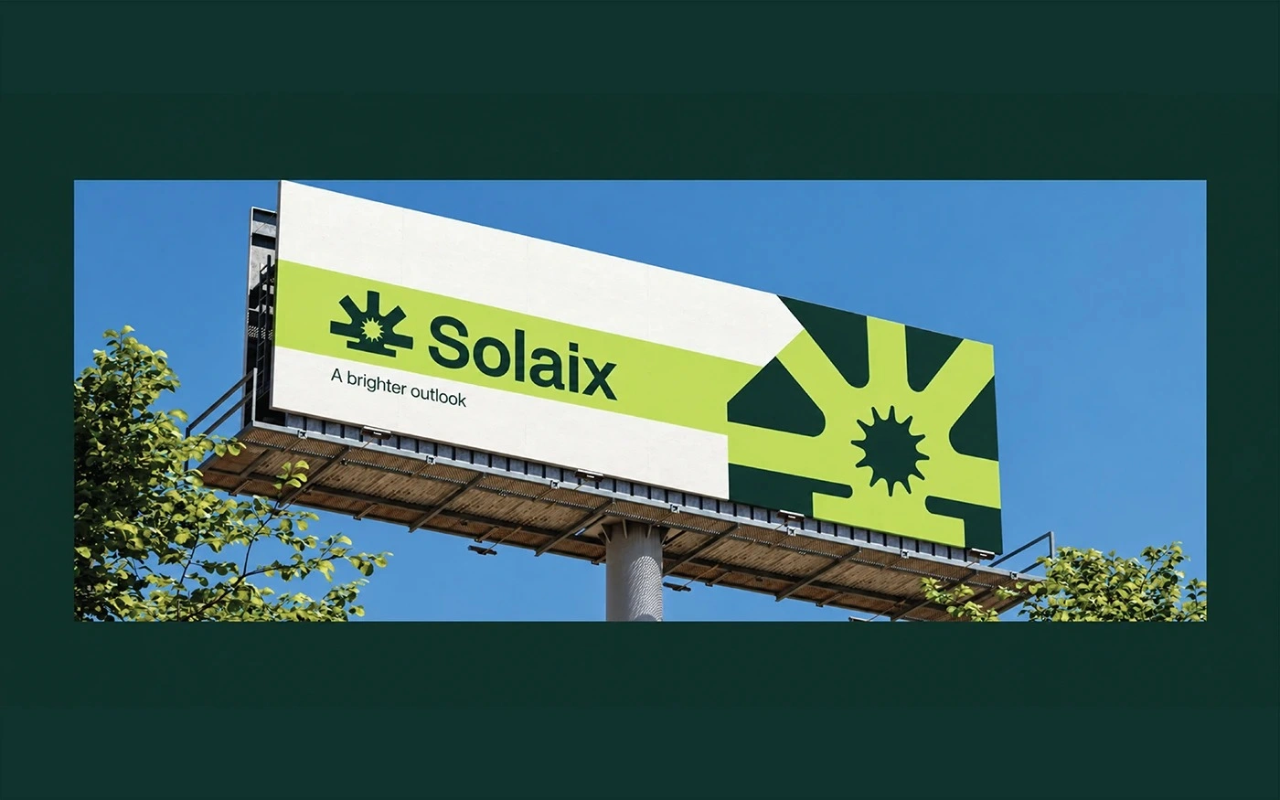
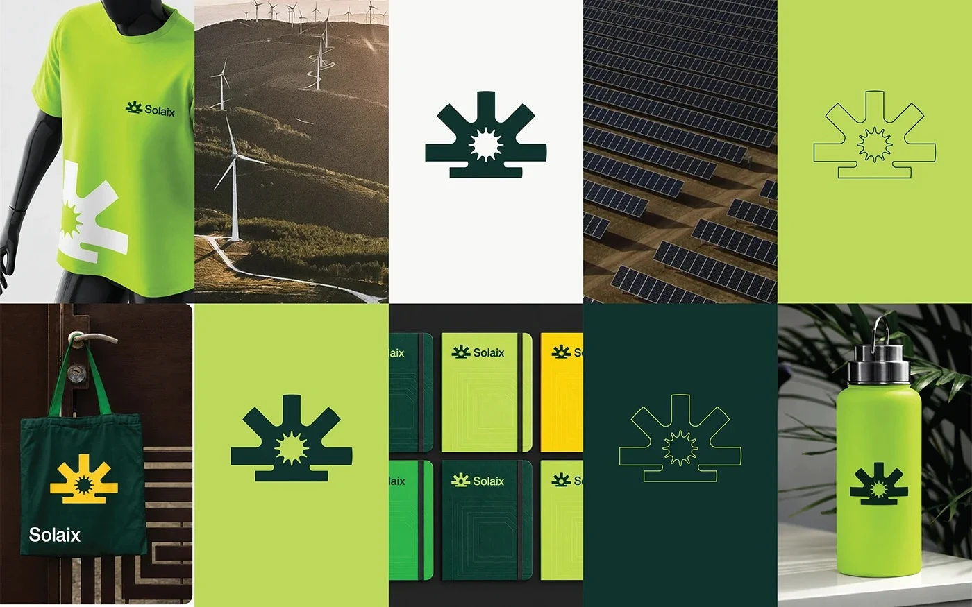
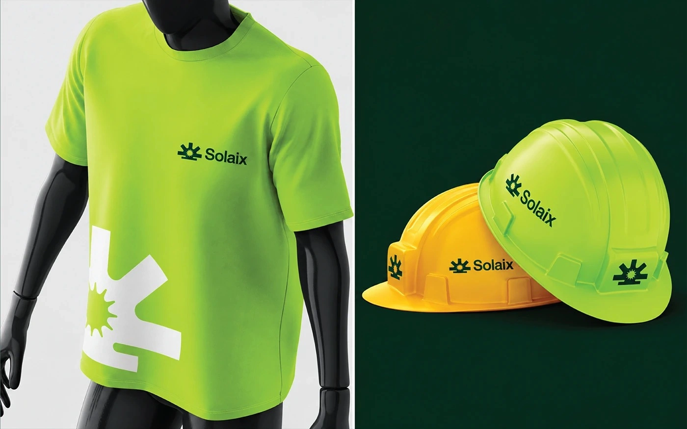
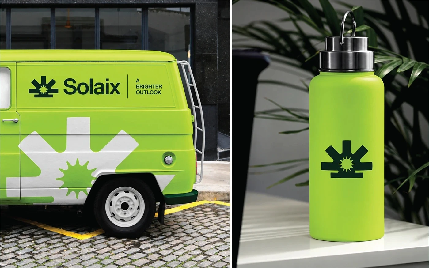
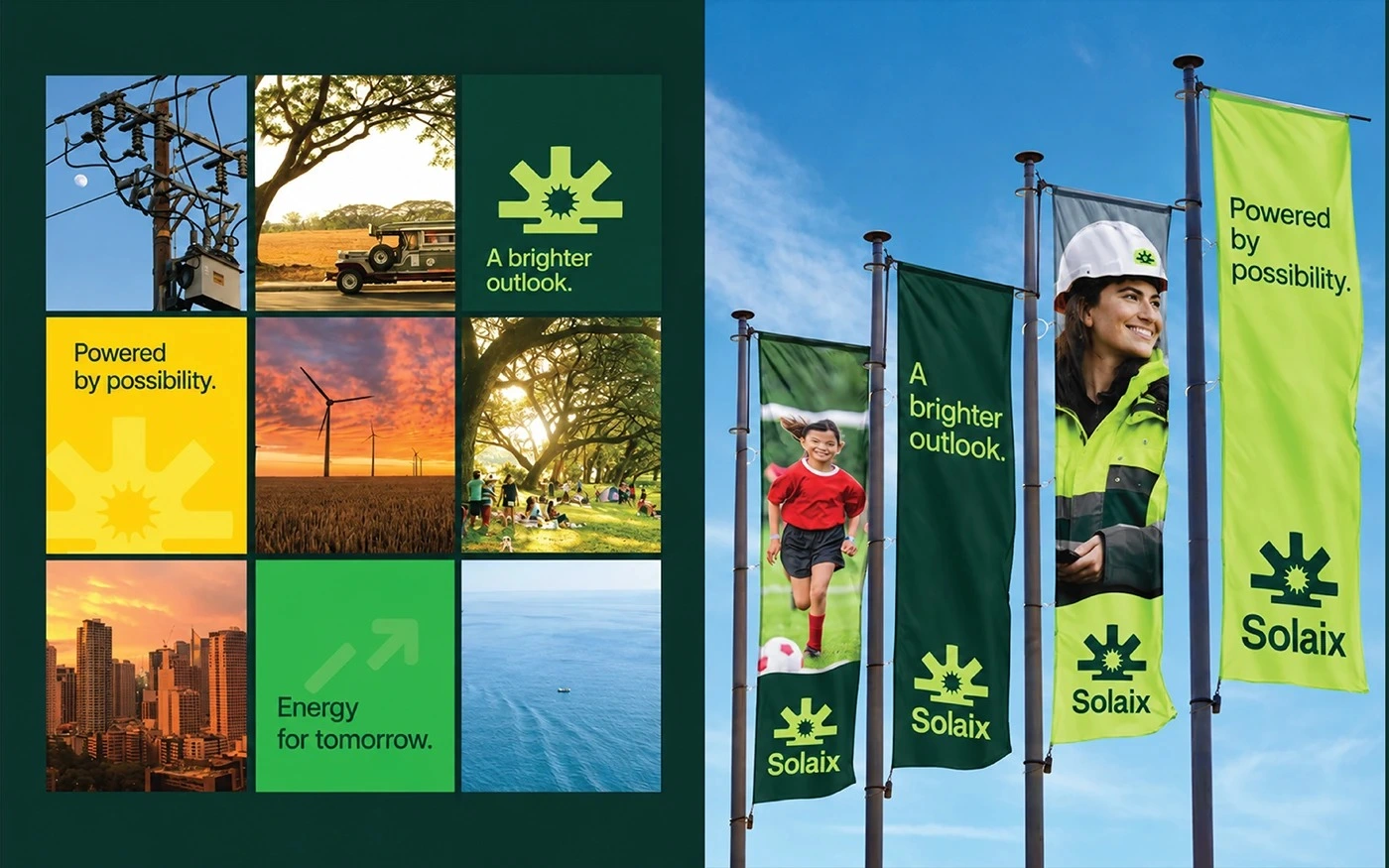
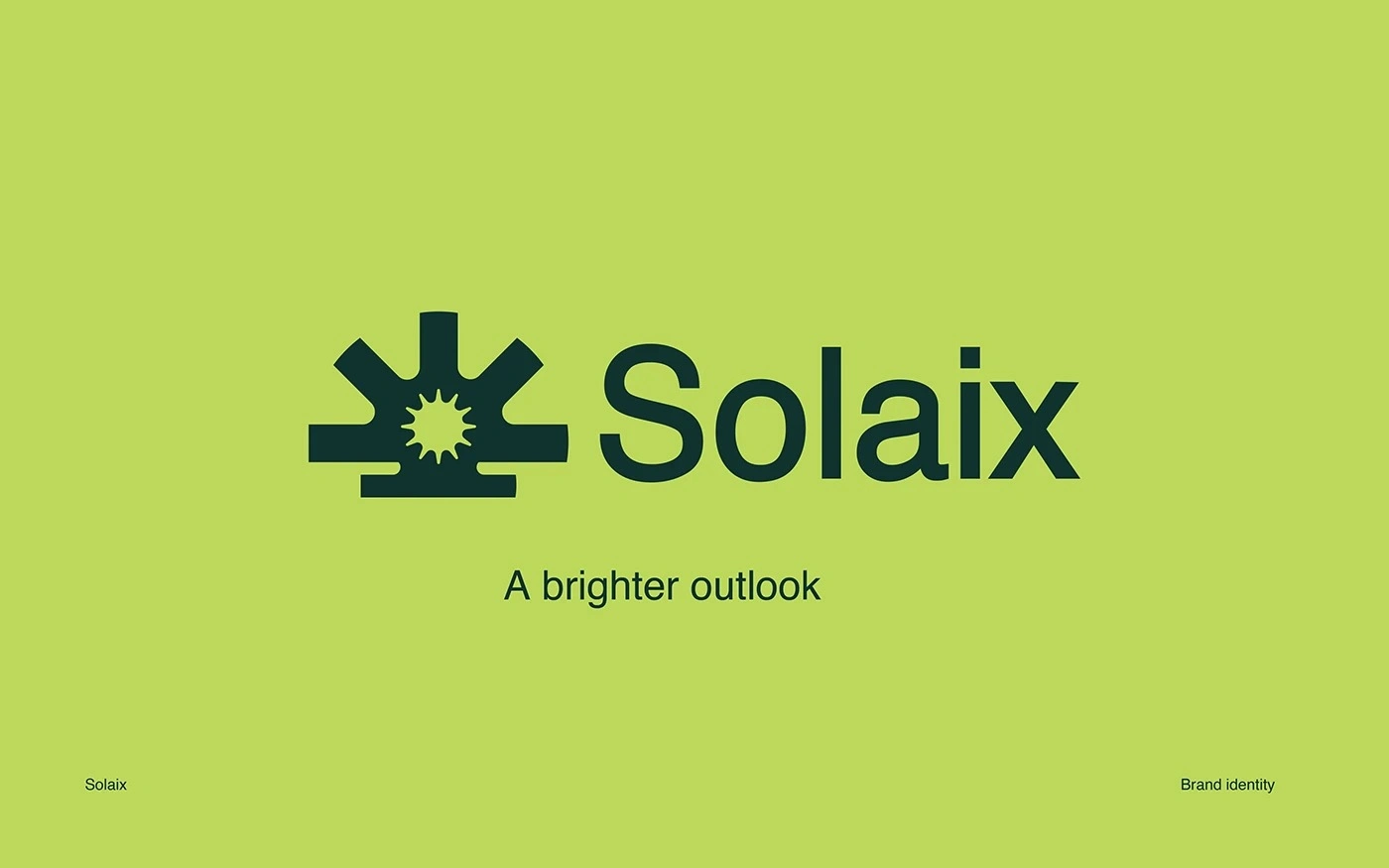
The work starts from the symbol: a geometric sun with a distinctive silhouette, drawn on a grid with proportions preserved, so it holds its shape at every scale, from an app icon to a billboard. The palette pairs deep green with bright lime and yellow accents, an energetic system that feels fresh rather than generic. Helvetica carries the voice, bold for headings and regular for body, and the tagline, A brighter outlook, states the promise in three words. The same symbol, colours, and type run through every application after this point.
Project scope
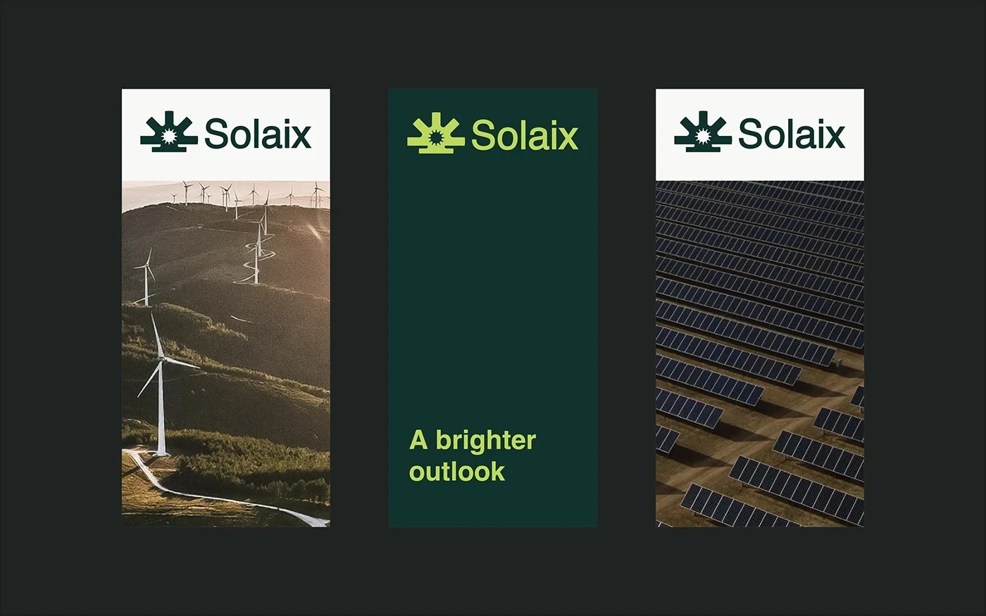
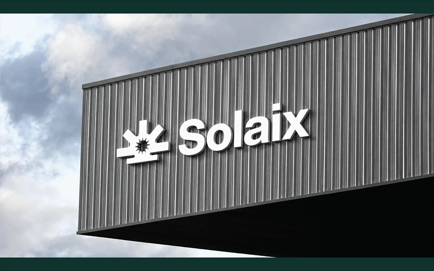
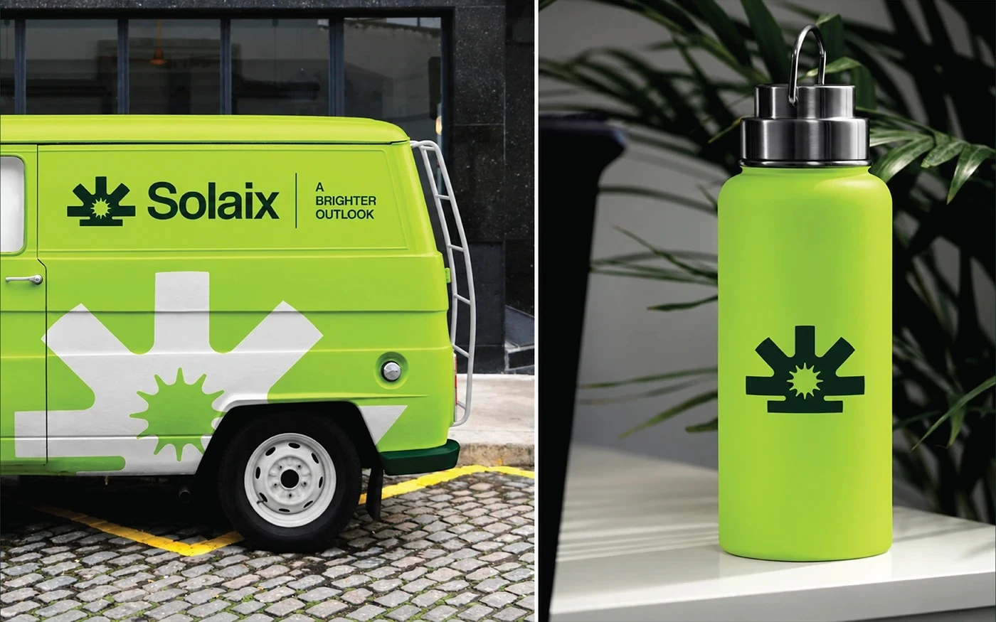
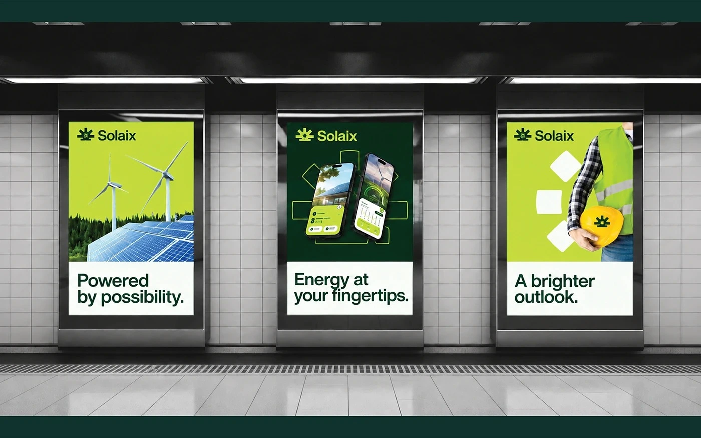
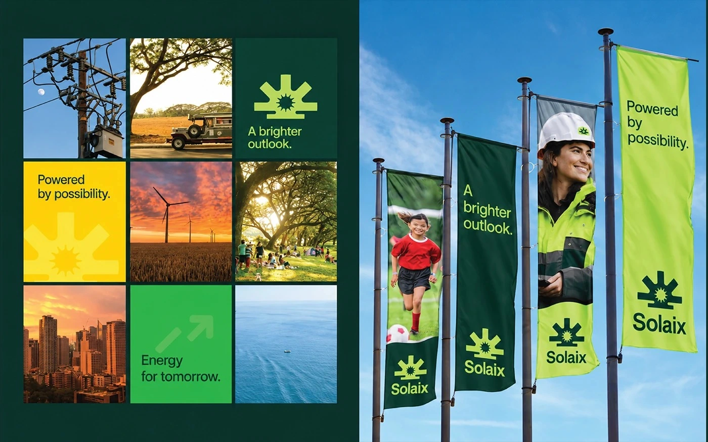
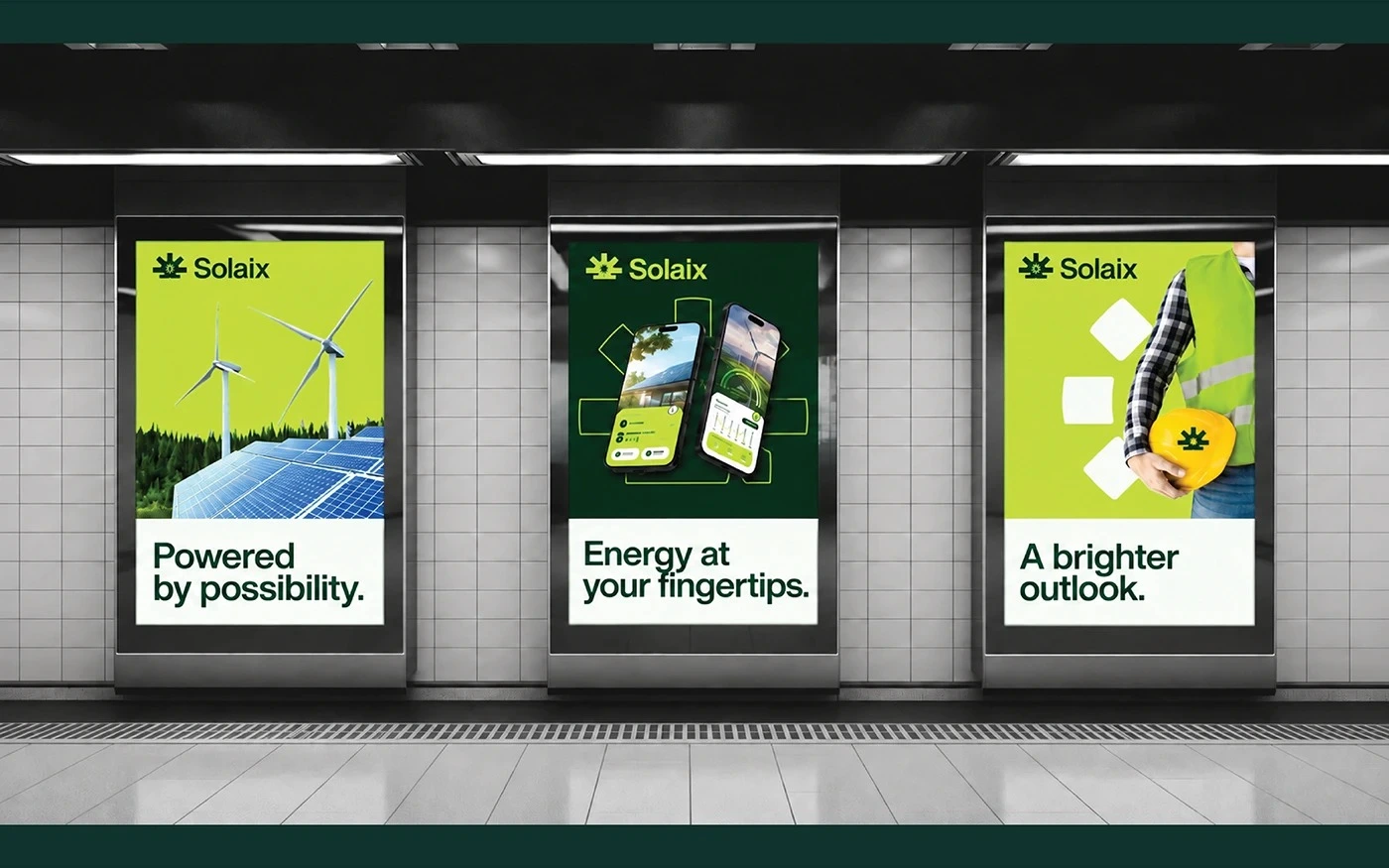
Logo design, visual identity system, brand guidelines, and application design, covering colour and typography systems, stationery and business cards, merchandise and uniforms, app UI and icons, signage, banners, posters, billboards, flags, and vehicle branding. Designed in Adobe Illustrator, InDesign, and Photoshop.
Final deliverables
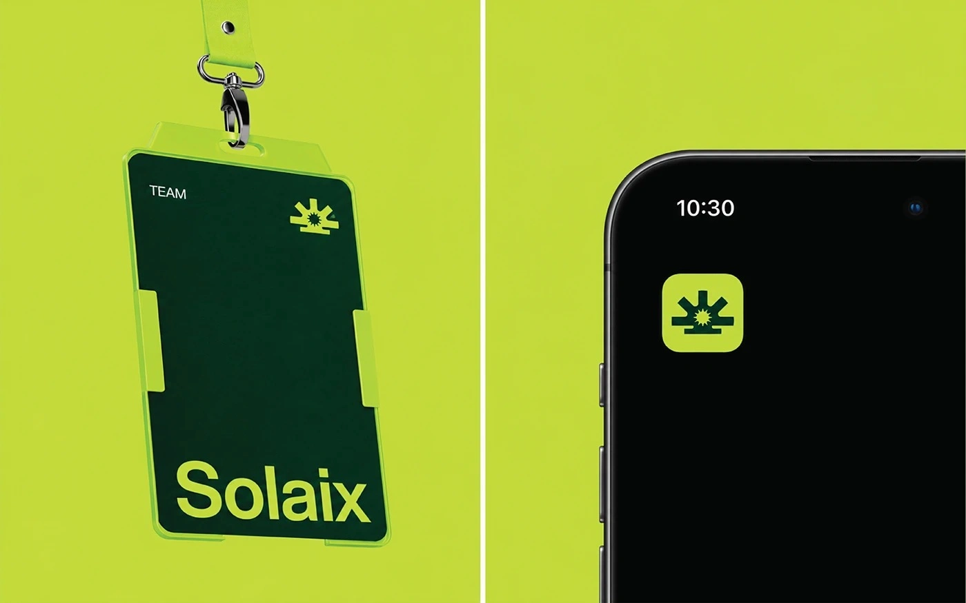
A complete identity package for Solaix: the geometric sun symbol and tagline, the visual identity system with logo proportions, colour, and typography guidelines, and a full set of applications across print, merchandise, digital, signage, and outdoor. The images above show the system applied, from the app icon and hard hat to the billboard and flags.
Like this project
Posted Oct 21, 2026
SOLAIX renewable energy brand identity and logo design: geometric sun symbol, green and lime palette, bold typography, app UI, signage and guidelines.