CRUMIO — Cookie Brand Identity & Packaging Design

Ashar Qasmani


Project overview
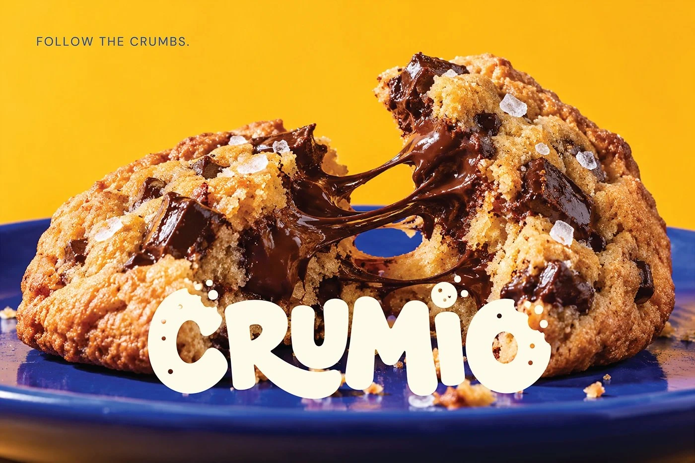
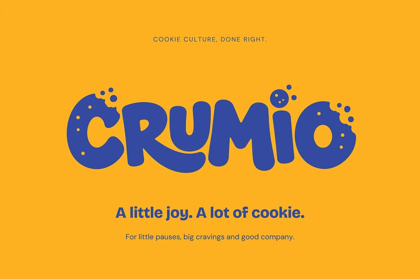
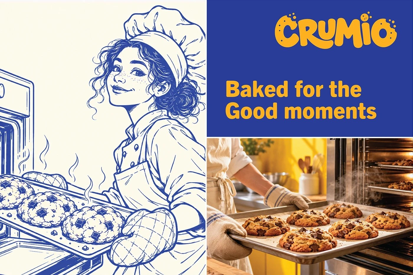
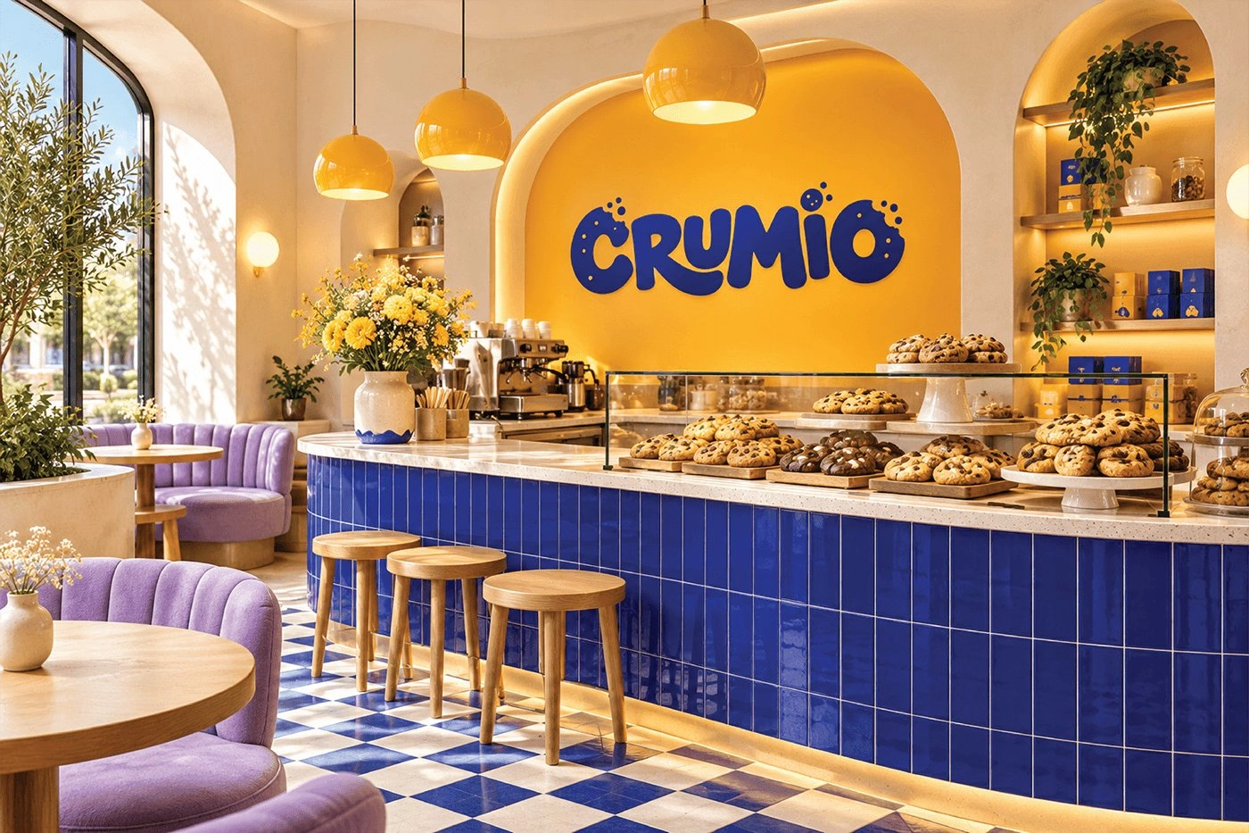
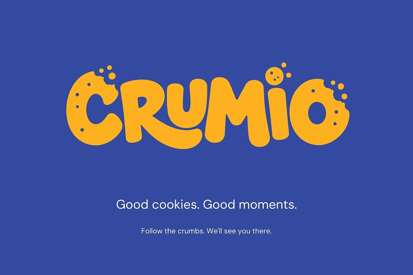
Cookie brand identity and packaging design for Crumio, a client, built around a playful bitten-cookie wordmark, bold typography, and a vibrant packaging system, carried through storefront and merchandise. The identity turns the bite itself into the brand mark, so every pack, sign, and sticker carries the same playful character.
The challenge
Cookie brands live on warmth, but warmth alone does not stand out on a shelf or a storefront. Crumio needed an identity that feels joyful without looking childish, works as a tiny seal on a pouch as well as a huge sign on a shop, and turns a simple cookie into a small moment people remember.
Design approach and key decisions
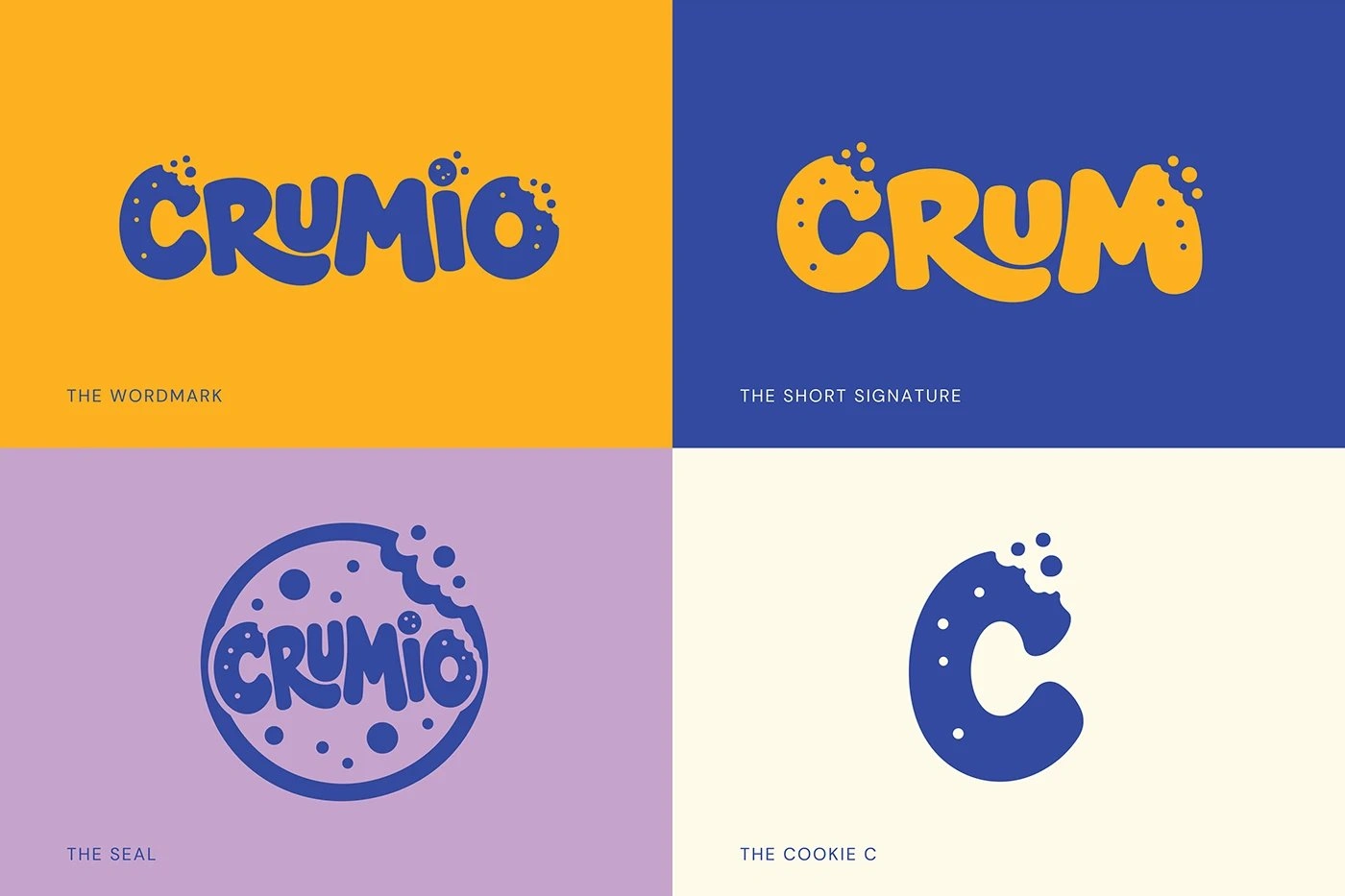
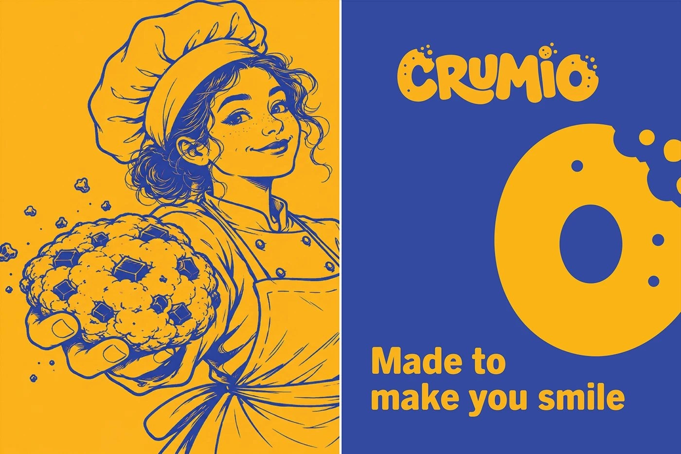
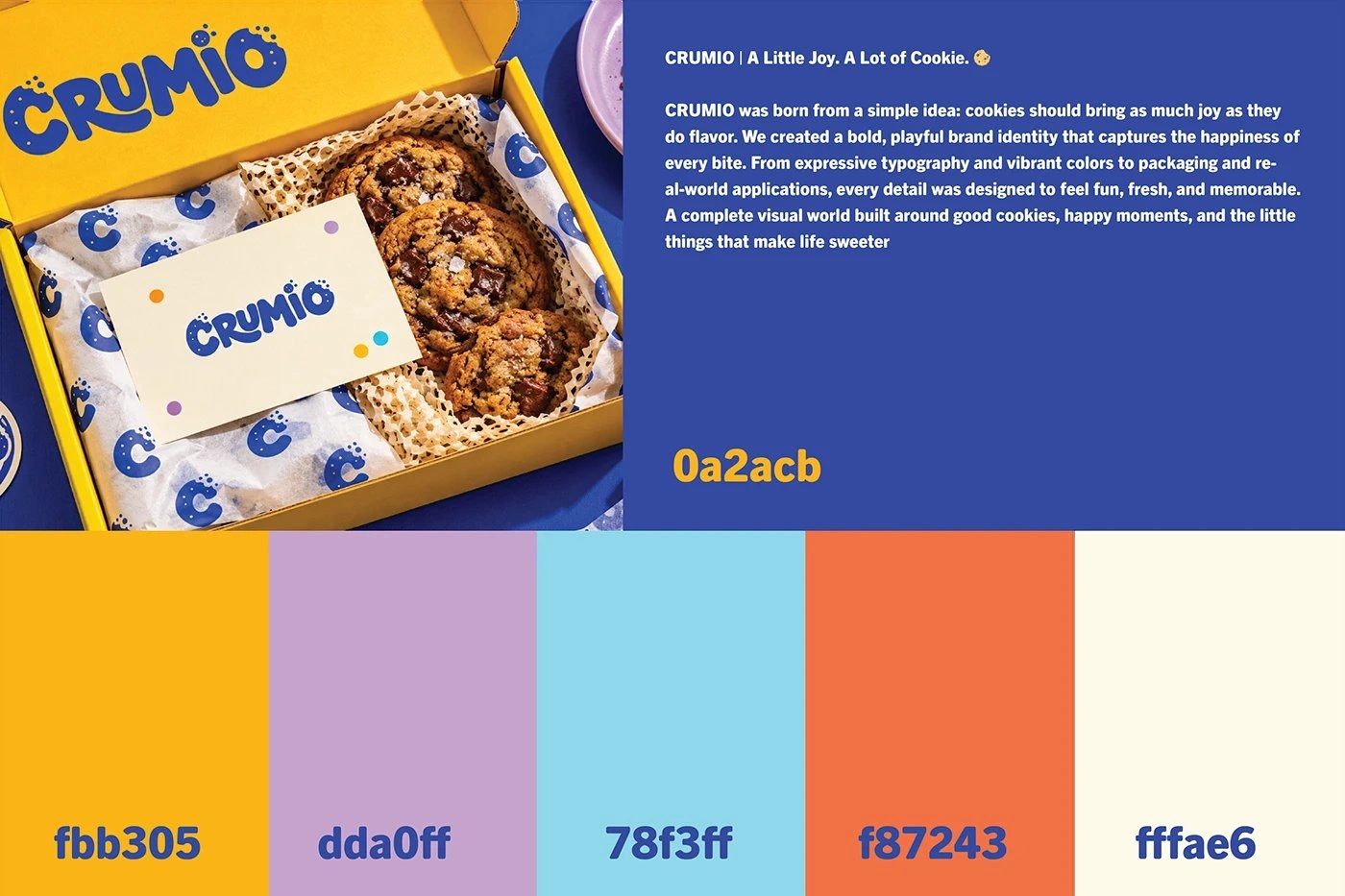
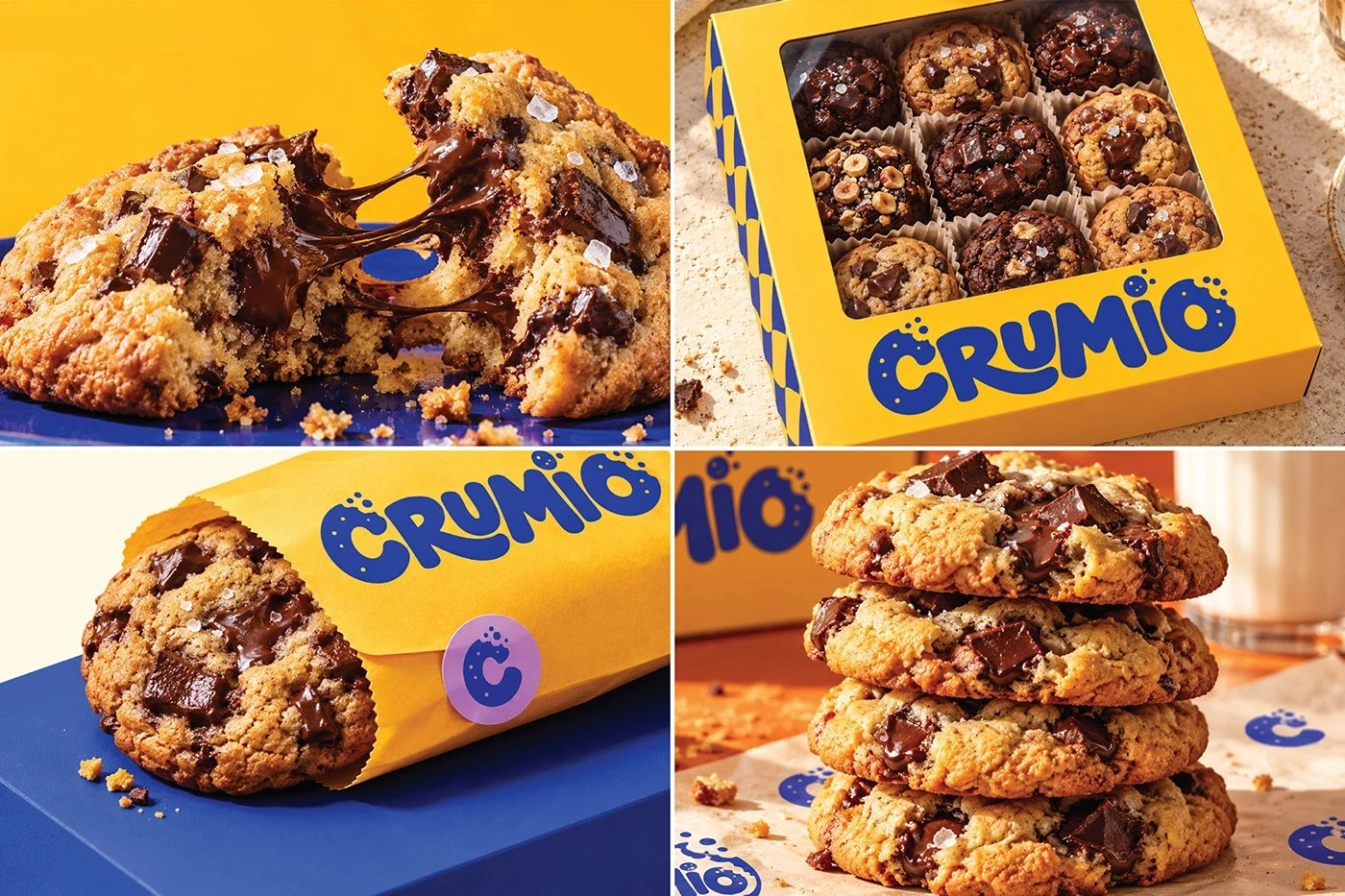
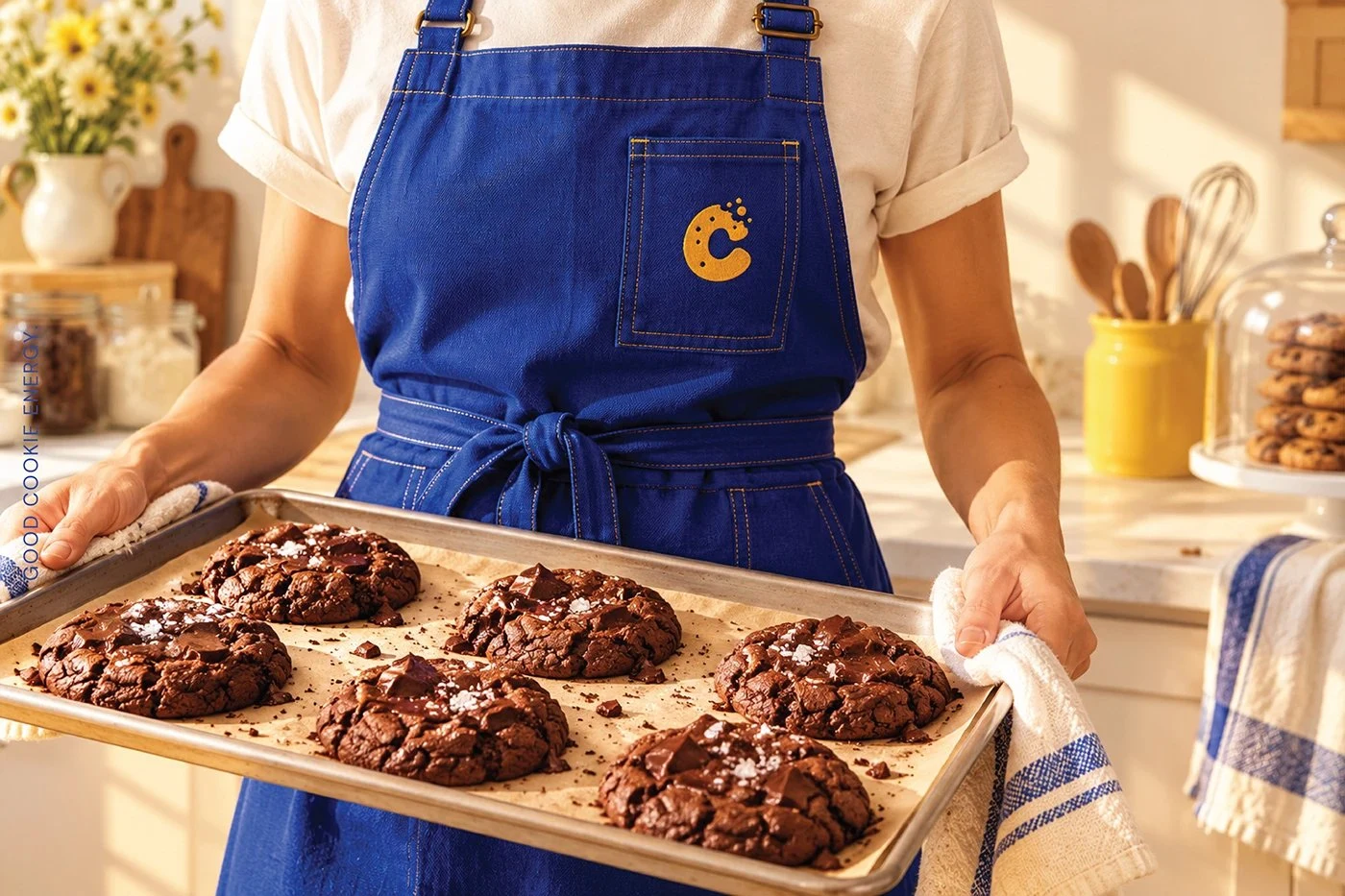
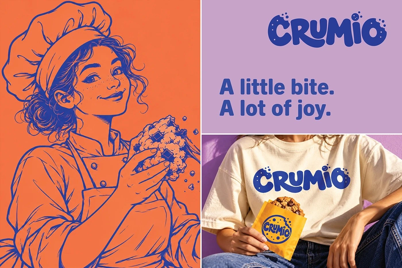
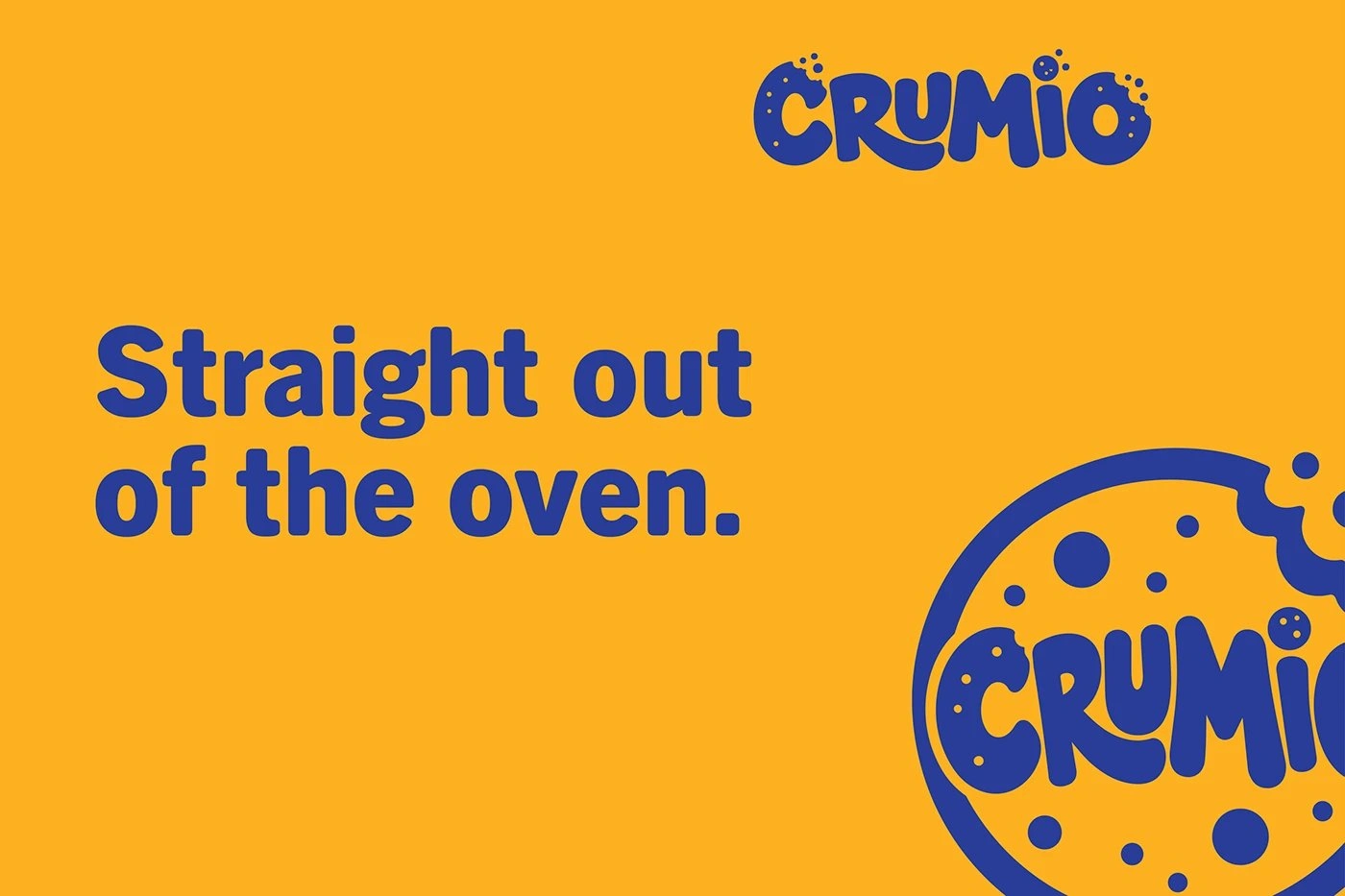
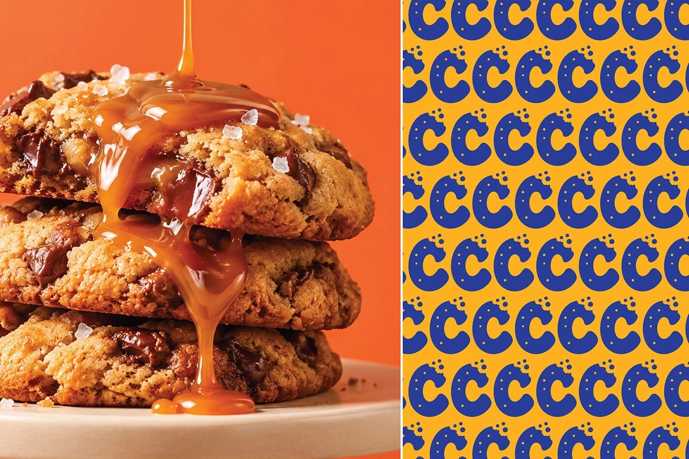
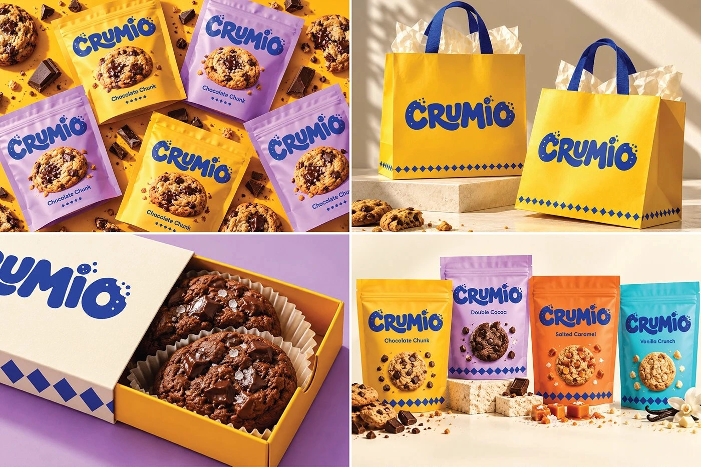
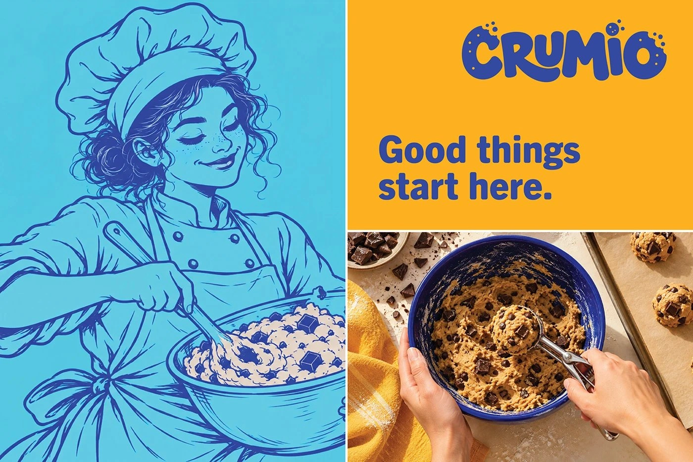
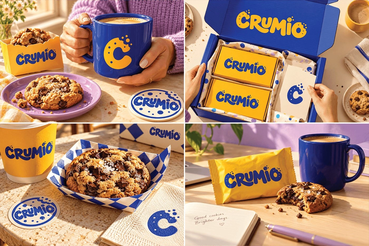
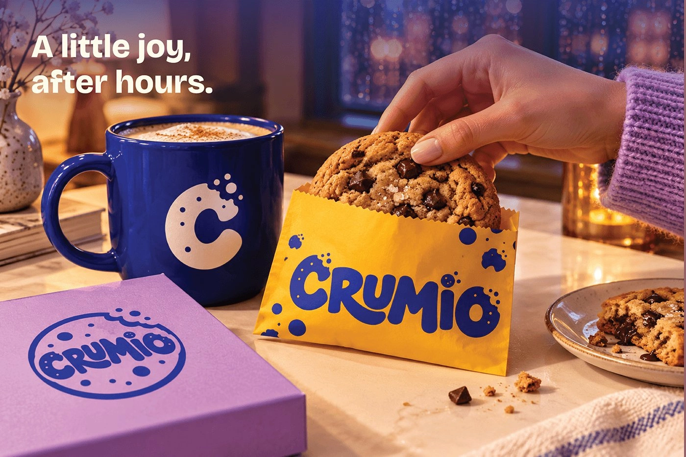
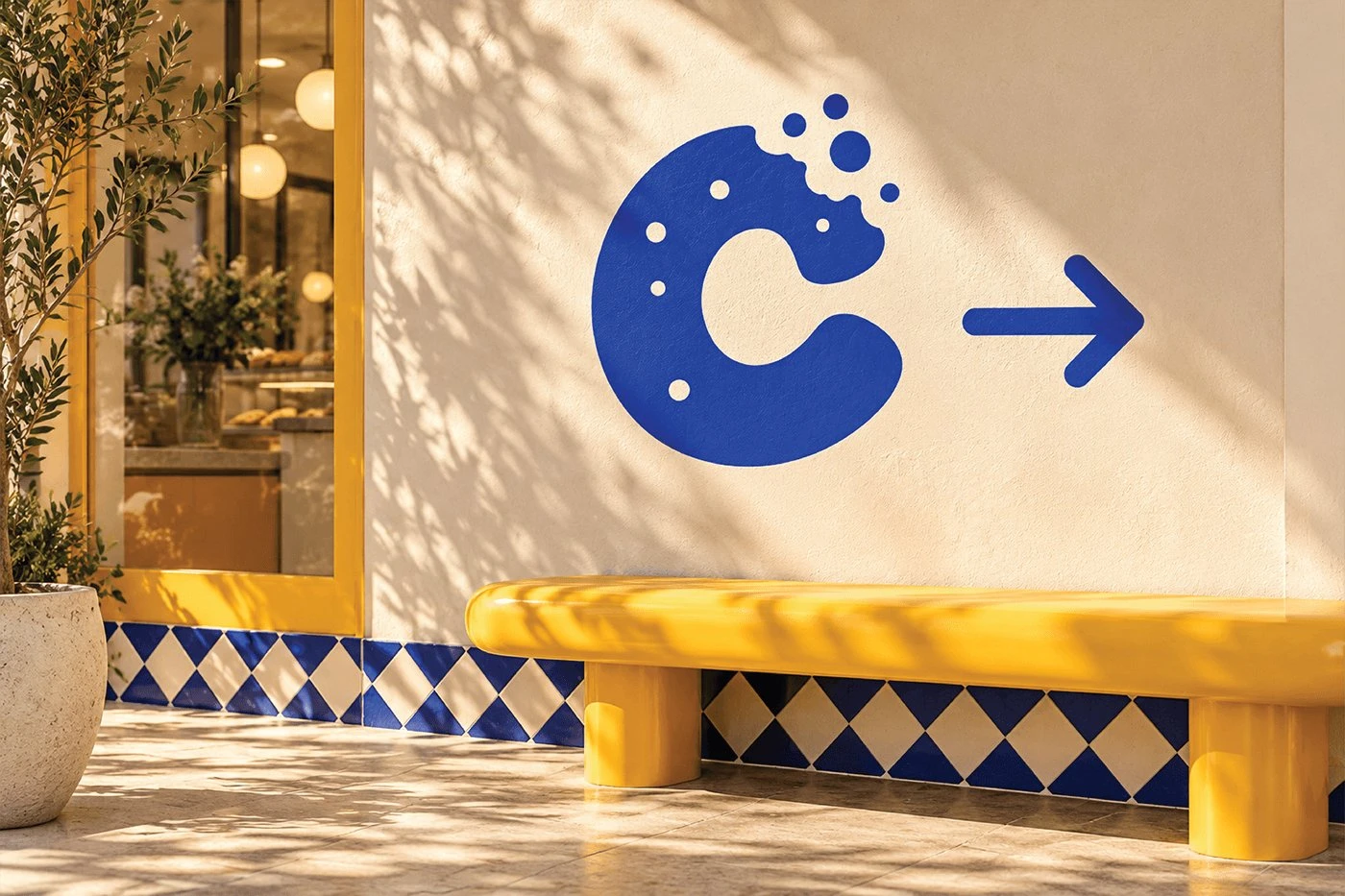
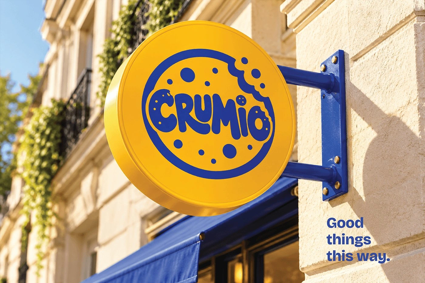
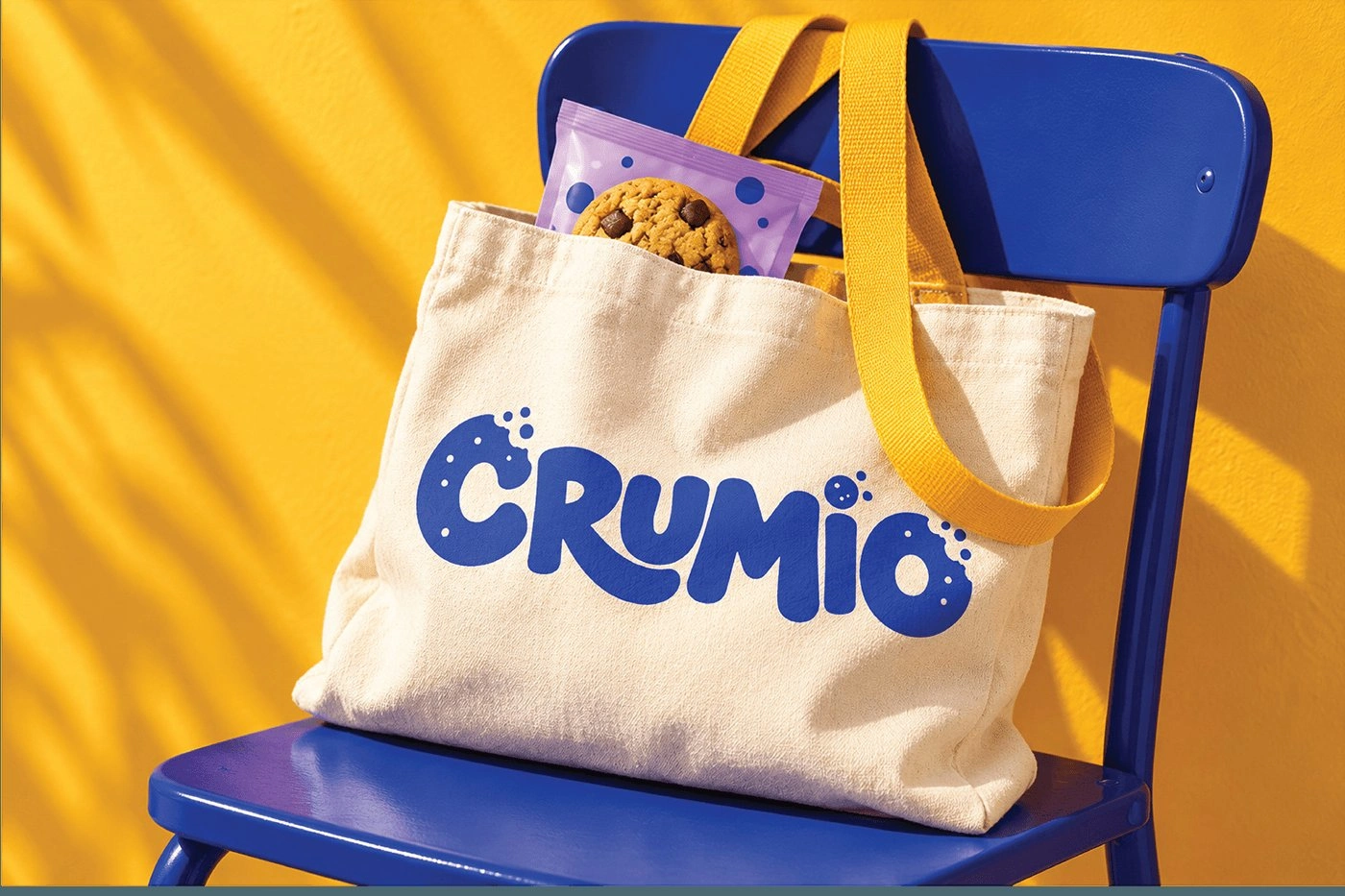
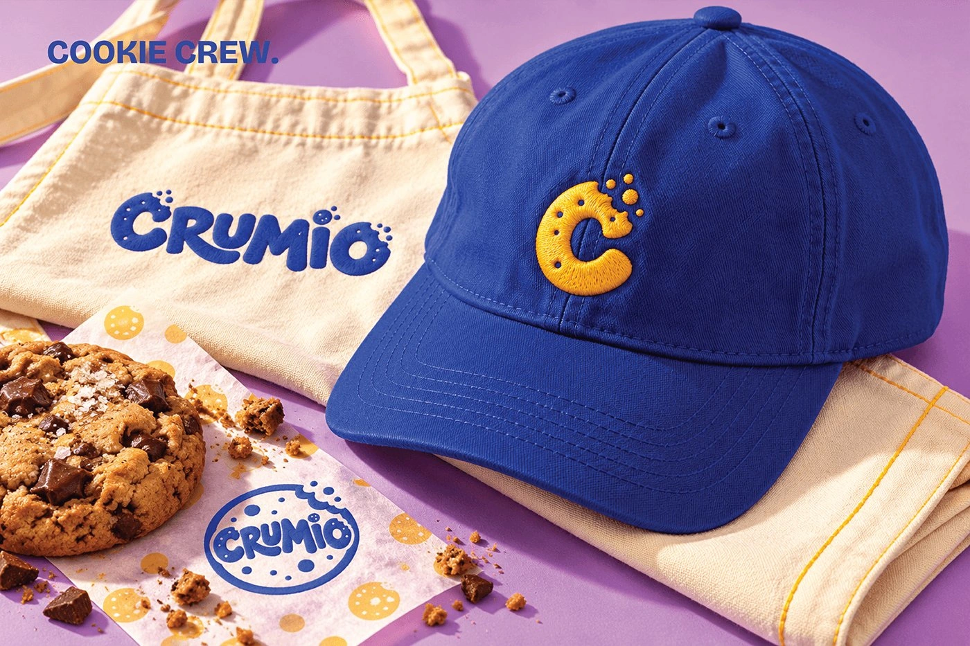
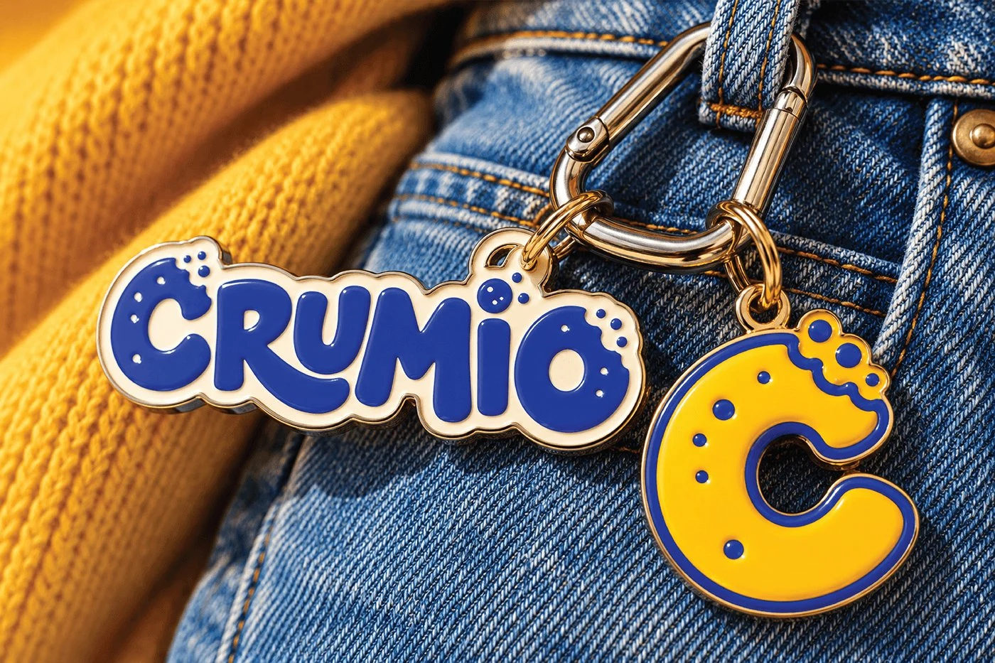
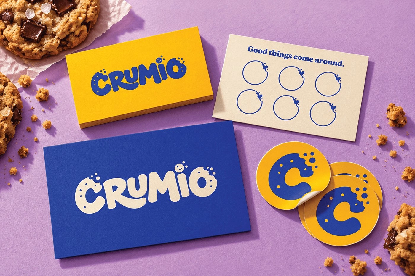
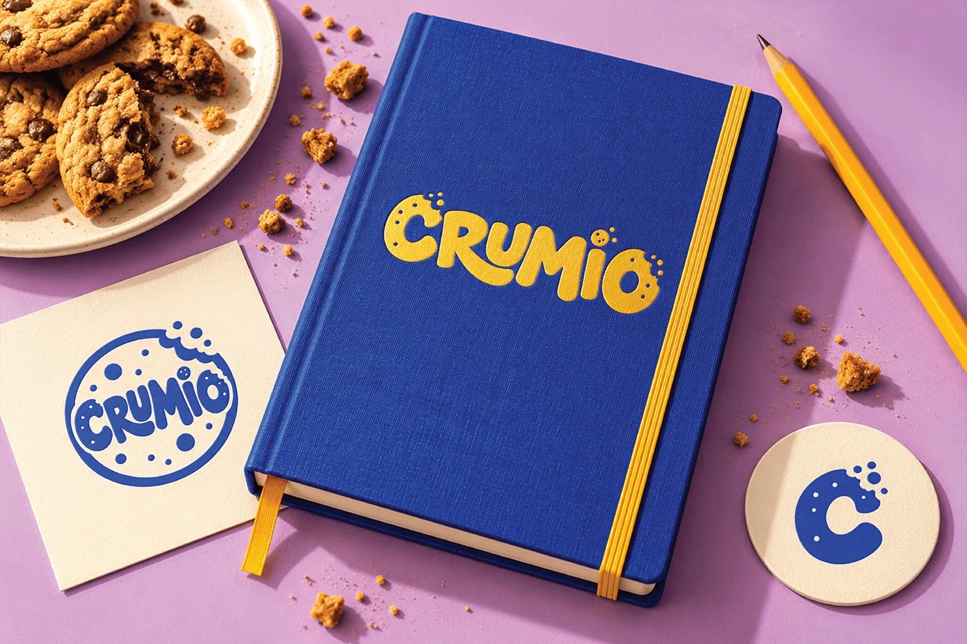
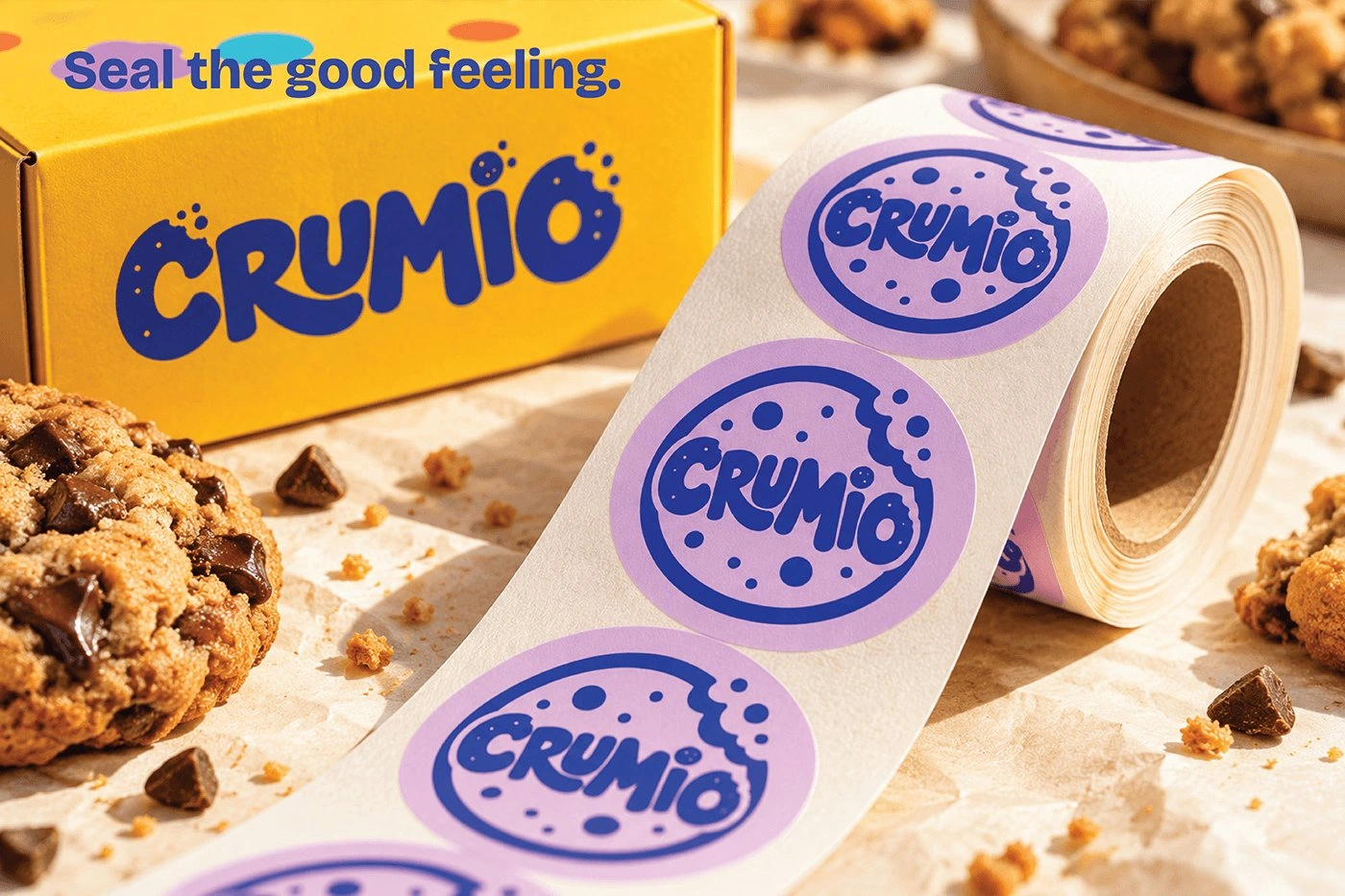
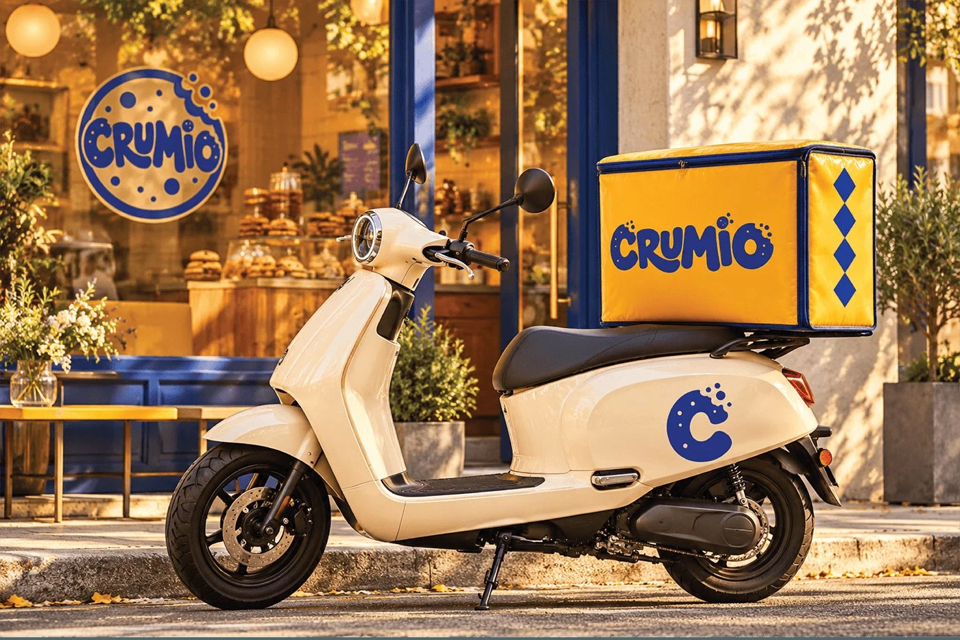
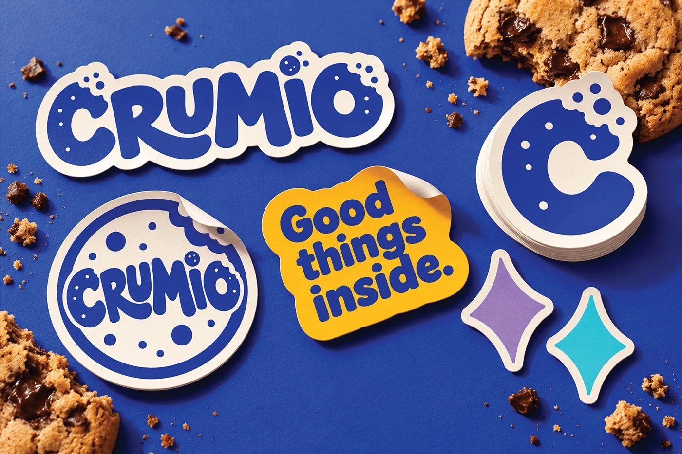
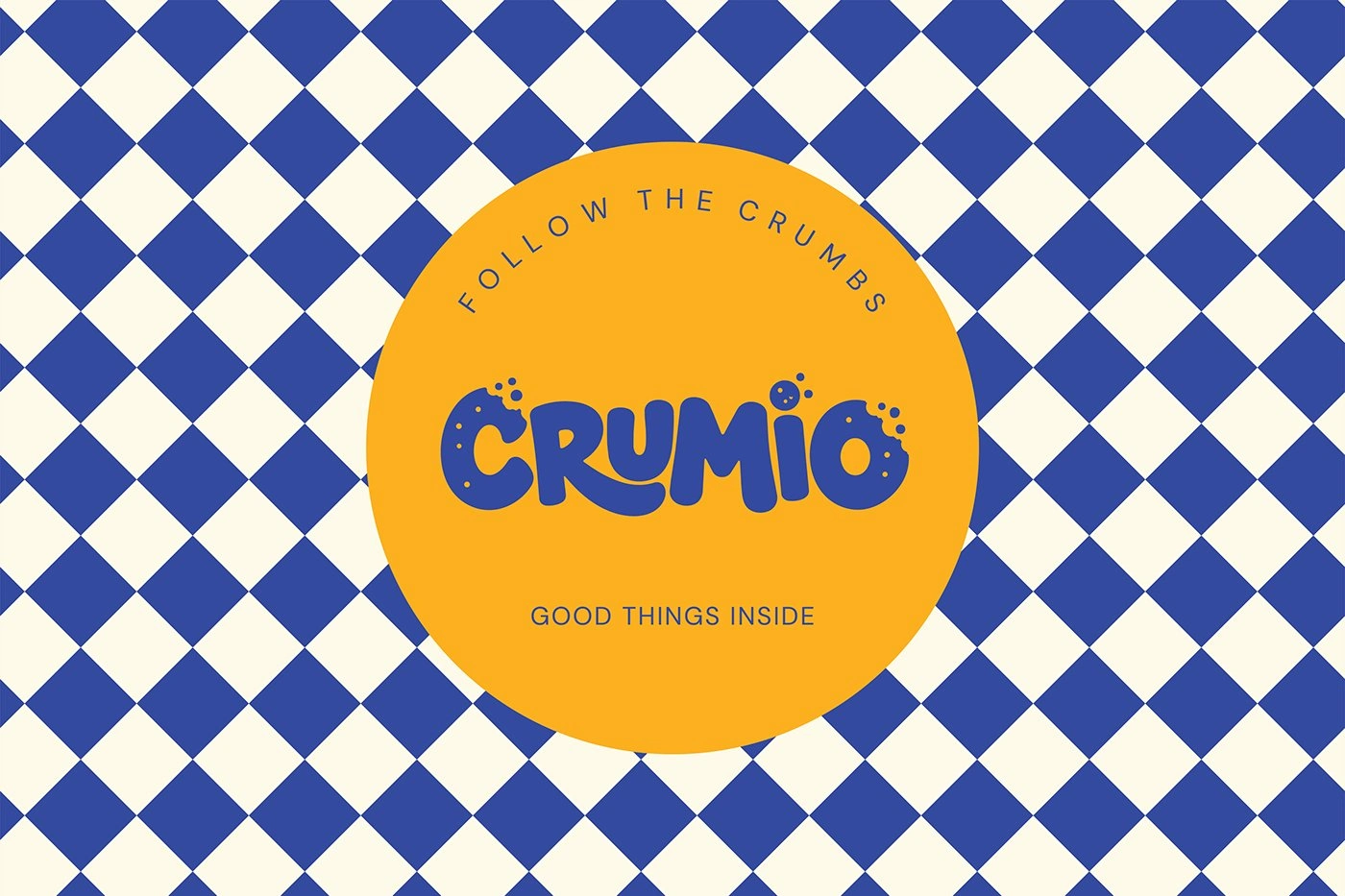
The work starts from the bite: a bold wordmark with a bitten edge, joined by a short CRUM signature, a circular bitten-cookie seal, and a bitten C letter mark, so the brand has a full family of marks for every size and surface. A vibrant palette of yellow, lilac, light blue, orange, and cream keeps the system bright and warm, and a friendly chef illustration adds character across the range. The same marks, colours, and illustration run through every application after this point, from the pouch and gift box to the storefront and scooter.
Project scope
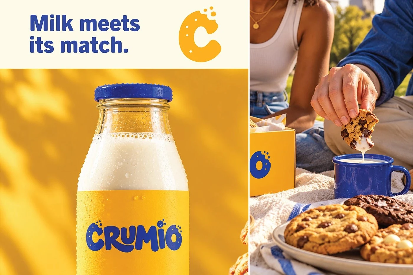
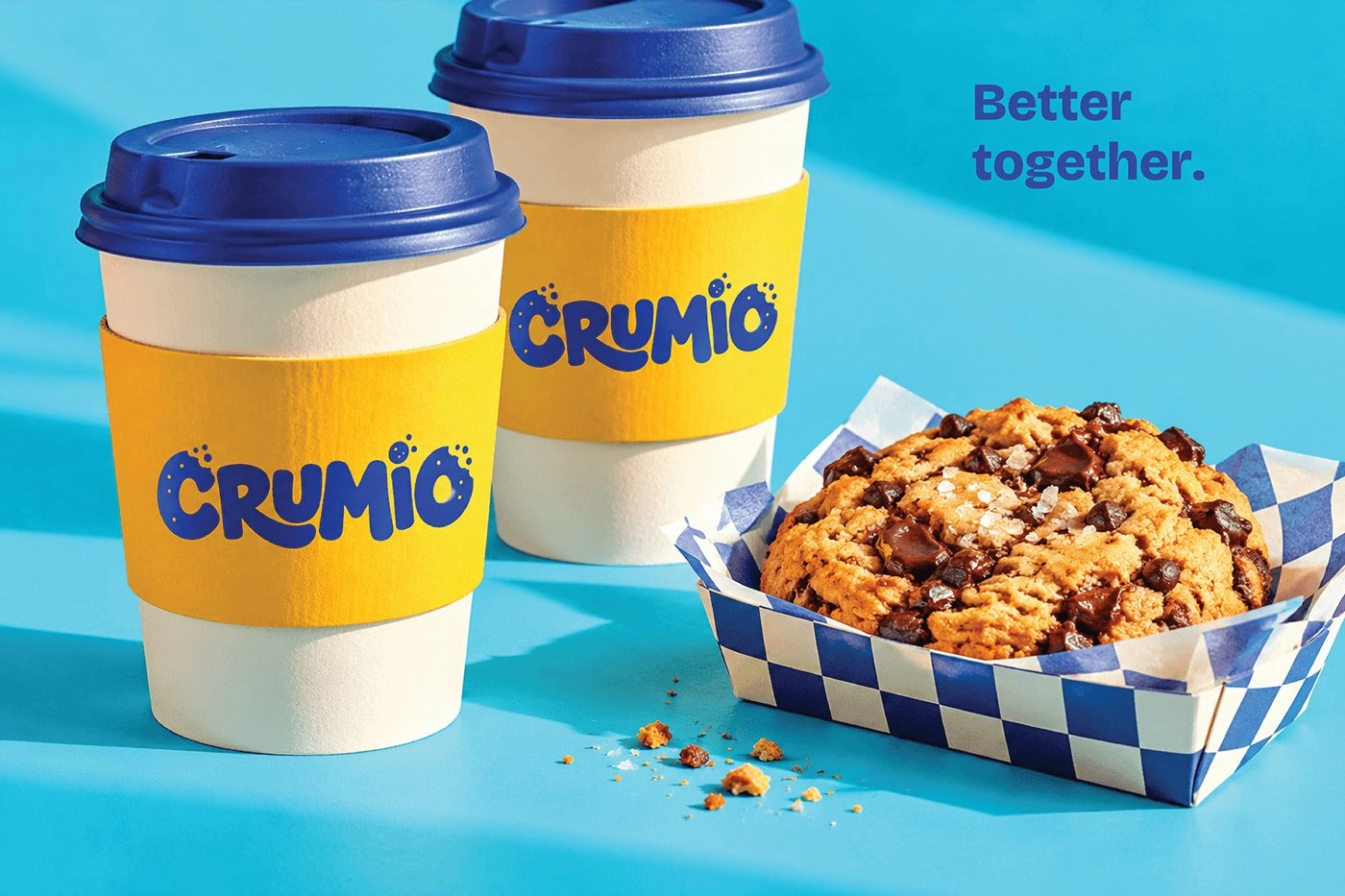
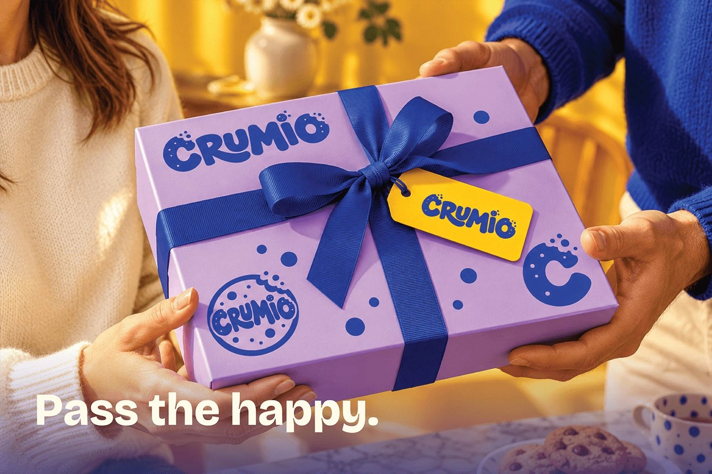
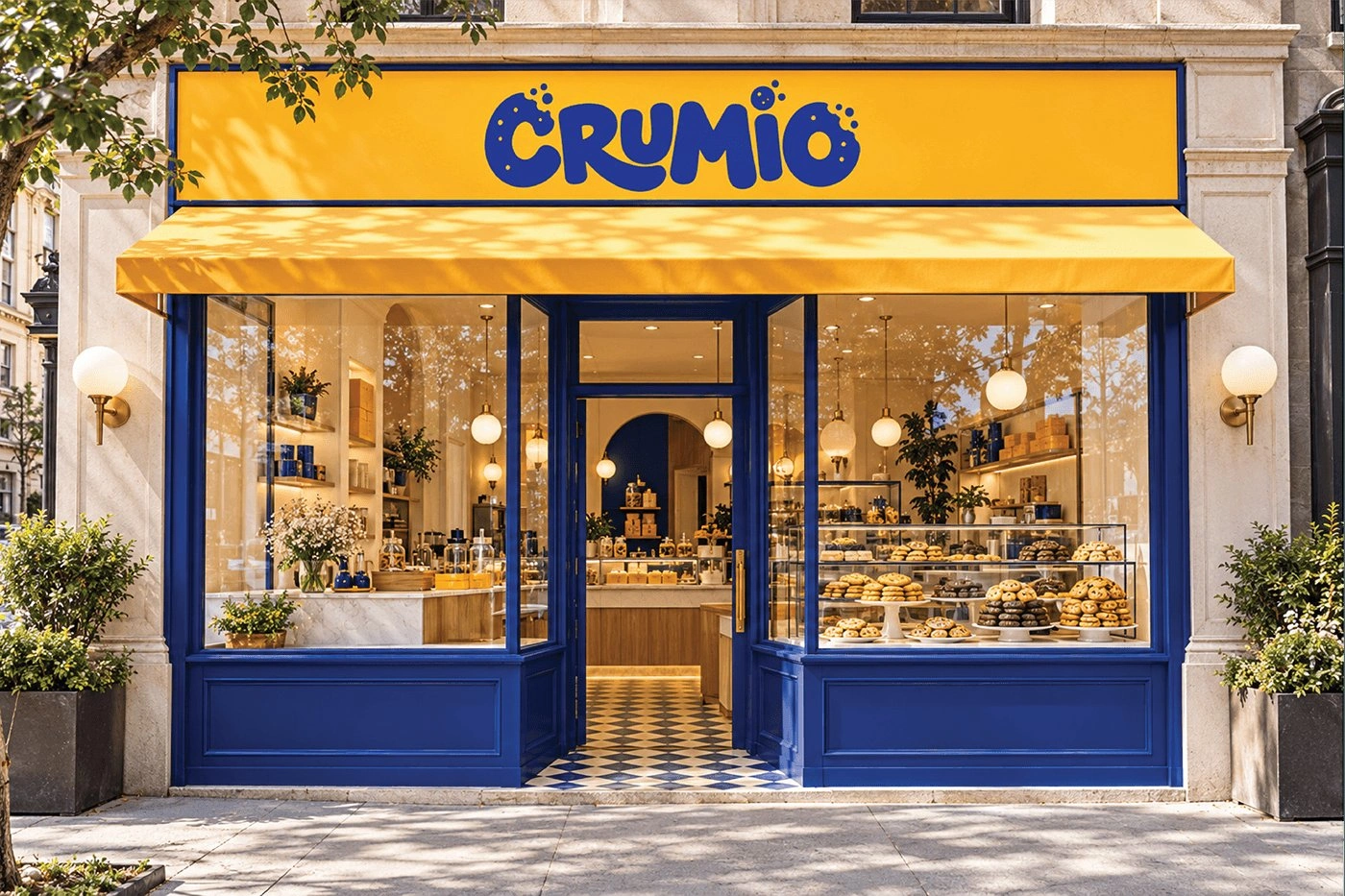
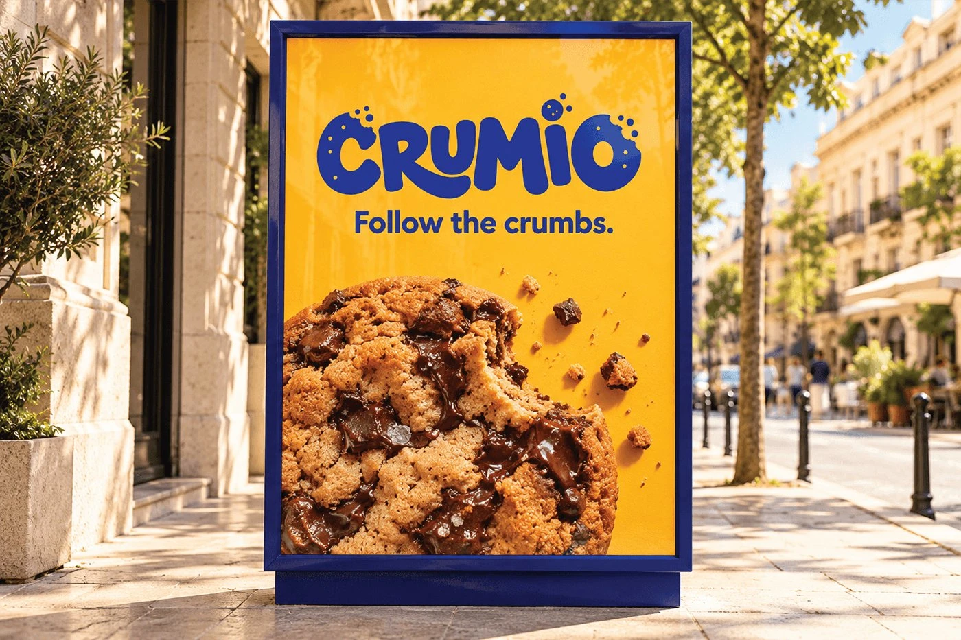
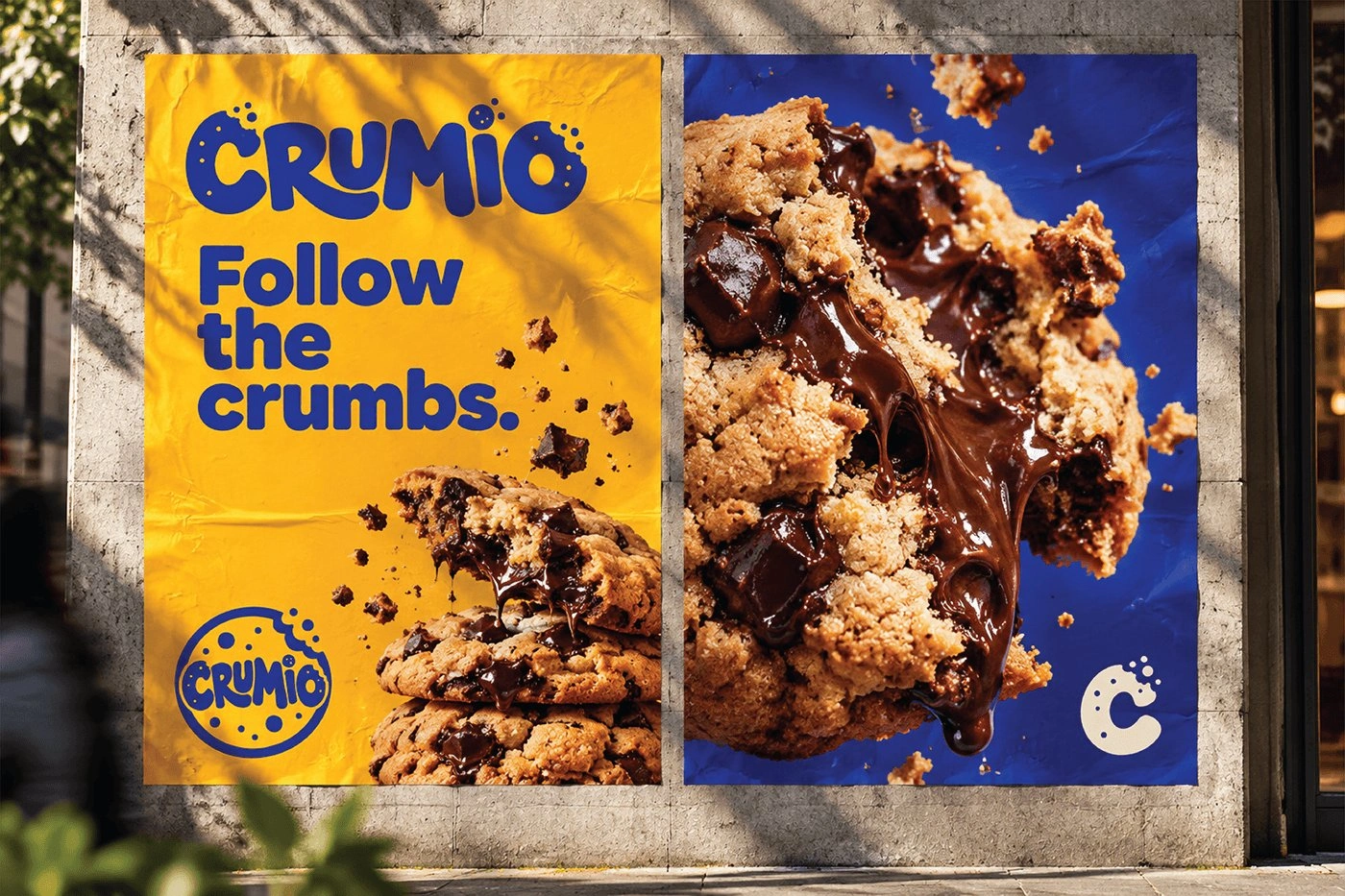
Logo design, visual identity system, and packaging and application design, covering the wordmark, seal, and letter mark, colour system, pouches, boxes, gift sets, shopping bags, cups, stickers, merchandise and crew apparel, storefront and interior, delivery, posters, and stickers. Designed in Adobe Illustrator, InDesign, and Photoshop.
Final deliverables
A complete identity and packaging package for Crumio: the bitten-cookie wordmark, CRUM signature, seal, and C letter mark, the visual identity system with colour, and a full set of applications across pouches, boxes, gift sets, merchandise, storefront, delivery, posters, and stickers. The images above show the system applied, from the pouch in hand and the shop interior to the poster on the street.
Like this project
Posted Oct 16, 2026
CRUMIO cookie brand identity and packaging design: playful bitten-cookie logo, bold typography, vibrant packaging system, storefront and merchandise.