The network for creativity
Join 1.25M professional creatives like you
Connect with clients, get discovered, and run your business 100% commission-free
Creatives on Contra have earned over $150M and we are just getting started
Back to feedPost

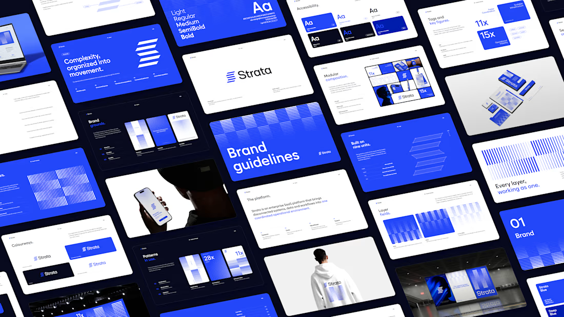
Enterprise software is rarely simple. Its brand shouldn’t add to the noise.
I’ve put together the brand guidelines for Strata, an enterprise SaaS platform that connects fragmented systems, data, workflows and teams in one coordinated environment.
The system runs on one idea: every layer, working as one.
Logo: five horizontal layers, each distinct, sharing one structure and direction, forming a subtle S
Colour: STRATA Blue for intelligence and forward movement, a refined near-black for authority, and generous white space for clarity
Layout: modular grids, strong alignment and clear hierarchy, so complex information stays readable
Complex platforms don’t need to look simpler. They need to look in control.
If you’re building a B2B platform and need a brand that makes complexity feel organized, let’s talk.
#brandidentity #logodesign #saasbranding #brandguidelines


The network for creativity
Join 1.25M professional creatives like you
Connect with clients, get discovered, and run your business 100% commission-free
Creatives on Contra have earned over $150M and we are just getting started











Related posts

Brand Expressions -- Olivir



Thats so crazy!!!!!! Seeing this I feel we humans are still far better than AI

A little peek at the brand work we did for Elio Mortgage.
A warm, approachable identity full of warm vibrant colors paired with soft sun rising inspired gradients, inner glows and custom illustrations & more. Loved this direction!
Full case study coming soon, from process to final identity.
Plenty of logo explorations to share too!


That color palette takes the whole identity to a different level!! I loove it.

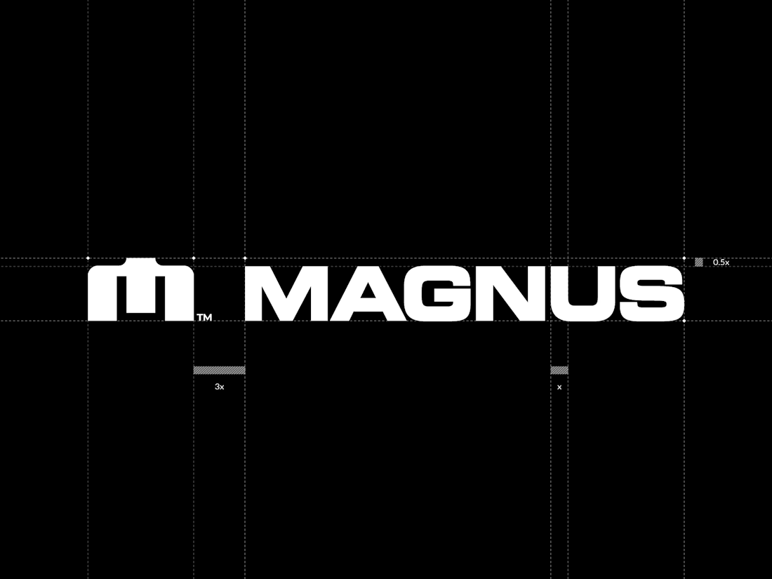
Every gap measured. A recent brandmark and logotype for Magnus, shown on the lockup construction grid. Precision and geometry are my thing :)

Great logo your work accuracy make unbelievable 🔥😎
Great job Pawel❤️