
Web Developer-Shopify, Webflow & Custom Builds That Converts
- $100k+
- Earned
- 23x
- Hired
- 5.0
- Rating
- 135
- Followers
Web Developer-Shopify, Webflow & Custom Builds That Converts
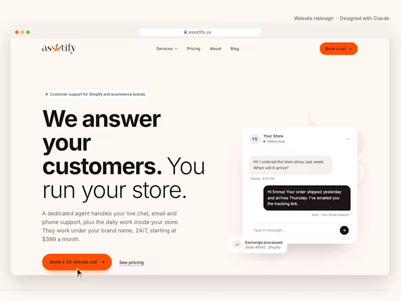
Assistify — Website Redesign
Wow. I tried designing with Claude for the first time, and I'm honestly in awe.
I redesigned the website for Assistify, my customer support and store management company for Shopify brands. In one evening, I went from "everything is wrong with this site" to 8 finished pages: a homepage, four service pages, About, Contact and Blog.
What I love about it:
• Clean, minimal layout with lots of white space, built on our own brand colors
• Subtle animations: a live chat demo, an inbox that clears itself, a phone call that connects
• Interactive sections, like a coverage-hours picker and a booking card
• Plain, honest copy that actually explains what we do
• Fully responsive on mobile
It also gave me a developer-ready package with clean HTML, CSS and JavaScript, so the build can start right away.
As someone who makes websites for clients, this changes how I'll start every project.
Web design · UI/UX · Website redesign · Shopify customer support.
1
2
141


Product Launch Videos for Startups!



Brand Identity, Web Design & AI-Powered SaaS Solutions
- 5.0
- Rating
- 56
- Followers
Brand Identity, Web Design & AI-Powered SaaS Solutions


SaaS Explainer Video | Product DEMO Video | Motion Graphics
- $1k+
- Earned
- 3x
- Hired
- 5.0
- Rating
- 19
- Followers
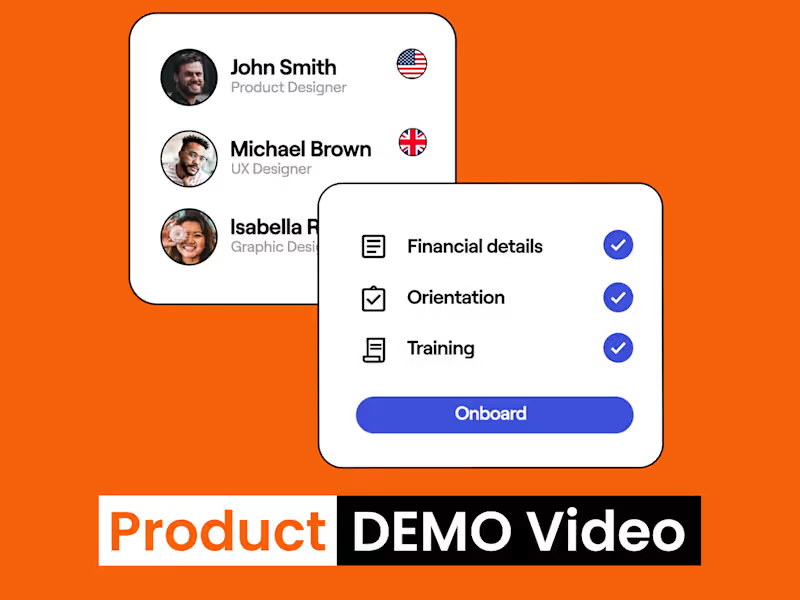
SaaS Explainer Video | Product DEMO Video | Motion Graphics



Software & Blockchain Engineer | AI, Web & Mobile Apps
- 5.0
- Rating
- 10
- Followers
Software & Blockchain Engineer | AI, Web & Mobile Apps
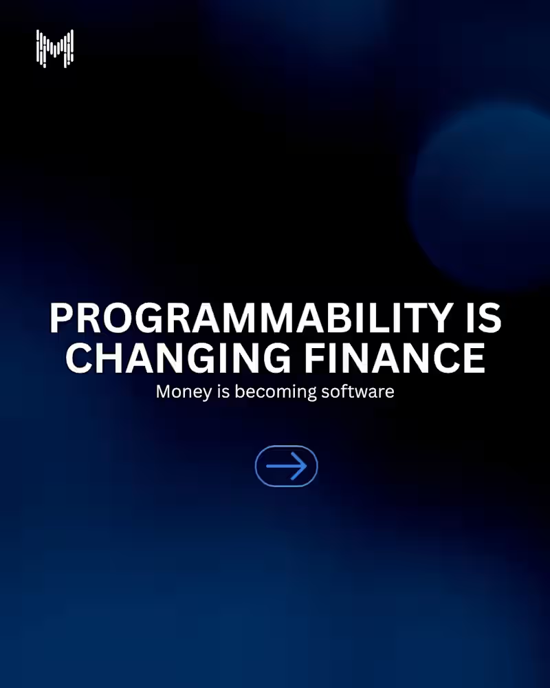
For decades, finance has relied on paperwork, intermediaries, and manual processes.
Today, programmable finance is changing the equation.
Through smart contracts and blockchain technology, financial products can execute automatically, enforce rules transparently, and interact with other systems in real time.
The future of finance isn't just digital.
It's programmable.
#ProgrammableFinance #Blockchain #Web3 #DeFi #SmartContracts #Fintech #DigitalAssets #BlockchainTechnology #FutureOfFinance #MkaitsTechnologies
3
446
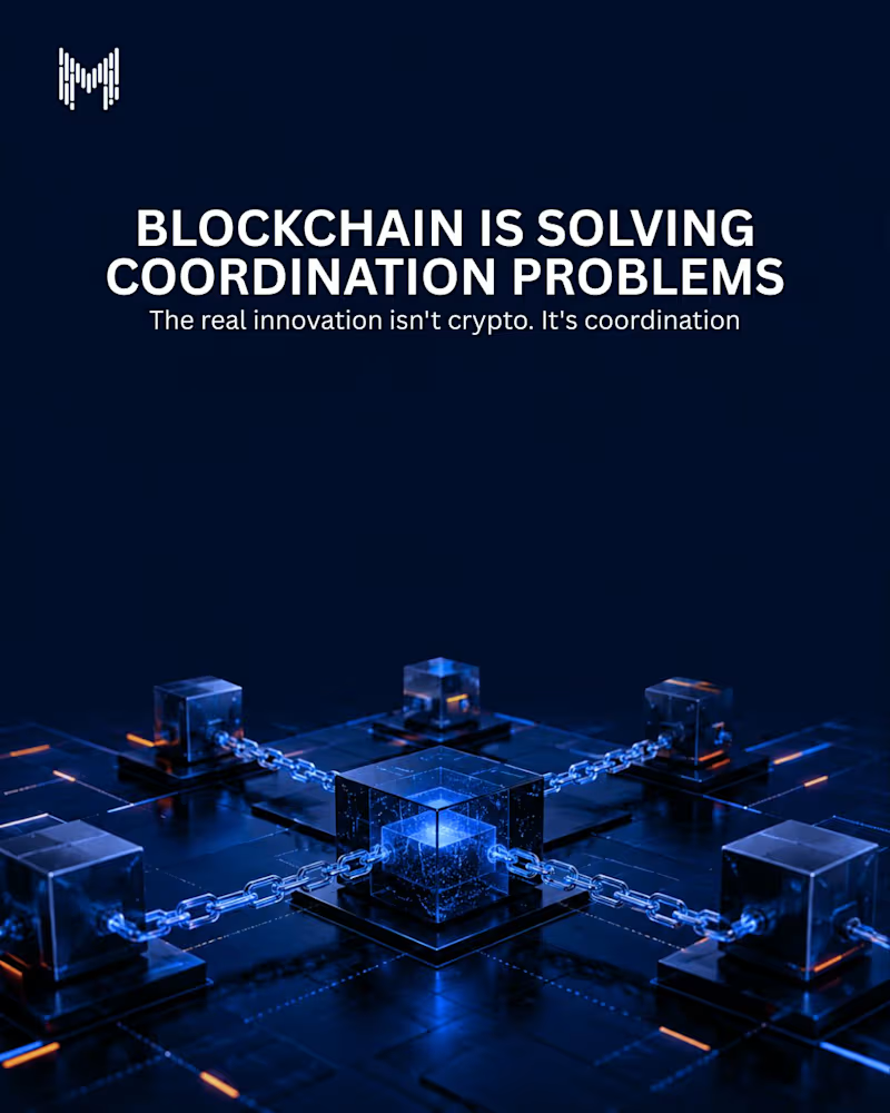
Most business challenges don't come from a lack of information.
They come from multiple parties trying to share, verify, and act on that information efficiently.
That's where blockchain changes the game.
By creating a shared, transparent, and tamper-resistant source of truth, blockchain reduces friction, eliminates unnecessary intermediaries, and enables faster collaboration across organizations.
The biggest opportunity in blockchain may not be digital assets.
It may be solving coordination at scale.
#Blockchain #Web3 #BlockchainTechnology #DigitalTransformation #SmartContracts #Innovation #EnterpriseTechnology #DigitalTrust #FutureOfBusiness #MkaitsTechnologies
3
270
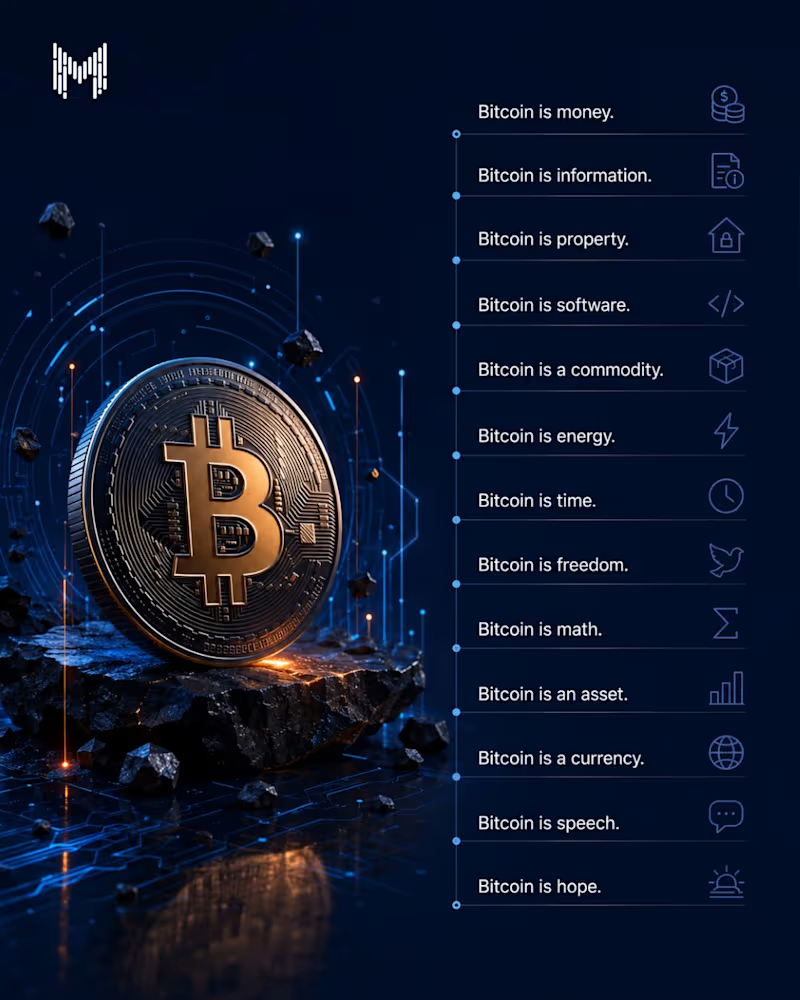
Bitcoin is more than a cryptocurrency. It’s a new way of thinking about value.
Unlike traditional money that can be created by central authorities, Bitcoin operates on open-source code, cryptography, and a decentralized network that anyone can verify. With a fixed supply of 21 million coins, scarcity is built into its design not decided by policy.
That’s why Bitcoin is described in so many ways.
Bitcoin is money because it can be transferred globally.
Bitcoin is property because you can truly own it.
Bitcoin is software because it exists as open-source code.
Bitcoin is math because cryptography secures every transaction.
Bitcoin is an asset because people store value in it.
Bitcoin is a currency because it enables peer-to-peer payments.
Bitcoin is information because every transaction becomes part of a transparent ledger.
Bitcoin is freedom because participation doesn’t require permission.
To some, Bitcoin is digital gold. To others, it’s a savings technology, a payment network, or simply a hedge against inflation.
Whether you’re optimistic or skeptical, one thing is undeniable: Bitcoin has sparked a global conversation about what money can be in a digital world.
3
370

Websites, apps & dashboards that convert, not just impress
- 5.0
- Rating
- 33
- Followers
Websites, apps & dashboards that convert, not just impress
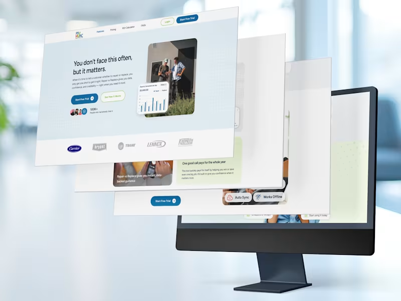
Repair vs Replace
Landing Page Design for P3 HVAC Software’s Standalone Decision
Tool
That single line, the hero headline of the Repair vs Replace landing page, does more work than most paragraphs. It names the emotional reality of the HVAC technician’s most difficult conversation: the one where a homeowner needs to decide whether to spend money repairing a system that might fail again, or invest in a replacement they’re not sure they can afford. My job was to build a page around that moment.
PROBLEM: The Rare Conversation That Has to Go Right
Repair vs Replace is not a decision that comes up on every job. It’s not even one that comes up every week. But when it does arise, when a homeowner’s 12-year-old unit stops working mid-July and a technician is standing in their living room with a diagnostic result in hand, that conversation is everything. Get it wrong and the technician looks like they’re upselling. Get it right and they become the most trusted person in the room.
The challenge the landing page had to solve was communicating all of that in a product that most technicians would need exactly once every few months.
SOLUTION: Every Section Answers a Question the Visitor Is Already Asking
The design philosophy for this landing page was built on a simple premise: a visitor reading down the page is having a silent conversation with the product. Each section needed to answer the next most likely question in their mind before they consciously formed it. The page was structured as a continuous argument, not a collection of sections.
MY IMPACT: What I Contributed to This Project
My work on this project spanned the full design lifecycle of the landing page, from initial layout strategy and content hierarchy through to the final, handoff-ready UI.
What this project taught me: Designing for a low-frequency, high-stakes use case is a genuinely different discipline from designing for a tool people use every day. When a visitor arrives knowing they won’t use the product often, every section of the page has to work harder to answer the implicit question: “is this really worth it for the three times a year I’ll need it?” The design answer is to make the value of those three moments feel so large that the monthly fee becomes irrelevant. That framing drove almost every layout decision I made on this project.
0
106

Product Designer for SaaS & MVPs

Branding | Brand Identity | Website
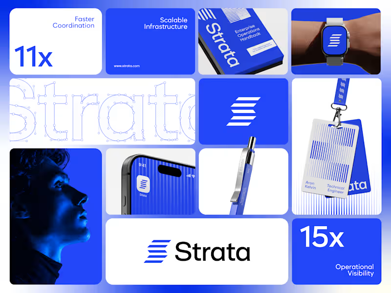
Strata’s brand runs on one colour, one shape and one rule. Restraint was the strategy.
I designed the brand identity for Strata, an enterprise SaaS platform that connects fragmented systems, data, workflows and teams. A product that removes chaos can’t have a chaotic brand, so every element earns its place: “Every layer, working as one.”
One shape: Five horizontal layers forming a subtle S. It works as the logo, a pattern and a rhythm for layouts.
One colour: Strata Blue #2447F9, carried by near-black and white. Solid only, never a gradient.
One rule: Complexity, organized into movement. If a layout feels busy, it’s wrong.
Structure: Modular grids, strong alignment and architectural spacing across every surface.
Imagery: Single-colour portraits in Strata Blue, so even the photography follows the system.
Fewer elements, used with discipline, scale further than more elements used loosely.
If your enterprise SaaS company needs a brand that stays consistent as it grows, let’s talk.
#VisualIdentity #SaaSBranding #B2BBranding #BrandDesign
1
109
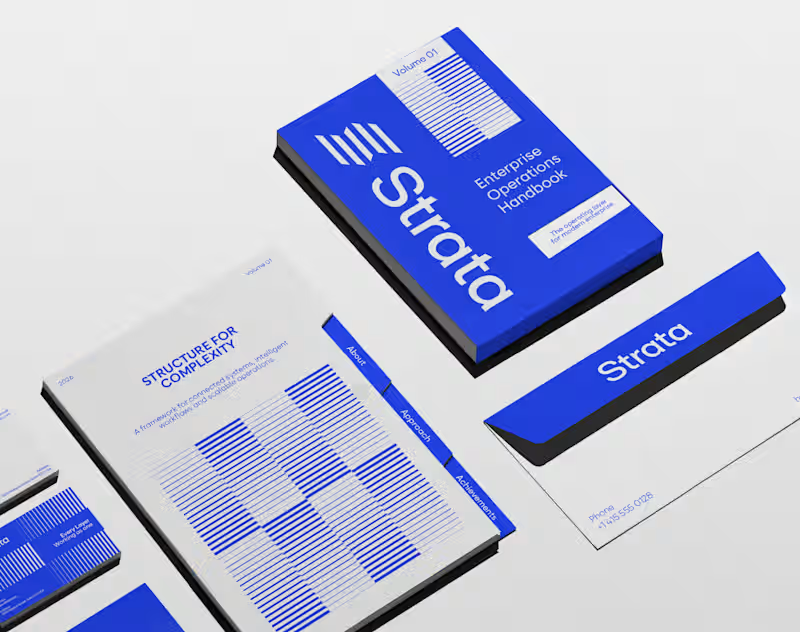
In geology, strata are layers laid down over time, each one holding the rest. That’s exactly what an enterprise platform should feel like.
I designed the brand identity for Strata, a SaaS platform that connects fragmented systems, data, workflows and teams. The name already carried the idea, so the identity makes it visible: “Every layer, working as one.”
Logo: Five stacked layers forming a subtle S, solid like rock and arranged for motion.
Principle: “Complexity, organized into movement” turns a dense product story into something calm.
Palette: Strata Blue #2447F9, near-black #02040C and white. Flat colour only, so every layer stays distinct.
Layout: Modular grids and architectural spacing that build pages the way strata build ground, in order.
Imagery: Portraits washed in Strata Blue, with light streaming through, putting people at the centre of the system.
A good name sets up the brand. The identity has to prove it.
If your SaaS or B2B platform needs a brand as solid as its infrastructure, let’s talk.
#BrandIdentity #SaaSBranding #TechBranding #LogoDesign
3
170
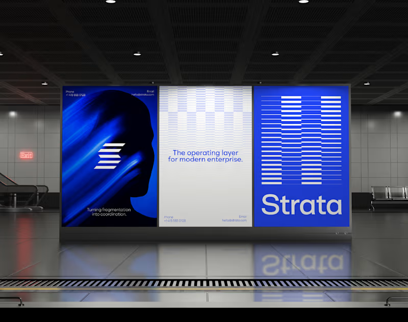
Every integration platform draws its brand from nodes and connecting lines. Strata is built from layers instead.
I designed the brand identity for Strata, an enterprise SaaS platform that unifies fragmented systems, data, workflows and teams. Its products sit on top of each other and work together, so the brand does the same: “Every layer, working as one.”
Mark: Five horizontal bars that read as a subtle S. Each one is a system, and the stack is the platform.
Wordmark: Clean and open beside the mark, letting the layers do the talking.
Strata Blue #2447F9: One confident colour with near-black and white. No gradients, no noise.
Grid: Modular, strongly aligned and spaced like architecture, because enterprise buyers trust structure.
Campaign imagery: Blue-washed portraits with light moving through, showing complexity becoming movement.
Structure is the feature enterprise buyers can see first.
If your B2B tech company needs an identity that makes its platform feel organized at a glance, let’s talk.
#SaaSBranding #VisualIdentity #EnterpriseBranding #LogoDesign
2
112
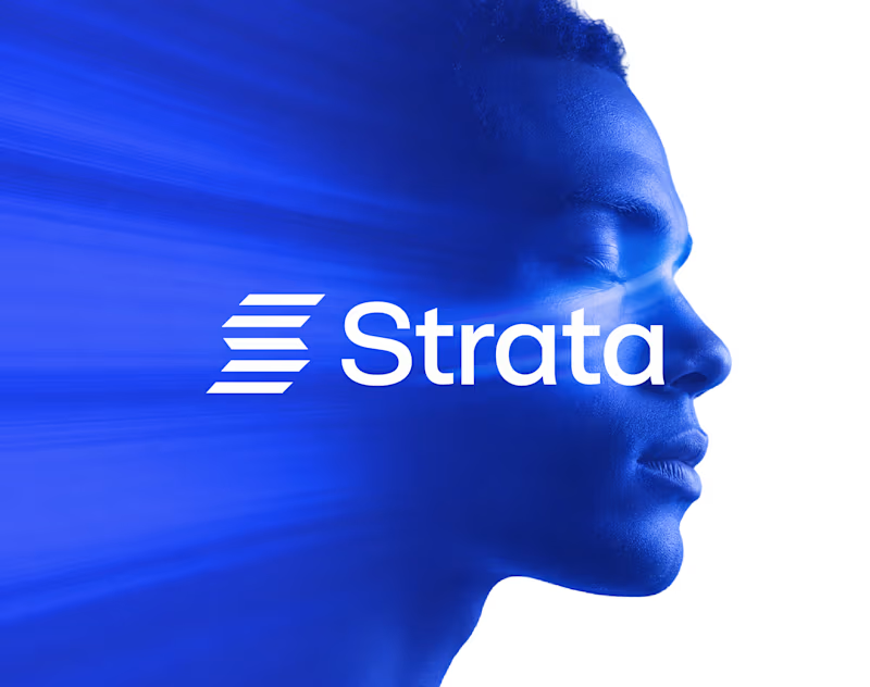
Enterprise software is rarely complex because of one system. It’s complex because nothing talks to anything else.
I designed the brand identity for Strata, an enterprise SaaS platform that connects fragmented systems, data, workflows and teams. The idea: “Every layer, working as one.”
Logo: Five horizontal layers stacked into a subtle S, separate parts moving as one structure.
Principle: “Complexity, organized into movement” shapes every layout decision.
Colour: Strata Blue #2447F9 with near-black and white. Solid colour only, no gradients, so it reads as clarity.
System: Modular grids, strong alignment and architectural spacing, so every surface feels engineered.
Imagery: Human portraits in Strata Blue, a reminder that behind every workflow there are people.
The best enterprise brands make complexity feel quiet.
If your SaaS company needs a brand that makes a complex product feel simple, let’s talk.
#BrandIdentity #SaaSBranding #LogoDesign #B2BBranding
3
141