Strata’s brand runs on one

Muhammad Abdullah


Strata’s brand runs on one colour, one shape and one rule. Restraint was the strategy.
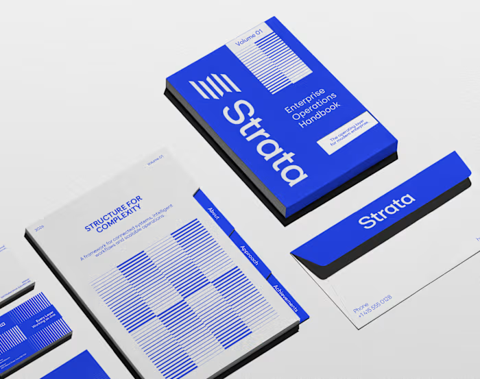
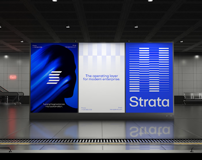
I designed the brand identity for Strata, an enterprise SaaS platform that connects fragmented systems, data, workflows and teams. A product that removes chaos can’t have a chaotic brand, so every element earns its place: “Every layer, working as one.”
One shape: Five horizontal layers forming a subtle S. It works as the logo, a pattern and a rhythm for layouts.
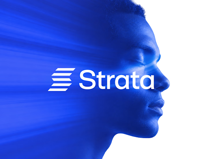
One colour: Strata Blue #2447F9, carried by near-black and white. Solid only, never a gradient.
One rule: Complexity, organized into movement. If a layout feels busy, it’s wrong.
Structure: Modular grids, strong alignment and architectural spacing across every surface.
Imagery: Single-colour portraits in Strata Blue, so even the photography follows the system.
Fewer elements, used with discipline, scale further than more elements used loosely.
If your enterprise SaaS company needs a brand that stays consistent as it grows, let’s talk.
#VisualIdentity #SaaSBranding #B2BBranding #BrandDesign
Like this project
Posted Nov 5, 2026
Strata’s brand runs on one colour, one shape and one rule. Restraint was the strategy. I designed the brand identity for Strata, an enterprise SaaS platform ...
Likes
0
Views
0