Porters Barbers Website Redesign
Koonj Imdad
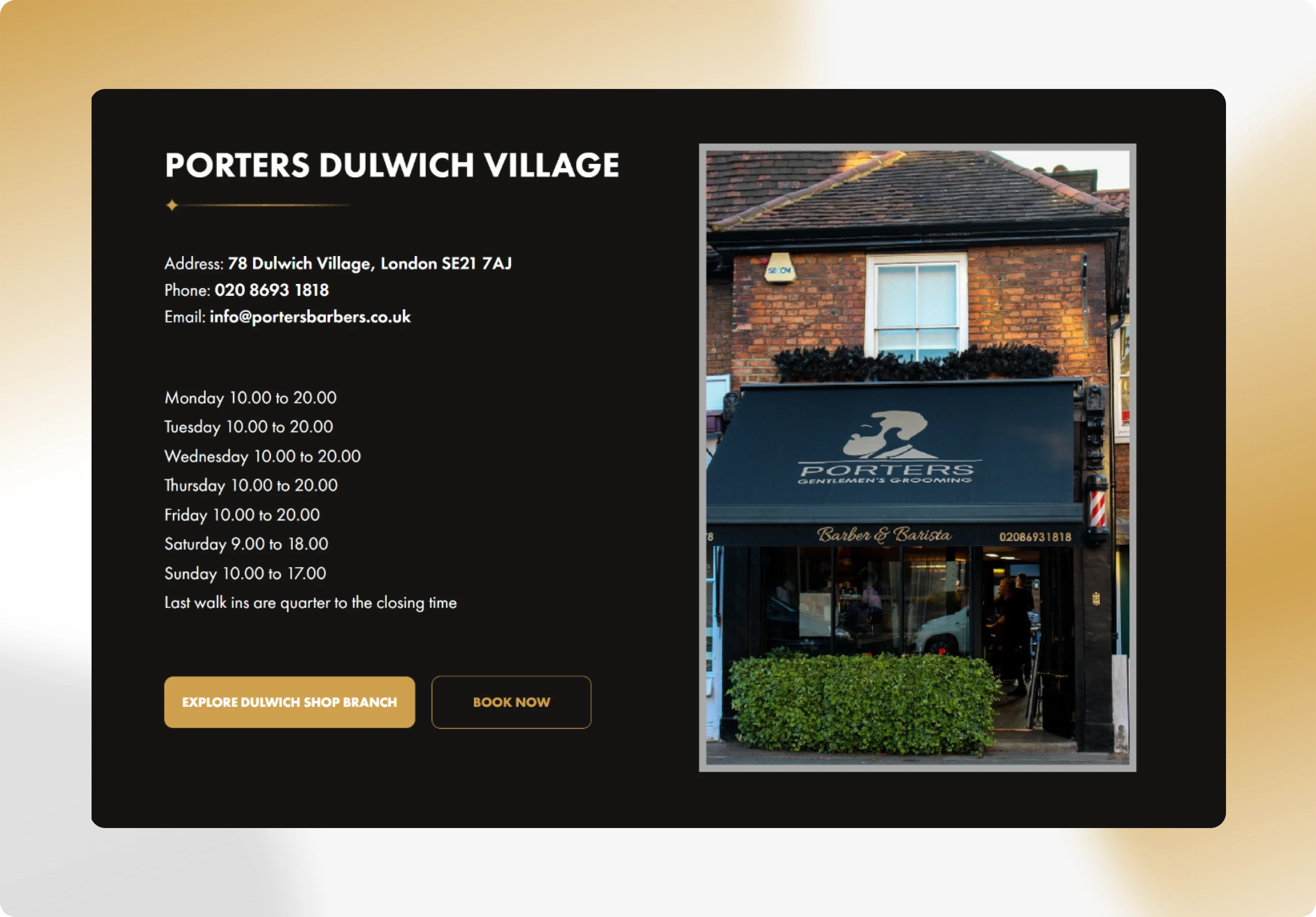
Porters Barbers
Homepage & Services Page Redesign
Premium Barbershop · Multiple Locations · London, UK
Redesigned the homepage and services page for one of South London’s most respected premium barbershops, translating a distinctive vintage-meets-modern brand identity into a digital experience that communicates luxury, builds trust, and converts first-time visitors into bookings.
About Porters Barbers
Porters Barbers is a premium men’s grooming destination operating across multiple South London locations, including Clapham, Dulwich Village, and East Dulwich. Unlike a standard walk-in barbershop, Porters positions itself as an experience; guests are welcomed with beer, coffee, tea, or scotch, seated in beautifully crafted vintage chairs, and attended to by expert barbers in an interior defined by exposed brick, antiqued brass, copper fittings, and Edison filament bulbs.
Their service menu goes well beyond a standard haircut. It includes luxury cut-throat razor shaves with hot and cold towel steam treatments, beard sculpting with blade work, men’s facial treatments, scalp rejuvenation, hair colouring, and signature packages that combine multiple services into a single premium session lasting up to an hour. Porters accepts both walk-ins and bookings across all locations.
The Problem
Despite the quality of the in-person experience, the website did not reflect it. The homepage was not communicating the premium positioning effectively, first-time visitors landing on the site had no immediate sense of what set Porters apart from any other barber on the high street. The services page presented a flat, undifferentiated list of treatments without helping users understand what each involved, how long it took, or what made Porters’ version of that service worth the premium price.
The result was a gap between what people expected from a Google search or a referral and what they found when they arrived online. The site was not converting the interest the brand was generating through word of mouth and its strong walk-in reputation.
Goals Defined at Kickoff
Design a homepage that immediately communicates premium positioning and brand character
Give first-time visitors a clear, confident path to booking within seconds of landing
Redesign the services page to organise treatments by category and communicate the value of each
Reflect the physical brand — the vintage aesthetic, the craftsmanship, the experience-led ethos — through layout, typography, and visual hierarchy
Make the multi-location structure easy to navigate without cluttering the main pages
Design something scalable so new services and future locations could be added cleanly
My Design Approach
Premium service businesses live or die on trust and atmosphere. The Porter's website had to do what a walk past the shopfront does, make someone stop, look through the window, and decide they want to come in. My process was built around understanding the brand’s physical character first, then translating it into layout decisions, visual hierarchy, and content structure that made the digital experience feel as considered as the in-person one.
Brand & Experience Audit
Before designing a single screen, I immersed myself in the Porters brand. Their physical spaces are defined by a very specific aesthetic: hand-crafted interiors, exposed brick, brass and copper hardware, vintage barber chairs, and Edison filament bulbs. The brand story is one of masculinity, craft, and ritual, a 21st-century take on the golden age of British barbershops. The existing website was not carrying any of this. I documented the gaps between brand identity and digital
presentation, which formed the foundation for every design decision that
followed.
Audience & Journey Mapping
Porters attracts two distinct visitor types with different needs. The first is a new customer arriving via a recommendation or a Google search, they need to be convinced this is worth the price before they book. The second is a returning customer who already trusts the brand and just wants to check a service, find a
location, or book quickly. The homepage had to serve both without compromise:
immediate brand impact for the new visitor, frictionless navigation for the
returning one. I mapped both journeys and identified the key decision points
where the design could win or lose them.
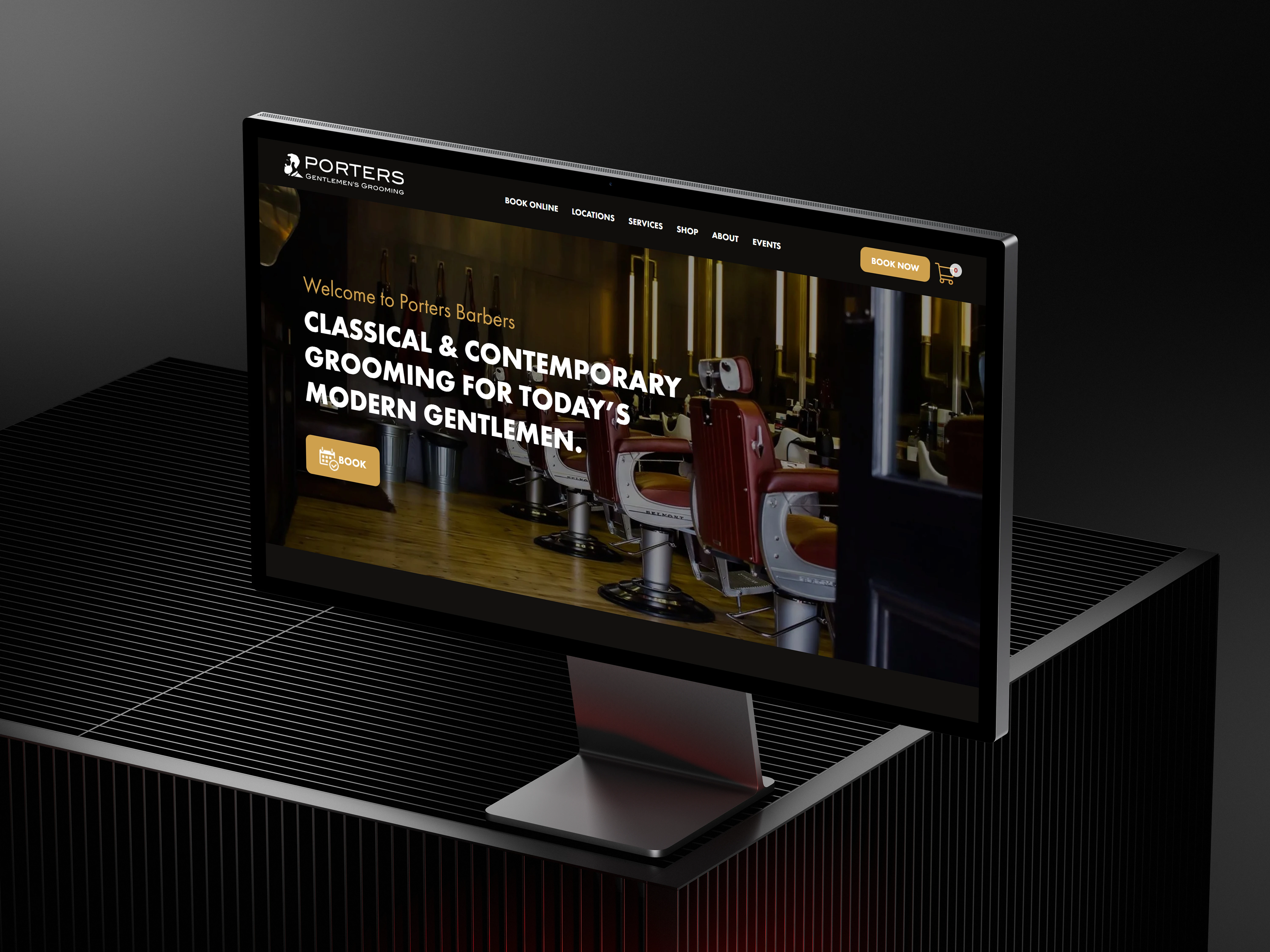
Homepage Structure & Hierarchy
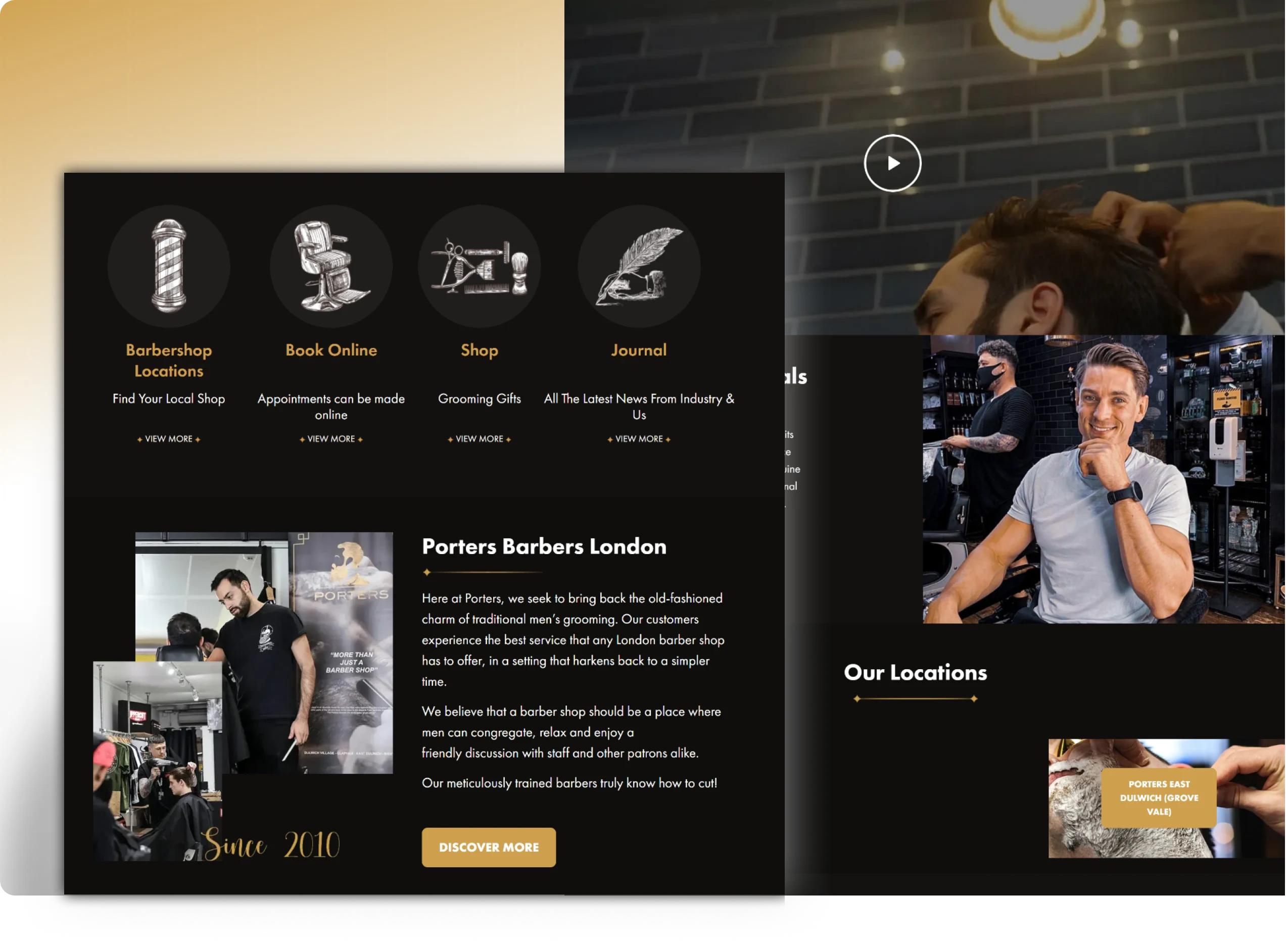
The homepage redesign was structured around a clear hierarchy of intent. The hero section led with a full-impact visual and a single, direct CTA (‘Book Now’) backed by a headline that communicated the experience, not just the service. Below the fold, the page moved through: a brief brand statement establishing premium positioning, a services overview using category tiles rather than a flat list, social proof through customer testimonials, and a location finder that made multi-location navigation simple without fragmenting the main page. Every section was designed to either build confidence or drive action.
Services Page Architecture
The existing services page listed everything in a single undifferentiated column. The redesign grouped treatments into clear categories, Haircuts, Shaving & Beard, Facials & Skin, Scalp Treatments, and Signature Packages, each with a category
header, individual service cards showing the treatment name, a brief description, duration, and price. This structure meant a user looking for a specific service could find it in seconds, while a user browsing for the first time could understand the full range without feeling overwhelmed. Booking CTAs were placed at the end of each category rather than buried at the bottom of the page.
Visual Design & Brand Translation
The visual language was built to mirror the physical spaces. A warm, dark palette with gold accents reflected the brass and copper hardware. Typography choices leaned into craft and character without sacrificing readability. Imagery was treated as a primary layout element, large, editorial-style photography that showed the space, the craft, and the people rather than generic stock. The overall result was a
design that felt like an extension of the barbershop itself rather than a
generic local business template.
What the Redesign Delivered
The redesigned homepage and services page gave Porters Barbers a digital presence that finally matched the quality of their physical offering. The work addressed the two biggest conversion barriers, brand credibility and service clarity, that the original site was failing to resolve.
Brand Impact
The homepage hero does not communicate premium positioning within the first viewport, new visitors immediately understand they are looking at a high-end, experience-led grooming destination, not a standard high-street barber.
Booking Clarity
A persistent, clearly positioned ‘Book Now’ CTA on the homepage removes ambiguity about how to take action, reducing the friction between intent and conversion for both new and returning visitors.
Service Discovery
Grouping 12+ services into five named categories on the redesigned services page cut the time needed to find a specific treatment and made the breadth of the offering easy to understand at a glance.
Premium Perception
The visual language, warm dark palette, gold accents, editorial photography, and considered typography translate the physical brand character into a digital environment that reinforces rather than undermines the in-person experience.
Location UX
The multi-location structure was addressed on the homepage with a simple location finder, avoiding the confusion of a fragmented site while keeping the main pages clean and focused.
Like this project
Posted Jun 29, 2026
Redesigned homepage and services page for Porters Barbers, enhancing brand identity and user experience.