Saibay Construction & Management: Brand Identity Guidelines

Saif Sheikh
Verified

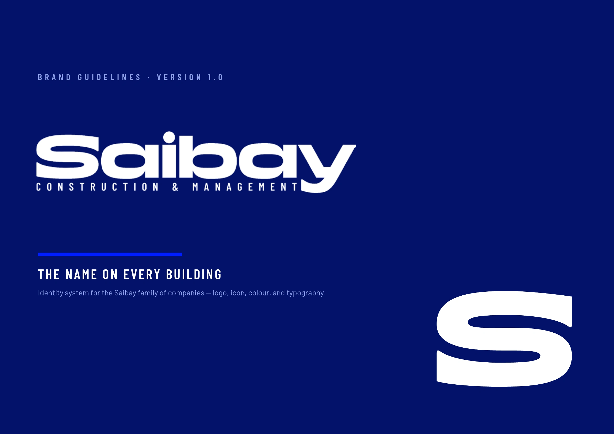
Saibay Construction & Management: Brand Identity Guidelines
Saibay is a family name, and the brand is built around that. The founders are putting their name on every building they deliver, so the identity works like a signature rather than a decorated logo.
I put together a 38-page brand book that turns that idea into a complete identity system:
Logo: an extended wordmark with a "Construction & Management" sub-line set like a dimension line on a drawing. It comes in four approved lockups, with clearspace rules, minimum sizes and six clear misuse rules.
Icon: the "S" taken straight from the wordmark rather than drawn fresh, so the icon and the logo are always the same shape. It has a Flat state and a Depth state, plus ready-made favicons and profile images from 1024px down to 16px.
Colour: Midnight (
#03126B) for authority and Electric Blue (#011EFE) for energy, backed by Steel, Sky, Ink Black and Paper White. There's a working ratio (55/28/10/7) and every pairing is checked for WCAG contrast.Typography: an extended display face kept only for the name, and Barlow for everything else, from site documents and proposals to the website.
Applications: business cards, site signage and social profiles, all using the same system.
The result is one consistent identity that looks confident on a hoarding board, a proposal cover or a phone screen.
Skills / tags: Brand Identity, Logo Design, Brand Guidelines, Visual Identity, Typography, Colour Systems
Like this project
Posted Sep 24, 2026
Saibay is a family name, and the brand is built around that. The identity works like a signature rather than a decorated logo.
Likes
0
Views
9
Clients
saibay construction & management