Founder & Creative Director @Stōkt


Founder & Creative Director @Stōkt



Brand & Web Designer │ Helping you build on Webflow & Framer
Brand & Web Designer │ Helping you build on Webflow & Framer


Framer Developer and Product Desginer


Product Designer for AI & Digital Products
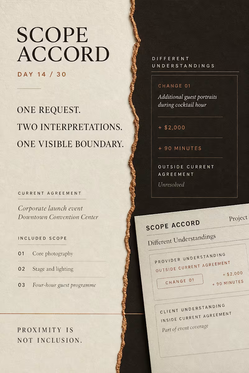
A request does not automatically change an agreement.
Scope Accord is a five-state interaction prototype designed around a common service-project problem: a client may hear “already included,” while the provider means “additional scope, cost and time.”
The proposed change remains structurally outside the current agreement until both parties express the same understanding of its impact.
One request.
Two interpretations.
One visible boundary.
Designed and built with React, TypeScript, CSS Grid and Playwright.
Live prototype:
https://scope-accord.vercel.app
2
119

What if a clinic earned trust by clearly showing what it still does not know?
I designed Meridian Physio, a fictional physiotherapy assessment experience built around one principle:
Competence Before Commitment.
The interface separates:
REPORTED → OBSERVED → TESTED → CONCLUDED → UNCERTAIN → NEXT
The most important state is UNCERTAIN.
Instead of using confidence as a visual shortcut, the experience shows the boundary between evidence, interpretation, and what still requires further assessment.
Built in Framer, with a custom product demo created using Remotion, Python, and FFmpeg.
This is Day 10 of my 30 Days of Real Business Problems challenge.
Memory hook:
“A clinic willing to show what it does not know yet.”
Full case study : https://contra.com/p/QFF2WWNU-meridian-physio-competence-before-commitment?r=faadil_boussari
I would be interested to know whether this kind of transparency would increase your trust in a healthcare service.
1
129
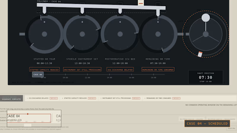
Day 5/30: MISREGISTER
An operating-room case can still look ready on paper after it has stopped being operationally executable.
I built MISREGISTER to make that gap physical.
CASE 04 is connected to four changing dependencies:
— staffed OR team
— sterile instrument set
— postoperative ICU bed
— remaining operating-room time
As those windows drift apart, the operating list stays unchanged.
The signature moment: the crank freewheels to the end-stop while CASE 04 still reads SCHEDULED.
Only after that failed test does a human re-strike the case as DELAYED or RESEQUENCED.
This is not clinical decision support. It is a synthetic operational prototype exploring the difference between a scheduled slot and executable capacity.
Built with React, TypeScript, SVG, Playwright, Remotion, Claude Code, Kimi, Agent Reach, ChatGPT, and AI33Pro.
Live prototype:
https://faadil1.github.io/misregister-day-5/
Source:
https://github.com/Faadil1/misregister-day-5
4
4
364
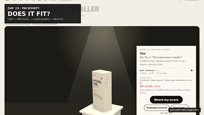
Packaging looks like graphic design. But every word takes physical space.
For Day 19, I built PACKSHIFT an interactive packaging experience where claims, languages, warnings and data become pressure on a finite surface.
It starts with the real 56 mm width of the carton.
Then you try to make everything fit.
Make the box smaller and the pressure becomes physical:
56 mm → pressure → CRACK → recovery → museum
The final package doesn’t just show the solution — it remembers the negotiation that produced it.
Underneath the public game is a deeper spatial compiler built with Blender + Three.js / React Three Fiber, where the same package can open, decompose, expose its dieline, redistribute information and refold.
Packaging is not a file. It is a compiled surface.
Full case study ↓
https://contra.com/p/3WBccUlM-packshift-packaging-is-a-compiled-surface
Live experience ↓
https://packshift-awd.pages.dev/
GitHub ↓
https://github.com/Faadil1/PACKSHIFT
Would love to know which moment lands most for you: Actual Size, the Hydraulic Press, or the Museum?
1
117

Designing and building high-performance websites
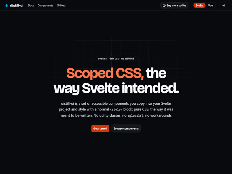
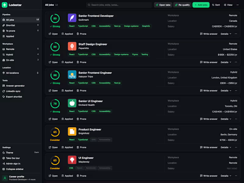
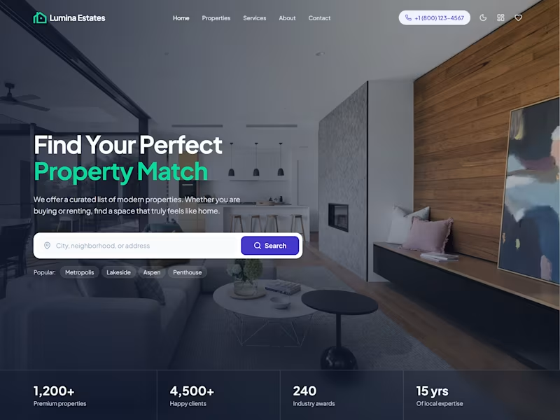
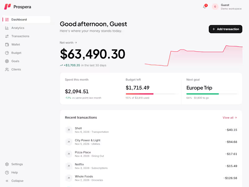

Innovative UX/UI/Prod. Designer 🌟


Web designer & developer. Landing pages, product UI, Shopify
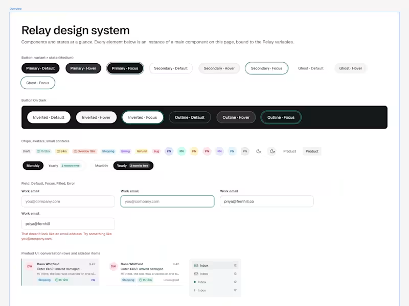
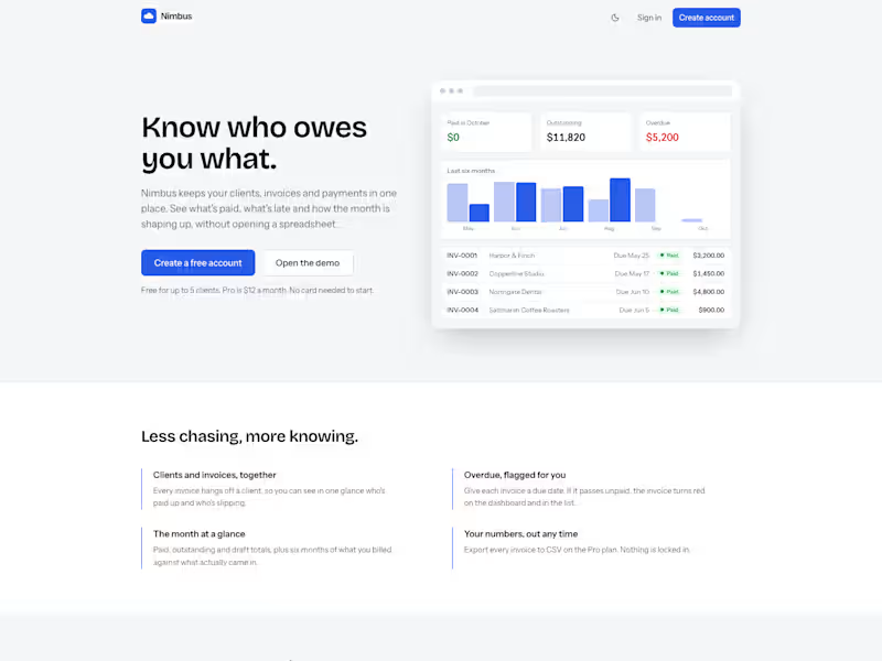
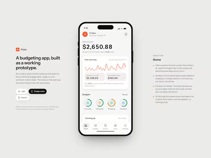
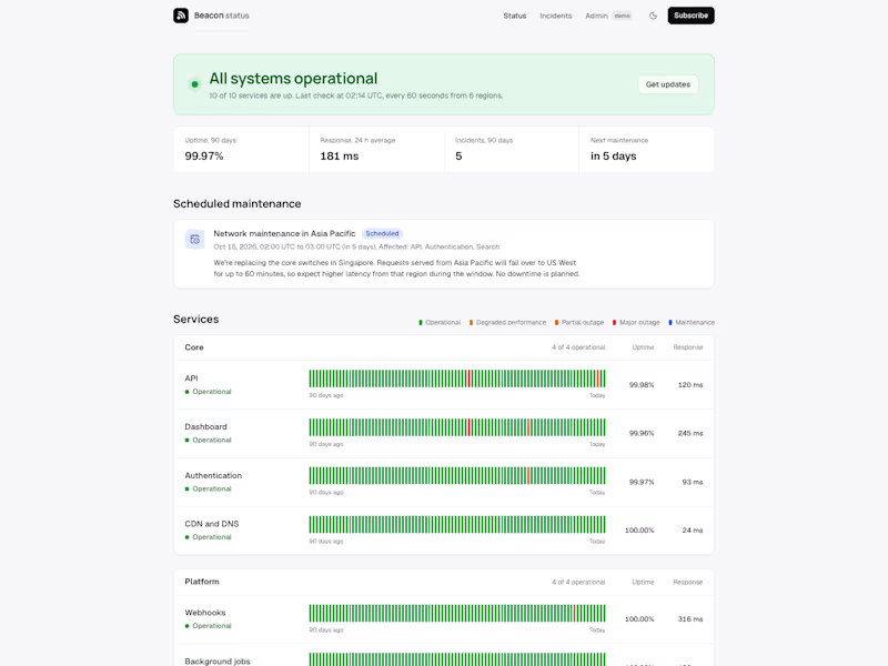

Designing premium SaaS experiences that actually convert.

Improved website design.
⚡ Smoother scroll and transition.
⚡ New dreamy glow without blurring edges
⚡ More prominent and improved CTA
1
49
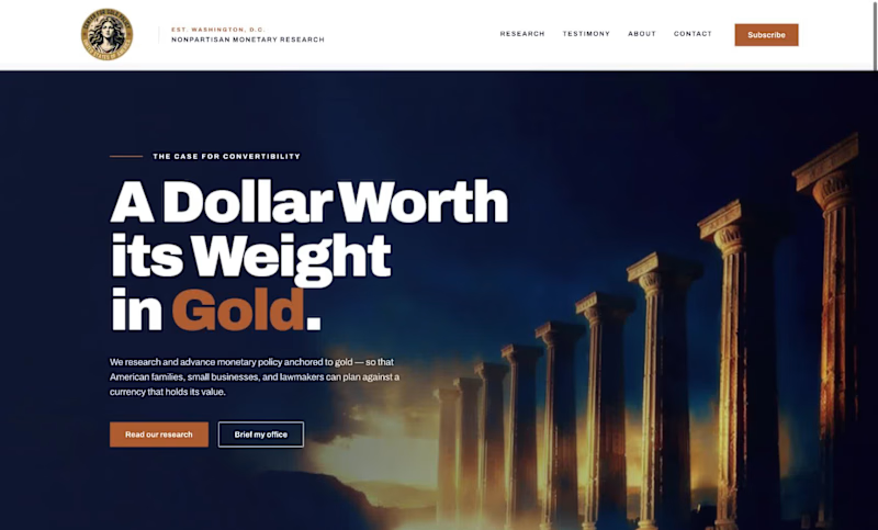
Client: A Washington, D.C.-based monetary policy research and advocacy organization (name withheld per client confidentiality).
Direction: Modern, bold, and credible, with large confident typography, minimal color, and real editorial weight.
What I delivered:
A full brand style guide: color system, type scale, component specs, and logo usage rules
A homepage built around a custom seal mark and a cohesive dusk-toned photographic treatment
One deliberate accent color (terracotta) instead of predictable palette choices
A custom architectural photography direction, anchored by an abstract Doric column hero image
Available for similar work: advocacy organizations, think tanks, and institutional brands.
2
134