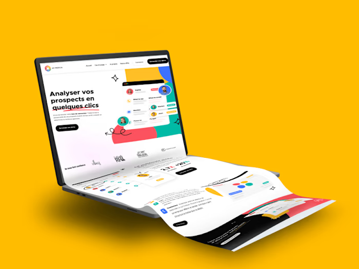
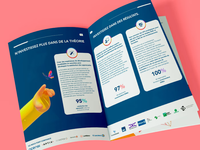
Touloisirs Website Redesign
Introduction
Project Background:
Touloisirs, a non-profit association formed from the merger of three organizations historically linked to the French postal services, specializes in providing competitively priced travel and leisure offers to its members.
Objectives
Enhance the usability and aesthetic appeal of the website.
Streamline the navigation to improve user access to travel and leisure deals.
Foster an engaging user experience that reflects the brand's values of quality service and personalized customer support.
Research
User Insights:
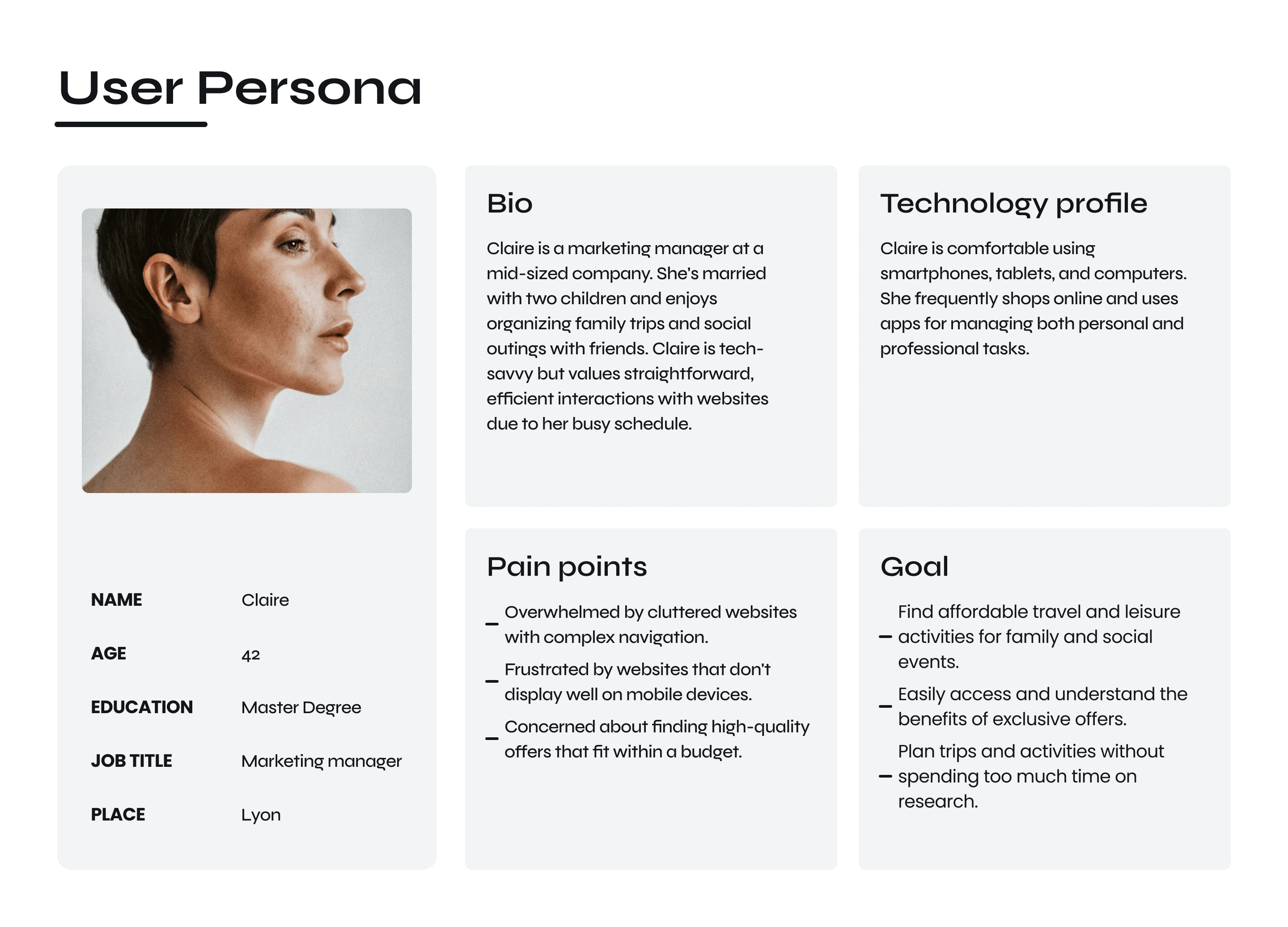
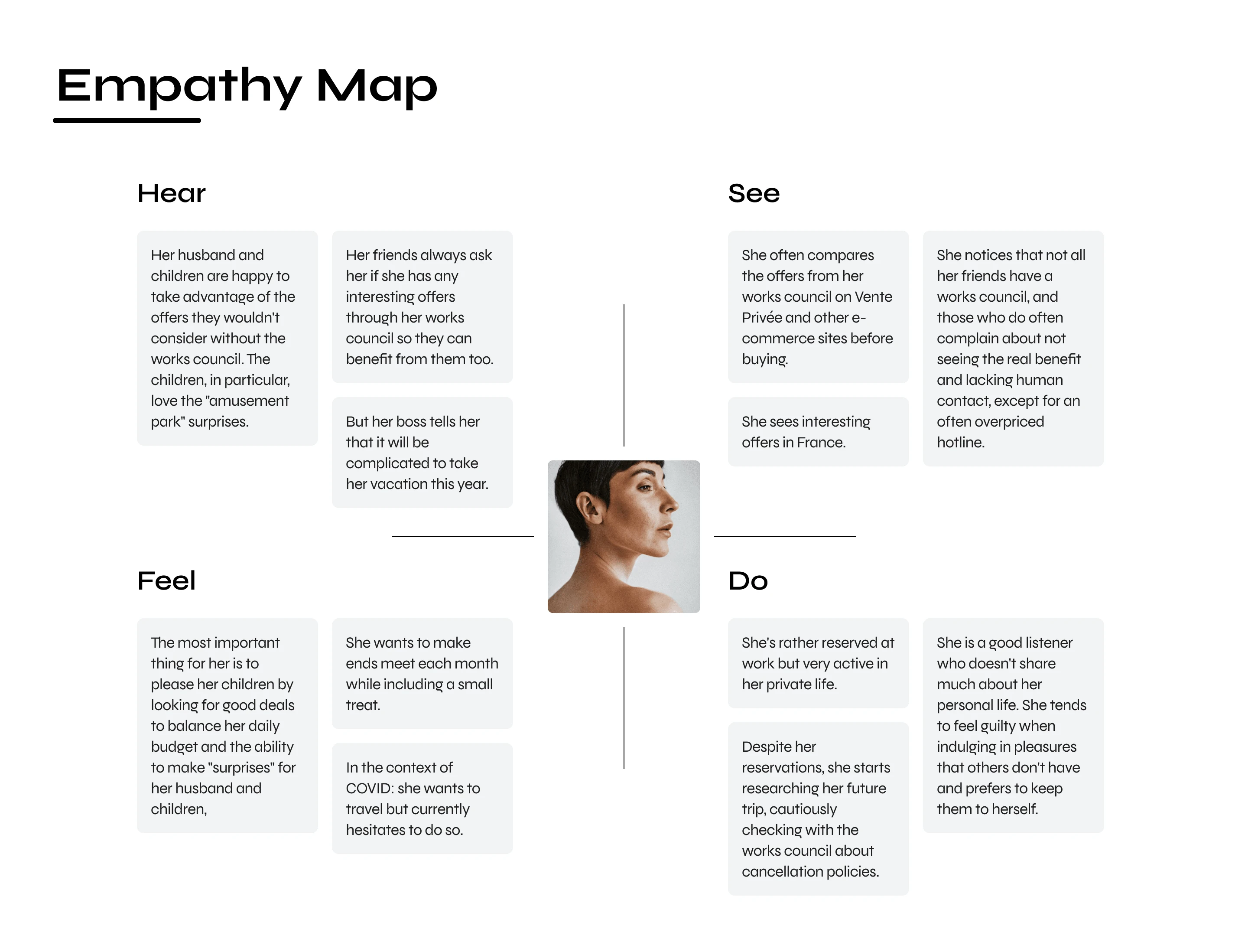
Initial feedback highlighted the need for a more intuitive interface that could better showcase the variety of offers and exclusive deals, making it easier for members to find and utilize services suited to their budgets and preferences.
Design Process
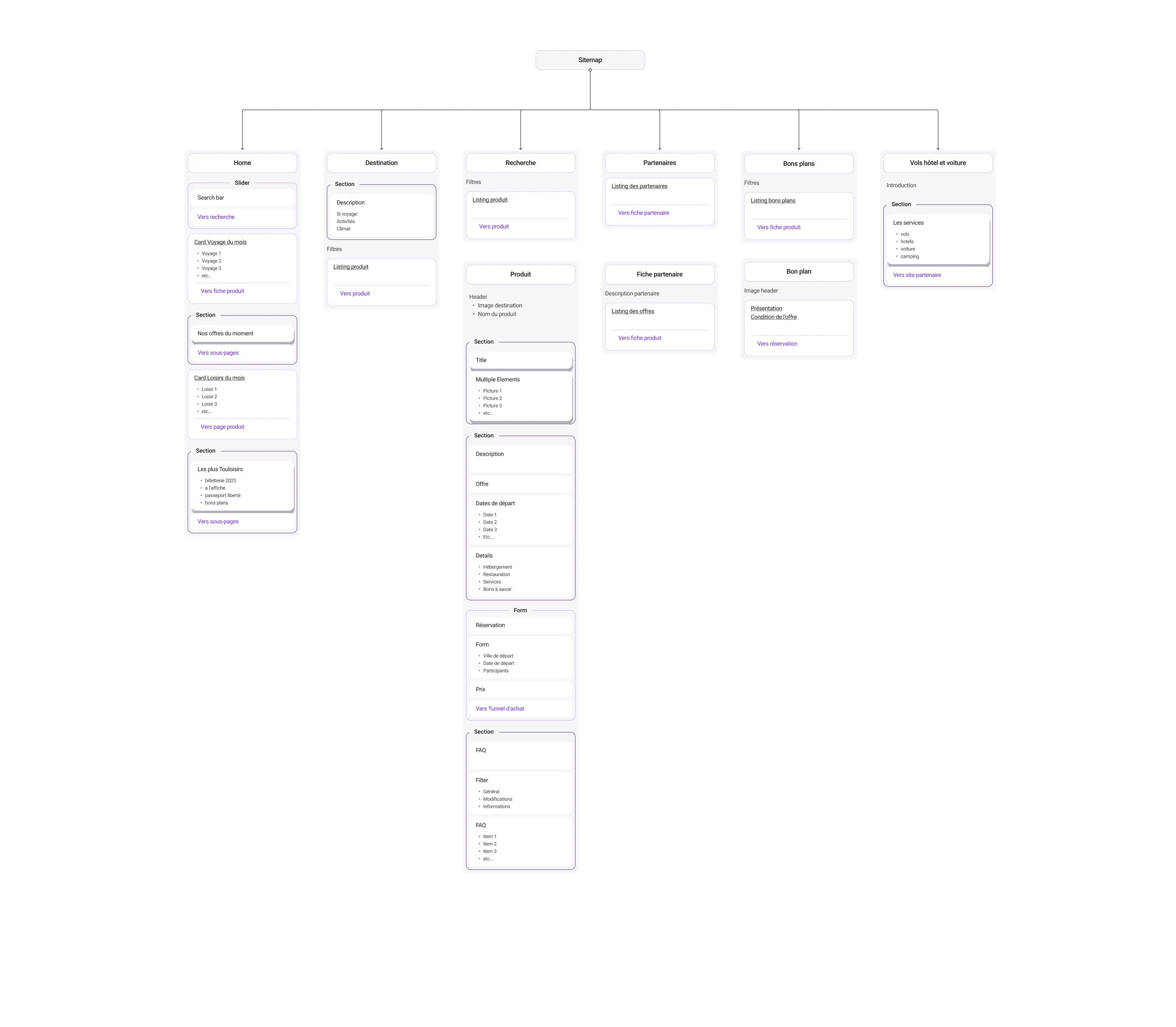
Information Architecture Reorganization: The redesign focused on clarifying the site’s structure to improve the discoverability of information and offers.
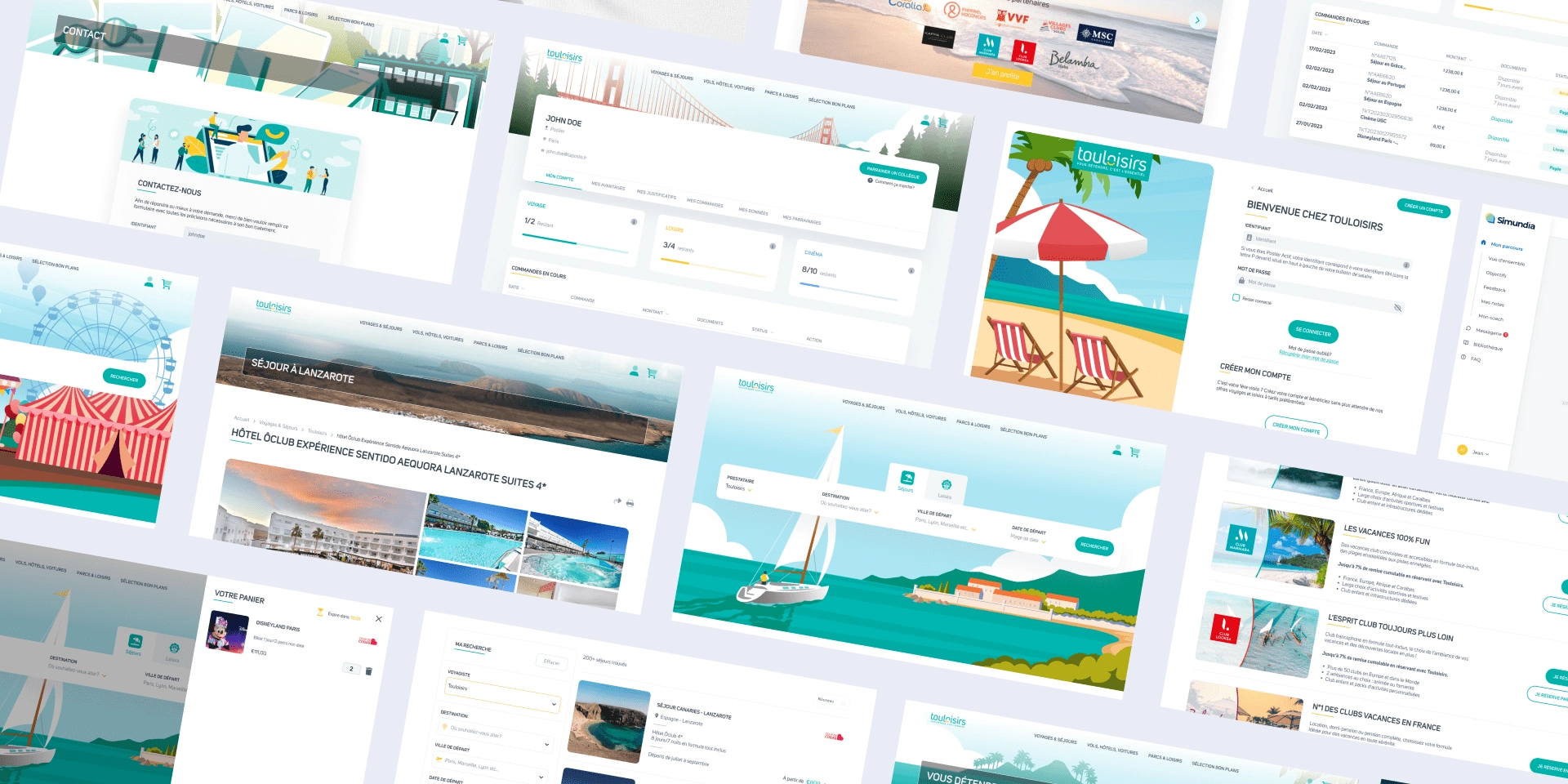
Visual Design Overhaul: Introduced a fresh, modern look that aligns with Touloisirs' mission of delivering quality and personalized service.
Responsive Design Implementation: Ensured that the website is fully functional across all devices, enhancing accessibility for all users.
Implementation
Prototyping and User Testing:
Multiple iterations of prototypes were developed, tested, and refined based on user feedback to ensure the redesign met the needs of end-users effectively.
Results
Increased Engagement: Post-redesign, the website experienced a significant uptick in user engagement, with longer visits and higher interaction rates.
Improved Customer Satisfaction: Enhanced navigation and accessibility led to better customer experiences and increased satisfaction with the platform.
Conclusion
The redesign of the Touloisirs website successfully addressed core user needs, leveraging UX principles to enhance site functionality and user engagement, ultimately supporting Touloisirs' goal of delivering exceptional travel and leisure experiences to its members.
Like this project
Posted Apr 17, 2024
Redesigned Touloisirs' website to enhance usability and visual appeal, improving member engagement and satisfaction with streamlined access to travel deals.
Likes
0
Views
18

