Sinea Training Program Design
Introduction
Project Overview:
Sinea specializes in creating tailored training experiences aimed at professional and personal development. The project focused on designing an adaptable and aesthetically appealing training program brochure.
Objectives
Develop a visually engaging yet easily editable training catalog.
Ensure the program's branding is consistent across different formats.
Design Challenges
The need for a design that is both high-quality in aesthetics and functionality in Word format.
Production of two distinct documents with specific requirements.
Solution Strategy
Tool Selection: Figma was utilized for its robust design capabilities and component features, which allowed for easy customization while maintaining visual consistency.
Word Integration: Designs were directly imported into Word to ensure that the graphical integrity was preserved in the document format required by Sinea.
Implementation
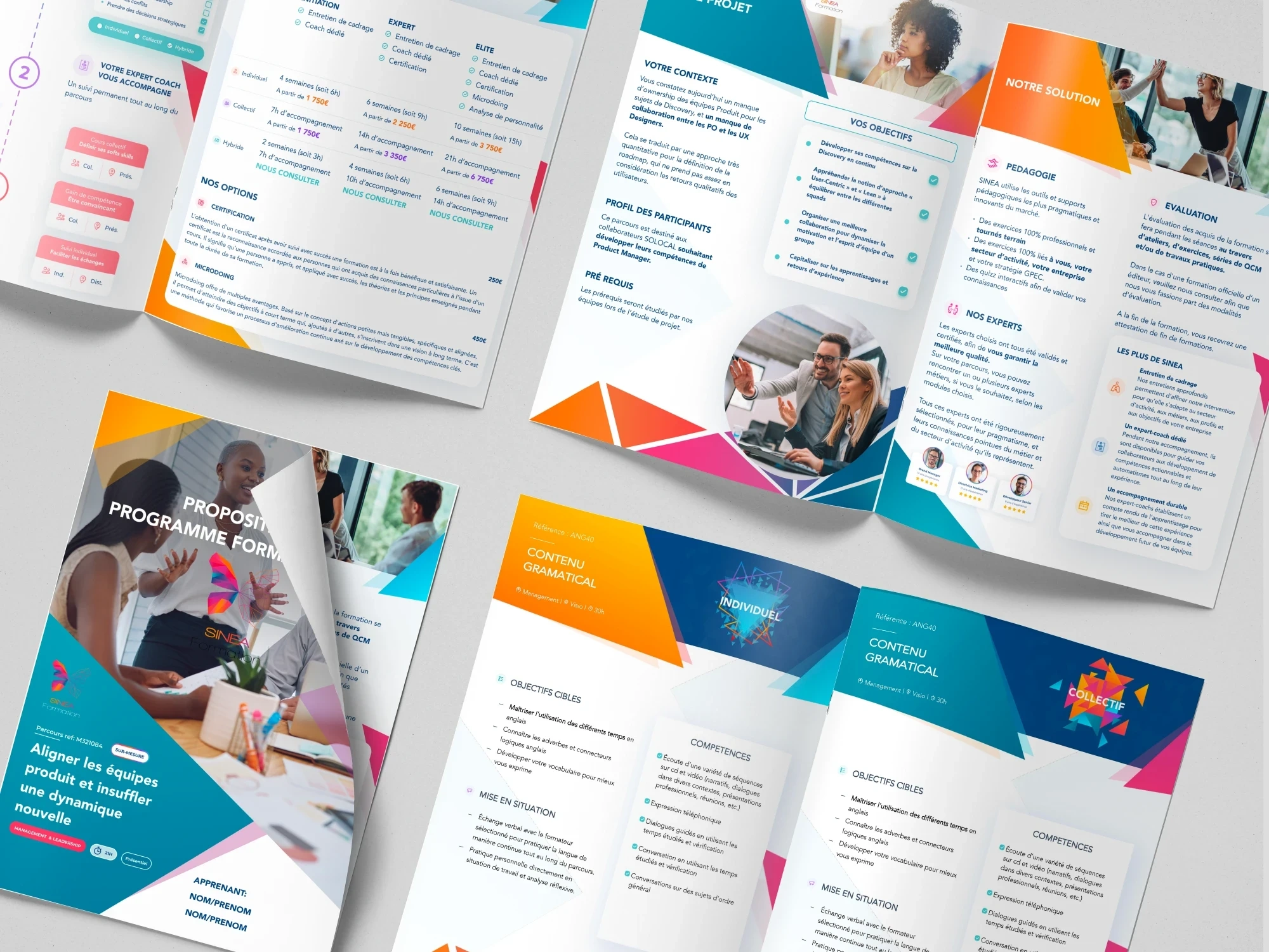
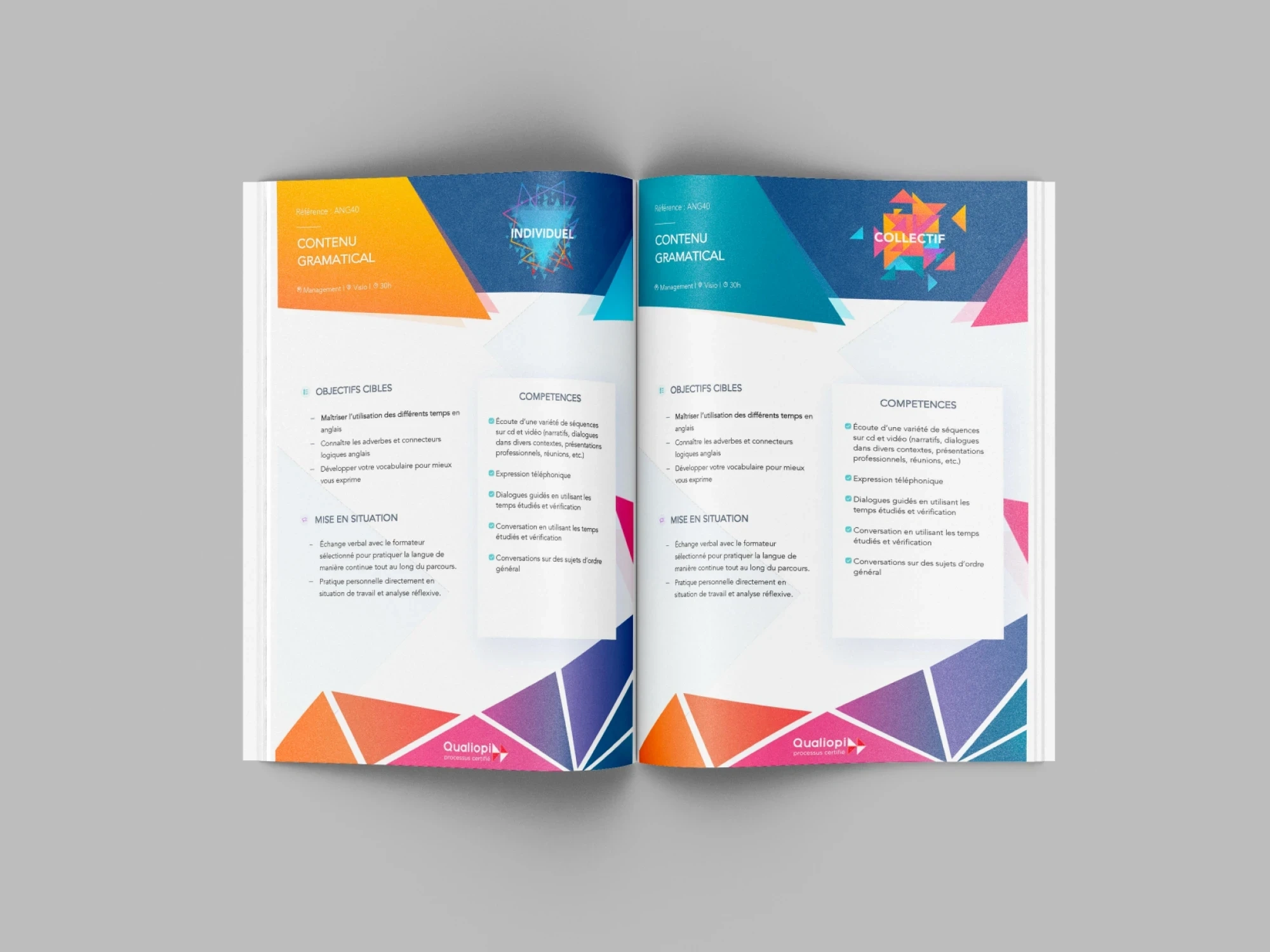
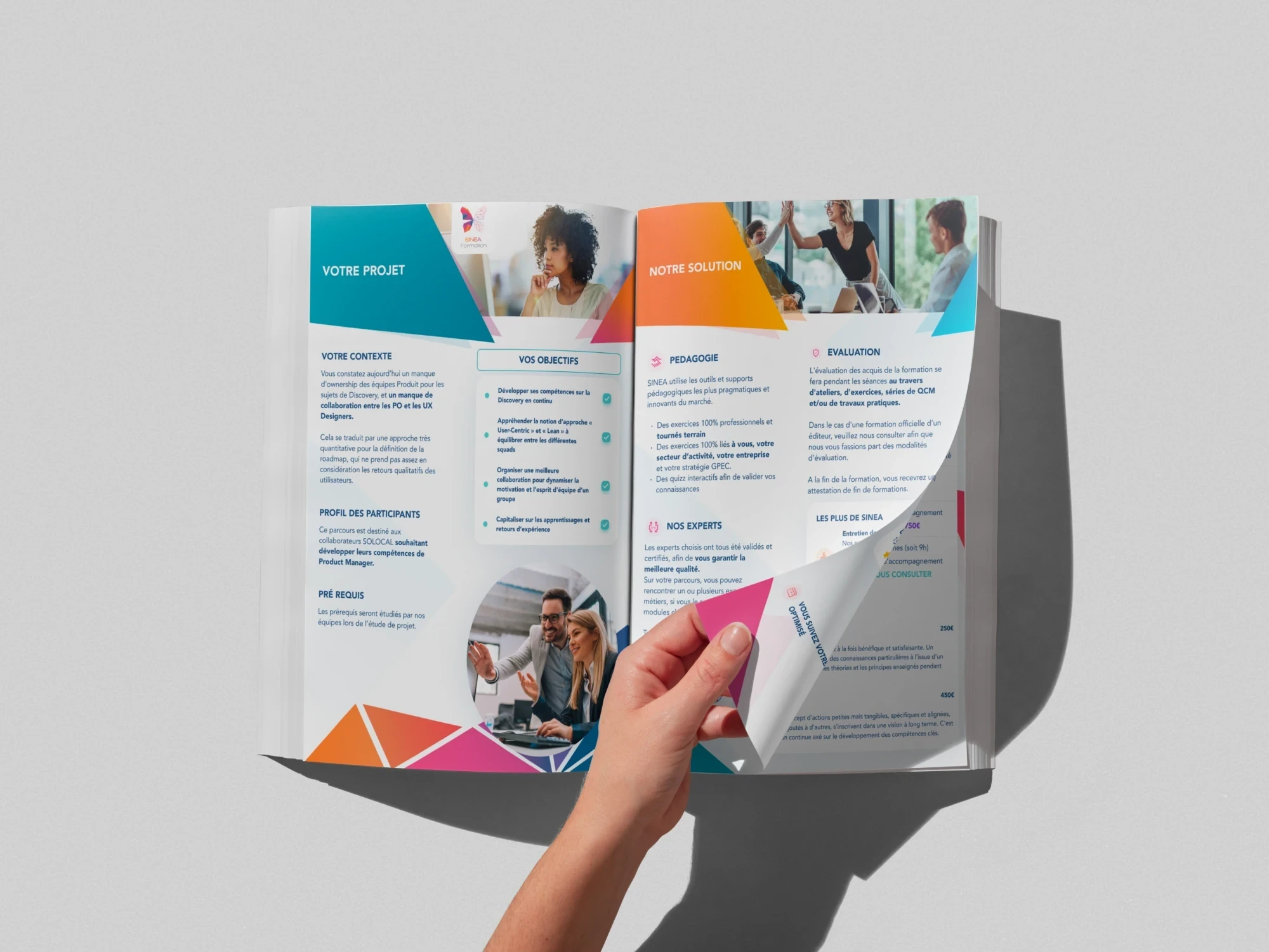
First Document: A detailed training catalog, customizable through Figma components.
Second Document: Competency pages designed for ease of modification, formatted in Word to meet client specifications.
Results
The project successfully delivered two documents that balanced high aesthetic quality with practical usability.
Sinea was able to provide clients with a professional and appealing look at their customized training options, enhancing user experience and satisfaction.
Conclusion
This case illustrates the effectiveness of using advanced design tools like Figma to achieve a balance between aesthetic appeal and functional requirements. The Sinea project exemplifies how tailored design solutions can significantly enhance the presentation and accessibility of professional training programs.
Like this project
Posted Apr 17, 2024
Designed a customizable training program brochure for Sinea using Figma and Word, enhancing both aesthetics and usability.
Likes
0
Views
8

