nomi Designs
Designing premium SaaS experiences that actually convert.
- 14
- Followers


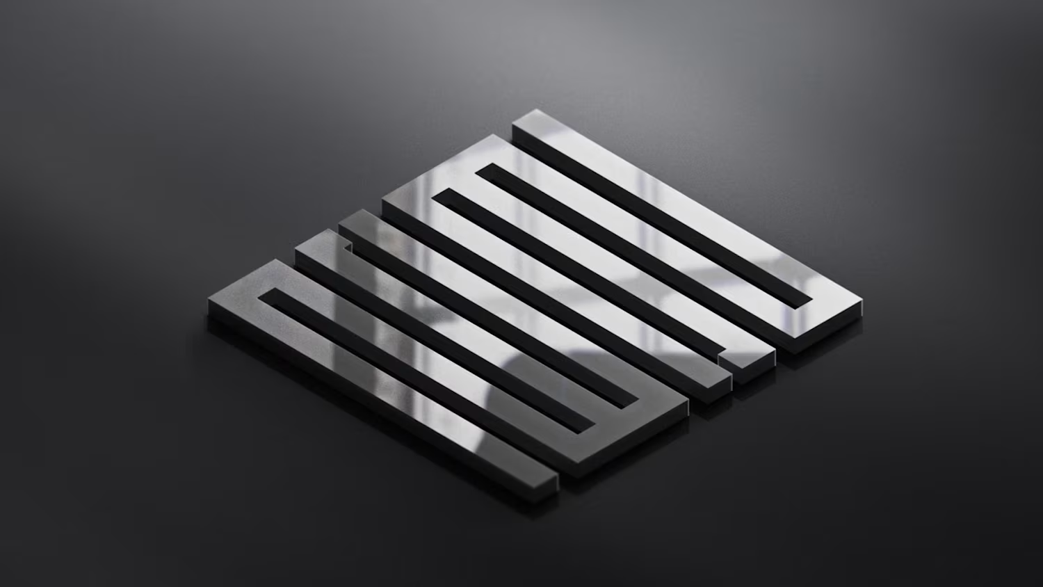
More glimpses of the CHI branding
4
29
Been busy updating my portfolio.
Stay tuned!
2
2
179
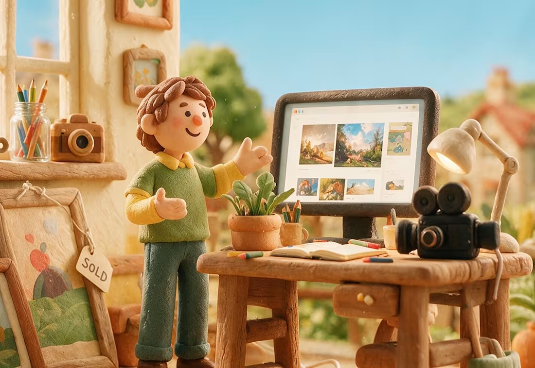
Claymation cartoons were my favorite type of animation when I was a kid.
There was something magical about seeing little handmade worlds come to life, frame by frame.
I still love that tactile, imperfect feeling, so I tried bringing a bit of it into this campaign.
2
1
156
Client: A Washington, D.C.-based monetary policy research and advocacy organization (name withheld per client confidentiality).
Direction: Modern, bold, and credible, with large confident typography, minimal color, and real editorial weight.
What I delivered:
A full brand style guide: color system, type scale, component specs, and logo usage rules
A homepage built around a custom seal mark and a cohesive dusk-toned photographic treatment
One deliberate accent color (terracotta) instead of predictable palette choices
A custom architectural photography direction, anchored by an abstract Doric column hero image
Available for similar work: advocacy organizations, think tanks, and institutional brands.
2
113