Brand Identity | AI Native- Product Design | Framer Websites


Brand Identity | AI Native- Product Design | Framer Websites


Top-Rated Independent Design. Develop. Deliver Results

Top-Rated Independent Design. Develop. Deliver Results



Crafting timeless indentity systems for Web3 & AI
Crafting timeless indentity systems for Web3 & AI


Identity & Packaging Systems Beyond Category Conventions

Identity & Packaging Systems Beyond Category Conventions


Design Engineer | Web & Mobile App Design

Design Engineer | Web & Mobile App Design


Logo Designer for Businesses Ready to Scale
- $•••••
- Earned
- 5x
- Hired
- 5.0
- Rating
- 106
- Followers
Logo Designer for Businesses Ready to Scale

HealthSense Brand Identity
A brand identity project I worked on in March 2026 for HealthSense, a Singapore-based health and wellness information brand focused on making health knowledge clear, accessible, and easy to understand.
The client envisioned something simple, clean, and modern, but with meaning behind it. I explored a minimal wordmark with a medical cross integrated into the lettering, creating a direct connection to healthcare while keeping the identity clear, professional, and memorable.
7
9
815
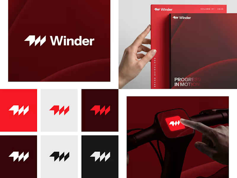
Winder is a bold brand identity built around a geometric W-inspired symbol, combining sharp angles and forward movement to represent progress, speed, and direction.
The identity uses a striking red and deep burgundy palette, supported by clean typography and a consistent visual system across brand guidelines, digital applications, and product mockups.
Progress in Motion.
76
100
5.9K
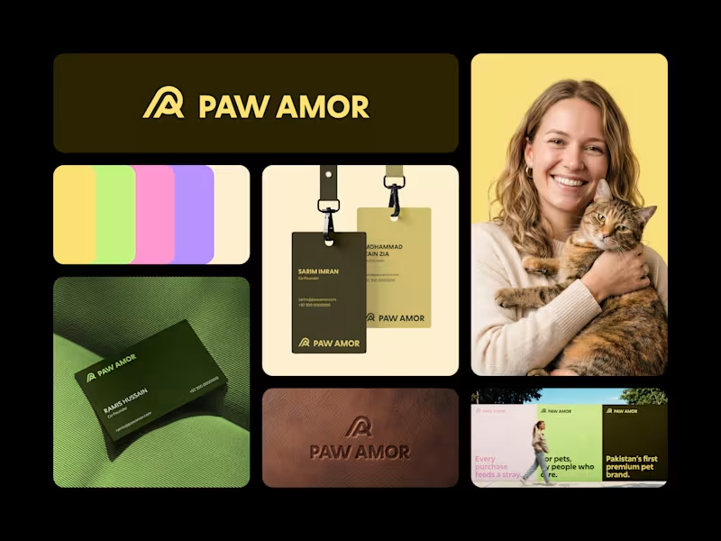
Paw Amor Brand Identity
A premium pet accessories brand concept from Pakistan, designed around the idea of connection between pets and their owners.
The PA monogram represents two forms coming together, inspired by warmth, closeness, and a subtle embrace.
I wanted the identity to feel premium and refined without becoming overly cute or playful, while still feeling warm and approachable.
Logo, color system, business cards, tags, packaging, and campaign applications.
2
4
583


Brand & Framer Designer for Startup Websites That Convert
- $5k+
- Earned
- 6x
- Hired
- 4.9
- Rating
- 44
- Followers
Brand & Framer Designer for Startup Websites That Convert


New brand identity for Curated Kitchens & Bath, a remodeling studio that helps homeowners fall in love with their space again.
The brief was warmth without the clutter. A calm, earthy palette of smoky green, warm taupe and soft greige, paired with a clean editorial wordmark and a house-shaped mark that tucks the kitchen right inside it.
Built out the full system too: logo suite, business cards, door hangers, flyers and merch, so every touchpoint reads as the same brand.
Which application is your favorite? Curious what stands out to you.
0
179
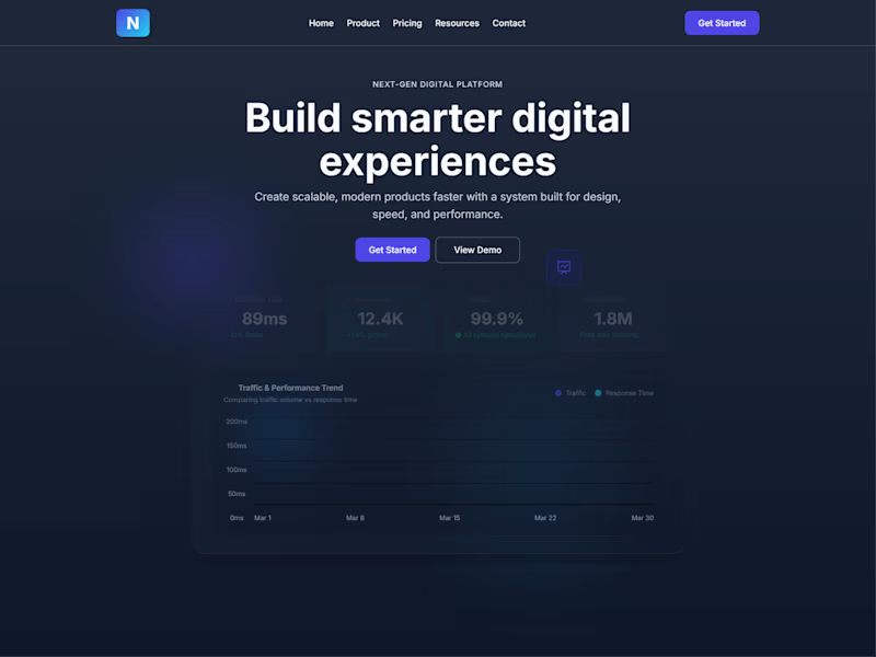
Just doing a simple web page design for a SaaS-based company. Let me know which hero section you think is doing a great job here.
5
432

For this challenge, I wanted to explore something different, turning a simple logo concept into a short brand-style animation.
PIXLWAY is a design agency focused on branding, web design, and development, helping businesses, founders, and growing brands build strong digital identities.
I thought it would be a great chance to go a step further and create a short promotional animation, almost like a mini brand trailer.
I developed two animation concepts in [@Kittl], then refined the final direction with a few tweaks to enhance the motion and overall feel.
Tools used:
Logo & animation concepts: @Kittl
Post-production edits: [@CapCut]
Kittl Project Board
(https://app.kittl.com/project/cmmfenjjw1vut0i9rpr02c6h2)LinkedIn Post (https://www.linkedin.com/feed/update/urn:li:activity:7439486799992795136/)
BTS video in the comments!
9
13
696

Brands, Websites and Product design

Brands, Websites and Product design