Built with Kittl

JR NOIRÉ — Luxury Fragrance Brand Identity & Packaging Design
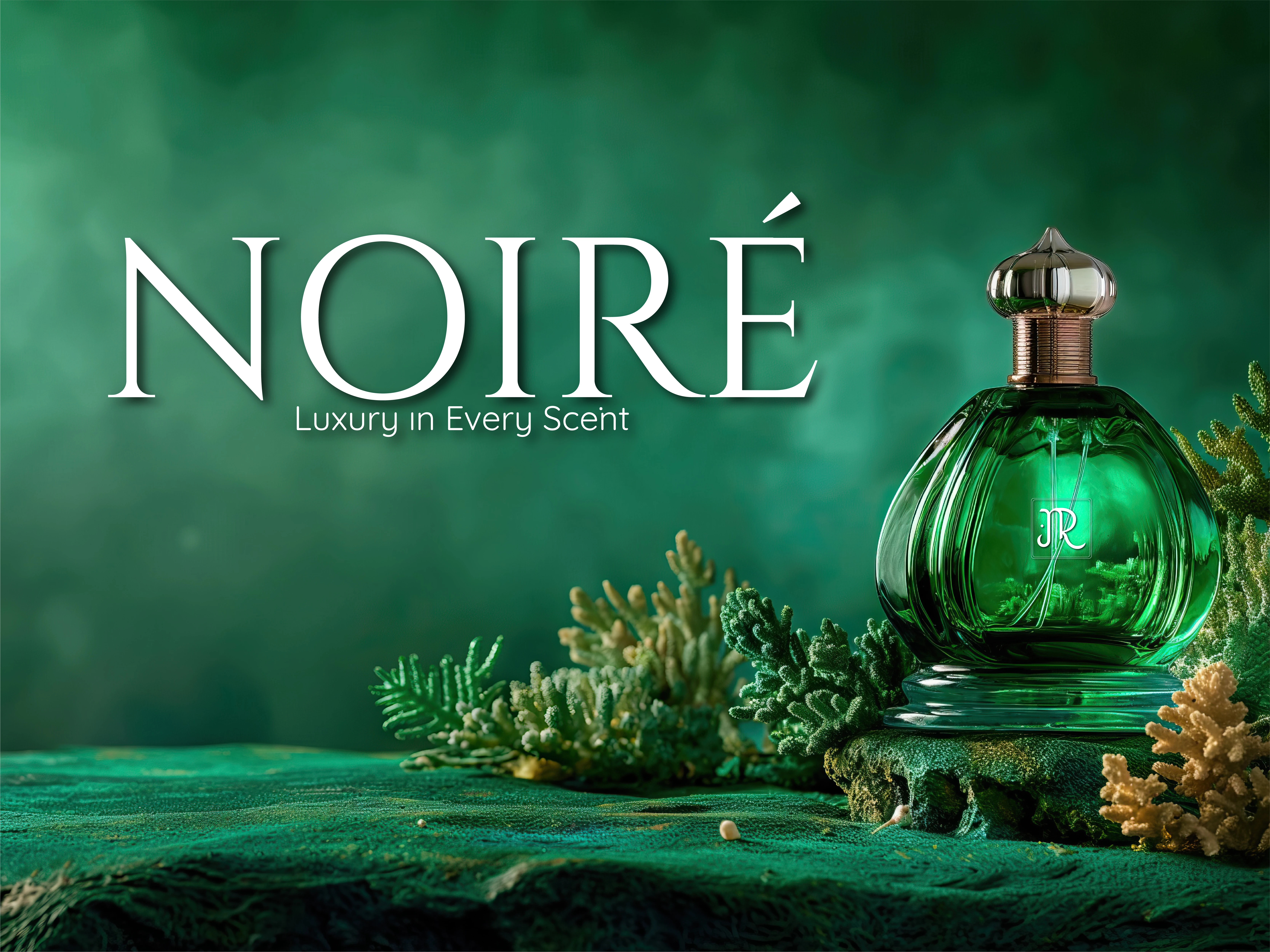
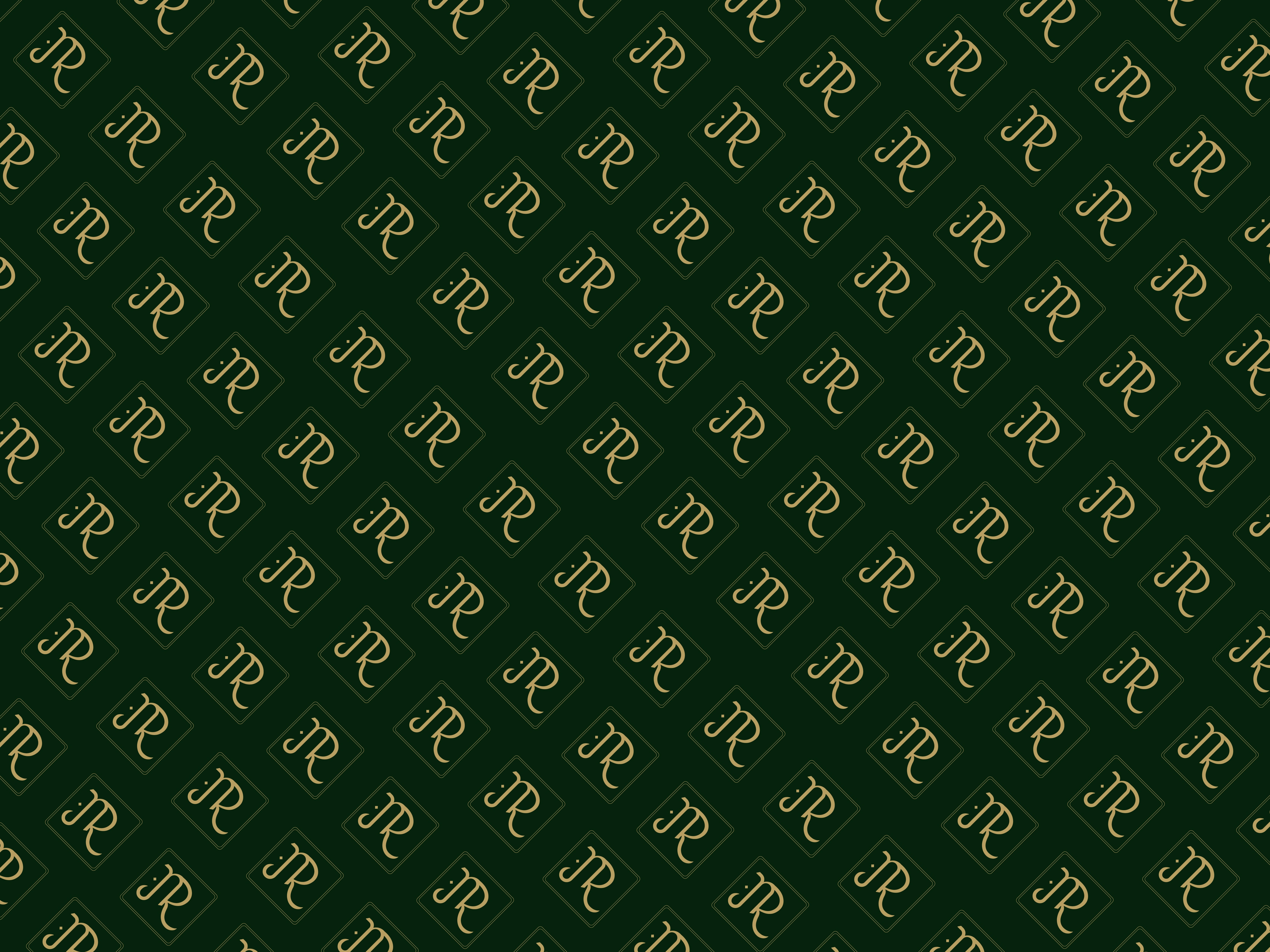
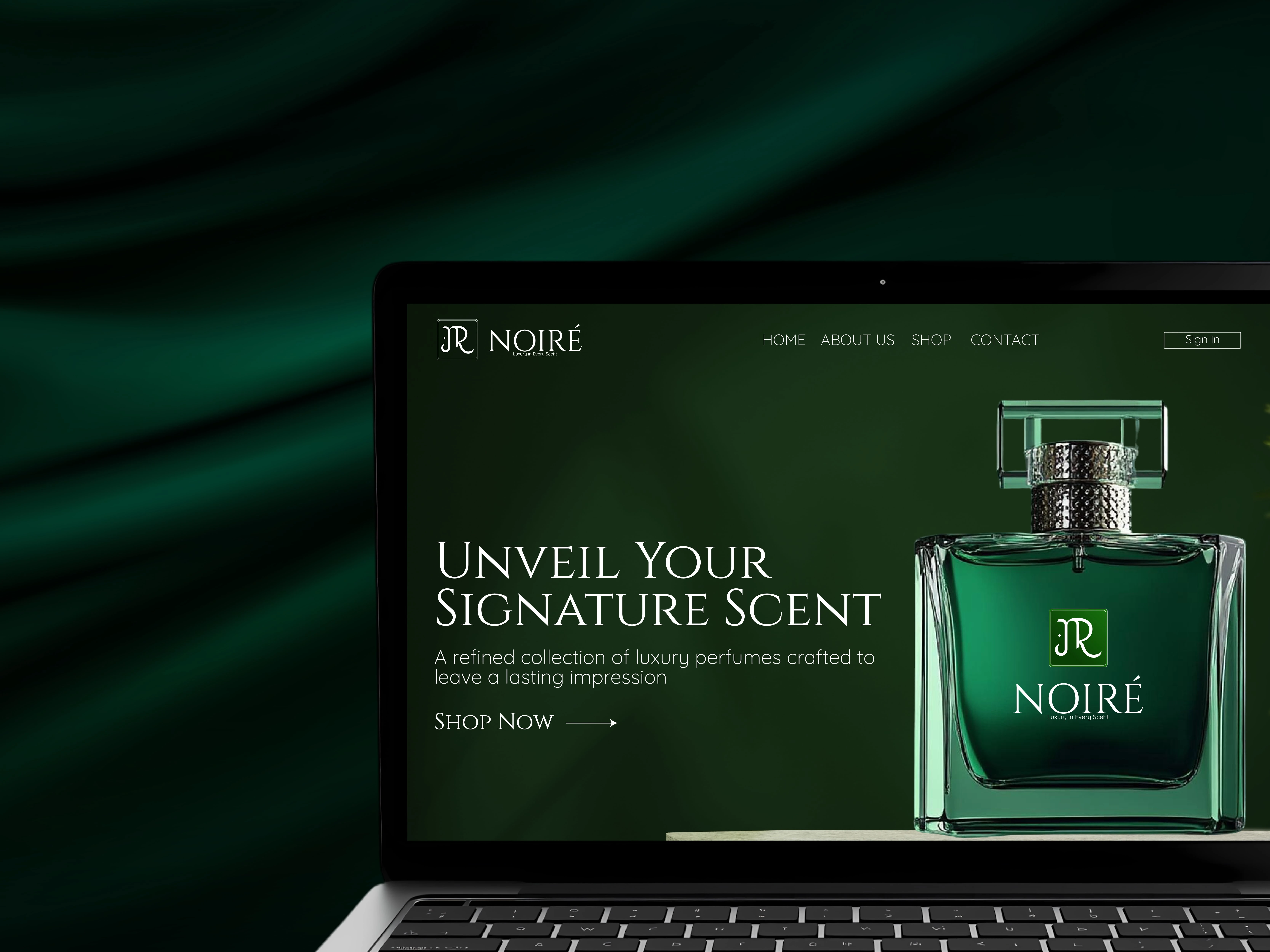
JR NOIRÉ was designed to feel timeless, bold, and unmistakably premium. The deep emerald green color palette was chosen to reflect heritage, confidence, and exclusivity key values of a luxury fragrance brand.
This hero visual sets the tone for the entire identity, positioning JR NOIRÉ as a statement scent for individuals who value elegance over excess.
Focus:
Luxury positioning · Premium color psychology · Visual storytelling
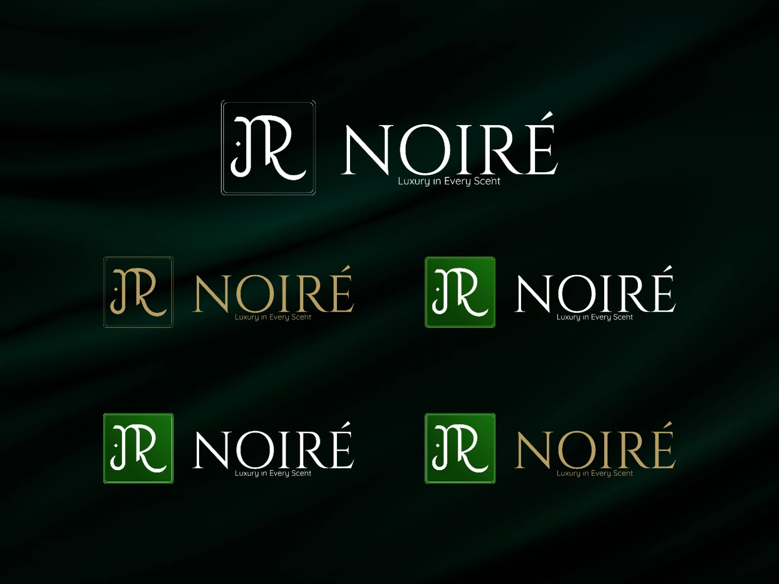
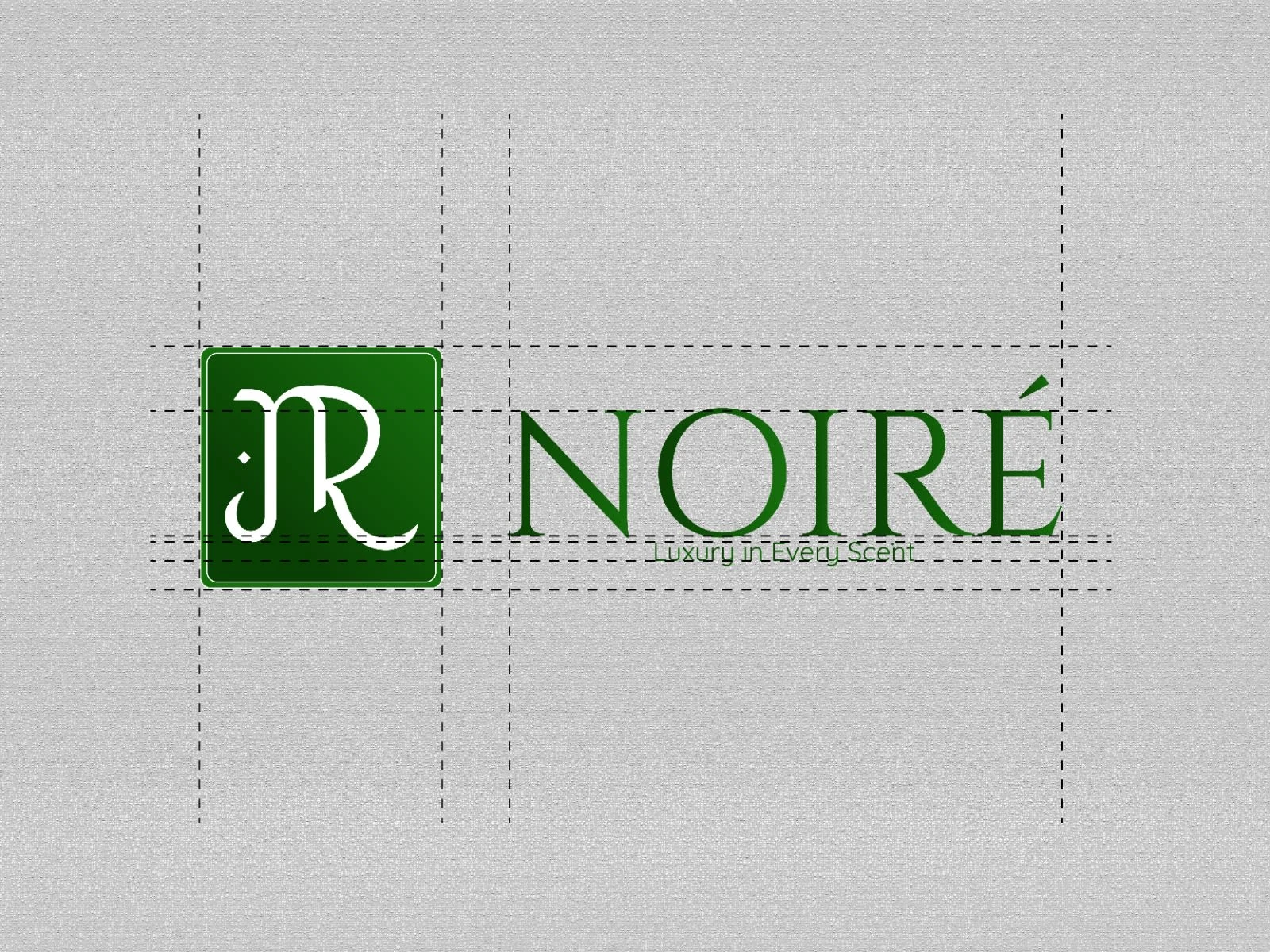
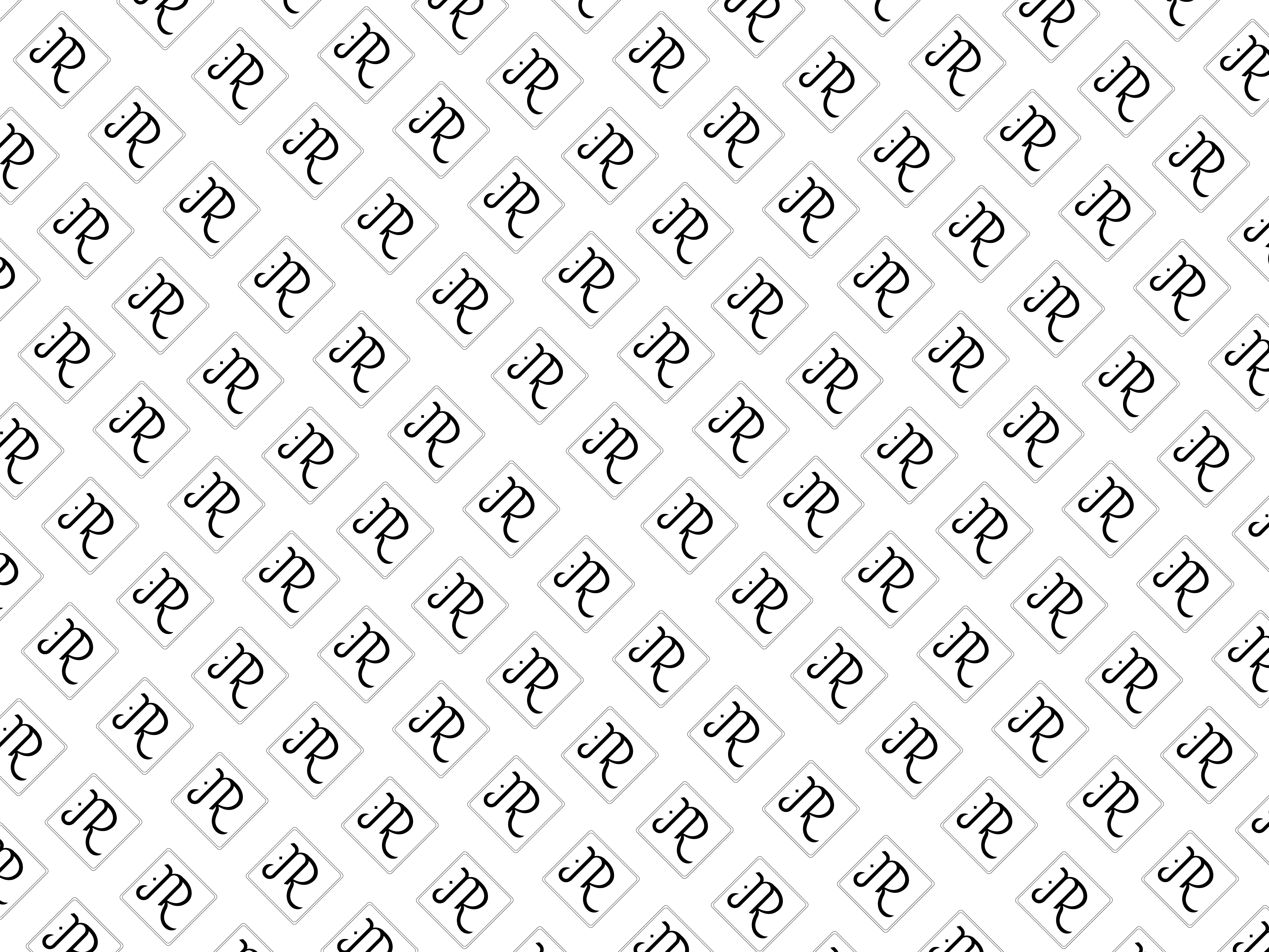
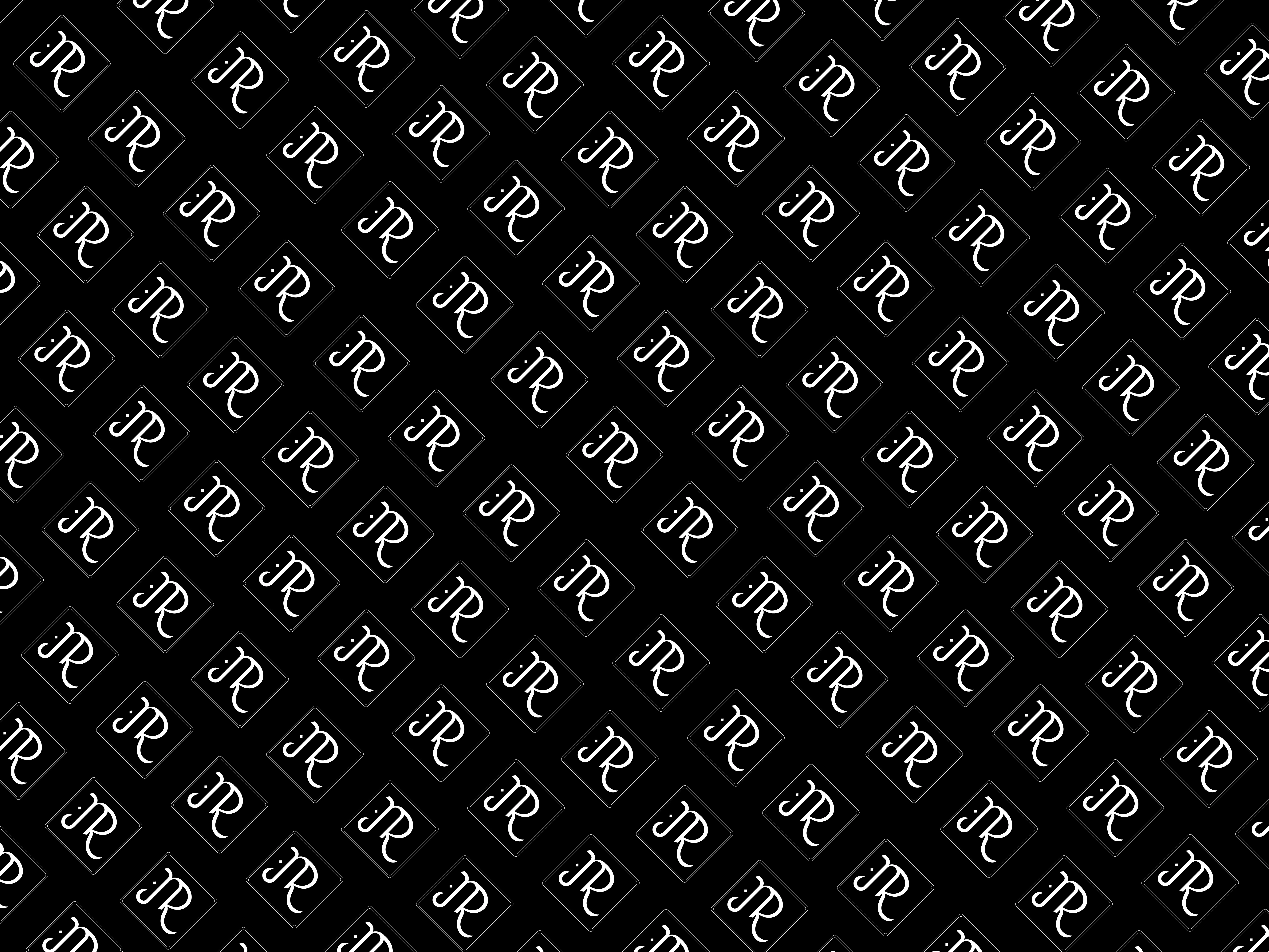
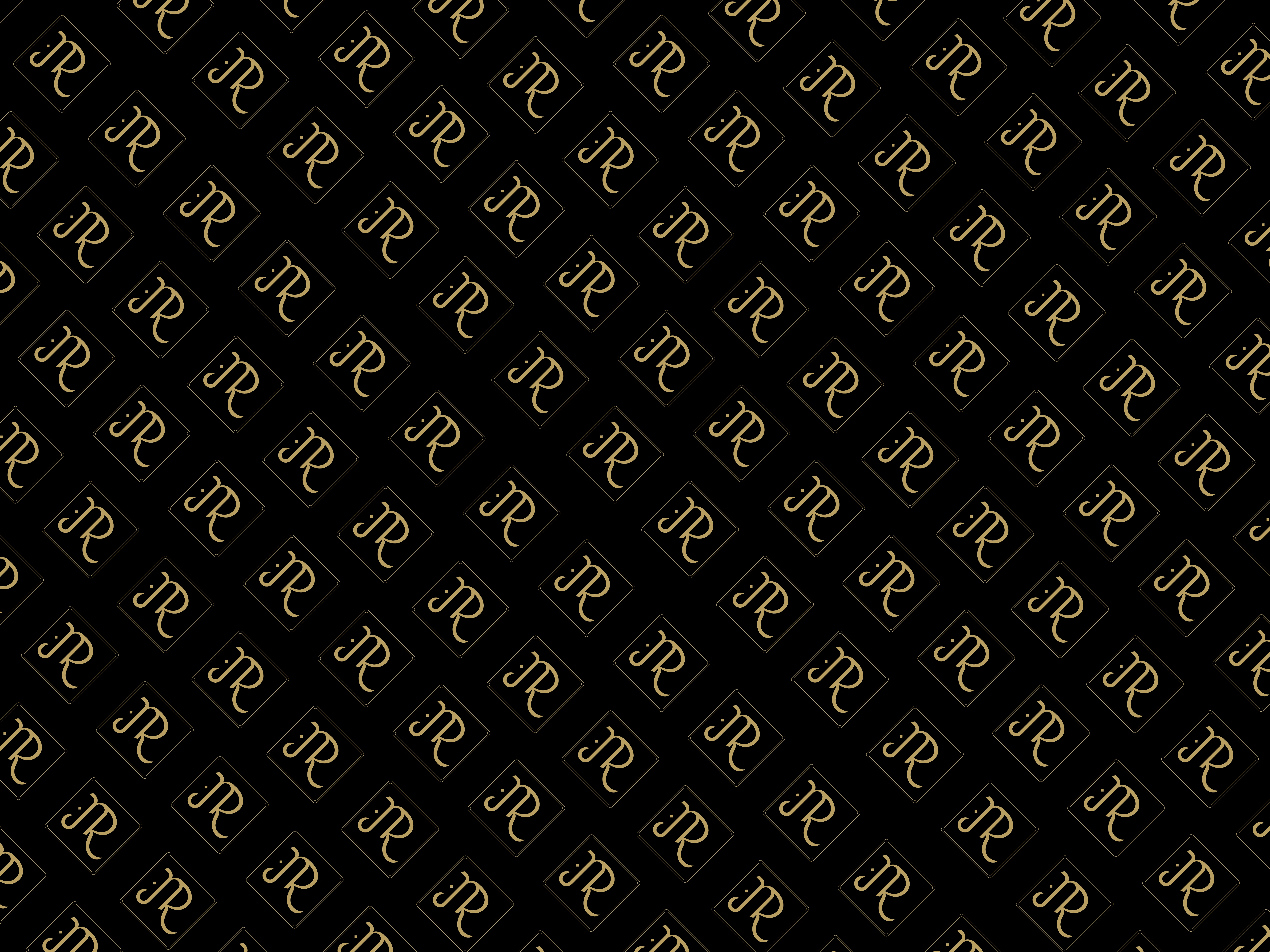
The JR monogram was crafted using a structured grid system to ensure visual balance, consistency, and scalability. Every curve and spacing was carefully calculated to maintain harmony across all brand applications.
A subtle diamond-dot element was added as a signature detail, representing precision, rarity, and the brand’s distinctive edge.
Design Approach:
Grid-based construction · Scalable logo system · Detail-focused branding
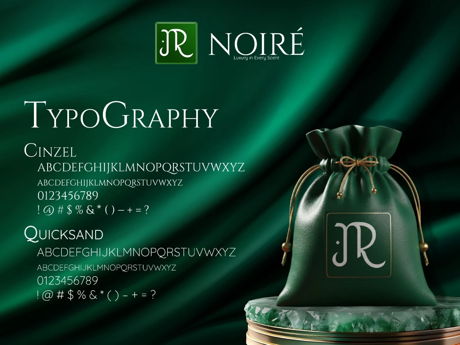
Typography plays a major role in how a luxury brand communicates. For JR NOIRÉ, I paired Cinzel with Quicksand to create a balance between classic prestige and modern clarity.
Cinzel adds a refined, royal character suitable for luxury branding, while Quicksand keeps the overall identity clean, readable, and digitally adaptable.
Typography Use:
Headings: Cinzel
Body & UI text: Quicksand

1 like · 11 views · Jan 10, 2026
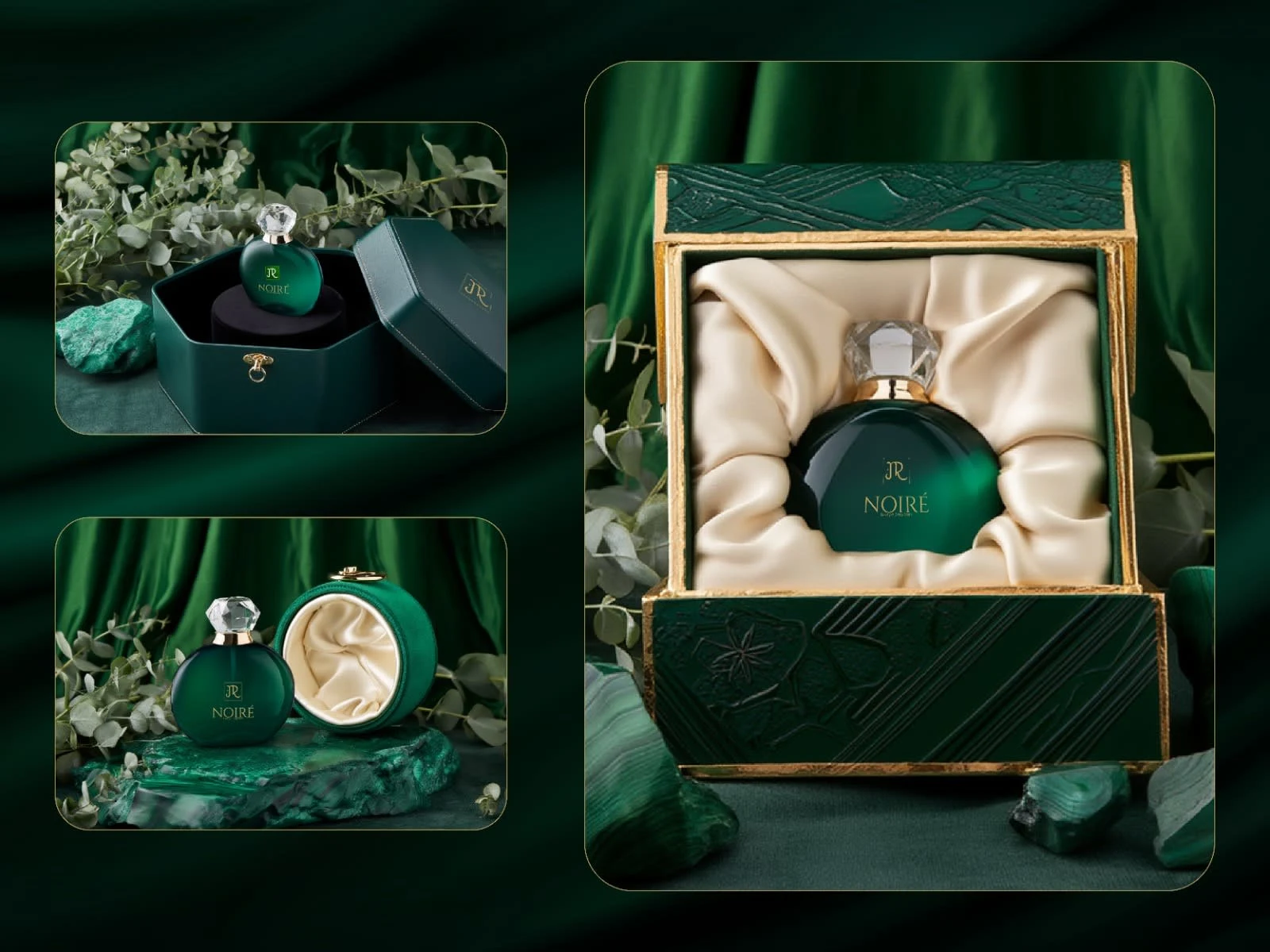
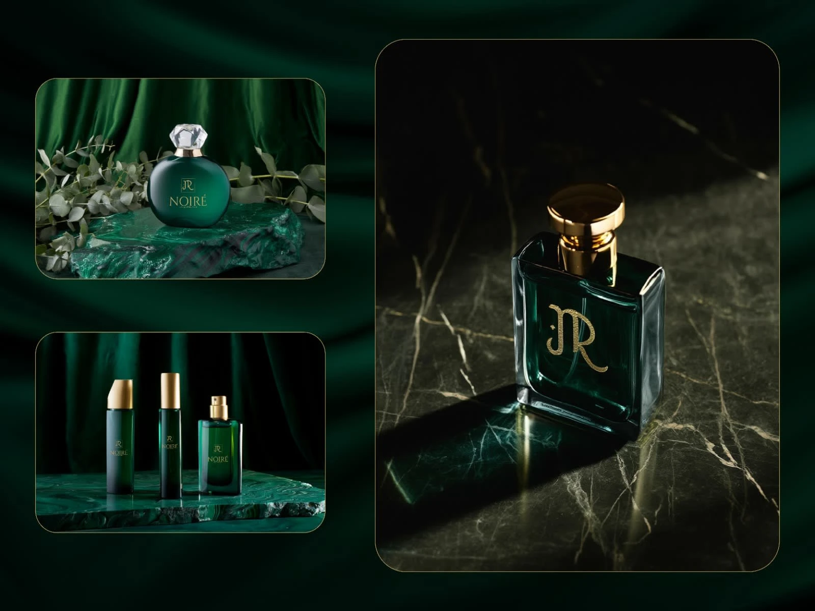
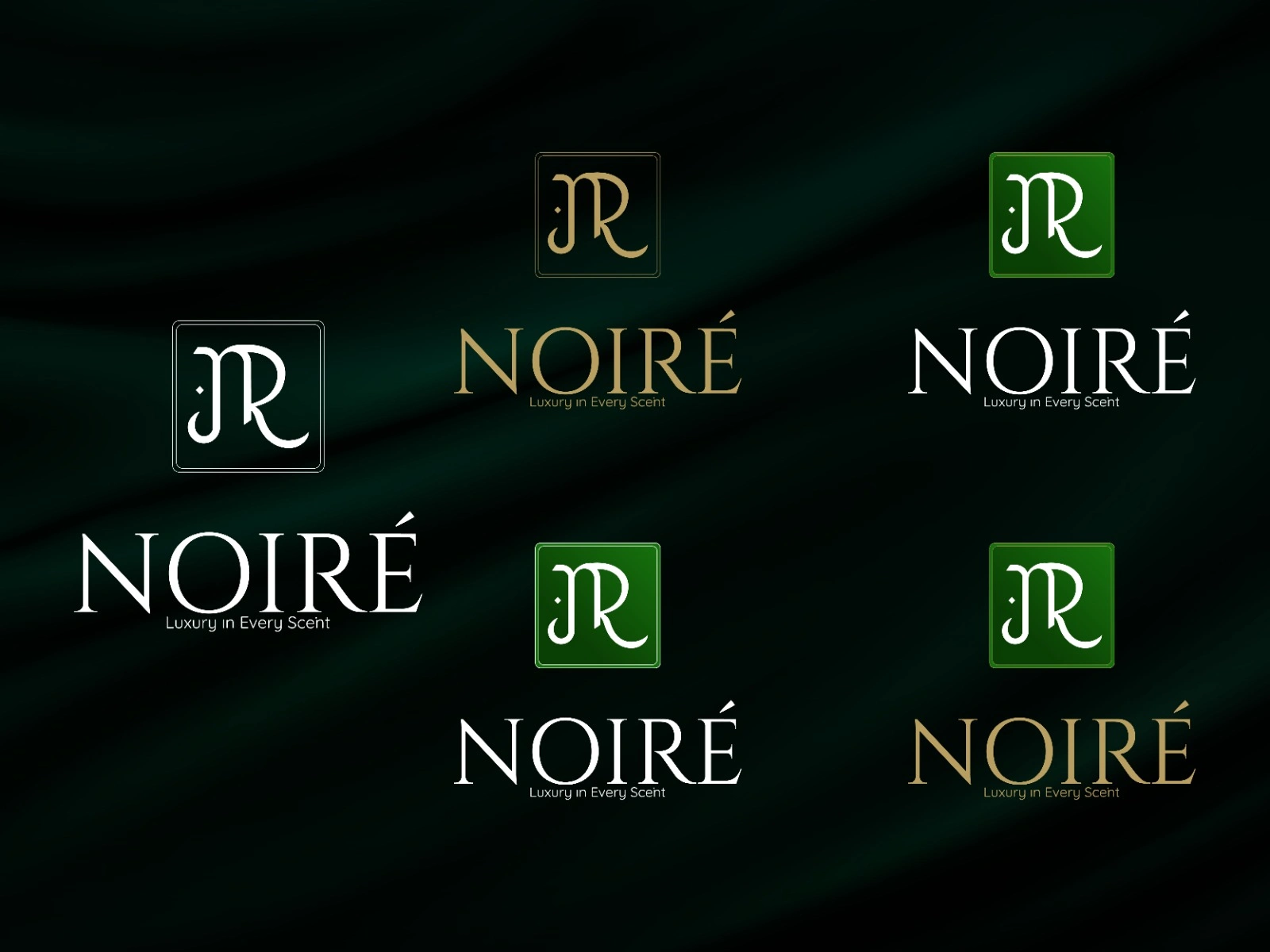
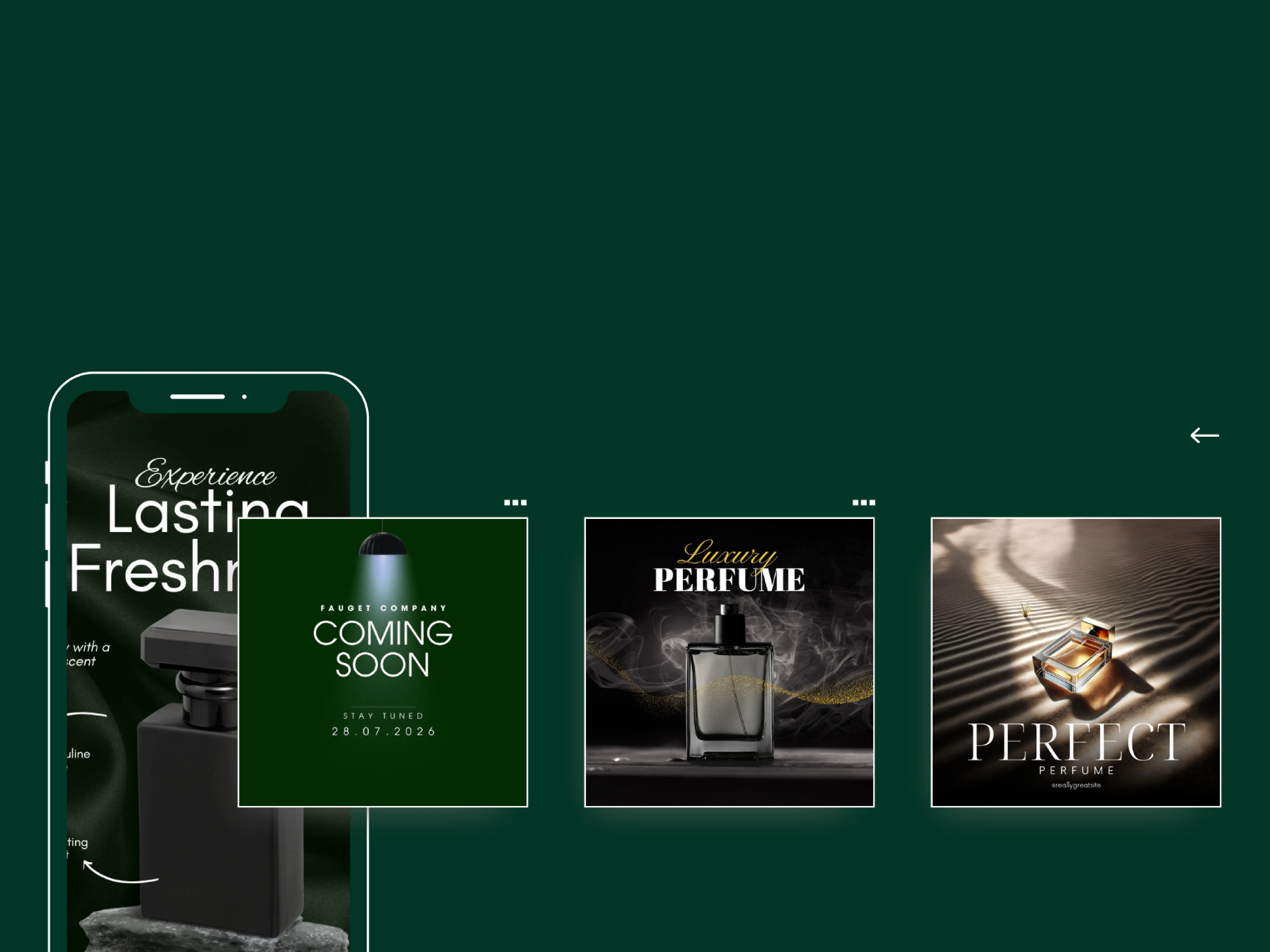
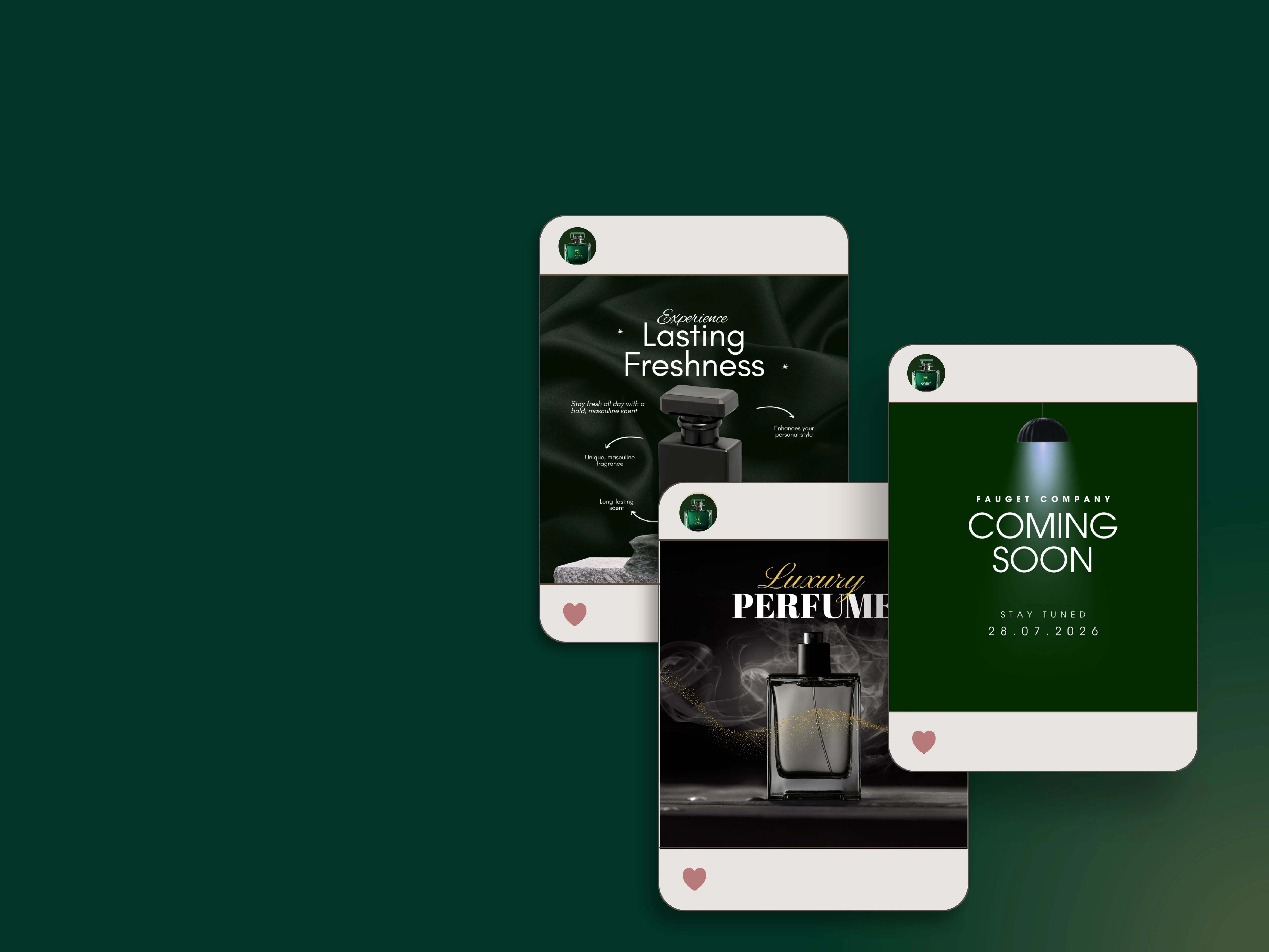
Designed a complete luxury brand identity for JR NOIRÉ, including logo design, typography system, premium packaging, and digital brand visuals.


