Projects using Notion in North Holland
Projects using Notion in North Holland
Sign Up
Post a job
Sign Up
Log In
Filters
2
Projects
People
Message
0
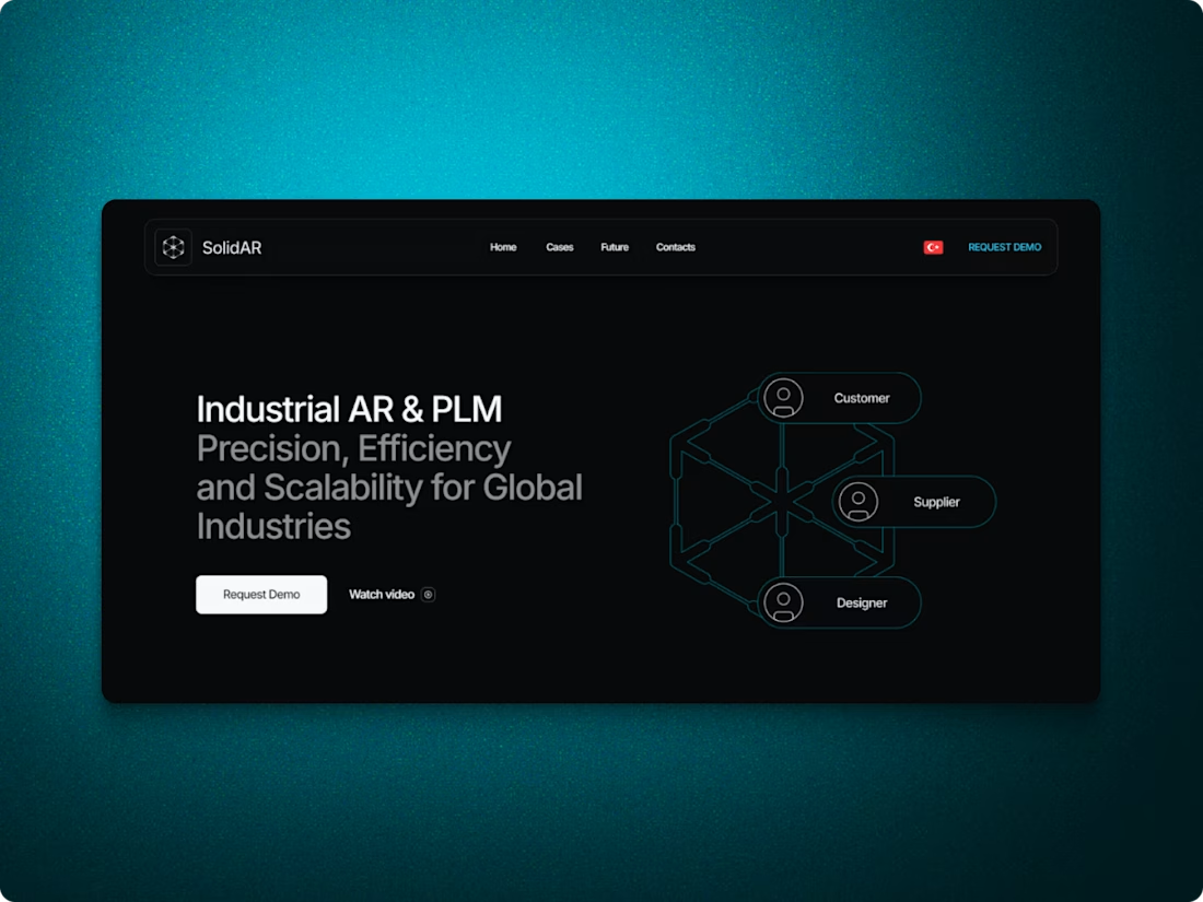
Konstantin Zudov
SolidAR Company website
0
15
Message
0
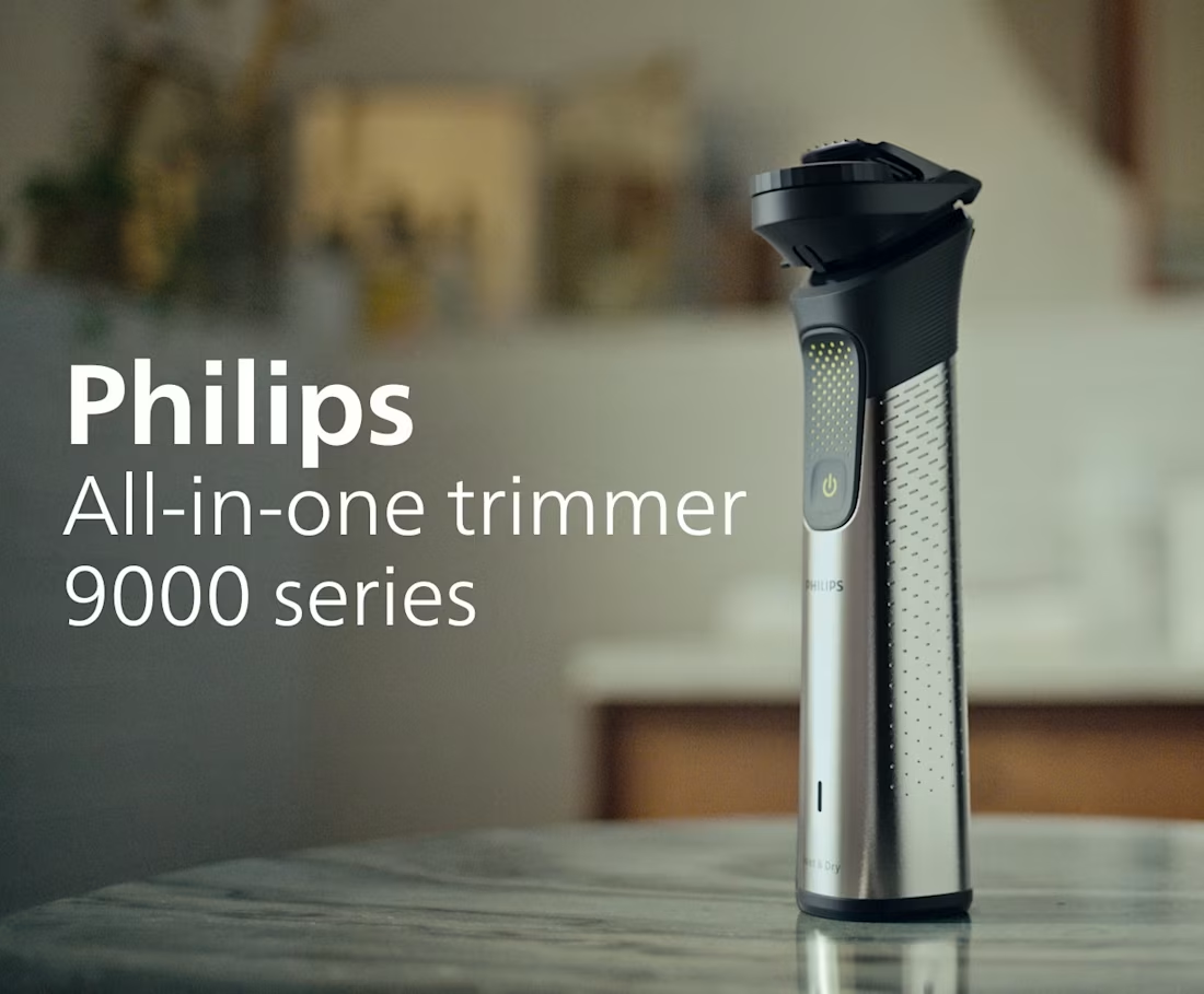
Coen Brasser
CG Product Replacements – Philips Broadcast Campaigns
0
5
Message
0
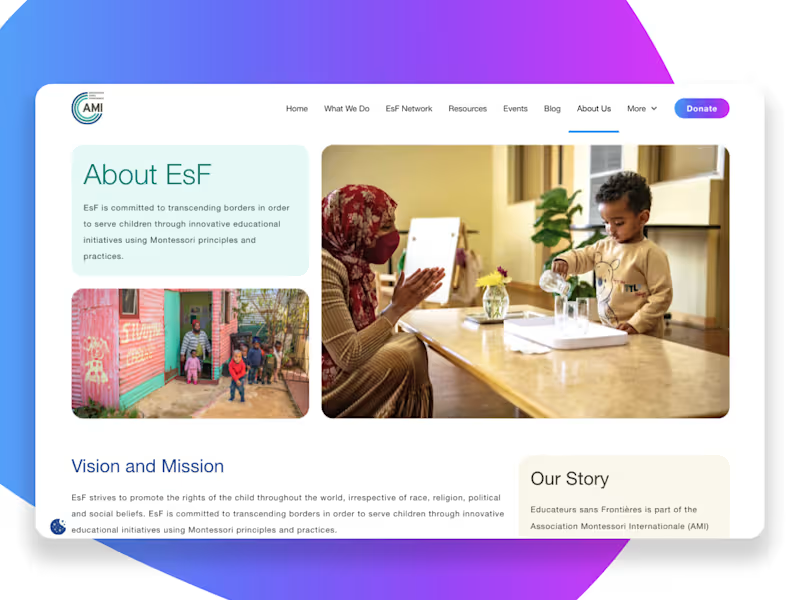
Awesome Digital Design
Montessori EsF Global Platform Development
0
7
Message
1
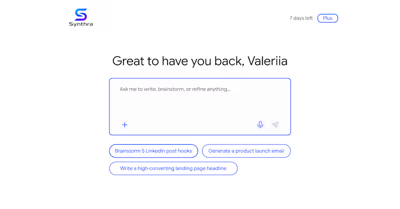
Valeriia Hamzatova
In a recent review of AI product, I noticed next: to help users getting over a blank state - there are pre-made prompts. Unfortunately 🥲 they acted as a pure ‘conversation starters’ - in the end, user still needs to start typing 👩🏻💻 in order to accomplish a task. Such pattern just postpones the moment user gets an actual value 💫 To fix this, pre-made prompts are better to work as templates 🙌🏻 It would reduce friction and improve the overall user experience 😉
1
166
Message
0
Godswill Ukpong
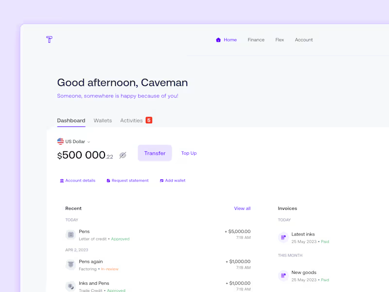
Building a comprehensive trade finance management solution
0
72
Message
0
Bram Goossens
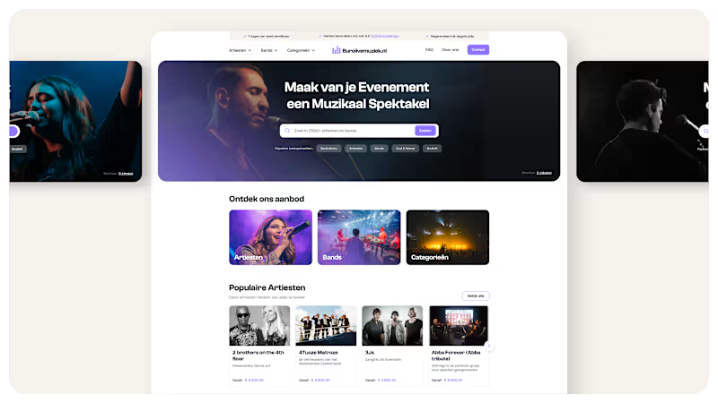
Taking the platform for booking bands and artists to a new level
0
15
Message
0
Jenifer Cerero
Spiritual Loung© Independent publication, 520+ organic subscribers, 0 paid ads.
0
57
Message
0
Laura Petrescu
One candidate - Three different reviews - One decision to hire
0
12
Message
0
Lisanne Nausner
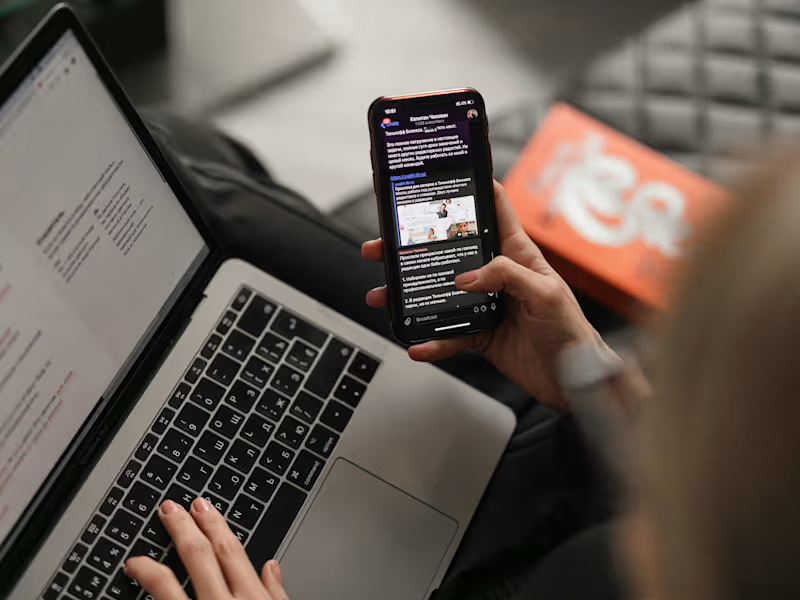
Copy for weekly tech newsletter
0
42
Message
0
Mercedes Juri
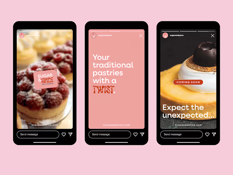
Sugar & Spice: Visual Identity
0
25
Message
0
Rina Yamazaki
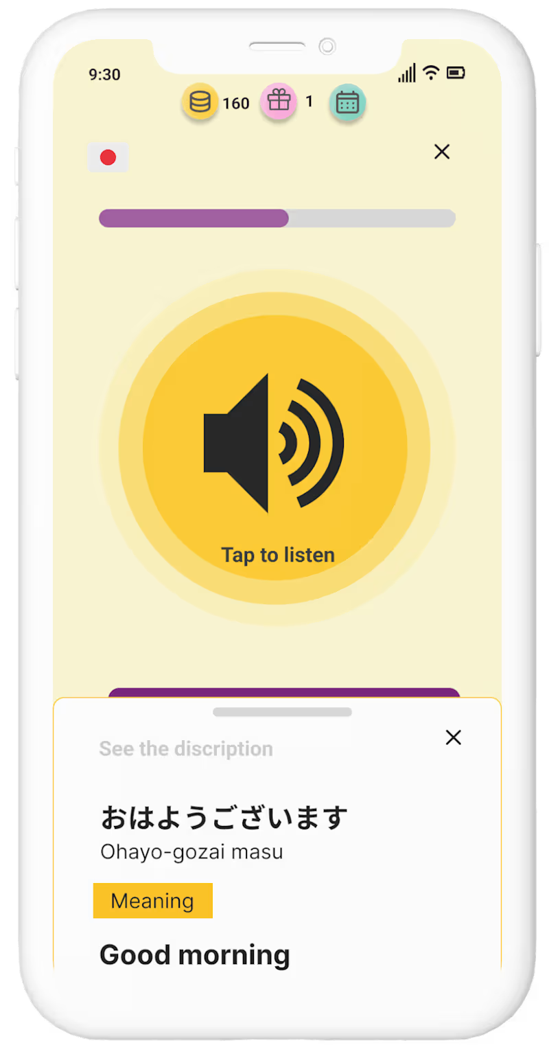
Services – UX&UI Designer Rina Yamazaki
0
17
Message
0
Charifa Ouirini
Personalised newsletters for every client
0
22
Message
0
Valeriia Hamzatova
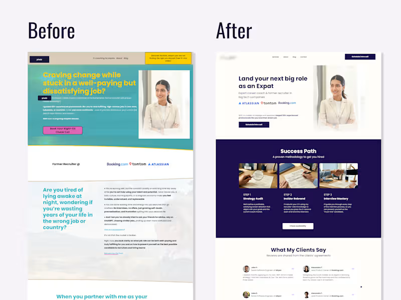
UX Review & Redesign Suggestion for a Career Coach 💼 ☝🏻Photos replaced and some details blurred with the client's permission In this redesign I focused on two main issues: credibility and clarity. Trust signals existed but were invisible. Logos from recognizable companies (Atlassian, TomTom, Booking.com (http://Booking.com)) and client testimonials were buried below the fold thus invisible to most visitors. Moving them above the fold immediately signals legitimacy before a potential client decides whether to keep reading. The target audience wasn't clear enough. The original headline spoke to a broad, emotionally frustrated audience without specifying who exactly the coach helps. The redesign suggestion narrowed the positioning so a potential client knows within the first scan: "this is for me." Nothing new was added, I just reframed what was already there 👩🏻💻
0
194
Message
0
Bram Goossens
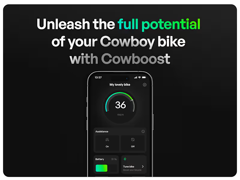
Unleash the full potential of the Cowboy bike
0
25
Message
0
Laura Petrescu
A candidate experience as smooth as butter
0
27
Message
0
Valeriia Hamzatova
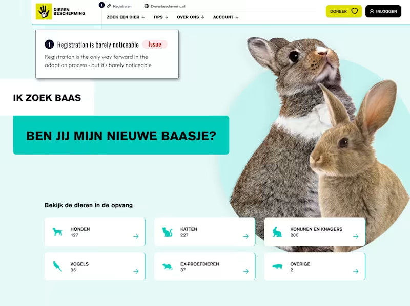
Registration wall nobody warns you about Ik zoek baas by dierenbescherming.nl (http://dierenbescherming.nl) receives thousands of monthly visitors looking to adopt a pet 🐶🐱🦮 The page looks like a browsing experience: scroll through animals, find one you love, proceed. But there's a catch nobody mentions upfront: you can't move forward in your adoption journey until registered. Visitors only discover this after they've already chosen an animal they want. That's not the best moment for a surprise. Here's the nuance though 👆 the registration requirement is right ✅ Adopting a pet is a serious commitment. Some people decide emotionally and later regret it, which is harmful to the animal. The screening process exists to protect against that. The UX failure isn't the barrier. It's that the page hides it. Framed honestly from the start - "we ask you to register because we care about the right match" - registration stops feeling like bureaucracy and starts feeling like trust 🧡 Sometimes the fix isn't removing friction. It's explaining it 💬
1
0
271
Explore projects