
Social Media Manager & Strategist | Content, Ads & Lead Gen
- $1k+
- Earned
- 3x
- Hired
- 5.0
- Rating
- 149
- Followers
Social Media Manager & Strategist | Content, Ads & Lead Gen


Community-Based Lead Generation & Marketing for a Consulting Business (NJ/PA/MI)
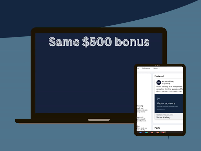
Client: Vector Advisory
I conducted in-depth community research and developed a lead generation strategy for a U.S.-based consulting business targeting audiences in New Jersey, Pennsylvania, and Michigan.
The project involved identifying high-potential Reddit communities, Facebook groups, and online forums, evaluating each community's rules, culture, audience fit, and engagement opportunities.
I created a structured research map with strategic recommendations, prioritized communities based on potential, and outlined compliant participation strategies aligned with the client's marketing requirements.
Key Deliverables:
Community Research Map (Excel)
Market & Audience Research
Community Prioritization Framework
Lead Generation Strategy
Compliance & Risk Assessment
Strategic Recommendations
Outcome:
The research was approved by the client and led to an ongoing monthly retainer, recognizing the quality of the analysis, firsthand verification, and strategic recommendations.
Skills:
Community Research • Lead Generation • Market Research • Social Media Strategy • Audience Research • Marketing Strategy • Reddit • Facebook Groups • Microsoft Excel
4
680
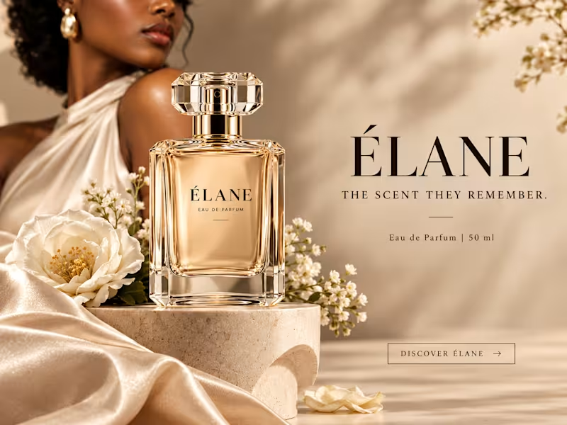
Same prompt. Same concept. Two AI tools. 👀
I gave ChatGPT and Gemini the exact same prompt to create a luxury perfume ad creative.
No changes. No extra instructions.
Now I want to know what YOU think:
Which creative did it better?
🔵 A— Gemini
🟣 B— ChatGPT
Look at the overall concept, visual quality, composition, typography, and how “ad-ready” it feels.
Who wins this round? 👀
Vote below and tell me what made you choose your answer.
#AIContent #AIAdvertising #AdCreative #CreativeStrategy #ChatGPT #Gemini #SocialMediaManager #SocialMediaStrategy #SocialMediaMarketing #MarketingStrategy #DigitalMarketing #ContentCreation
13
18
1.9K

Content Writer/Manager for B2B-B2C SaaS & Fintech Companies
- $1k+
- Earned
- 1x
- Hired
- 5.0
- Rating
- 14
- Followers
Content Writer/Manager for B2B-B2C SaaS & Fintech Companies


Framer Designer | Logo Designer | Copywriter | Editor

Writing grants yourself but not getting funded?
Common issues I fix:
❌ Applying for ineligible grants
❌ Weak problem statements
❌ No measurable outcomes
❌ Budgets that don’t align with narratives
My role is simple: turn strong missions into fundable proposals.
If funding is critical to your growth this year, we should talk.
📩 Message me on Contra.
0
112

Most grants fail before they’re even reviewed.
Not because your mission isn’t important—but because your proposal doesn’t speak the funder’s language.
I help nonprofits, startups, and social enterprises:
✔ Identify the right grants
✔ Build funder-aligned narratives
✔ Submit compliant, reviewer-ready proposals
If you’re tired of wasting time on rejections, let’s fix the strategy—not just the writing.
👉 DM me “GRANTS” to get started.
1
2
241
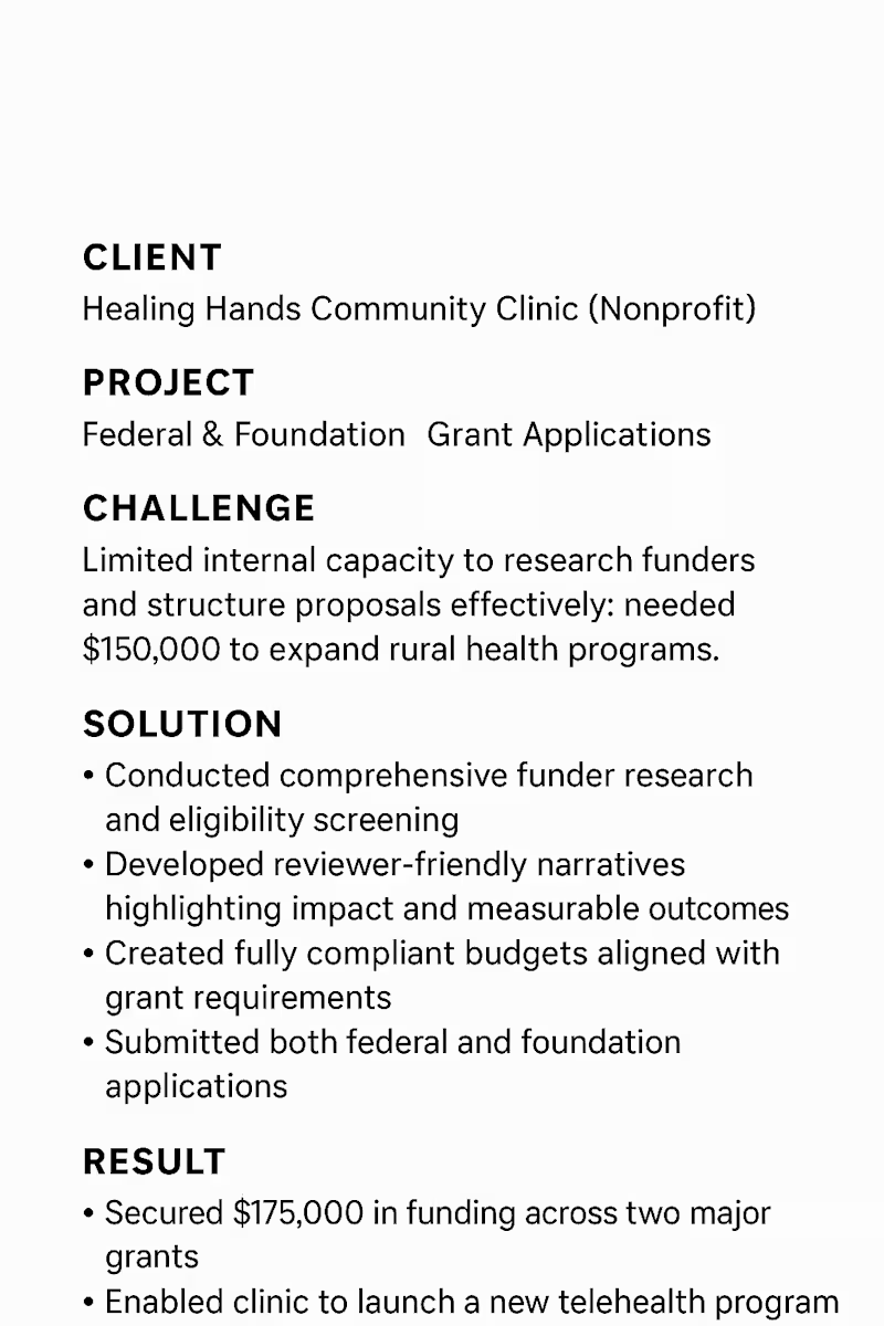
“Stop guessing with grant applications. With the right research, strategy, and structure, you’ll go from hoping to knowing you’ll win.”
I’ve helped startups, nonprofits, and community organizations move from:
❌ “We’ll try applying”
to
✅ “We know exactly why we’ll win”
What I bring:
• Funder research & eligibility screening
• Clear, reviewer-friendly narratives
• Budgets and compliance alignment
• Federal & foundation grant expertise
If funding is on your 2026 roadmap, I can help you secure it.
0
209

Turning Your Vision into Funded Reality
Are you struggling to secure funding for your nonprofit or startup? I help organizations craft winning proposals that maximize approval chances. With experience in corporate, government, and foundation grants, I’ve helped clients secure over $500k in funding. Let’s turn your project into a funded reality!
1
101

Freelance B2B Content Writer and Strategist
- $5k+
- Earned
- 13x
- Hired
- 4.9
- Rating
- 25
- Followers
Freelance B2B Content Writer and Strategist




UI/UX Designer specializing in Mobile & Web Design, Web2&3.
- 5.0
- Rating
- 1
- Followers
UI/UX Designer specializing in Mobile & Web Design, Web2&3.
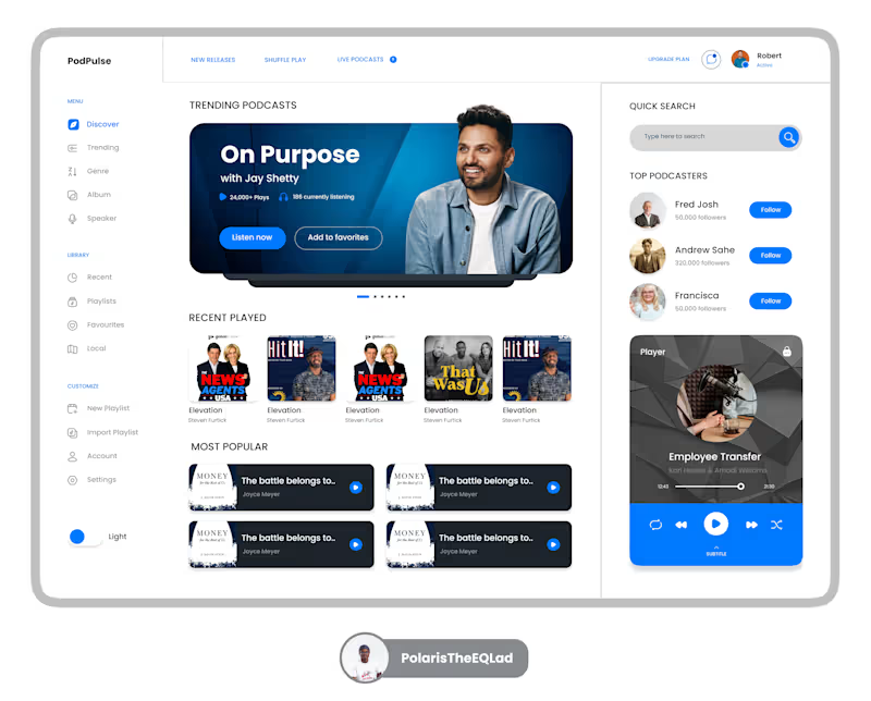
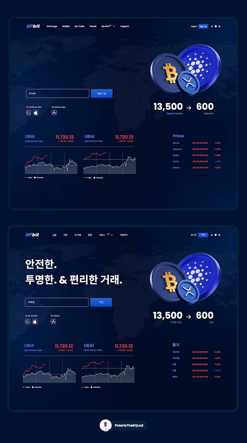
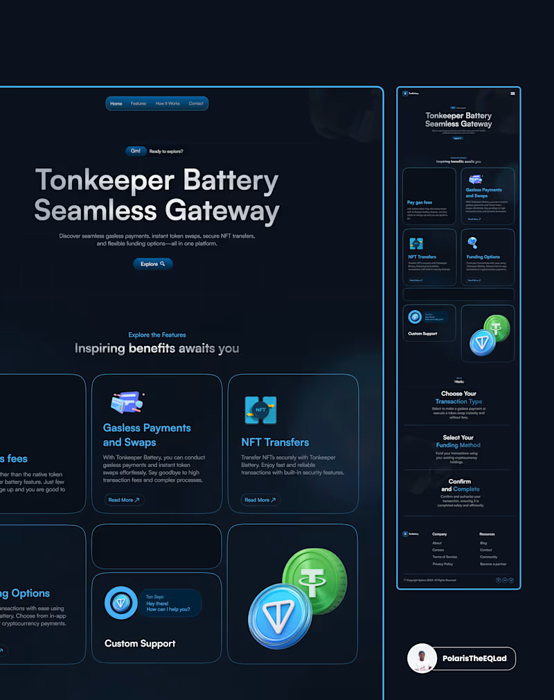
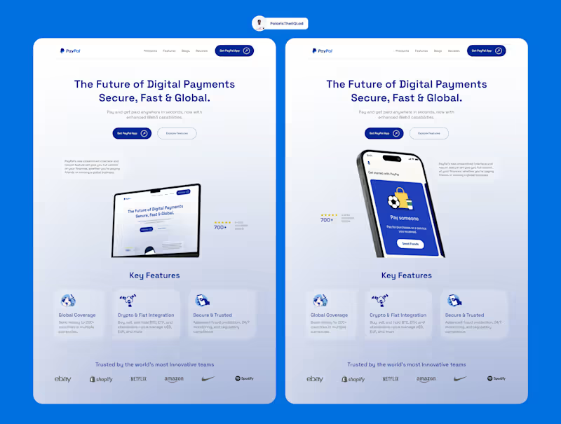

Product Designer (UI/UX) for SaaS & Mobile Apps
- 5.0
- Rating
- 11
- Followers
Product Designer (UI/UX) for SaaS & Mobile Apps
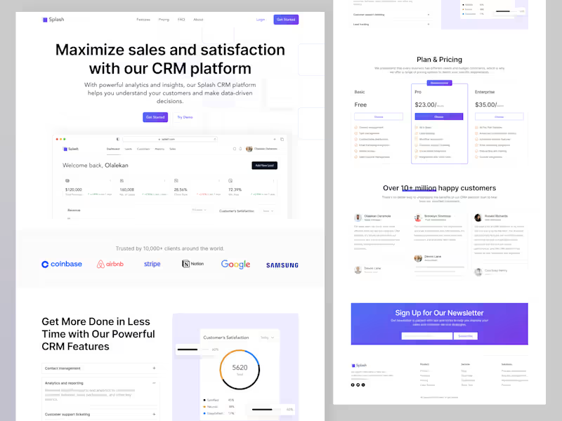
CRM Landing Page
A landing page isn’t just a visual entry point, it’s a decision making space.
For a CRM, clarity matters even more. Visitors need to immediately understand:
- What the product does
- Who it’s for
- How it makes their workflow easier
A high converting CRM landing page bridges marketing and product. It builds trust, explains value fast, and removes friction before a user ever signs up.
In this design, the focus was on:
- Clear value propositions over features
- Simple, structured layouts that guide attention
- Strong calls-to-action that feel natural, not forced
Good design sells. Great design converts.
Let’s build a landing page that converts
1
92
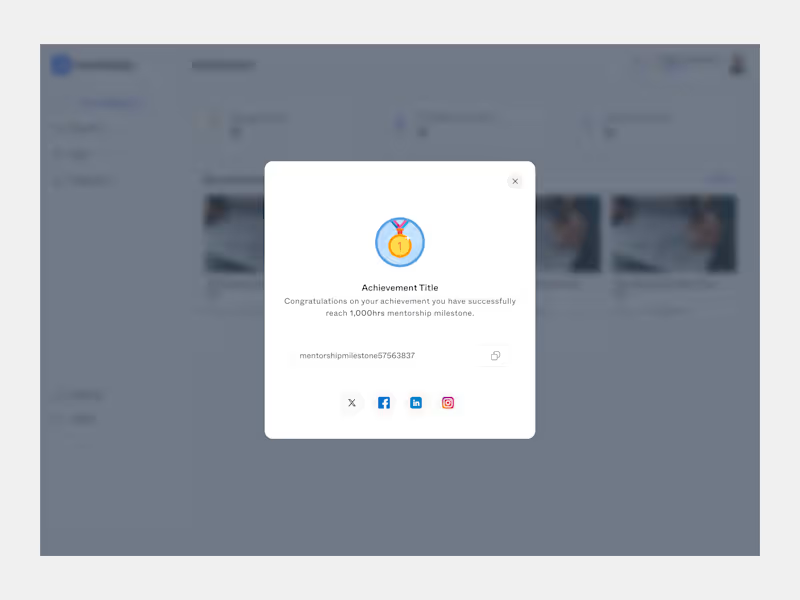
Achievement
I designed this achievement modal to make progress feel visible and rewarding.
The focus was on:
- Clearly highlighting what the user has achieved
- Making the reward feel meaningful, not distracting
A small moment like this can significantly boost motivation, engagement, and retention when done right.
Good gamification celebrates effort, not just completion.
👉 Looking to design engaging gamification experiences or dashboards? Let’s work together.
1
88
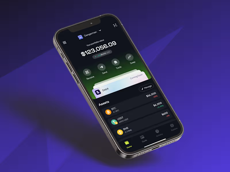


I turn complex topics into articles people actually finish
- 11
- Followers
I turn complex topics into articles people actually finish
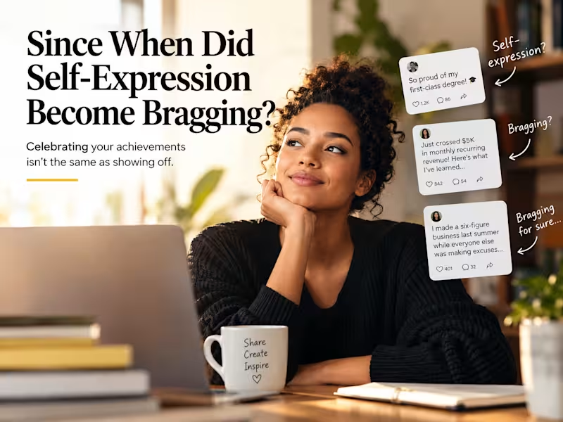
When does self-expression become bragging?
We often encourage people to share their work, celebrate their achievements, and express themselves. Yet when they do, we sometimes accuse them of showing off.
In this article, I explore the difference between celebrating personal success and communicating superiority, questioning why we sometimes mistake our reactions to other people's achievements for evidence of their intentions.
Because sharing something you're proud of doesn't automatically mean you're bragging.
0
23
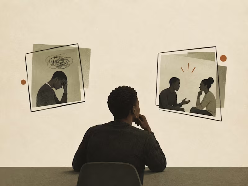
Solomon’s Paradox Isn’t What You Think It Is
Solomon’s Paradox offers a popular explanation, but what does the research actually demonstrate?
In this research-driven article, I examine the original experiments by psychologists Igor Grossmann and Ethan Kross, exploring how people reason about personal versus other people’s relationship conflicts. I broke down what the researchers measured as wise reasoning, examine their findings on psychological self-distancing, and question how far the conclusions can reasonably be generalized.
Rather than accepting a familiar psychological concept at face value, the article distinguishes the original evidence from the simplified claims often built around it.
Focus: Psychology, critical thinking, research analysis, and evidence-based writing.
0
86


Brand Identity & Visual Designer with 11+ Years Experience
New to Contra
Brand Identity & Visual Designer with 11+ Years Experience
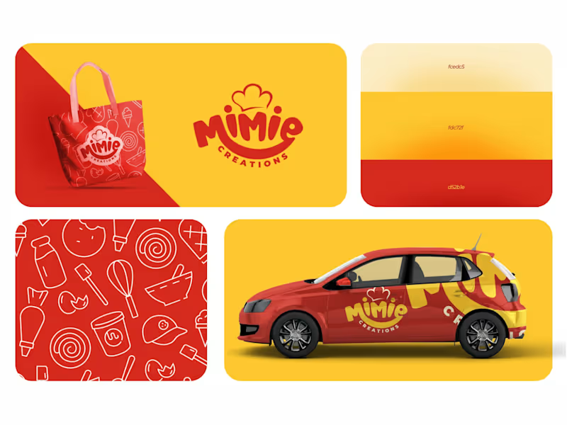
Mimie Creations: Brand Identity
Mimie Creations is a sweet treats and baking brand that needed a look as warm and inviting as its products. The goal was a brand that feels playful and homemade but still looks professional enough to grow into a real business.
The logo is a hand-lettered wordmark with a curved smile running through the type and a small chef's hat on top. It's friendly and easy to remember, and it tells people what the brand does before they read a word.
I kept the palette simple: a rich red and a soft butter yellow. The colors feel like fresh bakes and stay bold on packaging and vehicles. To give the brand more personality, I drew a custom pattern of baking icons, including whisks, spatulas, bowls, cookies, cones, and piping bags, which works as a backdrop on packaging and merchandise.
I then applied the identity to a branded tote bag and a delivery car wrap to show how it looks in real use.
Deliverables: Primary logo, color palette, custom icon pattern, tote bag mockup, vehicle branding.
0
45
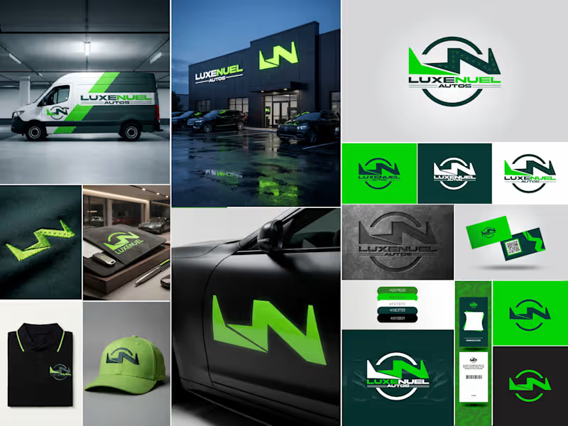
Luxenuel Autos: Brand Identity
Luxenuel Autos needed a brand that felt premium but still had energy, something that would look right on a dealership front and on a work van. I built the identity around a monogram that blends an "L" and "N" into one bold, angular mark. The shape reads like a road turning and a bolt of speed at the same time, and it sits inside a circular badge so it stays strong at any size.
For color, I went with a deep forest green paired with a bright electric green. The dark tone gives it weight and trust, and the bright one gives it that "always moving" feel. Black and white keep everything clean and easy to read.
Then I tested the mark on real touchpoints to make sure it worked outside the logo sheet: a wrapped service van, glowing storefront signage, embroidered polos and caps, business cards, ID badges, a key holder, and a car door decal. The logo also comes in solid, reversed, and embossed versions, so it holds up on light, dark, and textured surfaces.
The result is a complete, ready-to-use identity that makes the business look established from day one.
Deliverables: Primary logo, alternate and icon marks, color palette, brand applications, and mockups.
0
51
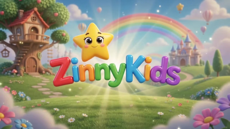
ZinnyKids: AI-Animated Kids’ Story Video
Description
I created this video for ZinnyKids, a kids’ learning and storytelling brand. The goal was to make something that looks warm, colorful and polished, like a real animated studio piece, without a studio budget.
Everything in it was built with AI video tools: the storybook world, the friendly teacher character and the movement, all kept consistent from scene to scene. That consistency is the hard part, and it’s where good prompting makes the difference.
I’m also a brand designer, so I don’t just make clips. I make sure the video matches your brand’s colors, style and voice.
If you need kids’ content, brand films, explainers, ads or social videos, I can build it with you.
0
31
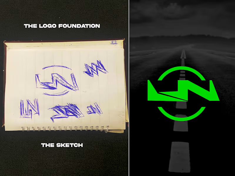
Every brand I build starts as a messy page of sketches.
On the left is where the Luxenuel Autos logo began: a lot of scribbled LN shapes and arcs I kept redrawing. On the right is the finished mark, with the road running through the center. The sketch is where I figure out what the brand should feel like, and the screen is where I polish it.
That's how I work with every client. I take the time to understand your business first, so the logo looks right and actually means something.
I'm Kachi, creative director at Kachiart Designs. I design logos and full brand identities for business owners, startups, churches, and CEOs.
Now I'm curious: looking at the sketch and the final logo, what's the first thing you notice, the letters, the road, or the circle?
And if you're starting a business or your brand needs a fresh look, send me a message here on Contra and tell me about it.
Other questions you can swap in:
Do you think a logo should be simple or detailed?
Sketch first or straight to the computer? What's your process?
Which do you like more, the rough sketch or the final logo?
0
77