Freelancers using Notion in Netherlands
Sign Up
Post a job
Sign Up
Log In
Filters
2
Projects
People
Yves Dukker
pro
Netherlands
Web & Product Designer - Launching experiences that convert.
$1k+
Earned
1x
Hired
5.0
Rating
29
Followers
expert
Follow
Message
Web & Product Designer - Launching experiences that convert.
1
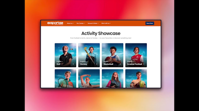
From Decline to Growth: The Exsportise Website Transformation
1
20
2
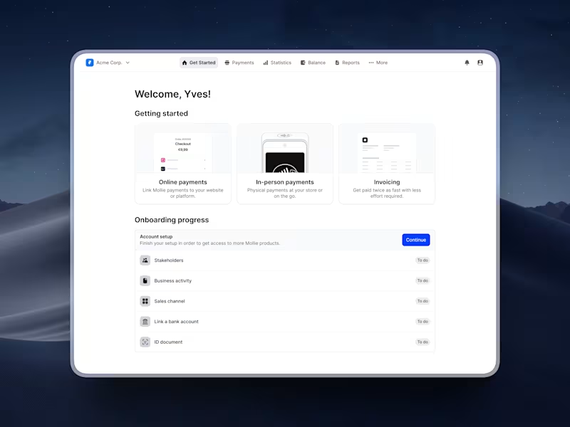
Redesign of Mollie's KYC and API Integration
2
20
1
Scalable Design System for Bunq
1
19
View more →
Notion
(2)
Follow
Message
David Pukha
Netherlands
Framer Developer & Web Designer
5.0
Rating
3
Followers
expert
Follow
Message
Framer Developer & Web Designer
0
High-Converting Brand, Copy & Landing Page for QuikMedia
0
14
0
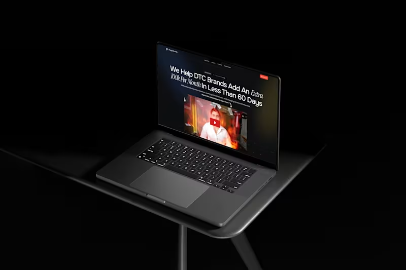
Marketing Agency MagneticAds - Framer Landing Page Development
0
3
0
SimplyFlowy - High-Quality Web Design Services
0
5
0
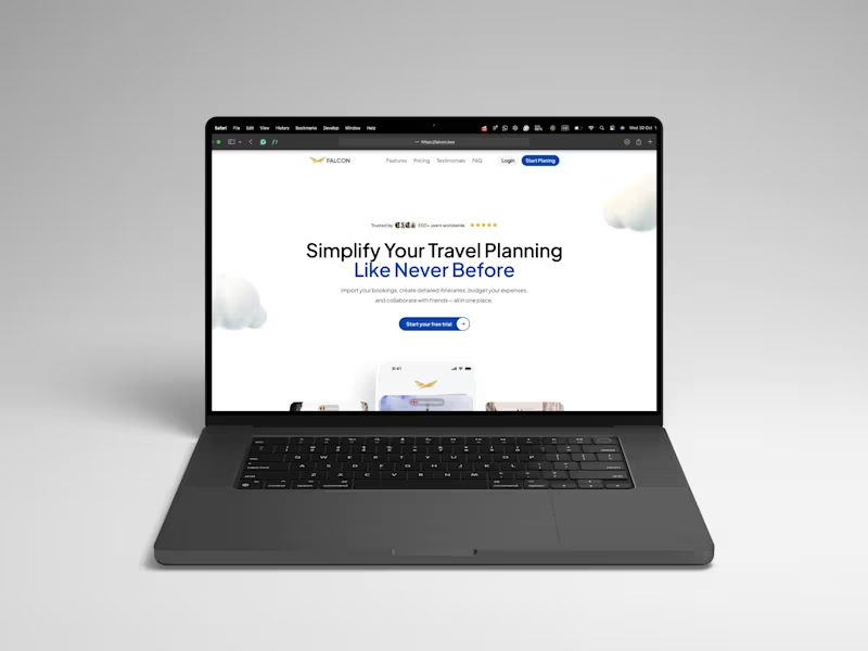
Falcon - Framer Landing Page Dev
0
14
Notion
(3)
Follow
Message
Michiel Burgess
Veldhoven, Netherlands
Framer expert - Custom Web Design & Development
2x
Hired
1
Followers
expert
Follow
Message
Framer expert - Custom Web Design & Development
0
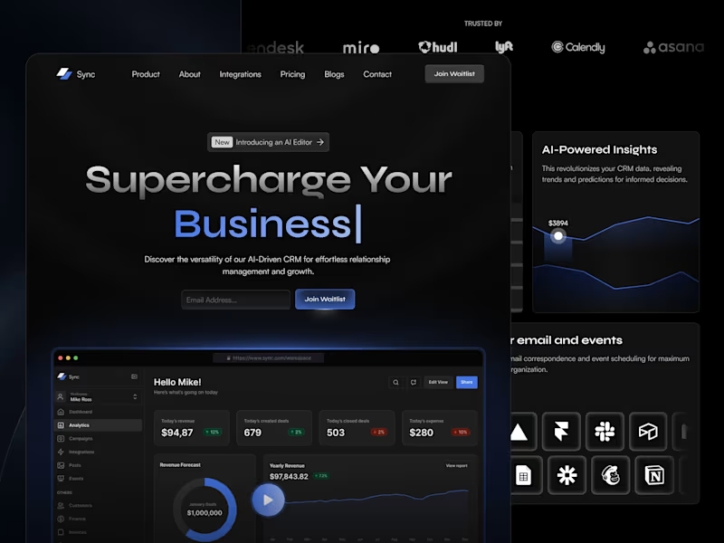
Sync SaaS CRM - Framer Template
0
23
1
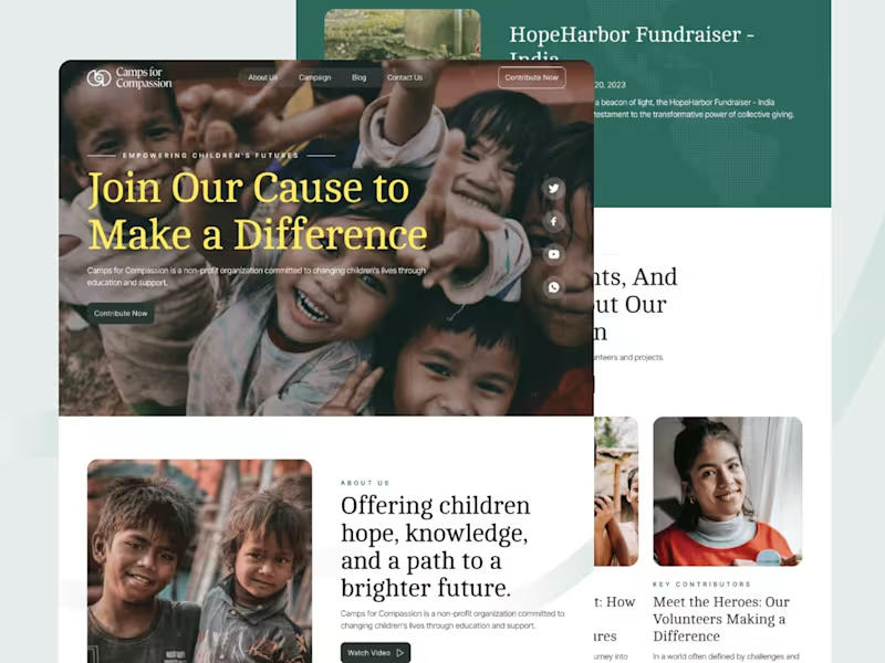
Camps for Compassion - Charity Framer Template
1
12
0
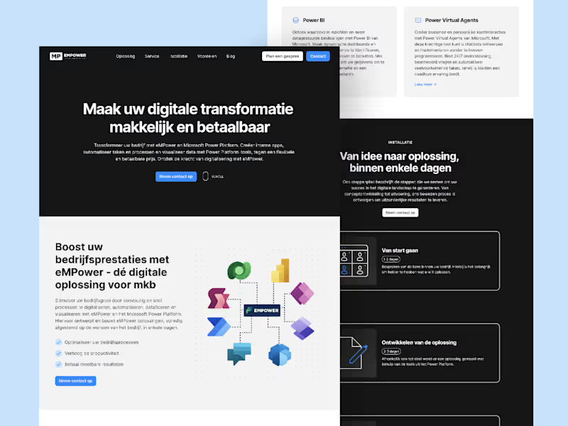
Empowermy - Make your digital transformation easy and affordable
0
25
0
Welleton - Websites that are easily self-adjustable
0
64
Notion
(3)
Follow
Message
Bram Goossens
Amsterdam, Netherlands
Let's close the gap between visitors and conversion.
expert
Follow
Message
Let's close the gap between visitors and conversion.
0
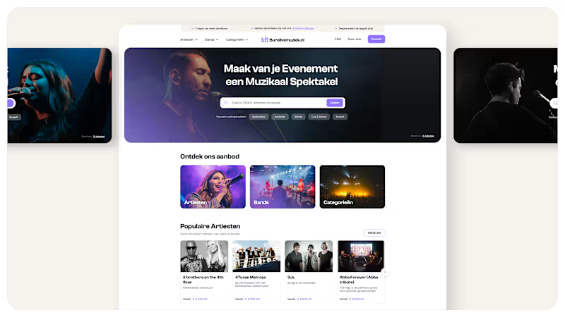
Taking the platform for booking bands and artists to a new level
0
13
0
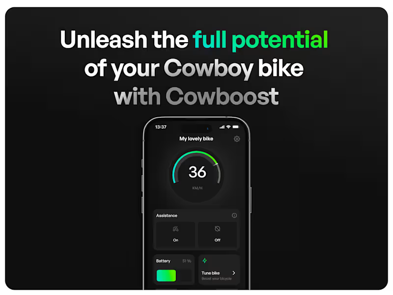
Unleash the full potential of the Cowboy bike
0
21
0
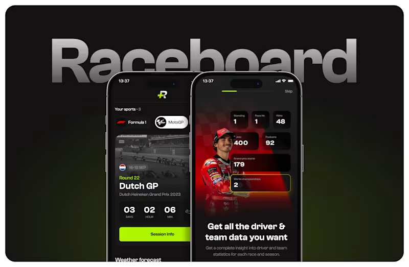
The app for the ultimate motorsport fan!
0
11
0
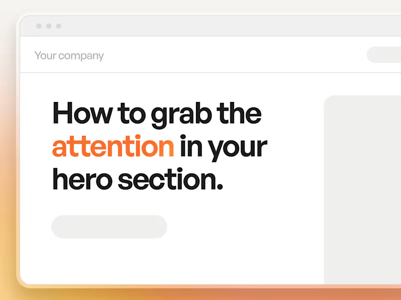
How to grab the attention in your hero section.
0
9
Notion
(3)
Follow
Message
Cecilia Lopez
pro
Cuijk, Netherlands
Project, Operations & Digital Business Manager
5.0
Rating
10
Followers
Follow
Message
Project, Operations & Digital Business Manager
0
Notion workflow consulting for entrepreneur's new project
0
12
0
Asana Workspace Audit
0
12
0
ClickUp Implementation for Legal Services Agency
0
6
0
Virtual Assistance for Sales & Business Development Consultant
0
2
Notion
(2)
Follow
Message
Valeriia Hamzatova
Amsterdam, Netherlands
Actionable UX Audits for startups and scaling businesses
1x
Hired
2
Followers
Follow
Message
Actionable UX Audits for startups and scaling businesses
1
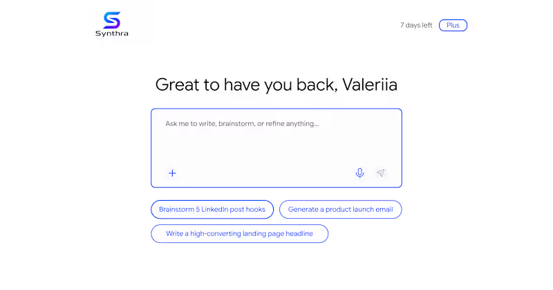
In a recent review of AI product, I noticed next: to help users getting over a blank state - there are pre-made prompts. Unfortunately 🥲 they acted as a pure ‘conversation starters’ - in the end, user still needs to start typing 👩🏻💻 in order to accomplish a task. Such pattern just postpones the moment user gets an actual value 💫 To fix this, pre-made prompts are better to work as templates 🙌🏻 It would reduce friction and improve the overall user experience 😉
1
156
0
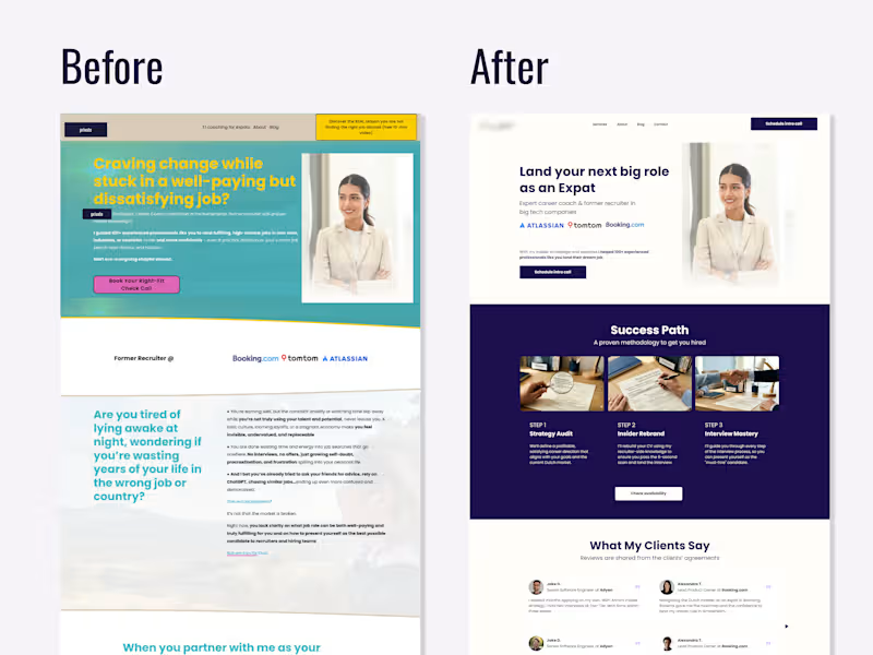
UX Review & Redesign Suggestion for a Career Coach 💼 ☝🏻Photos replaced and some details blurred with the client's permission In this redesign I focused on two main issues: credibility and clarity. Trust signals existed but were invisible. Logos from recognizable companies (Atlassian, TomTom, Booking.com (http://Booking.com)) and client testimonials were buried below the fold thus invisible to most visitors. Moving them above the fold immediately signals legitimacy before a potential client decides whether to keep reading. The target audience wasn't clear enough. The original headline spoke to a broad, emotionally frustrated audience without specifying who exactly the coach helps. The redesign suggestion narrowed the positioning so a potential client knows within the first scan: "this is for me." Nothing new was added, I just reframed what was already there 👩🏻💻
0
166
0
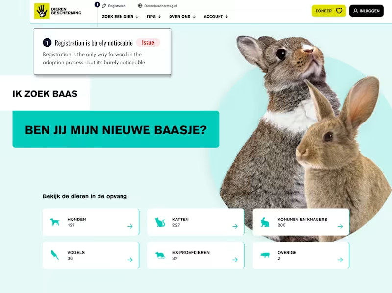
Registration wall nobody warns you about Ik zoek baas by dierenbescherming.nl (http://dierenbescherming.nl) receives thousands of monthly visitors looking to adopt a pet 🐶🐱🦮 The page looks like a browsing experience: scroll through animals, find one you love, proceed. But there's a catch nobody mentions upfront: you can't move forward in your adoption journey until registered. Visitors only discover this after they've already chosen an animal they want. That's not the best moment for a surprise. Here's the nuance though 👆 the registration requirement is right ✅ Adopting a pet is a serious commitment. Some people decide emotionally and later regret it, which is harmful to the animal. The screening process exists to protect against that. The UX failure isn't the barrier. It's that the page hides it. Framed honestly from the start - "we ask you to register because we care about the right match" - registration stops feeling like bureaucracy and starts feeling like trust 🧡 Sometimes the fix isn't removing friction. It's explaining it 💬
1
0
245
0
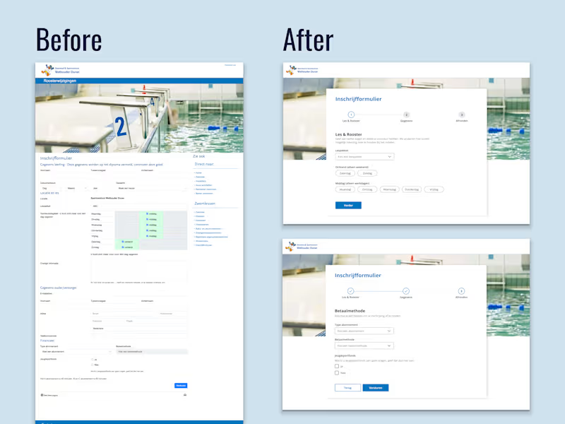
UX Redesign Suggestion — Swimming Lesson Registration Form Zwembad & Sportcentrum Wethouder Duran, Diemen A municipal swimming centre's registration form was technically functional but created unnecessary friction for parents signing up their children a task that should take minutes but felt overwhelming. Core problems identified ⬇️ 1. Single long-scroll form with no sense of progress or completion time 2. All time slots pre-selected by default, forcing parents to manually deselect irrelevant options 3. Poor scannability: inline labels, inconsistent field widths, and section headers in colour rather than hierarchy made it hard to read at a glance and easy to miss fields entirely Redesign approach: Restructured into 3 logical steps: lesson preference first, personal details second, payment last. This order follows the parent's natural decision flow: does this work for us → here's who we are → here's how we pay. The day selection was rebuilt from a confusing pre-checked grid into clear pill buttons grouped by ochtend/middag to reduce cognitive load and eliminating the default-selection error pattern. No new content was needed, only reframing what was already there. Speculative redesign based on a publicly accessible form, created to demonstrate UX audit and form design methodology
0
155
Notion
(3)
Follow
Message
Aron Koehoorn
Zwolle, Netherlands
Strategic Brand & UI/UX Designer | Building high-end designs
New to Contra
Follow
Message
Strategic Brand & UI/UX Designer | Building high-end designs
0
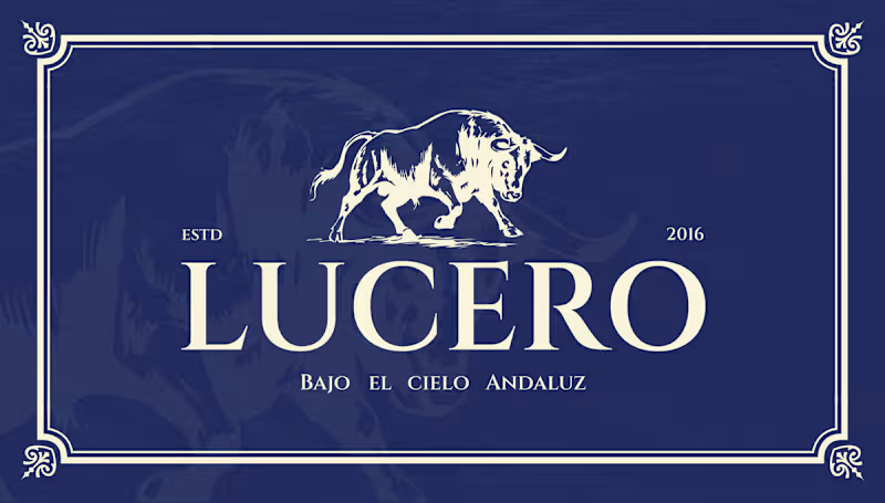
Lucero – Brand Identity & Web Design for an Authentic Andalusian Restaurant Services: Brand Identity, Logo Design, Web/UI Design, Custom Illustration, Exterior Signage About the Project Lucero is an authentic Spanish restaurant established in 2016, dedicated to bringing the rich, passionate culinary heritage of Andalusia to its guests. The objective of this project was to elevate their visual identity to match the premium, atmospheric, and romantic dining experience they provide—true to their tagline, "Bajo el Cielo Andaluz" (Under the Andalusian Sky). The Challenge Designing for traditional cuisines often comes with the risk of falling into touristy clichés. The challenge was to capture the authentic spirit of Southern Spain in a way that feels highly sophisticated, established, and elegant. The visual identity needed to communicate quality and tradition while appealing to a modern, discerning clientele seeking a high-end gastronomic experience. The Solution & Design Choices Logo & Iconography: The centerpiece of the brand is a majestic, hand-drawn illustration of a Spanish bull—a powerful symbol of strength and heritage. This is paired with a highly refined, classic serif typeface. The logo is designed to work beautifully across a flexible grid, easily adapting to light and dark backgrounds. Color Palette: I moved away from the expected bright reds and yellows of typical Spanish branding. Instead, the primary palette relies on a rich, deep midnight blue—representing the Andalusian night sky—perfectly contrasted with a warm, elegant cream tone. Custom Pattern Design: To add rustic charm and texture to the brand, I illustrated a bespoke, hand-drawn pattern. Featuring staple ingredients and culinary elements like garlic, vine tomatoes, pomegranates, and tapas, this pattern adds a playful yet artisanal touch to menus and packaging. Digital Experience: I designed a premium, responsive website interface that immediately invites users to "Dine under the Andalusian sky." The dark UI mirrors the intimate, warmly lit atmosphere of the physical restaurant, utilizing rich photography and elegant typography to drive reservations. Physical Branding & Storefront: The identity translates seamlessly into the physical environment. From the elegant window decals welcoming guests at the bistro-style storefront, to the classic, round projecting outdoor sign, the brand establishes a strong, sophisticated presence on the street. Deliverables Primary Logo & Responsive Brand Marks Color Palette & Typography System Custom Hand-Drawn Brand Pattern Responsive Website Design (Desktop & Mobile) Exterior Signage & Window Graphics
0
36
0
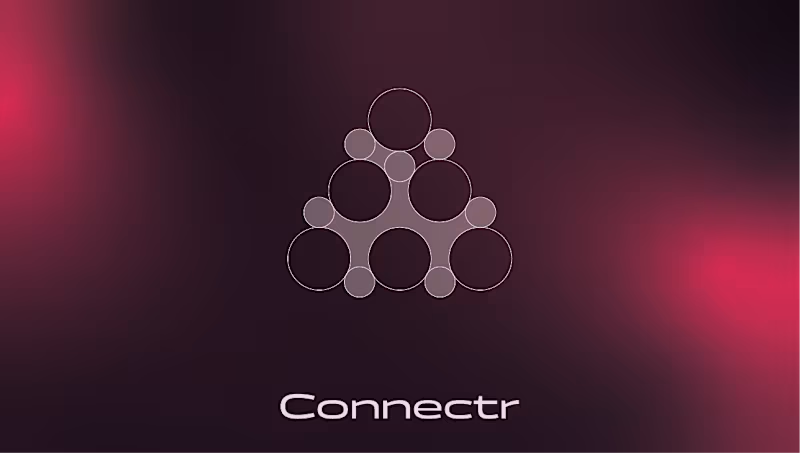
Connectr – Brand Identity & Digital Experience for Human-Centric Tech Services: Brand Identity, Logo Design, UI/UX Web Design, Copywriting Strategy, OOH (Out of Home) Design About the Project Connectr is a forward-thinking consultancy and recruitment agency operating at the intersection of IT and human behavior. Their core philosophy is simple but powerful: implementing technology is the easy part; getting people to adopt and embrace it is the real challenge. They needed a visual identity that clearly communicates their mission to bridge the gap between hard tech and human connection. The Challenge The IT consultancy space is heavily saturated with cold, hyper-corporate, and strictly digital aesthetics (often relying on standard "tech blue" color palettes). The challenge was to design an identity that feels instantly credible in the tech space, but radiates warmth, empathy, and human energy to attract both top-tier consultants and progressive clients. The Solution & Design Choices Logo & Geometric Grid: The core of the identity is the custom "node" icon. Built on a strict geometric grid of intersecting circles, the mark symbolizes a network of individuals connecting to form a cohesive, stronger entity. It visually represents the brand's core offering: bringing the right people together. Color Palette & Gradients: To break away from traditional tech branding, I introduced a striking, energetic magenta-to-red gradient. Set against deep, dark backgrounds (almost a rich plum/black), this gradient creates a glowing effect that feels vibrant, human, and modern. Crisp white is used for typography to maintain high legibility and contrast. Typography & Messaging: The brand's voice is bold and direct. The visual identity gives center stage to strong copy like "Tech snappen. Mensen begrijpen." (Understand tech. Understand people) and the core tagline "Meer mens. Meer impact." (More human. More impact). The clean, modern sans-serif typography ensures this messaging hits home instantly. Digital Experience: I designed a seamless digital experience across desktop and mobile. The website uses generous whitespace paired with the brand's signature soft gradients to create an interface that feels intuitive, clean, and welcoming—crucial for a platform focused on recruitment and human connection. OOH Campaign: The brand comes to life in the physical world through impactful billboard designs. Using dark backgrounds with the glowing gradient and relatable photography, the posters act as powerful recruitment tools and brand-awareness drivers in urban environments. Deliverables Brand Strategy & Core Messaging Geometric Logo Design & Identity System Responsive Website UI/UX Design Mobile Interface Design OOH Campaign Assets (Billboards & Posters)
0
43
0
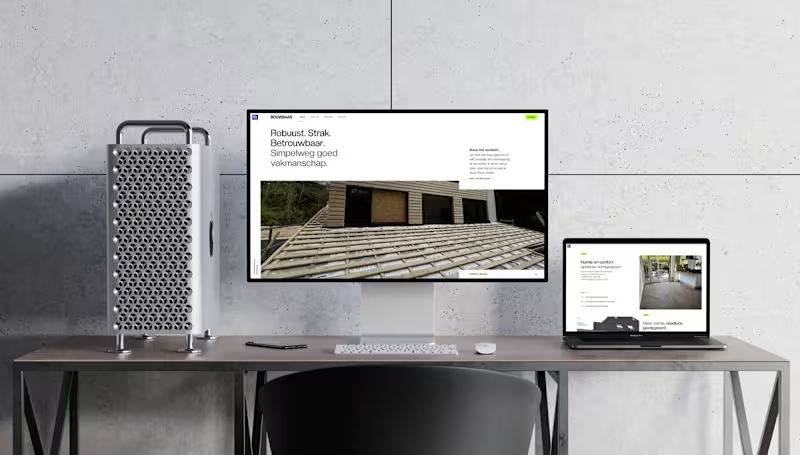
Bouwbaas – Brand Identity & Digital Presence for Modern Construction Services: Brand Identity, Web Design, UI/UX Design, Print Design, OOH (Out of Home) Design About the Project Bouwbaas is a construction and carpentry firm built on a foundation of robust, tight, and reliable craftsmanship. They needed a visual identity that steps away from the clunky, outdated aesthetics typical of the construction industry. The goal was to design a brand that feels as solid and meticulous as the physical work they deliver to their clients. The Challenge How do you make a construction brand look premium, modern, and trustworthy without losing its approachable, hardworking core? The challenge was to balance high-end digital minimalism with structural, bold typography and color choices that work just as well on a muddy construction site as they do on a high-resolution display. The Solution & Design Choices Logo & Identity System: The core of the identity is a structural, interlocking "BB" monogram. It conveys strength and architectural precision. The color palette pairs a deep, professional navy with a striking, vibrant blue and crisp white. Typography & Voice: Using a clean, sans-serif typeface, the brand voice is straightforward and confident ("Robuust. Strak. Betrouwbaar."). This no-nonsense approach is translated directly into the brand's visual hierarchy. Digital Experience: To showcase their projects, I designed a minimal, highly visual website. The layouts prioritize large, high-quality imagery of their carpentry and renovation work, ensuring a seamless experience across all devices, from desktop to mobile. App Design: The brand extends to mobile touchpoints with a sleek, highly legible app interface and an instantly recognizable home screen icon. Physical Branding & Print: A construction brand lives in the physical world. I designed clean, authoritative corporate stationery, including premium business cards. Furthermore, I created large-scale environmental graphics, like branded site fencing, which serves as an impactful billboard while a project is underway. Deliverables Brand Strategy & Identity System Custom Monogram Logo Responsive Website Design Mobile App Iconography Corporate Stationery (Business Cards) Environmental/Site Signage
0
47
0
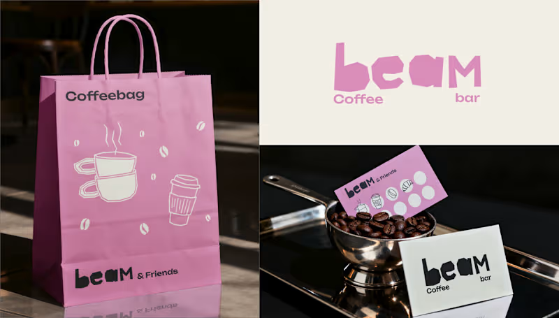
Beam Coffee Bar – Brand Identity & Storefront Design Services: Brand Identity, Packaging Design, Custom Iconography, Storefront Design, Merchandise About the Project Beam Coffee Bar is a modern, neighborhood coffee spot that doesn't take itself too seriously, but takes its coffee very seriously. The goal was to create an approachable, highly recognizable, and uplifting brand identity that brings a pop of color and personality to the daily coffee routine. The Challenge The third-wave coffee scene is often dominated by ultra-minimalist, moody, or hyper-industrial aesthetics. The challenge for Beam was to break the mold by designing a visual identity that feels incredibly fresh, playful, and inviting, while still communicating the high quality of their espresso and baked goods. The Solution & Design Choices Logo & Typography: The custom "beam" wordmark features chunky, irregular, "cut-out" style lettering. This organic, slightly imperfect typography gives the brand a human touch and a playful, laid-back energy. Color Palette: I moved away from traditional coffee tones and introduced a signature, vibrant pastel pink paired with off-white and a deep, dark roast brown. This high-contrast palette makes the brand instantly recognizable and highly "Instagrammable." Custom Iconography: To add charm across all touchpoints, I developed a set of quirky, hand-drawn line art icons featuring a croissant, a muffin, stacked coffee cups, a moka pot, and a stylized character enjoying a brew. Packaging & Merchandise: The playful aesthetic was rolled out across various physical items, including pink "Snackbags" for pastries, custom coffee cups with personalized name spaces ("This is your Cappuccino, Laura"), branded receipts, and "beam & Friends" punch cards for community loyalty. Storefront Design: The brand comes to life on the street level with a striking pink-and-white striped awning, crisp window decals featuring the custom iconography, and a clean, brightly lit shop sign that makes the café an unmissable local landmark. Deliverables Primary Logo & Typography System Custom Illustration & Iconography Library Packaging Design (Cups, Snack bags, Receipts) Merchandise & Loyalty Cards ("beam & Friends") Physical Storefront Branding (Awning, Signage, Window Decals) Looking for a brand identity that stands out in a crowded market? Let's collaborate and bring your vision to life.
0
54
Notion
(1)
Follow
Message
Godswill Ukpong
Amsterdam, Netherlands
Product Designer: people-copy-design-code-revenue
5.0
Rating
2
Followers
Follow
Message
Product Designer: people-copy-design-code-revenue
0
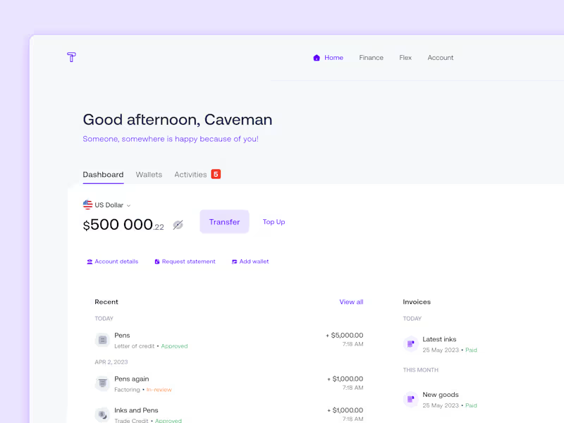
Building a comprehensive trade finance management solution
0
62
0
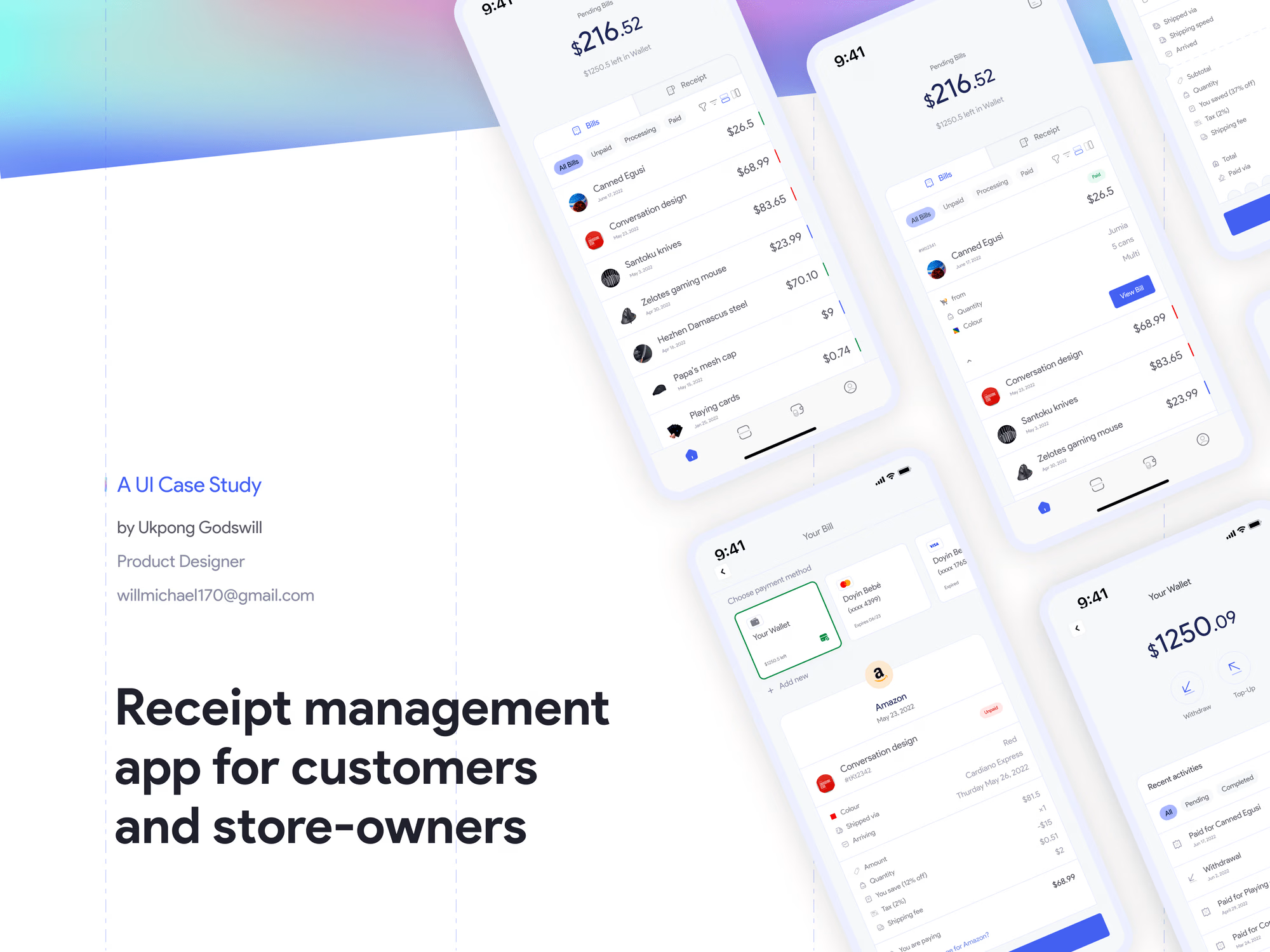
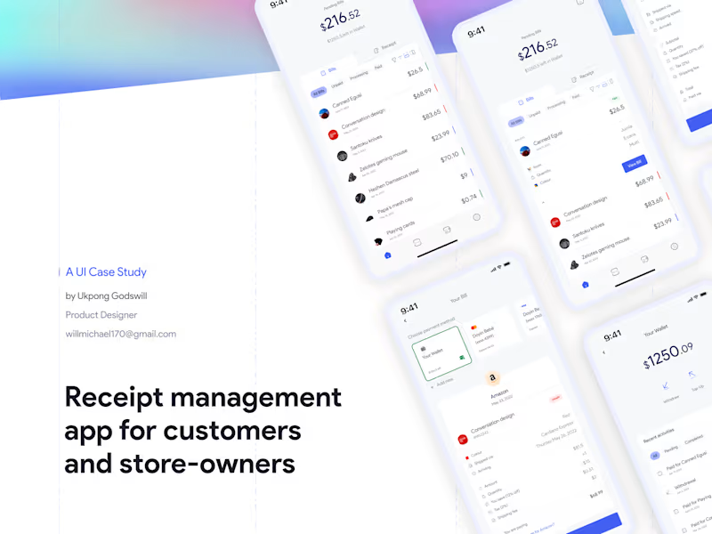
Receipt management app for customers and store-owners
0
30
0
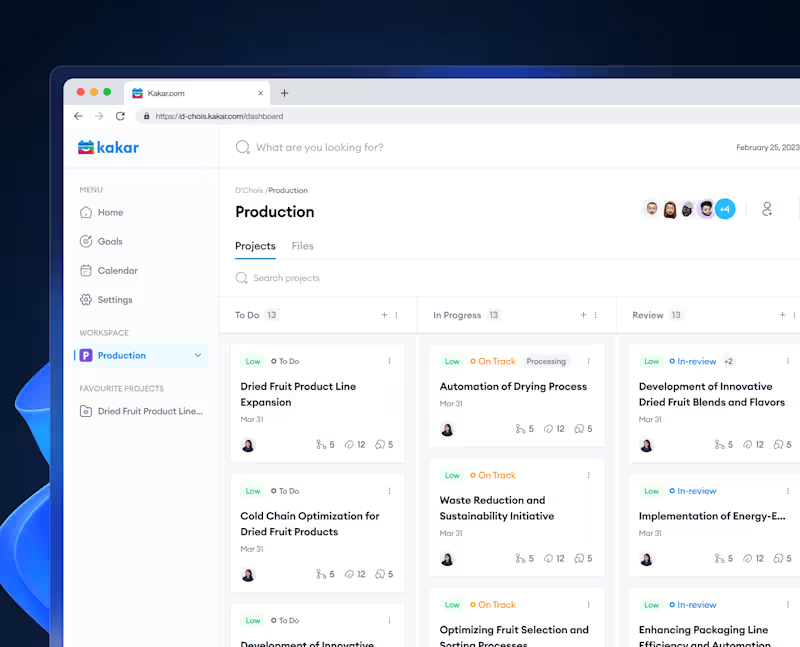
Kakar: A SaaS productivity tool that helps teams get stuff done.
0
14
View more →
Notion
(1)
Follow
Message
Explore people