
Brands built from idea to launch, with brains & personality.


Brands built from idea to launch, with brains & personality.
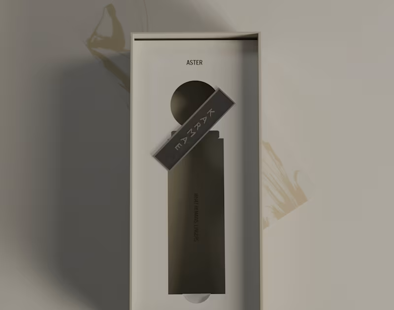
KARMAE: ASTER | Product, Packaging & 3D Development
Part two moves a little closer to the product itself.
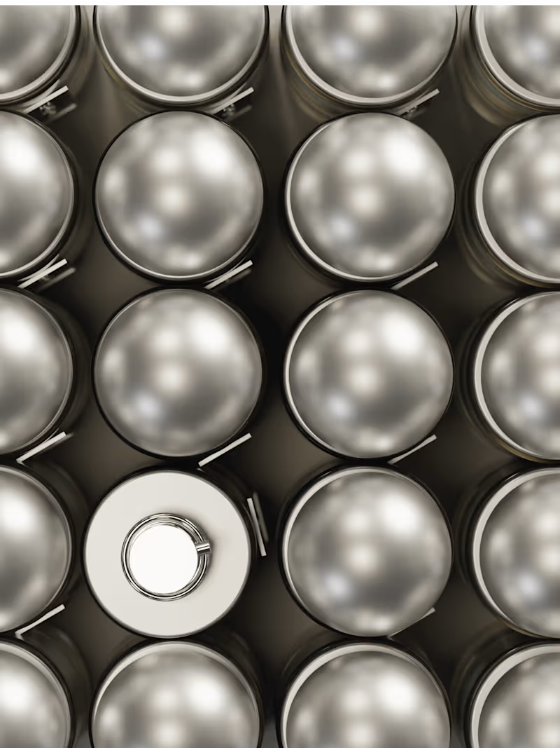
ASTER was designed as the softer side of the KARMAE world, but that softness still needed structure. The material language became a big part of that balance, combining frosted glass, muted metallics and pale neutral tones to keep the product feeling tactile, refined and recognisable.
From there, the packaging and product details were developed to feel like part of the same system rather than separate applications. The aim was to keep every touchpoint visually quiet, but still specific enough to carry the identity on its own.
Everything shown here was designed and directed by me, including the product development, packaging, materials, compositions and final 3D renders built in Blender.
A closer look at the details behind ASTER.
3
27
835
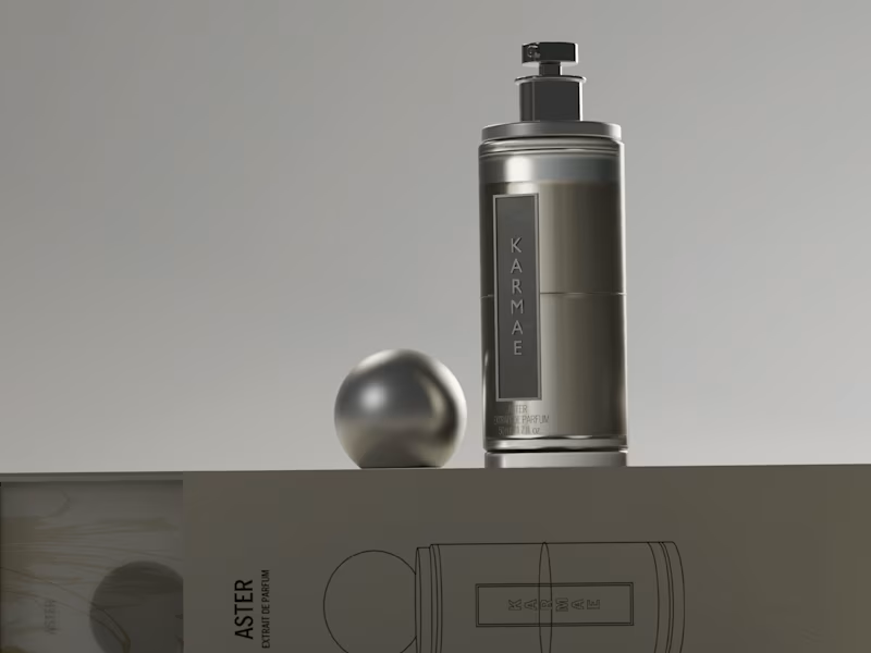
KARMAE: ASTER | Brand Identity, Packaging & 3D Direction
ASTER explores the softer side of KARMAE.
Where Orbit leaned into shadow, mineral weight and atmosphere, ASTER brings the same brand world closer to light. Frosted glass, pale botanicals, muted metallics and softer tonal contrast create a quieter, more tactile expression without losing the core identity behind it.
For this refresh, I kept the original KARMAE foundation and expanded the system rather than replacing it. The goal was to show how one brand can hold two very different moods while still feeling cohesive across product, packaging and visual direction.
Everything shown here was designed and directed by me from start to finish, including the product design, packaging, environments, materials and final 3D renders built in Blender.
Part one of ASTER.
7
20
1K
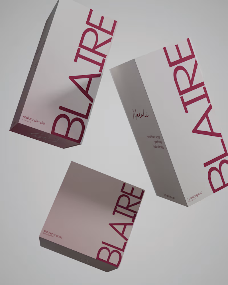
BLAIRE | Brand Identity & Packaging
Blaire was built around the idea of making a minimal brand feel distinctive without relying on excess.
The visual direction combines a restrained palette, confident typography and metallic packaging details to create something that feels clean and elevated, while still carrying enough personality to be recognisable.
Rather than treating the logo, packaging and supporting graphics as separate pieces, the identity was designed as one system. Repetition, scale and typography become part of the brand language, allowing it to stay consistent across both product and communication.
A closer look at some of the applications that brought the Blaire identity together.
44
122
4.3K


Crafting bold brands for unstoppable businesses!
Crafting bold brands for unstoppable businesses!





I Build Visual Identities for New & Growing Brands
- 1x
- Hired
- 5.0
- Rating
- 57
- Followers
I Build Visual Identities for New & Growing Brands

Vintage illustration artist and Framer template designer
- $1k+
- Earned
- 3
- Followers
Vintage illustration artist and Framer template designer

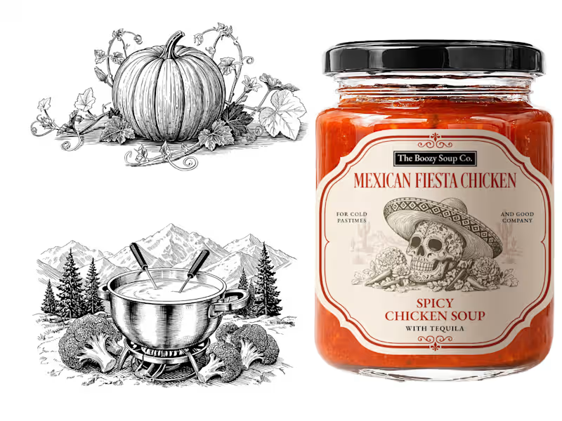

Premium Brand Designer | Logo Design | Packaging | AI Artist
- 15
- Followers
Premium Brand Designer | Logo Design | Packaging | AI Artist
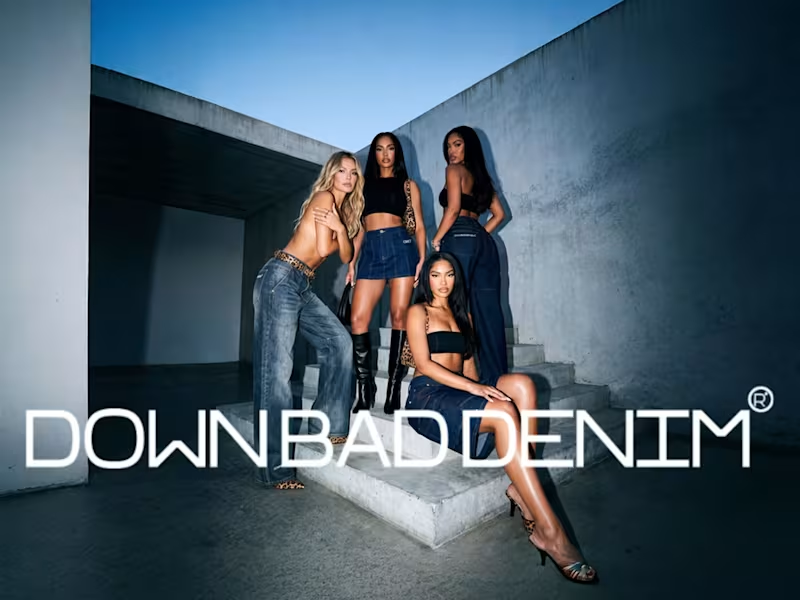
A full brand identity for Down Bad Denim Co., a premium small-batch denim label specialising in embroidery, rhinestone embellishments, and statement-making fashion.
The brief called for a visual identity that feels expressive, fashion-forward, and unmistakably premium — equally at home in a boutique window and on a social feed.
We built a complete brand system covering the logo suite, typography, color palette, packaging, and label design. Every decision was made to match the quality and boldness of the product itself.
8
25
919
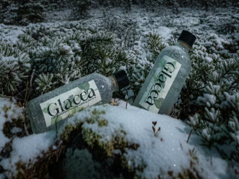
The brand identity captures the essence of its source – pure, intentional, and respectful of the resources that make it possible. From bottle design to packaging and digital assets, every touchpoint reflects a modern approach to purity, responsibility, and connection to nature.
Created for Brief Me Up's Brief 23, targeting wellness-focused individuals and eco-minded customers who value transparency, sustainability, and a refined relationship with what they consume.
1
191
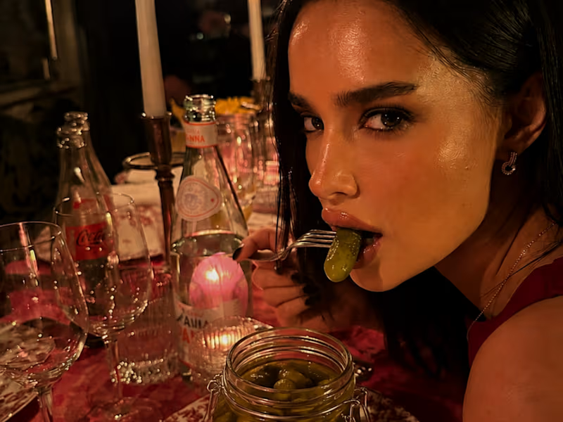
Complete brand identity for Cuke, a pickle brand that turns snack culture into a brand personality. Created for a design challenge focused on chaotic, cool, and oddly luxurious branding.
Challenge
The brand needed to appeal to consumers who embrace their unconventional snack habits while maintaining premium positioning. The identity had to balance playful provocation with sophisticated design—internet humor meets luxury branding.
Solution
I developed a distinctive brand system centered on the tagline "Wet, Salty, Yours"
0
123
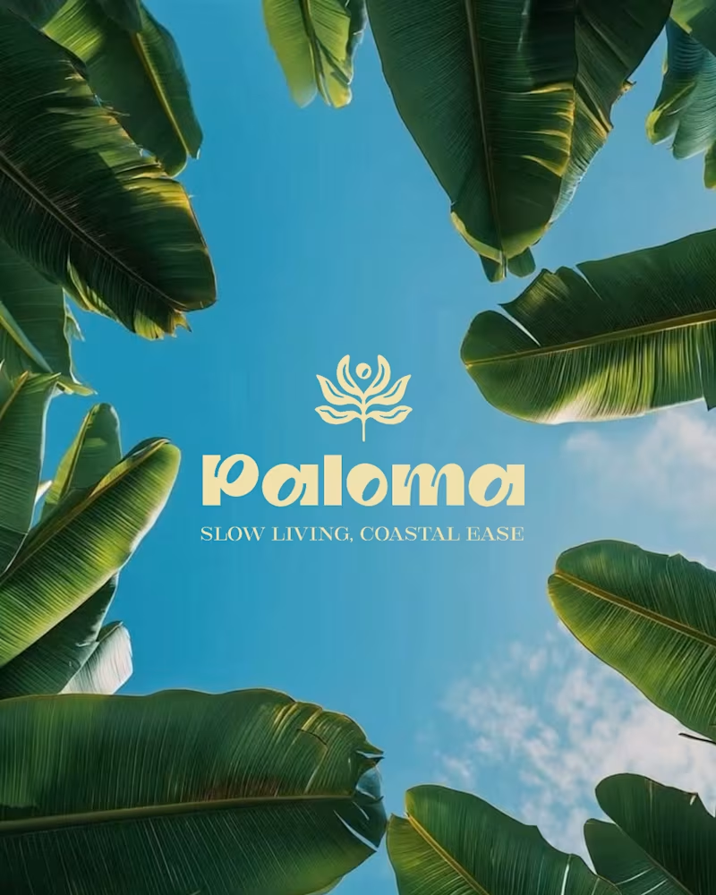
Paloma is a Mediterranean holiday residence designed as a calm retreat between sea, sun, and slow living. The challenge: build a brand identity that feels relaxed yet refined rooted in simplicity, light, and coastal ease.
The identity extends to primary deliverables including room keys and comprehensive branding guidelines, creating a complete system that invites guests into a space designed for escape and ease.
21
47
984

Creative branding for impressive brands
Creative branding for impressive brands


Visual Designer bringing premium aesthetics and structure
New to Contra
Visual Designer bringing premium aesthetics and structure

Premium Packaging & Unboxing Experience Design
'Minimalist structural design meets luxury tactile brand identity.'
I designed this premium corporate packaging and unboxing presentation for the 'iz' brand identity system. In the high-end retail and lifestyle sector, the tangible presentation of a product is just as critical as the item itself; the unboxing journey must immediately establish an impression of pure class and luxury sophistication.
My strategic design approach for this project:
• Monochromatic Visual Contrast: Utilizing a sleek, deep black matte finish for the structural display box, contrasted against a clean, repeating white logo monogram wrapping system.
• Material Architecture & Detailing: A bold, gloss-black geometric monogram UV-printed on the inner lid, paired with a central circular brand seal sticker that secures the custom tissue paper with architectural symmetry.
• Premium Tactile Flow: The angled geometric fold of the paper wrapping is meticulously structured to create an inviting, memorable presentation that maximizes negative space and clean branding.
Elevating Your Brand's Touchpoints
Are you a premium fashion brand, high-end e-commerce business, or luxury boutique looking to elevate your physical unboxing experience? I will translate your corporate vision into a stunning, tangible package design that leaves an unforgettable first impression. Let's design your next luxury presentation together.
0
87

Premium Logo Design & Visual Identity
"Minimalist elegance translated into a powerful brand identity."
I designed a custom logo for Massagepraktijk IMA that radiates tranquility, purity, and mindful care. The concept combines fluid, organic lines with a refined color palette to immediately convey a deep sense of relaxation and professionalism to the target audience.
What I delivered for this project:
Concept Development & Symbolism: A layered, continuous line-art design where the gentle contours of the human silhouette and welcoming, supportive hands harmonize beautifully.
Typography & Structural Balance: A meticulous selection of an elegant, modern typeface that stands in perfect alignment with the minimalist line work.
Aesthetic Ethics: A cohesive visual identity that breathes warmth, therapeutic trust, and pure class.
Elevating Your Vision
Are you looking for a logo or a complete visual identity that reflects the unique soul of your business? I will translate your vision with precision and artistic flair into a timeless design. Let's collaborate to bring your brand to life.
0
85
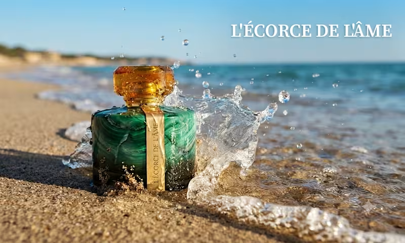
Every time I see the sunlight hitting the turquoise water, I think about the memory it leaves on the skin. I wanted to capture that precise moment where the elements collide: the raw, cooling salt of the ocean and the grounded, deep warmth of amber. I asked myself, "Can a fragrance feel like a sun-kissed horizon?"
Meet L'ÉCORCE DE L'ÂME.
L'Écorce de l'Âme isn't just a perfume; it’s a design study in duality. It starts with a cool, sharp rush of sea salt and bergamot , a crisp, modern surface ,before blooming into a heart of delicate jasmine and peppered freesia. Finally, it settles into an irresistible amber base, reminiscent of sun-drenched skin against the tide.
As a product designer, I treated the bottle design as the "bark" , the solid, protective exterior that, when cracked open, reveals the "soul" of the scent within. It’s about the tension between the mineral and the organic, the stillness and the wave.
1
148
Luxury isn’t just about the product—it’s about the entire unboxing experience. 🖤✨
A sneak peek at a premium curated packaging project. From custom monogrammed wrapping paper to sleek, branded sticker seals, every single touchpoint is designed to make a powerful statement before the box is even fully opened. 📦
In a competitive market, custom packaging is what transforms a simple purchase into a memorable brand ritual. I love helping businesses elevate their physical identity and connect with clients on a deeper, tactile level.
Need a premium design transformation for your brand's products or gifts? Let’s collaborate and craft an experience your customers won't stop talking about. 💼🎨
2
121