BLAIRE | Brand Identity &

May | Brand designer, strategist & creative director


BLAIRE | Brand Identity & Packaging
Blaire was built around the idea of making a minimal brand feel distinctive without relying on excess.
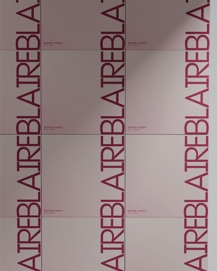
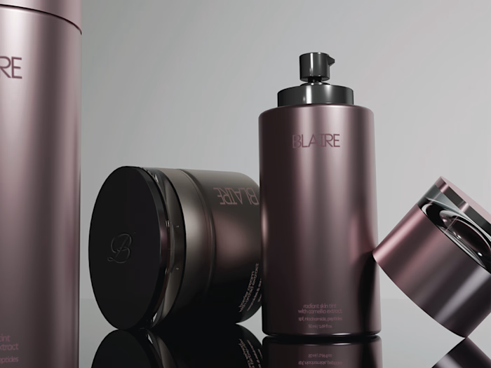
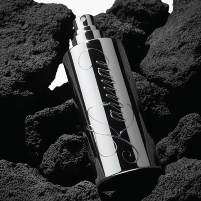
The visual direction combines a restrained palette, confident typography and metallic packaging details to create something that feels clean and elevated, while still carrying enough personality to be recognisable.
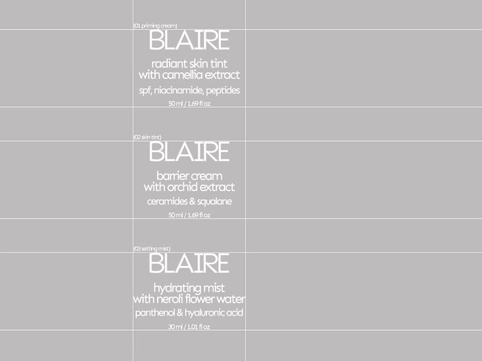
Rather than treating the logo, packaging and supporting graphics as separate pieces, the identity was designed as one system. Repetition, scale and typography become part of the brand language, allowing it to stay consistent across both product and communication.
A closer look at some of the applications that brought the Blaire identity together.
Like this project
Posted Aug 26, 2026
BLAIRE | Brand Identity & Packaging Blaire was built around the idea of making a minimal brand feel distinctive without relying on excess. The visual directi...