Framer Sites Built to Match Your Brand's Voice


Framer Sites Built to Match Your Brand's Voice



Turning Consumer Brands into Category Leaders
- $10k+
- Earned
- 4x
- Hired
- 5.0
- Rating
- 71
- Followers
Turning Consumer Brands into Category Leaders
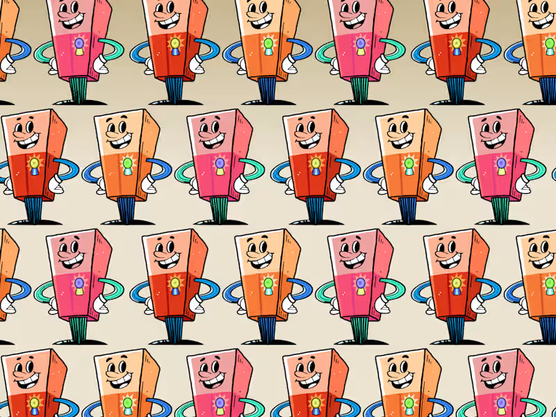
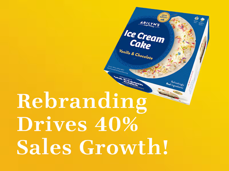
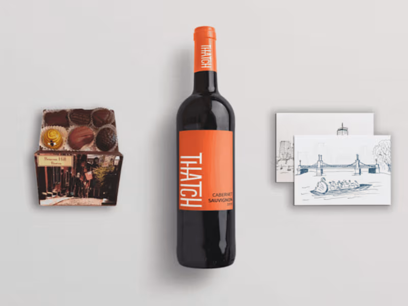
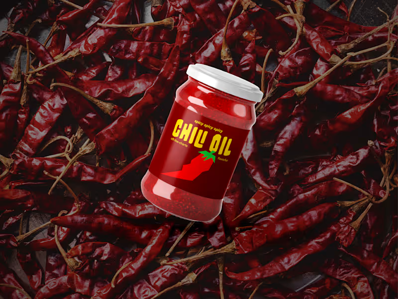
"Your packaging might be invisible. Not bad. Not ugly. Just... forgettable."
It's one of the more uncomfortable conversations to have with a client — when the work looks fine but strategically misses the mark. When it fits the category so well it disappears into it.
The shelf is a crowded place. Every category has a look, and most brands follow it. That's exactly the problem.
When I look at how well a package stands out, I focus on four things: color, shape, typography, and positioning. Not as design choices — as competitive advantages. The question isn't whether each element looks good. It's whether the combination is unmistakably theirs.
If you're working on a packaging project and want a second opinion on where it lands competitively — reach out.
1
316


Branding and Website Designer
Hello Contra Fam!
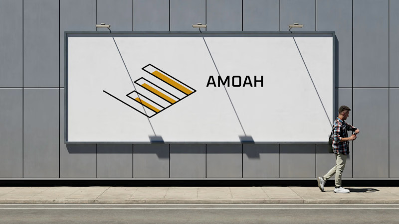
I'm thrilled to share my first attempt at Procreate Dreams with you all! I've just completed a logo animation for my personal brand, Amoah Design, and it's been an exciting departure from my usual workflow in Adobe After Effects.
This project was all about exploring the art of frame-by-frame animation, and I'm really pleased with how it turned out.
I'm curious to hear from those of you who have experience with Procreate Dreams. What are your impressions of the software? I'd love to get your insights!
2
20
885



Web, graphic, logo design expert



Web Design & UX/UI | Cat & Coffee enthusiast


Empowering brands with visual allure 🚀

Custom Wix & Squarespace Sites | Branding Expert



✏️ Research driven visual solutions for brands
✏️ Research driven visual solutions for brands