
pro
Jeff Sugarman
Turning Consumer Brands into Category Leaders
- $1k+
- Earned
- 4x
- Hired
- 5.00
- Rating
- 57
- Followers
"Your packaging might be invisible. Not bad. Not ugly. Just... forgettable."
It's one of the more uncomfortable conversations to have with a client — when the work looks fine but strategically misses the mark. When it fits the category so well it disappears into it.
The shelf is a crowded place. Every category has a look, and most brands follow it. That's exactly the problem.
When I look at how well a package stands out, I focus on four things: color, shape, typography, and positioning. Not as design choices — as competitive advantages. The question isn't whether each element looks good. It's whether the combination is unmistakably theirs.
If you're working on a packaging project and want a second opinion on where it lands competitively — reach out.
1
126

A logo design that got shifted to the reject bin, but I think it's a pretty cool monogram. It was fun working out the interplay between the two letters.
2
226
I'm working on a new branding project, where the emphasis is on grace under pressure.
3
222
Loving how easy it is to create motion graphics with Jitter.
2
1
273
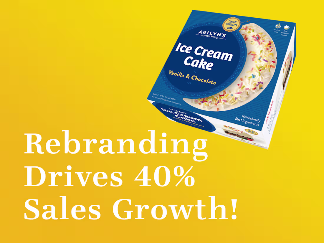
Melting Barriers: The Abilyn’s Frozen Bakery Rebrand
2
29
Logo Design Wisdom: Strategy Over Style
0
14
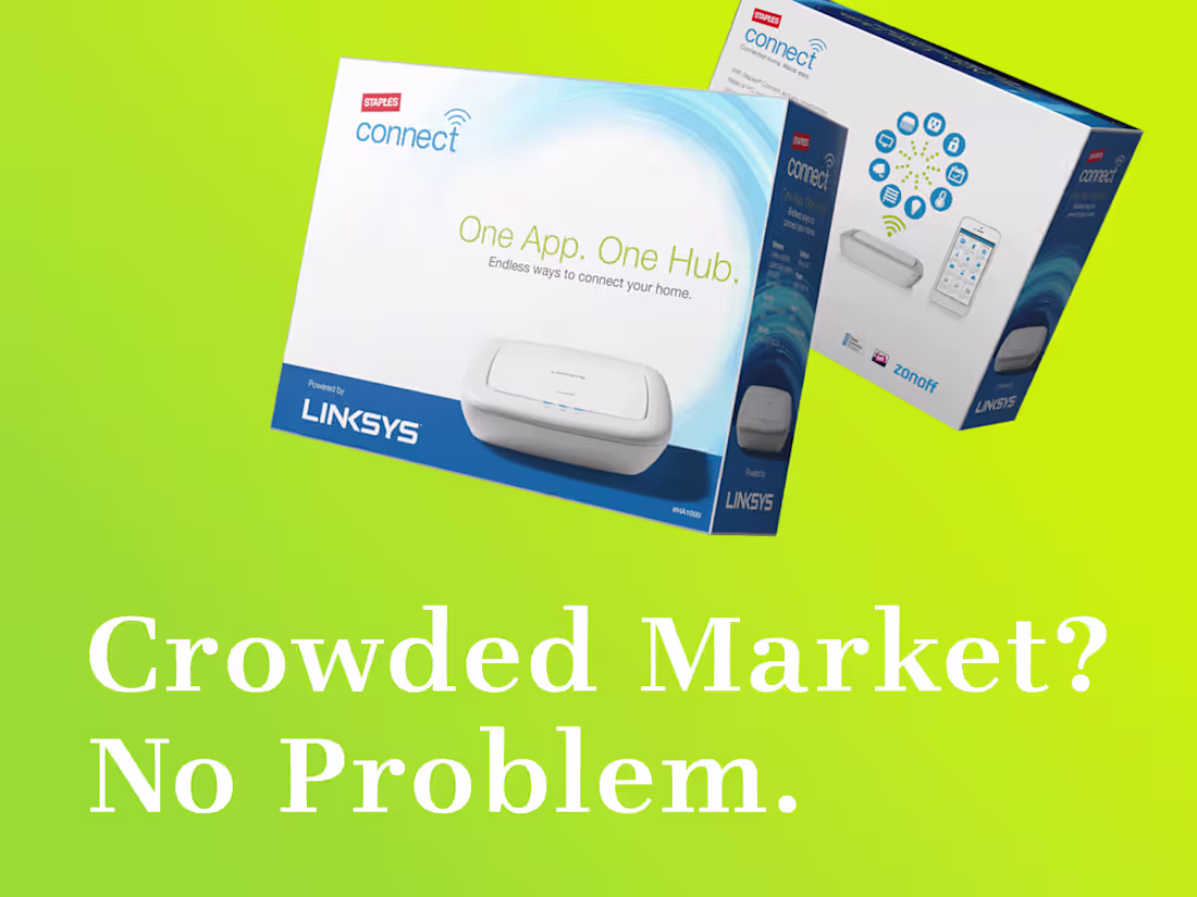
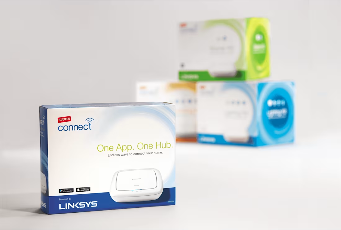
Crowded Market? No Problem.
0
16
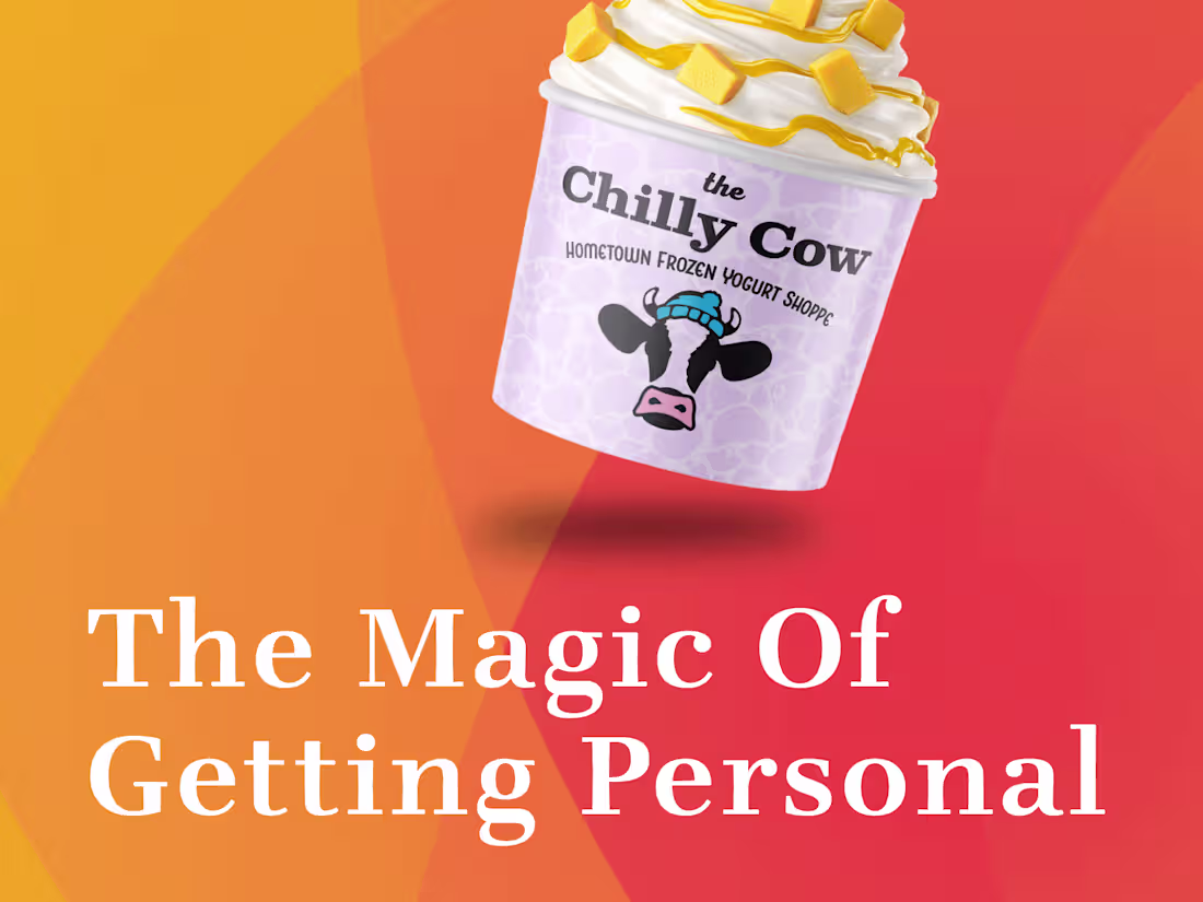
The Magic of Getting Personal
0
11
Yolo Travel: A Website That Inspires Action
0
14
Staples: Breathing Life Into a Stale Brand
0
13

Mithril Identity and Website
0
20
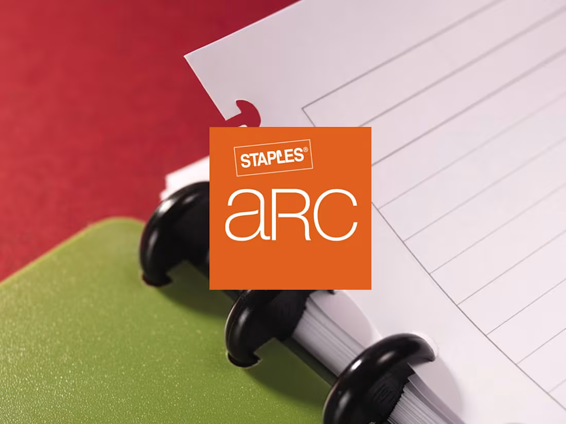
Crafting Premium Identity: The Staples Arc Notebook Story
0
13
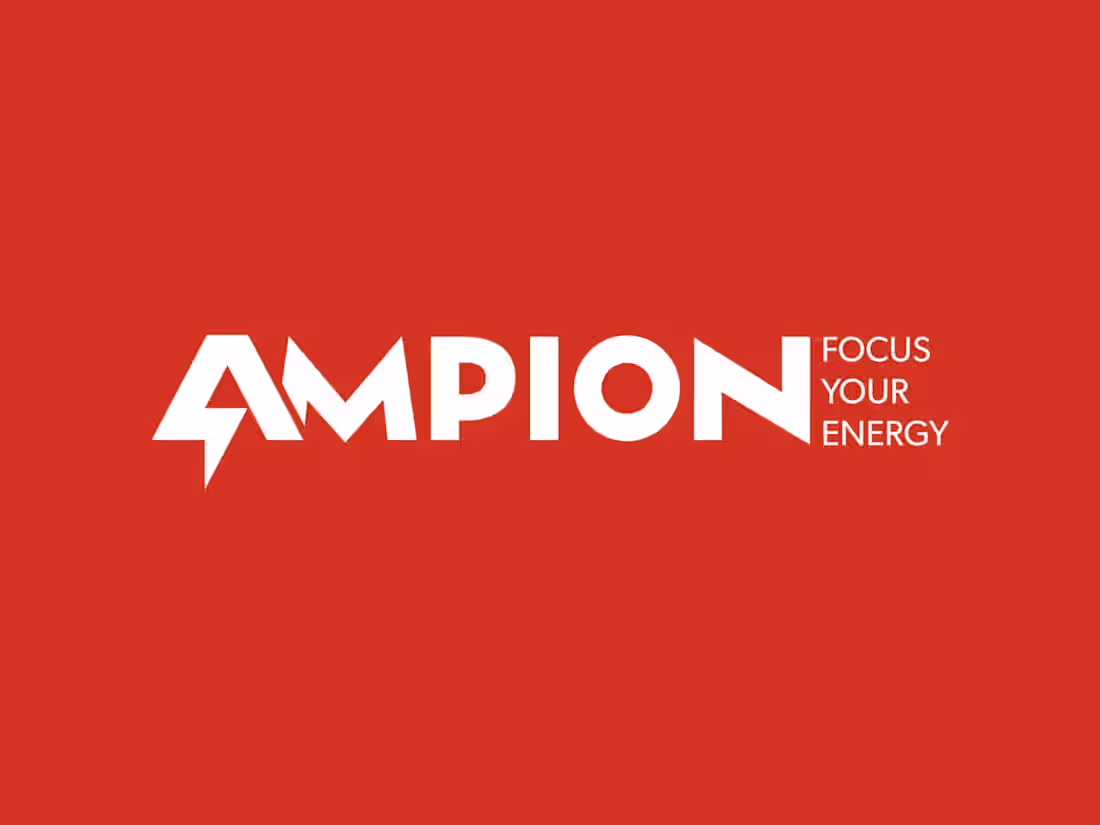
From Features to Experience: The Ampion Brand Transformation
0
18
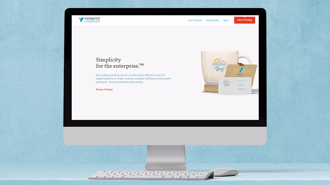
VistaPrint Corporate: Beyond the Business Card
0
15
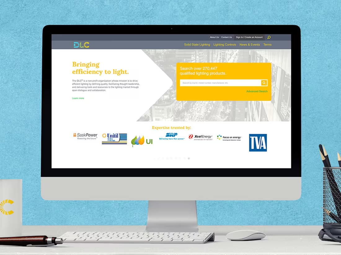
DesignLights Consortium: A Digital Overhaul
0
21