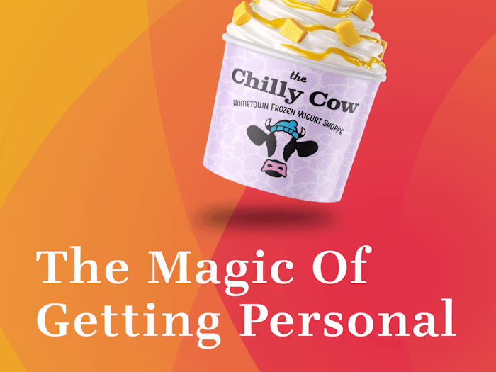
Crowded Market? No Problem.
Jeff Sugarman
Lost in the Crowd? Let's Fix That.
Growing brands don't just need great design—they need strategic differentiation that cuts through competitive noise. Whether it's helping a Mediterranean food brand honor its heritage while appealing to mainstream consumers, or creating an entirely new product category for an innovative desktop shredder, I specialize in package design that makes brands impossible to ignore.
This portfolio showcases a curated selection of packaging solutions spanning various industries and product categories. The work presented includes both client collaborations and conceptual explorations, the latter serving as creative laboratories where I push boundaries, test new ideas, and explore emerging design directions without commercial constraints. These concept pieces demonstrate my design thinking process and ability to innovate across different brand personalities and market segments.
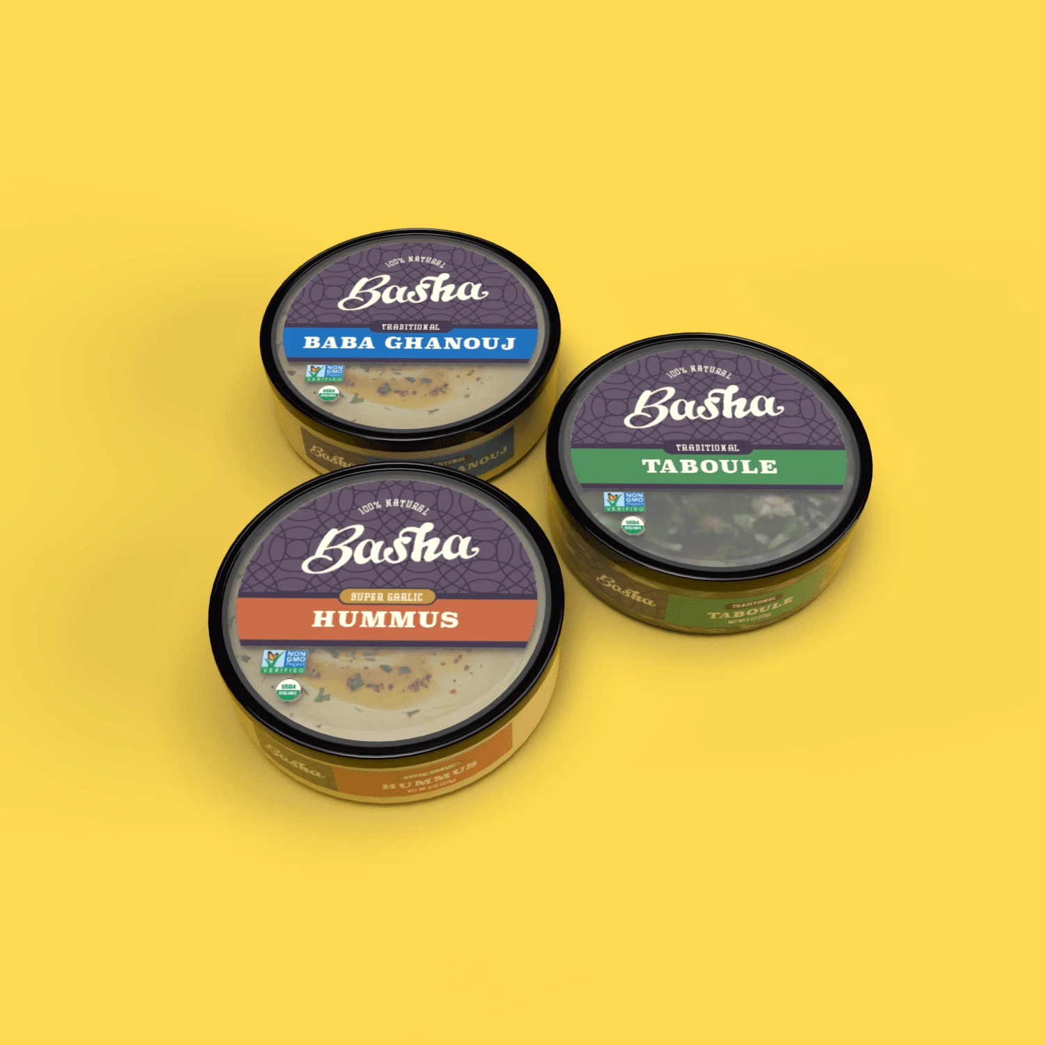
Transforming Authenticity into Shelf Appeal
Basha Brand's Mediterranean dips and spreads were struggling to gain traction with customers, and it was easy to see why. The original label wasn't professionally designed and looked sloppy—hardly inspiring confidence in a food product. More importantly, there were no visual ties to the founder's rich Mediterranean heritage, missing a powerful authenticity story. Customers couldn't easily distinguish between product categories like hummus, baba ghanouj, and taboule, and there wasn't an organized way to identify flavors within each category.
My redesign addressed all of these concerns systematically. I created a visual heritage system that honored the founder's Mediterranean roots while establishing a clear product hierarchy and flavor organization. The result transforms a struggling brand into one that commands attention and communicates both authenticity and professionalism.
Creating New Categories
Staples' in-house product team had developed something truly innovative: a desktop shredder designed to be small and quiet enough to sit on a person's desk. While there was plenty of competition among office shredders, there were no other products like this at the time. The challenge wasn't just designing packaging—it was establishing an entirely new product category while convincing customers that this compact shredder was powerful enough to destroy sensitive documents.
I created a complete brand ecosystem for this groundbreaking product: developing the MailMate product name and logo, designing the package system, directing product photography that demonstrated its unique benefits, creating intuitive icons for each feature, and working with a copywriter to craft compelling on-package call-outs and the product tagline. The comprehensive branding strategy successfully communicated the product's unique positioning and built consumer confidence in its capabilities.
The result was a highly successful product launch that exceeded sales expectations, proving that strategic design can create new market opportunities.
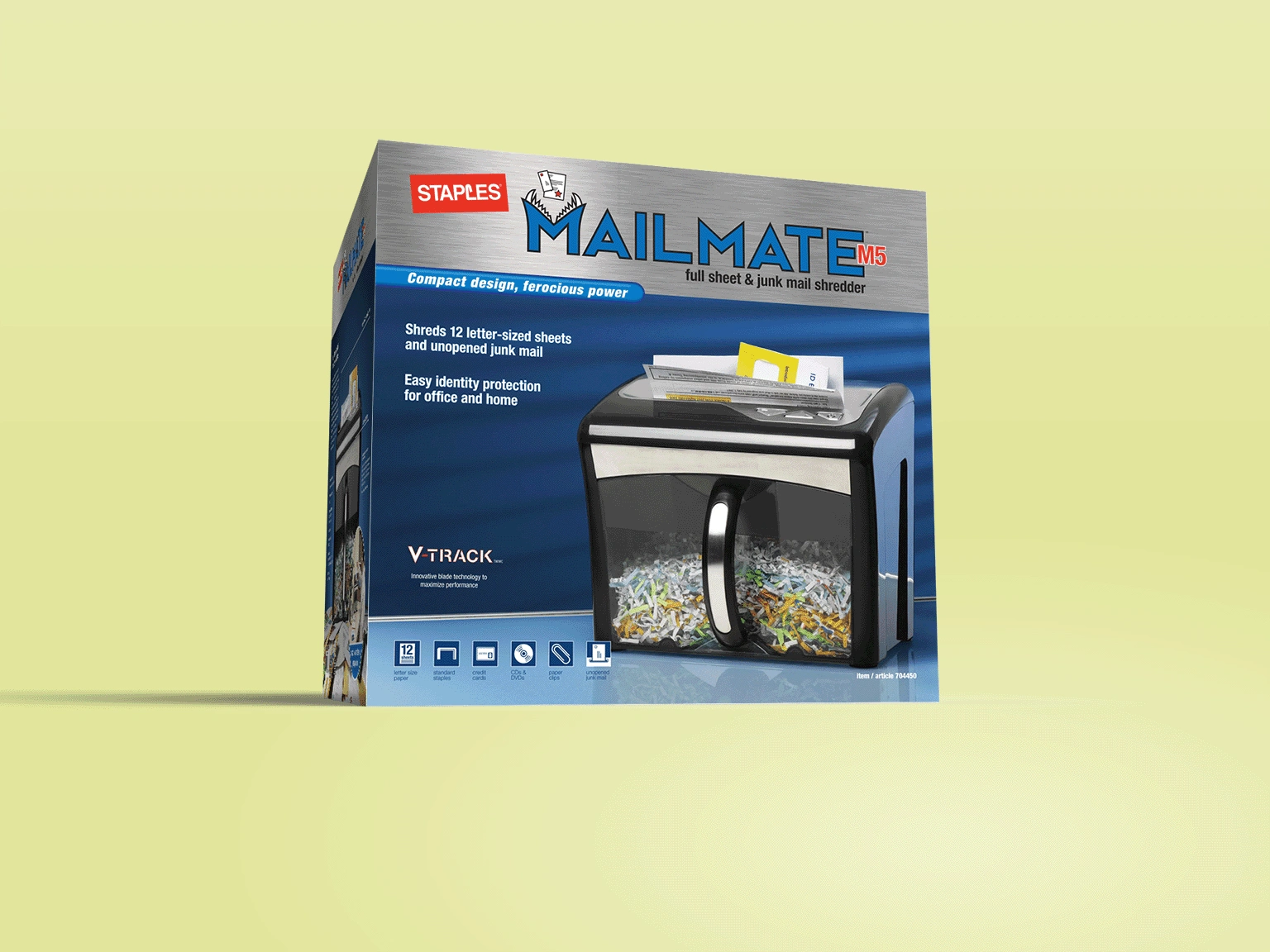
Product branding and package design for Staples line of shredders.
Standing Out in Saturated Markets
This self-directed project began with a moment of inspiration: I saw a maple tree just after a brief rainstorm as it was turning colors in fall, with sunlight shining through it. The tree had a supernatural quality that sparked an idea for an energy drink brand. I loved the pun potential of "Super Natural"—playing on both unusual energy and very natural ingredients in a category dominated by synthetic, aggressive imagery.
For an industry obsessed with artificial intensity and harsh graphics, I saw an opportunity to differentiate through ethereal, fantasy-inspired visuals. Using Midjourney, I created a fantasy version of that memorable maple tree as the background for a 16-oz can design. The concept challenges energy drink conventions by suggesting that natural sources can provide superior energy, positioning the brand to capture consumers seeking alternatives to traditional energy drinks.
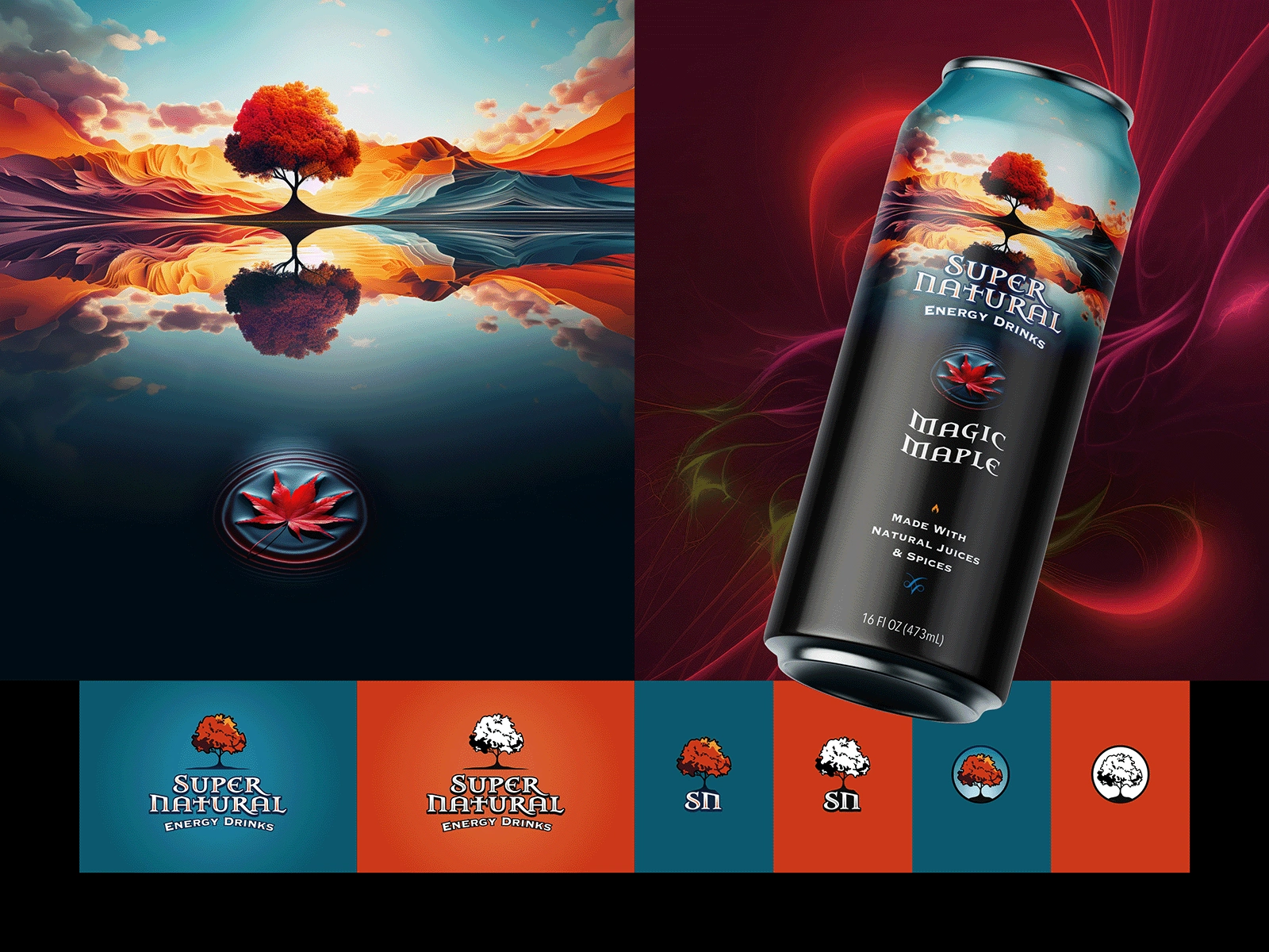
Concept for an all natural energy drink.
Elevating Commodity Products
As Creative Director for Staples' private label products and services, I faced a fascinating challenge: how do you position a line of mundane office products—staplers and hole punches—as premium quality items suitable for an executive's office? The OneTouch line needed to transcend its commodity category and command respect in professional environments.
Leading my team, we developed sophisticated branding that repositioned these basic tools as quality investments rather than disposable supplies. The design strategy elevated the entire product experience, from naming to visual identity, creating a cohesive premium line that felt at home in corner offices.
Our work contributed to the steady growth of the private label business, proving that even the most utilitarian products can be transformed through strategic design.
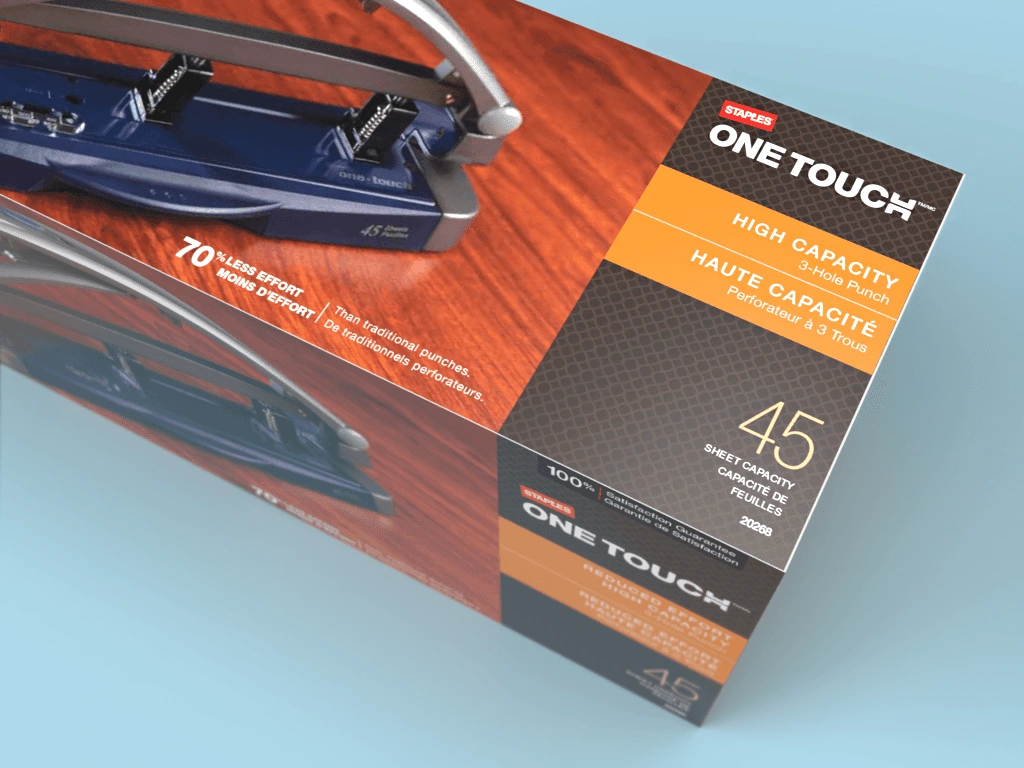
Product branding and package design for Staples line of high capacity staplers and hole-punches.
Bridging Cultural Authenticity with Mass Appeal
This self-directed project grew out of my research into the growing market for foods and flavors from different ethnic backgrounds. Through this research, I identified a specific challenge that ethnic food brands face: they need to establish their authenticity without alienating customers who are unfamiliar with their food traditions. I wrote a blog post exploring this challenge and the strategies brands could use to address it.
To demonstrate the ideas discussed in my blog post, I created Ola's, a line of Nigerian chin chin snacks—named as a fun tribute to Ola, the father of Sam Obisanya from Ted Lasso. Using colors and patterns found in traditional Nigerian cloth and hand-drawn lettering that reflects the handmade, family recipe nature associated with chin chin, I developed a brand that honors its heritage while remaining approachable to North American consumers unfamiliar with the product.
The project demonstrates how thoughtful design can bridge cultural gaps, making authentic ethnic foods accessible to broader markets without compromising their identity—and positions me as someone who thinks strategically about market challenges before designing solutions.
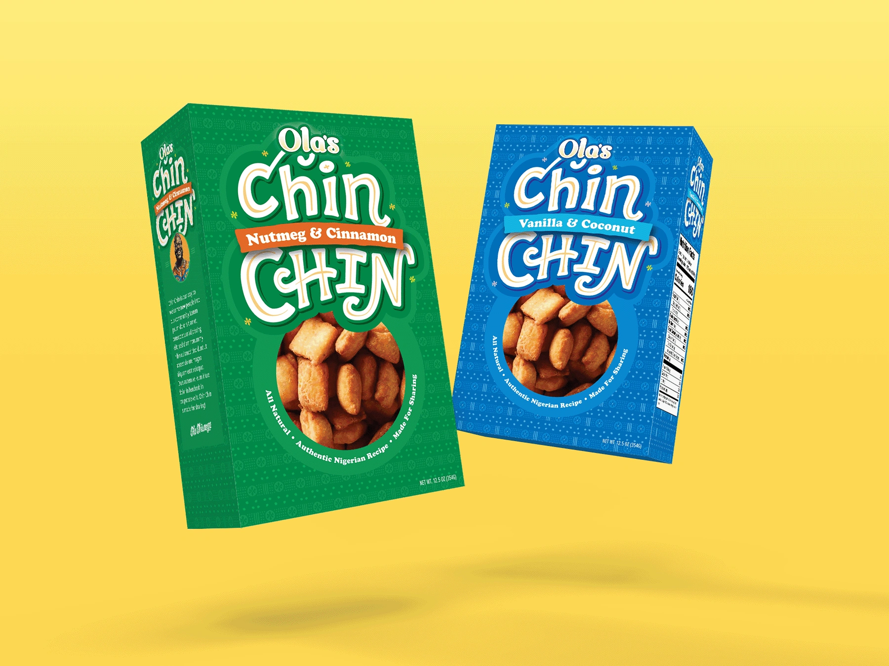
Concept for a blog post on introducing ethnic foods to the American consumer.
Cutting Through CBD Clutter
Knowing that the health supplements market—especially CBD—was growing rapidly but becoming increasingly cluttered, I created Kamino as an example of how strategic design could carve out a unique positioning. I conceived the brand specifically as a supplement to help athletes manage the physical stress of active training, targeting this specific segment of the market rather than trying to appeal to everyone.
In a category where most products look clinical or overly edgy, I designed two labels—'Recovery' and 'Warm Up'—using a sophisticated color-coding system: cool aqua blue for recovery and warm yellow-orange for warm up. The modern, clean aesthetic communicates that this is a non-addictive product, while custom icons help differentiate each product's specific function. The typography combines bold serifs for product titles with thin, condensed sans-serif for descriptions, creating a look that's modern but not harsh or intimidating.
The concept shows how smart design can help CBD brands break away from category clichés by focusing on specific consumer segments rather than generic wellness positioning.
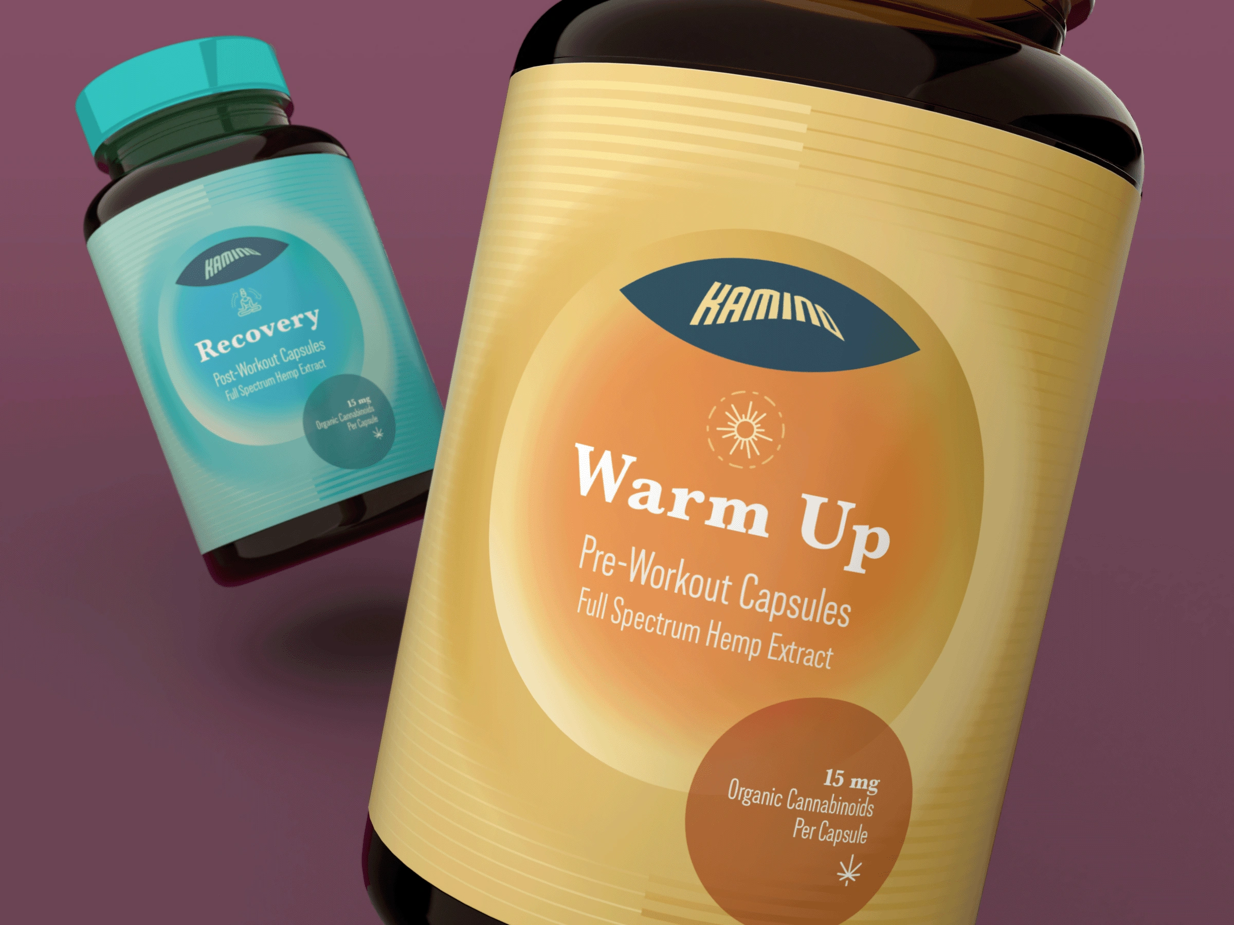
Concept for a supplements brand
Elevating RTD Category
The ready-to-drink cocktail market represents a growing opportunity, but most brands in this space look either cheap or overly casual. I saw a chance to create something that felt truly premium and sophisticated. Inspired by Cloud City from Star Wars—with its elegant feeling and details that reference cruise liners of the 1920s—I developed a concept that brings cinematic sophistication to canned cocktails.
I created a custom, art deco-styled typographic logo and drew a cocktail glass that visually echoes Cloud City's distinctive structure. Custom fruit illustrations for each flavor add another layer of premium detail that tells a story rather than simply showing ingredients. The entire system elevates the ready-to-drink experience from a convenience purchase to an indulgent experience.
This concept demonstrates how pop culture inspiration, when thoughtfully applied, can help brands stand out in crowded categories by tapping into shared cultural references.
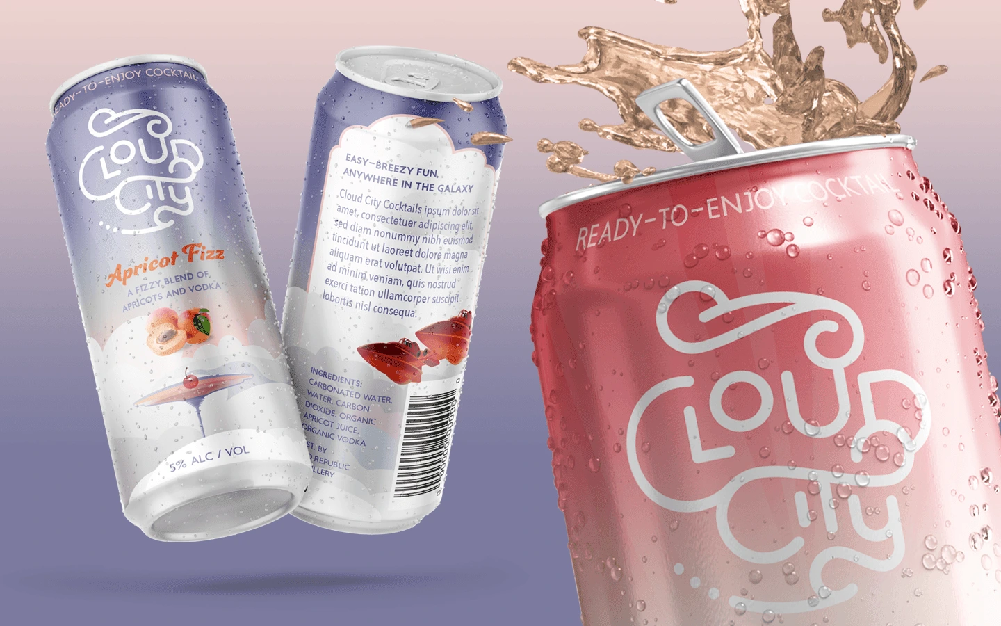
Concept for a Ready-To-Drink brand
Ready to Break Through the Noise?
Every growing brand faces the same fundamental challenge: standing out in competitive markets. Whether you're launching a new product or repositioning an existing one, strategic package design can be the difference between getting lost on the shelf and commanding customer attention.
Book a free 30-minute introductory call to help you decide if I am the right creative for you. In this call, we'll get to know a bit about each other and discover your vision for your product. Together, we can explore how a thoughtful design strategy can help your brand cut through the competition and connect with your ideal customers.
Like this project
Posted Feb 27, 2025
Strategic packaging that helps growing brands break through competitive noise. Seven diverse projects show how design solves market challenges.
Likes
0
Views
16
Timeline
Jan 1, 2024 - Ongoing