Yolo Travel: A Website That Inspires Action
How Strategic Web Design Amplified a Start-Up’s Influence Among Business Leaders
SoulBuffalo isn't your average travel company; they offer transformative experiences designed to confront and inspire today's business leaders. Catering to a discerning clientele of business leaders and sustainability advocates, SoulBuffalo had a unique challenge: articulating its complex value proposition in a way that would resonate with busy executives. I was brought on board to craft a new website that does just that.
Project Rationale
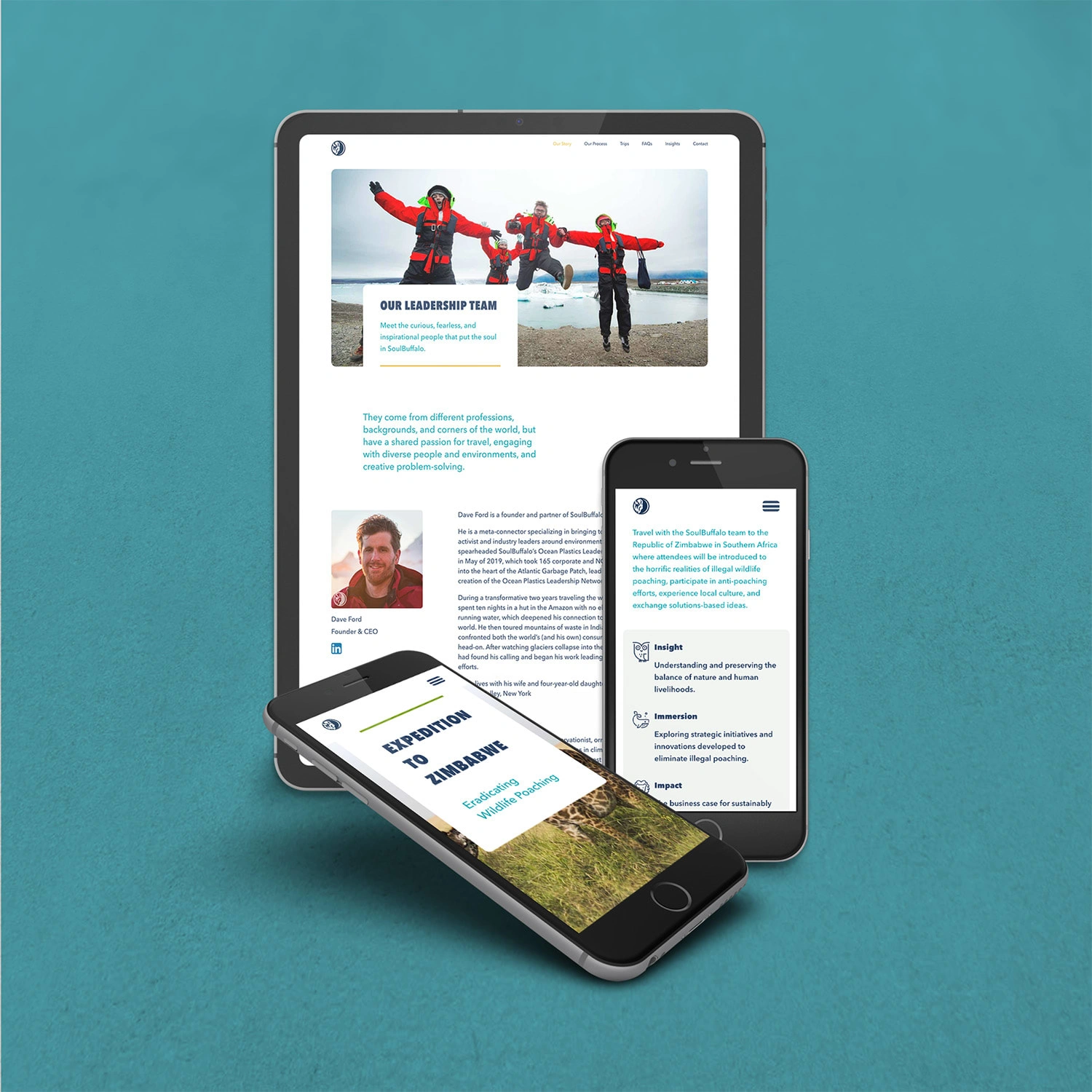
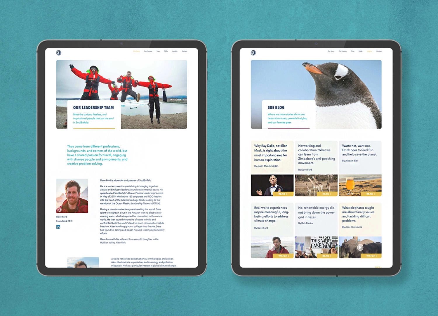
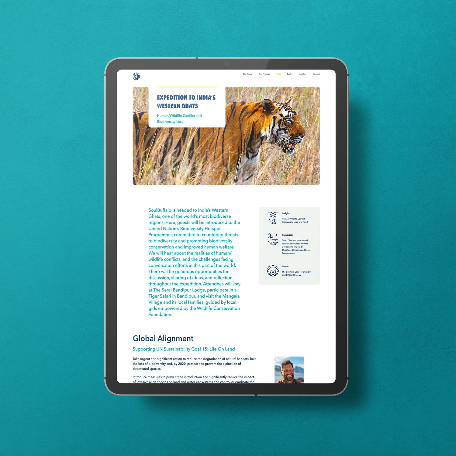
From the get-go, we anchored the SoulBuffalo brand in three core principles: Immerse, Influence, and Impact. The site leans heavily on travel photography to showcase the beautiful locations SoulBuffalo visits and the problems they’re confronting – balancing between inspiration and confrontation.
Prominent, descriptive headlines and subheads make it easy for busy executives to skim the site and still come away with a clear picture of SoulBuffalo’s value proposition. As for the aesthetic, we chose a light, airy color palette to let the photography shine. To guide visitor interaction, we used a sunflower yellow for all actionable buttons—a hue as inviting as it is hard to miss.
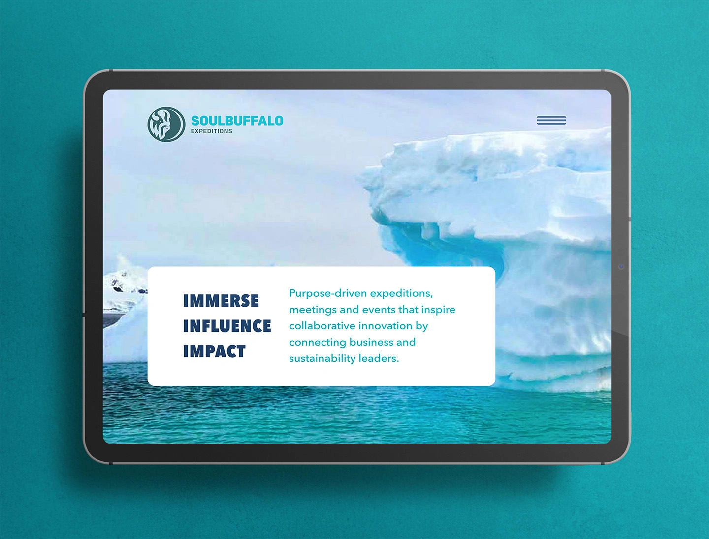
The hero module of the website emphasizes SoulBuffalo's value proposition.
Scope of Work
Creative Direction & Design Implementation
Copy Direction & Tag-line
Website
Project Management
Like this project
Posted Jan 16, 2024
Craft a new website that would articulate the complex value proposition of this unique, mission-driven travel company.

