Mithril Identity and Website
Jeff Sugarman
Mithril Brand System
Mithril is a startup providing innovative battery anode technology for electric vehicles. The new identity is designed to convey the energy flowing into this innovative industry.
The interesting challenge here was designing for two very different audiences: deep technical experts (scientists and engineers who want granular detail) and investors who need high-level understanding without the technical depth. I developed the complete system from strategic analysis through implementation—logo, typography, color architecture, illustration direction, and a set of iconic graphics that could flex from technical white papers to investor presentations. Rather than locking them into rigid grids, I built the guidelines around rationale—explaining why each element exists and how to apply the pieces across different contexts. This gave them a coherent system that could adapt to wildly different media and audience needs while maintaining credibility with both groups.
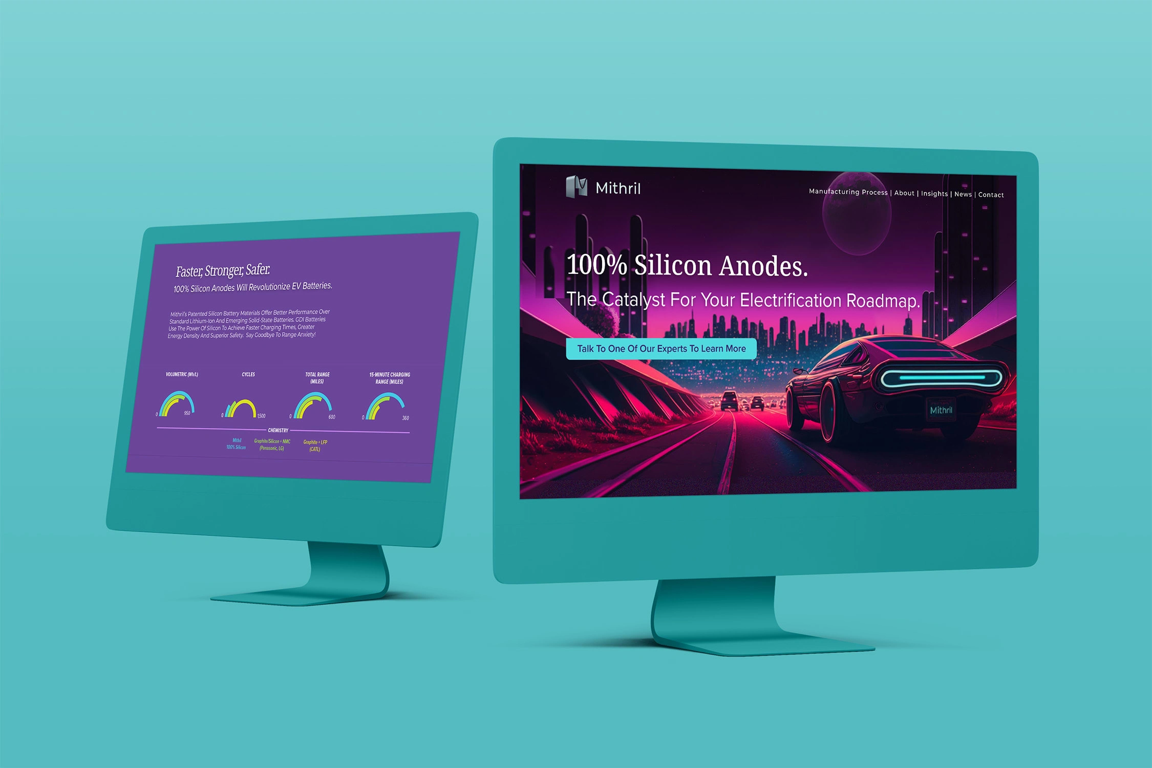
Website Design
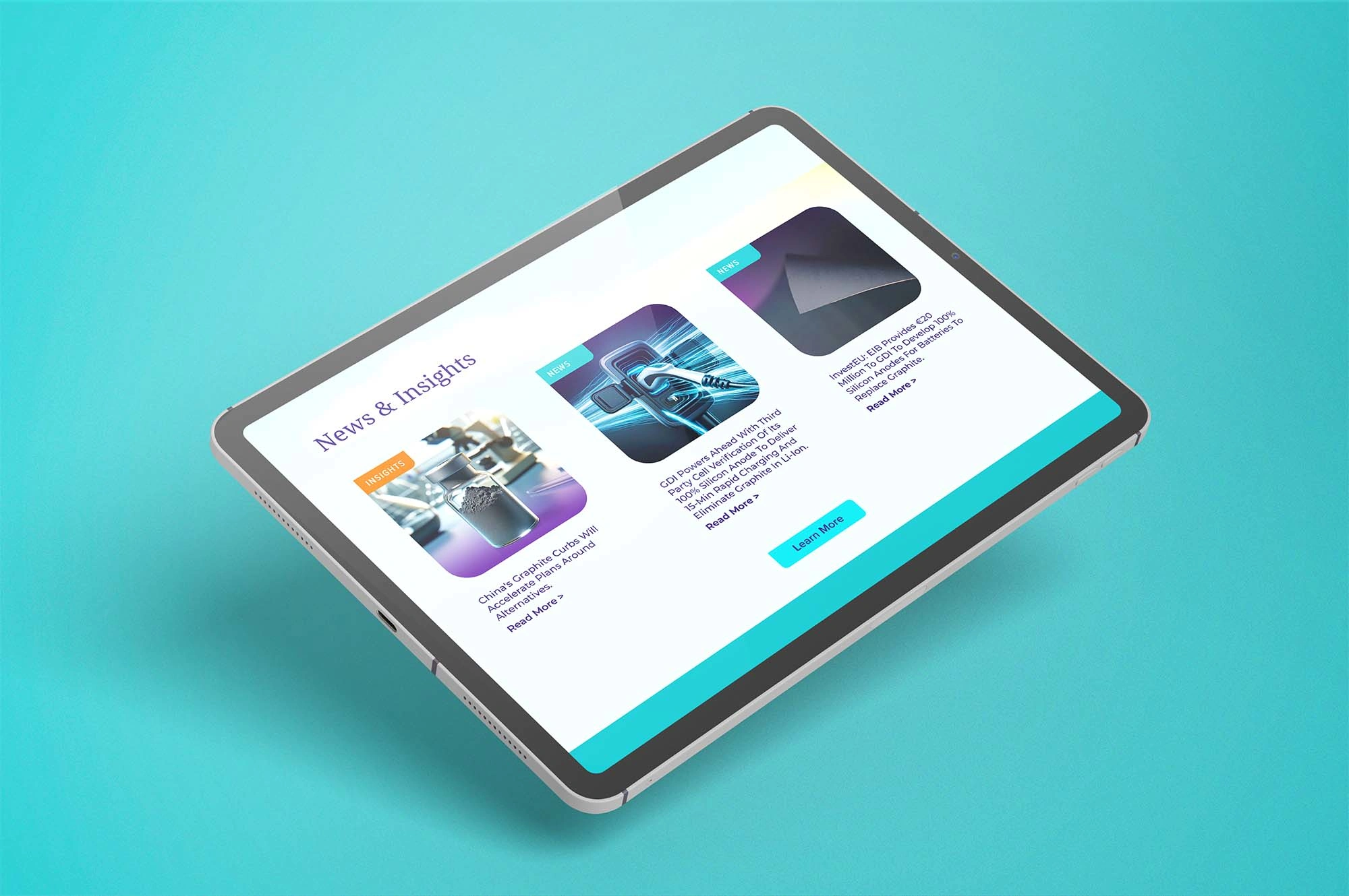
Website Design
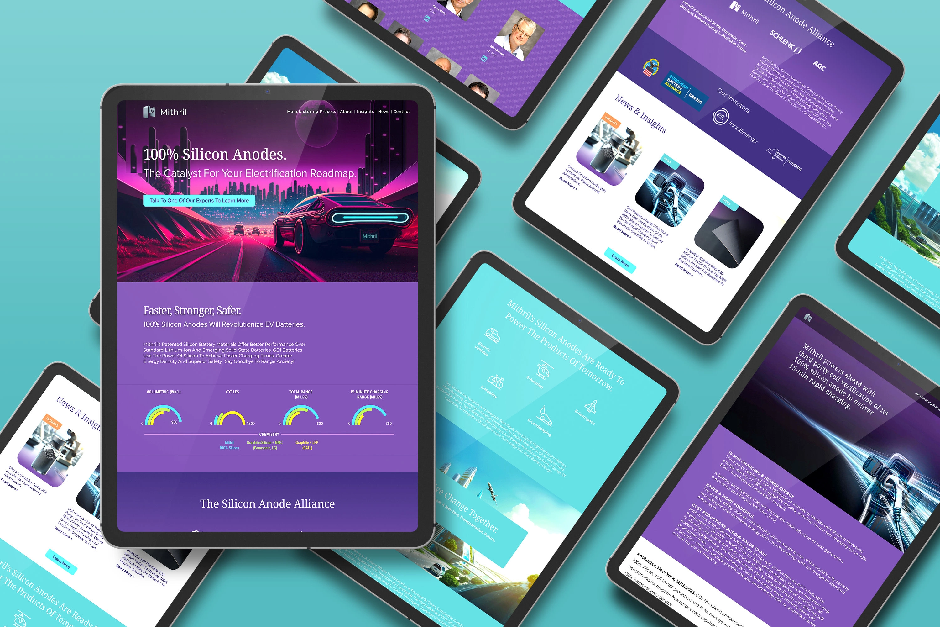
Website Design
The New Logo
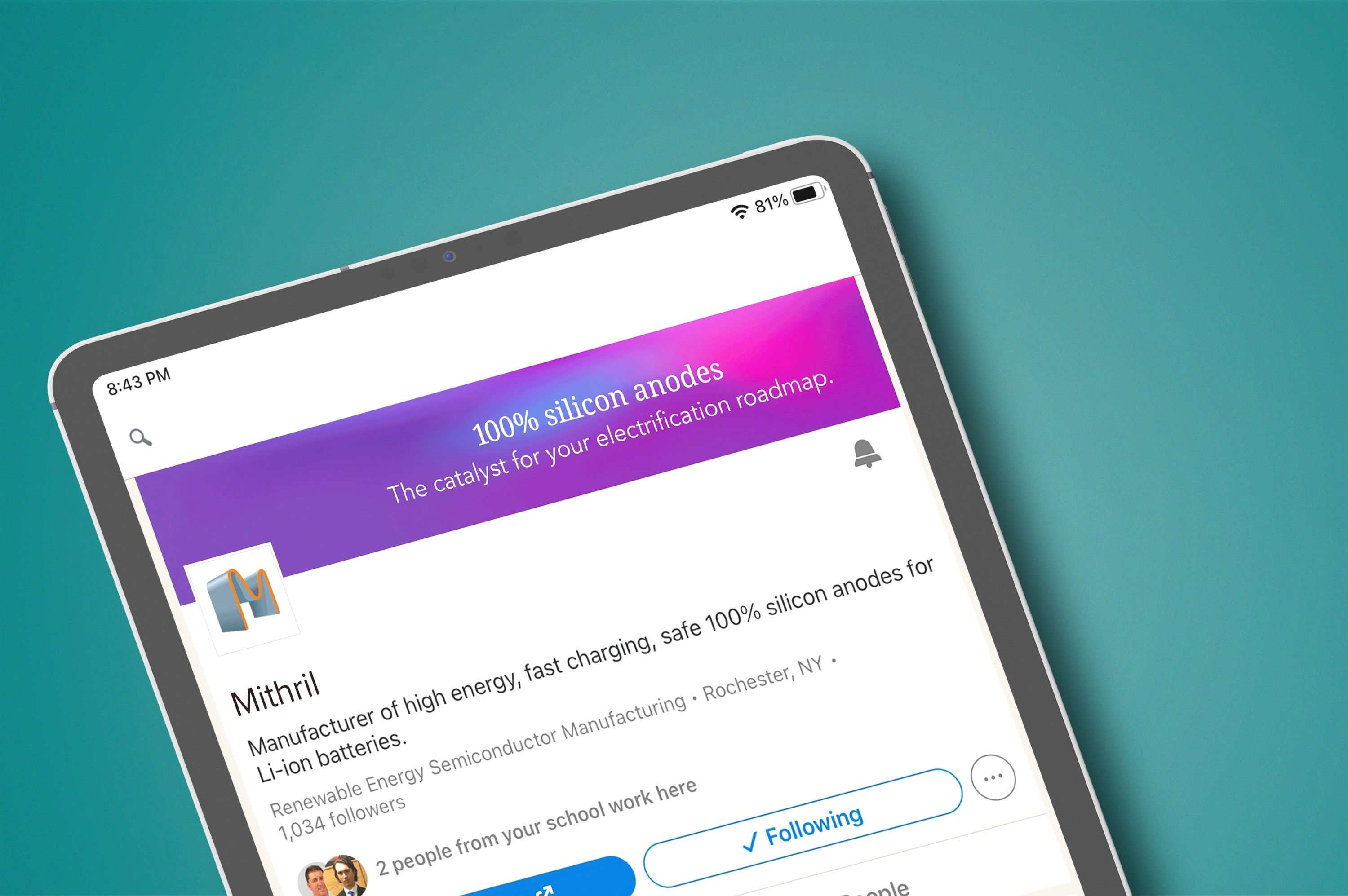
Social Media Refresh
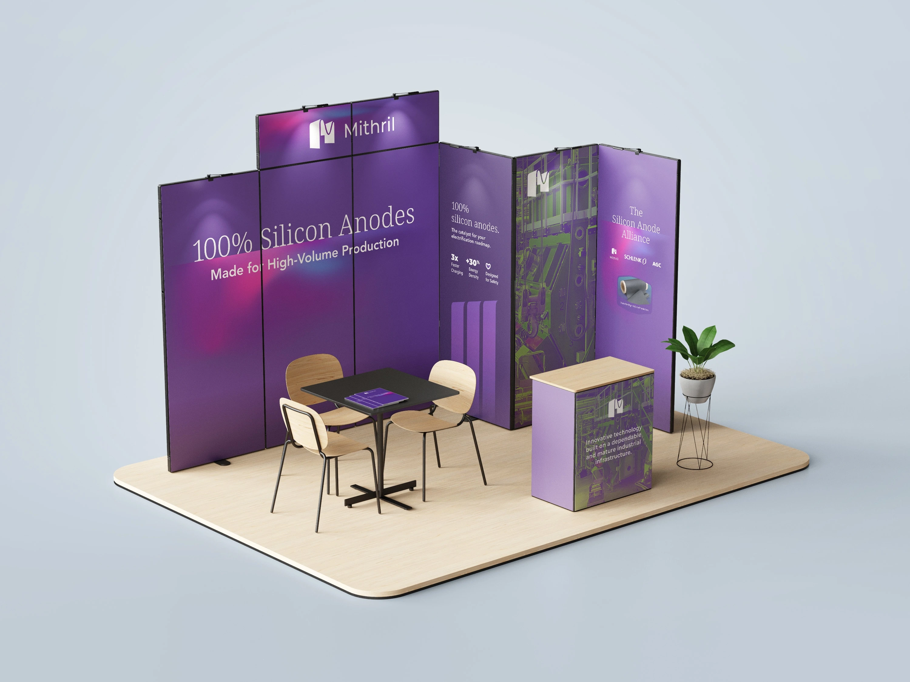
Trade Show Booth

PowerPoint Template
Like this project
Posted Feb 29, 2024
Brand refresh for a tech startup manufacturing EV battery components. The new identity is designed to convey the energy flowing into this innovative industry.
Likes
0
Views
20
Clients
GDI