
pro
Jeff Sugarman
Turning Consumer Brands into Category Leaders
- $1k+
- Earned
- 4x
- Hired
- 5.00
- Rating
- 57
- Followers
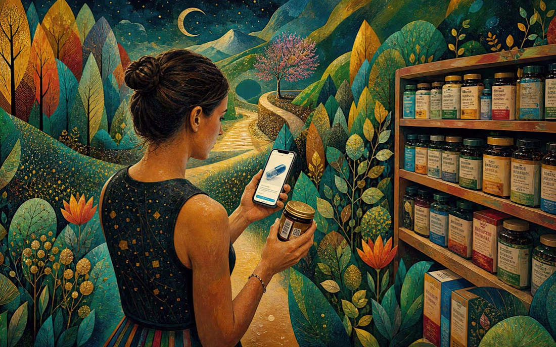
Consumer packaging is about to get a second code — a QR code. Most brands will treat that as a compliance headache. I think it's the most interesting thing to happen to a package in years.
Here's why. A barcode rings up the sale and then goes quiet. A QR code is a door. A shopper...
"Your packaging might be invisible. Not bad. Not ugly. Just... forgettable."
It's one of the more uncomfortable conversations to have with a client — when the work looks fine but strategically misses the mark. When it fits the category so well it disappears into it.
The shelf is a...
Recraft or Kittle? Which platform are you using, and why does it work for you?
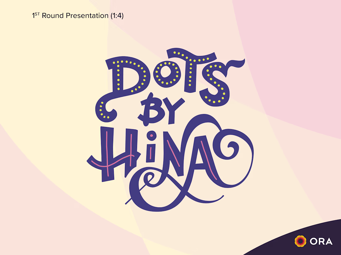
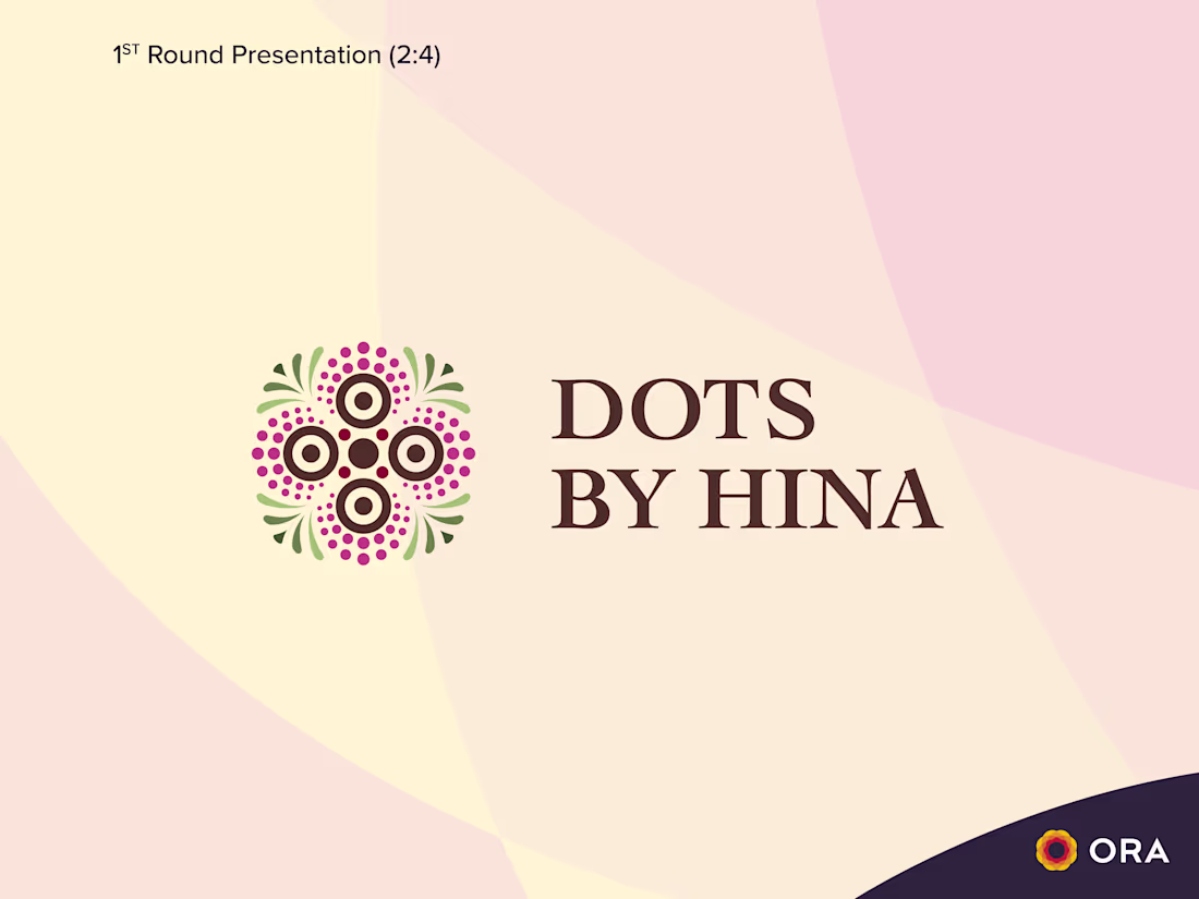
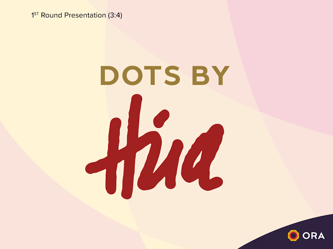
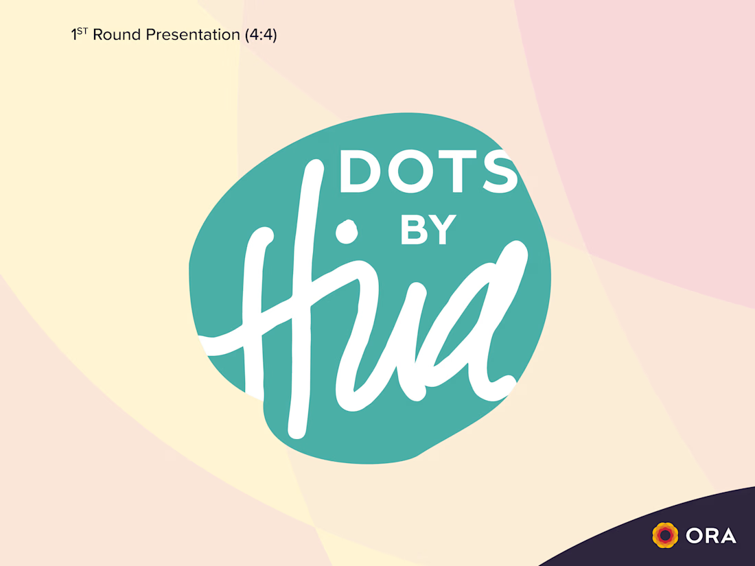
First round concepts for Hina, a mandala artist with a growing craft business. She reached out for help distilling her intricate work into a simple, memorable mark.
I'm working on a logo design for a company that manages the legal side of residential real estate. In this design direction, I'm focusing on a house icon with subtle upward arrows to give a positive aura. Which option do you like best?
0 voted
0%

3 voted
100%

3 votes
Closed