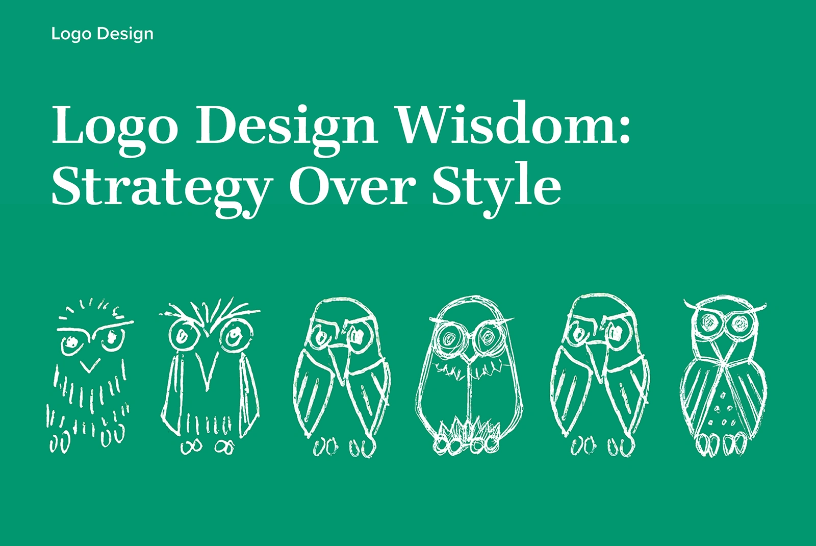
Logo Design Wisdom: Strategy Over Style
Jeff Sugarman
A potential client once asked me, “Do you design logos?” The question caught me off guard at first—after all, my portfolio is full of logos. But then I realized something—most of my portfolio showcases the final products: complete package designs, fully developed websites, finished brand systems. The logos are there, but they’re often integrated into the bigger picture rather than standing alone.
So I did something I haven't done in a while: I went back through years of work and pulled together six logos from across my client base—B2C and B2B, product brands and service companies. What you'll see here isn't just the final designs, but the creative exploration that led to each one, including concepts that clients ultimately rejected. There’s no shame in those outtakes; they’re proof of the depth of thinking that goes into every project.
💡 INSIGHT
A logo is more than visual identity—it’s emotional shorthand.
Great logos become symbols that instantly remind customers of all the positive experiences they’ve had with your brand. But to be effective, the logo must be rooted in core brand attributes—not just aesthetic appeal. “Looks cool” isn’t valuable if it’s meaningless. When your logo authentically reflects your values, it triggers the right associations and builds lasting brand loyalty.
My Collaborative Process
Logo design is one of my favorite creative challenges—trying to pack meaning into a simple image takes real discipline and creativity. But here’s what I’ve learned: the best logos emerge from collaboration, not isolation.
1. Foundation Discovery: Identifying Core Brand Attributes
I start with discovery sessions, interviewing founders and key stakeholders to uncover the top three brand attributes that define what makes their company unique. These aren’t marketing buzzwords—they’re the foundational concepts usually tied to why the company was founded in the first place. The goal is to identify traits that feel timeless, authentic, and ownable.
2. Competitive Context Analysis
Before designing anything, I analyze the competitive landscape. What do the logos of top performers look like? Are there industry color conventions or common symbols? Understanding these market trends is crucial—to create a logo that stands out, you first need to understand the context in which it will appear.
3. Concept Development & Strategic Exploration
Armed with clear brand attributes and market context, I develop concepts that span a wide but relevant range. Some will knowingly stretch boundaries, others will be ”safe bets”—but all are rooted in those core brand truths we identified.
4. Collaborative Refinement
What I’m really after in that first presentation is a good conversation. Many people find it easier to describe what they’re seeking once they have visuals to react to. From there, it’s a process of refining ideas based on feedback, always working toward that perfect symbol that captures the essence of their brand.
💡 INSIGHT
Consistency over time creates powerful brand recognition.
The most effective symbols are those that remain consistent over long periods, allowing people to become familiar with them and intuitively understand their meaning. For brands in competitive markets, the goal should be a logo that won’t need changing every time the product or service evolves. While logos do need to evolve over time, getting it right the first time minimizes costly rebrands and maximizes brand equity.
Abilyn’s Frozen Bakery
The Results: Following a complete rebrand that included logo design and packaging system, Abilyn’s Frozen Bakery saw a 40% increase in sales volume—proving that strategic brand work delivers measurable business impact.
The Challenge: Abilyn’s Frozen Bakery (AFB) is a regional ice cream cake brand producing all-natural, allergen-safe ice cream cakes and novelties. The founder faced a key strategic question: should they create a personification of Abilyn? They also needed their brand to connect authentically with New England’s longstanding ice cream culture while standing out in a competitive market.
The Approach: Through our discovery process, we explored multiple brand directions. I developed concepts that ranged from traditional typographic solutions to various personifications of Abilyn—including visual representations of what she might look like and even her signature, as if she were personally approving each product.
The Solution: The final typographic solution won because we determined that connecting to local ice cream shop traditions would be more valuable to the brand in the long run than trying to make Abilyn feel like a real person. The custom typography leans into the traditional ice cream shop aesthetic that resonates so strongly in New England, creating an authentic connection that feels both timeless and approachable.
The Impact: This wasn’t just a logo project—it was part of a complete brand system that included packaging design. The 40% sales increase demonstrates how strategic brand work, when applied holistically, can deliver significant business results.
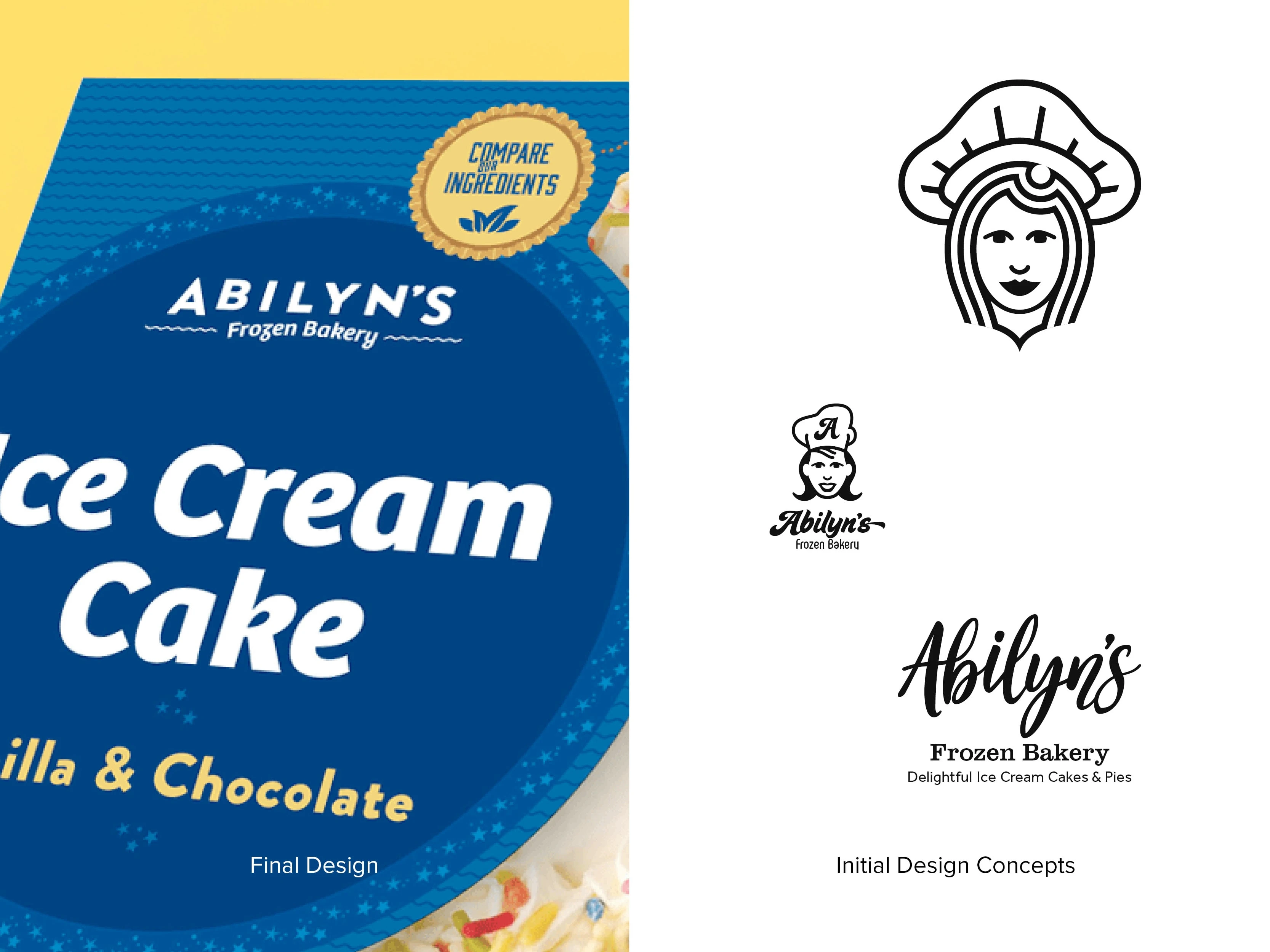
Logo design for Abilyn’s Frozen Bakery
EVCAN: Electric Vehicle Charging Accessibility Network
The Context: Efficiency Forward, a long-time client, came to me with a new challenge: developing a brand for their program advocating for decarbonization by accelerating reliable, grid-flexible EV charging solutions. Despite the current political climate being hostile to renewable energy, EVCAN has had a very successful launch.
The Foundation Discovery: They had done their homework—a first draft mission statement, extensive brand attributes list, and defined stakeholder audience. But we needed to refine this into something actionable. Working together, we prioritized their attributes into the essential three:
Trust & Integrity (establishing credibility as impartial experts)
Accessibility & Simplicity (making complex solutions understandable)
Action & Speed (reflecting the rapid pace of EV innovation)
The Competitive Context: In the EV advocacy space, we needed to differentiate from both industry players and environmental groups. The brand needed gravitas while feeling approachable—what I dubbed “The Polished Professional.”
The Naming Challenge: One of the biggest hurdles was finding something trademarkable with an available URL. I recommended a strategic acronym: EVCAN (Electric Vehicle Charging Accessibility Network). This links the established “EV” with “CAN,” giving the brand both descriptive clarity and a positive, can-do attitude.
The Visual Solution: The logo design roots itself in ”action and speed”—key brand attributes that reflect the pace of innovation in the EV market. The ligature between ‘C’ and ‘A’ conveys flowing electricity, reinforced by bright, neon colors that reference the EV charging world. By placing this element between ‘C’ and ‘A’, we subtly reinforce the ‘CAN-do’ message.
Strategic Delivery: To support diverse applications, we delivered four logo variations: the official version with full name and Efficiency Forward byline, logo with byline only, logo with tagline (“Power Through Connection”), and the standalone mark—each optimized for print and digital use.
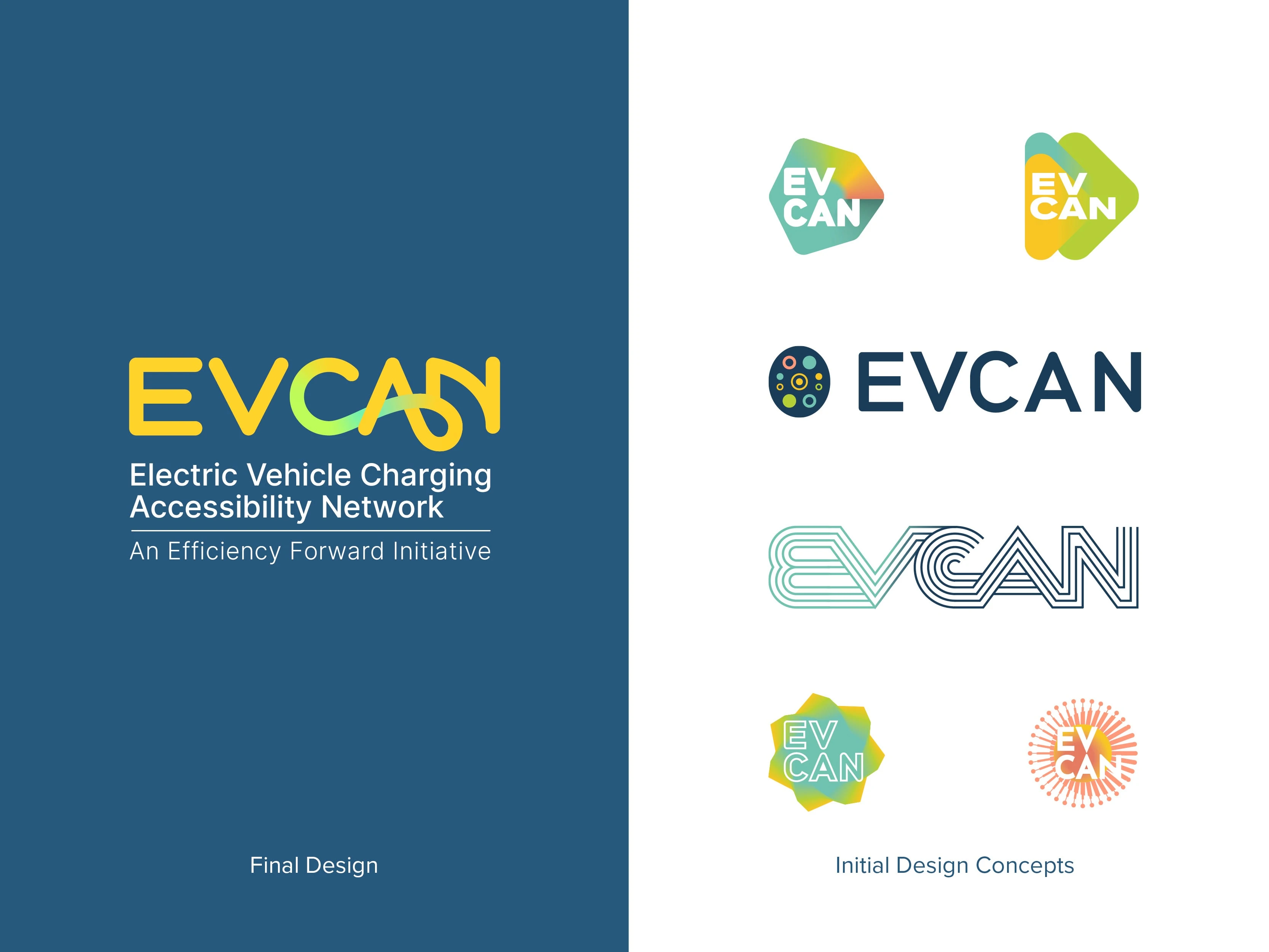
Logo design for EVCAN

Concept visualization
AVVER
The Challenge: AVVER is an AI-powered SaaS startup for recruiters that uses AI to conduct initial interviews with job candidates. Their unique value proposition—and biggest branding challenge—was making AI-powered interviews feel “real” to candidates, not dehumanizing.
The Solution: I designed a logo using the familiar speech bubble as a building block to create an iconic ‘A’ form. Four speech bubbles in primary colors symbolize the conversational nature of the platform, directly addressing their core challenge of humanizing AI interaction.
The Strategy: By choosing speech bubbles—universally recognized symbols of conversation—the logo immediately communicates that this technology facilitates genuine dialogue rather than robotic interrogation.
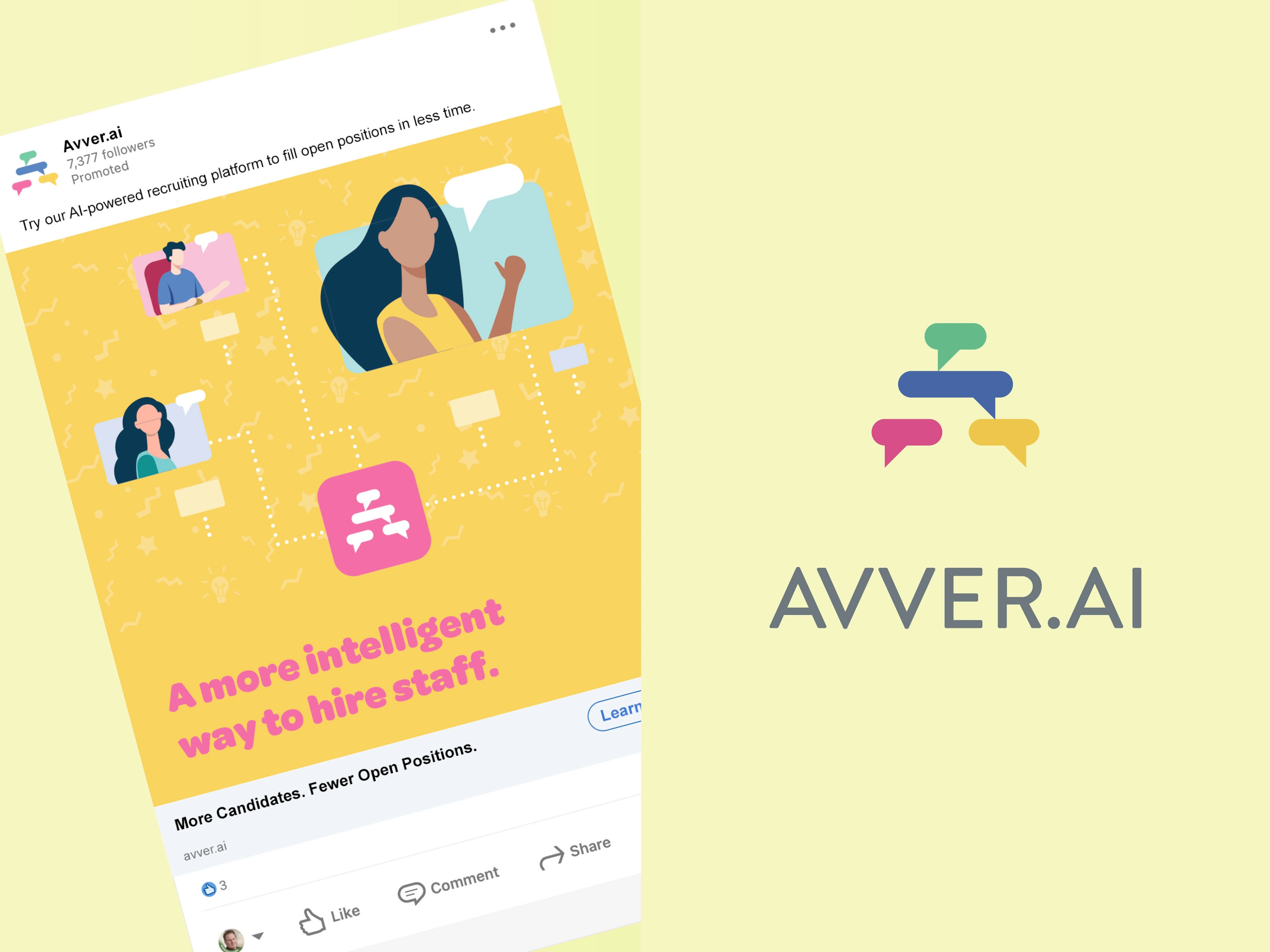
Logo design and visualization for Avver
Arlington Soccer Club
The Challenge: The Arlington Soccer Club (ASC) had an amazing culture and passionate community, but an outdated logo that neither reflected the club’s philosophy nor captured the joy people find in playing ”the beautiful game.”
The Approach: Working with several parent/coaches, I persuaded the ASC board of directors to consider a rebrand. I developed four concepts that drew inspiration from the best European professional football teams while incorporating elements specific to Arlington’s local identity.
The Strategy: Some concepts expressed the speed and fluidity of the game through dynamic visual elements. Others integrated Arlington-specific features: the Mayflower (Massachusetts state flower), water symbols reflecting the town’s ponds and streams, and stars nodding to the area’s colonial history.
The Impact: By creating a professional logo that feels more like those of the pro clubs these kids follow and admire, we helped players feel more connected to the sport. When young soccer fans wear jerseys with logos that mirror their professional heroes, they feel more excited to participate—demonstrating how strategic design can enhance engagement even at the community level.
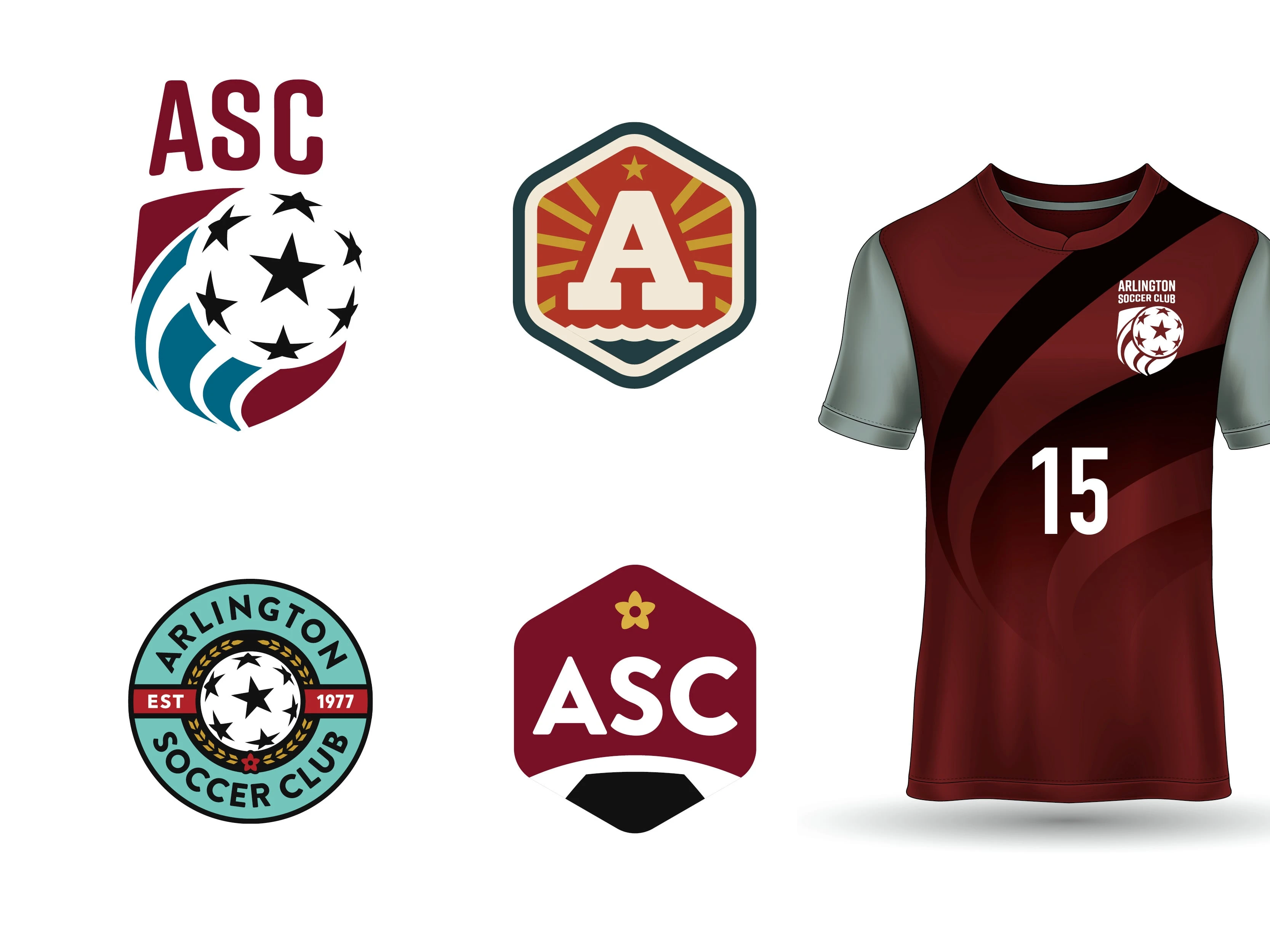
Logo design for Arlington Soccer Club
DesignLights Consortium
The Challenge: The Design Lights Consortium (DLC) is an independent non-profit that provides decision makers with data and resources on quality lighting, controls, and integrated building systems to reduce energy, carbon, and light pollution. They needed a logo that could cut through the complexity of their technical mission.
The Solution: The logo conveys optimism through its visual representation of “shining light”—rays emanating through the letters ‘DLC.’ This design directly reflects their mission to bring clarity to the confusing amount of data surrounding lighting controls effectiveness.
The Strategy: By literally incorporating light rays into the letterforms, the logo becomes a visual metaphor for the organization’s core purpose: illuminating complex information to help decision makers choose better solutions.
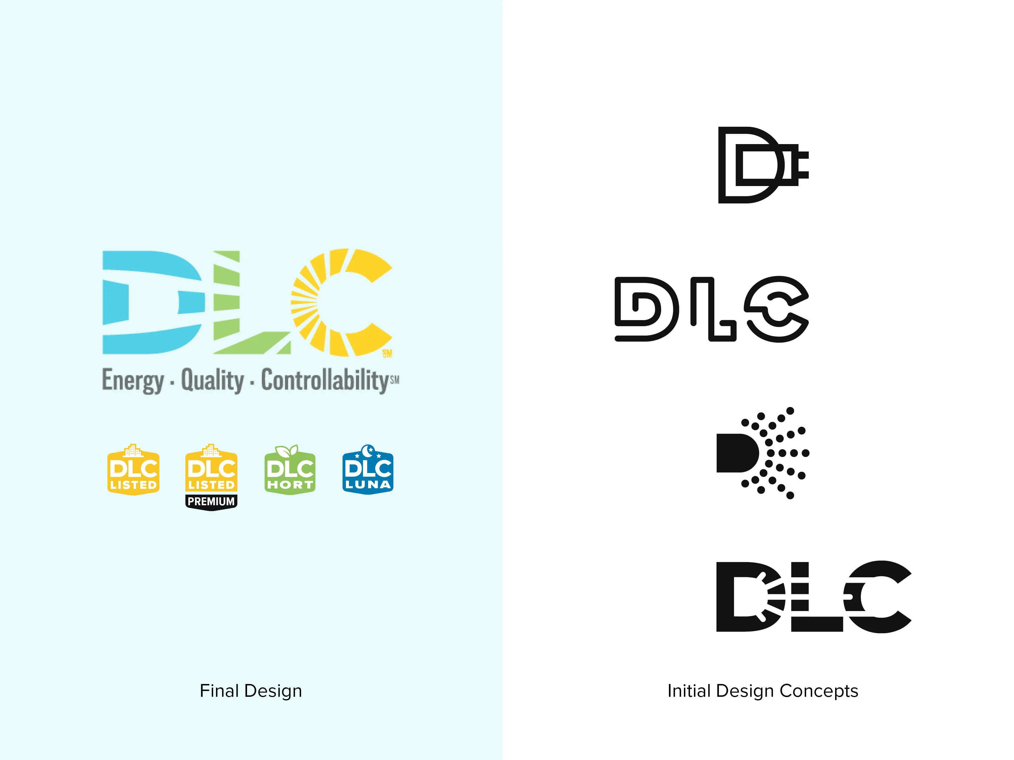
Logo design for the DLC
Beyond the Logo
Here’s the thing that many business people don’t realize: the logo isn’t the brand—it’s just one component that shapes your customer’s experience. A logo is powerful precisely because it connects to everything else: your messaging, your customer service, your product quality, your values. When done right, it becomes a shorthand for all those positive associations.
That’s why I love working with clients who are launching something new or ready to evolve. There’s an opportunity to think strategically about the entire brand experience from the ground up, with the logo serving as the visual anchor for everything that follows.
Ready to strategically align your brand? Whether you’re a startup founder defining your identity for the first time or a CMO looking to evolve an existing brand, let’s talk about creating a logo and brand system that accurately represents what makes your company unique. The best brand work happens through collaboration—and it starts with a conversation.
Contact me to discuss your project

An assortment of logos and icons
An assortment of logos and icons
Like this project
Posted Jun 26, 2025
Great logos aren’t just pretty—they’re powerful symbols that link everything your brand represents. Discover the collaborative magic behind memorable design.
Likes
0
Views
14