Staff Product Designer. I design, build and improve software


Staff Product Designer. I design, build and improve software
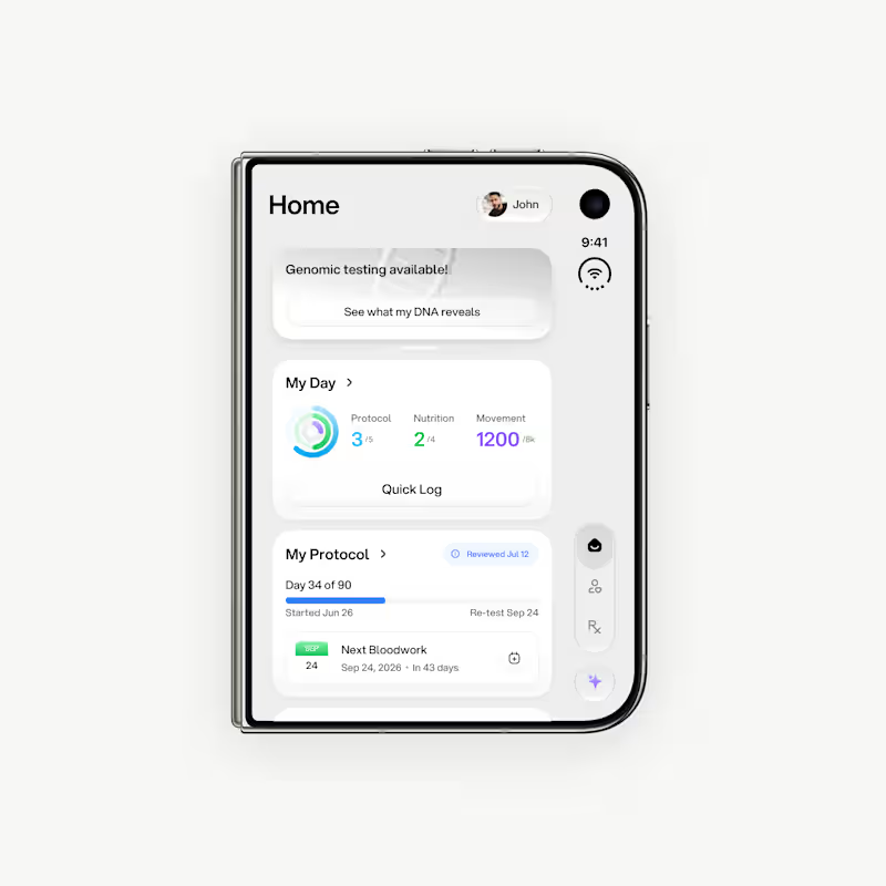
First drafts for iPhone Duo. It's too early, but I already can say that there are so many weird UX things going on with this device. Nevertheless, this is a great design challenge!
1
6
436
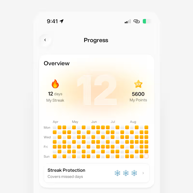
Hello, Contra! Check out my latest work in progress on amazing new features for a health tech mobile app 🚀
2
9
547
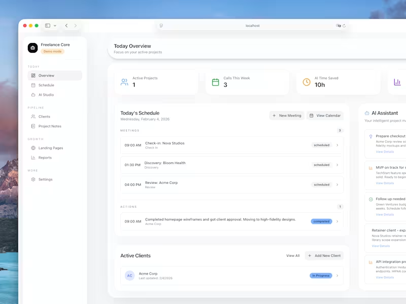
Hey, Contra! Check my first digital product: Freelance Core - your client pipeline in a box.
Built this for myself, now sharing it with you!
Freelance Core is a pre-built web app for managing your freelance business. Run it locally or deploy to Vercel. SQLite database included - no setup headaches.
🍱 What's inside:
- Client pipeline with project tracking and a Kanban board
- Weekly schedule for all your calls
- AI-powered call prep (never walk into a meeting blind)
- Project notes that actually stay organized
- Reports dashboard to see where your time goes
- Pipeline value tracking so you know your business health at a glance
🛠️ More is coming!
https://contra.com/products/YWzMLUC9-freelance-core-your-clients-pipeline-in-a-box
6
1.3K


UI/UX Designer & Ecommerce Specialist


Full-stack design & dev studio for AI and tech startups
Full-stack design & dev studio for AI and tech startups


Designer for your SaaS, app, deck and brand.

Designer for your SaaS, app, deck and brand.

SaaS Product Designer | UI/UX, Webflow & B2B Websites
- $1k+
- Earned
- 4x
- Hired
- 5.0
- Rating
- 437
- Followers
SaaS Product Designer | UI/UX, Webflow & B2B Websites
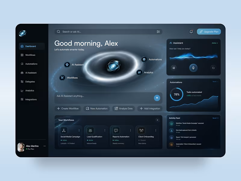
AI Automation Platform — SaaS Dashboard & Mobile App UI Design
✨ Smarter Workflows, Powered by AI
A futuristic AI automation platform concept that brings workflows, intelligent assistance, and performance analytics into one digital workspace. The design combines a deep navy interface, electric blue accents, and immersive orbital visuals to make complex automation tools feel intuitive and accessible.
Special attention was given to:
• Immersive dashboard composition with glowing orbital graphics and futuristic visual elements
• AI assistant interface featuring voice interaction controls, animated-inspired waveforms, and quick actions
• Organized workflow cards, automation management, and real-time activity feeds
• Clear analytics widgets with progress indicators, performance charts, and automation status controls
• Responsive desktop and mobile layouts with consistent dark-mode styling and streamlined navigation
The result is a modern SaaS experience that balances futuristic aesthetics with practical usability, giving users a clear view of their workflows, AI tools, and automation performance.
4
9
226
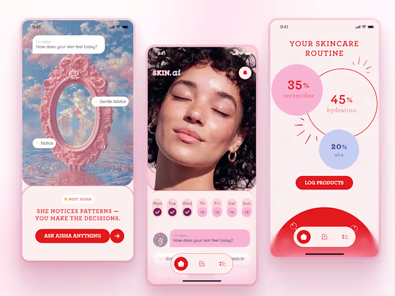
SKIN.ai — AI-Powered Skincare Routine & Skin Diary App 💗✨
SKIN.ai is a playful BeautyTech mobile app concept designed to make skincare tracking feel more personal, visual, and engaging.
The experience combines structured routines, skin journaling, educational content, and an AI-style assistant that helps users reflect on daily skin changes without making the product feel overly clinical. The visual direction uses soft pinks, bold red accents, editorial typography, and expressive imagery to create a distinctive beauty-focused interface.
Special attention was given to:
• morning and night skincare routines with clear step-by-step tracking;
• a skin diary that encourages users to log changes and build consistent habits;
• AI-style guidance through a friendly assistant experience 🤖;
• educational skincare content integrated into the product journey;
• interactive reflection and gamified elements that make daily check-ins feel more engaging;
• clear product logging and routine overview screens;
• a strong mobile-first visual system designed to feel modern, expressive, and easy to use.
The result is a BeautyTech experience that turns skincare routines into a more engaging daily ritual — blending functionality, education, and personality in one mobile product 🌸
Looking to create a mobile experience for your beauty, wellness, health, or AI-powered product? Let’s build something users actually enjoy coming back to 💫
7
28
1.9K
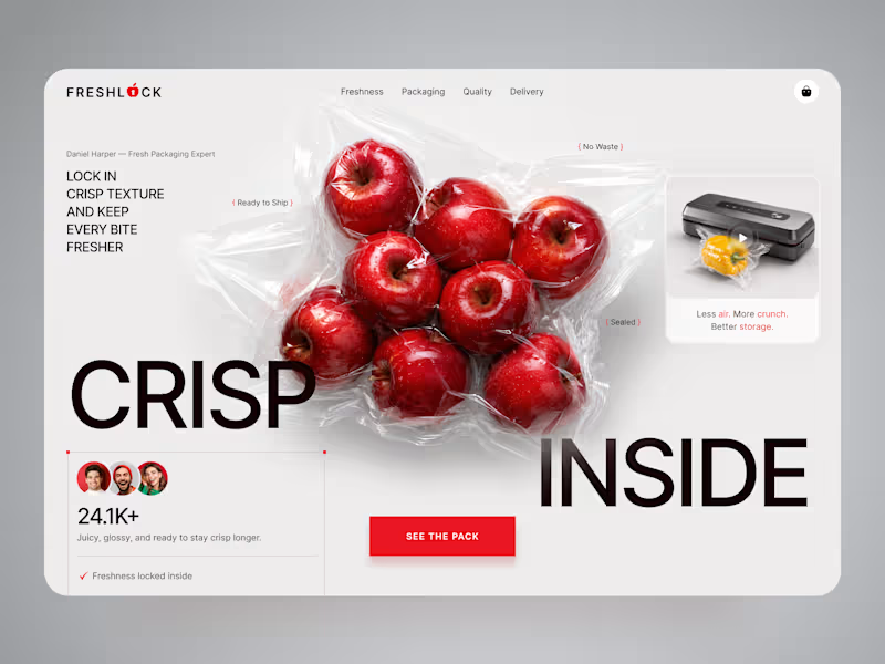
FreshLock — Food Packaging Landing Page Design 🍎📦
FreshLock is a modern landing page concept created for a food packaging brand focused on preserving freshness, reducing waste, and presenting innovative packaging solutions through a clean digital experience.
The goal was to communicate product benefits instantly while making the website feel fresh, premium, and trustworthy. The visual direction combines bold typography, minimal layouts, realistic product imagery, and vibrant red accents to create a strong first impression while keeping the focus on the product.
Special attention was given to:
• a product-first hero section that immediately highlights freshness and packaging quality;
• clean visual hierarchy that makes key messages easy to scan;
• responsive desktop and mobile layouts optimized for every device 📱;
• trust-building elements showcasing product quality, freshness, and customer confidence;
• bold CTAs that encourage users to explore the product and learn more;
• a minimal interface that lets the packaging and product visuals become the center of attention;
• a scalable landing page design suitable for future product launches and marketing campaigns.
The result is a modern, conversion-focused landing page that helps communicate product value, strengthens brand credibility, and creates an engaging experience from the very first screen ✨
Looking to create a modern landing page for your food, packaging, FMCG, or consumer product brand? Let's build something fresh together 🚀
75
222
6.4K
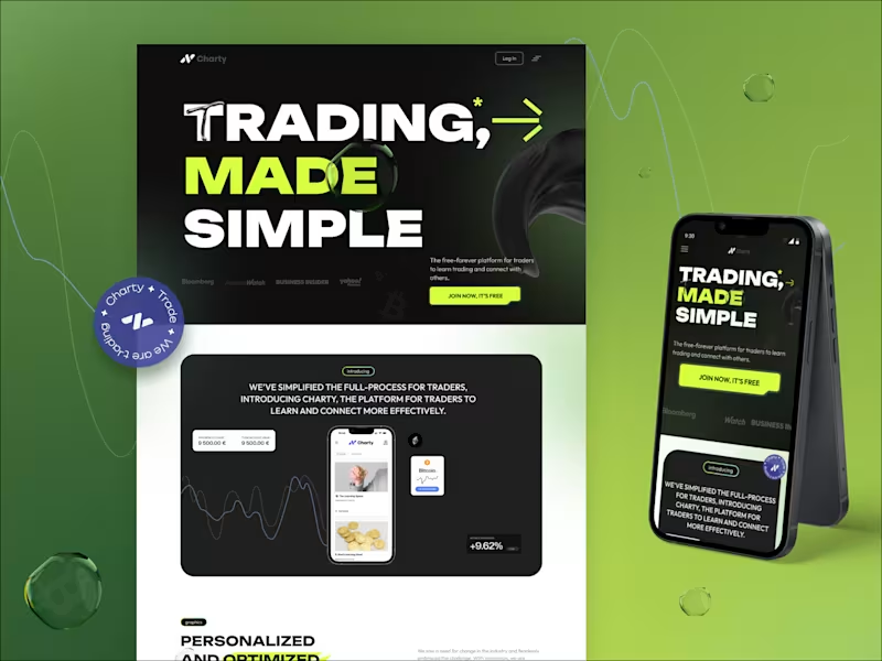
Charty — Crypto Trading Platform Landing Page 📈⚡
Charty is a bold FinTech landing page concept created for a trading platform that helps users learn, connect, and navigate the market through one clear digital experience.
The main goal was to make trading feel less intimidating and more accessible without losing the energy and confidence expected from a modern finance product. The visual direction combines strong typography, high-contrast layouts, vivid lime accents, and product-focused storytelling to create an experience that feels dynamic, modern, and conversion-driven.
Special attention was given to:
• a high-impact hero section that communicates the core value instantly;
• clear product positioning for traders who want to learn, connect, and grow;
• responsive desktop and mobile layouts designed for a consistent experience across devices 📱;
• structured feature sections that simplify complex trading information;
• strong calls to action focused on registration and early user acquisition;
• visual elements inspired by market movement, analytics, and digital finance;
• a scalable design system that can support future platform pages and product features.
The result is a memorable FinTech experience that makes the product easier to understand, strengthens trust, and guides users toward joining the platform 🚀
Looking to launch a crypto, trading, FinTech, or Web3 product with a stronger digital presence? Let’s create something bold and clear together ✨
9
670

Crafting effective product design for web and mobile apps.
- $•••••
- Earned
- 1x
- Hired
- 5.0
- Rating
- 75
- Followers
Crafting effective product design for web and mobile apps.




Product Designer, Framer & Jitter Expert

Product Designer, Framer & Jitter Expert


Webflow/Framer Expert & UXUI Designer for growing businesses
- $1k+
- Earned
- 2x
- Hired
- 4.6
- Rating
- 60
- Followers
Webflow/Framer Expert & UXUI Designer for growing businesses
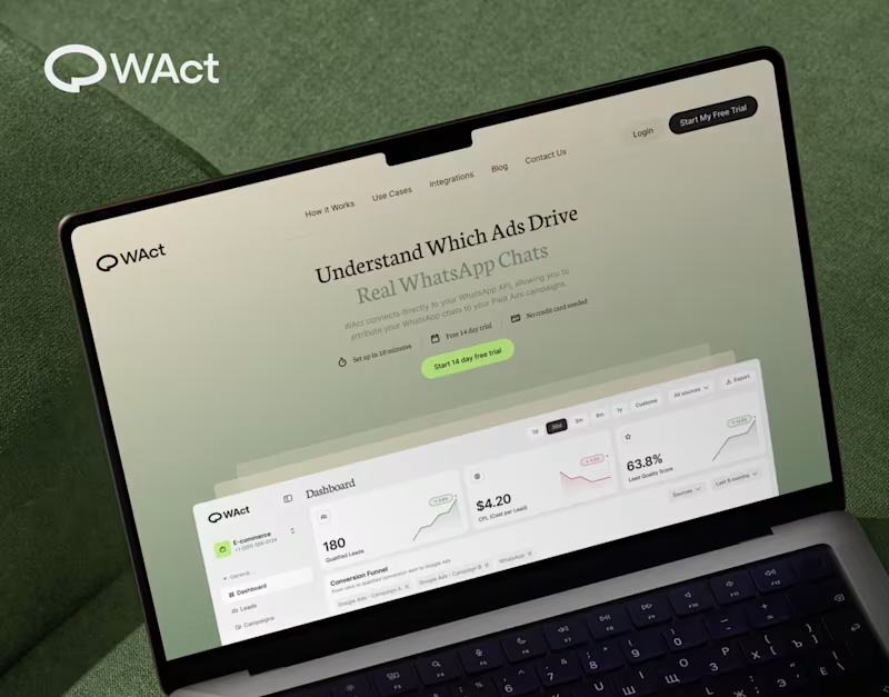
When designing WAct, the main challenge was to make complex analytics feel calm, approachable, and actionable.
Marketing tech platforms often suffer from visual noise: endless charts, aggressive contrast, and buried data.
For WAct, I took an editorial SaaS approach:
Visual Hierarchy: Kept the primary metric cards (CPL, Lead Quality Score) instantly readable at a glance.
Warm Aesthetic: Used a soft, olive-green gradient backdrop paired with editorial typography to make the brand stand out from generic blue dashboard templates.
Dashboard Logic: Structured the flow so users can track multi-channel ad conversions straight into WhatsApp chats without getting overwhelmed.
Building a complex B2B platform or analytics tool? Let’s connect and create a seamless UI/UX for your product.
🔗 Explore the full case study on Behance:
Check out WAct on Behance (https://www.behance.net/gallery/253815513/WACT)
7
22
706