Simplifying Patient Registration for Ognomy
Anastasiia Barbashyna
Ognomy – Streamlining Patient Registration
The Context:
Ognomy is a telemedicine platform making sleep apnea diagnosis accessible. Their patient registration MVP had been live for over a year untouched — 9 screens of all-caps text, stacked buttons, no trust signals, and a UI that felt more clinical anxiety than caring healthcare.
My Role:
Solo designer. Full web + mobile patient registration redesign, done in one week.
So, how it was improved? Let's start with patient flow fixes
1️⃣ Web platform
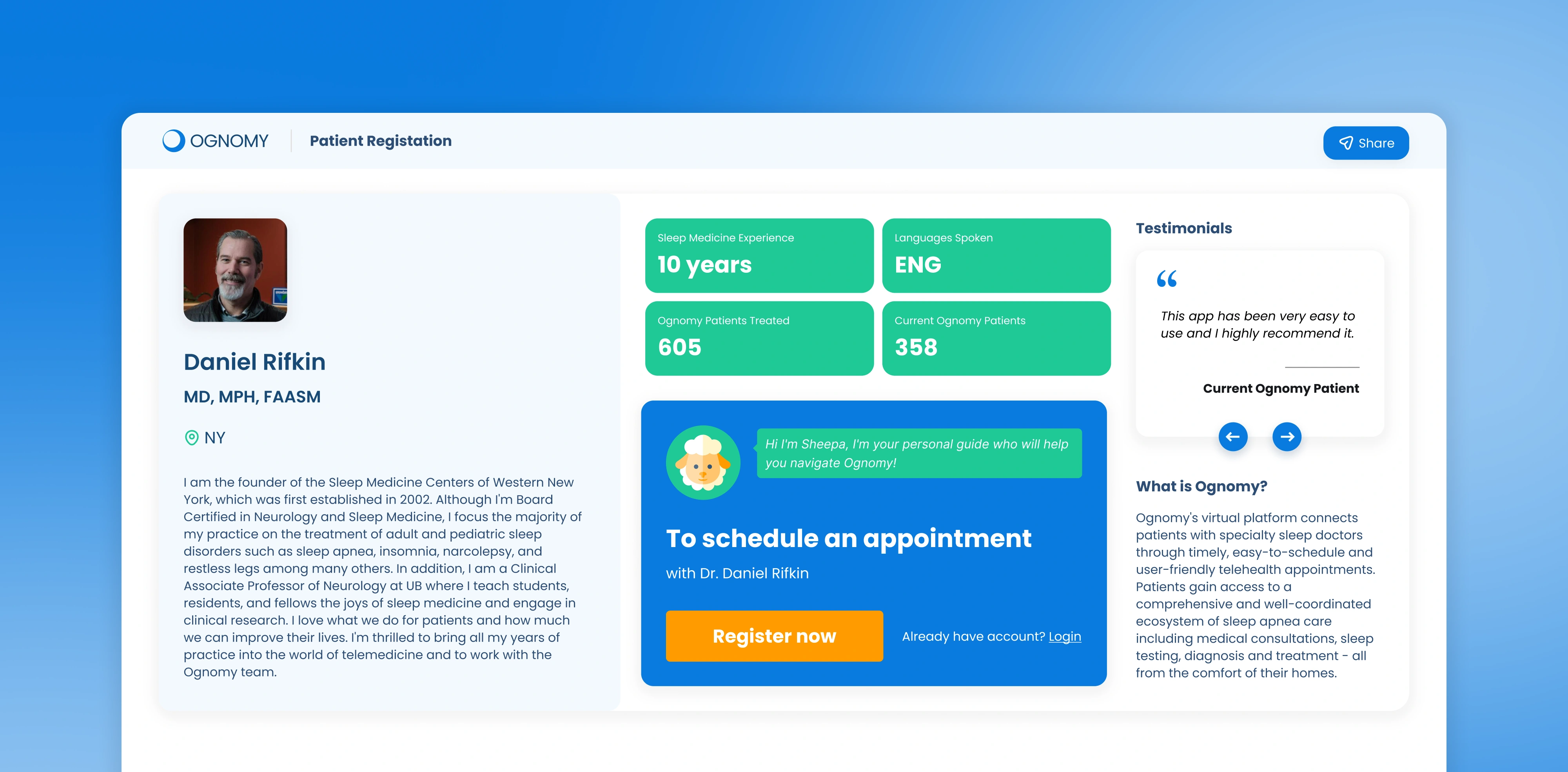
I analyzed the existing process and identified lack of UX/UI. Patients needed clearer guidance, so I restructured the flow for a more intuitive experience. As a result I've came up with faster, frictionless registration process that felt intuitive and effortless.
From the first sign-up to the first appointment, the path is now smooth. No confusion, no guessing.
After onboarding, users now get gentle guidance—what to do next, who to talk to, how to keep going. All clearly laid out and stress-free.
I redesigned the patient experience on desktop to be clearer, cleaner, and more encouraging. Important info is easy to find, and the interface feels less clinical and more caring.
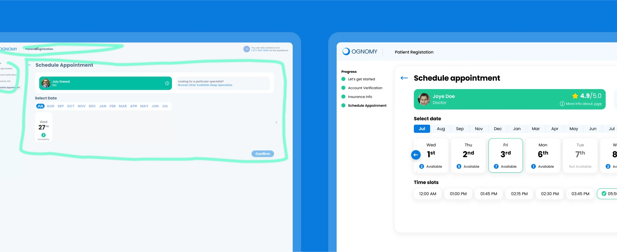
Schedule appointment: Old UX/UI vs New
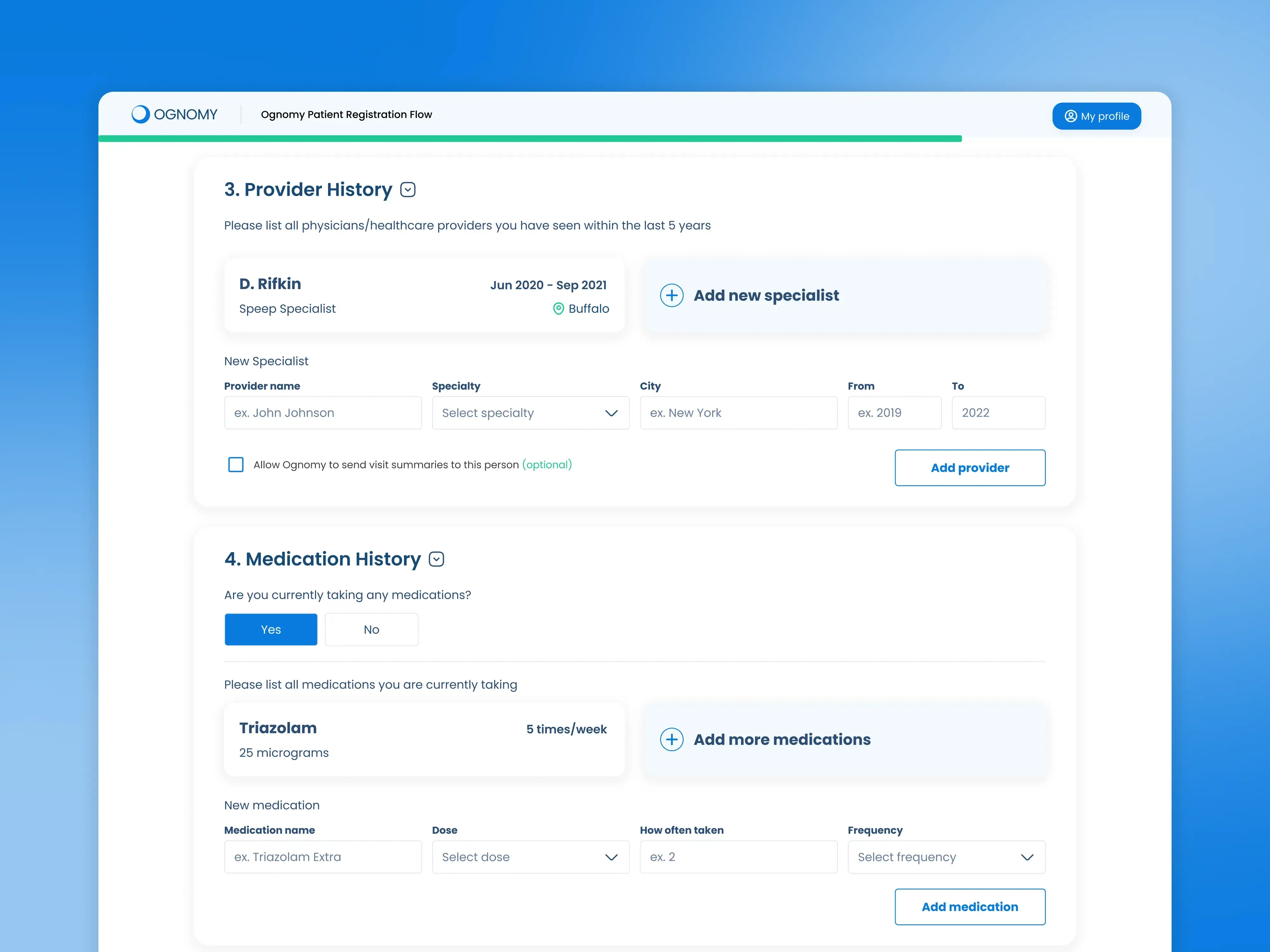
Snippet from new UX/UI for Patient registration flow
And what happened to mobile, you may ask... Well, UX audit helped to identify issues, and simplify mobile app experience in terms of appointment booking.
I cleaned up the app’s navigation, reduced unnecessary steps, and made actions easier to take.
The mobile app patient flow was rethought entirely. Fewer steps, clean contrast, CTAs, simplifies logic. The experience now feels simple and supportive (even if you’re half-asleep) :D
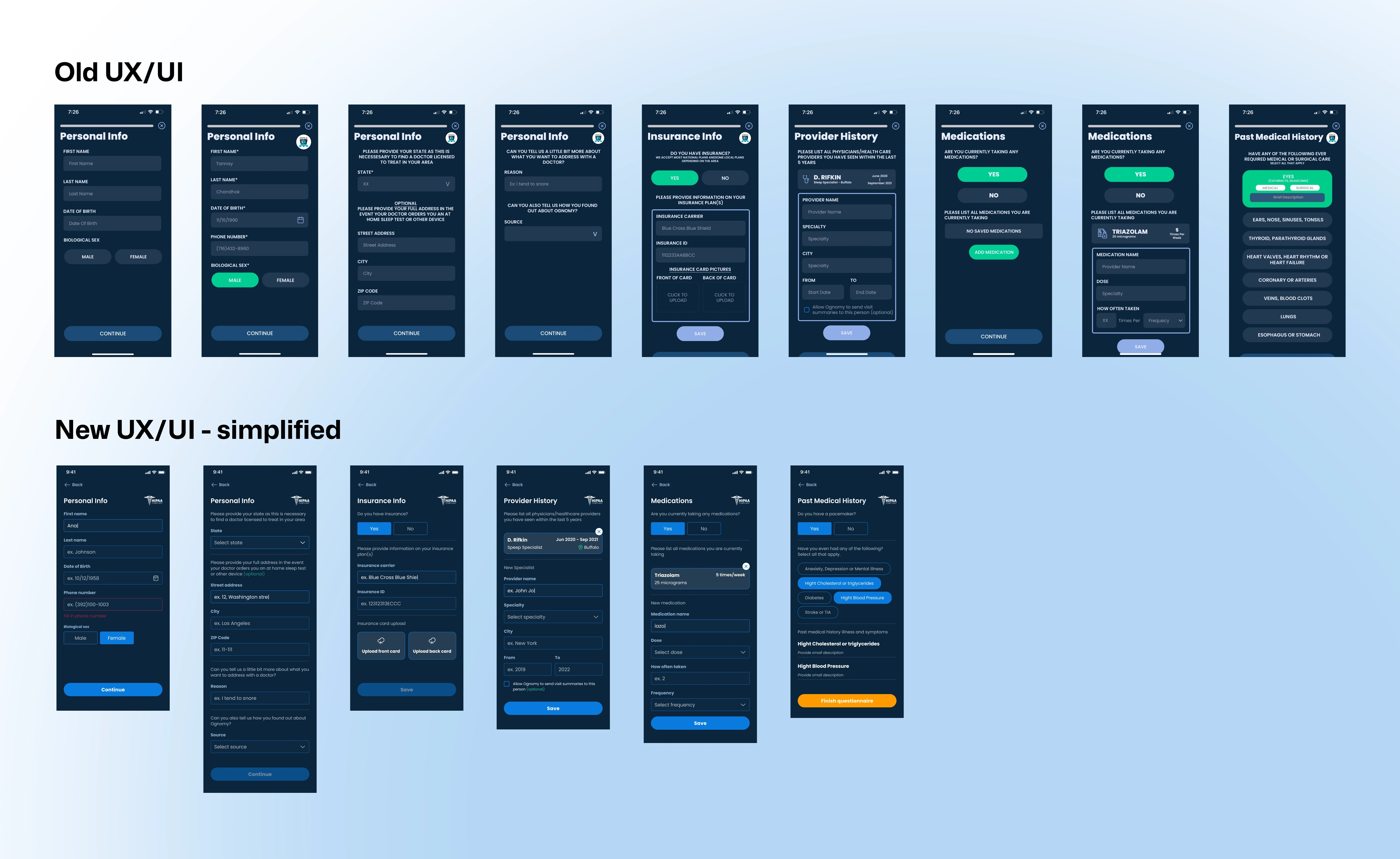
Visual example of how UX and UI got simplified, leading to increased retention rates.
The initial design was prepared quick for the MVP, but stayed like that for a year. The healthtech can be challenging, knowing how much essential data you need to provide to use the services. So when I got a chance, I've improved the flow and steps within not only brand consistency, but UI guidelines, making the process more pleasant. Below you can see the close ups on the improvements of patient registration flow, and how good UI can bring chaos to solid look and feel.
![Close up on the UX/UI improvements [1]](https://media.contra.com/image/upload/fl_progressive/q_auto:best/brtbajkr0uwxycoaqmqa.webp)
Close up on the UX/UI improvements [1]
![Close up on the UX/UI improvements [2]](https://media.contra.com/image/upload/fl_progressive/q_auto:best/daithvuh4xg06kkjkw88.webp)
Close up on the UX/UI improvements [2]
![Close up on the UX/UI improvements [2]](https://media.contra.com/image/upload/fl_progressive/q_auto:best/jvttdscpurnvqikvoahl.webp)
Close up on the UX/UI improvements [2]
Thank you for getting right to the end :) Feel free to leave me a message, if you have a healthtech project that needs refinements.
Like this project
Posted May 28, 2025
Improved patient registration on web&mobile: Ognomy HealthTech
Likes
2
Views
10
Timeline
Jan 1, 2019 - Feb 1, 2019
Clients
Ognomy Sleep