Squared Marketing: Rebrand and Evolve
Anastasiia Barbashyna
from A-Squared Media to SQUARED MARKETING 🚀
Little intro: Squared Marketing is a Boston-based creative agency that helps real estate, construction, and architecture brands stand out through powerful visuals and strategic marketing.
Formerly known as A Squared Media, they’ve grown from a production-focused studio into a full-scale marketing partner — blending video, design, and messaging to help companies connect with their audiences and sell with clarity.
I was initially meant to refresh their website, but as we started talking, I realised, that we can do way more than that, knowing that massive business relaunch is coming. So I challenged myself with rebranding, but challenged is a strong word, when it comes to Squared Marketing founders. They gave me freedom, with the only ask in mind - please, somehow leave the owl... 🦉
So I entered into my creative paradigm to find SM essence.
Let me show you how the initial logo looked like and the my way of thinking, that's an important part.
I don't want you to get subjective, but in my opinion, they had a lovely logo for a bookstore, Harry Potter scene or else, not the marketing. Because of its details the logo got lost in small sizes, and that's not the way you want to look in social media as a business. 🤓
There is no spoilers, just the process - the pre-selected form is the right one :)
Let's see in small size I was talking about previously:
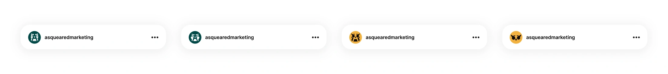
Do you see what I see? :) 😊
A rebrand where the owl survived! Now, I needed to shape it just for Squared Marketing guys.
Easter egg 🐣: the owl’s lashes represent quote marks, because this owl doesn’t just see — she speaks, as marketing does.
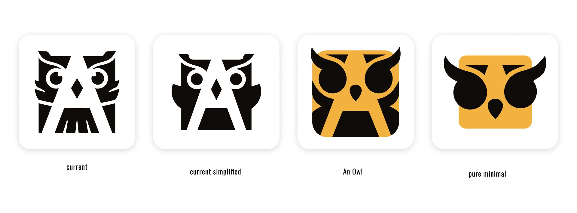
So for me, it was the key to find the way to show the expertise, experience, and passion. The next step we took to find the right owl's look, Squared wanted to see her eyes, even though, it was a tiny tricky to implement. I was keeping in mind the minimalistic approach I wanted to maintain. It was crucial for small-size mark in use, so it won't get mushy.
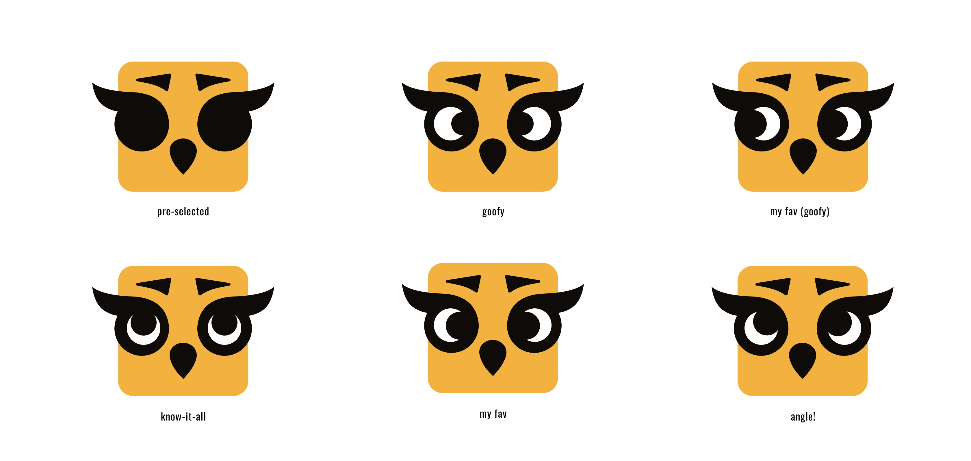
The options for the owl, each unique, and delivers different attitude.
At some point, the heat of which one to pick got wiiiild! So as a creative, I love finding the ways for a perfect match. Thus, I built a “Choose your owl” prototype, where each founder could mix & match eyes, brows, beaks, lashes — until we found the one that felt exactly right. A visual hybrid, where some elements came from one founder, others from the other, and a few shared — now they each see themselves in it. How cool is that?
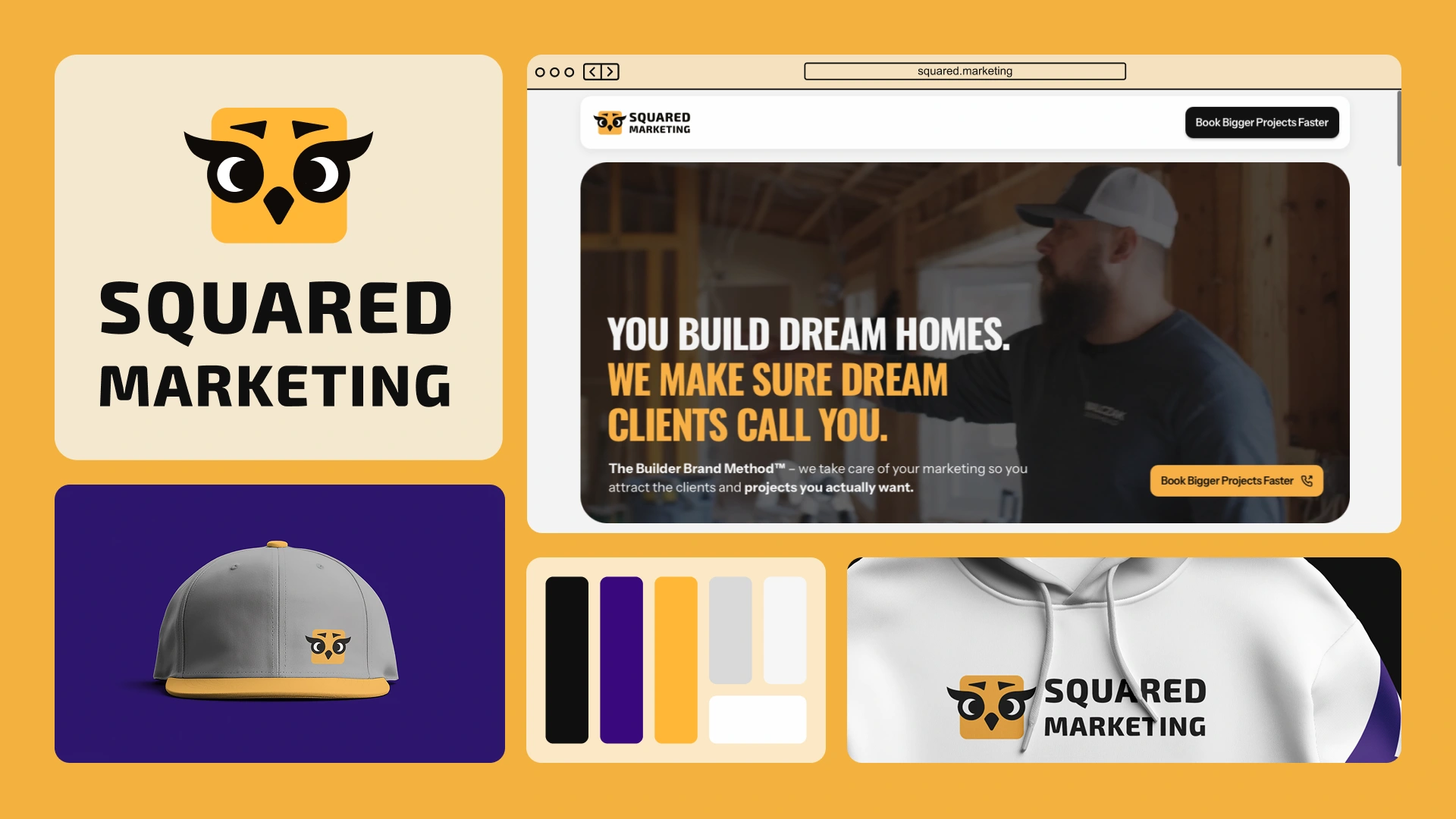
Of course, the logo mark cannot stay there all alone, so I've came up with the perfect color palette emphasising the business and the target audience it speaks to.
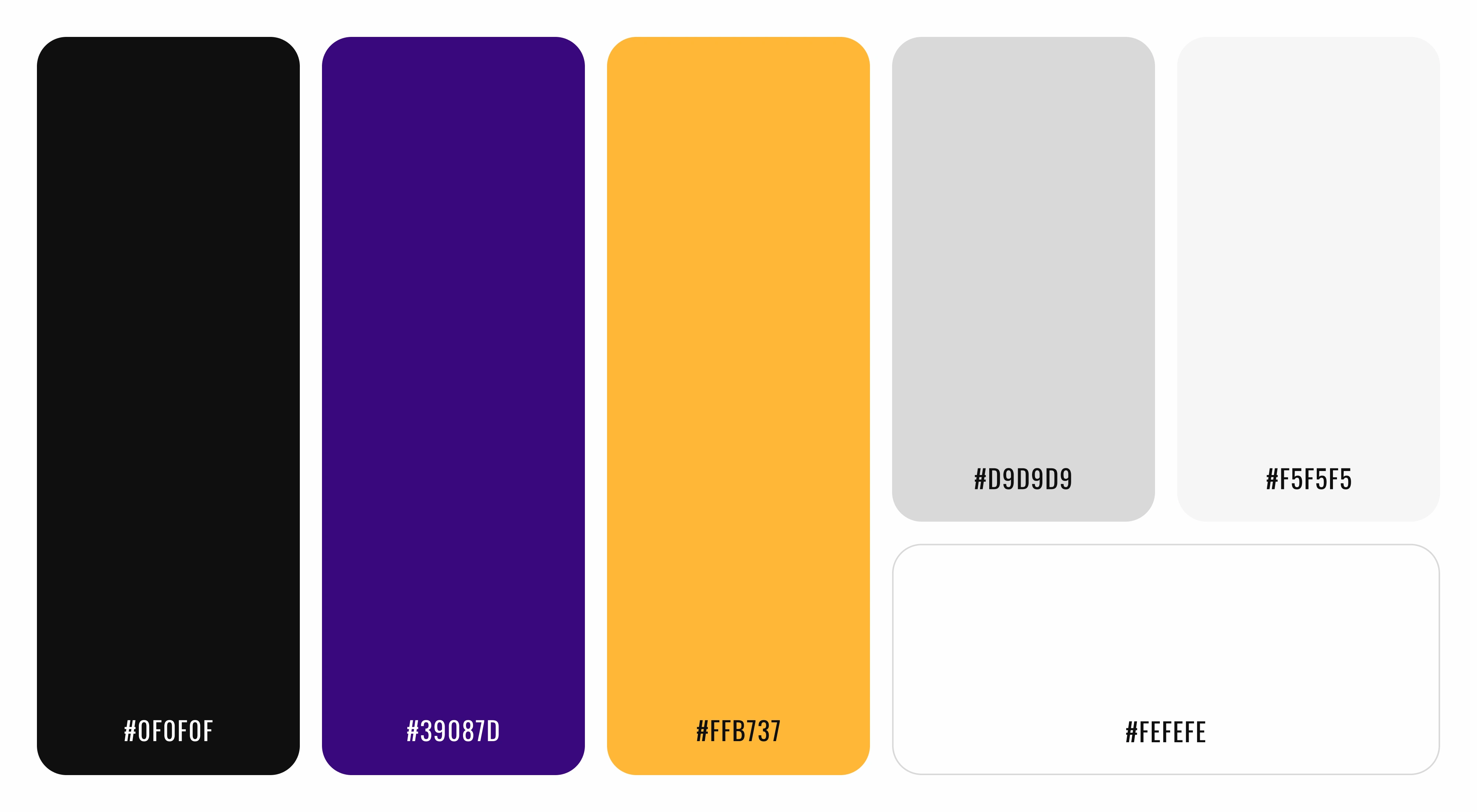
3 Primary colours, and the grey shades make a perfect combo.
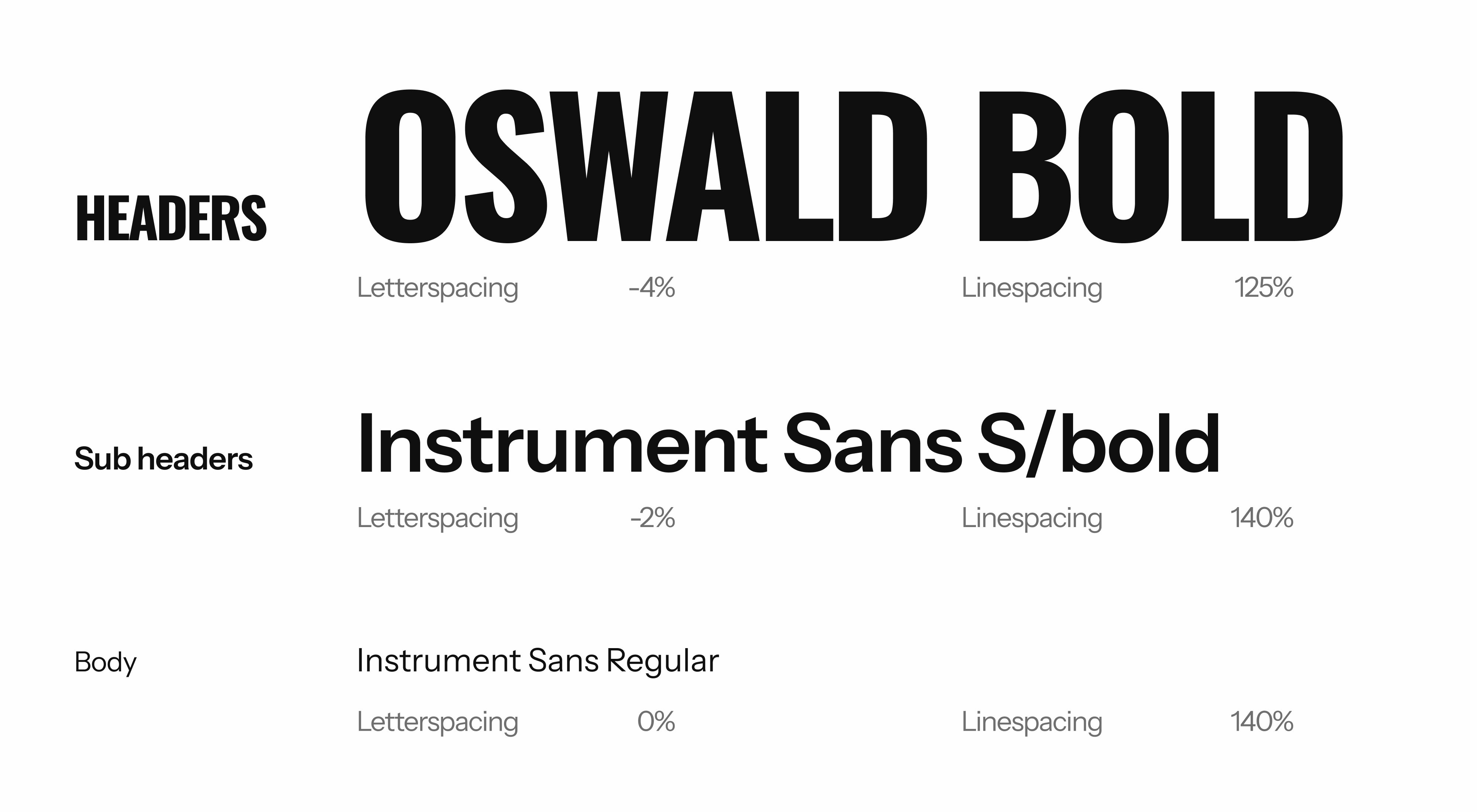
As the last piece of trio, fonts come in, I wanted them to be prominent, corresponding, bold and soft at the same time.
🧨 What I loved most
The entire process. It was pure creative chemistry. We laughed, brainstormed, vibed, I've received lots of Looms with OMGs and WOOOWs on my designs (which is pure fluttery) — and by the end, I signed off something that reflects who they are and where they’re going.
I was trusted fully - and gave back my all, a visual that feels like them. Strategic, flexible, full of personality just as the team.
There're gonna be more awesome designs for them, that's just the beginning of Squared Marketing! 😎
Want to get similar funky, bold, yet cute'n'cozy transformation - feel free to ping me!
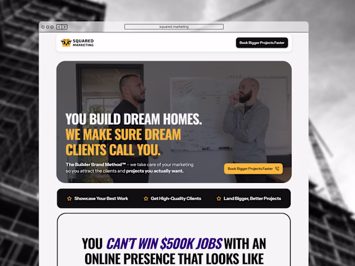
PS: if I've wrote it even in a tiny engaging way, you probably remember, it's all started with the website request :) So, as for the website, check out the case study here
Like this project
Posted Jun 10, 2025
Rebranded Squared Marketing with a new look & feel, keeping the essence. Got the visuals to speak and resonate with who they are now.
Likes
2
Views
10
Timeline
May 1, 2025 - May 18, 2025