Freelancers using WooCommerce in London
Sign Up
Post a job
Sign Up
Log In
Filters
2
Projects
People
Nabeel Ahmed
London, UK
Product Designer · Web & App Developer · AI Automation
5.0
Rating
21
Followers
Follow
Message
Product Designer · Web & App Developer · AI Automation
0
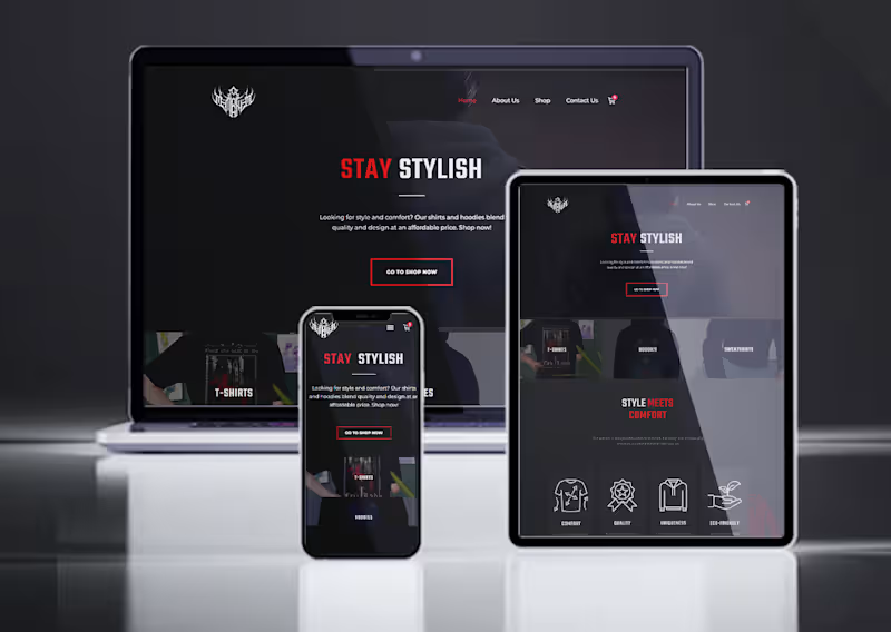
Mementomori Store — E-Commerce Website Design & Development
0
6
0
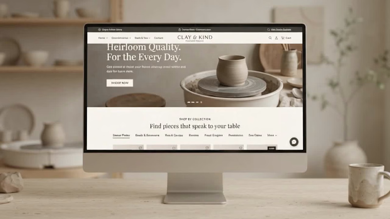
Clay & Kind — Artisan E-commerce Website Design & Development
0
2
0
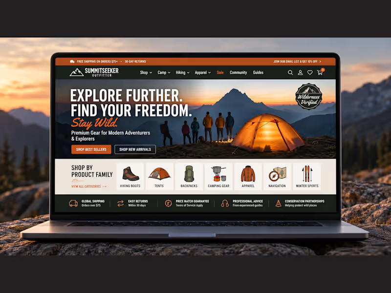
SummitSeeker — Outdoor E-Commerce Website Design & Development
0
6
0
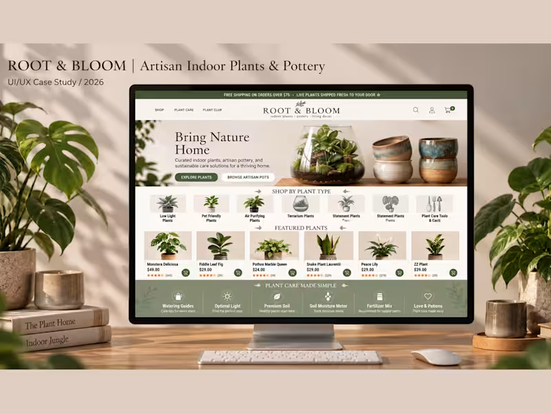
ROOT & BLOOM E-commerce Website Design
0
3
WooCommerce
(4)
Follow
Message
doris james
London, UK
WordPress & WooCommerce Website Developer
11
Followers
Follow
Message
WordPress & WooCommerce Website Developer
1
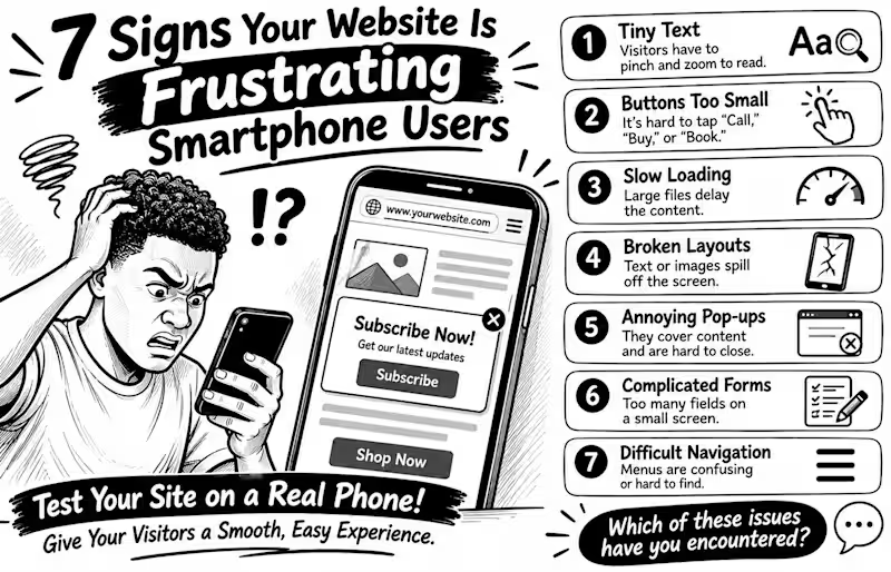
7 Signs Your Website Is Frustrating Smartphone Users Your website may look perfect on a laptop but feel like hard work on a phone. And that matters: the 2025 Web Almanac found that only 48% of mobile websites achieved good Core Web Vitals, compared with 56% on desktop Here are 7 warning signs to check 1️⃣ Tiny text Visitors have to pinch and zoom just to read. 2️⃣ Buttons too small People struggle to tap “Call,” “Buy,” or “Book” without hitting something else. 3️⃣ Slow loading Large images and heavy scripts delay the content people came to see. 4️⃣ Broken layouts Text, images, or menus spill off the screen or overlap. 5️⃣ Annoying pop-ups Full-screen offers cover the content and are difficult to close. 6️⃣ Complicated forms Too many fields make enquiries or checkout tiring on a small screen. 7️⃣ Difficult navigation Menus are confusing, links are crowded, or important actions are hard to find. Don't just shrink your desktop website and call it mobile-friendly. Open it on a real phone and try to complete a task as a customer would 💬 Which of these problems have you encountered on a business website?
1
1
24
1
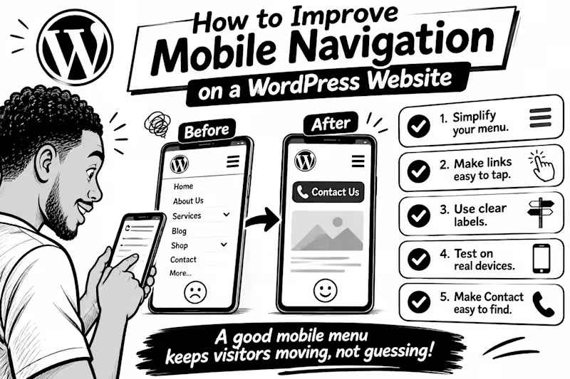
How to Improve Mobile Navigation on a WordPress Website Ever tried to find a service on a website, only to give up because the menu was confusing? Visitors can face the same frustration on mobile. Here are 5 practical fixes 1. Keep the menu simple. Prioritise pages people need most: Services, About, Contact, or Shop. Too many options make decisions harder. 2. Make links easy to tap. Digital.gov (http://Digital.gov) recommends touch targets around 48 CSS pixels, with enough space between them to reduce accidental taps. 3. Use clear labels. “Get a Quote” tells visitors more than “Explore.” Make each menu item’s destination obvious. 4. Test on a real phone. Try every link, check submenus, and make sure the menu opens and closes easily. 5. Make the next step easy to find. If calls or bookings matter, keep Contact, Book Now, or Call visible without crowding the menu. WordPress’s Navigation block lets you control how menus collapse into a mobile icon and how submenus open so check those settings in your editor. 💬 What frustrates you most on mobile websites: tiny links, confusing menus, or too many options? Tell me below.
1
42
1
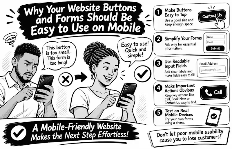
Why Your Website Buttons and Forms Should Be Easy to Use on Mobile Imagine a potential customer visiting your website, ready to contact you, but struggling to tap your tiny contact button or complete your enquiry form. What happens next? They may simply leave. Mobile usability goes beyond making your website fit a smaller screen. Every interaction should feel effortless. Here are 5 things every business website should get right Make buttons easy to tap. Avoid tiny buttons and keep enough space between clickable elements to prevent accidental taps. Simplify your forms. Ask only for information you genuinely need. Too many fields can make enquiries feel like hard work. Use readable input fields. Make text clear, provide visible labels, and ensure fields are easy to select and complete. Make important actions obvious. Your Call, Book Now, Contact Us, and Submit buttons should be easy to find. Test on real mobile devices. Don't rely only on desktop previews. Try completing your own contact form using your phone. Here's an important detail WCAG 2.2 recommends a minimum target size of 24 × 24 CSS pixels for many interactive controls, with certain exceptions. Bigger, well-spaced buttons can make mobile interactions even easier. Remember: A website shouldn't just attract visitors; it should make taking the next step easy. Have you ever abandoned a website because its buttons or forms were difficult to use on your phone? Share your experience
1
37
0
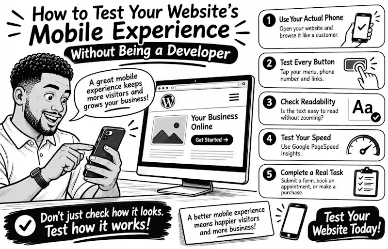
How to Test Your Website's Mobile Experience Without Being a Developer Your website may look perfect on a laptop but become frustrating on a phone Tiny buttons, unreadable text, and complicated forms can make simple tasks harder than they should be The good news? You don't need coding skills to test your mobile experience. Try these 5 simple checks Use your actual phone. Open your website and browse it like a customer. Can you find important information quickly? Test every button. Tap your menu, phone number, contact button, and links. Are they easy to press without accidentally clicking something else? Check readability. Is the text comfortable to read without zooming? Does anything extend beyond the screen? Test your speed. Enter your page URL at Google PageSpeed Insights (pagespeed.web.dev) and review its mobile performance report. Complete a real task. Try submitting a contact form, booking an appointment, or completing a test purchase. Don't stop at the homepage! Remember, a good mobile experience isn't just about fitting a smaller screen. It's about helping visitors accomplish what they came to do. Your turn: When did you last test your entire website on your phone? Try it today and tell me what you discover
0
36
WooCommerce
(22)
Follow
Message
Pierre Ester
London, UK
Story-Powered Digital Experiences
1x
Hired
5.0
Rating
26
Followers
Follow
Message
Story-Powered Digital Experiences
0
Ecommerce P.O.D. site Mrch.World
0
16
1
I'm very excited to share with you FitBuilder, which I aim to make the most flexible fitness app out there! I made it in about 4 months, using a variety of tools. It was inspired by the best fitness apps I've ever tried in the last 12 years, focusing on bodyweight training, so you you can workout anywhere - no gym required! Hopefully, you will find it as valuable in your fitness journey as I do. Full case study here (https://contra.com/p/oRBMmr6b-fit-builder-modular-fitness-app-development?referralExperimentNid=DEFAULT_REFERRAL_PROGRAM&referrerUsername=pierre). 💪🔥
2
1
341
0
3D Artworks for Rigon: Cero y Uno
0
21
0
Animations for Voidpet
0
21
WooCommerce
(1)
Follow
Message
Ermanno Fissore
London, UK
Product Designer and Framer expert
$1k+
Earned
1x
Hired
4
Followers
expert
Follow
Message
Product Designer and Framer expert
0
Photographer portfolio and e-commerce
0
18
0
Fissolo Gru Website Redesign
0
15
0
Ollmoo Website
0
106
0
Omeat. Meat made better in every way.
0
67
WooCommerce
(1)
Follow
Message
Taimur Iqbal
London, UK
Shopify, WordPress, Webflow & Framer Web Developer
82
Followers
Follow
Message
Shopify, WordPress, Webflow & Framer Web Developer
5
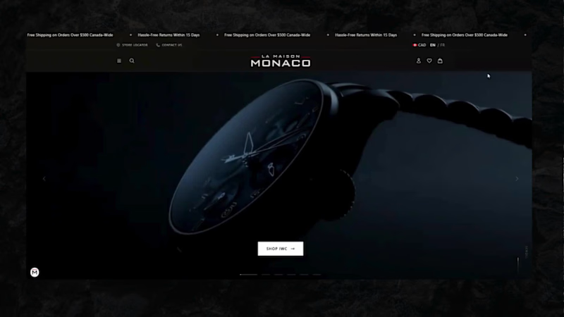
La Maison Monaco — Luxury Watch & Jewelry Ecommerce Site Built a high-end ecommerce website for La Maison Monaco, an authorized retailer of luxury watches and fine jewelry (Omega, IWC, TAG Heuer, Hublot, Zenith, and more) with boutiques across Quebec and Ontario. The site features immersive video hero banners, brand-specific shop pages, a novelties showcase, financing integration (Flexiti), multi-location store locator with appointment booking, a jewelry and accessories collection, and bilingual EN/FR support delivering a polished, editorial-grade shopping experience worthy of the luxury brands it represents. 🔗 https://lamaisonmonaco.com/ (https://lamaisonmonaco.com/)
5
258
4
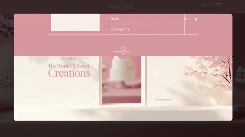
Samadi Sweets A soft, elegant website for a dessert and event-catering brand. It uses blush pink, cream and cherry blossom details, with smooth scroll animations and a full-screen menu. It's built to showcase the desserts and drive event quote requests. Services: UI/UX design, motion/interactions, web development
1
4
399
1
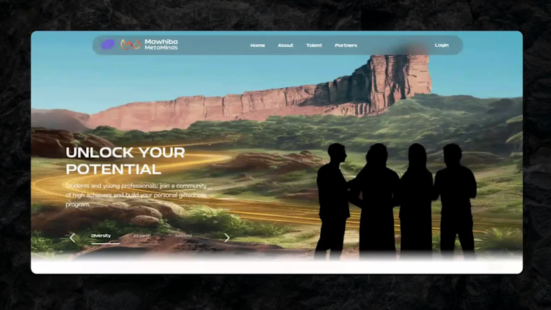
Mawhiba MetaMinds — Cinematic Hero & Landing Experience Designed and developed an immersive, story-driven hero section for Mawhiba MetaMinds, a platform connecting students and young professionals with a global community of high achievers. Built a dynamic carousel that transitions between cinematic scenes from desert landscapes symbolizing growth and diversity to a cosmic "infinite possibilities" sequence each paired with bold typography and a clear CTA. Focused on smooth transitions, responsive layout, and a premium visual identity that matches the platform's ambition to nurture and showcase talent.
1
1
213
8
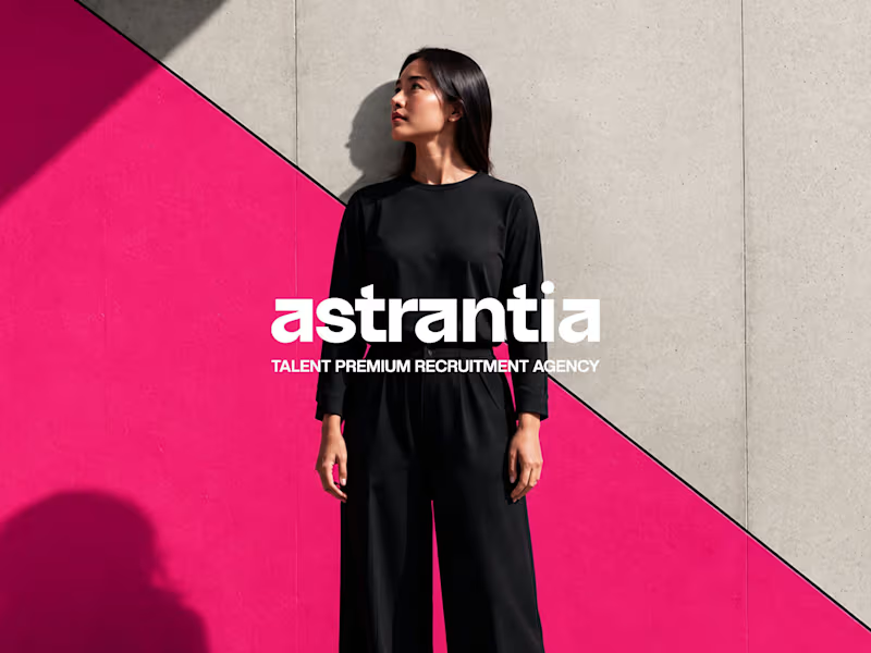
Logo design and brand identity project for Astrantia Talent, a premium recruitment agency. Explored three wordmark concepts bold geometric type, editorial gradient, and architectural serif built around a vibrant purple-to-magenta palette for a modern, memorable recruitment brand identity.
5
8
1K
WooCommerce
(1)
Follow
Message
Fred Oyetayo
London, UK
Experienced: Web and Software Developer
Follow
Message
Experienced: Web and Software Developer
0
Patrick Row Maison Web Development
0
29
0
Dlaw.ng Mobile App
0
39
0
Web Development for Fresible
0
31
0
Dlaw.ng Web Development
0
19
WooCommerce
(1)
Follow
Message
Peter Egbunu
London, UK
Digital Marketer & eCommerce Developer | 5yrs EXP
Follow
Message
Digital Marketer & eCommerce Developer | 5yrs EXP
0
Facebook sales
0
4
0
e-Commerce Development| EddyUP Empire
0
1
0
Facebook Conversion
0
7
0
Eye-catching 3D avatar character animation business Ad Video
0
4
WooCommerce
(2)
Follow
Message
Skylight Pulse
London, UK
One-Stop Solution for Website, Animation & Marketing Needs
Follow
Message
One-Stop Solution for Website, Animation & Marketing Needs
0
Website & Stores Designed By Skylight Pulse Digital
0
14
0
3D Animation Project
0
14
0
2D Animation Explainer Video.
0
9
View more →
WooCommerce
(1)
Follow
Message
Explore people