

🏆Flutterflow Agency of the year 2026 Award Winner


🏆Flutterflow Agency of the year 2026 Award Winner


WordPress Developer & Web Designer | Sites That Convert

WordPress Developer & Web Designer | Sites That Convert


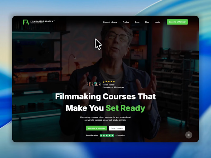

High-performing Web Design, Branding, Animation & AI

High-performing Web Design, Branding, Animation & AI


Helping SaaS companies Scale with high performance website
- $1k+
- Earned
- 2x
- Hired
- 5.0
- Rating
- 11
- Followers
Helping SaaS companies Scale with high performance website

This is why SaaS founders pay $3k+ for a landing page.
Not "better design" —
better decision making.
Same product. Same features.
Completely different user journey.
Before → scattered, unclear, no obvious next step
After → focused, purposeful, guides you to act
What actually changed?
Unified the visual language → coherent professional feel
Created clear hierarchy → eyes follow the right path
Added strategic space → decision feels natural not forced
That's it.
Clear journey = confident visitor
Confident visitor = easier decision
Easier decision = more conversions
Most people think conversion optimization is about CTAs.
It starts way before the CTA.
Design isn't decoration.
It's the journey between landing and converting.
Before → After 👇
Which one guides you better?
#SaaS #WebDesign #UXDesign #Conversion #Startups
0
45


$60,000 spent on a landing page redesign.
Result: prettier site, same conversion rate.
Because UI improved. UX didn't.
Pretty design gets people in the door.
Skip accessibility, confuse the journey, miss what users need?
They leave anyway.
UI and UX aren't optional add-ons.
They're the entire product experience.
2
4
125


AI Workflow specializing in Flora node-based pipelines

AI-generated 3D character concepts using my Flora node pipeline.
Pipeline: Reference images → GPT-5.2 prompt definition → Nano Banana 2 → Recraft V4 → Magnific Precision upscale
Styles covered:
— Sci-fi mech characters
— Streetwear fashion figures
— Stylized mascots
— Futuristic humanoids
Each character generated in under 10 minutes. Total cost per concept: under $10.
Use cases: game design, animation pre-production, NFT collections, concept art exploration.
Full pipeline available as a product on my profile.
0
181

nobody has built an interaction that gives users power OVER the algorithm. so i did.
reverse-engineering the algorithim patterns and accepted the
makeathon challange to built something different.
it's called Project Helix.
instead of a feed that talks AT you, every recommendation comes with a question:
"i'm showing you this because of X. do you accept, modify, or reject — and why?"
you reject something → the system rewires in time. not after 30 days of behavior. immediately.
the graph you see? that's the Path Matrix. it visualizes how your negotiations reshape the algorithm's decision tree. every rejection creates a new branch. every acceptance reinforces a path. you're watching your own agency become architecture.
try it yourself → https://option-payer-93231299.figma.site
2
5
343

Plasma Star Gradient Effect — Figma
I developed this interface design by pushing Figma’s gradient capabilities beyond the standard tools—delivering a visually distinct result within a basic, minimalist framework.
The project was created for a client seeking something unconventional, yet clean and refined.
1
164
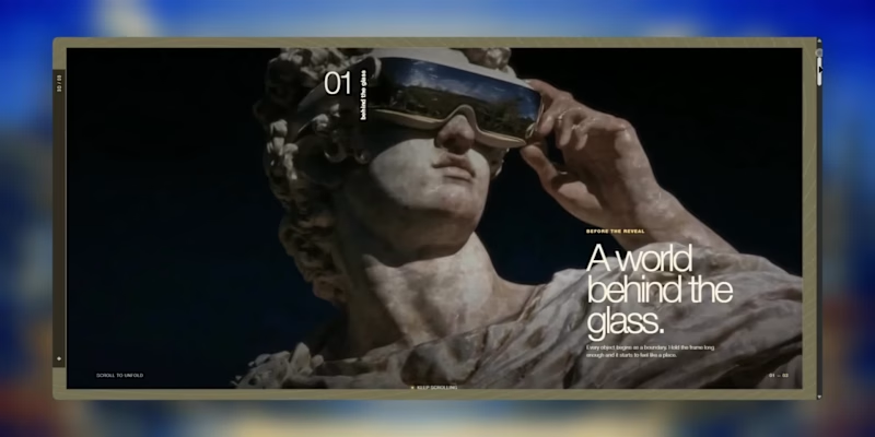
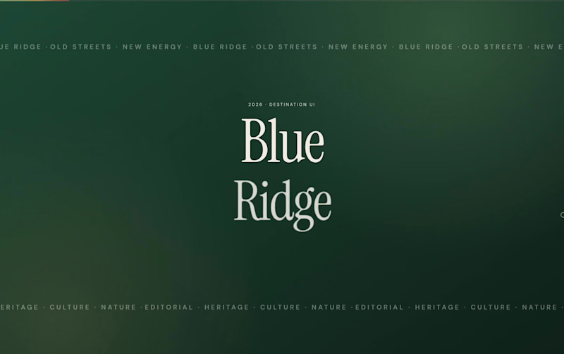
An exploration of how a strong hero section can establish the entire mood of a digital experience.
For this project, I wanted to blend classical imagery with a more contemporary, cinematic web direction, large editorial typography, restrained UI, immersive motion, and a hero that immediately sets the visual language for everything that follows.
I designed and developed the experience while experimenting with Midjourney × Krea during the visual exploration process, then carried that direction through the interface, interactions, and final build.
A study in art direction, web design, motion, and development and how new creative tools can make the path from an early visual idea to a working experience significantly faster.
Role: Creative Direction, Web Design & Development
Exploration: Midjourney, Krea
Build: Next.js
Still exploring where this visual language can go.
0
88

Designing products that people love to use ✨

Designing websites people love to use.

Product designer with experience of 7+ years building SaaS.
Product designer with experience of 7+ years building SaaS.


View more →