hello@humanespace.in
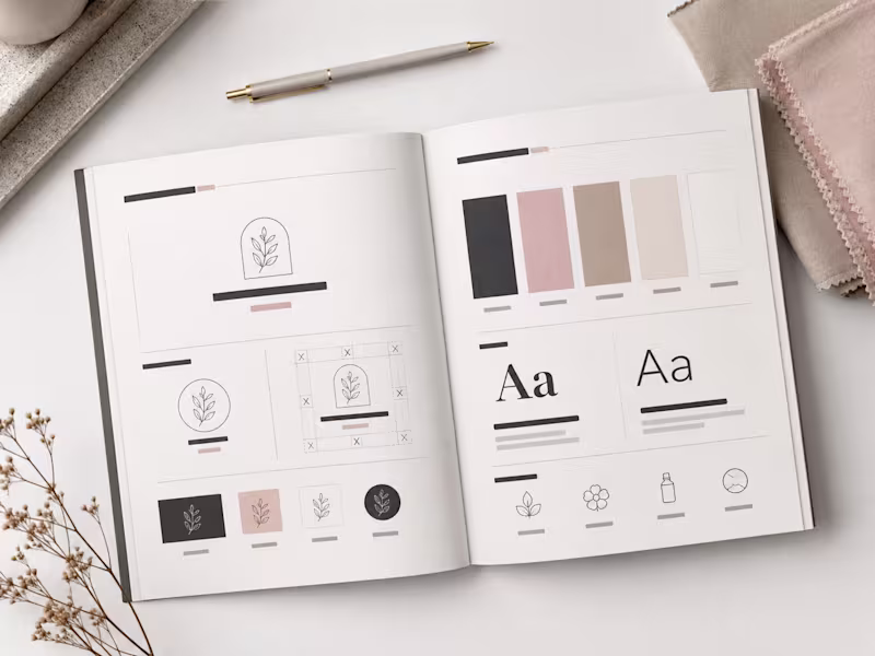
Shaping brands that feel meaningful, human, and memorable.
- $1k+
- Earned
- 1x
- Hired
- 5.0
- Rating
- 11
- Followers
Shaping brands that feel meaningful, human, and memorable.

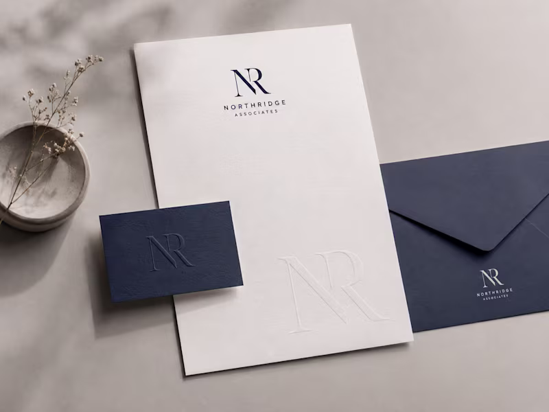
We help brands look sharper, sound clearer, and grow faster
- 1x
- Hired
- 5.0
- Rating
- 66
- Followers
We help brands look sharper, sound clearer, and grow faster

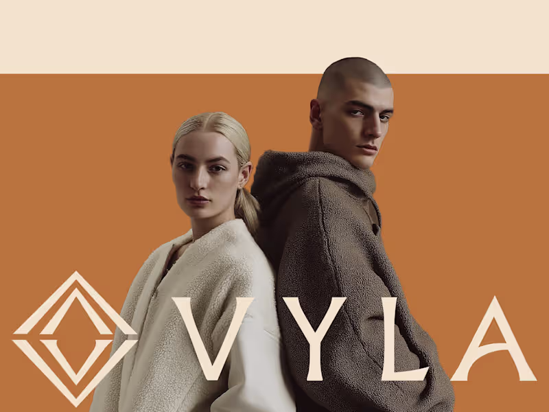
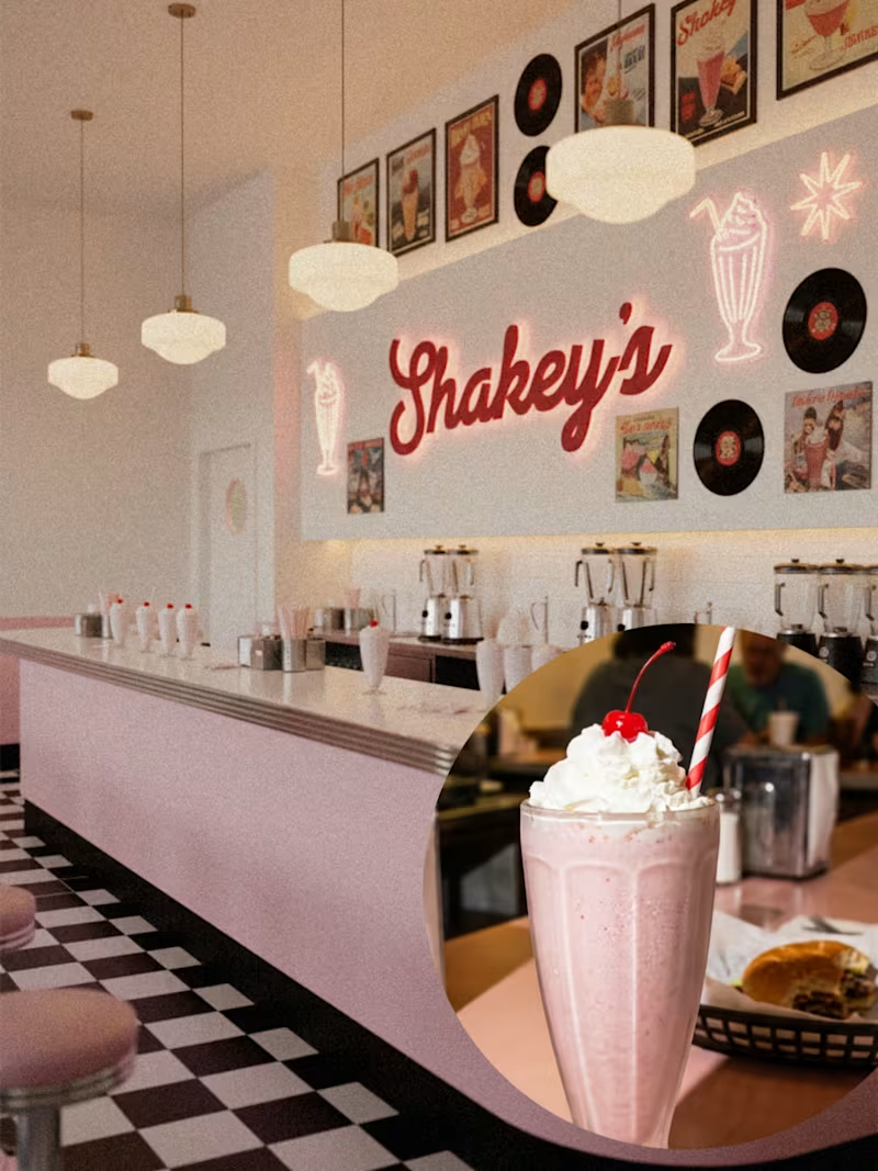
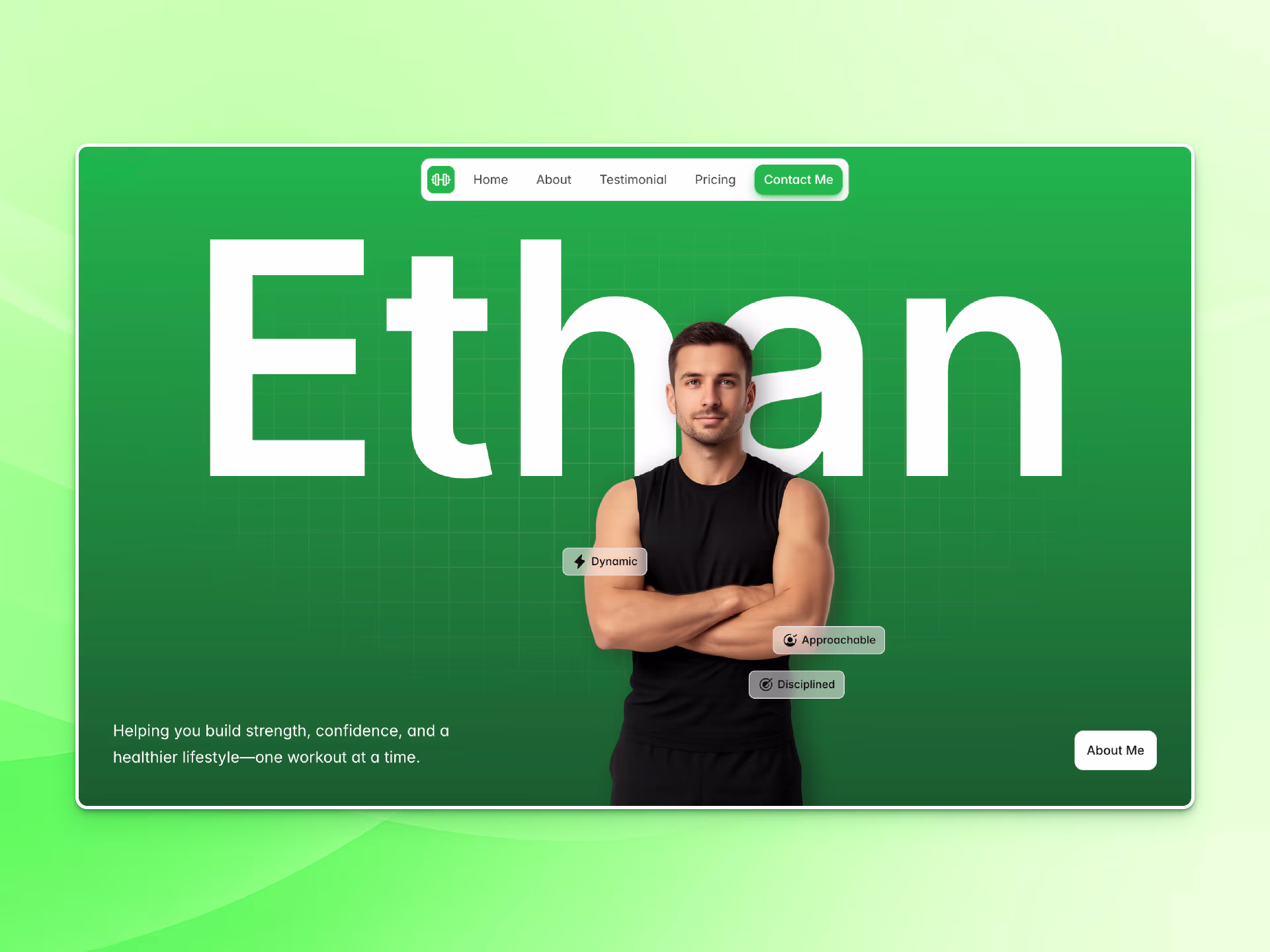
Visual design for authors, coaches & bold creatives
Visual design for authors, coaches & bold creatives

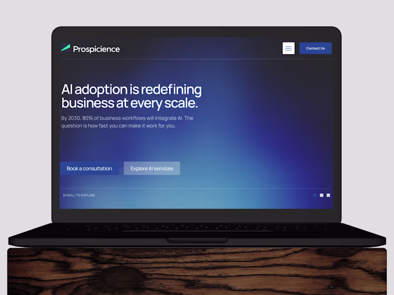
Designing scroll-stopping creatives for product brands.
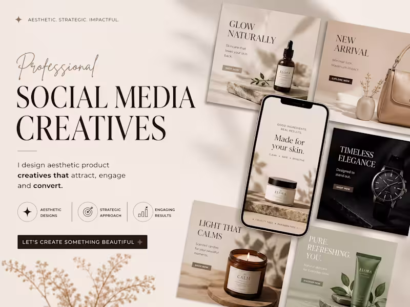

Turning your casual scrollers into obsessed buyers


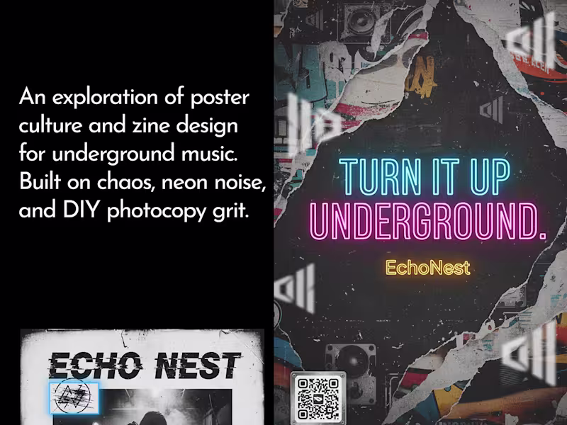
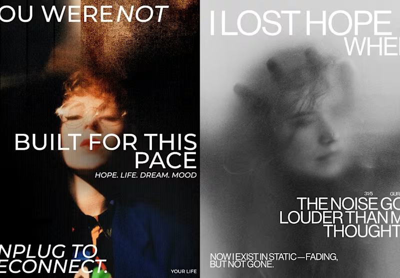
Let me tell your story...


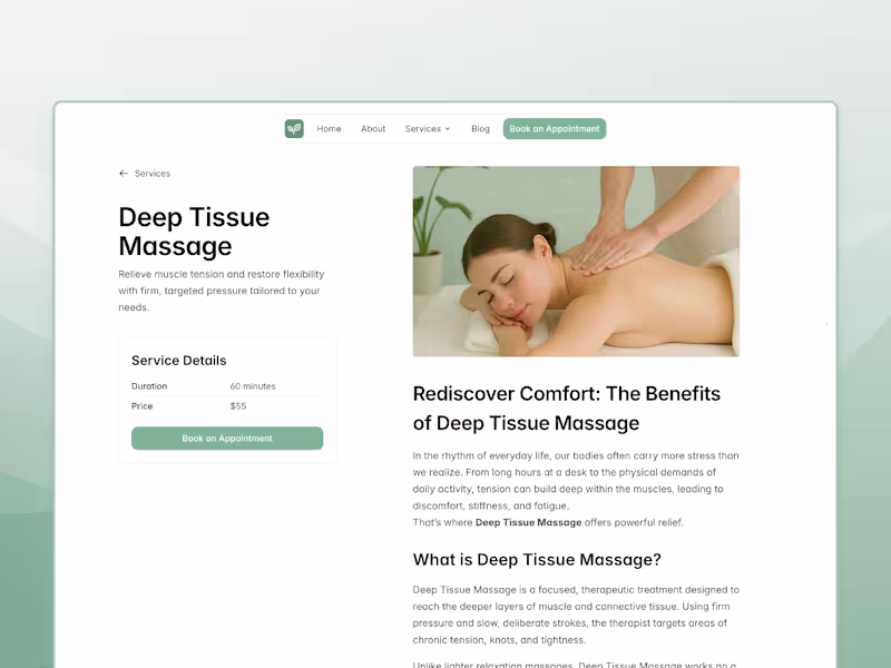
Clean, modern, and minimal Framer designer.
View more →