The network for creativity
Join 1.25M professional creatives like you
Connect with clients, get discovered, and run your business 100% commission-free
Creatives on Contra have earned over $150M and we are just getting started
Back to feedPost
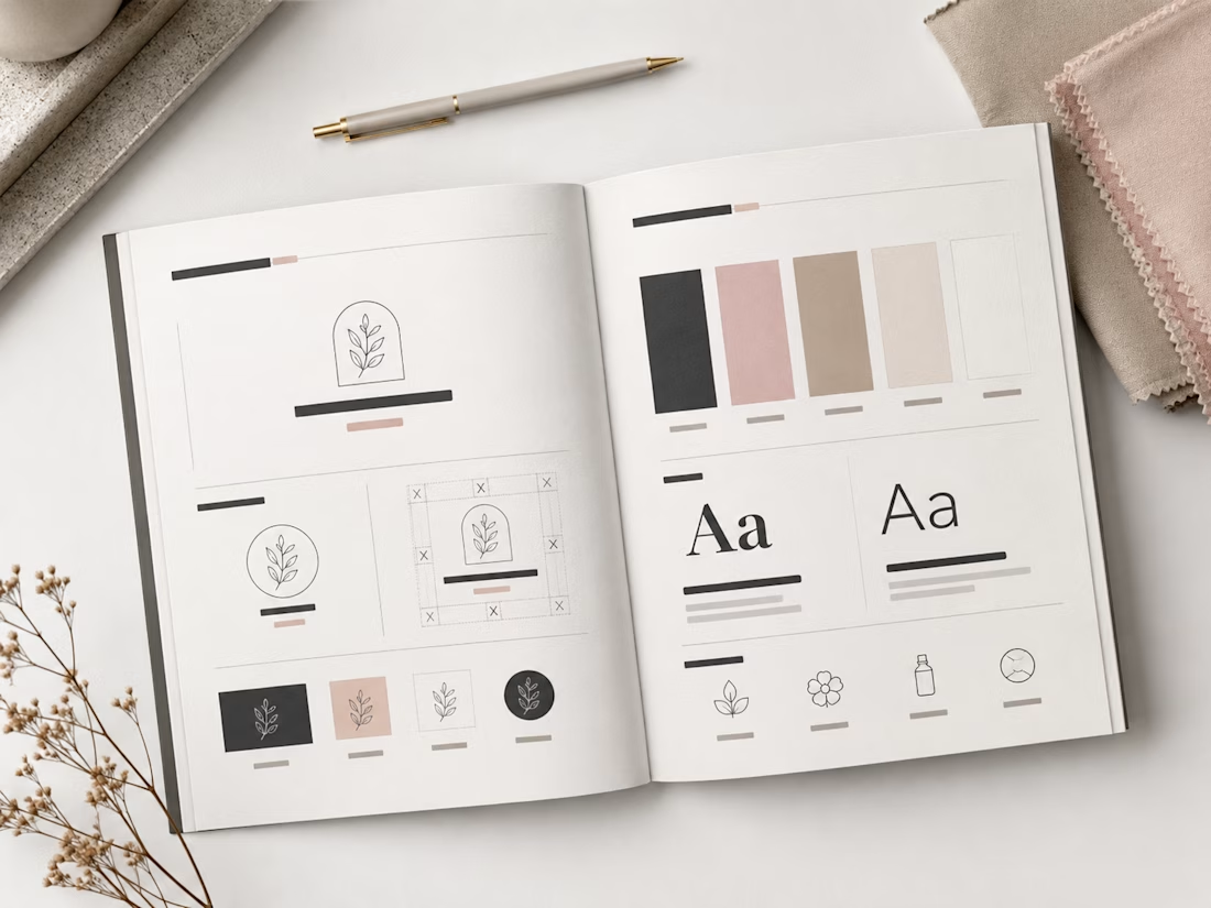
This spread showcases the editorial layout of the CALMÉA Botanical Skincare Brand Style Guide. Designed to serve as the definitive blueprint for the brand's visual identity, the layout maintains a high-end, editorial feel with a focus on generous negative space and clear information hierarchy.
Spread Layout & Specifications
Left Page (Logo Systems & Usage): Dedicated to the structural core of the brand. It outlines the primary arched botanical logo mark, alternative circular sub-marks, and the precise clear-space grid construction. The lower section demonstrates icon versatility across dark, light, and inverted color blocks.
Right Page (Color & Typography): Focuses on the core design systems. The top half displays the refined, earthy color palette blocks (charcoal, dusty rose, warm taupe, soft cream, and crisp white). The midsection dictates the typographic hierarchy, contrasting a bold serif display typeface with a clean, light serif/sans-serif body pairing. The bottom row highlights custom brand iconography for packaging use.
Art Direction: Styled in a flat lay format featuring raw tactile fabric swatches, a minimalist matte pen, and delicate dried florals to reflect the organic essence of the brand.
The network for creativity
Join 1.25M professional creatives like you
Connect with clients, get discovered, and run your business 100% commission-free
Creatives on Contra have earned over $150M and we are just getting started
Related posts
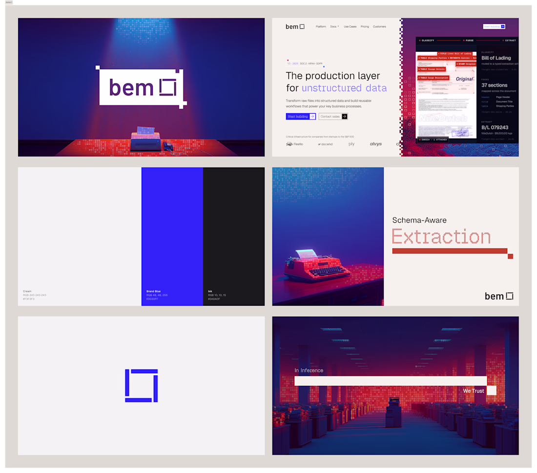
I've had so much fun working on bem. Came in with logo marks and colors, and we're looking for an identity to call home. After doing some research and inspiration exercises, we came up with this concept, which I absolutely love.
Impressive work !
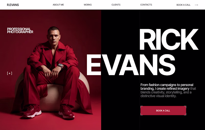
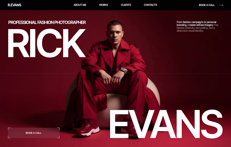
Design Duel ⚡
Two hero concepts. One fashion photographer.
🅰️ Structured split layout 🅱️ Full-screen editorial experience
Which one would you choose for your portfolio? Vote A or B and tell me why.
6 voted
20%
24 voted
80%
30 votes
Closed
I love your designs so much! 😍
Two homepage concepts for film production studio - which one do you choose? 🧐
38 voted
57%
29 voted
43%
67 votes
Closed
amazing!
Challenges
View allTrending
Claude
Claude has entered the design space. How are you using Claude Design?
Contra University
Learn from expert creatives how to earn more using next-gen AI tools.
fifaworldcup2026
The World Cup is here and the whole world's watching. How are you designing for the world stage?
creativeaiflow
Creative AI workflows are evolving. What tools do you use, and what are their strengths and weaknesses?
freelancerlife
Freelancer life is wins, pivots, and everything in between. What’s yours right now?