The network for creativity
Join 1.25M professional creatives like you
Connect with clients, get discovered, and run your business 100% commission-free
Creatives on Contra have earned over $150M and we are just getting started
Back to feedPost
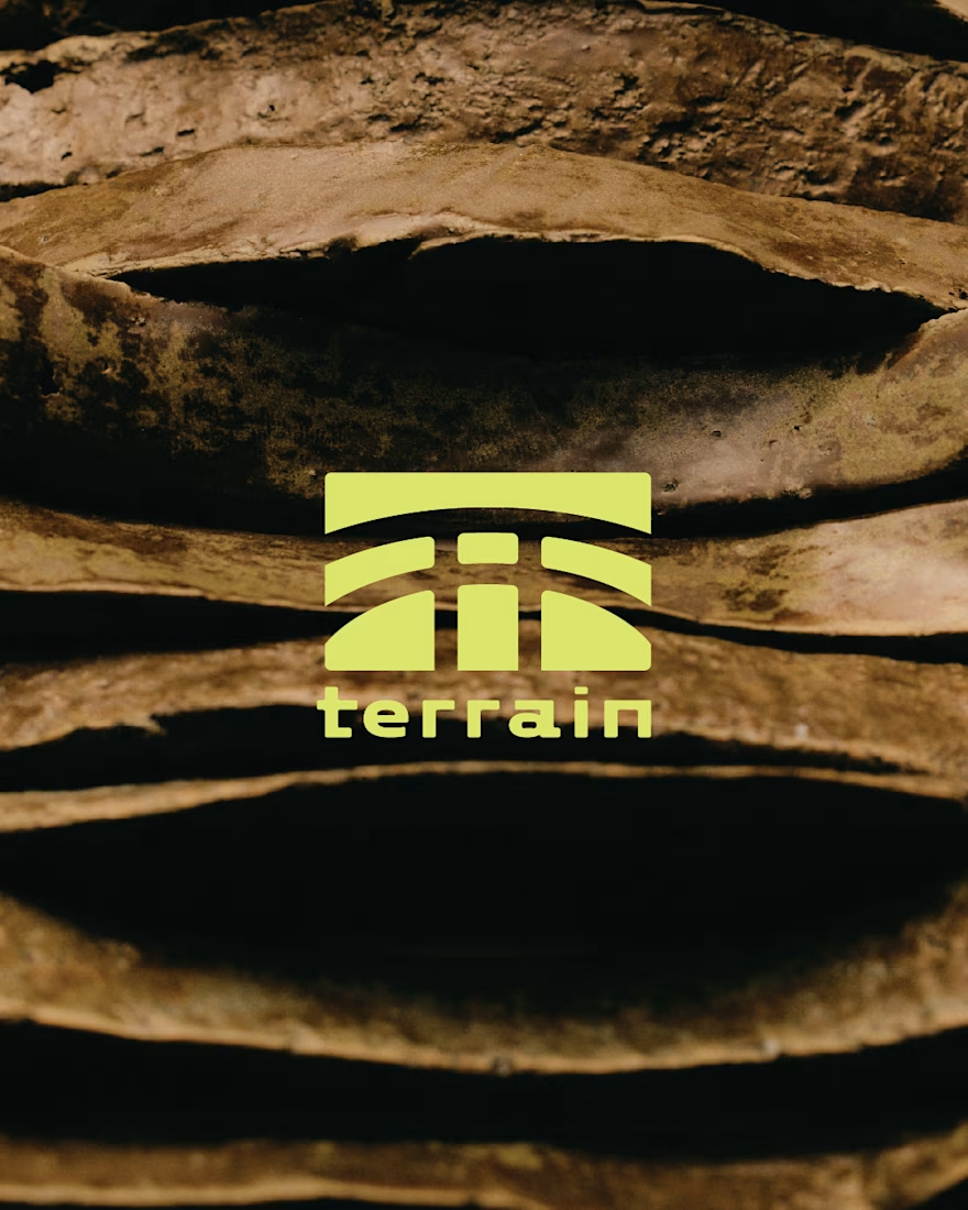
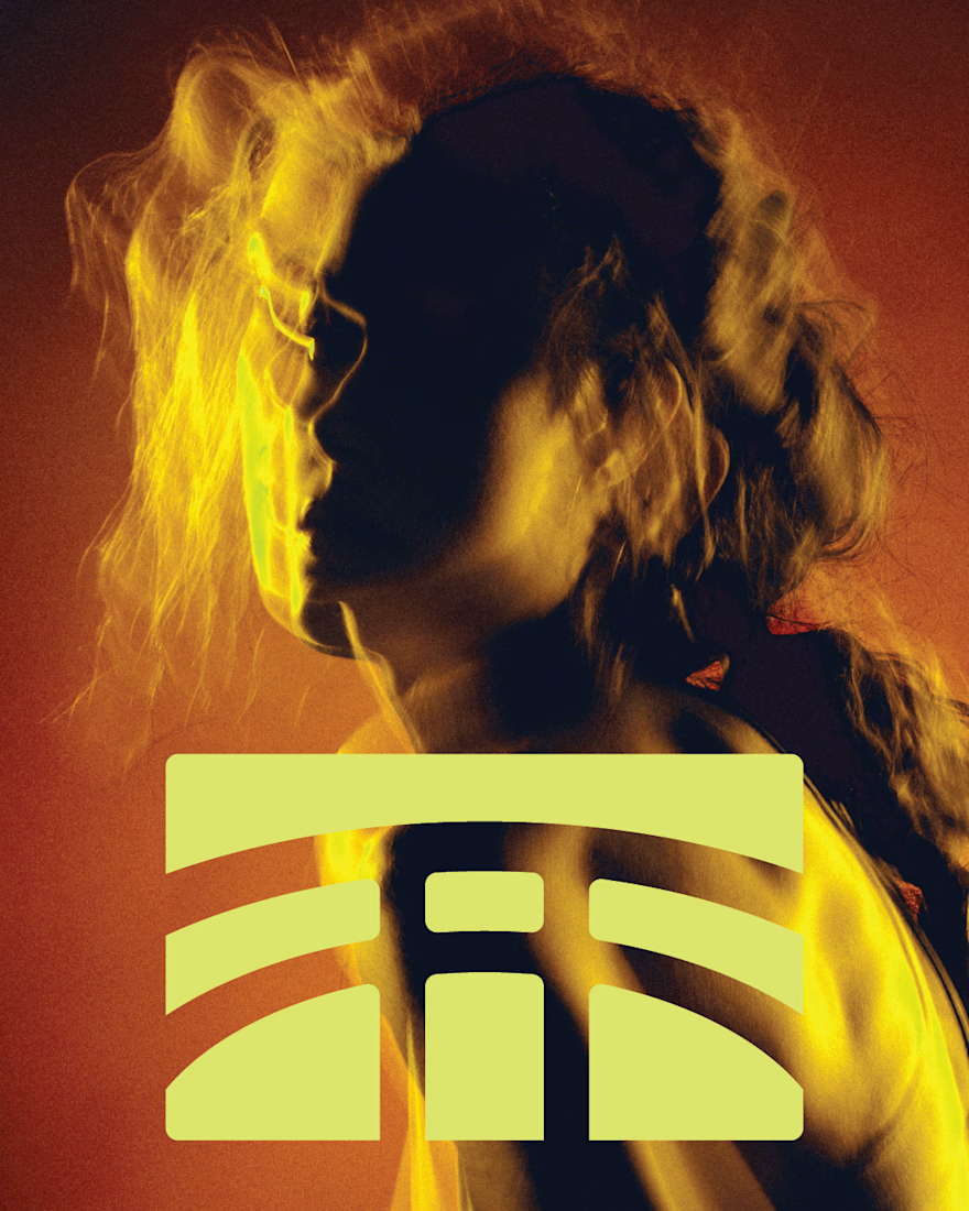
Terrain - Cycle Spin studio branding concept:
The name was derived from the outdoors.
The T logo Symbol was inspired by the shape of a bike, the word mark inspired by strength and designed to stand out against other brands in the space.
The colours were inspired by the outdoor scenery and the neon lights we see in modern studios of this kind.
Art direction focusing on movement and intensity.




Cool work, Jesus ⚡️

Thank you Celia! 🙌

The T logo doubling as a bike silhouette is nice visual wordplay, that kind of dual meaning usually feels forced when it's forced. Did Cycle Spin catch that connection right away, or did you have to point it out to them?
I appreciate the feedback Maty! I spent a lot of my free time tweaking the logo so I'm glad you liked it.
The inspiration for this project came from me just looking at the visual identities of gyms in my city (Calgary). There's not much differentiation happening in in that...

Amazing work, Jesus 🫠
Cheers Salman!
The network for creativity
Join 1.25M professional creatives like you
Connect with clients, get discovered, and run your business 100% commission-free
Creatives on Contra have earned over $150M and we are just getting started
Trending
retrofuturism
Share your favorite designs from the past exploring the distant future. Or your own take on the aesthetic 🚀
halftone
Dots. Texture. Grain. Let's see your designs using the halftone technique.

Midjourney
Creatives are showing off what they're making with Midjourney.
colorgrade
Video editors sound off: How do you enhance the mood of your video in color grading?
Related posts

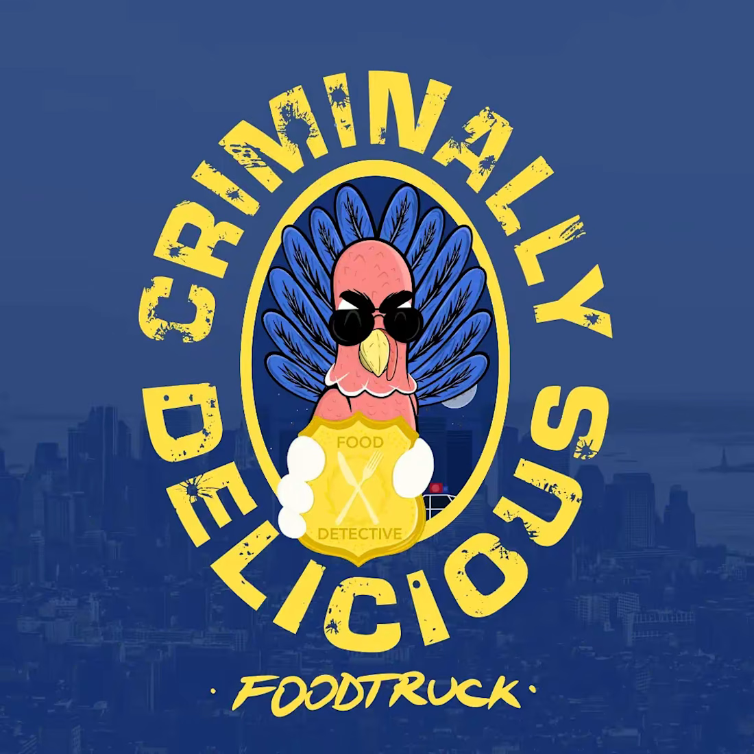
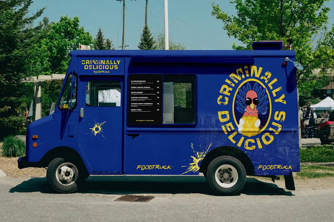
Brooklyn Nine-Nine, Boyle’s Food Truck visual identity
The other day I started thinking of fictional brands from TV shows and If you ever watched Brooklyn Nine-Nine you must know Boyle!
The idea was simple:
What would Boyle’s food truck look like if it were a real Brooklyn food truck?
I approached it as a visual designer, building the identity around the character himself — enthusiastic, slightly chaotic, unapologetically passionate about food, and very Brooklyn.
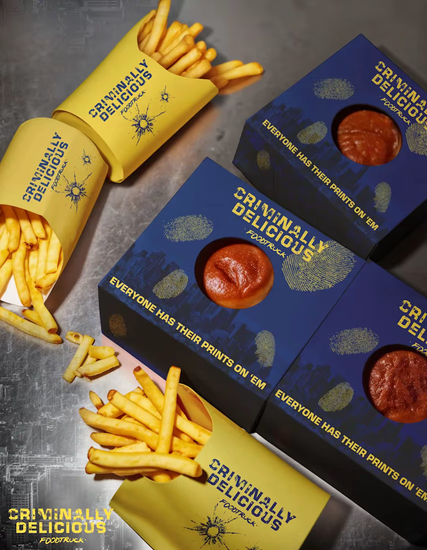
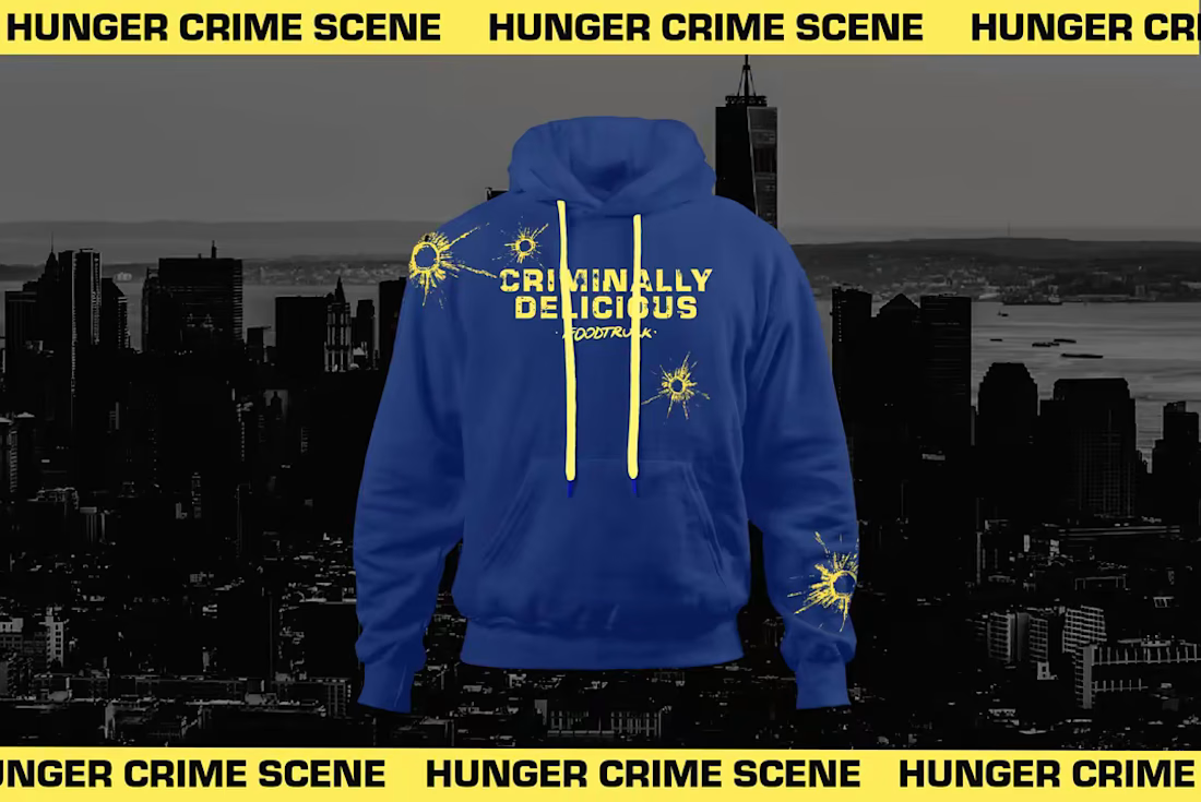
I worked on the visual language across the truck, typography, colors, graphics and supporting touchpoints to make it feel like an actual food business with a mascot, rather than just a prop from a TV show.
The challenge was finding the balance between Brooklyn, food culture and Boyle's personality without making it feel like a generic New York food truck.
And honestly, fictional brands are some of my favorite design exercises.
There’s already a story, a personality and an audience.
The fun part is figuring out:
What does that look like?


Creativity at its Peak

Belovetz is a clothing brand born from a simple truth: the bond between people and their pets deserves to be worn, not just felt. Rooted in soft Y2K nostalgia and vintage warmth, the brand brings together comfort, style, and companionship into a single wardrobe made for two.
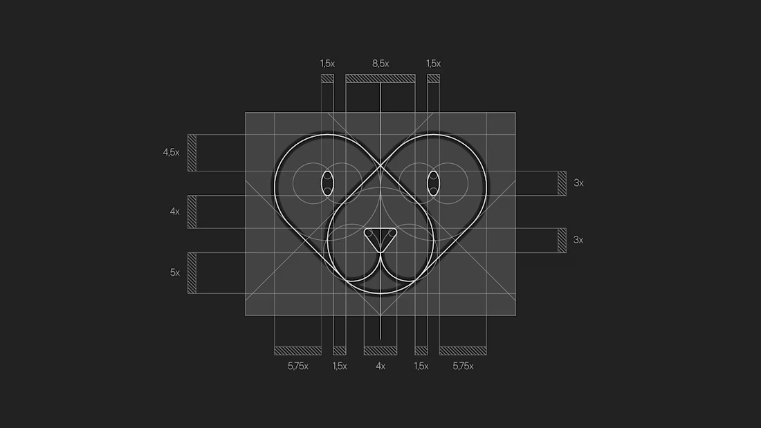
The identity of Belovetz was built around a soft, cozy aesthetic — warm pastel tones, rounded typography, and a visual language that feels like a favorite childhood sweater. Every detail, from the heart-shaped logo to the bandaid symbol woven into its DNA, speaks of care, affection, and the kind of love that never goes out of style.
More than a fashion label, Belovetz is an invitation: to dress the same way you love — openly, comfortably, and together with the ones who matter most, four-legged or not.
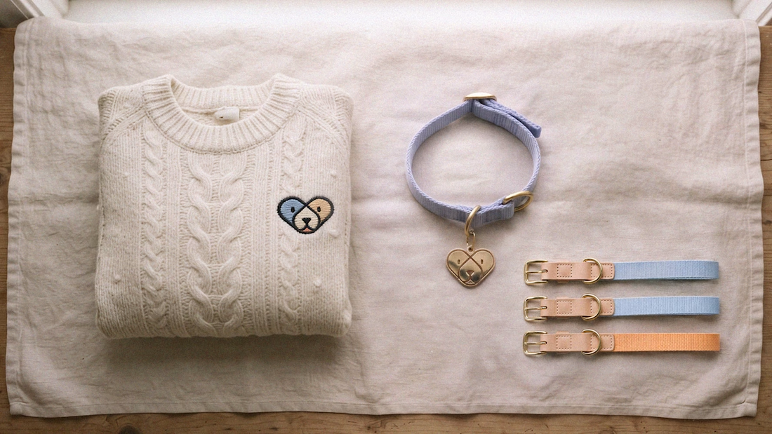
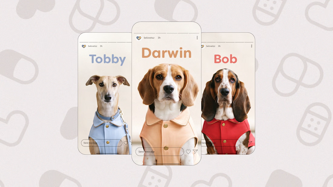

this logo is the cutest, those colors on the pups in the last pics are so smart to use in alignment!


this project is one of my favourite projects I’ve ever done for a surrogacy brand
I learned a lot while exploring this design direction
charged $2.8k for design +development 💸
now, my starting price is $4k for one page site


Awesome 🔥👏👏


