The network for creativity
Join 1.25M professional creatives like you
Connect with clients, get discovered, and run your business 100% commission-free
Creatives on Contra have earned over $150M and we are just getting started
Back to feedPost
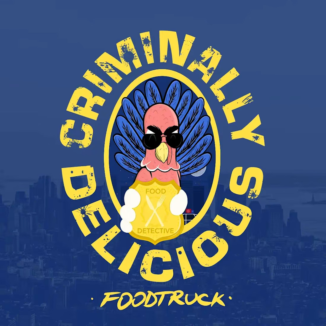
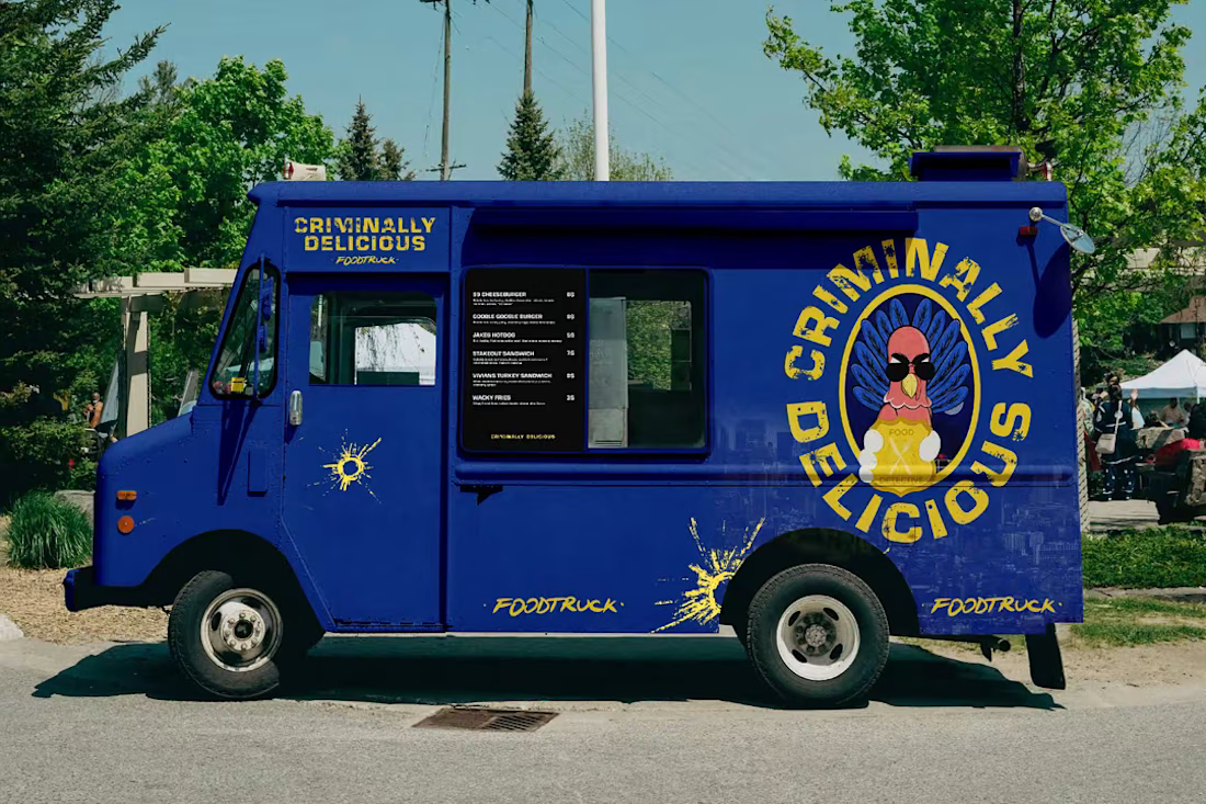
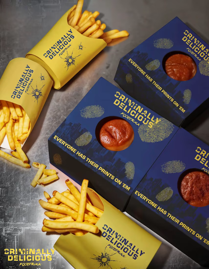
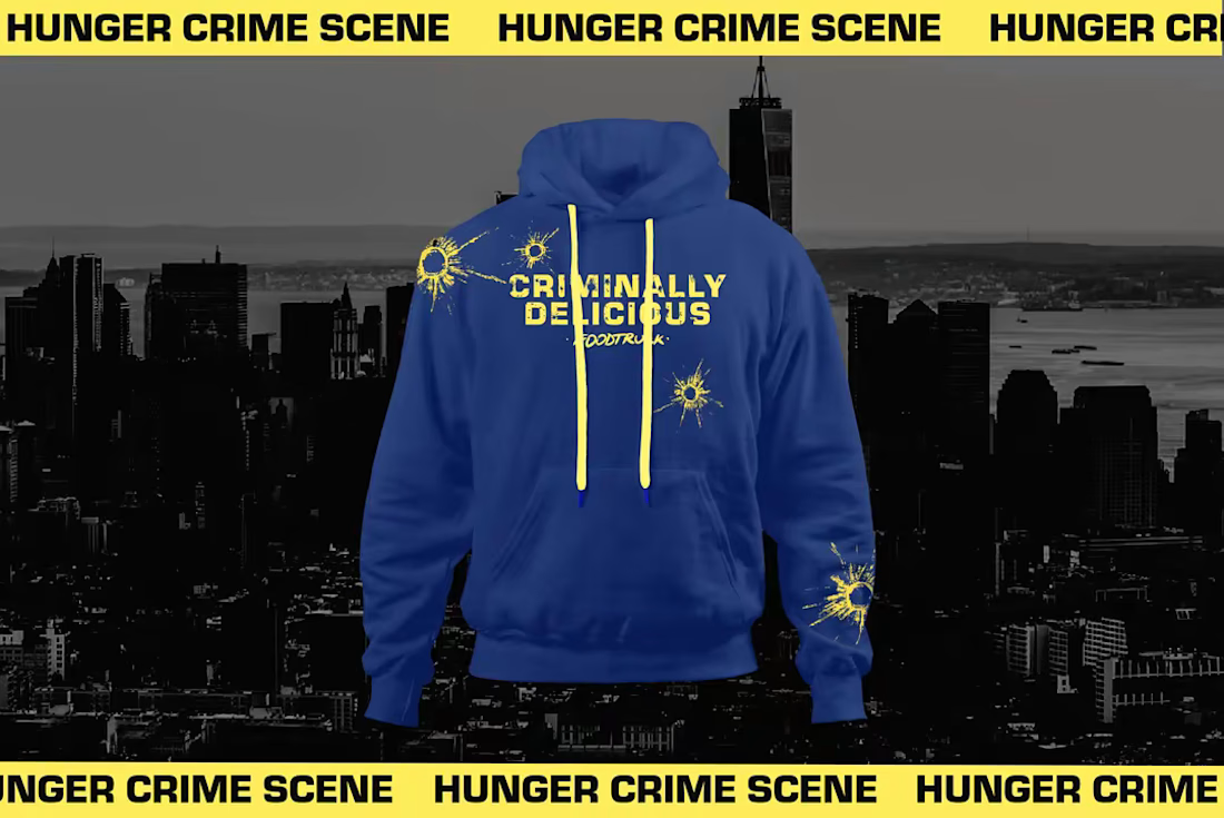
Brooklyn Nine-Nine, Boyle’s Food Truck visual identity
The other day I started thinking of fictional brands from TV shows and If you ever watched Brooklyn Nine-Nine you must know Boyle!
The idea was simple:
What would Boyle’s food truck look like if it were a real Brooklyn food truck?
I approached it as a visual designer, building the identity around the character himself — enthusiastic, slightly chaotic, unapologetically passionate about food, and very Brooklyn.
I worked on the visual language across the truck, typography, colors, graphics and supporting touchpoints to make it feel like an actual food business with a mascot, rather than just a prop from a TV show.
The challenge was finding the balance between Brooklyn, food culture and Boyle's personality without making it feel like a generic New York food truck.
And honestly, fictional brands are some of my favorite design exercises.
There’s already a story, a personality and an audience.
The fun part is figuring out:
What does that look like?



TOP 🔥

Hey, Thanks!


Robert, the blue food truck looks cool.
Thanks! Glad you like it!

These look really good!
Thank You!

Turning Boyle's understated personality into a full food truck brand, crest and merch included, is such a fun exercise. Did you pick him specifically because his character had the most brand potential, or was it more of a personal favorite?
Excellent question! I think it was a combination of both. In the series he shortly does have a food truck, and maybe I was biased in that way, but looking toward his character I would place him in the top 3 characters in the series and my personal favourite and think he has the most brand potential.

Creativity at its Peak
Hey there and Thank You!
Thank You!

Boooomm, super unique man, I love it!! 💯
Wow, Thanks!


This is such a beautiful piece of work! Great design, strong creativity, and excellent attention to detail. Well done
Hey, Thank You so much!

Great design...love the color
Thanks, I’m glad you like it!

This deserves more than just liking, this deserves to be featured! 🏆 Turning fictional pop-culture concepts into fully realized brand identities is so fun and creative.
Such kind words. Thank You for the nice comment. It was fun creating it!


Can't stop looking at this! 🎯
Thanks so much!

The truck wrap and the hoodie both feel like they could exist on an actual Brooklyn street corner, that's the hardest part to nail with fictional brand work. Which touchpoint here took the most iterations to land?
Thanks! Well the overall feel and look took some iterations. Aiming for personality that can depict the character from the series, the Brooklyn feel while having the concept brand strategy in mind.


Love it!
Hello and Thank You!

Awesome work!!
Wow, Thanks!

Top 🔥
Thank You!

Professional and impressive design work ! Good job
Thank You!
The network for creativity
Join 1.25M professional creatives like you
Connect with clients, get discovered, and run your business 100% commission-free
Creatives on Contra have earned over $150M and we are just getting started

Challenges
View all


Related posts

NURV® 🟠
Phase 39/35. Readiness 94%. 4/28 laps.
A swim, nutrition and supplement app where every number is made of dots and the only color is the one that matters.
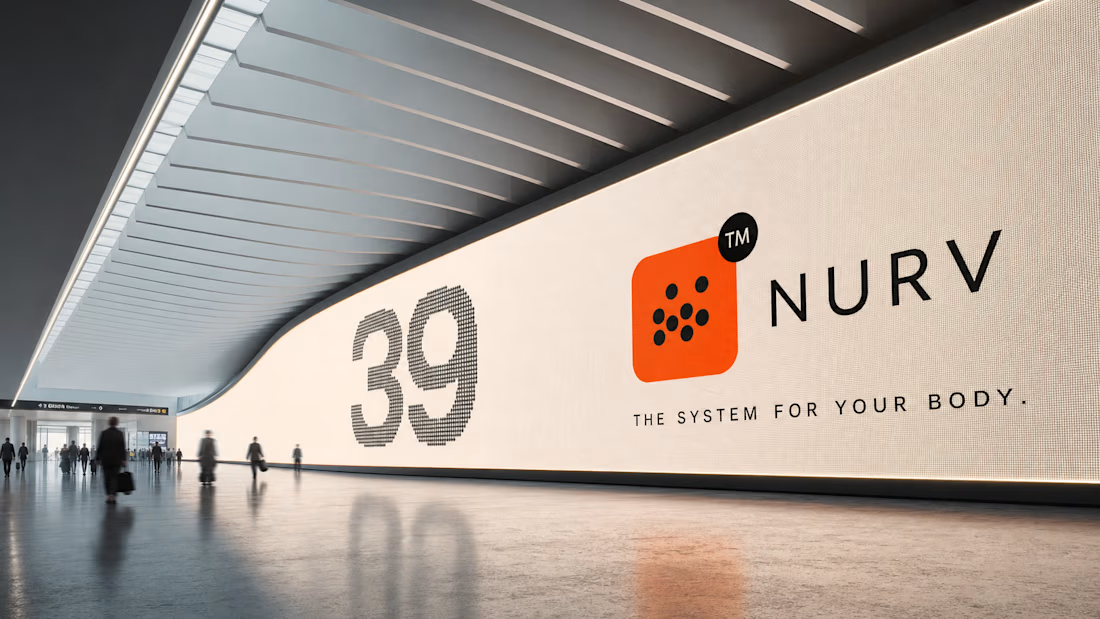

Dots as the only visual language with one orange accent is a bold, consistent call.

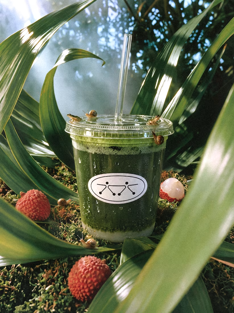
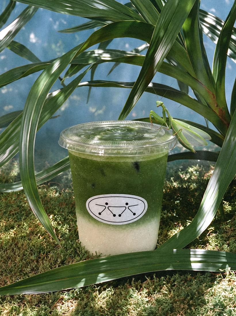
A little matcha ecosystem 🌿
AI campaign visuals for Brooklyn-based matcha brand boy bạn.
Creative Direction & AI Production — Se3d Studio


Love this!

A creative concept for a granola brand exploring a simple thought: nostalgia can be a surprisingly powerful driver of desire. And sometimes, of sales.

So cool!!