The network for creativity
Join 1.25M professional creatives like you
Connect with clients, get discovered, and run your business 100% commission-free
Creatives on Contra have earned over $150M and we are just getting started
Back to feedPost
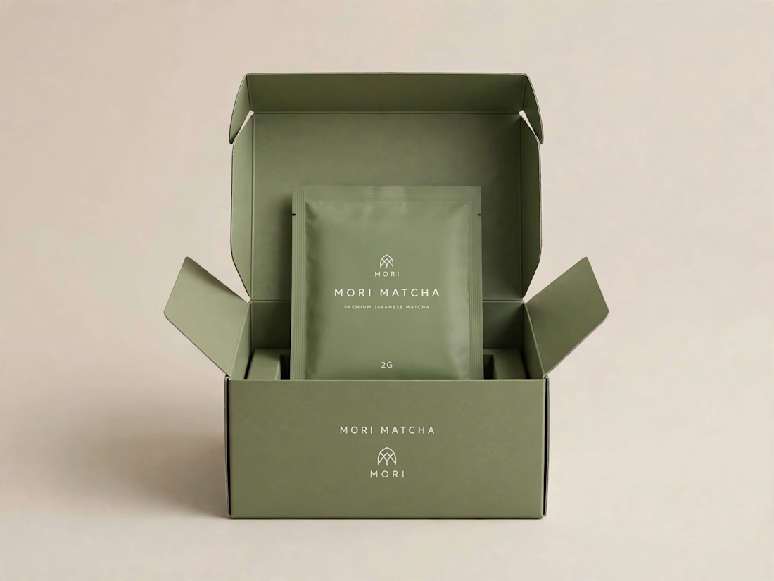
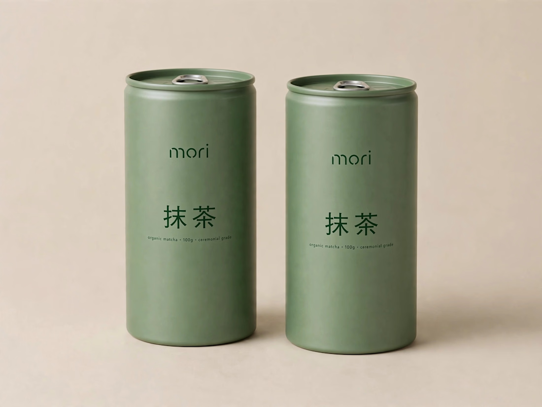
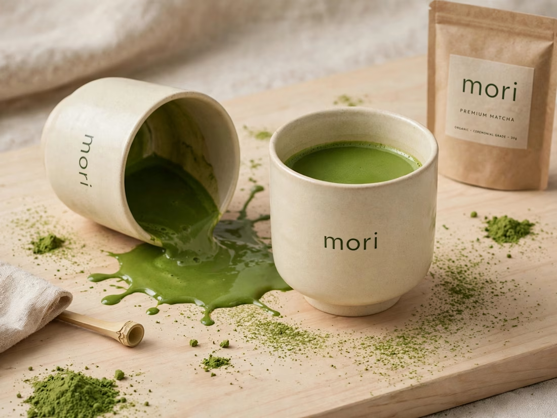
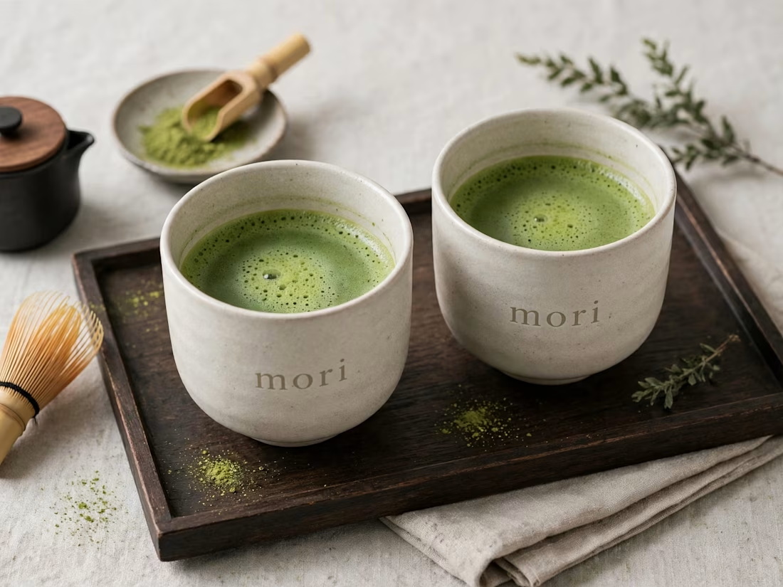
more visuals from my latest project — mori matcha 🍵
explored minimal Japanese packaging with earthy greens and calm typography.
focusing on premium ceramic cups and clean can design.
#branddesign #packagingdesign #visualidentity #brandstrategy #matcha #minimaldesign #japanesedesign #figma #mockup #branding



A bit more context on this project 👇
Goal was to create a calm, premium Japanese identity for MORI — focusing on earthy greens, clean typography, and minimal packaging that feels ritualistic.
Explored cups, cans, and box packaging for a full system.
Happy to hear your thoughts — what would you improve?

That earthy green and calm typography is such a perfect match for matcha, feels really premium and Japanese
Thanks Ashik! Exactly what I was going for — that earthy calm premium feel. Appreciate it!

Thank you Naim Vai! Wanted to keep it minimal but with intention, glad it comes through 🙏
The network for creativity
Join 1.25M professional creatives like you
Connect with clients, get discovered, and run your business 100% commission-free
Creatives on Contra have earned over $150M and we are just getting started

Challenges
View all


Related posts

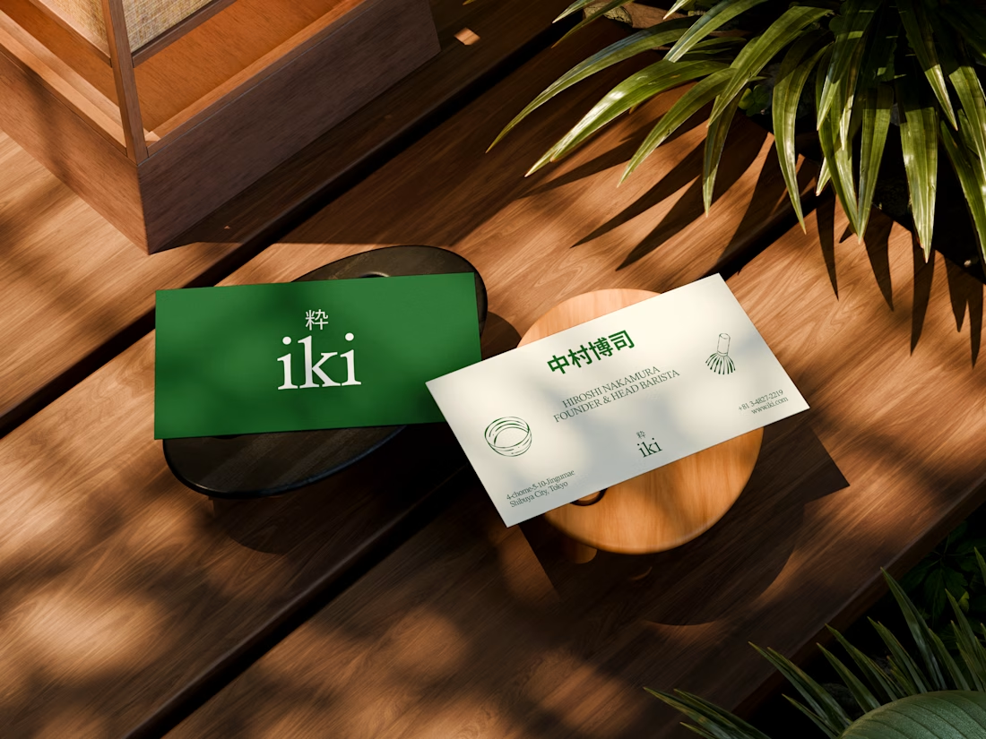
some visuals from iki, a matcha shop i’m currently working on 🍵
one of the most interesting parts of this project has been figuring out how to turn an abstract concept into something people can actually see and feel.
from the typography to the illustrations and overall visual language, every element is an opportunity to give the brand more personality and make it feel like its own world.
still exploring, but i’m really enjoying where this is going.
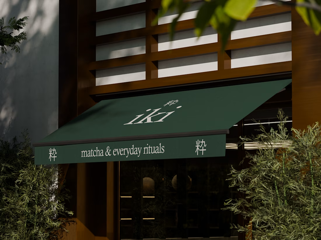
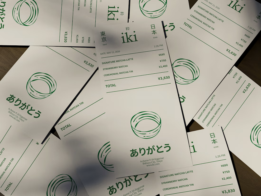
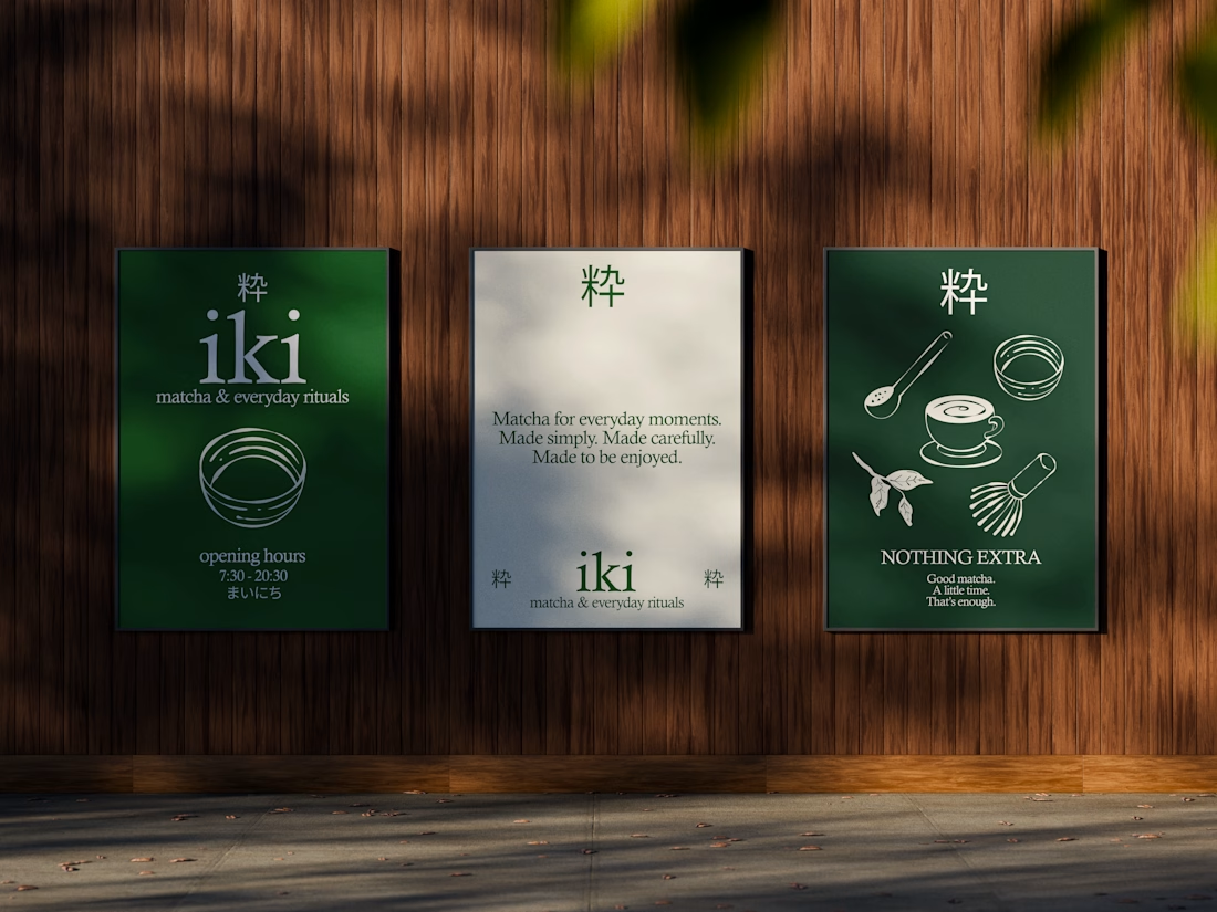


the illustration direction feels like it could take over the whole shop interior, not just the cups. thats usually where these projects fall apart

One brand, very different variety products. 👀
BASYX is one of my favorite projects because the packaging had to work across categories, from skincare to food, while still feeling like one cohesive brand.
That’s the fun challenge of multi-product brands: creating a visual system flexible enough to grow without losing its identity.

wow amazing