
Robert Ban Bebek
Brand & Visual Identity Designer | UX/UI


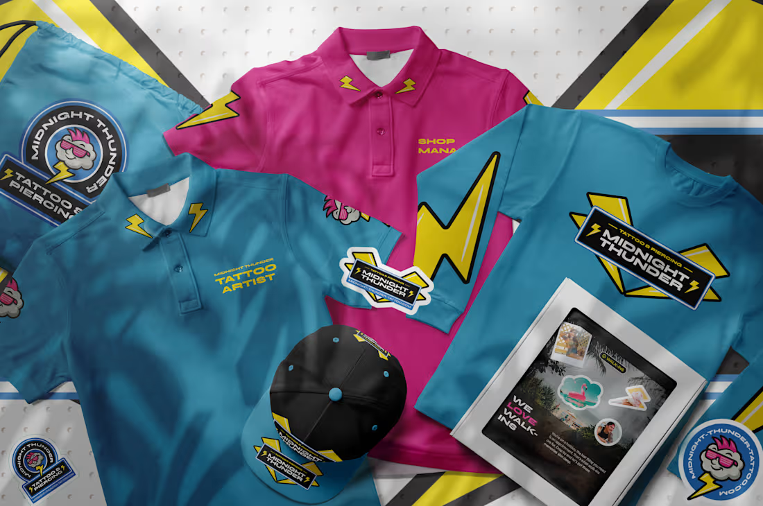
Midnight Thunder Tattoo
0
2
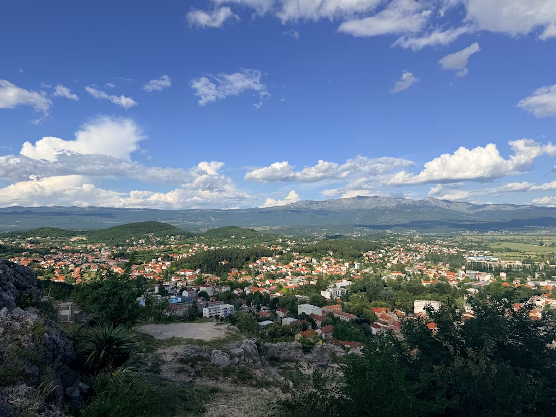
The other day I sat in a restaurant in a small Dalmatian town (Croatia) and ordered my favourite meal, with a glass of wine
The restaurant is beautiful and serves traditional Dalmatian food, and if you ask me I think they are one of the best in town. The place has that traditional feel - stone walls, objects that are passed through generations, the atmosphere is nice, and did i mention the food is great?
I know the owner and he just happned to see me in thebcorner of the place, sat down and had some wine with me. A quick chit chat turned into a 3 hour long conversation.
The cost of the ingredients went up, and he was thinking of raising prices, but he had some concerns. He was worried people might stop coming to the place.
I asked him 🧐:
“Why would someone choose your place over another one in this town? I mean there are other great restaurants in the radius of 200m!
He said instantly:
“We have the best food in town!”
And he is right, I don’t disagree.
But that alone isn’t enough. There is no emotional connection to that.
The owner was worried if he raised the price, people would go to another place. And ti this point we are still competing on great food. He had mentioned it a few times through the conversation, but I felt there is more to it, just had to dig deeper.
Then, later in the conversation, he mentioned that they have local fishermen who fish specifically for them and that the pasta and gnocchi are hand made.
“Aha. There it is!”🧐😮
That’s the meaning, the story, the value.
That’s the little piece that makes the restaurant more than just a place with good food.
Now I know the story, it’s not just an ordinary traditional restaurant. This place has history, tradition, meaning and a story to connect to the sea. It’s connected to local fisherman and you get that feeling of eating something fresh from the sea!
And suddenly, the price can mean something different.
This is where I think a lot of smaller businesses miss the point of branding.
They focus on prooving the product is better!
But “better” is incredibly easy to compete with. It is a broad statement and is not defined. What does better mean?
Your competitor can say they're better too.
The real question is:
“What makes you meaningful?”
Because people don't always pay more simply because something is objectively better.
Sometimes they pay more because it means something to them!
The owner did not have to invent a story. He just forgot one piece of the puzzle.
Finding the story that's already there — and making people see it!
2
123
Hello there!
Here is a mash-up of some recent projects I have been working on.
2
2
174
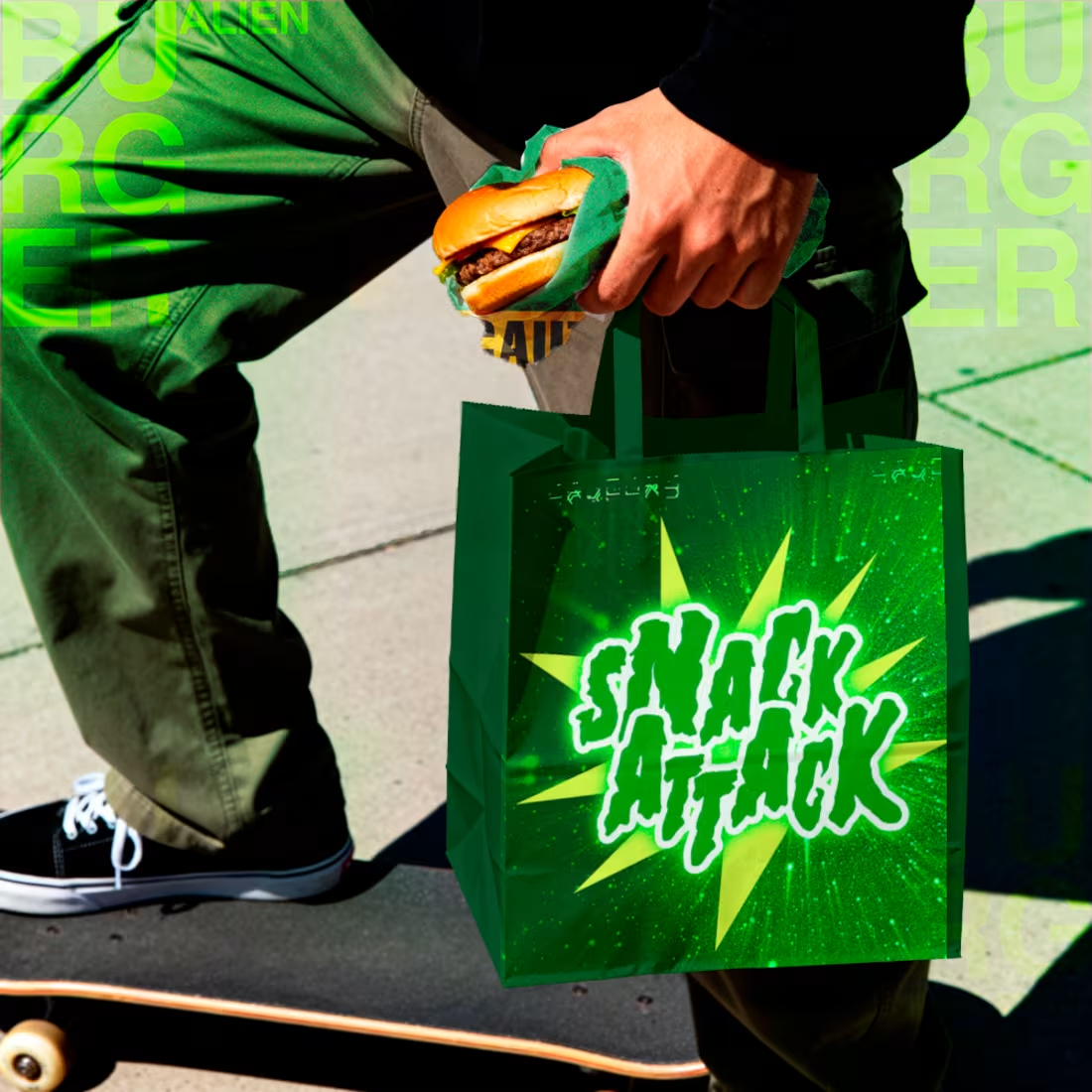
What if Tom DeLonge from Blink 182 had a burger bar? What would that look like? Hmmmmm, I wonder …
4
3
152