The network for creativity
Join 1.25M professional creatives like you
Connect with clients, get discovered, and run your business 100% commission-free
Creatives on Contra have earned over $150M and we are just getting started
Back to feedPost
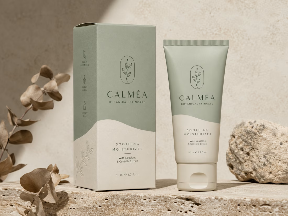
This project showcases the visual identity and packaging design for CALMÉA Botanical Skincare. The goal was to translate the brand’s core philosophy- gentle, plant-based, and science-backed skin nutrition—into a physical product experience that feels deeply calming and luxurious.
Design Strategy & Key Elements
Color Palette: A soothing, nature-inspired palette featuring a muted sage green and a warm, textured cream tone. The split-tone layout uses organic, fluid curves that mimic natural landscapes or gentle waves.
Typography & Visual Assets: The brand name "CALMÉA" is set in an elegant, high-contrast serif typeface, paired with clean, architectural sans-serif typography for product details. The primary logo icon features a minimalist botanical branch enclosed in a delicate arch.
Packaging Layout: As seen in the image, the outer box features structured side-panel iconography ("Clean Ingredients," "Plant Based," and "Cruelty Free") and a subtle line-art botanical illustration on the lower section. The theme carries over seamlessly to a matte-finish squeeze tube.
Art Direction: The staging emphasizes raw, tactile textures - rough travertine stone, natural direct sunlight, and dried eucalyptus branches- to highlight the organic origin of the product.
The network for creativity
Join 1.25M professional creatives like you
Connect with clients, get discovered, and run your business 100% commission-free
Creatives on Contra have earned over $150M and we are just getting started
Related posts
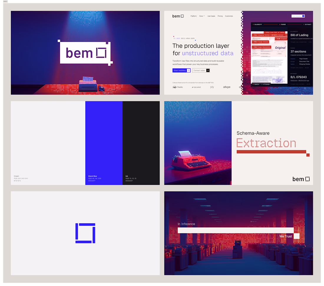
I've had so much fun working on bem. Came in with logo marks and colors, and we're looking for an identity to call home. After doing some research and inspiration exercises, we came up with this concept, which I absolutely love.
Impressive work !
Two homepage concepts for film production studio - which one do you choose? 🧐
38 voted
57%
29 voted
43%
67 votes
Closed
amazing!
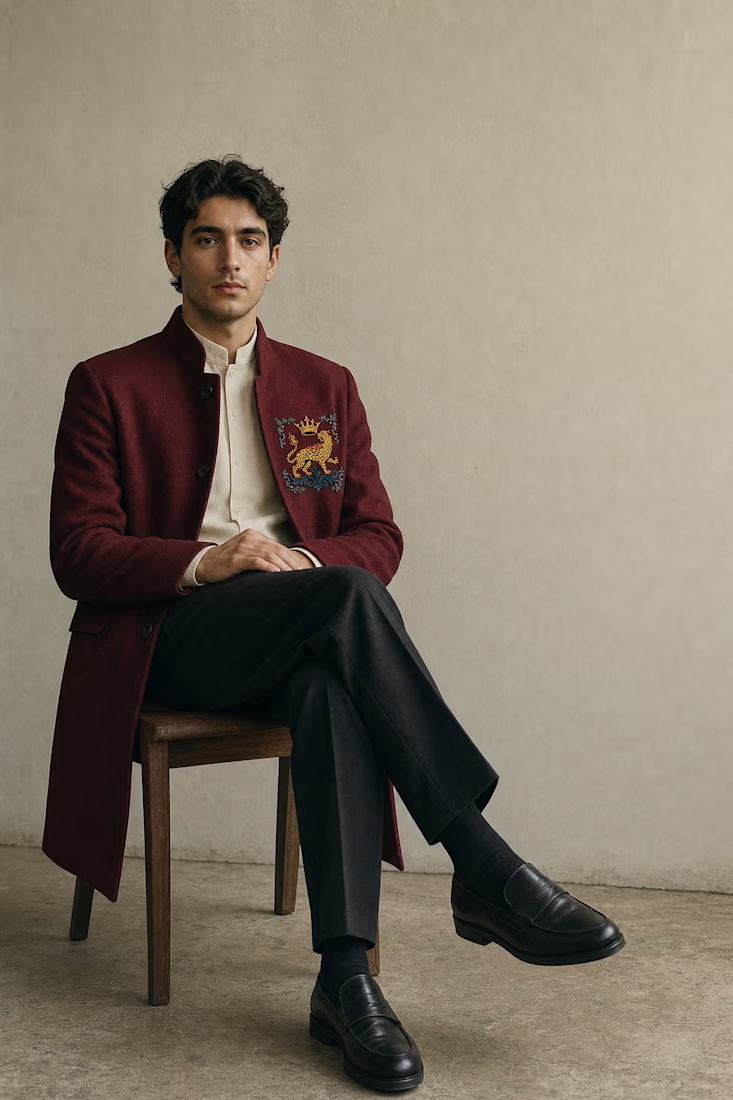
New case study: WILD ARMS 🐆👑 — a fashion house where the crown survived but the monarchy didn't. Built one illustrated crest and let it carry everything from a wax seal to a city billboard. Full process + visuals up now.
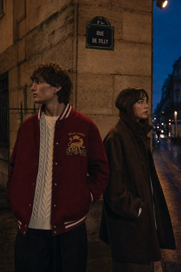
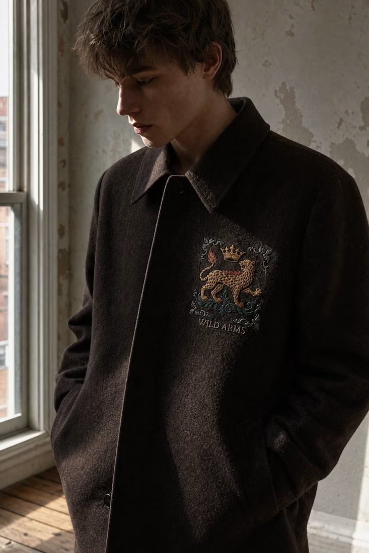
A crown that survived the monarchy is a great narrative hook for a single crest to carry across everything from a wax seal to a billboard. Curious how you decided which elements to simplify for the small scale versions versus the large format applications.
Challenges
View allTrending
Claude
Claude has entered the design space. How are you using Claude Design?
Contra University
Learn from expert creatives how to earn more using next-gen AI tools.
fifaworldcup2026
The World Cup is here and the whole world's watching. How are you designing for the world stage?
creativeaiflow
Creative AI workflows are evolving. What tools do you use, and what are their strengths and weaknesses?
freelancerlife
Freelancer life is wins, pivots, and everything in between. What’s yours right now?