Brand Identity design for B2B Fintech Startup - Bluefyn
Aadarsh Pandey
Verified
Bluefyn sits in a unique position: too technical for a consumer fintech aesthetic, too ambitious for a typical B2B SaaS look. The brand needed to command trust with two very different audiences at the same time — enterprise operators making financial decisions, and investors evaluating a category-defining bet. The identity had to project calm authority without feeling cold, and infrastructure-grade credibility without feeling corporate.
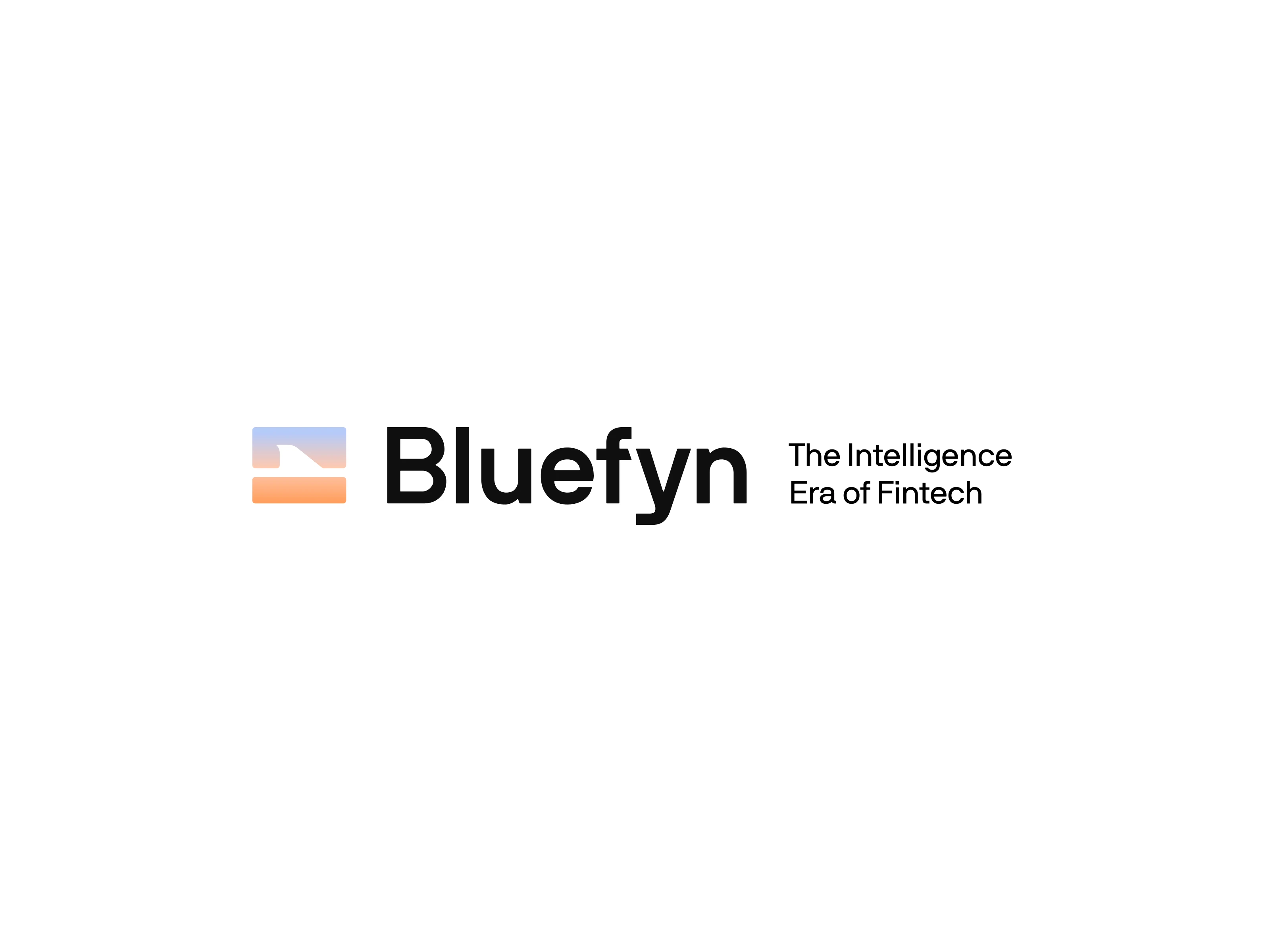
Brand Identity for the Intelligence Era of Fintech: A two-week brand sprint for an AI-native economic intelligence platform built by former Deel operators.
Bluefyn is an AI-native economic intelligence platform for fintech infrastructure. Built by senior operators from Deel, the company verifies the economic truth of every transaction across a fintech company's entire provider stack.
Through LoudFace Agency, I was brought in to lead the complete brand identity over a two-week sprint. The existing identity didn't reflect the scale of what the founders were building. The brand needed to feel like infrastructure, not a startup. Something closer to Stripe or Palantir than a typical fintech SaaS tool.
This case study walks through how we got there.
Process
Discovery & Alignment
We ran a Brand Personality Spectrum exercise with both founders independently, then brought the results together to surface alignment and tension. The results were remarkably consistent across ten key spectrums. Serious, modern, minimal, rational, niche, authoritative. The single point of divergence was the corporate vs. human axis, which reflected the brand's own internal tension.
Moodboards
Two distinct visual directions were developed, each grounded in a defensible strategic territory: Institutional Precision and Superintelligent Infrastructure. The founders chose a path that balanced institutional confidence with intelligent warmth.
Logo Exploration
The founders shared a 10-concept logo review document with ranked feedback. I used their top-rated concepts as a foundation and developed five refined routes, eventually merging the Oversight Layer concept with a custom fin cutout that nods to the brand name without being literal.
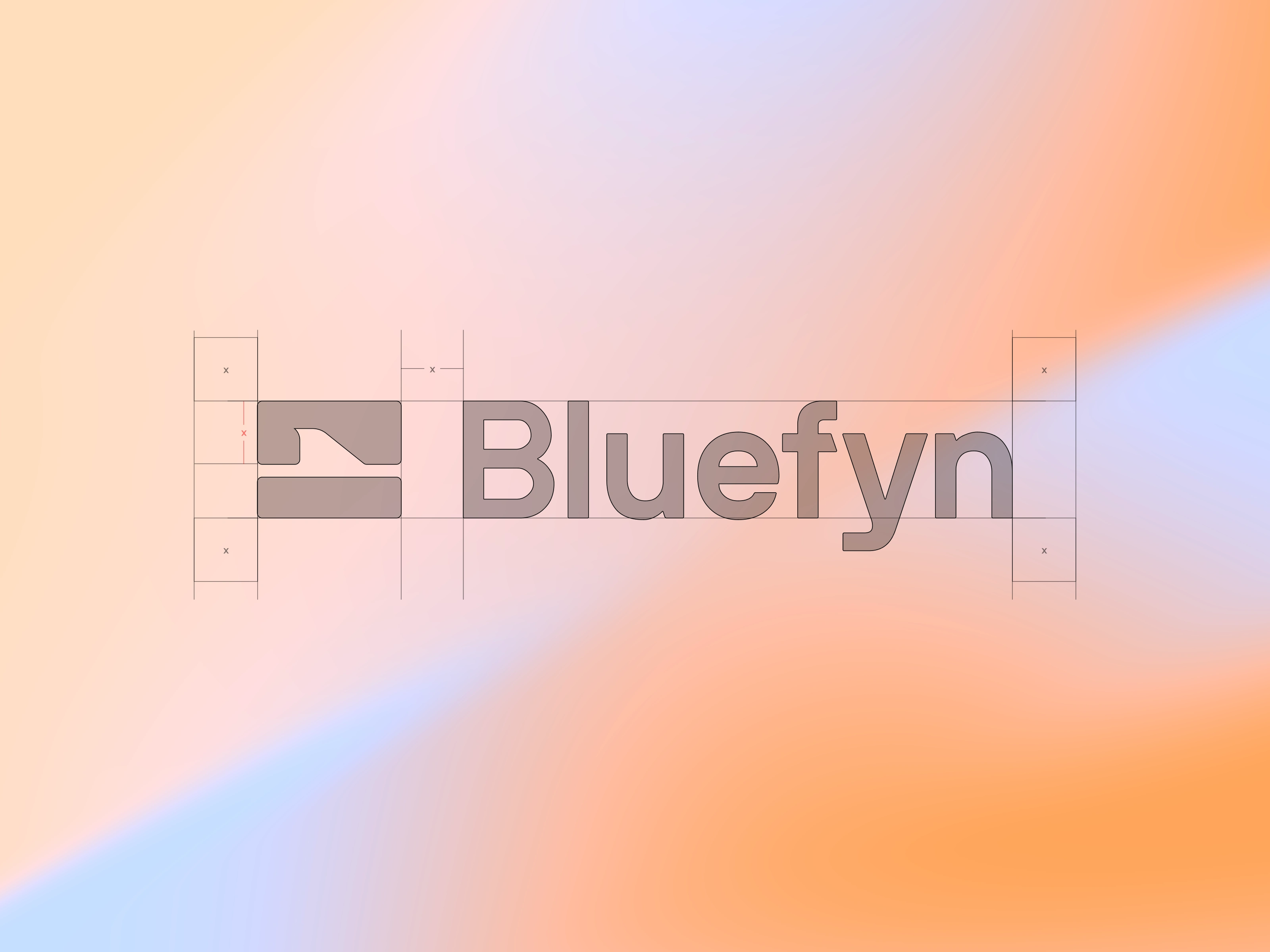
Logomark + Wordmark dissection
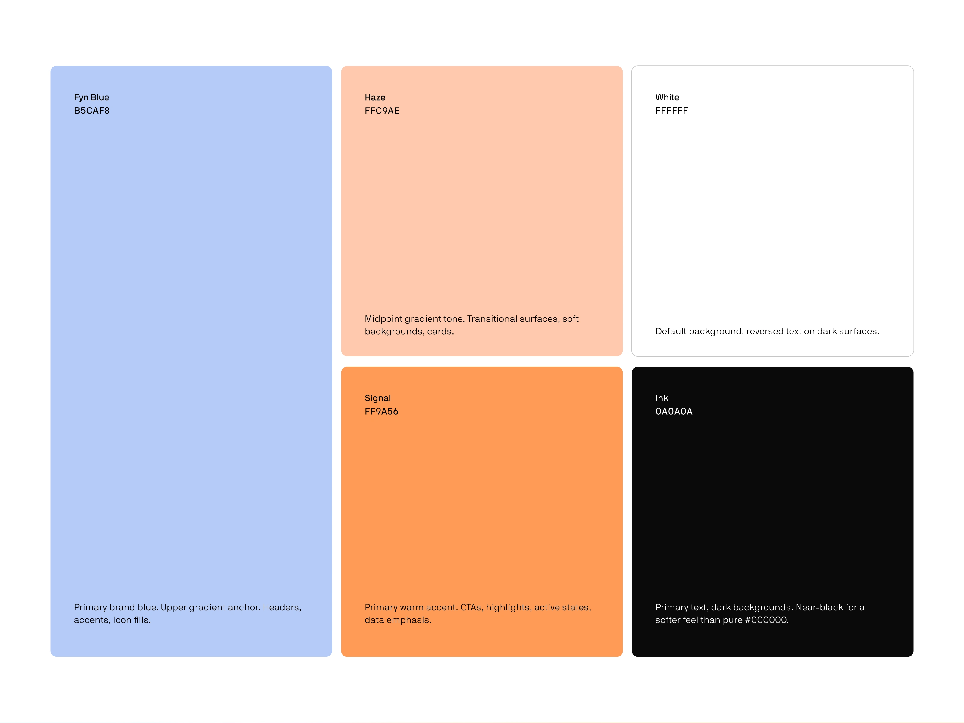
Primary Color Palette - Bluefyn
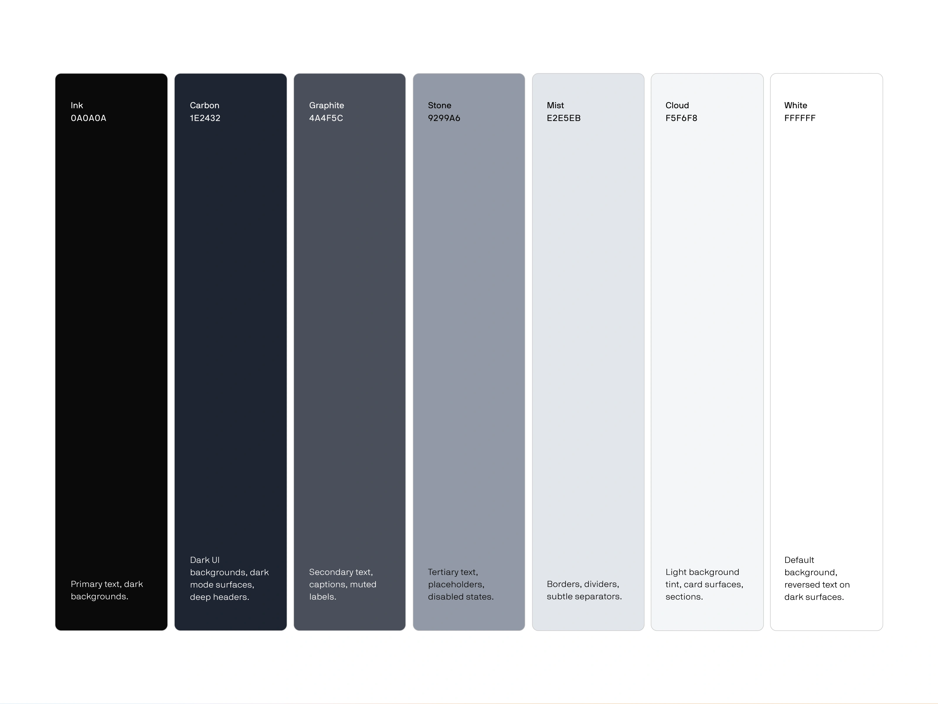
Neutral Color System - Bluefyn
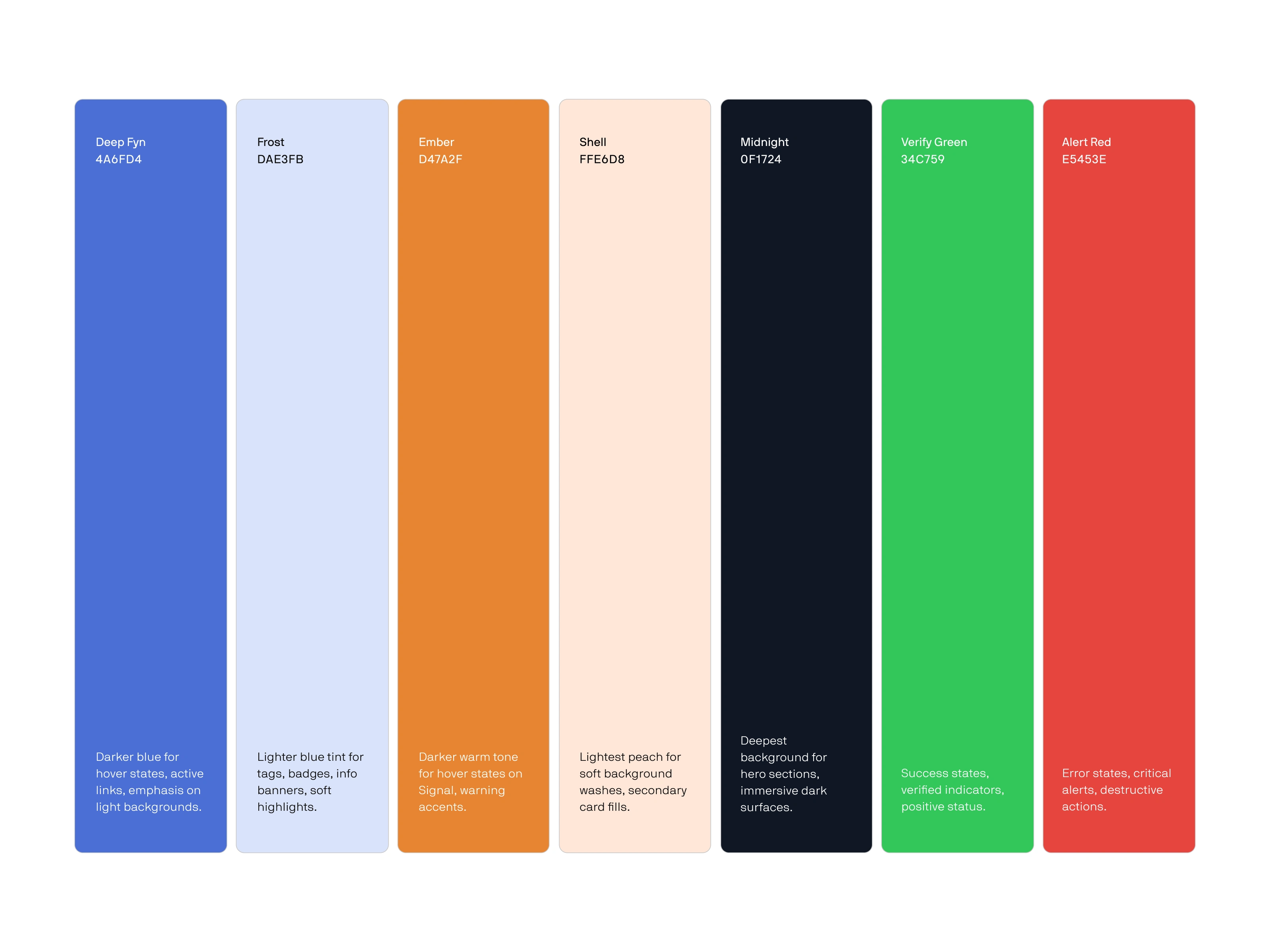
Expanded Color Palette - Bluefyn
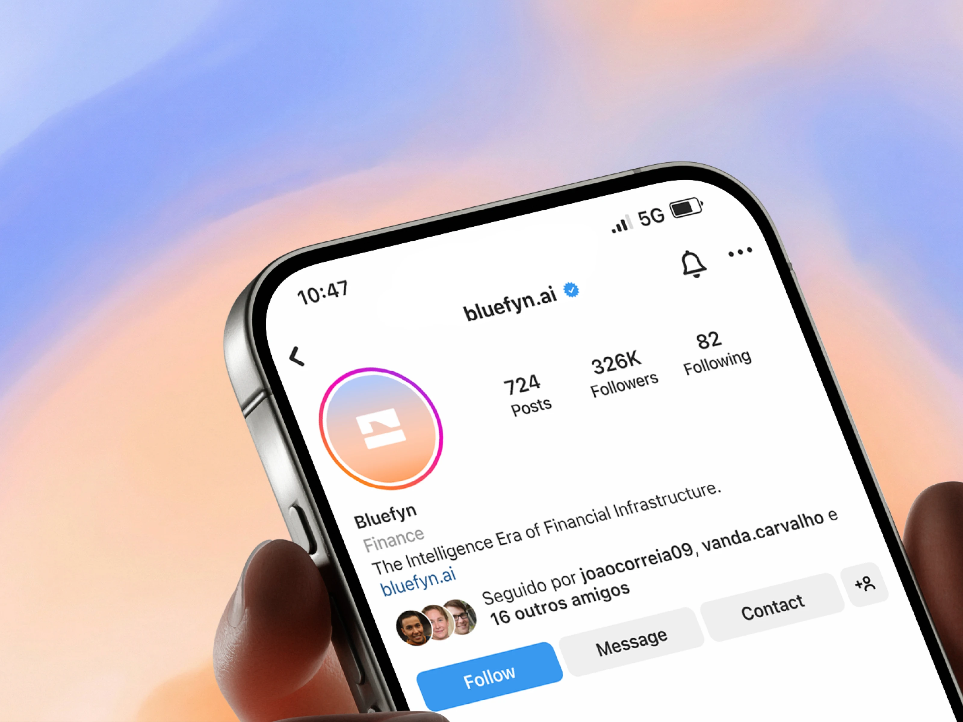
Instagram Profile Mockup

Gradients developed for Bluefyn
Complete Identity Breakdown
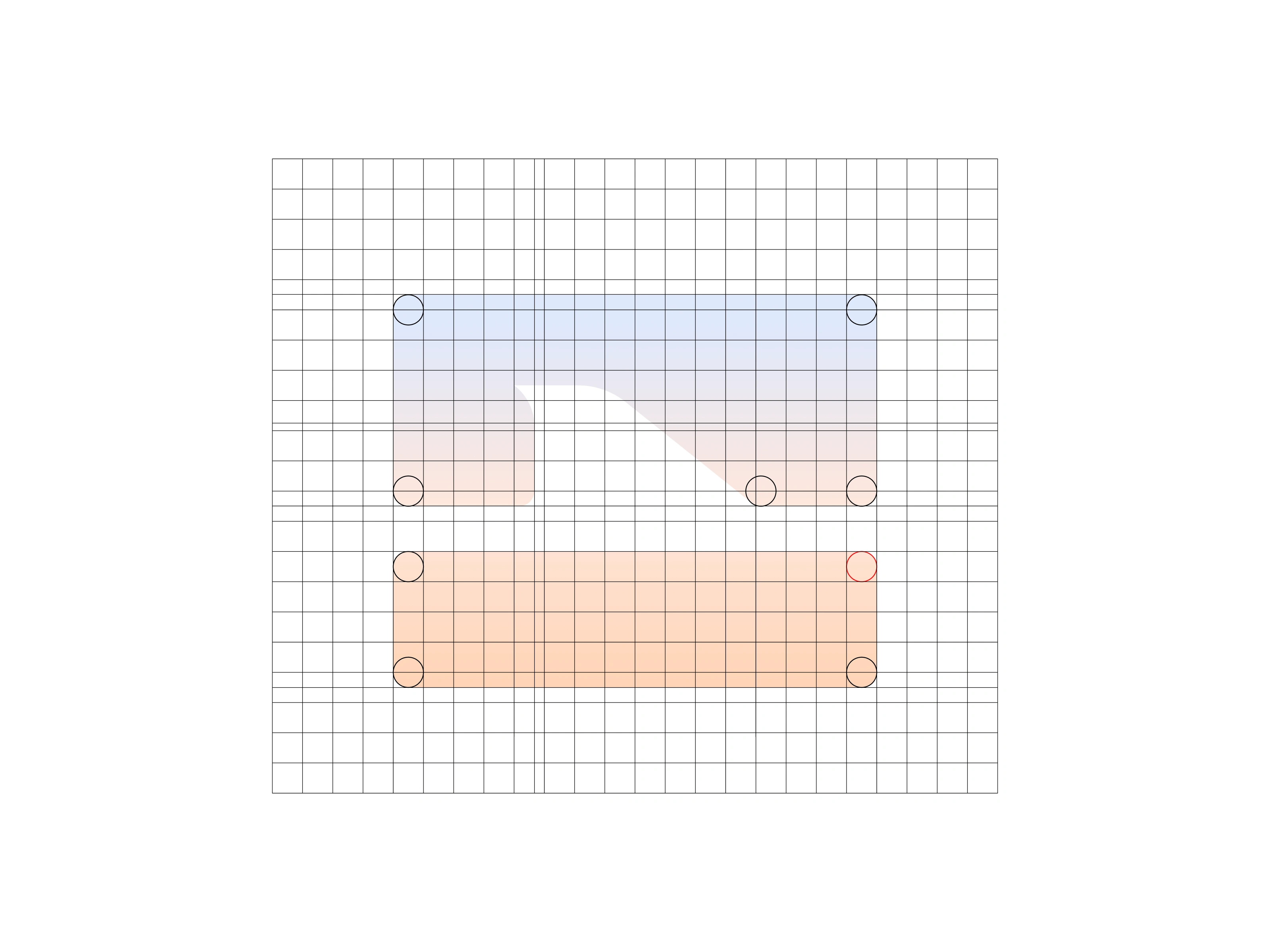
Logomark
The Bluefyn symbol is built from two horizontal bars with a precise fin cutout in the upper layer. The dominant top bar represents the intelligence layer sitting above the financial infrastructure beneath it. Every curve, proportion, and gap is derived from a modular square grid, giving the mark the kind of mathematical integrity that mirrors Bluefyn's own approach to verification.
Typography
NB International Pro was selected for its quiet confidence and structural clarity. Straight terminals ground each letterform with stability, while slightly rounded corners soften the geometry just enough to feel approachable at body sizes. The ink traps in the wordmark echo the fin cutout in the symbol, creating a visual thread between mark and type.
Color System
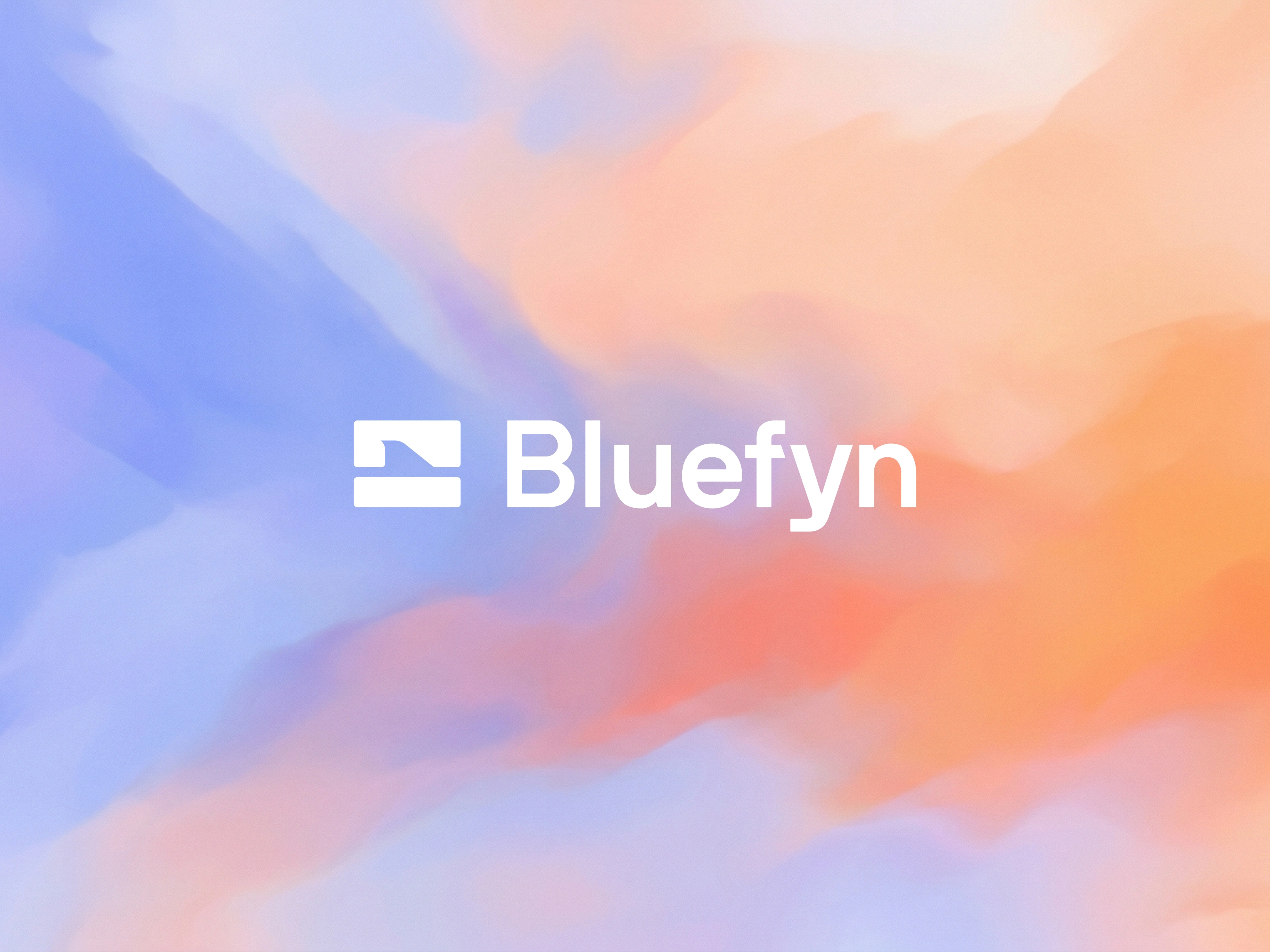
The palette is anchored by a gradient we named Dawn, flowing from periwinkle blue through peach to tangerine. It signals continuous intelligence moving calmly across layers of complexity. A supporting neutral system and expanded functional palette ensure the identity holds up across UI, print, and digital contexts.
Imagery
Abstract color field imagery drawn from the Dawn palette serves as the brand's visual texture. The imagery is always atmospheric and unhurried, soft washes of color blending without hard edges or recognizable forms. It acts as the brand breathing, never competing with content.
Layout Principles
The layout system follows three rules: generous white space to let every element command attention, bold headlines that rank highest in visual hierarchy, and imagery that bleeds to the edge with no margins. The result is a layout that feels spacious yet confident, minimal yet considered.
Brand Applications
The identity extends across a discreet landing page, out-of-home hoardings, investor materials, and social content. Each surface follows the same principle: say less, mean more. The brand is designed to feel quietly inevitable, like something that was always going to exist.
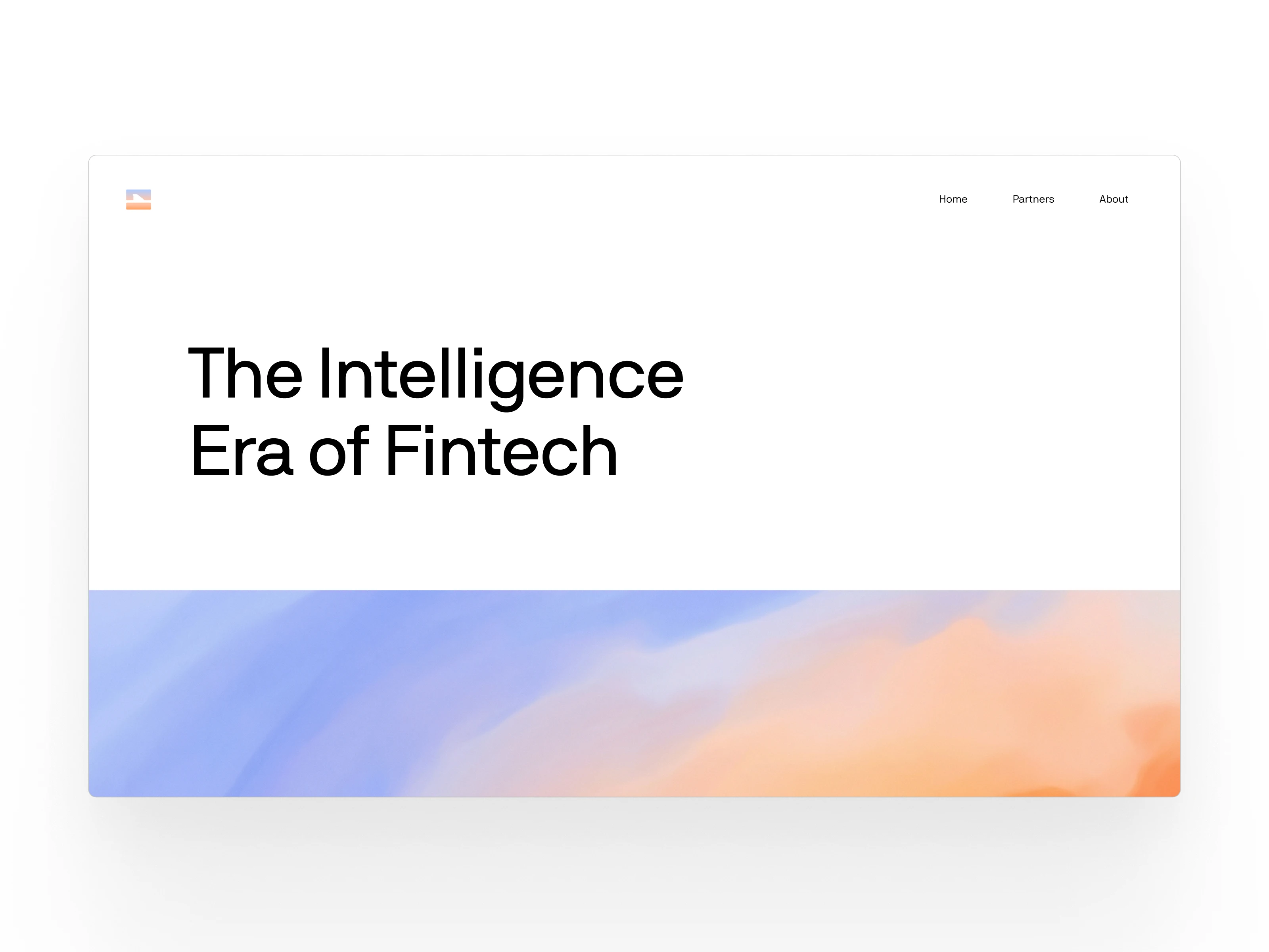
Landing Page - UI Demonstration
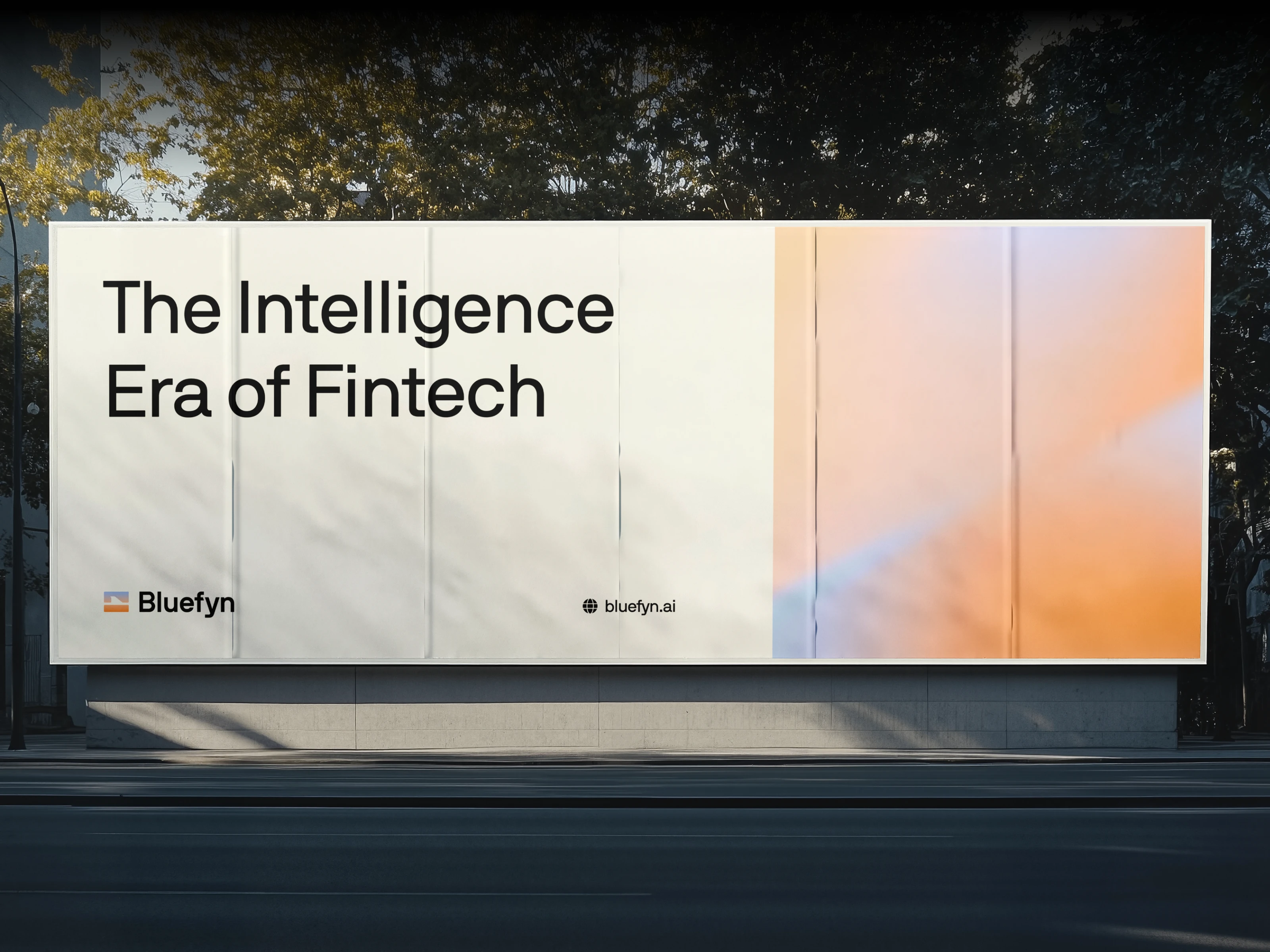
OOH Ad
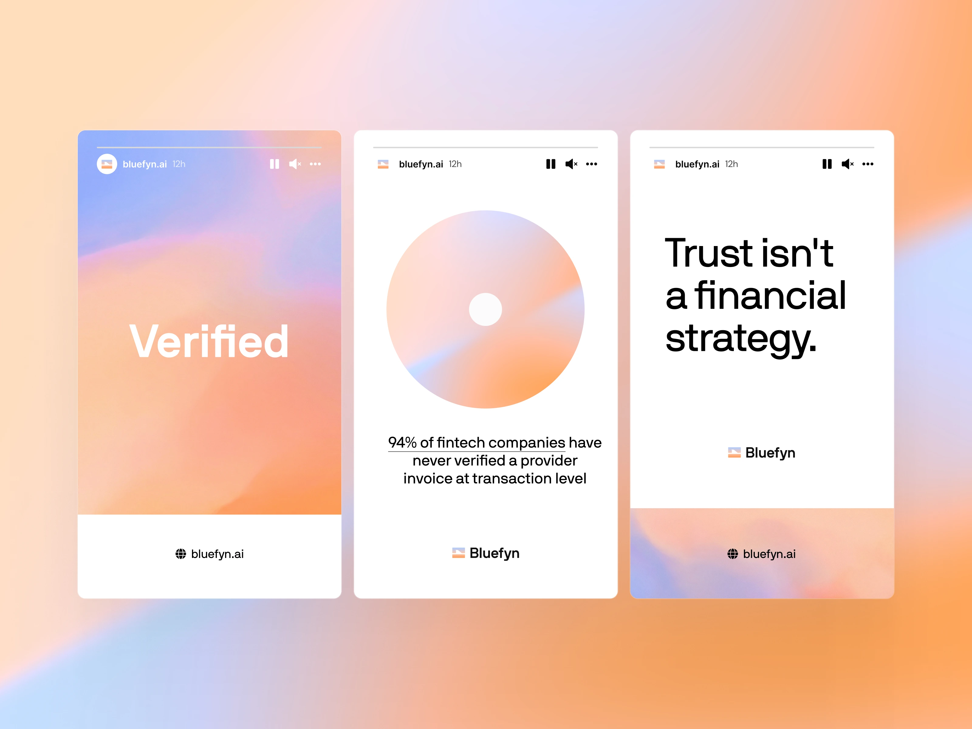
Instagram Stories
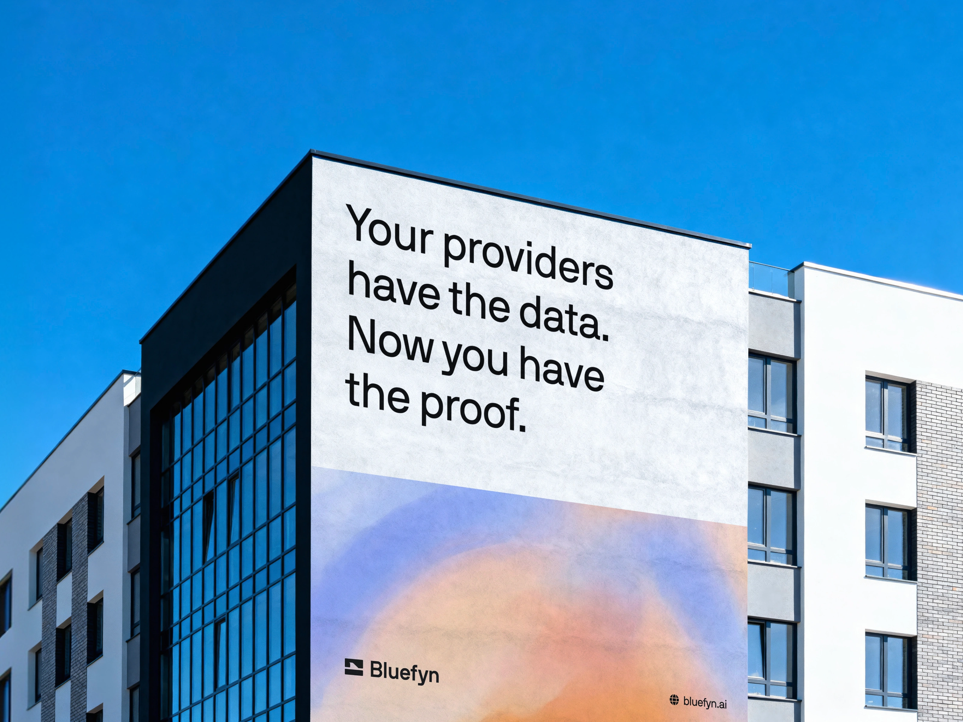
OOH Marketing Asset
Brand Guidelines for Bluefyn
Outcome
The final identity positions Bluefyn as a category-defining infrastructure brand rather than a fintech tool. The system is built to scale from a discreet, high-signal landing page today to a complete product interface, investor materials, and public brand presence over the coming years. Delivered in 14 days from kickoff to handoff.
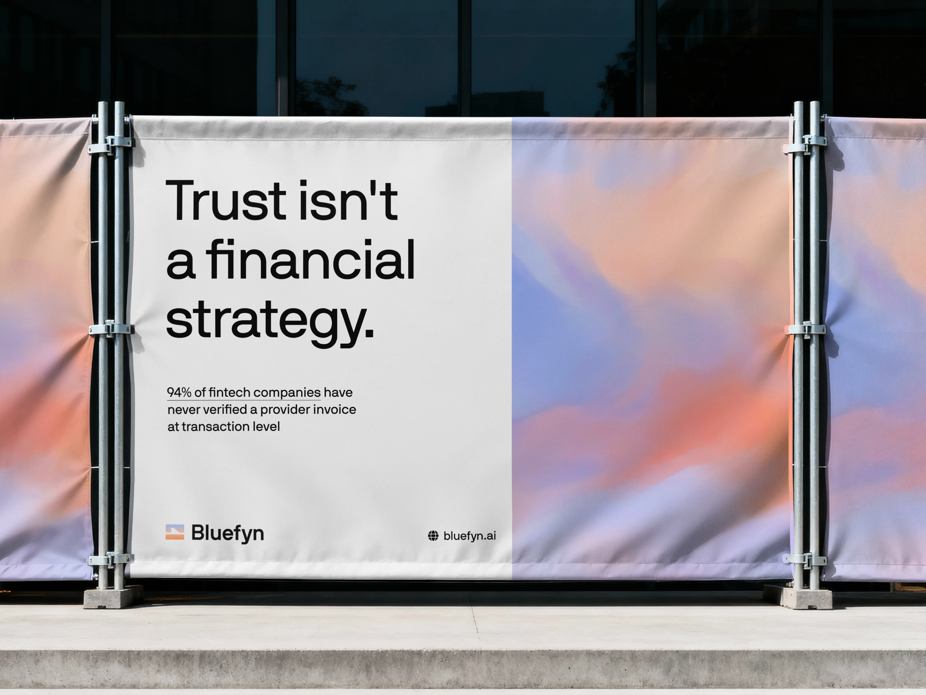
OOH Marketing Asset
Bluefyn (Client)
Zack Shooter - Co-Founder and CEO.
Djordje Milosevic - Co-Founder and CPO.
LoudFace (Agency)
Arnel Bukva - Founder and CEO, Loudface.
Tamara Pavlović - Senior Product Manager
Andrea Van Wyk - Copywriter
Humane Space
Our Role - Lead Brand Designer (Brand Strategy, Identity Design, Brand Guidelines)
Timeline - 2 Weeks
Year - 2026
Like this project
Posted Apr 17, 2026
A complete brand identity for an AI-native fintech intelligence platform. Delivered logo, type system, color palette, and guidelines in a 2-week sprint.
Likes
0
Views
35
Timeline
Mar 16, 2026 - Apr 11, 2026
Clients
Webflow Premium Enterprise Agency