


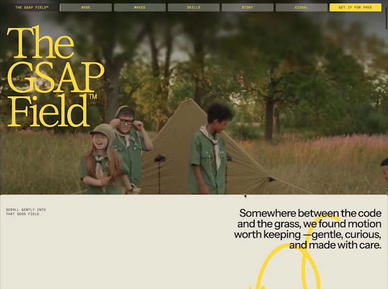
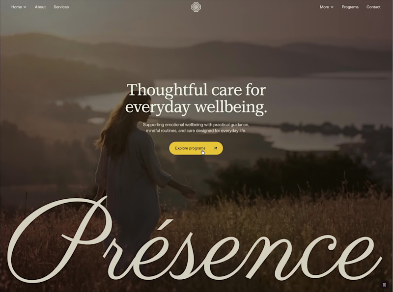
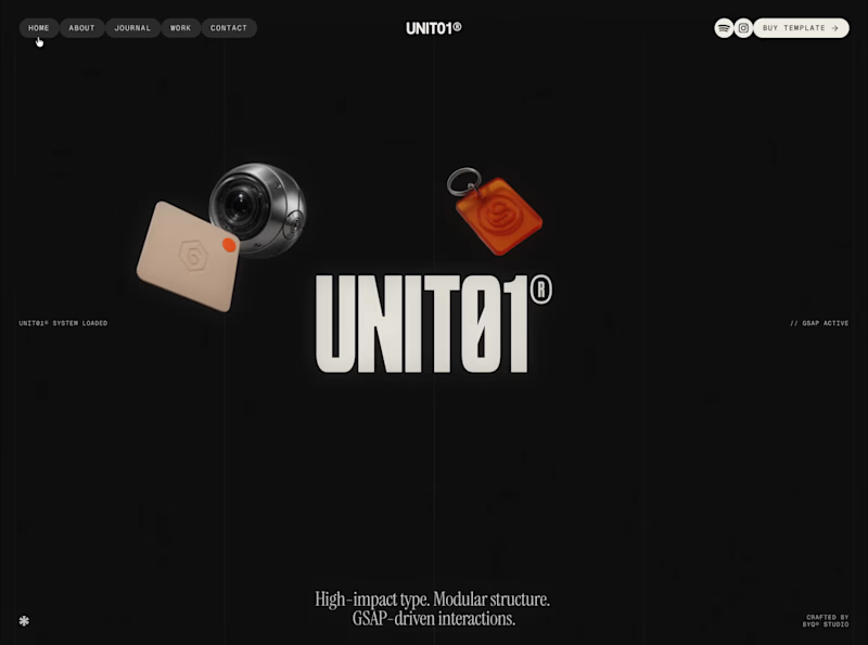
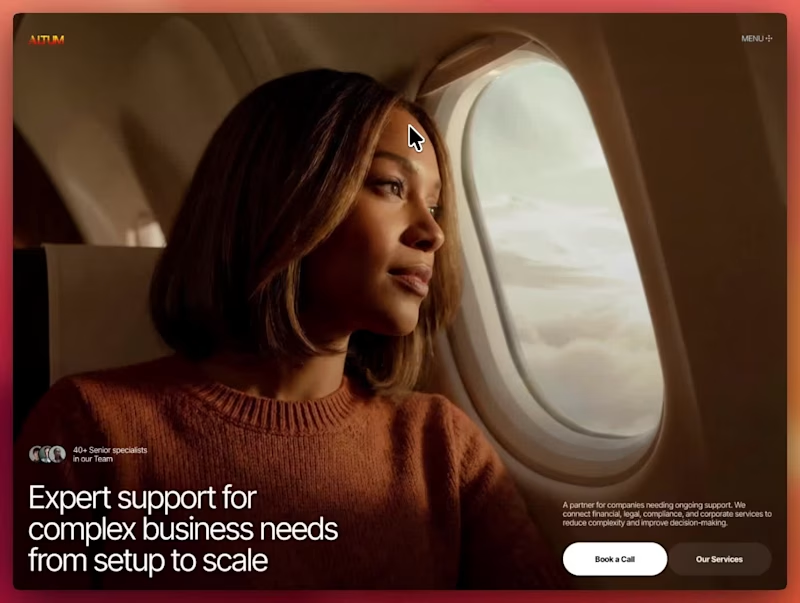

SaaS MVP Developer for Founders | Web & Mobile Apps
- $10k+
- Earned
- 2x
- Hired
- 5.0
- Rating
- 73
- Followers
SaaS MVP Developer for Founders | Web & Mobile Apps

Brand Identity Designer | Logos & Visual Systems
- 45
- Followers
Brand Identity Designer | Logos & Visual Systems
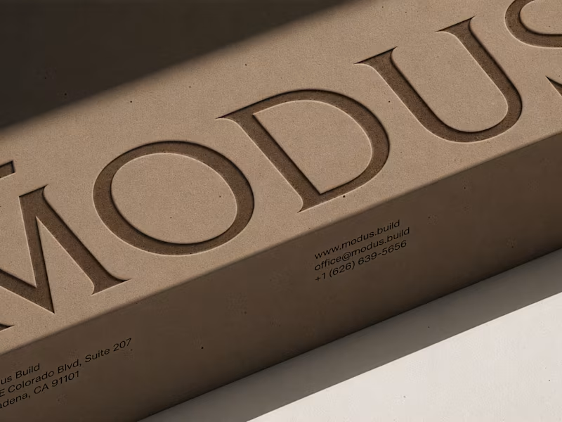
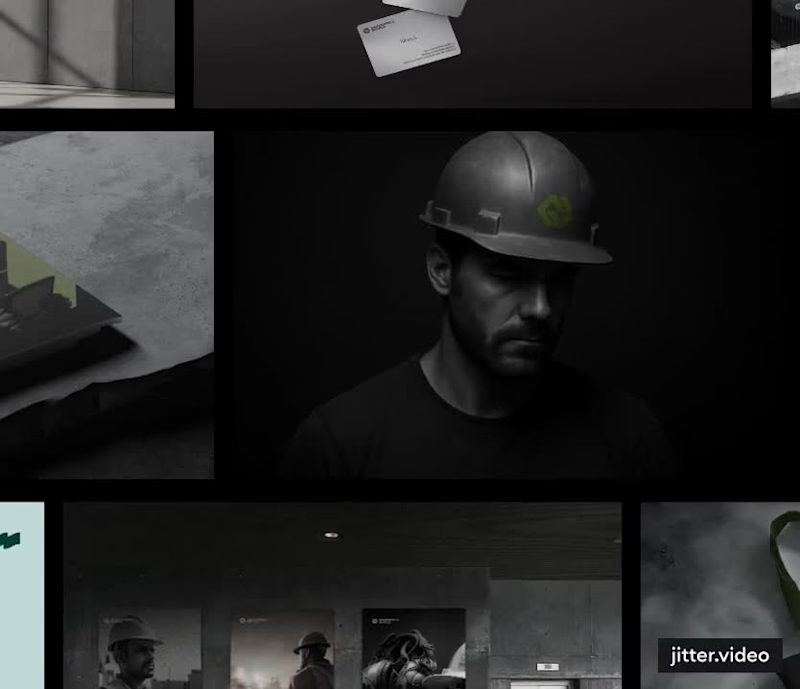
MODUS Build - Brand Identity & Web Design
Coming from an architectural background, I approached MODUS Build with a particular appreciation for precision, proportion, and thoughtful design.
The challenge was to create a distinctive identity that communicates these values without relying on conventional construction imagery.
The concept was built around a simple typography idea: “The Measure of Good Building.” A small detail above the letter M represents a reference measure - a fixed length against which other dimensions can be measured. This subtle intervention gives the logo its meaning and connects it directly to the brand's philosophy.
I carried this idea into a cohesive visual system, bringing together typography, graphic patterns, brand applications, and website design.
For me, the most rewarding part was creating something visually refined yet purposeful, where even the smallest detail has a reason to exist, keeping the same principle as in architecture.
#branding #logodesign #webdesign
91
117
5.4K
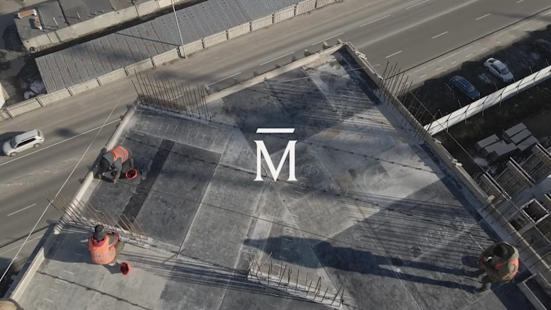
Before you build the future, you need to define it.
What happens when a brand needs to reflect not just where a company stands today, but where it's heading tomorrow?
A recent branding project let me explore exactly that.
Here's a little sneak peek. Full case study coming soon.
2
346
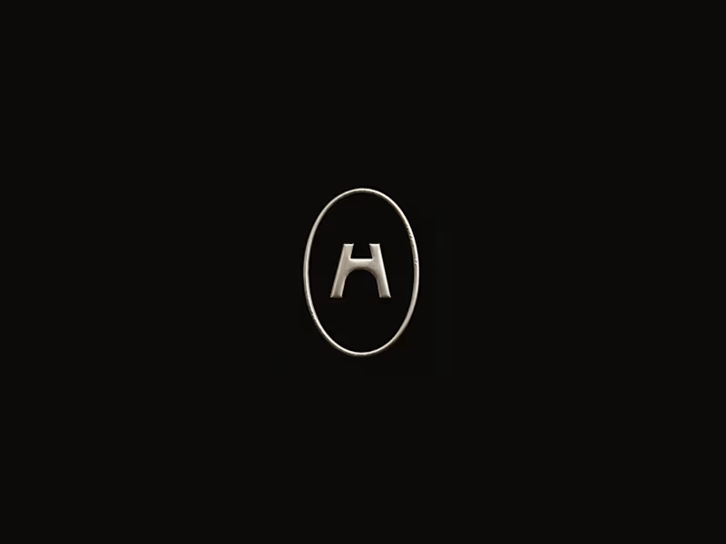
Sometimes, one image says more than an entire brand presentation.
When presenting a logo concept, the way you show it can completely change how a client perceives it.
A logo on a plain background shows the design. But adding the right texture, material, and context can help the client feel the brand before the full identity even exists.
I’m currently exploring a metallic finish for a logo concept, and it got me thinking about how much the right visual can communicate beyond the mark itself.
Of course, the full presentation matters, but sometimes, a single image is all it takes to make the vision click.
Designers, have you ever had a client connect with a concept through one mockup more than an entire presentation?
4
424

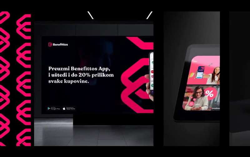
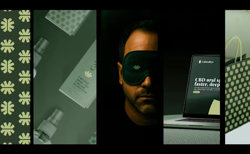
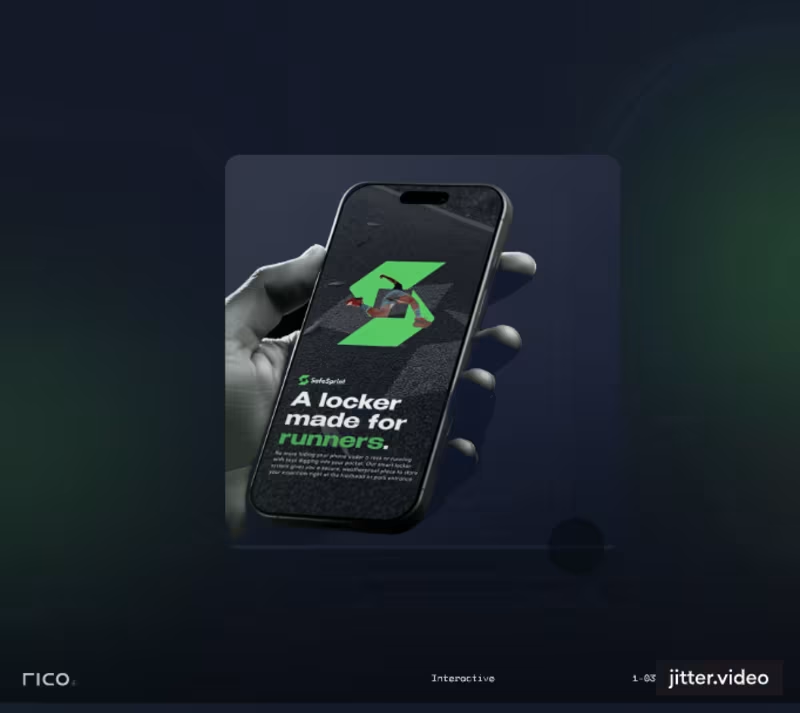
Brand Design That Converts Vision Into Revenue
- 43
- Followers
Brand Design That Converts Vision Into Revenue

Next.js Developer | Fast Websites & Web Apps for Businesses
- 34
- Followers
Next.js Developer | Fast Websites & Web Apps for Businesses
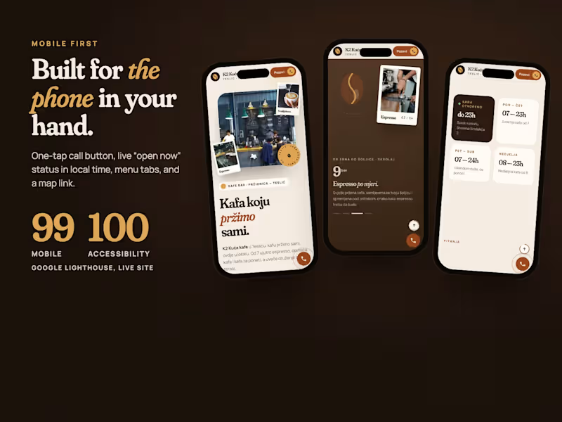
K2 Kuća kafe: a scroll-driven website for a café with its own roastery
A warm, editorial one-page site where a coffee bean roasts as you scroll, built mobile first and scoring 99 on Lighthouse mobile.
K2 Kuća kafe is a café and roastery in Teslić, Bosnia and Herzegovina. Their story is simple and strong: they roast their own coffee on site. I designed and built a one-page website around that story.
Scroll story "From bean to cup": a pinned section where the bean changes colour from green to dark roast, the background warms up and the temperature climbs from 20°C to 210°C, then to the espresso and the cup.
Mobile first: one-tap call button, a live "open now" status calculated in local time, menu tabs, horizontal photo album and a Google Maps link.
Design: Fraunces + Manrope, cream and espresso tones, polaroid-style photography, a bento offer grid and a menu that reads like a café board.
Performance: static site with self-hosted fonts, responsive WebP images and GSAP loaded on first interaction. Lighthouse on the live site: 99 performance (mobile), 100 accessibility, 100 best practices, 100 SEO.
Role: Design, development, motion (GSAP), deployment
Tools / tags: Web Design, Web Development, GSAP, ScrollTrigger, Responsive Design, Performance, Vercel
Link: https://k2-kuca-kafe.vercel.app
5
4
240
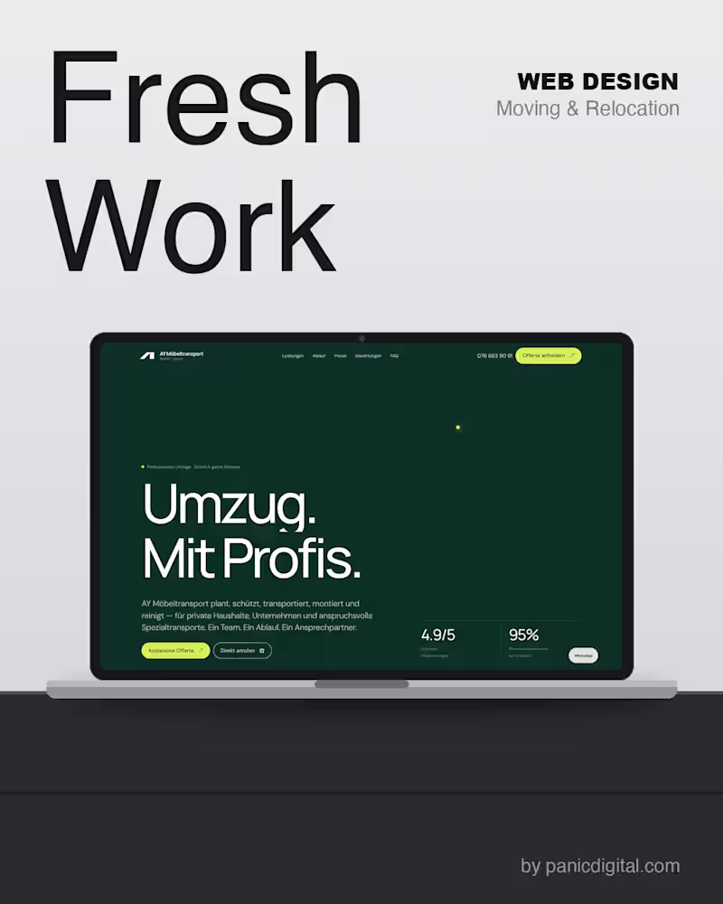
📦 Umzug. Mit Profis.
Professionelle Umzüge und Möbeltransporte in Zürich und der ganzen Schweiz.
Want a website like this for your business? 👉 panicdigital.com (http://panicdigital.com)
1
104
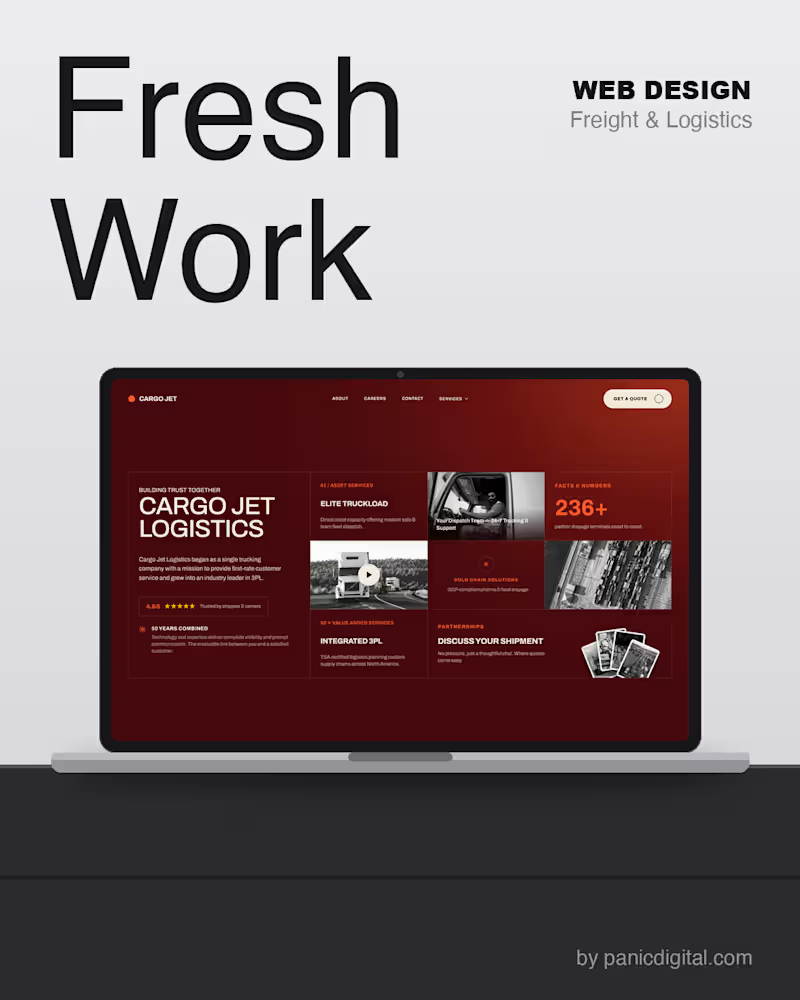
New project delivered 🚛 Cargo Jet Logistics — a website built to match a
3PL that runs 24/7. Clean, fast, and built to convert shippers into leads.
👉 See the full project: cargojet.vercel.app (http://cargojet.vercel.app)
9
14
441

AUTO SERVIS HUSO
Your car in safe hands. A confident, cinematic site for a certified Bosch Car Service — design, build & motion.
Website design & development by panicdigital.
— — —
🌐 autoservis-huso-maglaj.vercel.app
(http://autoservis-huso-maglaj.vercel.app)💬 Want one like this? DM us.
📩 panicdigital.com (http://panicdigital.com)
4
147

Senior Product Designer for AI & Fintech Products
- 11
- Followers
Senior Product Designer for AI & Fintech Products

🚗 TOKYO NIGHTS is live.
For the Config Makeathon, I challenged myself to build something completely different from my usual UX/UI work: a playable racing game prototype created with Figma Make.
Features:
⚡ Interactive city map
🏁 Playable race events
🚘 Vehicle customization garage
🎮 Arcade-inspired driving experience
🌃 Neon cyberpunk atmosphere
It was a great opportunity to explore what Figma Make can do beyond traditional product design and experiment with interactive gameplay mechanics.
Try the live prototype:
https://tokyo-nights-racing.figma.site
#ConfigMakeathon #FigmaMake #Figma #GameDesign #UXDesign #ProductDesign
1
3
226


Intent-Based Collaboration
A product design exploration reimagining collaboration through intent-driven interaction.
Instead of showing who is online, the system communicates how people want to work, helping teams collaborate without interrupting focus. An AI assistant observes context and surfaces the right moments for feedback, sync, and collaboration.
Re-imagined interaction: shifting teamwork from presence-based to intent-driven collaboration.
🔗 Live prototype: https://intent-based-collaboration.figma.site
Role: Product Designer
Tools: Figma Make · Figma
3
193

Creating custom Webflow solutions for agencies and startups
Creating custom Webflow solutions for agencies and startups


Design Director & Creative Lead at Stilpo
New to Contra
Design Director & Creative Lead at Stilpo

Durex set out to reposition, renew, and elevate its digital presence with an innovative, modern e-commerce platform targeted directly at a 18–25 audience.
To create an immersive user experience, we leveraged the brand's iconic cylindrical geometry to build a central hero graphic—framing an entrance to a semi-realistic, elevated product world. We combined bold typography, fluid motion, and dynamic color compositions with interactive micro-copy that responds to every click, turning standard e-commerce navigation into a vibrant, engaging brand dialogue.
0
64
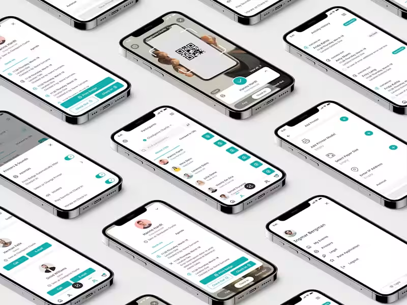
Entrance App is a specialized mobile application engineered for seamless event operations—enabling real-time check-ins, automated badge printing, and comprehensive staff and location management.
Inheriting an existing platform burdened with critical usability issues, we conducted a rigorous technical and UX audit to document, clean up, and restructure the core system. Through iterative discovery cycles with product owners, we redesigned the user flows, established a robust UI and design system, and created the end-to-end visual identity—culminating in the new app naming and logo architecture.
0
80
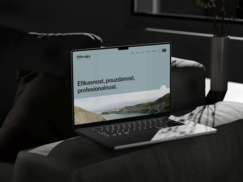
Founded in 1989, Otraks Group handles complex electrical engineering—from substation installation and hydroelectric testing to project management and consulting.
Using raw electricity as both the functional core and the creative catalyst, we translated abstract electrical energy into a dynamic visual identity. From this motif, we delivered complete branding, website design, and front-end development, establishing a unified visual environment across both physical and digital touchpoints.
0
119