Centerfield Supply™ | Brand Identity Design
Drazen Vukajlovic
About
Centerfield Supply™ is a Canadian industrial supply company that works with civil construction, mining, pipelines, oil and gas, forestry, and rail. They provide reliable solutions, from erosion control and geosynthetics to environmental consultation and hydroseeding. Their focus is on meeting demanding industry needs while promoting sustainability and consultative service.
Project Goal
The goal of this project was to establish a clear art direction and cohesive brand identity. The design was crafted to feel bold and sporty while remaining masculine and professional, reflecting the strength and credibility of true expertise.

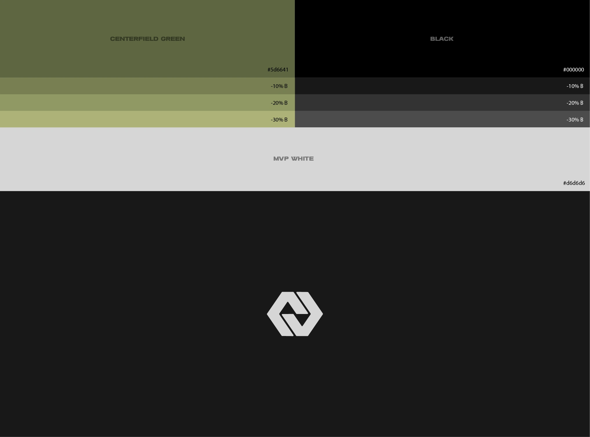
Color Palette
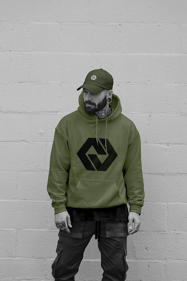
Olive green was chosen as the primary color to emphasize the company’s connection to rugged, real-world environments and its grounded, practical approach. Dark tones were used to create a mature and professional feel, reflecting a dependable organization.


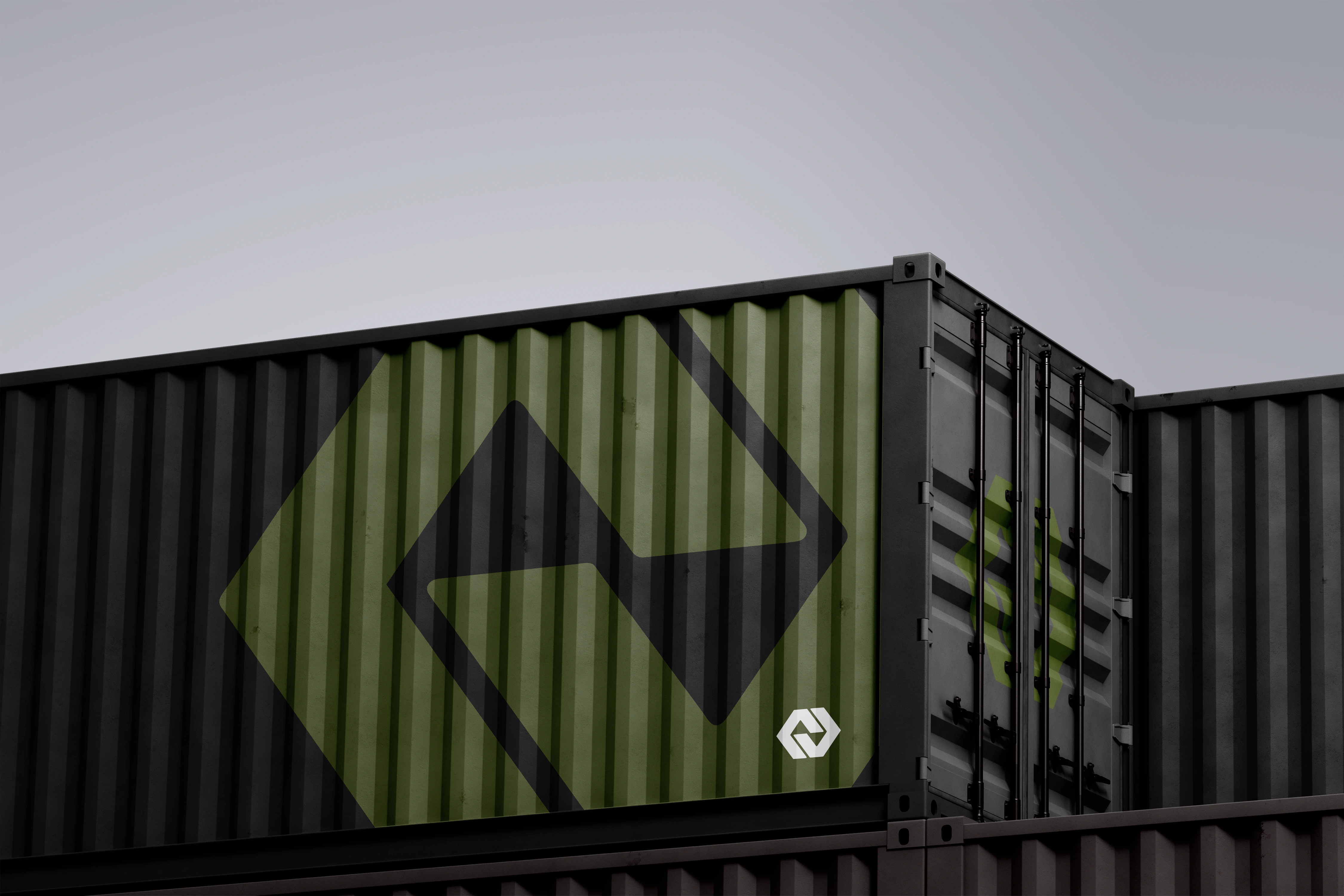
Logo Design
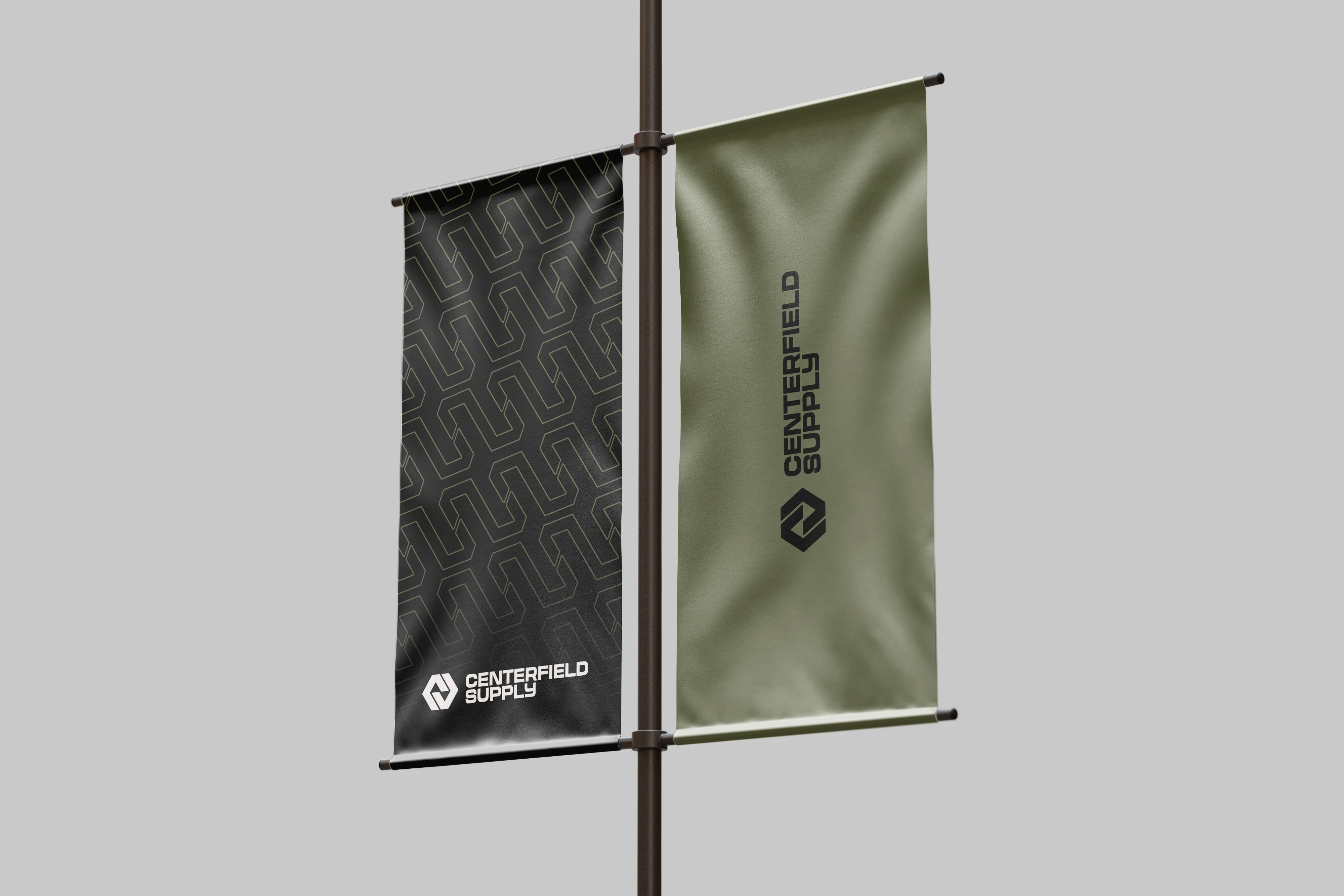
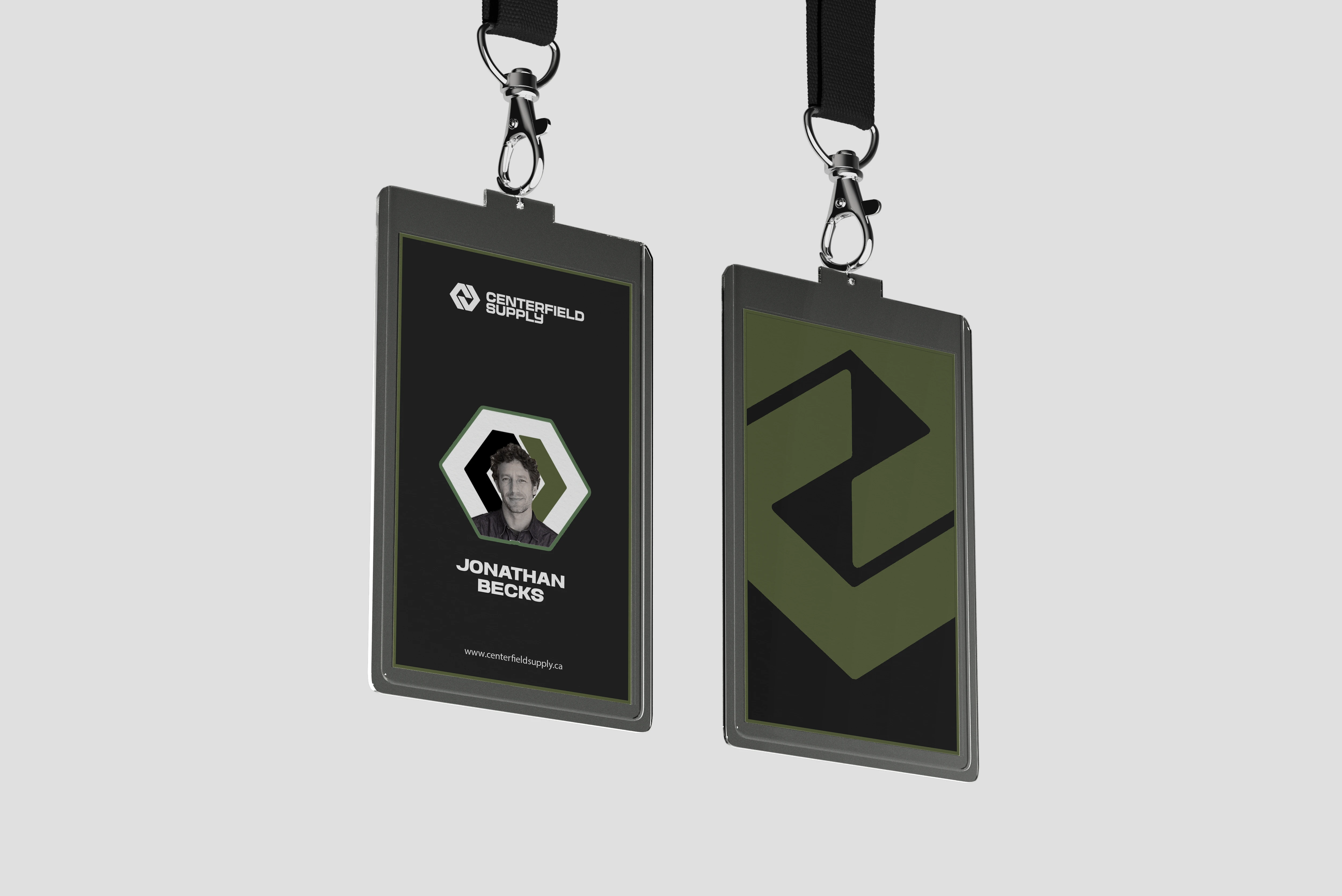
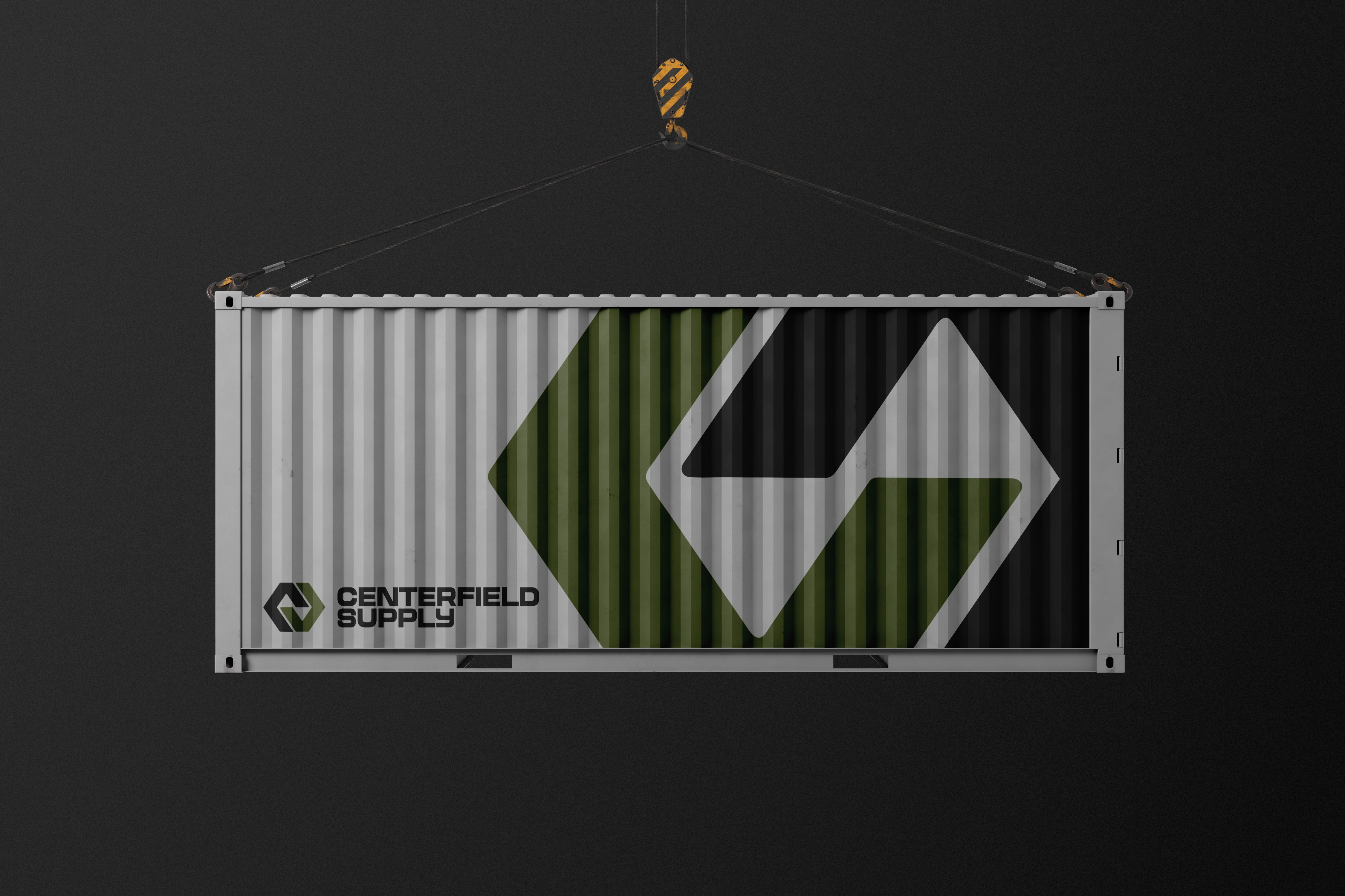
The logo incorporates a chain link and two negative space triangles to represent the above and below earth scope of the company’s operations. It also features a lockup of the CS initials, tying the visual identity directly to the brand.
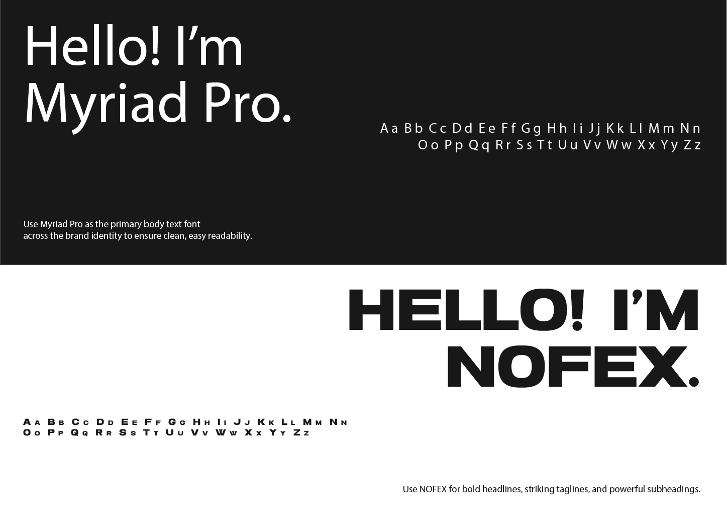
Typography
Headlines use NOFEX, a bold and commanding font that conveys the company’s energy and resilience. Supporting text uses Myriad, which brings professionalism, seriousness, and clarity. The combination strikes a balance between boldness and sophistication.
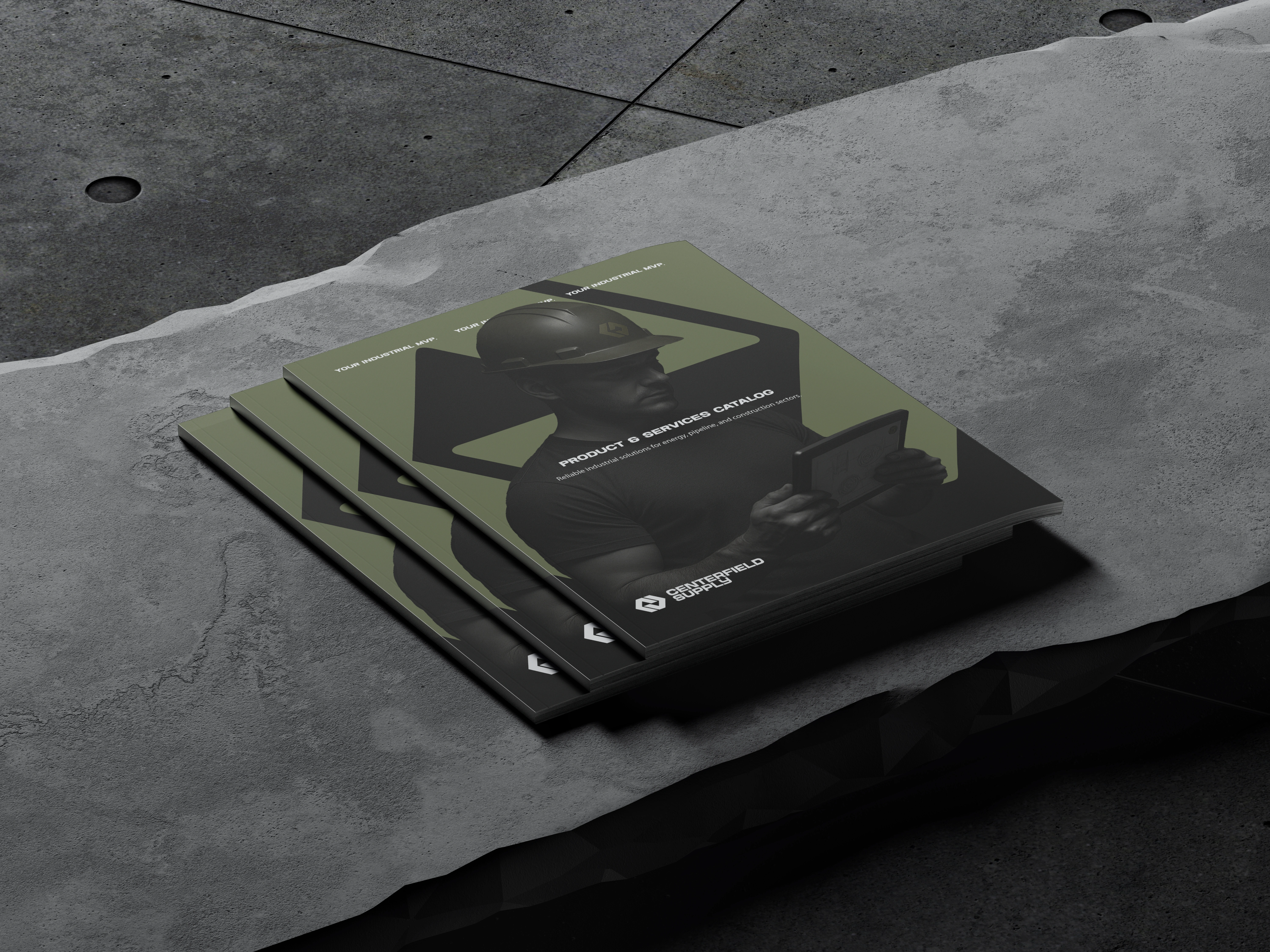
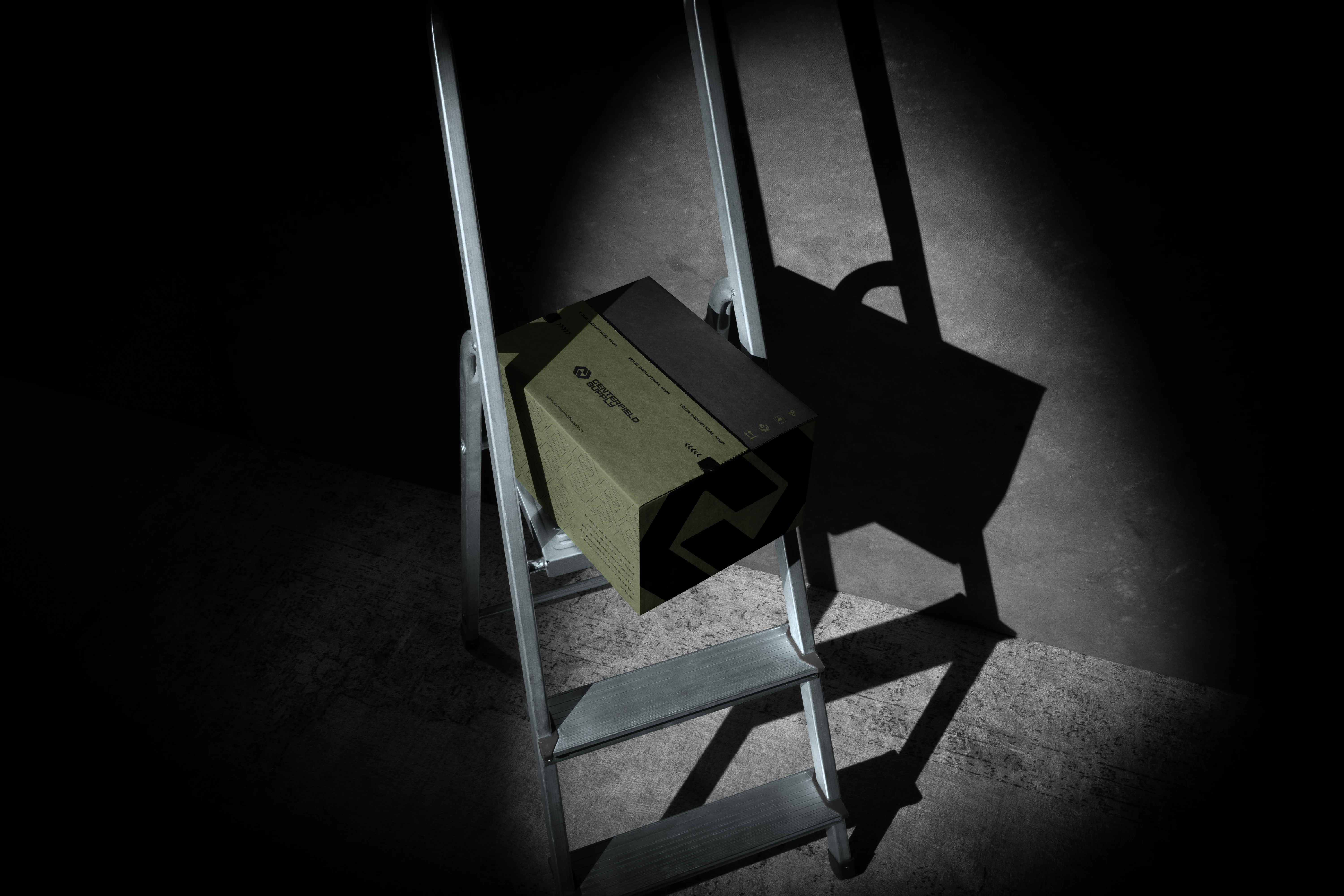
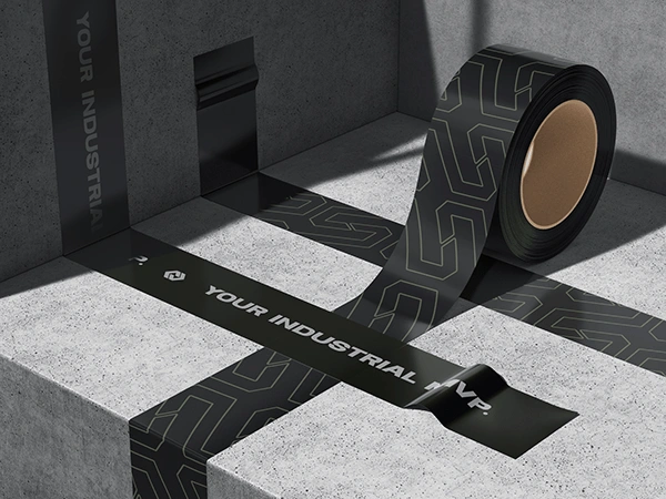
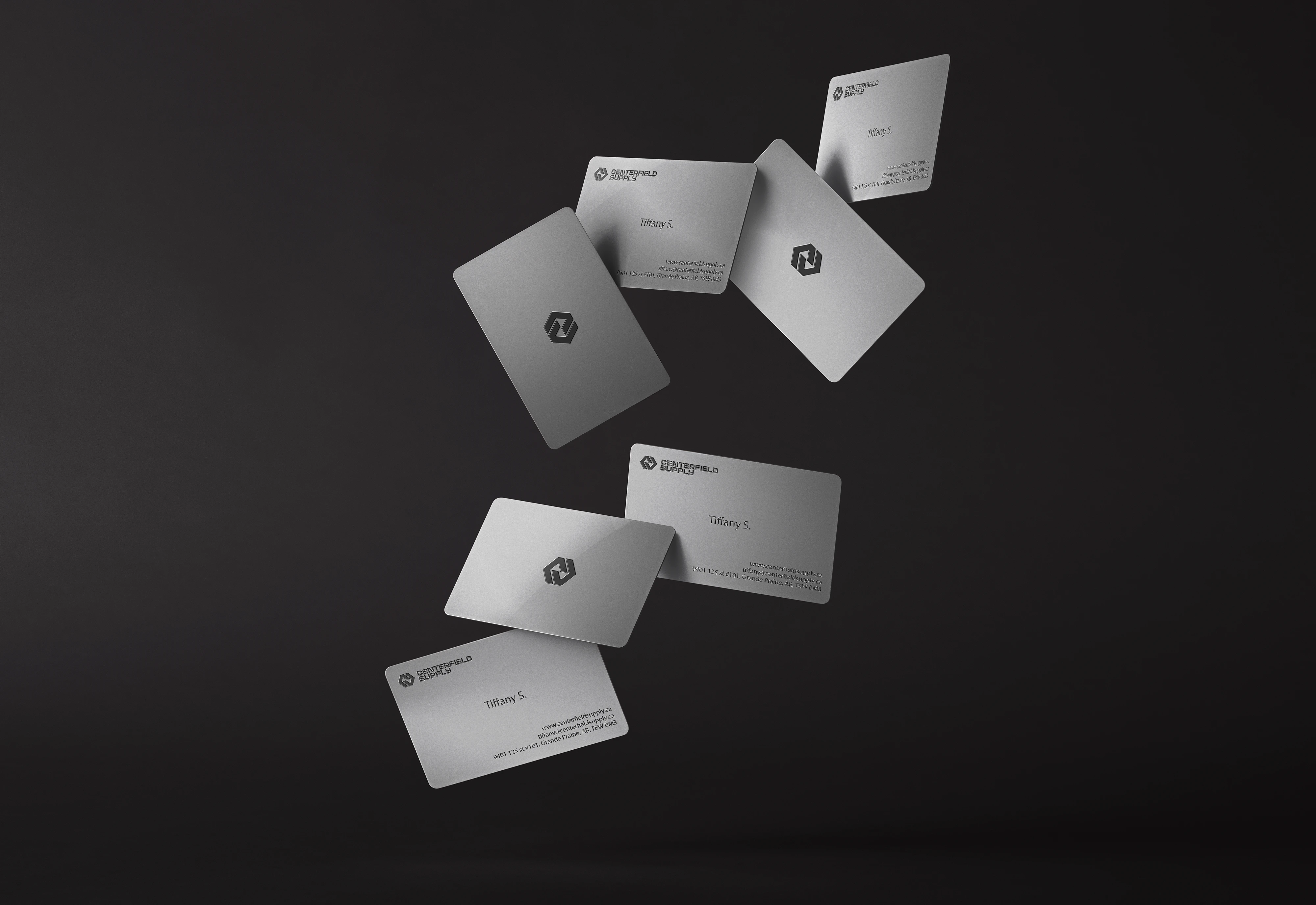
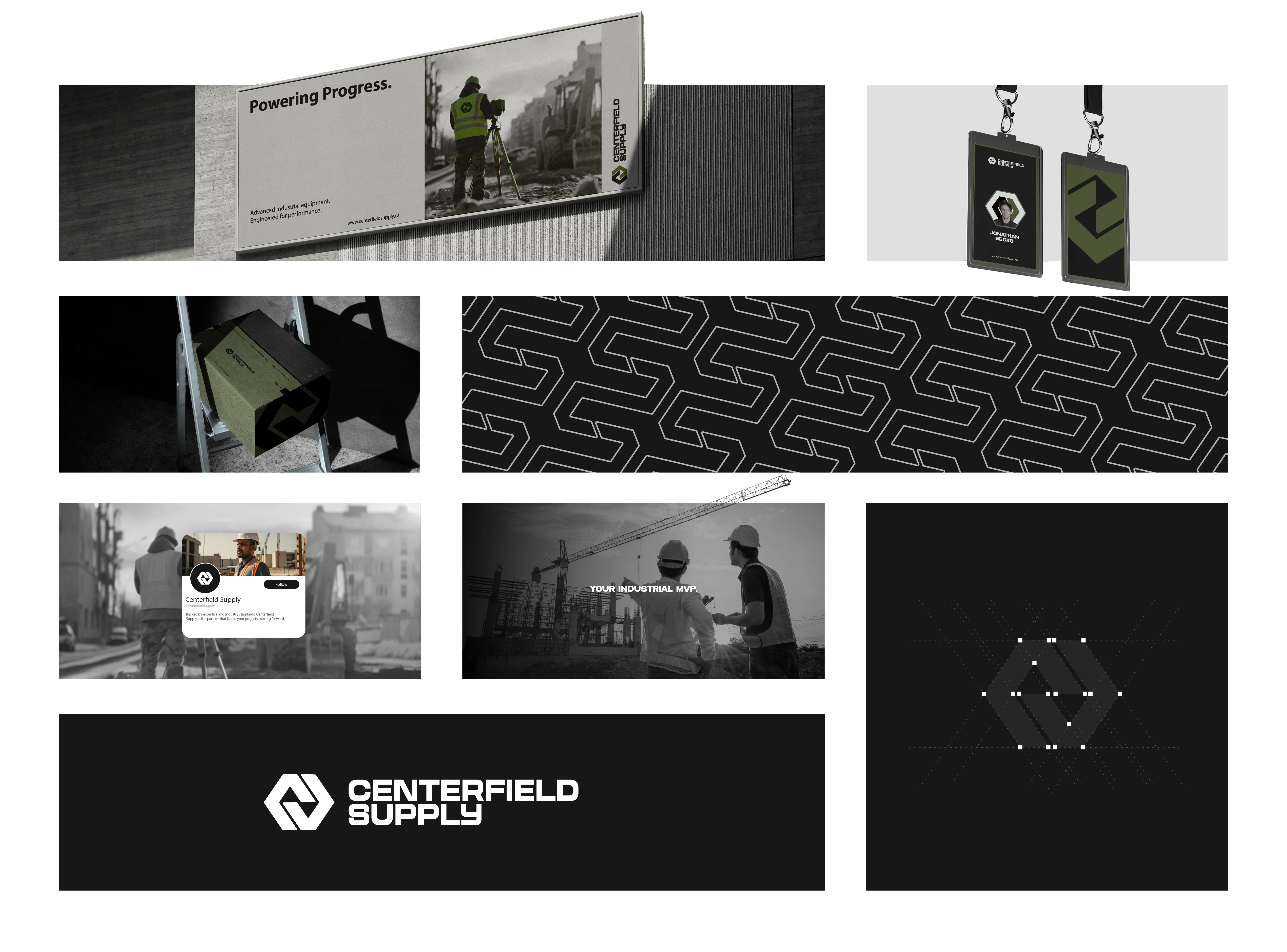
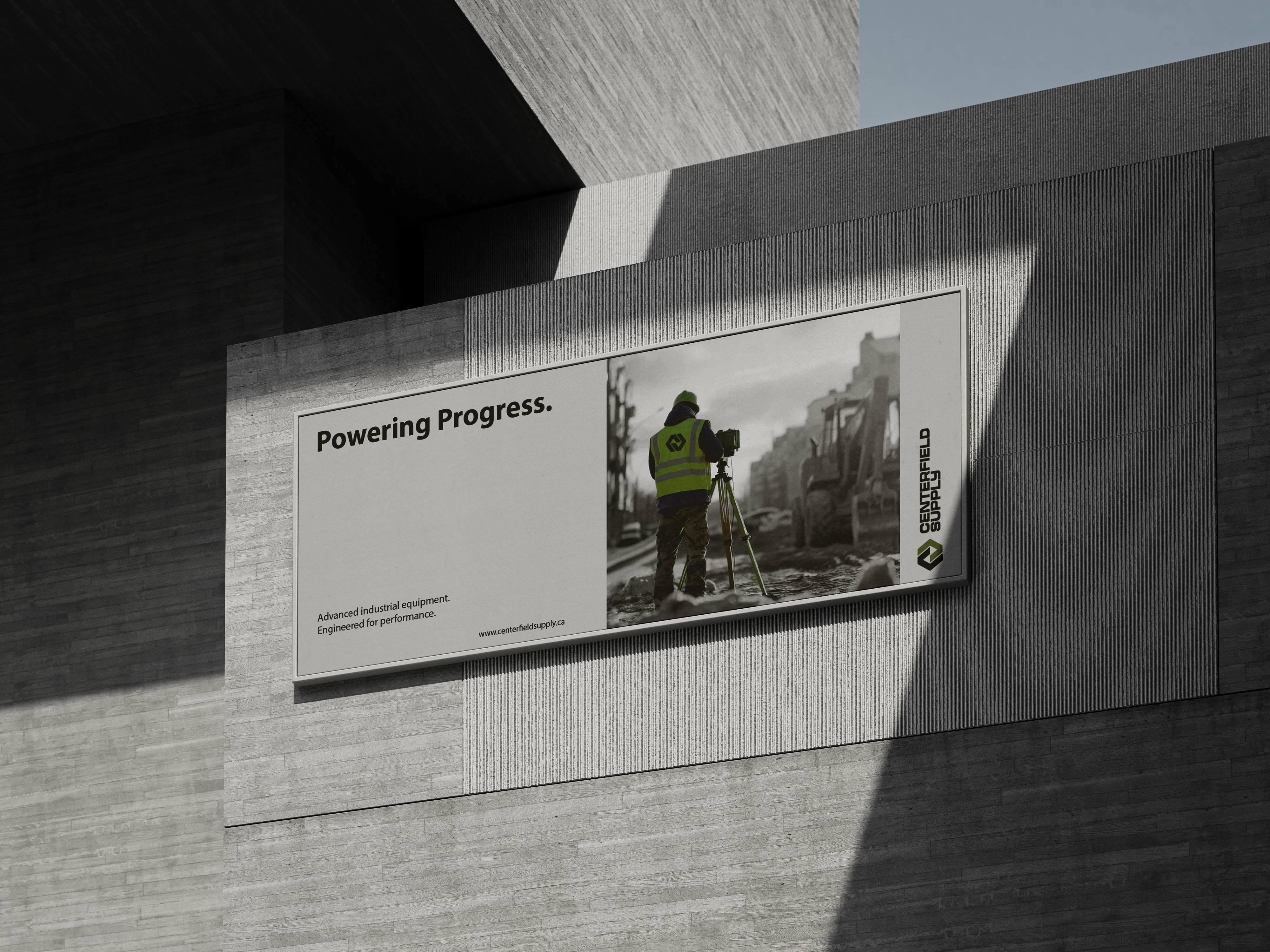
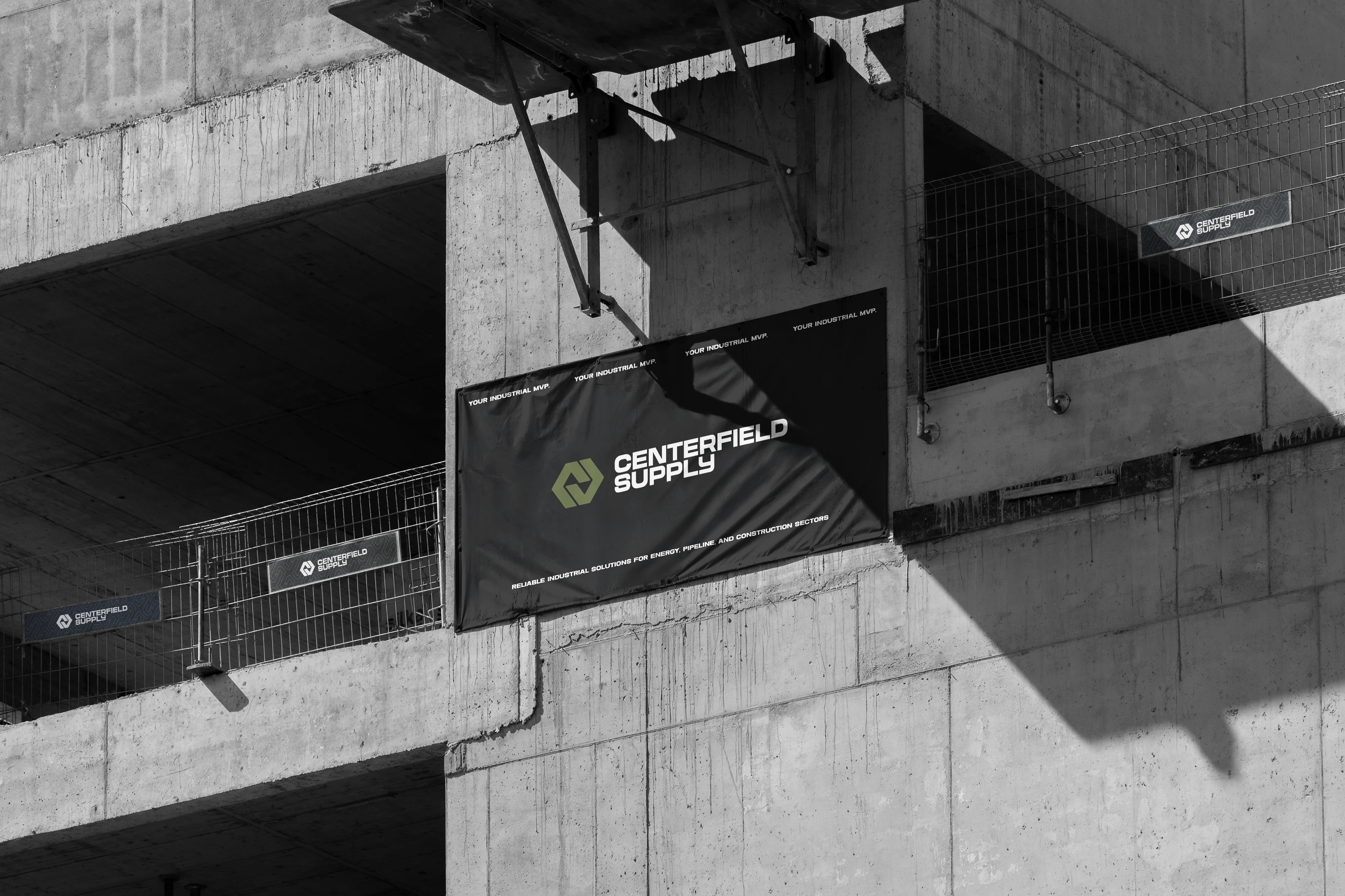
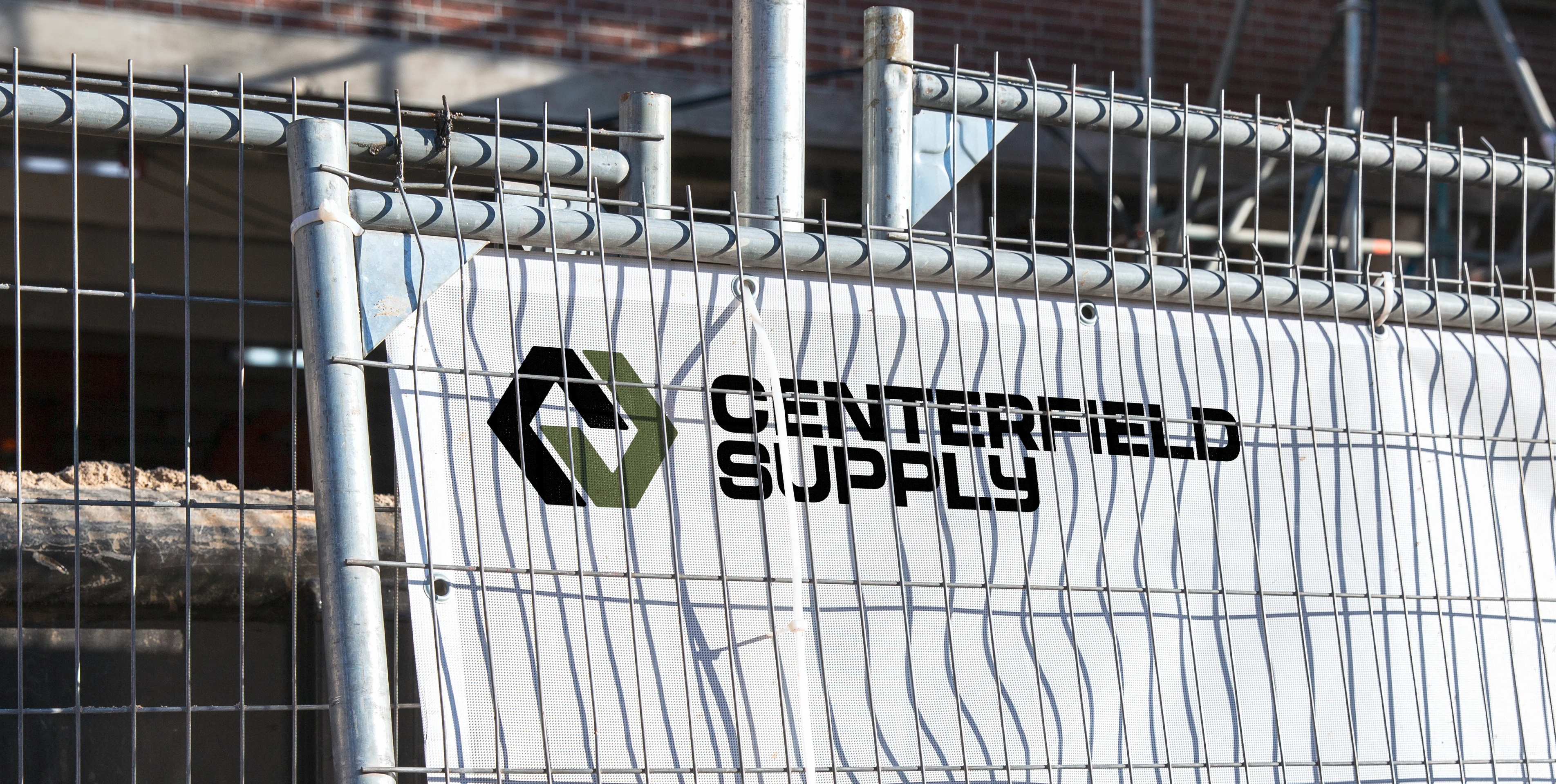
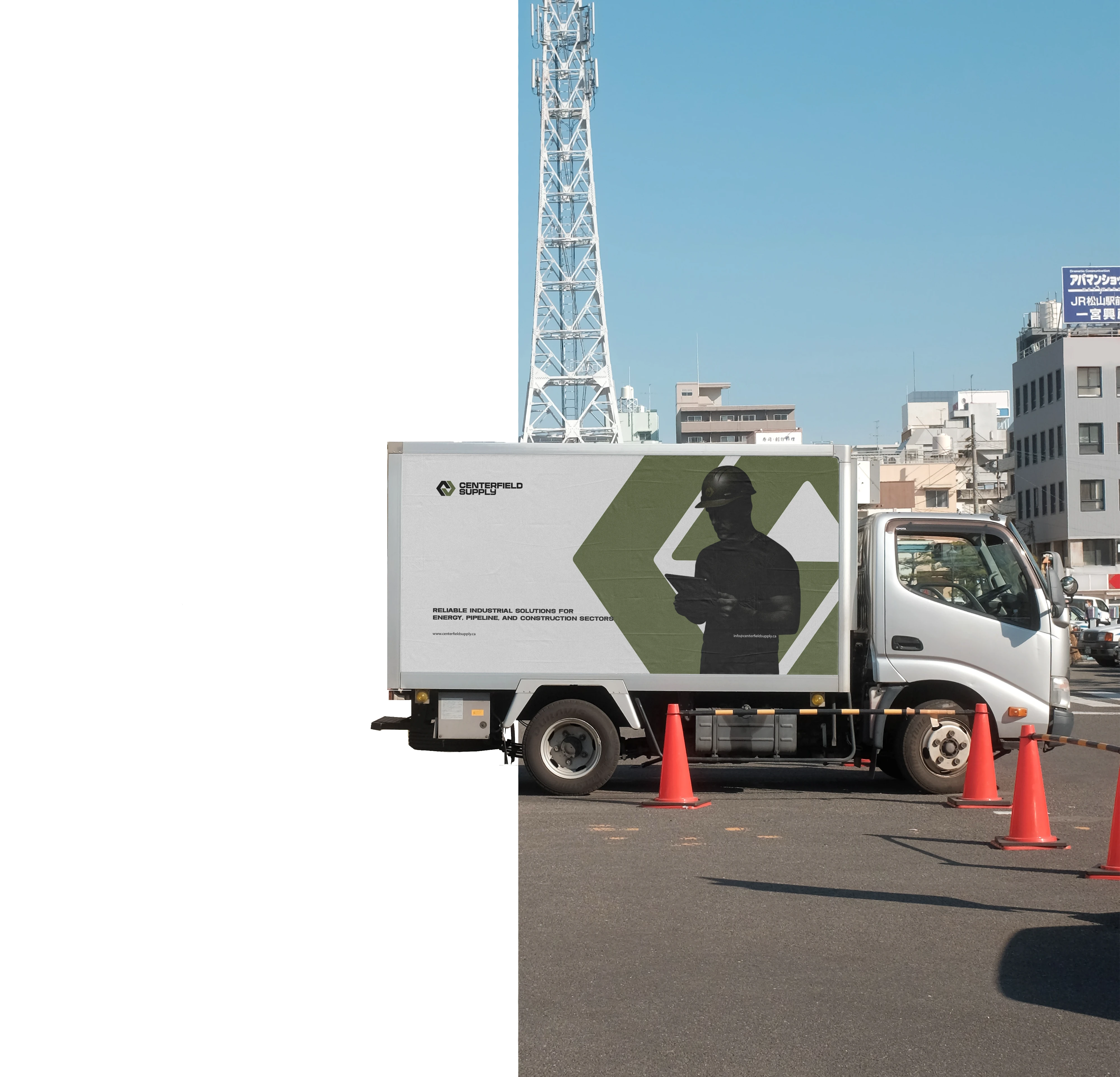
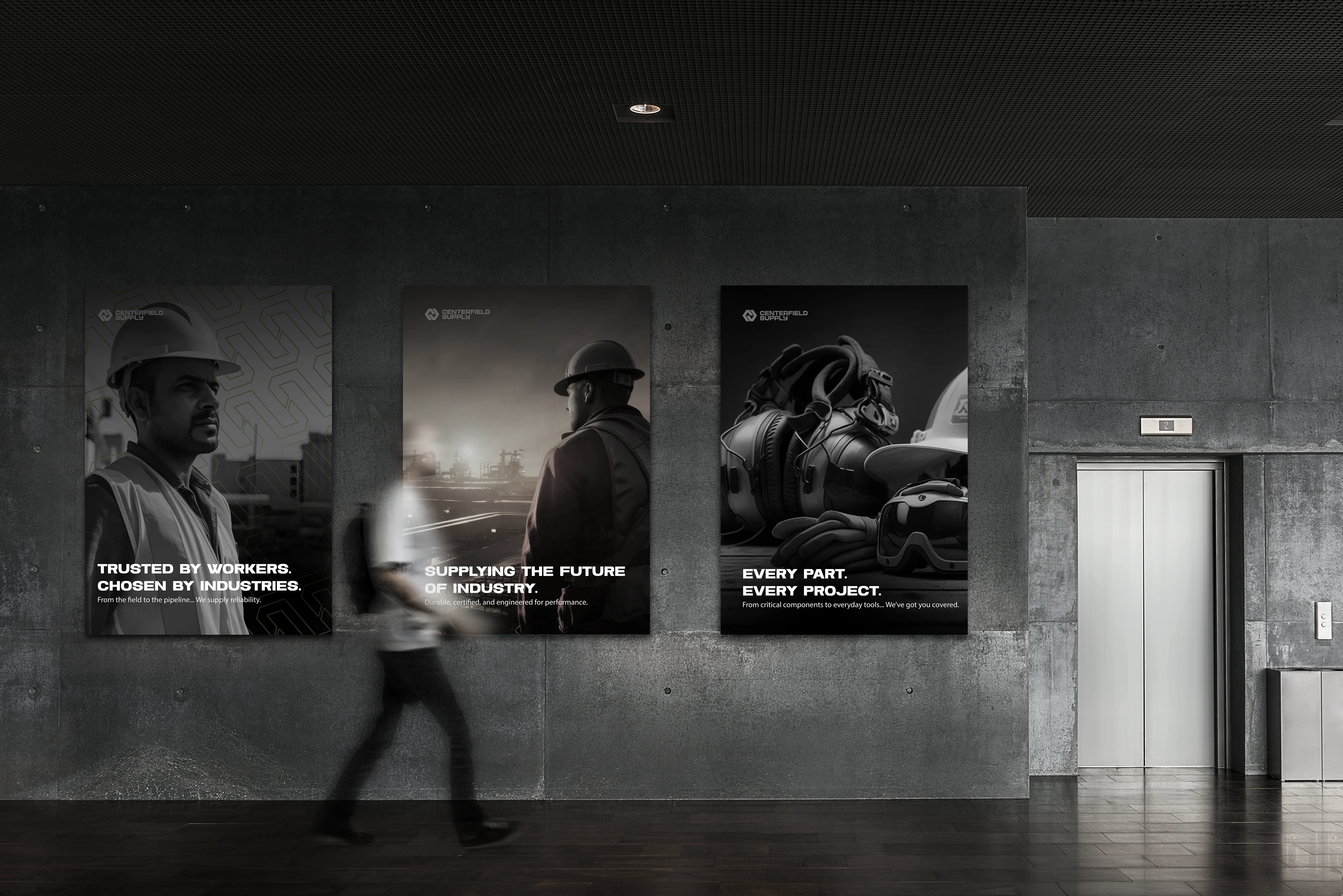
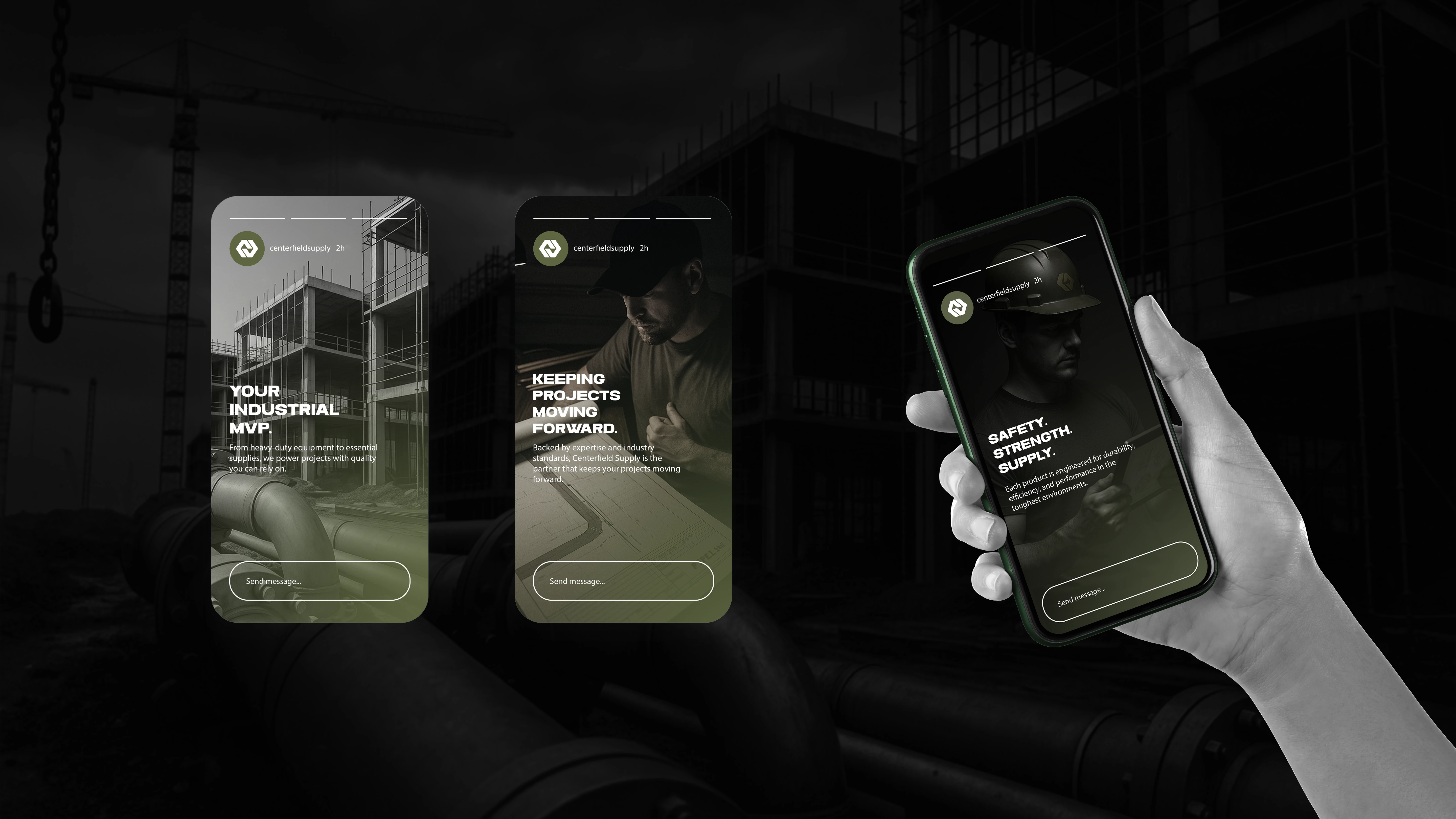
The presentation covers all touchpoints relevant to the company. The showcased elements demonstrate how the brand’s visual assets are applied across different settings, materials, surfaces, and environments.

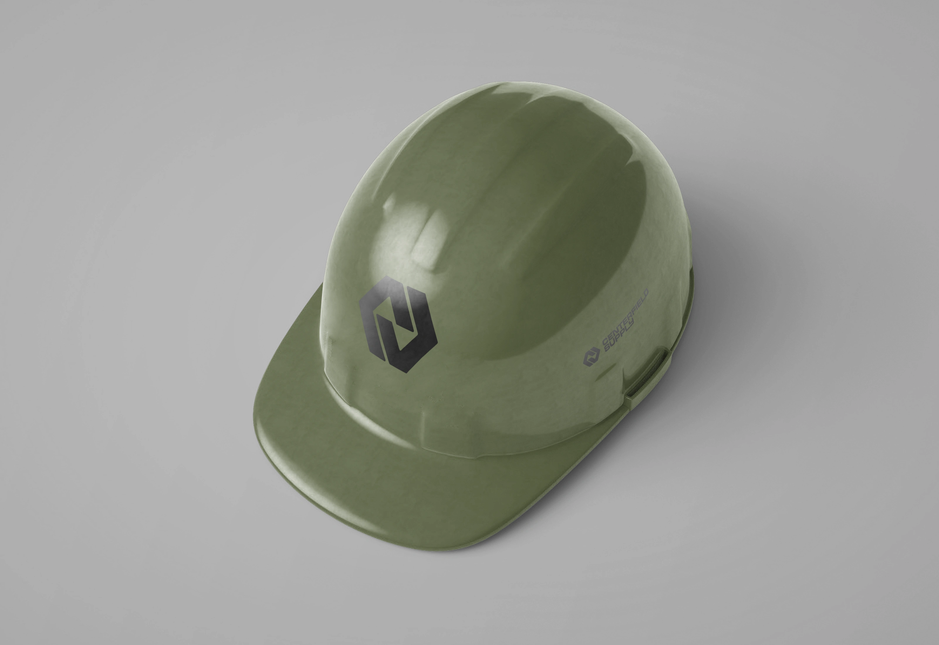
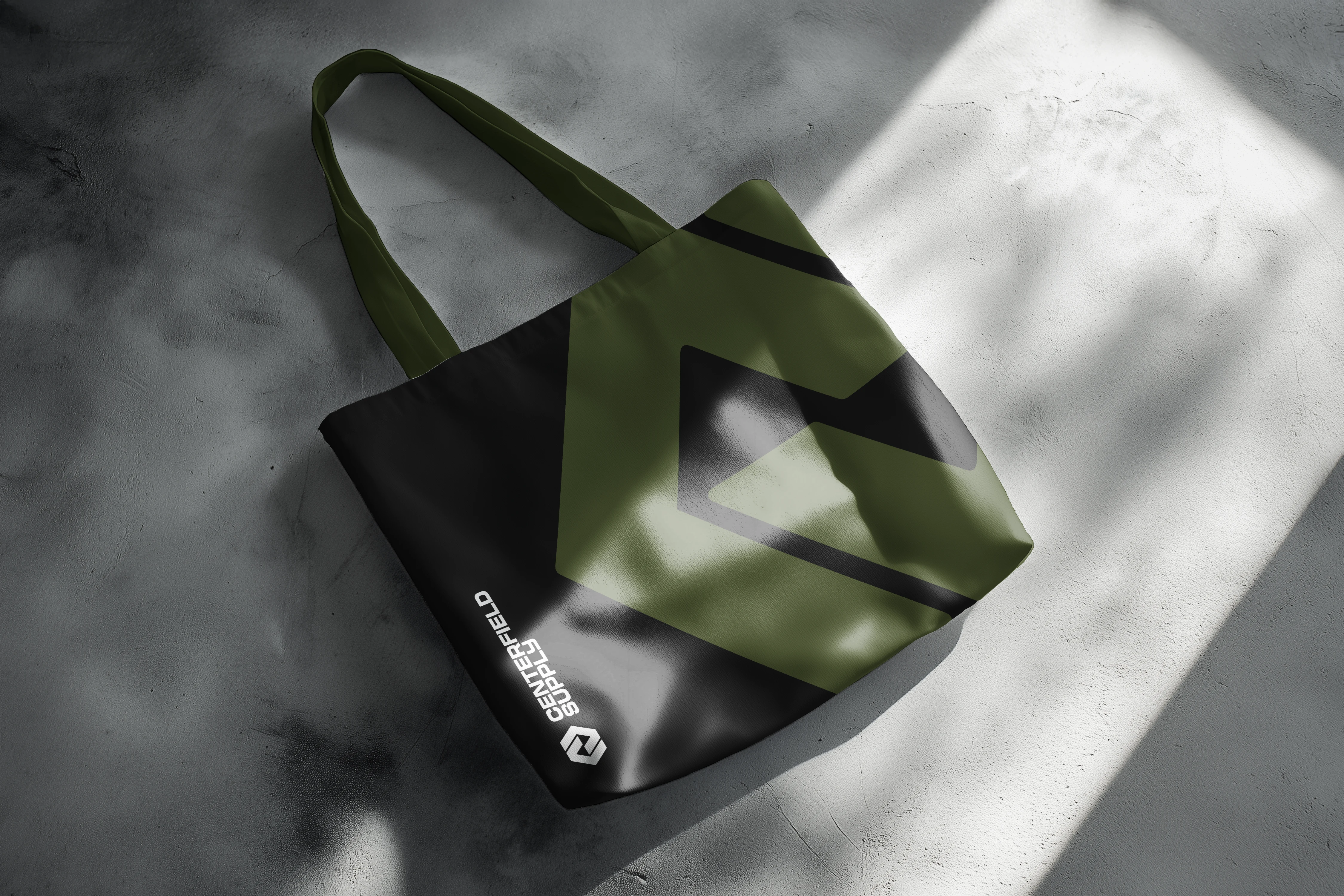
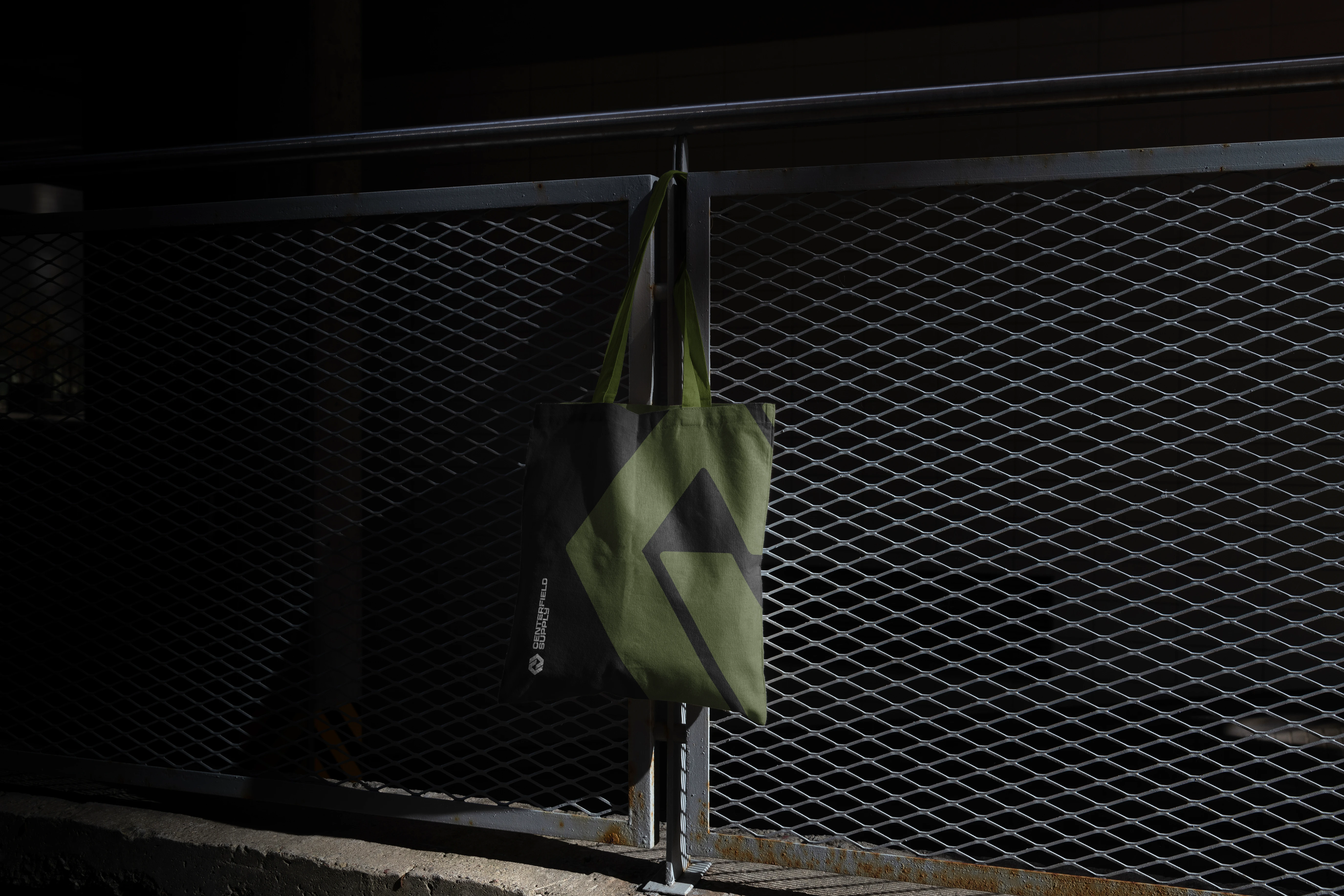
The brand is designed to work seamlessly across both indoor and outdoor touchpoints, ensuring consistency and impact whether on signage, packaging, uniforms, or environmental graphics.
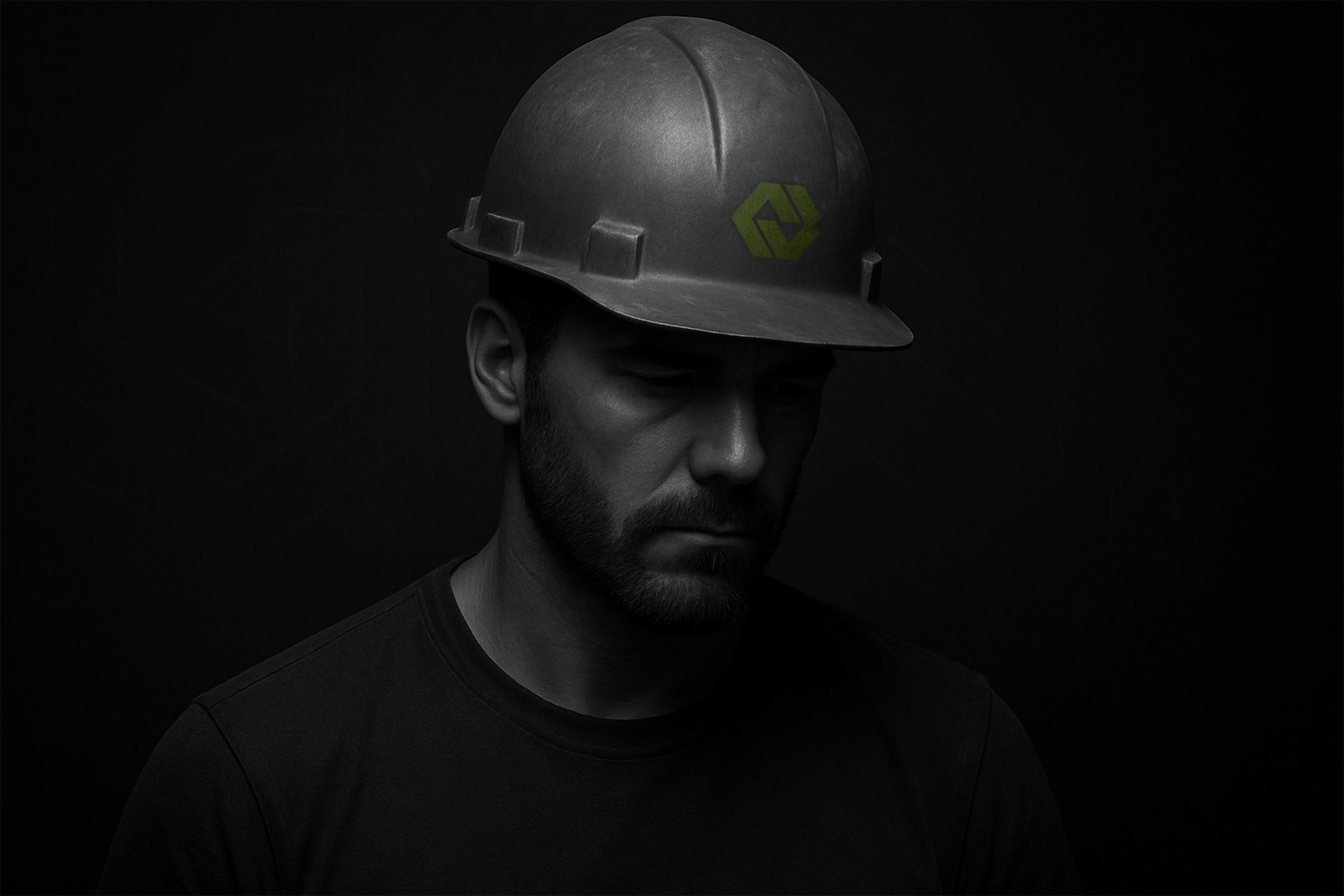
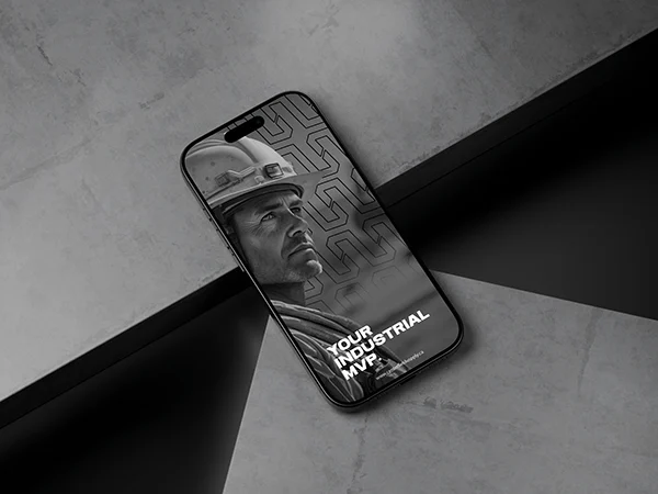
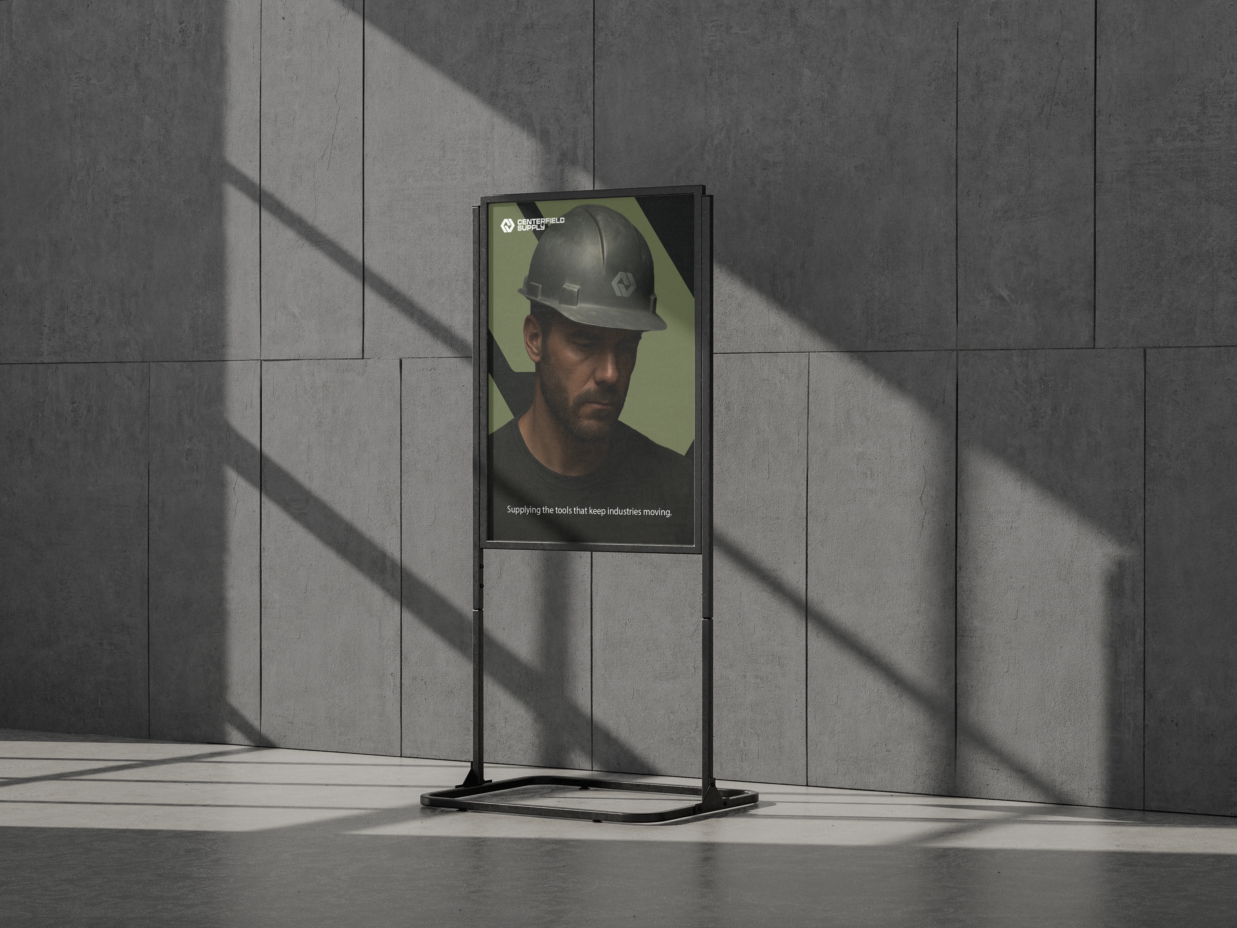
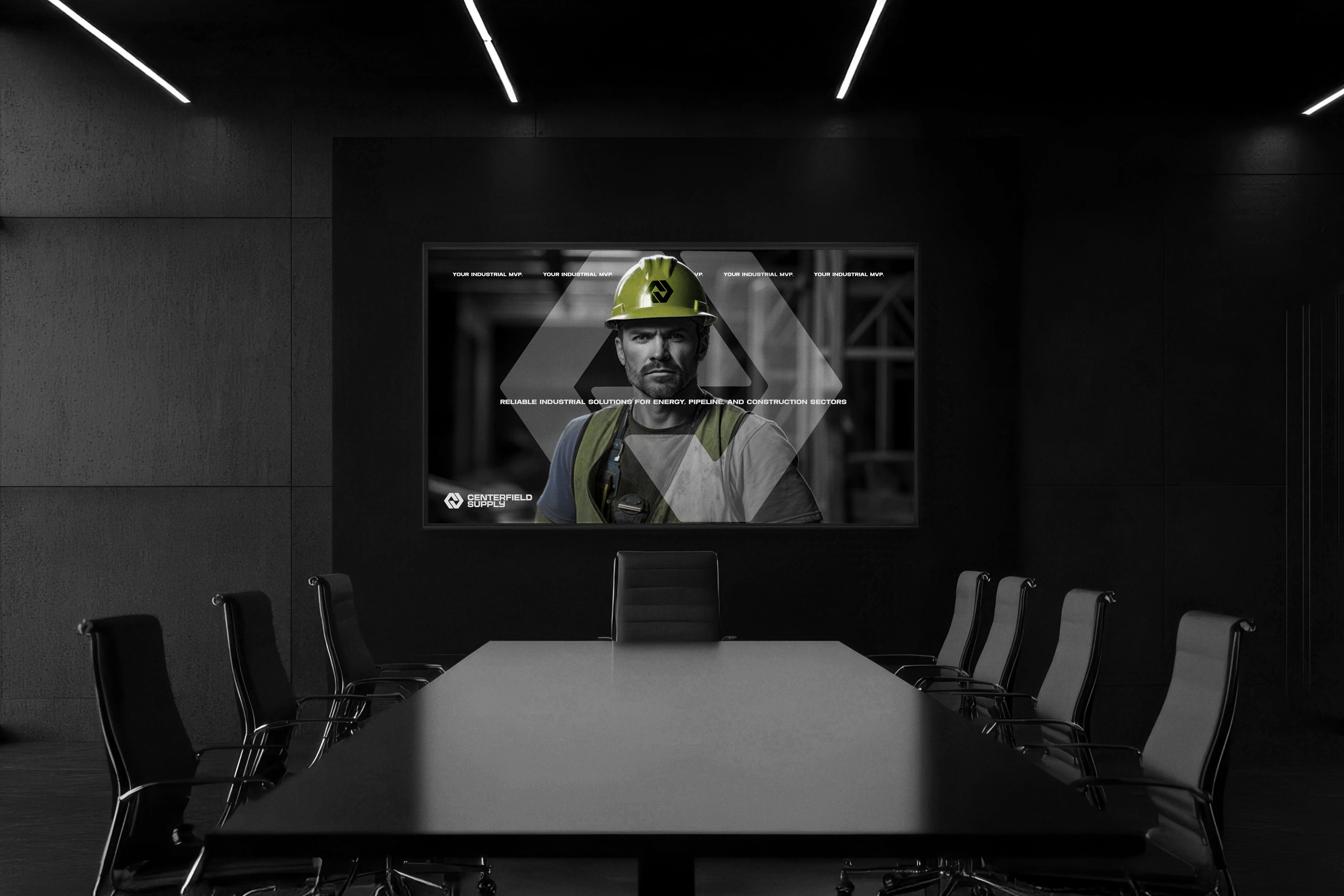
Models and imagery are chosen to represent real professionals with authority, conveying expertise, reliability, and trust.
Imagery & Art Direction
Imagery focuses on people, showing workers as the real MVPs of the company. This human-centered approach highlights who the company serves and the purpose behind its work. The visuals are authentic, strong, and clearly convey the brand’s tone and values.
The Centerfield Supply brand is designed to feel strong, professional, and authentic. Every part of it, from the logo and colors to the typography and imagery, reflects the people the company serves and its commitment to doing work that matters.
Thank you for watching!
If you enjoyed this project, please like, comment, and follow.
Like this project
Posted Aug 24, 2025
Centerfield builds strong, long-lasting relationships with clients by providing sustainable, cost-effective solutions that support project goals and budgets.